A better wireless access map?
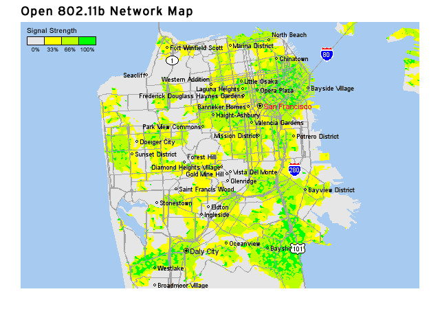
As open 802.11b access points increase in number (and the canonical list of them is created), this map will get crowded and not very useful. More useful would be a map where approximate 802.11b signal strengths are denoted by color**. With the wide view (as shown), you get just the strengths with the nodes showing up as you zoom down to the street-level view. You could also toggle a setting between open networks and fee-based networks (like Surf and Sip or Boingo). (Update: Christopher writes in with a pointer to the Wireless Network Visualization Project)
The April 2002 issue of Wired contains an infographic of wireless access points across the United States. An annotated list of the wireless access points included in their statistics is available in PDF format on their site.
** Note: the signals strengths denoted on this map have no basis in reality. The map is just for demonstration purposes. Map graphic borrowed from Yahoo! Maps.
Socials & More