Gorgeous Typography on Fire Insurance Maps
Absolutely beeeeeyooootiful typography on these Sanborn fire insurance maps.
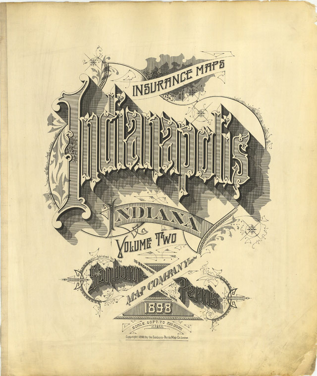
Sanborn’s fire insurance enterprise produced not only excellent and detailed urban maps, but they also maintained an elegant aesthetic in the headings and legends on the maps themselves, and in the title pages of the (larger) city volumes. The ornamental flair is diverse — I don’t think any of the examples above repeat type styles — and lends an air of individuality and refinement to each of the towns surveyed.
Although this sort of artistic embellishment was unlikely to have increased map sales on its own, it’s a charming addition which will have perhaps made the purchasers feel a sense of pride and a little more secure about their own unique town. And it’s certainly in keeping with the cartographic tradition of decorative trimmings.
Chris Ware must have a stack of these babies near his drawing table from which to crib.
Socials & More