The short list of nominees for the 2016 Information is Beautiful Awards
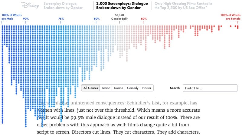
The Information is Beautiful Awards have announced the shortlist of nominees for the best infographics, data visualizations, and data journalism for 2016. Literally hours of exploration here. Some well-deserved shouts out to Polygraph (multiple projects, including their breakdown of film dialogue by gender and age), Nicholas Felton’s Photoviz, climate spirals, FiveThirtyEight’s 2016 election forecast map, and many other projects you might have seen here or elsewhere.
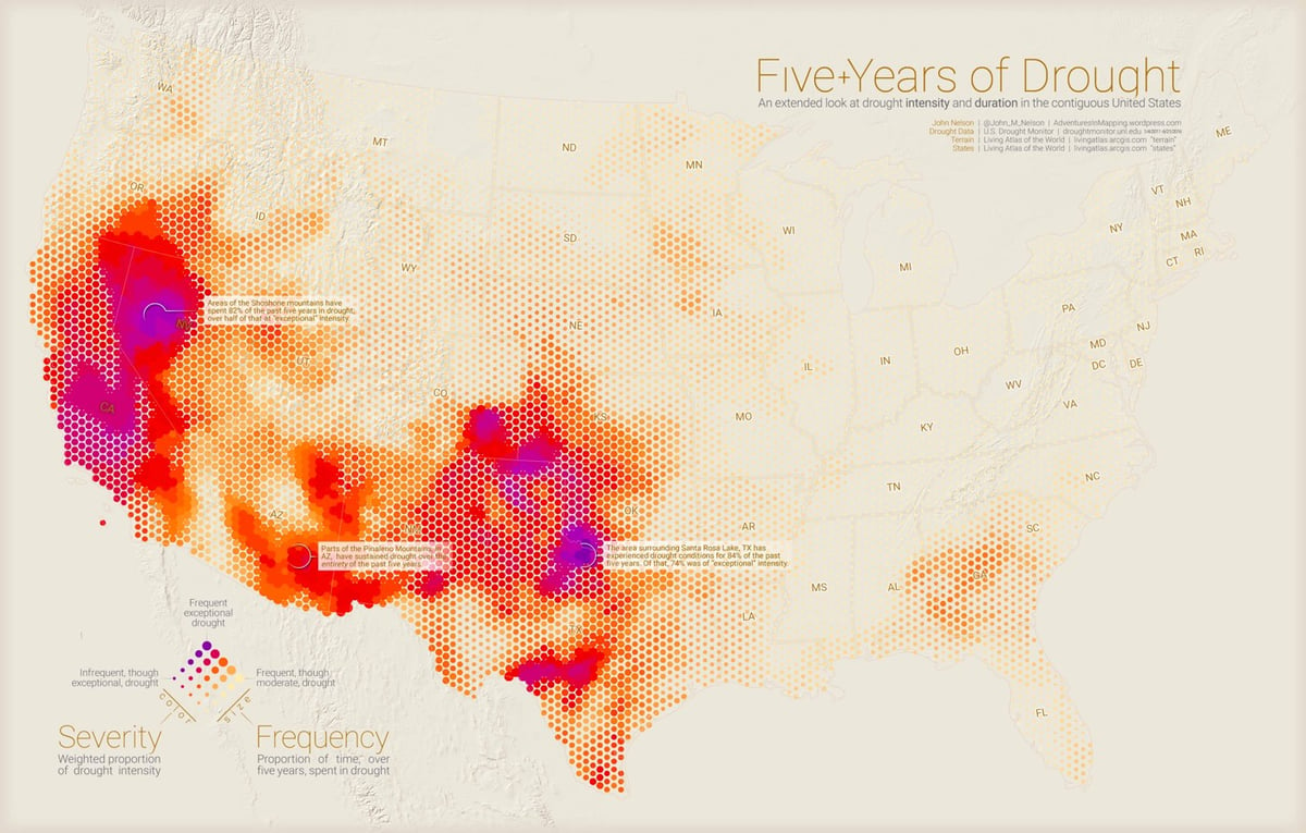
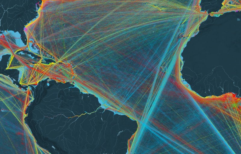
The images above are from Adventures in Mapping, Polygraph, and Shipmap.
Stay Connected