kottke.org posts about color
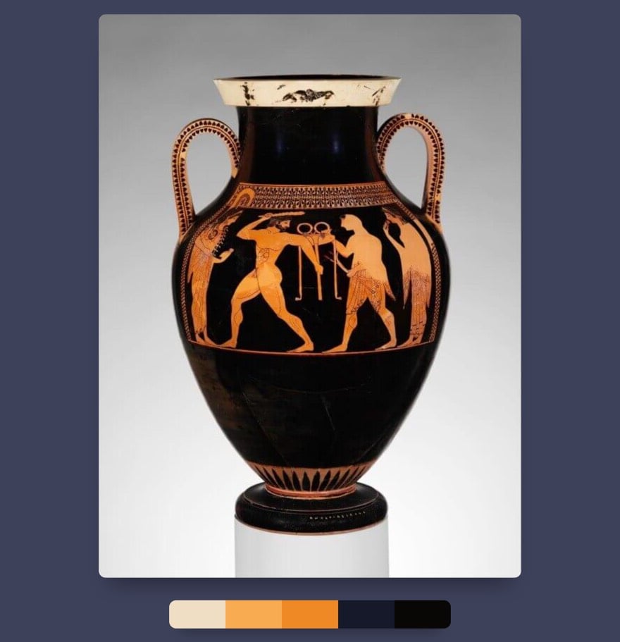
So we all know the color purple has always been associated with royalty because the dye used to make it was extremely limited because you could only get it from the Phoenician city of Tyre where a tiny snail lived. Dye makers had to “crack open the snail’s shell, extract a purple-producing mucus and expose it to sunlight for a precise amount of time,” and it took 250K snails to make an ounce of dye. But did we know purple isn’t like all the other colors?
Most of you here probably know that our perception of color comes down to physics. Light is a type of radiation that our eyes can perceive, and it spans a certain range of the electromagnetic spectrum. Individual colors are like building blocks in white light: they are subdivisions of the visible spectrum. For us to perceive an object as being of a certain color, it needs to absorb some of the subdivisions in the light that falls on it (or all of them, for black). The parts it reflects (doesn’t absorb) are what gives it its color. But not so for purple, because it is a non-spectral color.
Hahahah. Yessssss. Pound sand, Harold!
“Barbaric.” A “nightmare of vulgarity.” “Monstrous.” “A violent mess.” “The work of a madman.” Those are just some of the reactions that Henri Matisse’s Dance received after its public debut in 1910. In this video, Evan Puschak shares How Matisse Revolutionized Color In Art with this painting and other Fauvist work.
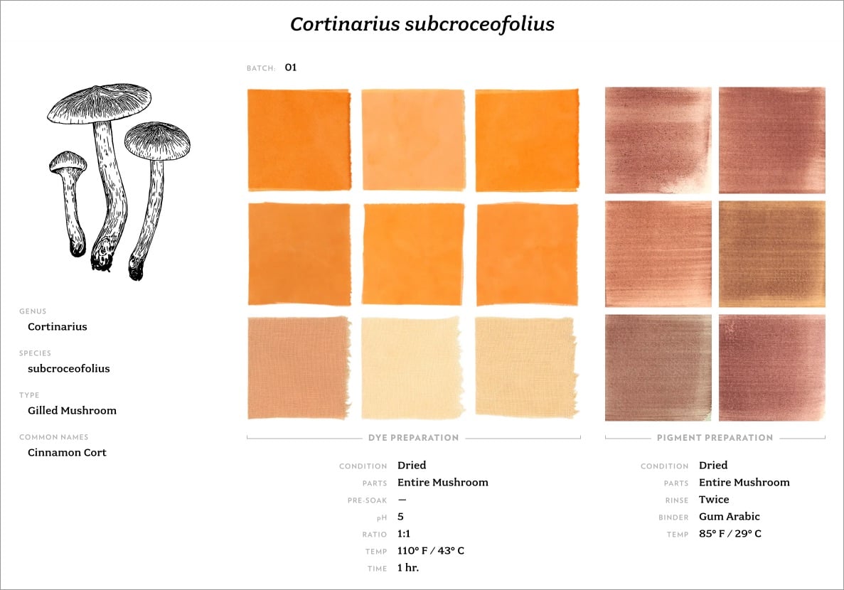
The Mushroom Color Atlas is a resource and reference for everyone curious about mushrooms and the beautiful and subtle colors derived from dyeing with mushrooms. But it is also the start of a journey and a point of departure, introducing you to the kaleidoscopic fungi kingdom and our connection to it.
I love stuff like the Mushroom Color Atlas. There’s a book version coming out soon — you can pre-order at Amazon, Bookshop.org, or Chronicle Books. (via @presentandcorrect)
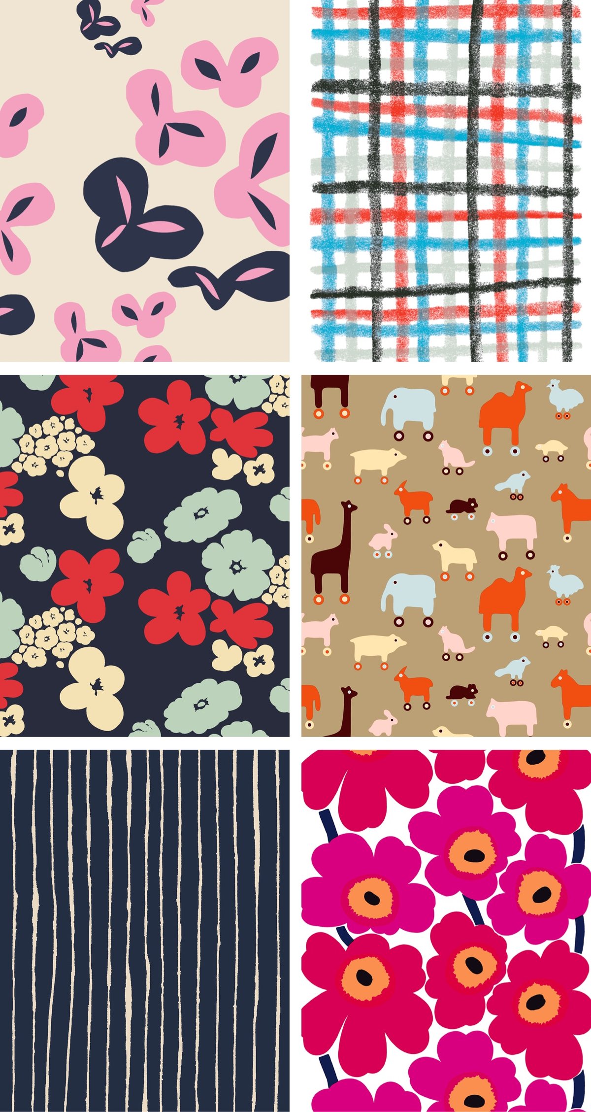
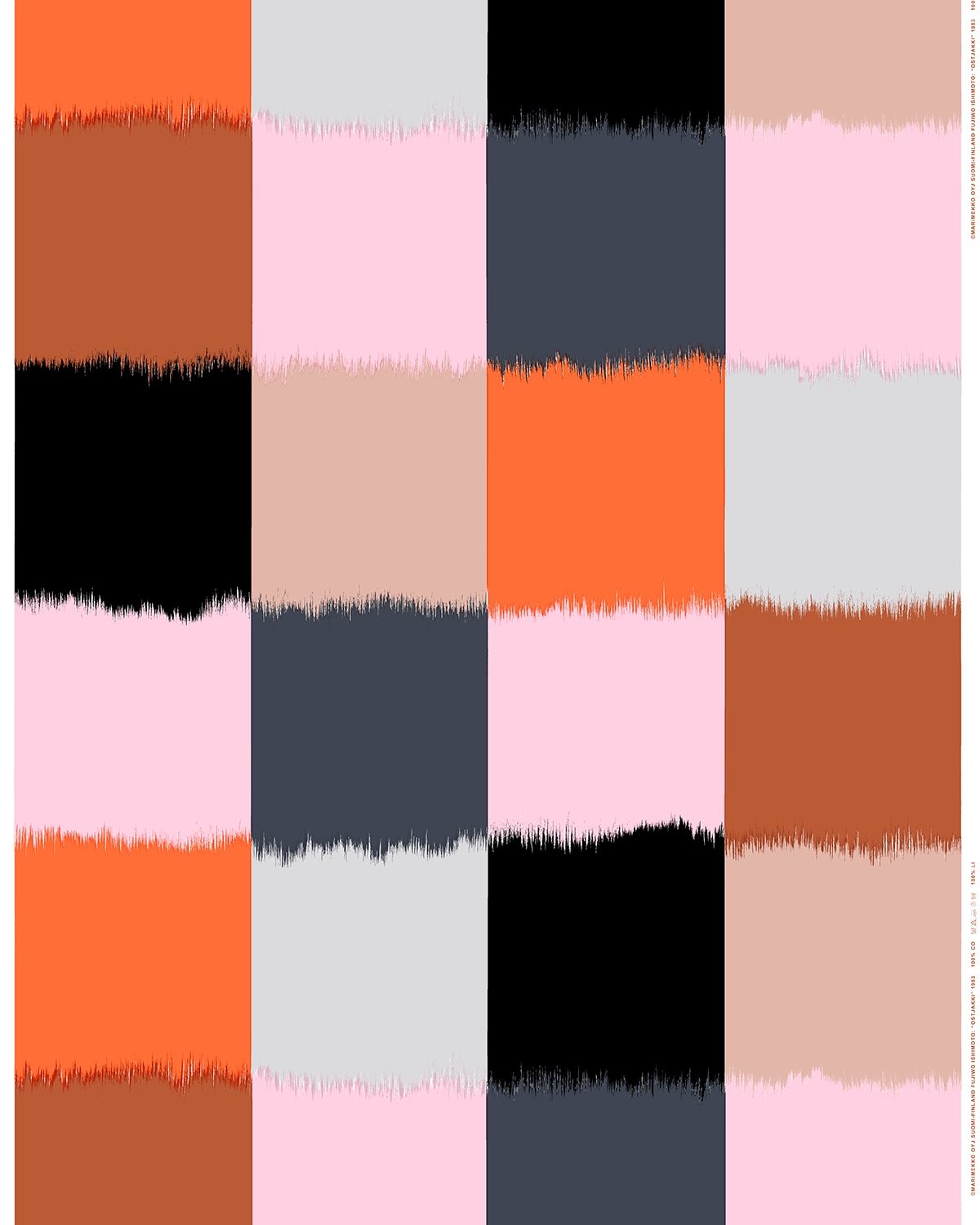
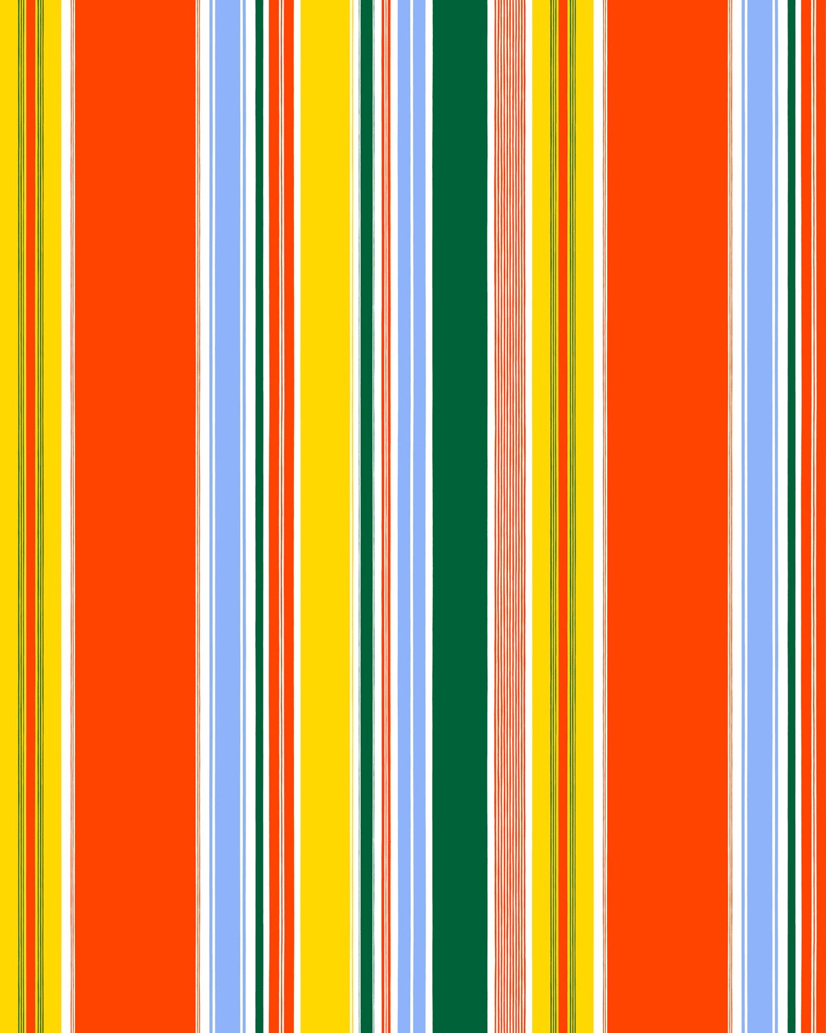
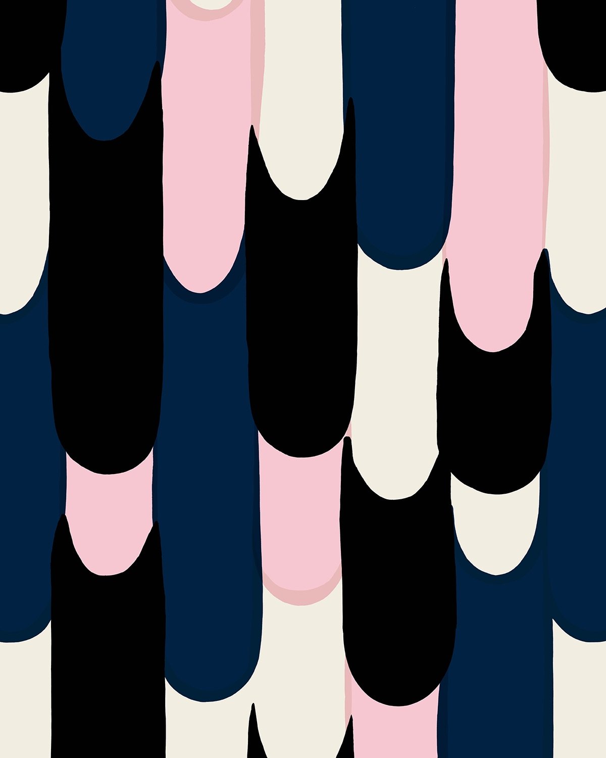
Maripedia is an online database of hundreds of print patterns that Marimekko has used in their products since the 1940s. You can browse by decade, designer, or style…or you can search by image. That’s right, just upload an image of the pattern on your pillowcase or dress and it’ll tell you who designed it and when.
Also, just take a look at these patterns:

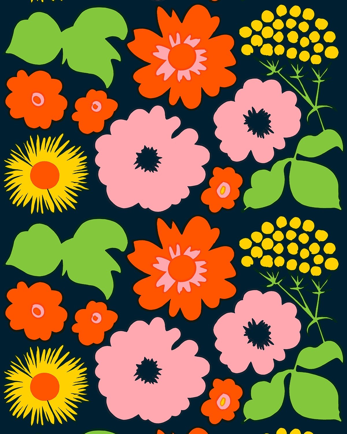
Endless design and color palette inspiration. (via @presentcorrect.bsky.social)
Somehow, I didn’t know that until quite recently, tennis balls were white instead of yellow (Wimbledon used white balls until 1985). Here’s a British Pathé film from 1961 that shows how tennis balls were made, along with Wimbledon ball boy training:
I also didn’t know that many people think tennis balls are green when they are actually a color called “optic yellow”. Oh and that David Attenborough had a hand in the switch from white to yellow.
The change in color happened due to the demands of television transmissions. In 1972 television was already in color all over the world (although in Spain it was not generalized until five or six years later). At the end of the 1960s, the person in charge of the BBC broadcasts (which, of course, was in charge of Wimbledon) was the renowned documentary filmmaker David Attenborough. And he noticed that the visibility of the traditional white ball was not perfect, especially if it approached the lines of the rectangle of play.
In that year of 1972, tennis was in full growth: the professional and amateur circuits had unified and women’s professional tennis was also growing. Tennis was becoming a great world spectacle and in this context television was fundamental. The International Tennis Federation, in charge of the rules, commissioned a study which showed that the yellow ball was more visible and therefore easier for viewers to follow. The courts, moreover, began to be multicolored once the use of synthetic materials in official tournaments was approved.
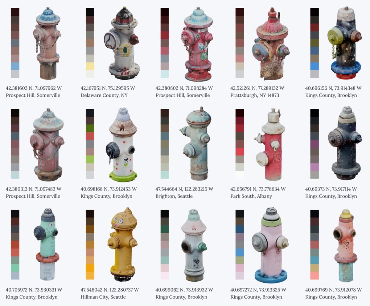
The Hydrant Directory is a collection of colorful fire hydrants where “each hydrant has been processed into color palettes for free use by artists and designers”. I love stuff like this. (via @presentandcorrect)
From Business Insider’s series Still Standing, a look at La Maison du Pastel, a 300-year-old French company that makes pastels for artists by hand. Back in its golden age, the company supplied the likes of Monet & Degas but fell into neglect near the end of the 20th century. The newest generation of ownership has restored the company and they now offer over 1,900 different pastel colors.
Seriously, take a look at their online shop…there’s all sorts of amazing stuff in there. Like this antique watercolors set — get a load of these color names: Violet Lake, Burnt Lake, Carmine, Venice Red, Vermilion, Orange Chrome, Gamboge, Zinc White, Yellow Ochre, Burnt Umber, Van Dyck Brown, Lamp Black, Payne’s Gray, Indigo, Celestial Blue, Blue Ash, Prussian. You can even order a full set of their pastels for only €29,450.00 (the set comes with a custom-made chest of drawers).
I am not at all an artist but these colors all look so amazing that I’m eyeing one of the smaller sets for myself… (thx, caroline)
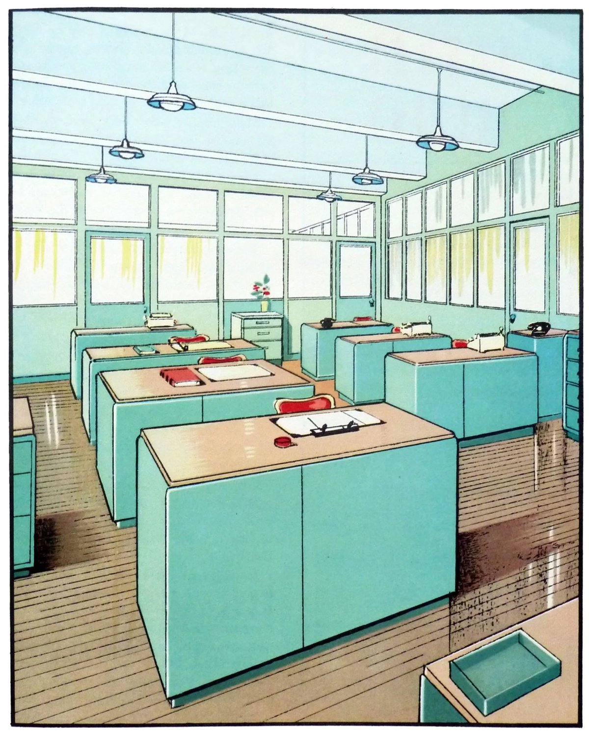
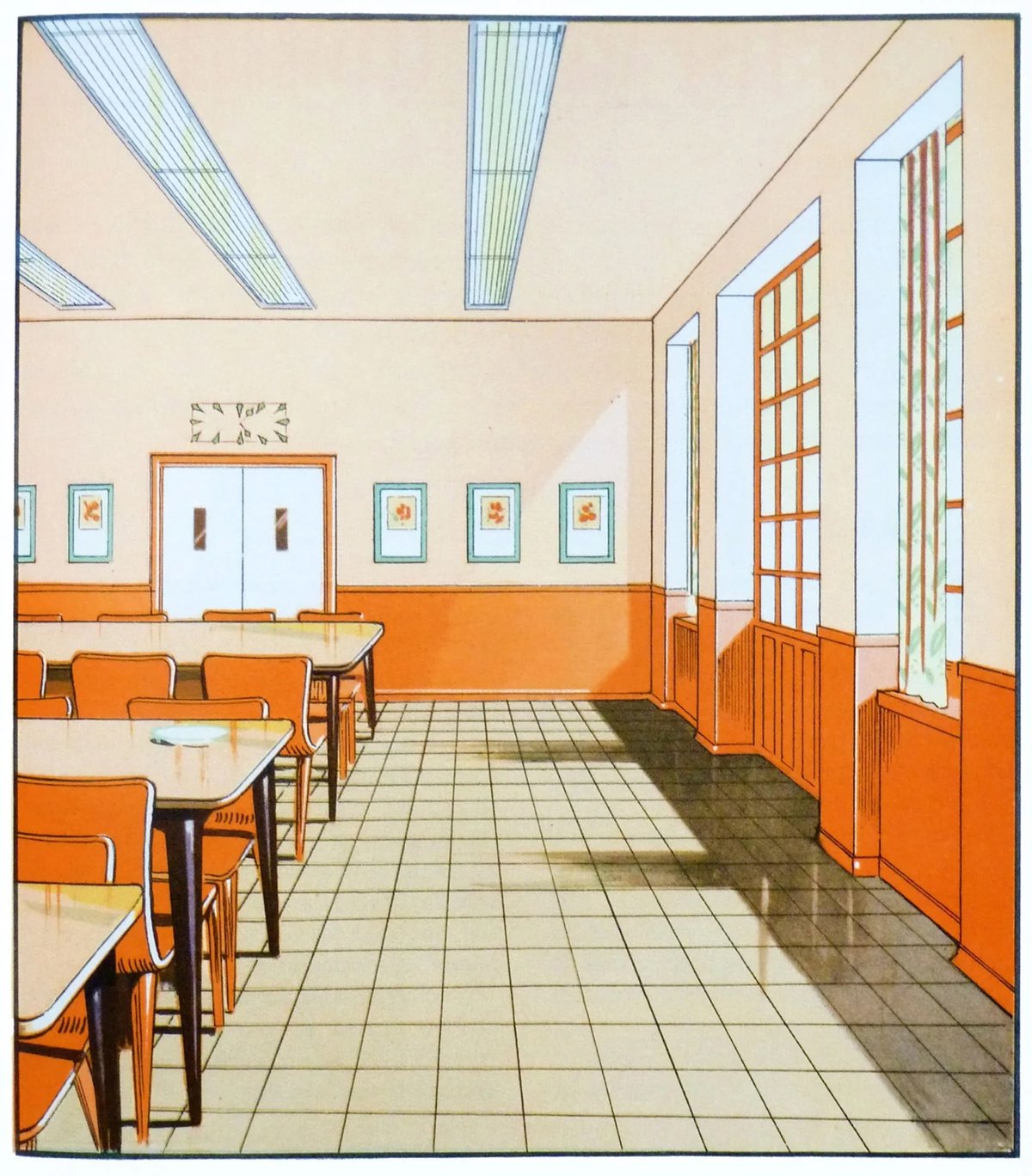
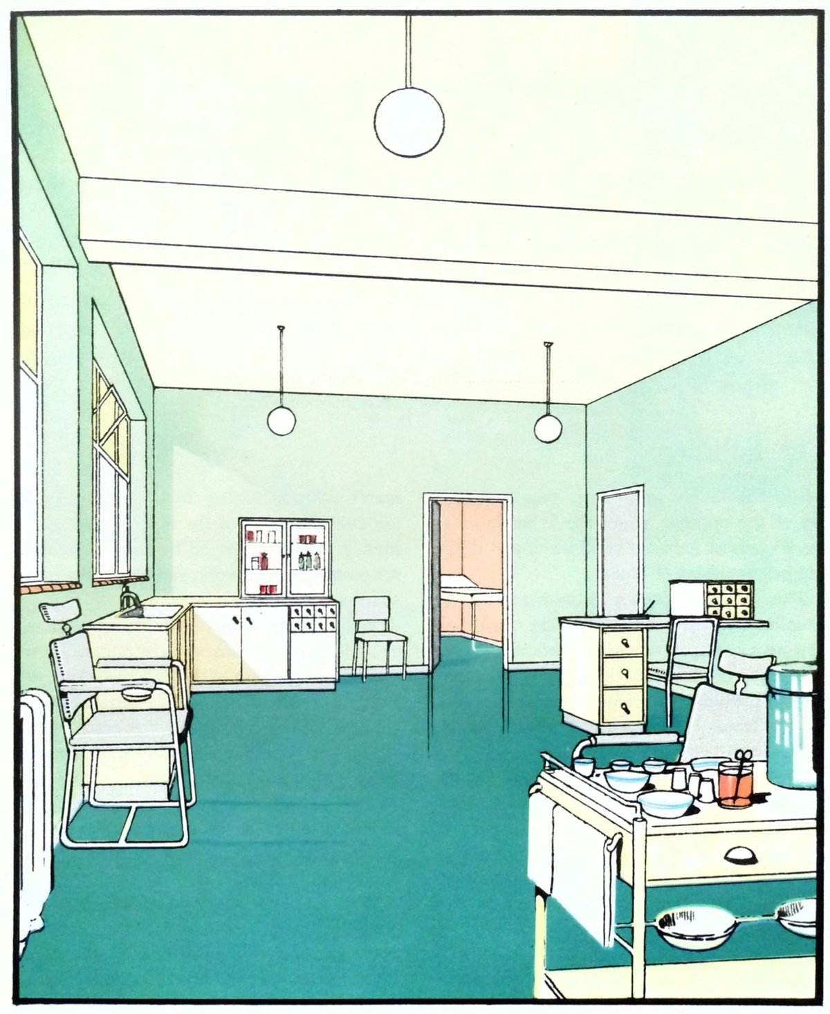
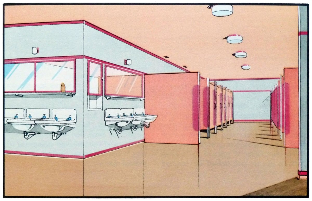
If you’re looking for some color palette inspiration, check out these scans from The Function of Colour in Factories, Schools & Hospitals (1930). Which is presumably a book? Whatever…the precision and colors of these illustrations are marvelous.
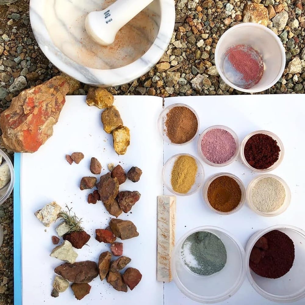
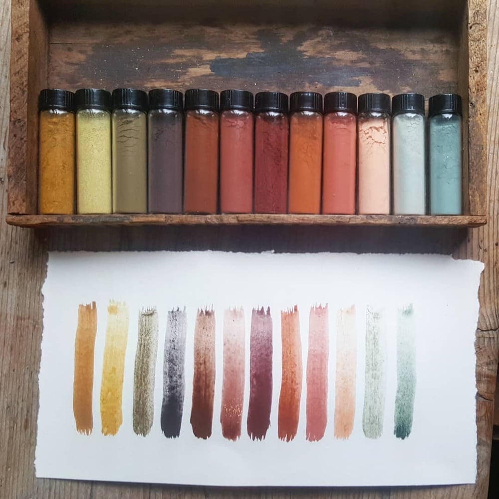
Heidi Gustafson is the curator of Ochre Sanctuary, a collection of iron-based earths that are the oldest natural pigments used by humans. In her new Book of Earth, Gustafson details where these pigments come from and how to use them to create art. Here are a few images from the book and the Ochre Sanctuary:
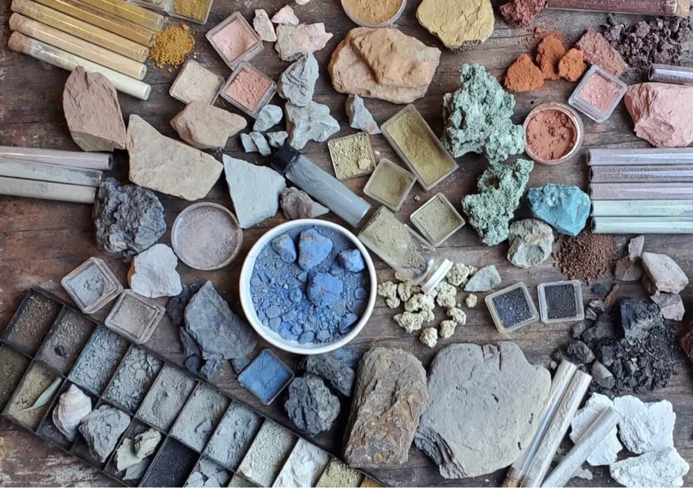
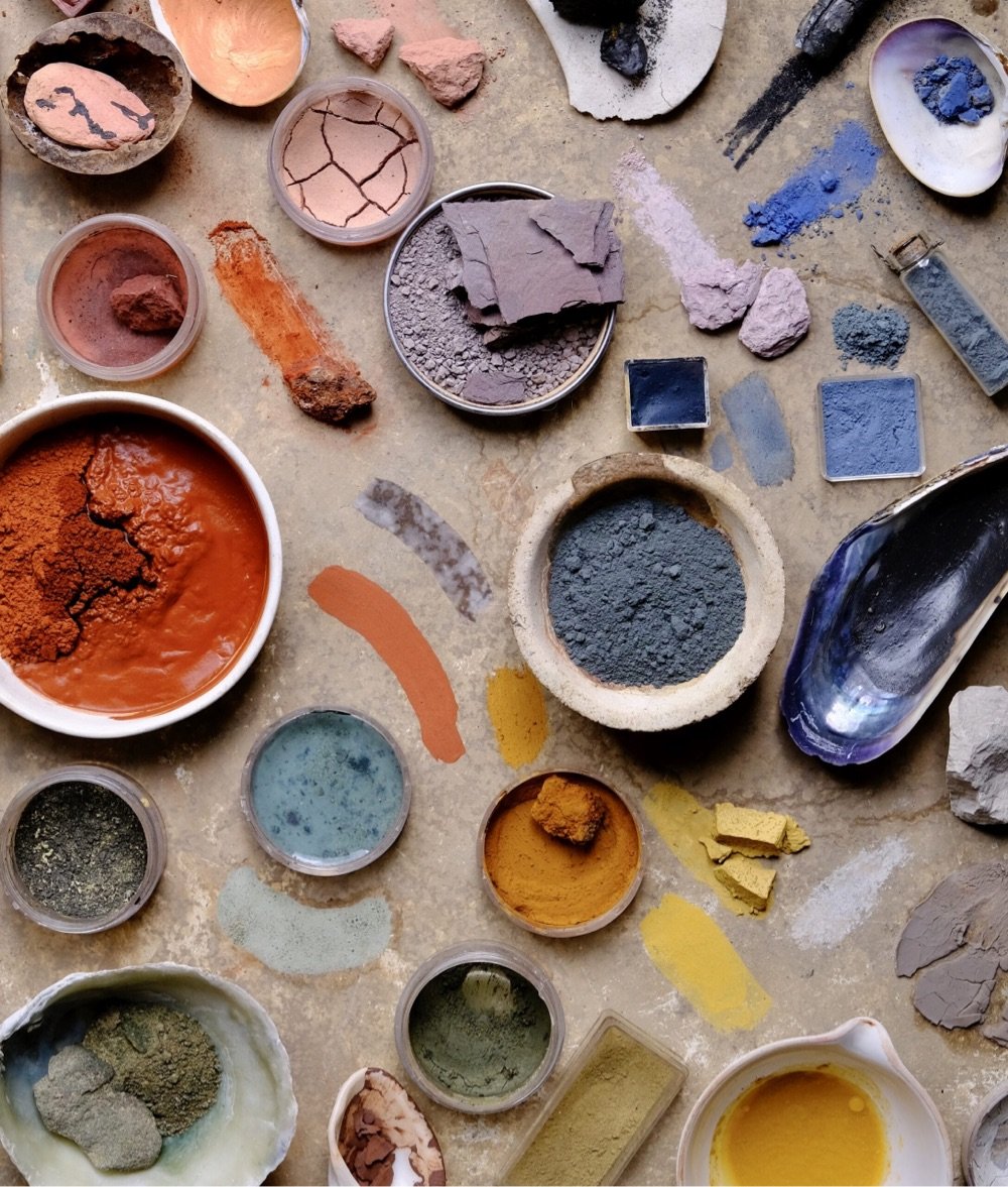

Looks like a gorgeous book. Check out her Instagram for more colorful photos of ochres.
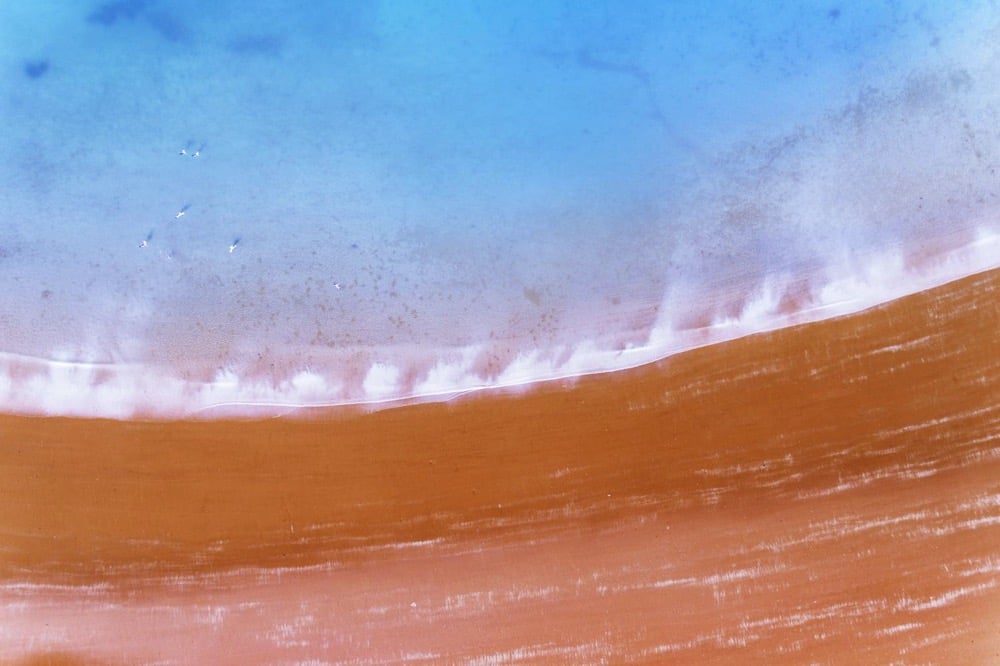
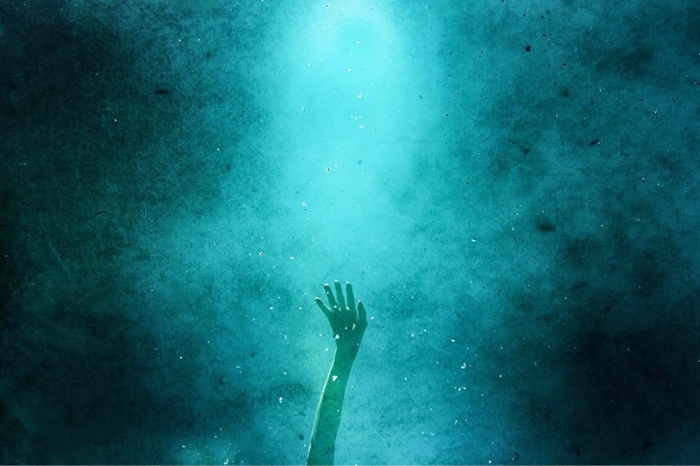
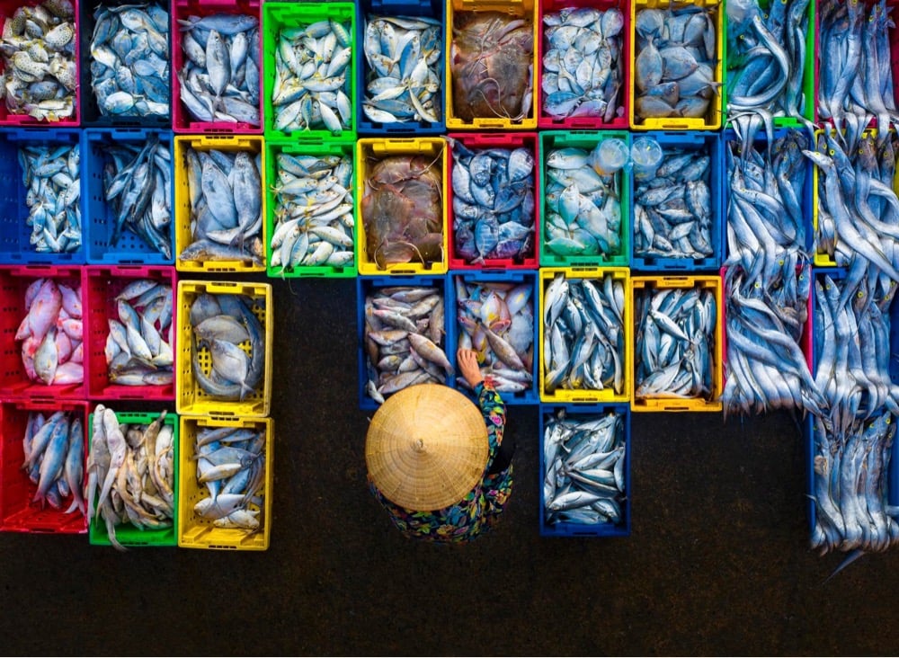
AAP Magazine has announced the winners of their 21st annual photo competition. This year’s theme was “Colors” and I’ve embedded a few of my favorites above (from top to bottom: Miloš Nejezchleb, Vitaly Golovatyuk, Graham Earnshaw, Joanna Borowiec, and Pham Huy Trung).
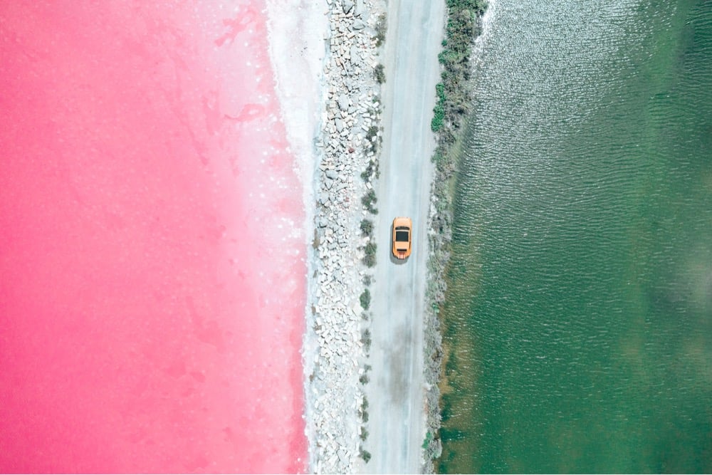
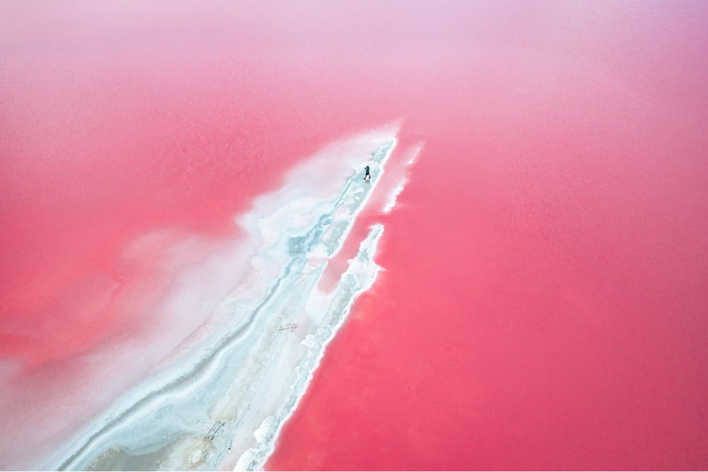
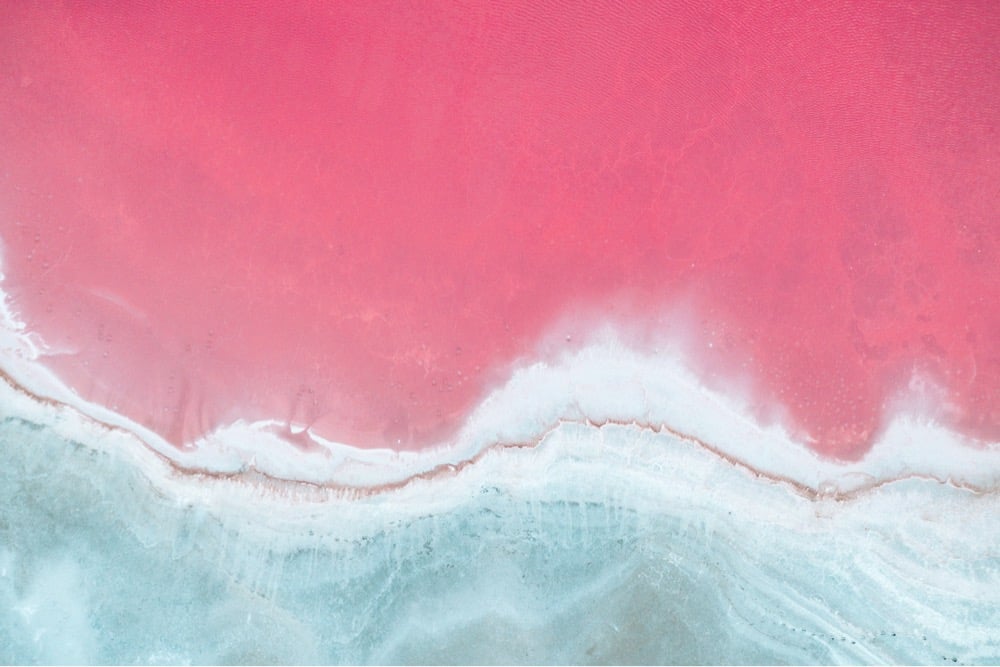
Check out Italian photographer Paolo Pettigiani’s photos of the evaporation ponds of Camargue, France. While these ponds are industrially harvested for their salt, the pink color of the water is naturally occurring in the salt marshes of the area, caused by halophile dunaliella salina algae. The area is also an important bird habitat and is one of the few places in Europe that flamingos live, which might seem like a coincidence until you learn that flamingos gain their pink color from eating the algae and shrimp that also feed on the algae. (via moss & fog)
Urine color is an indicator of how hydrated you are and Pantone are the color experts, so of course they’ve teamed up with a Scottish bottled water company to produce a chart with 5 color gradations that help you determine your hydration level. But 10 glasses of water a day?! I’m not sure the science supports that, particularly since we get a lot of our recommended intake from regular food & beverage consumption.
It remains unclear where the “8 x 8” water intake recommendation comes from. Perhaps, this two-liter intake threshold is derived from a misinterpretation of original recommendations offered by the U.S. Food and Nutrition Board in 1945 as well as the 2017 European Food Safety Authority, which states the daily recommended amount of water includes all beverages plus the moisture contained in foods.
This means that the moisture contained in foods, especially fresh fruits, sodas, juices, soups, milk, coffee and, yes, even beer, contributes to this daily recommended water requirement. These guidelines go on to suggest that most of the recommended water content can be accomplished without drinking additional cups of plain water.
(via print)
It’s fascinating to me how people can focus, specialize in, and love a tiny narrow niche and make it their life’s work. Heidi Gustafson, who’s creating a many-colored library of one of mankind’s first pigments, ochre, is one such person.
[A]t her small cabin near the foothills of the Cascade Mountains, creating an extensive ocher archive to catalog samples she’s gathered along with submissions of the mineral sent in from all over the world. While there has recently been renewed interest in creating paints from natural pigments, Gustafson’s focus is on ocher alone — and it extends beyond the material’s artistic uses to its scientific, symbolic and spiritual properties.
She initially got on the trail for ochre through a dream, a trail, and an old quarry in Oakland, before moving up the coast to continue her quest.
In 2017, a year after relocating to rural Washington, she officially began her ocher archive. While she forages in the Pacific Northwest, a slew of archaeologists, artists, scientists and pigment makers — a number of whom heard about her project through word of mouth — have also contributed to the archive, submitting samples from as far as Zambia, the Brazilian Amazon, New Zealand and Russia. Once each specimen arrives at her studio, it is ground by hand into pigment, labeled and added to her collection, which now includes over 400 different samples.
Be sure to check out her Instagram account for a lot more pictures of her love for ochre and pigments.
Update: The images in this post were originally from the New York Times article, and were replaced by some from Heidi Gustafson’s Instagram account.
The light and the wind happened to be just right for Greg Harlow to catch this rainbow emanating from upper portion of Yosemite Falls. Beautiful. The 21-second time lapse version of the video makes the falls look like a rainbow flame:
It’s astounding enough that perfect curves of color appear in the sky after rainstorms, but could you imagine seeing a waterfall rainbow like this happen in real life? My head would have exploded. (via the kid should see this)
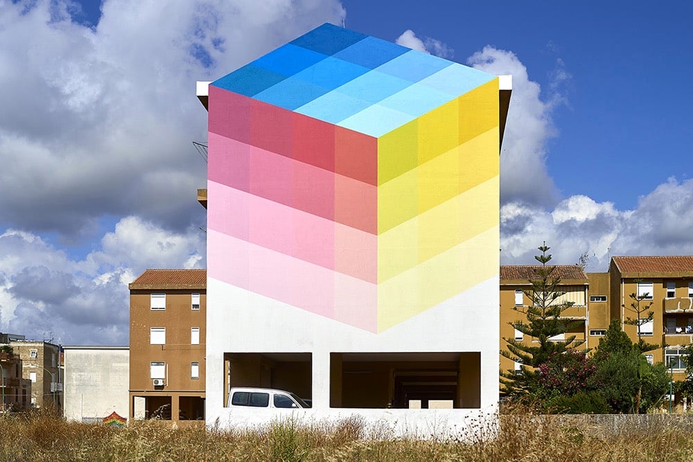
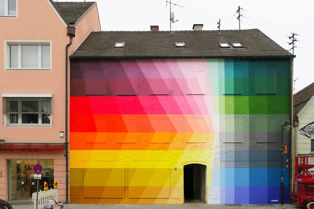
I love these colorful pixelated exteriors by Italian artist Alberonero. These are going on the mood board for my theoretical future house. You can find more of their work on Facebook, Instagram, and Tumblr. (via colossal)
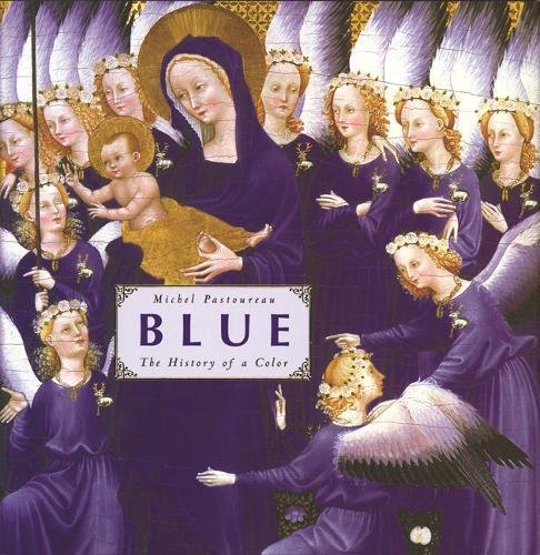
Even colors have histories, and what vibrant histories they are. French historian Michel Pasteureau’s Blue: The History of A Color (he’s also done histories of red, green, and black) is capably reviewed by Jesse Russell in the Claremont Review of Books in an essay called “The Colors of Our Dreams.” Russell offers the following luminous details.
Blue was once little-known in the Western palette. Homer’s sea was “wine dark”; blue would not be used as water’s color until the seventeenth century. It has evolved from its original association with warmth, heat, barbarism, and the creatures of the underworld, to its current association with calm, peace, and reverie. Like the unruly green, the Romans associated blue with the savage Celtae and Germani, who used the woad herb’s rich leaves for their blue pigments. These northern barbarians also painted themselves blue before war and religious rituals. The ancient Germans, according to Ovid, even dyed their whitening hair blue.
The Romans, in contrast, preferred the color red—the Latin word, “coloratus” was synonymous with that for red, ruber. The Romans and Greeks did import lapis lazuli, the exquisite blue rock, from exotic locals such as China, Iran, and Afghanistan. But neither used the barbaric blue for important figures or images, saving it for the backgrounds for white and red figures. Even the Greek words for blue, like the names of colors in the Bible, largely were meant to evoke certain states or feelings as opposed to exact visual colors. Blue, like green, was the color of death and barbarism. The nobler colors—white, red, and black—were preferred.
Blue’s fortunes changed in the Middle Ages when it became associated with both the heavens and heaven, and particularly an association with the Virgin Mary. French royalty adopted blue as their official color; and in modernity, the introduction of indigo from the Americas and the invention of Prussian blue in the early 18th century helped cement blue (along with white and red) as part of a tripartite color scheme that gave us the flags of Great Britain, the United States, and France.
And then along came Goethe:
By the mid-nineteenth century, blue became a Romantic symbol of melancholy. Among those guilty of luring the moody young to dress in blue was Wolfgang von Goethe who, in The Sorrows of Young Werther, depicted his title character in a blue coat. This, coupled with Werther’s untimely death, inspired a craze for blue coats and a mania for suicide among melancholy European youth. Werther’s blue jacket was matched by the blue flower in Novalis’s unfinished posthumous piece Heinrich von Ofterdingen, which narrates the tale of a medieval troubadour who seeks out the flower as a symbol of the authentic life of beauty and art. Young, melancholic Frenchmen were doubly encouraged in their swooning by the closeness shared by the French word for blue flower, “ancolie,” and the ending of “mélancholie.”
From Romanticism’s murky forest a host of verbal expressions bloomed, linking blue with odd, melancholic reverie. Fairy tales were known as “blue tales”; to be terribly drunk in German became known as “being blue” or “Blau sein”; and the “blue devils,” from which we get the great American expression (and musical genre) “the blues,” meant to be afflicted with a lingering sadness.
Blue has a curious oscillation between conservativism and rebellion, perhaps especially in France, but throughout the world:
The navy blazer, a sign of conservativism and preppy formality in the twentieth century, was once a mark of the avant garde Westerner, adorned in what became known as “sportswear.” Aspiring radicals wore blue jeans, made from denim dyed with indigo, but ultimately derived by Levi Strauss from the pants made from tent canvas for California prospectors. Eventually, jeans became leisurewear for Americans from the East Coast who wanted to dress like the cowboys of the increasingly tame “wild west.” As the tides of early twentieth-century fashionable rebellion swelled, blue jeans were given the stamp of haute couture in a famous 1935 edition of Vogue, and, after World War II, were a symbol of rebellion and nonconformity—especially in newly liberated Europe. But in the West, jeans eventually became blasé (but comfortable) everyday wear when everyone—even conservative squares—started wearing them. This did not stop blue jeans from becoming symbols of rebellion in Communist countries during the heady days of glasnost and perestroika, and later in the Muslim world a symbol of youthful rebellion.
Taken together, the genealogy of blue is a history of finding meaning in difference, whether it was the Germanic blue facing off against the Roman red, the vibrant blue jacket against the staid black coat, or the heavenly Marian apparition set off against the profane, multicolored world below.
(Via The Browser.)
In a letter to his brother Theo, Vincent van Gogh called his 1888 oil painting The Night Café “one of the ugliest pictures I have done”.
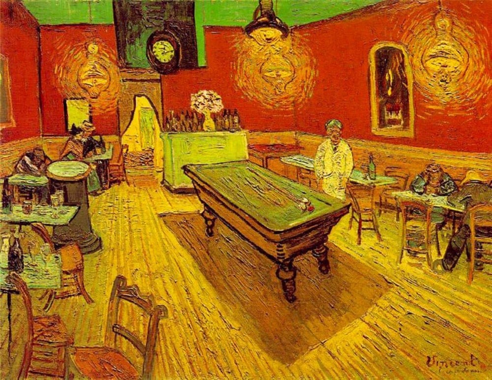
In this video, Evan Puschak looks at what van Gogh meant by that and how he used discordant colors together to suggest a mood.
van Gogh wrote of his intentions for the painting to his brother:
I have tried to express the terrible passions of humanity by means of red and green. The room is blood red and dark yellow with a green billiard table in the middle; there are four lemon-yellow lamps with a glow of orange and green. Everywhere there is a clash and contrast of the most alien reds and greens, in the figures of little sleeping hooligans, in the empty dreary room, in violet and blue. The blood-red and the yellow-green of the billiard table, for instance, contrast with the soft tender Louis XV green of the counter, on which there is a rose nosegay. The white clothes of the landlord, watchful in a corner of that furnace, turn lemon-yellow, or pale luminous green.
A site called The Colors of Motion makes single image timelines of the use of colors in movies. They sample frames at regular intervals, choose the average color of each frame, and stack them up. Here’s their representation of Blade Runner 2049:
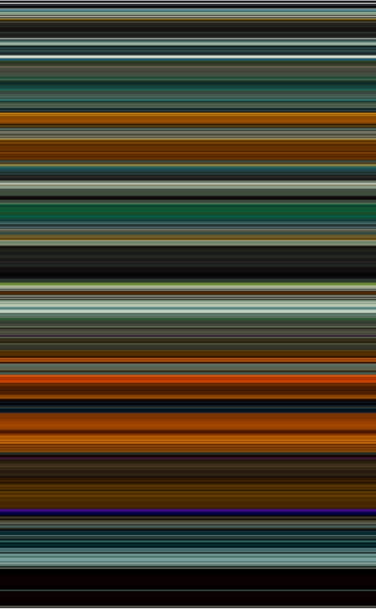
If you click through on specific films, you can see the actual screencaps used for sampling and buy prints.
The Moviebarcode Tumblr pre-dates The Colors of Motion, although they appear to use a slightly different technique: each scene is smooshed into a single vertical line. Here’s Mad Max: Fury Road:
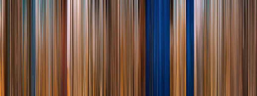
Prints are available from Moviebarcode as well.
See also Brendan Dawes’ Cinema Redux and Wes Anderson Palettes.
Designer Jacopo Colò has made a video game that allows you to spend an hour inside a 2013 James Turrell installation, The Color Inside.
Turrell’s work is all about the fundamental materials: space, time and light, and is usually focused on permanent installations. His most famous works are the Skyspaces. A Skyspace is (most of the times) a room with a hole in the ceiling that allows to see the sky above, with nothing in between. At specific times during the day — at sunrise and sunset — a hidden strip of LED lights color the room, rotating trough the whole color spectrum. And if during the day the hole in the ceiling simply frames the sky, during the light show, filtered through a cloud of colored light, the view of the sky is altered. The sky can become pink, green, deep blue. It’s a beautiful spectacle.
Here’s a sped-up video that shows the, uh, “game play”:
As the daughter of a trained art conservationist, I find this endlessly fascinating.
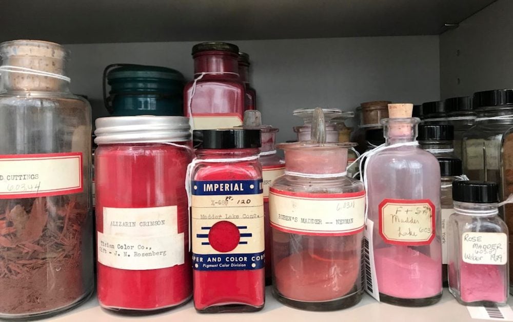
Edward Forbes, the former director of Harvard’s Fogg Art Museums, amassed a collection that is essentially a library of color.
With the help of these rainbow-bright samples, scientists are able to ward off color loss. They can restore faded pieces through identifying what chemical response caused the fading in the first place. They can also reconstruct stories of paintings and people through an examination of the minerals they used to create their colors and the binding materials they sourced from nature. The color library is a working laboratory, one that traces the history of color from ancient stones to twenty-first-century nanotubes.
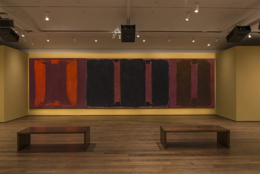
The library helped with the restoration of Harvard’s faded Rothko mural, the subject of one of my favorite New Yorker essays. Here’s a list of the ten rarest pigments in the Forbes collection.
Color Leap lets you time travel back through the color palettes of history, from colorful Egyptian sarcophagi circa 2000 BCE to stained glass windows circa 1000 CE to advertisements in the 1950s.
Clicking on the colors will copy the hex code for that color to your clipboard. (via design observer)
While Isaac Newton and the 17th century were more decisive for understanding the physics of color, you can’t beat the late 18th and early 19th century for a broader, subtler, more humanistic sense of the science of colors. The playwright and polymath J.W. von Goethe built up his Theory of Colours by collecting almost 18,000 meteorological and mineralogical specimens, with an emphasis on subtle distinctions between colors and their psychological perception in nature, rather than wavelengths of light.
Another phenomenal collection of naturalist examples is Abraham Gottlob Werner’s Nomenclature of Colours, first published in 1814. An 1821 edition recommends it for “zoology, botany, chemistry, mineralogy, and morbid anatomy.” At My Modern Met, Kelly Richman-Abdou writes:
Nomenclature of Colours served as a must-have reference for artists, scientists, naturalists, and anthropologists alike. The exquisitely rendered guide showcases the earth’s rich range of color by separating it into specific tones. Illustrated only by a small swatch, each handwritten entry is accompanied by a flowery name (like “Arterial Blood Red” and “Velvet Black”) as well as an identifying number. What the book is truly known for, however, is its poetic descriptions of where each tone can be found in nature.
Werner was a German mineralogist who created the system of color classification in the book to help distinguish between his own samples. His Scottish collaborators Patrick Syme and Robert Jameson were a painter and naturalist, respectively, who adapted the system into the book format in which it exists today. As you might guess, each color in the book includes a name, a swatch, and examples from the animal, vegetable, and mineral world showing where each color is found in nature.
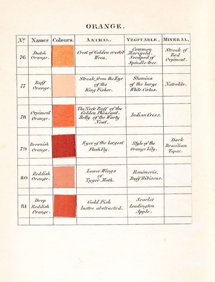
Probably the most famous user of Werner’s book was Charles Darwin, who used it to help describe animals and other bits of the natural world in his books and journals. But if you think about it, before photography, anything that let naturalists describe what they were seeing in something resembling a universal vocabulary had to be essential. Essential enough that they were willing to produce the book by hand, with no real way to print in color.
Amazon sells a pocket-sized facsimile edition of the book. It may not be as handy as a color wheel for painting a room, but might be handier if you’re identifying bird eggs or a rare bit of stone.
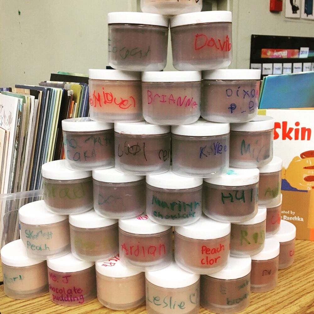
For the beginning of school, second-grade teacher Aeriale Johnson had each of her students mix up a container of paint that matched their skin color so they could use it in paintings of themselves during the rest of the school year.
We started with a base of brown or peach tempera for each child then, in small groups, added white, yellow, red, dark brown and/or green to get to just the right hue. They looked like they were at Ulta trying to find foundation. :) The conversations were great!
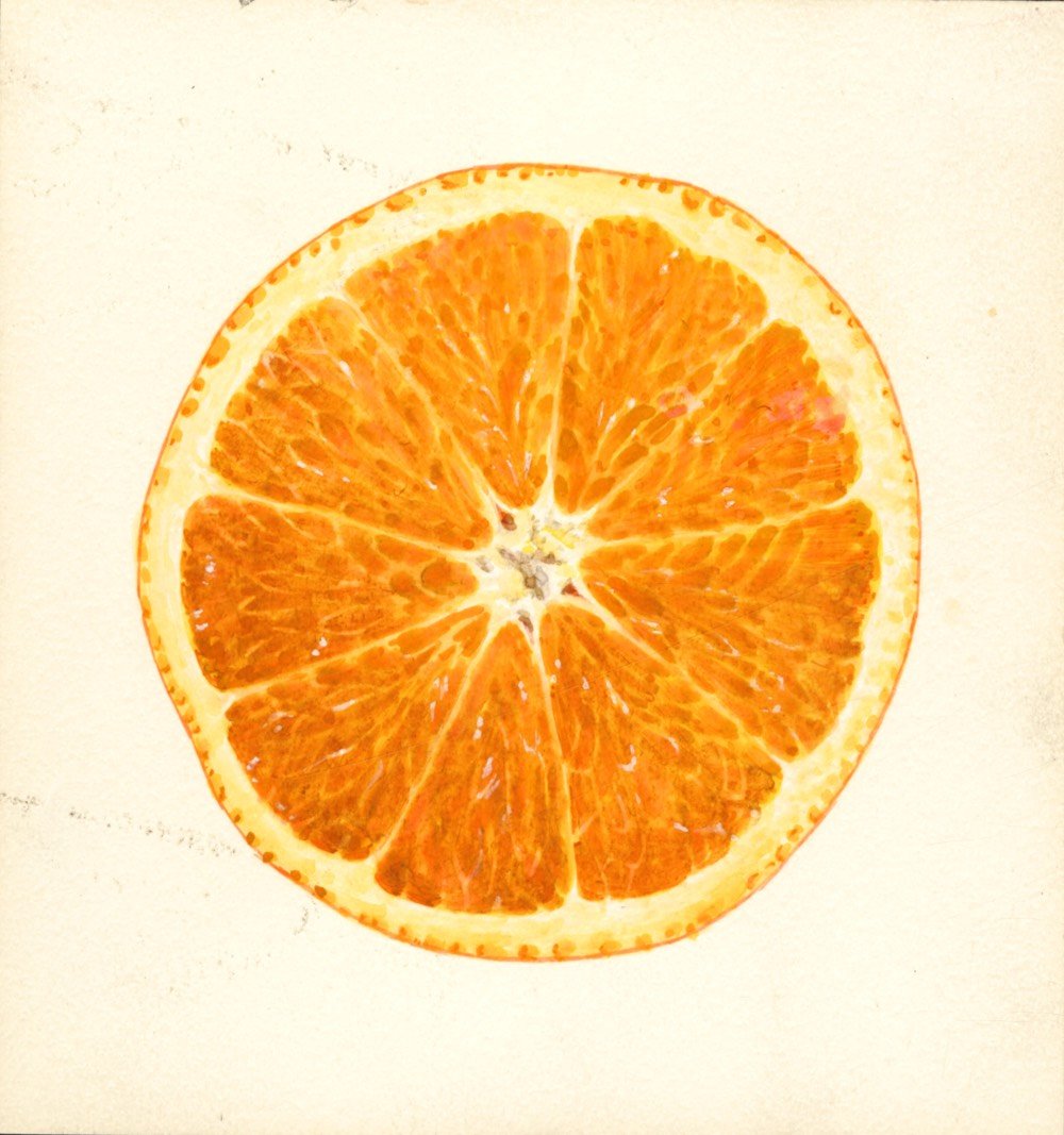
The human eye can see millions of colors but it can take awhile for language to catch up. Take the color orange. Until the 16th century, there was no word for that color in English and even then, when writers referenced it, they said something like “that thing that is the color of an orange”.
Orange, however, seems to be the only basic color word for which no other word exists in English. There is only orange, and the name comes from the fruit. Tangerine doesn’t really count. Its name also comes from a fruit, a variety of the orange, but it wasn’t until 1899 that “tangerine” appears in print as the name of a color-and it isn’t clear why we require a new word for it. This seems no less true for persimmon and for pumpkin. There is just orange. But there was no orange, at least before oranges came to Europe.
This is not to say that no one recognized the color, only that there was no specific name for it. In Geoffrey Chaucer’s “Nun’s Priest’s Tale,” the rooster Chaunticleer dreams of a threatening fox invading the barnyard, whose “color was betwixe yelow and reed.” The fox was orange, but in the 1390s Chaucer didn’t have a word for it. He had to mix it verbally. He wasn’t the first to do so. In Old English, the form of the language spoken between the 5th and 12th centuries, well before Chaucer’s Middle English, there was a word geoluhread (yellow-red). Orange could be seen, but the compound was the only word there was for it in English for almost 1,000 years.
Also, it has never occurred to me before reading this that “chromatically brown is a low-intensity orange”. !!! Anyway, this piece is an excerpt from the book On Color.
See also literature’s slow invention of the color blue. Orange painting by James Shull (via jodi)
The Victoria and Albert Museum filmed this short four-part documentary about the Somenotsukasa Yoshioka dye workshop near Kyoto, Japan. They make dyes using only natural materials, producing vibrant colors using little-used and often long-forgotten techniques.
Sachio Yoshioka is the fifth-generation head of the Somenotsukasa Yoshioka dye workshop in Fushimi, southern Kyoto. When he succeeded to the family business in 1988, he abandoned the use of synthetic colours in favour of dyeing solely with plants and other natural materials. 30 years on, the workshop produces an extensive range of extremely beautiful colours.
Another great find from internet gem The Kid Should See This.
Modern art museum patrons are often confounded by all-white paintings like those of Robert Ryman. Like, what the hell? It’s just a white painting? “I could do that.” In this video, Vox’s Dean Peterson talks with The Whitney’s assistant curator Elisabeth Sherman about how you might approach thinking about minimalist art.
The art critic Peter Schjeldahl, writing about a retrospective of Ryman’s work for the New Yorker, gets at what the artist is attempting to communicate with his work:
Always, Ryman invites contemplation of the light that falls on his paintings (which when I saw them, on a recent cloudy day, was glumly tender as it filtered through the Dia skylights) and of their formal relation to the rooms that contain them. There’s no savoring of style, just stark presentation. His work’s economy and quietness may be pleasing, but its chief attraction is philosophical. What is a painting? Are there values inherent in the medium’s fundamental givens — paint skin, support surface, wall — when they are denied traditional decorative and illustrative functions? Such questions absorb Ryman. Do they excite you? Your answer might betray how old you are.
And Ryman himself talked about why he uses white in an interview with Art21:
White has a tendency to make things visible. With white, you can see more of a nuance; you can see more. I’ve said before that, if you spill coffee on a white shirt, you can see the coffee very clearly. If you spill it on a dark shirt, you don’t see it as well. So, it wasn’t a matter of white, the color. I was not really interested in that. I started to cover up colors with white in the 1950s. It has only been recently, in 2004, that I did a series of white paintings in which I was actually painting the color white. Before that, I’d never really thought of white as being a color, in that sense.
Leatrice Eiseman, Pantone Color Institute’s executive director, teaches an annual class on trend forecasting and the psychology of color. She joined Pantone after publishing her 1983 book “Alive With Color,” and she created the color clock concept.
Eiseman believes that our reaction to colors “goes beyond the psychological into the physiological” and that colors carry inherent messages that all humans innately understand — the whispers of that “ancient wisdom.” She doesn’t deny the important influence of memory and social factors on color perception, but often, she says, “our response is involuntary, and we simply have no control over it.”
Last October, Eiseman published her 10th book, “The Complete Color Harmony, Pantone Edition,” her boldest statement yet on the psychology of color — and one that might rightly be displayed in the self-help section. Consider a chapter titled, “Personal Colors: What Do They Say About You?” which offers a kind of chromatic horoscope that locates truths not in the cosmos but in the spectrum of visible light.
If you’ve ever wondered how the Pantone Color of The Year comes to be, Bruce Falconer’s exploration of the business of color is the place to start.
N.B. I’m pretty sure lilac will be the next millennial pink, but I’m no expert.
In The Wizard of Oz, when Dorothy lands after being brought to Oz by a tornado, she opens the door and, bang!, Technicolor. It’s a surprising transition, one of the most effective in film history. But it wouldn’t have been a complete shock for audiences in 1939 because Oz was not the first film to feature the color technology. In this video, Phil Edwards details the history of Technicolor, how it works, and how it changed movie making.
Many people recognize Technicolor from The Wizard of Oz, but the technology existed long before then. Two strip Technicolor and three strip Technicolor both revolutionized the film industry and shaped the look of 20th century film.
But Technicolor also influenced movies through its corporate control of the technology. People like Natalie Kalmus shaped the aesthetic of color films, and directors redesigned their sets and films based on the Technicolor look that the company — and viewers — demanded.
Edwards also did a “director’s cut” video with further information that wasn’t in the first video.
66-year-old William Reed was born colorblind. For his birthday, his family bought him a pair of Enchroma sunglasses, which allows wearers with red-green colorblindness to see colors. His reaction when he puts the glasses on for the first time is something else, especially when you consider how grumpy and curmudgeonly he starts out. I lost it when he started rubbing and clapping his hands together and waving his arms…he is feeling all of the feels right there.
Update: Here’s a nice video explanation of colorblindness and how those glasses work for some people.
(thx, david)
If you look at the basic colors from a variety of cultures & languages from around the world, there are differences in the number of colors represented in each language. Some languages only have words for black, white, and red while others have words for more than 10 basic colors. Surprisingly, there’s a pattern behind the development of these color words across many of these languages: the words for colors were often invented in the same order.
See also one of my favorite segments of Radiolab on the color blue.
Older posts
Socials & More