Emigre is doing web fonts
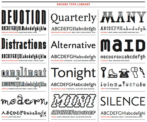
Old-school font foundry Emigre is doing most (all?) of their typefaces as web fonts. I’m going to redo my goth blog in Exocet.
This site is made possible by member support. 💞
Big thanks to Arcustech for hosting the site and offering amazing tech support.
When you buy through links on kottke.org, I may earn an affiliate commission. Thanks for supporting the site!
kottke.org. home of fine hypertext products since 1998.
Beloved by 86.47% of the web.
Old-school font foundry Emigre is doing most (all?) of their typefaces as web fonts. I’m going to redo my goth blog in Exocet.
Emigre has released a sans serif companion for Mrs Eaves, Mr Eaves.
Mr Eaves was based on the proportions of Mrs Eaves, but Licko took some liberty with its design. One of the main concerns was to avoid creating a typeface that looked like it simply had its serifs cut off. And while it matches Mrs Eaves in weight, color, and armature, Mr Eaves stands as its own typeface with many unique characteristics.
Very handsome. I’ve always liked the attitude and flourishes of Emigre’s typefaces. (via quips)
The influential design magazine Emigre stopped publishing issues back in 2005, but now they’re releasing issue No. 70, which is actually a hardcover book celebrating the best of Emigre from the past 25 years.
This book, designed and edited by Emigre co-founder and designer Rudy VanderLans, is a selection of reprints, using original digital files, tracing Emigre’s development from its early bitmap design days in the late 1980s through to the experimental layouts that defined the so called “Legibility Wars” of the late 1990s, to the critical design writing of the early 2000s.
(via quipsologies)
Emigre is posting some essays from the back issues of its dearly departed magazine.
After having the same web site since like 1985, Emigre has finally launched a redesign. The new site looks like it was done in 1998; the front page is all images, laid out in tables, and is invisible to search engines.
Emigre Magazine has published their last issue (69, dudes!). Rick Poynor, in his farewell post on Design Observer, says goodbye to Emigre. Emigre fueled my interest in design back in the day.
Socials & More