kottke.org posts about 0sil8
From 1996, a Wired article by Josh Quittner about Suck, Carl Steadman and Joey Anuff’s now-legendary website.
Who at HotWired noticed the look of dread and tension on the faces of Carl and Joey when Suck secretly launched like a torpedo on August 28, 1995? Carl tied his desktop machine at HotWired into his server, which was hidden in plain sight among the array of hardware, so he could watch as people logged in to Suck that first day. This is the coldly accurate terror of the new medium: Carl could tell at any second not only how many people were logged in to his server, but in some cases, who they were.
On that first day, a hundred people found Suck — not a bad turnout considering the Boys told only their friends. Naturally, their friends told their friends, and good news travels like a sweet breeze across the Web.
This was critical since Carl had set some ambitious goals: he wanted 1,000 hits by the end of the week, he wanted to be more successful than any HotWired channel by the end of two months, and he wanted to be the Cool Site of the Day within three months.
Suck made each benchmark.
Some notes: 1) Suck was one of the handful of sites that inspired me to start publishing online. Thank you, Carl & Joey. 2) I loved the site so much that I build a parody of it called Sock. They linked to it soon after it went up and I DIED. Can’t link to it because 0sil8, my site from that era, isn’t online right now. 3) I applied for an internship at Hotwired in early 1996. Never heard back. What an alternate timeline that would have been. 4) Reading this made me sad. I love the Web so much, like more than is probably sane and healthy for a non-human entity, but nearly every other good thing in my life has happened because of it. And that Web is going quickly, if not already gone. All good things… and all that, but it still fucking wrecks me.
Late last week Jason Santa Maria posted the first web site that he’d ever made and asked others to do the same. The earliest web page of mine still online is a parody of Suck that I did in March 1996 called Suck for Dummies. (It’s now called Suck for Dimwits because I received a C&D from the X for Dummies people threatening to sue.) In June of 96, I made this over-the-top home page, Jason’s Awesome WWW Home Page. (Warning,
My earlier sites are lost, I think. (I have a few Zip and Jaz disks that might have some older stuff on them but I don’t have the capability to read them anymore.) Before 0sil8, there were three or four efforts that I must have deleted from my hard drive at some point, including some embarrassing efforts involving fractals. The very first thing I did in HTML was a personal home page around Nov/Dec 1994 that lived on a 3.5” floppy. I coded it on the computer in my dorm room (using an early version of HTML Assistant and Aldus PhotoStyler) and then put it on a floppy to use on the computer in the physics lab, the only computer I had access to on campus that had internet access. The page was little more than a gussied up list of links that I liked to visit online, but I loved building, rebuilding, and redesigning it over and over, even though I was the only one who ever saw it. The handcrafted/DIY nature of building that page hooked me on web design. I would give almost anything to see that little page again.
Three cities, two serious relationships, one child, 200,000 frequent flier miles, at least seven jobs, 14,500 posts, six designs, and ten years ago, I started “writing things down” and never stopped. That makes kottke.org one of a handful of the longest continually updated weblogs on the web…something to be proud of, I guess. The only thing I’ve done longer than kottke.org is sported this haircut. (Perhaps not something to be proud of…the hair-in-stasis, I mean.)
Being a digital packrat, I have screenshots of all the past designs the site has had. When I started, the posts were actually hosted on another site of mine, 0sil8, that I’d been doing since 1996. I didn’t know at the time that kottke.org would eventually kill 0sil8. This was the first design (full size):
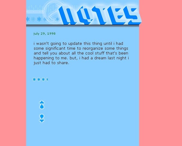
It’s a little misleading because there’s only one post shown on the page…there were usually more, displayed reverse chronologically. The stars were a rough rating of how well that day had gone called the fun meter.
When I moved the site to its own domain after a few months, I redesigned it to look like this (full size):
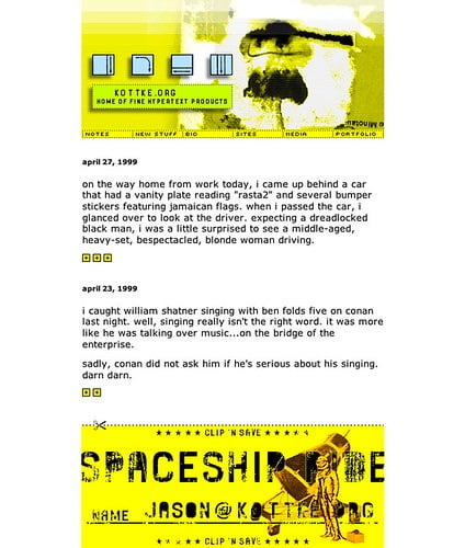
The aesthetic was influenced by the pixel grunge style of Finnish designer Miika Saksi…you can see some of his older work here. The font in the navigation is Mini 7…Silkscreen was still several months away at that point. The fun meter is still present as is the all-lowercase text, a house style I thankfully dropped a few months later. The cringeworthy writing took a few more years to iron out…if it ever fully was.
This one’s still my favorite; it turned a lot of heads back in the day (full size):
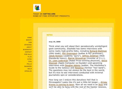
With dozens of spacer gifs and five concentric tables, it was a bitch to code. There was also a capability to modify the look and feel of the site…you could choose between this design, the older design pictured above, and a text-only version. Inline permalinks were introduced on kottke.org in March 2000 and subsequently the idea was spread across the web by Blogger.
But it only lasted for about a year. In late 2000, I swapped it for this one (full size):
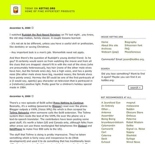
The familiar burn-your-eyes-out yellow-green makes its first appearance. I never really meant to keep it or for it to become the strongest part of the site’s identity. After this design launched, I cycled through a few colors (the old yellow, blue, red) before getting to the yellow-green…and then I just got lazy and left it. For 8 years and counting. The post style underwent several changes with this design. In June 2002, I switched to Movable Type after updating the site by hand for four years. Soon after that, I added titles to my posts. In late 2002, I added a frequently updated list of remaindered links to the sidebar. In late 2003, the remainders moved into the main column and have become an integral part of the site. I also started reviewing movies and books around this time…kottke.org became a bit of a tumblelog.
In July 2004, I refreshed the design a bit…tightened it up (full size):
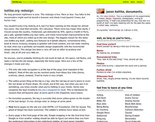
After about a year, I changed it again to the current look and feel (full size):
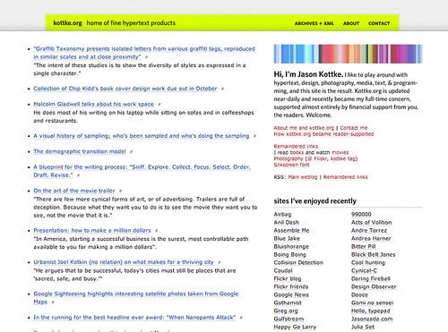
Sorry, that got a little long…there’s a lot I didn’t remember until I started writing. Anyway, I didn’t intend for this to become a design retrospective. Mostly I wanted to thank you very sincerely for reading kottke.org. Over the last ten years, I’ve poured a lot more of myself than I’d like to admit into this site and it’s nice to know that someone out there is paying attention. [Cripes, I’m choking up here. Seriously!] Thanks, and I’ll see you in 2018.
Adam and David recently reminded me of pocket, an episode of 0sil8 I did back in 2001 (the second-to-last episode actually):

pocket was a broadcast mailing list for mobile phones. People signed up and then I sent them SMS messages on their phones periodically. As I recall it only lasted a few weeks before I shut it down; there just didn’t seem to be anything interesting about broadcasting short messages to a group of friends and strangers.
In 1965, the Washburn A mill, the last operating flour mill in Minneapolis, became also the last flour mill to close its doors, having been preceded by an entire industry that, at one time, produced more flour than any other place in the U.S. The closure came when the mill’s operating company, General Mills, moved its headquarters to Golden Valley, where real estate was plentiful and inexpensive. The area around St. Anthony Falls, the geological feature responsible for the beginnings of industry in the area, had long since fallen into general disrepair and it wasn’t long before the Washburn A was deserted and inhabited by the homeless.
The area started to show signs of life again in the 70s and 80s after being added to the National Register of Historic Places in 1971. Old mill buildings were converted for non-industrial business and residential use as people began to recognize the unique character and history of the area around the falls. In 1991, the Washburn A building burned and part of its structure collapsed, but firefighters saved the rest of the historic building from destruction. The remnants of the building and the adjacent grain elevators remained empty for years afterwards, save for the occasional graffiti artist and urban spelunker.
I knew very little of this when I moved to the Twin Cities in 1996 and not much more when I left Minneapolis for San Francisco in 2000. Almost every weekday for two years I drove or pedaled past the shell of the Washburn A mill on the way to and from work on Washington Avenue in the warehouse district, where we manufactured web pages to fill a growing online space. Topped by the Gold Medal Flour sign, the mill became my favorite building in the Twin Cities, leading me to include it in The Minneapolis Sign Project I did for 0sil8 shortly before I left for the West Coast.
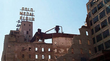
It seemed the perfect symbol of a time and industry long past, broken down but not entirely wiped away. I returned to visit Minneapolis occasionally and would drive past the Falls, wondering what would happen to my building, hoping against hope that they wouldn’t eventually tear it down. With the structure in such bad shape, demolition seemed to be the only option.
Last week, Meg and I spent a day in Minneapolis on our way to visit my parents in Wisconsin, my first stay in Mpls since mid-2002. Meg wanted to investigate running trails and I wanted to sneak a peek at the Gold Medal Flour Building (as I had taken to calling it), so we walked the three blocks to the river from our hotel, housed in the former Milwaukee Depot. The Gold Medal Flour sign was visible from several blocks away, so I knew they hadn’t torn down the grain elevators, but it wasn’t until I saw the shell of the Washburn A building peeking out around one of the other mill buildings that I knew it had been spared as well. As more of the building came into view, I saw a glass elevator rising from the ruins, backed by a glass facade.
What the??!?
Now practically running along the river in excitement and bewilderment, dragging poor Meg along with me in a preview of her jog the next morning, I saw a wooden boardwalk in front of the building and headed for what looked like the entrance. The burned out windows and broken glass remained; except for the elevator and the 8-story glass building sticking out the top, it looked much the same as it had after burning in 1991. I scrambled through the entrance and, lo, the Mill City Museum.
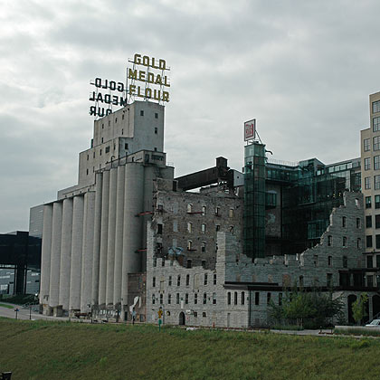
And what a museum. It was just closing when we got there, but we returned the next morning for a full tour of the museum and the Mill Ruins Park. The highlight of the museum is an elevator tour of the mill as it was back in the early 20th century. They load 30 people at a time into a giant freight elevator, which takes the group up to the 8th floor of the museum, stopping at floors along the way to view and hear scenes from the mills workings, narrated by former mill workers. After the elevator tour, you’re directed to an outdoor deck on the 9th floor, where you can view the shell of the mill building, St. Anthony Falls, the Stone Arch Bridge, the Gold Medal Flour sign, and the rest of the historic area.
Meyer, Scherer & Rockcastle are the architects responsible for the project, and they deserve all the accolades they get from one of the most unique museums I’ve ever been to. The statement from the American Institute of Architects jury explains the design of the museum:
A creative adaptive reuse of an extant shell of a mill building, with contrasting insertion of contemporary materials, weaving the old and the new into a seamless whole…A complex and intriguing social and regional story that reveals itself as the visitor progresses through the spaces. It is museum as a verb…A gutsy, crystalline, glowing courtyard for a reemerging waterfront district that attracts young and old and has stimulated adjacent development.
I still can’t quite believe they turned my favorite Minneapolis building (of all buildings) into a museum….and that it was done so well. More than anything, I’m happy and relieved that the Gold Medal Flour Building will always be there when I go back to visit. If you’re ever in Minneapolis, do yourself a favor and check it out.
Photos on Flickr tagged “mill city”
Photos on Flickr tagged “mill city museum”
Mill City: A Visual History of the Minneapolis Mill District was helpful in writing this post
A Washington Post review of the museum from September 2005
The new Guthrie Theater is right next door and is a dazzling building in its own right (photo, more photos)




Stay Connected