The History of Italics In Type
I don’t know the author or typographer behind The Temporary State. There’s a contact address that reads “B. Tulskaya ul. 2-571, Moscow, Russia, 115191.” But Mx. Tulskaya (if that’s indeed the author) has made an outstanding pocket history of the use of italics in type, partly to defend against the fact that The Temporary State’s fonts do not use an italic typeface.
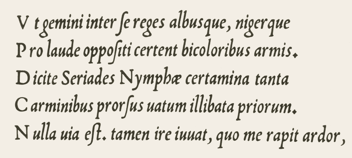
I knew, for instance, that Venetian printer Aldus Manutius is generally credited with introducing italics into European print (partly, the histories say, to imitate Latin handwriting, and partly as a space-saving device). I did not know that after other printers began to copy Manutius’s use of italics, the Venetian Senate granted Aldus exclusive right to use them.
I knew that Italian futurist poet and manifesto-writer Filippo Marinetti championed a wide range of typographic innovations; I did not know (or had forgotten) that he wished to reserve italic type for “a series of similar and swift sensations,” while bold would be used for the imitation of heavy tones, and so on. A kind of emotional functionalism in type.
It is strange, how Marinetti in his call for revolution against “the Poetry Book” doesn’t see any problem with italics. Somehow, Roman numerals are an issue, but the use of highly decorative imitation of a 16th century pretty handwriting is a futuristic expression, not part of the “typographic harmony” ensemble. It is even stranger, that he doesn’t address the application of italic itself, as his idea of highlighting the page with «3-4 colors and 20 different typefaces» is very close to how the use of italic is regulated in the Chicago Manual. The only difference is: where Marinetti suggests «20 different typefaces», Chicago suggests only one — italic. So, seemingly to achieve Marinetti’s idea all that is needed is to diversify the means of text highlighting. And it’s not like there are no alternative typographic traditions, which could be used to substitute the italic.
Much of the article is devoted to this; how you can achieve the typographic effect of italics (emphasis, foreign words, titles, etc.) without using italic type. Here the examples are legion. In German blackletter, foreign words (especially in Roman languages) would be put in Roman type, while emphasized words or phrases would be in boldface. In Cyrillic printing, especially in the Soviet period, you see “sperrsatz,” or wide spacing, to denote emphasis.
Bauhaus, following the German blackletter tradition, forsook italic typesetting altogether, opting for a combination of boldface, sperrsatz, and fonts of different sizes, all of which achieve the effect of italics without the pretense of adopting an old Latin handwriting style.
Since few social media networks support bold and italic typesetting, it’s interesting to think about the range of ways users still suggest italics or the effect of italics.
There’s pseudo-Markdown, in the form of
*italics*
or
_italics_
Of course, there’s
ALL CAPS
There are also memes and GIFs, which are a way of both drawing emphasis to text and giving it an emotional characterization that go far beyond what Marinetti could dream of with his really quite limited notion of “3 or 4 different colours and 20 different typefaces on the same page. That text itself would and could be animated, that it could be superimposed on a miniature movie that would explode into mostly-text networks, is a future Marinetti might have embraced, but one he couldn’t quite fully see.
(Via Robin Sloan)
Stay Connected