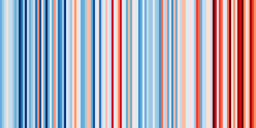
Using temperature data from around the world, climate scientist Ed Hawkins has built a tool for viewing the “climate stripes” for almost any location, a data visualization that represents the change in temperature over time over the past 100+ years. For most locations, the graphs shift from blues to oranges & reds as the climate warms, neatly illustrated by the global graph:

Here’s Vermont (where I live) and Arizona:
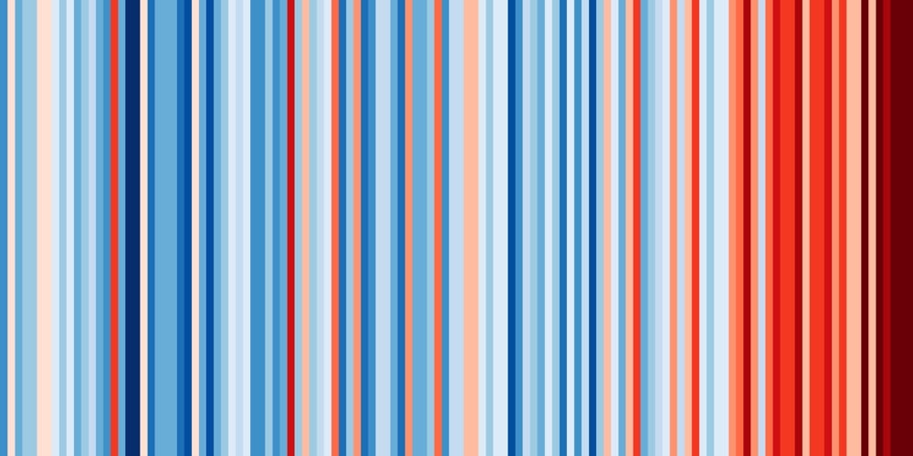
You can see there’s more variation on the regional level than globally. Check out the graph for Mississippi:
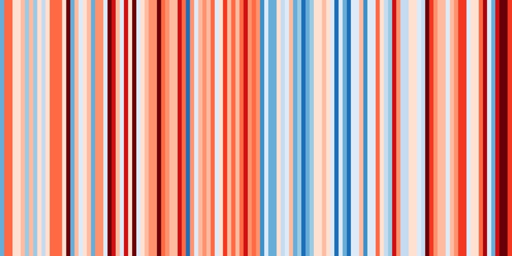
The warming patterns for particular regions are not going to be uniform…some places are actually forecast to get cooler and wetter rather than hotter and dryer. You can create and download your own climate stripes here…perhaps you can use it to make a global warming blanket. (via riondotnu)
Using simple graphic representations of annual temperatures (like this one posted by climate scientist Ed Hawkins), people are knitting and crocheting blankets that show just how warm the Earth has gotten over the past few decades. See Katie Stumpf’s blanket, for example.
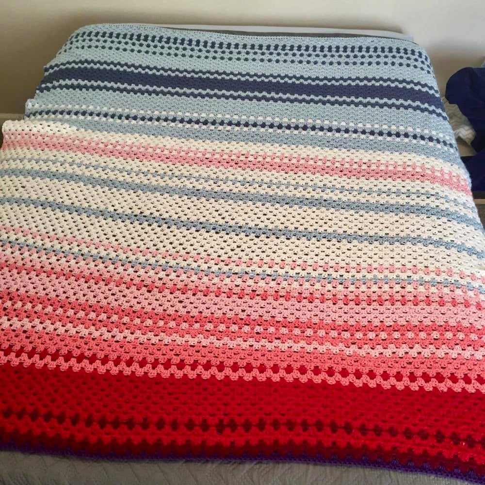
According to climate scientist (and crocheter) Ellie Highwood, these blankets are a subset of “temperature blankets” made to represent, for example, daily temperatures over the course of a year in a particular location. The blanket she crocheted used NOAA data of global mean temperature anomalies for a 101-year period ending 2016.
I then devised a colour scale using 15 different colours each representing a 0.1 °C data bin. So everything between 0 and 0.099 was in one colour for example. Making a code for these colours, the time series can be rewritten as in the table below. It is up to the creator to then choose the colours to match this scale, and indeed which years to include. I was making a baby sized blanket so chose the last 100 years, 1916-2016.
If you read her post, she provides instructions for making your own global warming blanket.
P.S. You might think that with the Earth’s atmosphere getting warmer on average, these blankets would ironically be less necessary that they would have been 50 years ago. But climate change is also responsible for more extreme winter weather events — think global weirding in addition to global warming. So keep those blankets handy!
Stay Connected