kottke.org posts about Mad Men
Mark Simonson takes an extensive look at the typography of Mad Men and concludes that a surprising amount of the type is set in fonts that either weren’t around in the early 60s or weren’t yet popular in the US.
Then there is the Gill Sans (c. 1930) problem. Gill is used quite a lot in the series, mainly for Sterling Cooper Advertising’s logo and signage. Technically, this is not anachronistic. And the way the type is used — metal dimensional letters, generously spaced — looks right. The problem is that Gill was a British typeface not widely available or popular in the U.S. until the 1970s. It’s a decade ahead of its time in American type fashions.
There’s also the Arial problem in the ending credits.
Fashion designer Michael Kors based his 2008 fall collection in part on Mad Men. The maturity of dress on the show is part of what attracted him:
Aren’t we ready for that again? For some maturity? I have to tell you, I am sick and tired of hair down to there and crotch-high hemlines. It’s so obvious. For Fall I was really trying to bring back buttoned-up sexy — think Grace Kelly. So cool, so poised. She never reveals a thing and you can’t take your eyes off of her. I mean, watch “Rear Window.” That’s smart sexy; it’s interesting sexy. And it’s grown-up sexy. You want a tip on looking hot? Wear reading glasses and a fitted dress. Simple.
He’s right about Grace Kelly. I watched Rear Window recently and she’s something else in it.
Andrew Johnston has been posting great meaty Mad Men reviews over at The House Next Door after each episode. Here’s a two-fer that covers the last couple of installments. You can find the rest of the season 2 recaps here.
The Washington Post takes a stroll through Manhattan, circa the Mad Men era.
Sterling Cooper, as every fan with a pause button knows, is at 405 Madison Ave., an address that…does not exist. If it did exist, it would be where a bank of Chase ATMs is now, not the ideal spot to spend the morning, but don’t worry, soon it will be 11:30 and time for your first cocktail.
One place the article doesn’t mention is Lutèce, the fancy French place frequented by the bigwigs in the show. It closed in 2004. (thx, jake)
Mad Men gets a C- for using Arial in the closing credits instead of original-and-still-champion Helvetica. Time for Sterling to have a chat with the art department.
Answers to frequently asked questions and questions that need not be asked: What Would Don Draper Do? (via fimoculous)
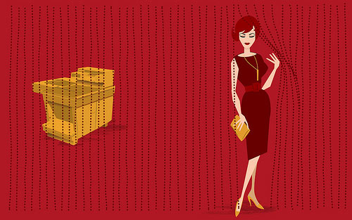
Update: What Would Joan Holloway Do? Never mind that, where are the pinup posters?
An appreciation of Mad Men by designer Michael Bierut.
Jesus God in heaven! Not until I know I’m not wasting my time! From the minute Don launched his this-meeting-is-over bluff, I was on the edge of my seat, and my lovely wife Dorothy will tell you that I literally clapped my hands at that line. For me, this sequence is as close to pornography as I ever get to see on basic cable.
Alright, uncle, I give, I give. I will try and find some time in my schedule to watch this show.
Newer posts


Stay Connected