The Designer’s Dictionary of Type
In his forthcoming book, The Designer’s Dictionary of Type, Sean Adams profiles 48 of the best-known typefaces in the world, from Helvetica and Garamond to Cooper Black and OCR-A. Fast Company has a short excerpt.
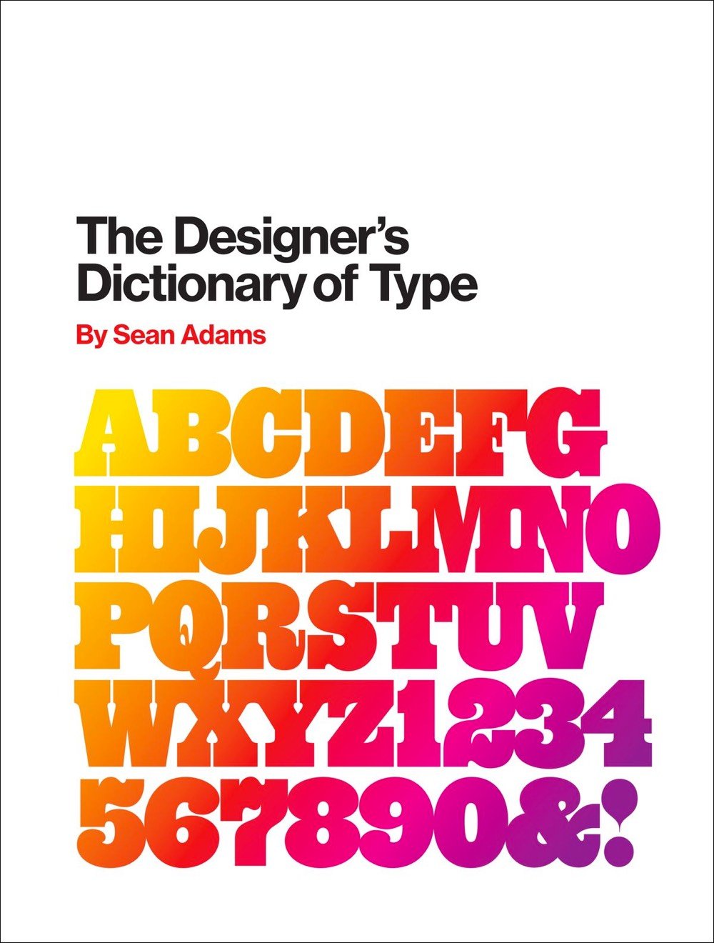
Cooper Black has a close association with the 1970s; however, Oswald Cooper actually created the typeface in 1921. Cooper designed the Black weight after releasing a larger Cooper Old Style family of fonts. The forms are based on old style serif typefaces but are “fat” and soft. This type of letterform gained popularity between 1910 and 1920. Other designers worked with similar forms, such as Frederic Goudy and his typefaces Goudy Heavy Face and Pabst Extra Bold. In the 1960s and 1970s, designers looking for alternatives to cold Swiss modernism and Helvetica looked back and revived Cooper Black. Its soft forms worked exceptionally well with phototypesetting, which allowed for extremely tight kerning. Both the counterculture movement and low-end DIY design adopted Cooper Black. By the end of the 1970s, the typeface was ubiquitous, but it again fell out of fashion as the New Wave movement gained momentum.
Stay Connected