Hey folks. One of the things I realized coming back here after my time away is that I’m not super happy with how the site works & looks. It could be *waaay* better. The last time I fully redesigned the site was back in 2016 and it’s showing its age. But redesigning the whole shebang just isn’t feasible right now, so I’m starting to do what I can, here and there. First up is taking the Quick Links out of their front page box (the 10 latest links were collected below the first post) and inlining them into the main flow. (If you’re reading this in RSS or clicked through from social media, you can head to the front page to see what I’m on about.) The Quick Links represent a lot of the site’s present activity and I was worried they were a little lost down there in that box…like, were people actually reading them? Were they even aware of the existence of the Quick Links? Were they missing 40-60% of the site’s total activity? That felt like something that needed to be addressed without delay.
It’s not a perfect solution, I’m still not happy with how it works, and the whole thing is slightly inconsistent/janky in terms of design (e.g. multiple people have told me the inlined Quick Links look like ads), but I felt it was more important just to get something out there. There is a much better version of the kottke.org frontpage in my head, but as my art director (i.e. me) is currently 100% focused on editorial, it’s going to have to wait. Feedback is welcome via email, Twitter, or Mastodon. Thanks!
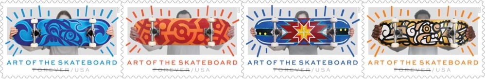
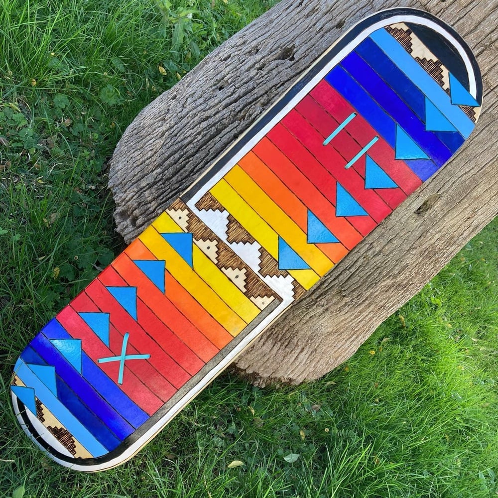
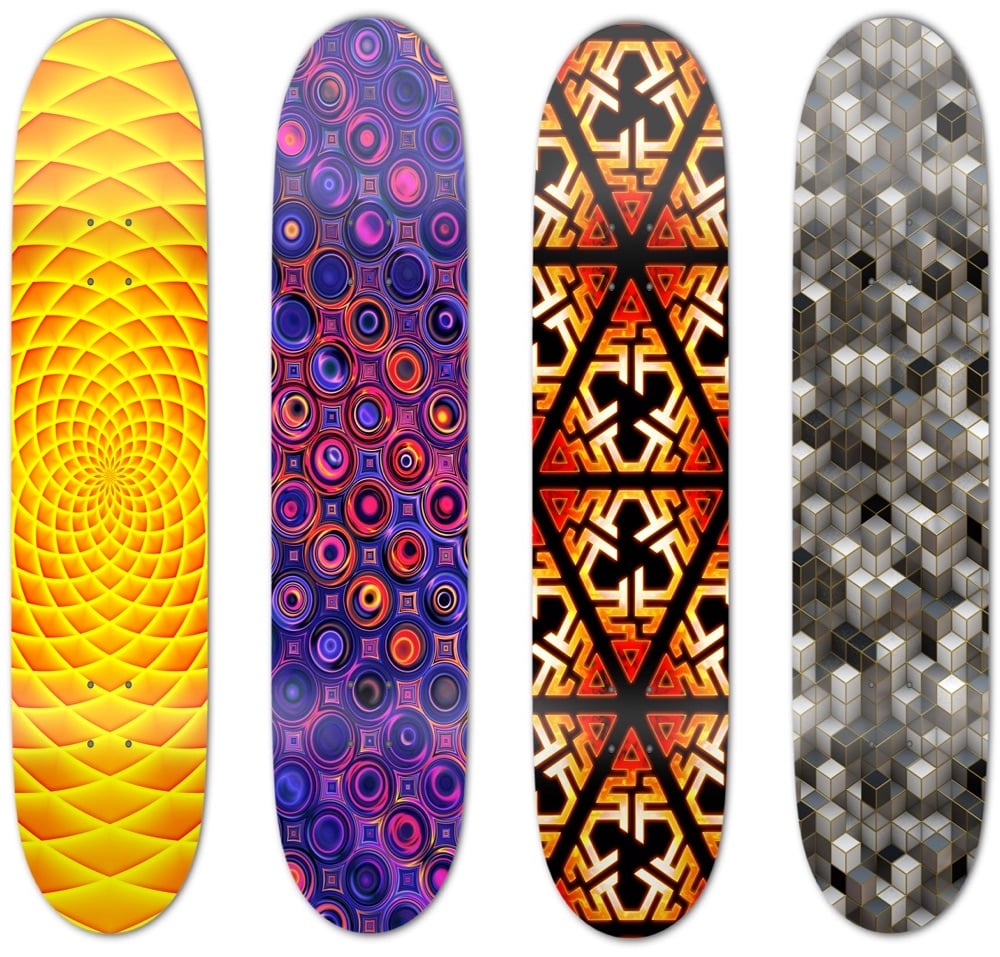
Antonio Alcalá designed the stamps, which feature skateboard decks created by four different artists:
Di’Orr Greenwood is a member of the Najavo Nation who does pyrographic art, burning images into the wooden decks of some of the boards she designs. Greenwood also carves cedar wood flutes and teaches skateboarding. From her Instagram, one of decks she’s designed recently:
Crystal Worl is “Tlingit Athabascan from Raven moiety, Sockeye Clan, from the Raven House” who currently lives and works in Juneau, Alaska. Her Instagram is here and here’s a recent deck from her website:
Federico Frum is a street mural artist from Colombia who is based in Washington DC; he operates under the name MasPaz. From his Instagram, a recent desk design:
I’m excited to get some of these stamps when they come out later in the year. (via lizzie armanto)
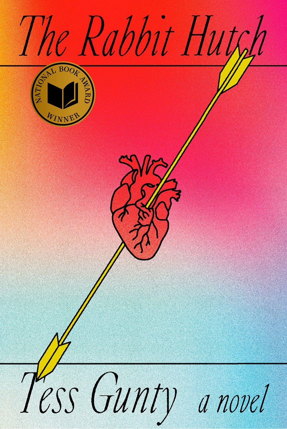
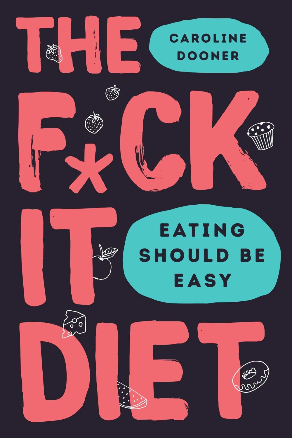
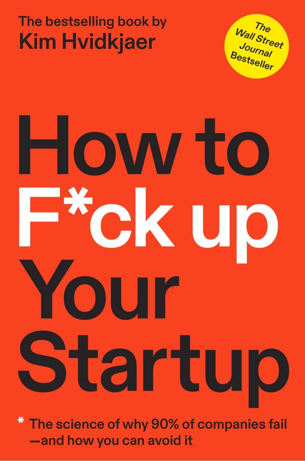
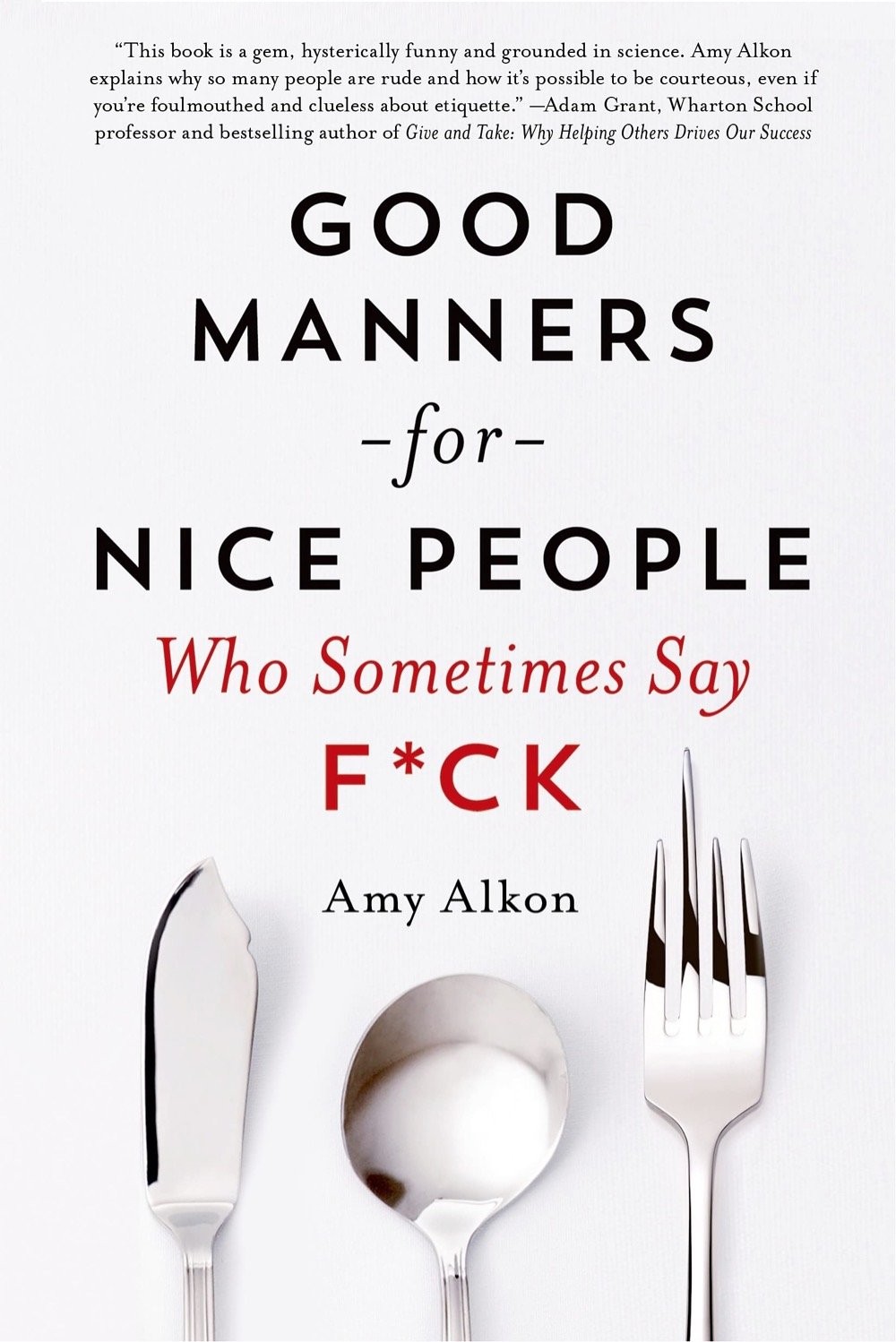
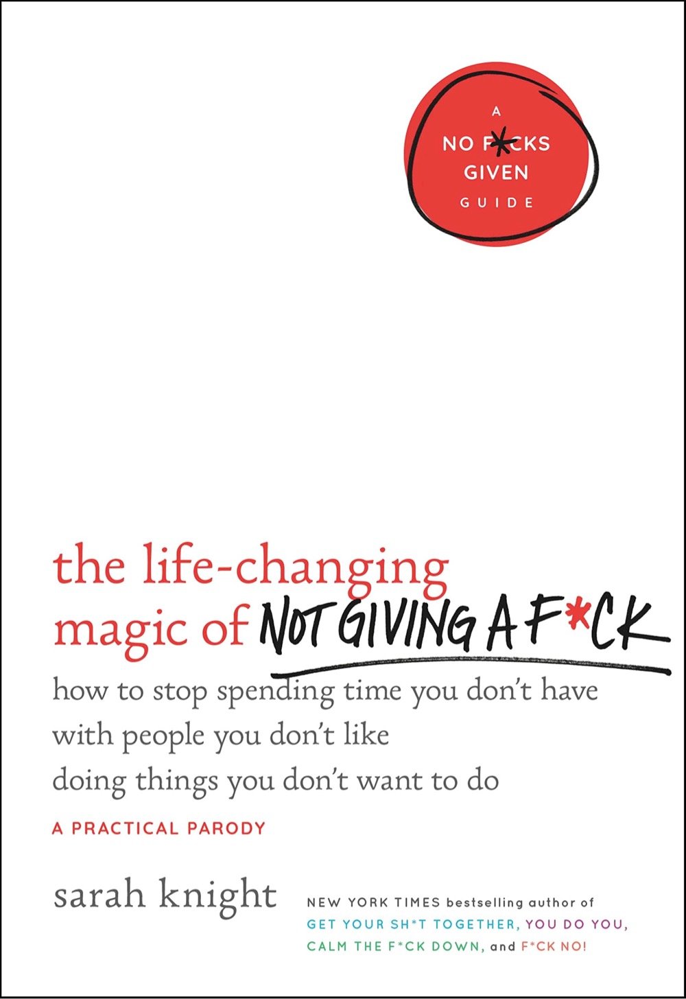
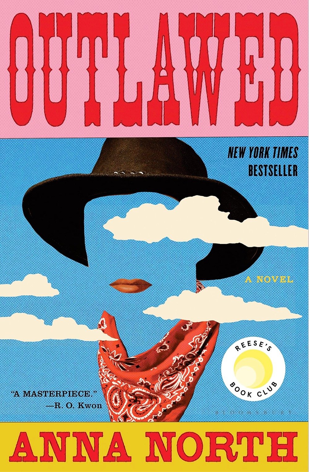
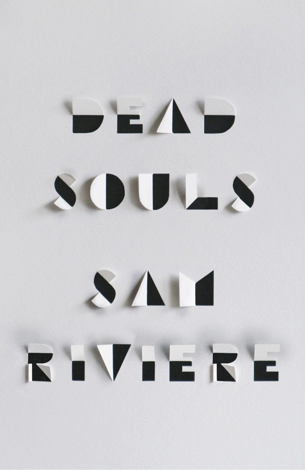
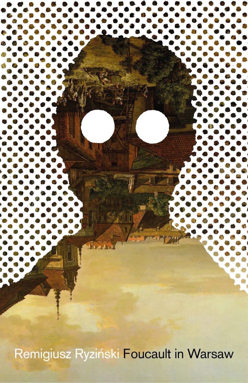
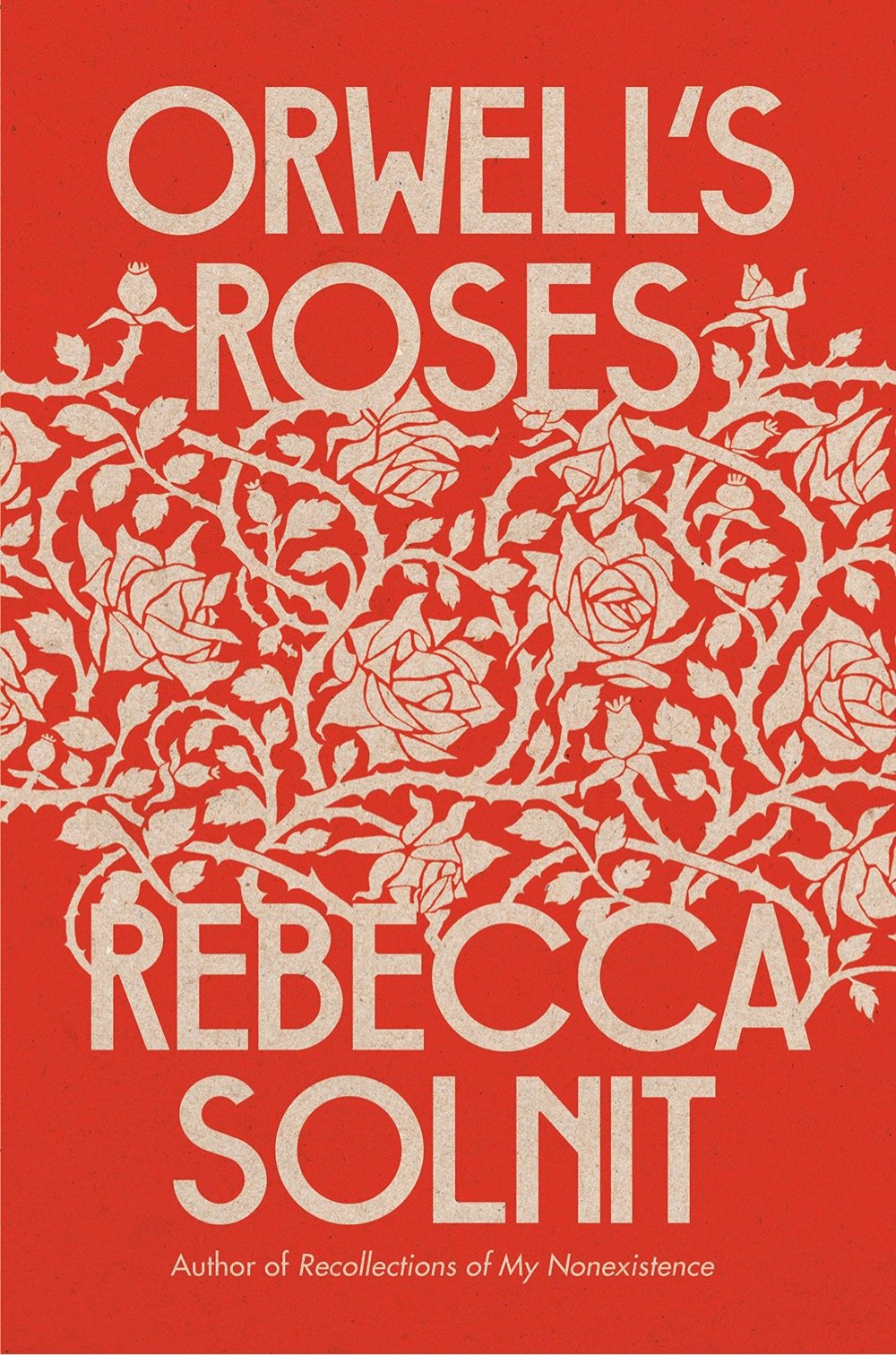
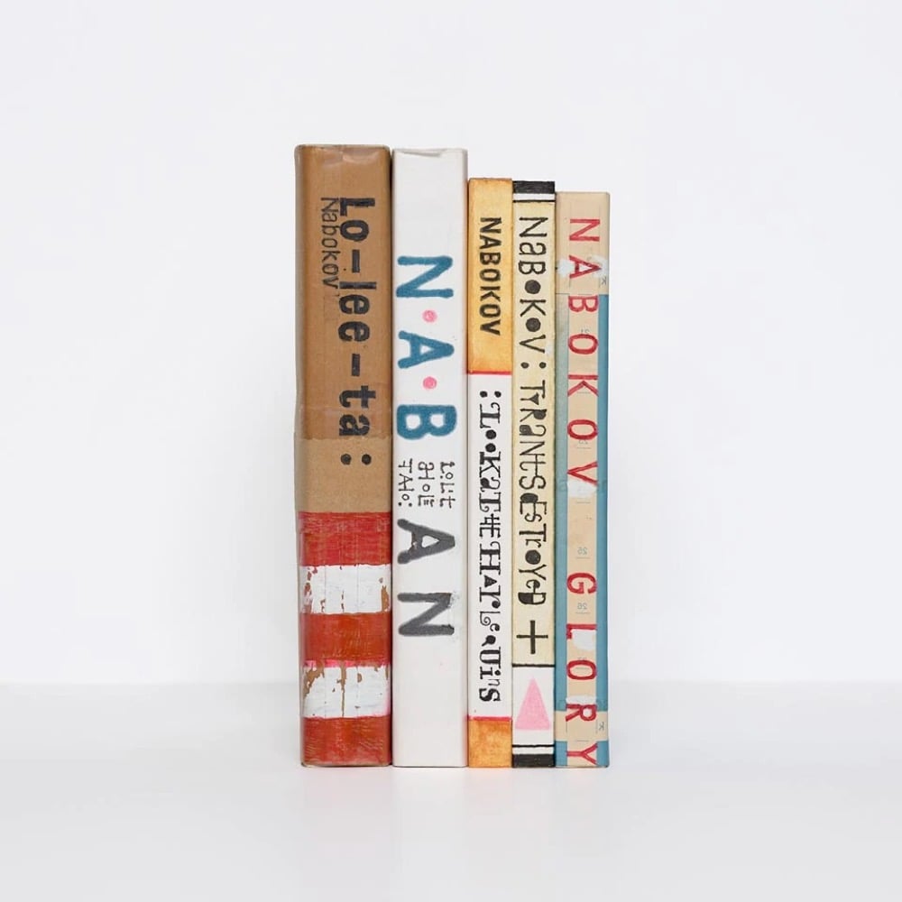
The book cover is one of my all-time favorite design objects and a big part of the reason I love going to bookstores is to visually feast on new covers. I don’t keep an explicit list of my favorites from those trips, but there are definitely those that stick in my mind, covers that I’ll instantly recognize from across the room on subsequent trips.
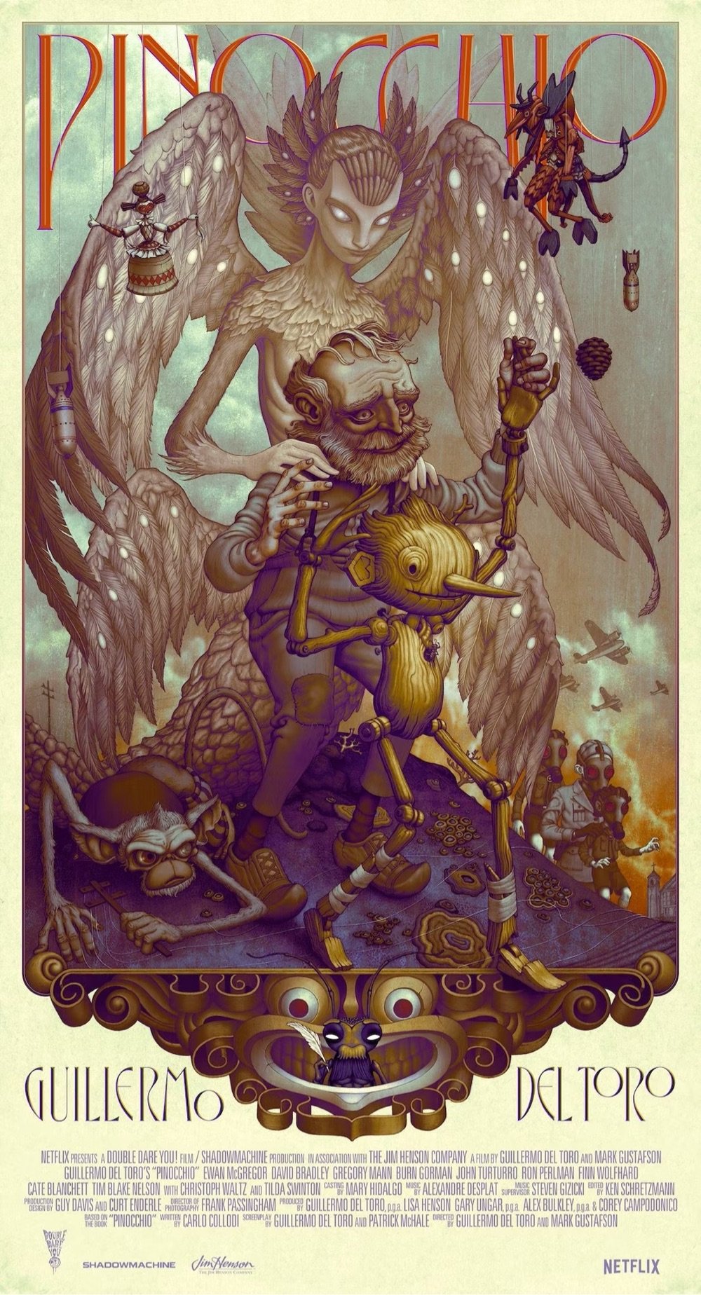
I’ve spent the last few days rediscovering some of them (and finding new ones) on the end-of-the-year lists of the best covers of 2022. You can find some of 2022’s most wonderfully designed covers above; from top to bottom:
Note: When you buy through links on kottke.org, I may earn an affiliate commission. This year, I’m linking to Bookshop.org when I can but if you read on the Kindle or Bookshop is out of stock, you can try Amazon. Thanks for supporting the site!
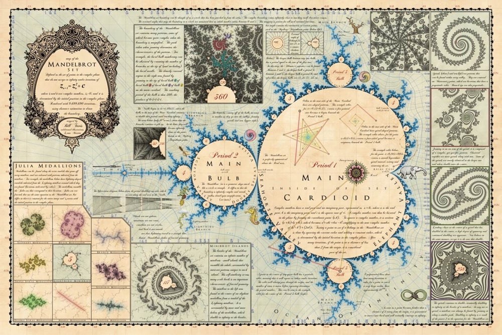
Bill Tavis designed this lovely vintage-style map of the familiar fractal shape, the Mandelbrot set. He is selling a poster version of the map, starting at the very reasonable price of $24. I don’t usually highlight the price on this sort of thing, but an unauthorized seller on Amazon was selling poor-quality counterfeits of the map and even though it wasn’t his fault, Tavis offered to replace any of the crappy maps for free. Great map, and apparently a great human who made it.
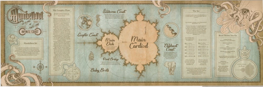
I found Tavis’s map when I was searching for the creator of this similarish map that I found on Twitter (bigger here).
Anyone know who made this version? Jonny Laser made the map in the second image for VSauce (scroll down a bit). (thx, kirsten)
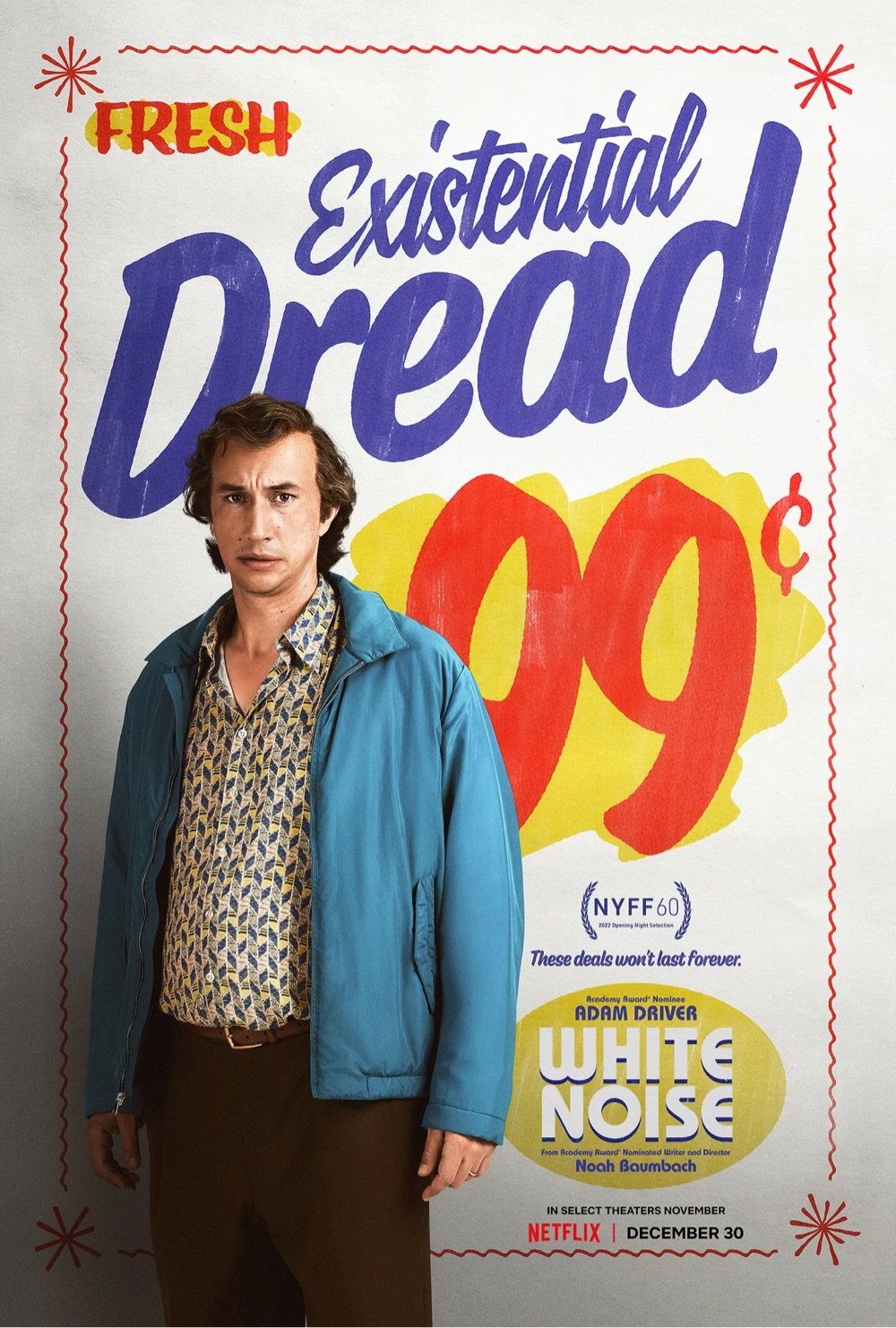
I’m still trying to wrap my mind around it all. There seems to be a correlation between how Alejandro’s work was absorbed and referred to by subsequent filmmakers and how his work was ingested and metabolized by computer programming. But these two things are not the same. I want to say that influence is not the same thing as algorithm. But looking at these images, how can I be sure?
It’s hard to find many shortcomings in the software. It can’t render text. And like many painters and sculptors throughout history, it has trouble getting hands right. I’m nitpicking here. The model contains multitudes. It has scanned the collected works of thousands upon thousands of photographers, painters and cinematographers. It has a deep library of styles and a facility with all kinds of image-making techniques at its digital fingertips. The technology is jaw-dropping. And it concerns me greatly.
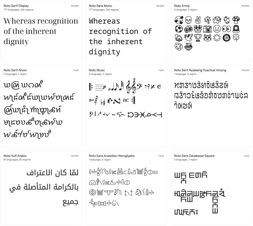
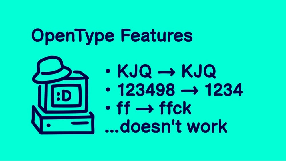
Google has developed a typeface called Noto that seemingly includes every single character and symbol used for writing in the history of the world. I mean, look at all these different options: Korean, Bengali, Emoji, Egyptian hieroglyphs, Coptic, Old Hungarian, Cuneiform, Linear B, Osage, and literally dozens more.
Noto is a collection of high-quality fonts with multiple weights and widths in sans, serif, mono, and other styles. The Noto fonts are perfect for harmonious, aesthetic, and typographically correct global communication, in more than 1,000 languages and over 150 writing systems.
A particular shoutout to Noto Emoji: it supports the latest emoji release (14.0) and includes 3,663 emoji in multiple weights.
Perhaps it’s time for a new typeface ‘round these parts…
Update: I got it in my head that Noto was a new typeface, but it was first released in 2013. But Noto’s monochrome emoji font is new — I think that’s where I got confused.
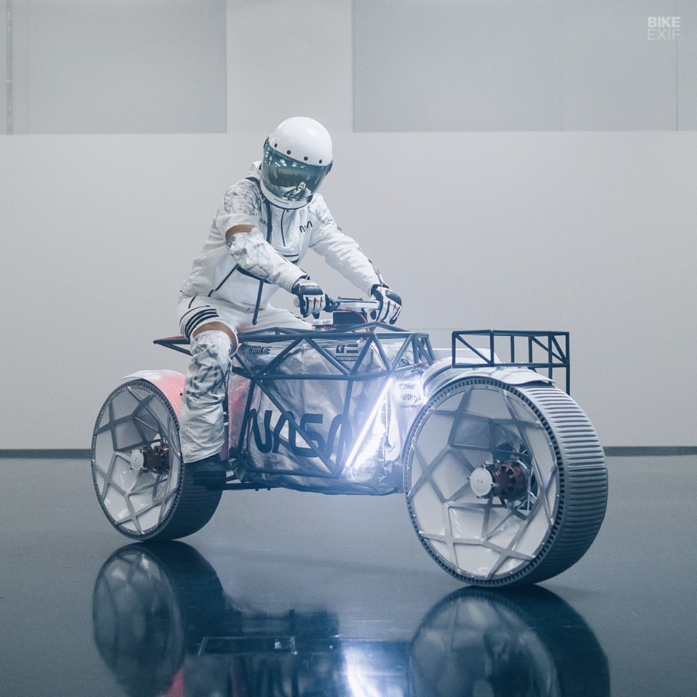
Regarding flat track racing on the moon, I would prefer some big gaps and jumps more than turning left around an oval. With almost one-sixth of Earth’s gravity, I’d need only a small bump to jump 10 meters — that would be fun! Maybe the Tardigrade inspires space-addicted people and engineers for upcoming lunar missions, and I would be more than happy to be a tiny part of that.
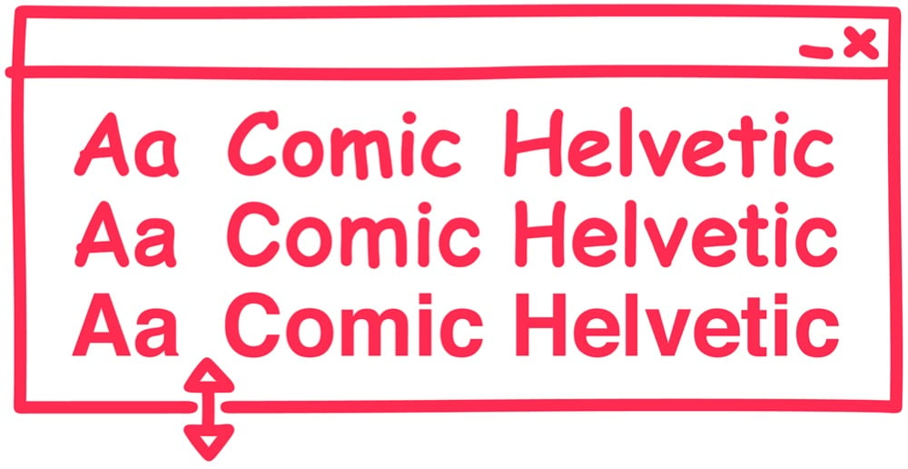
In some workplaces, people use Helvetica to conduct business because it conveys a sense of order and authority. In other workplaces, people use Comic Sans, which conveys a sense of casual chaos. Designer Alexander Pravdin decided to combine the two typefaces into one diabolical font: Comic Helvetic. You can download it here.
If you need me for the rest of the day, I’ll be over in the corner trying to decide where these three typefaces fit on the alignment chart. (via print)
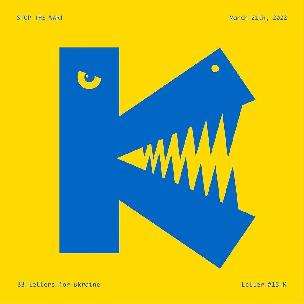
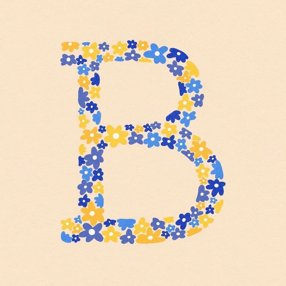
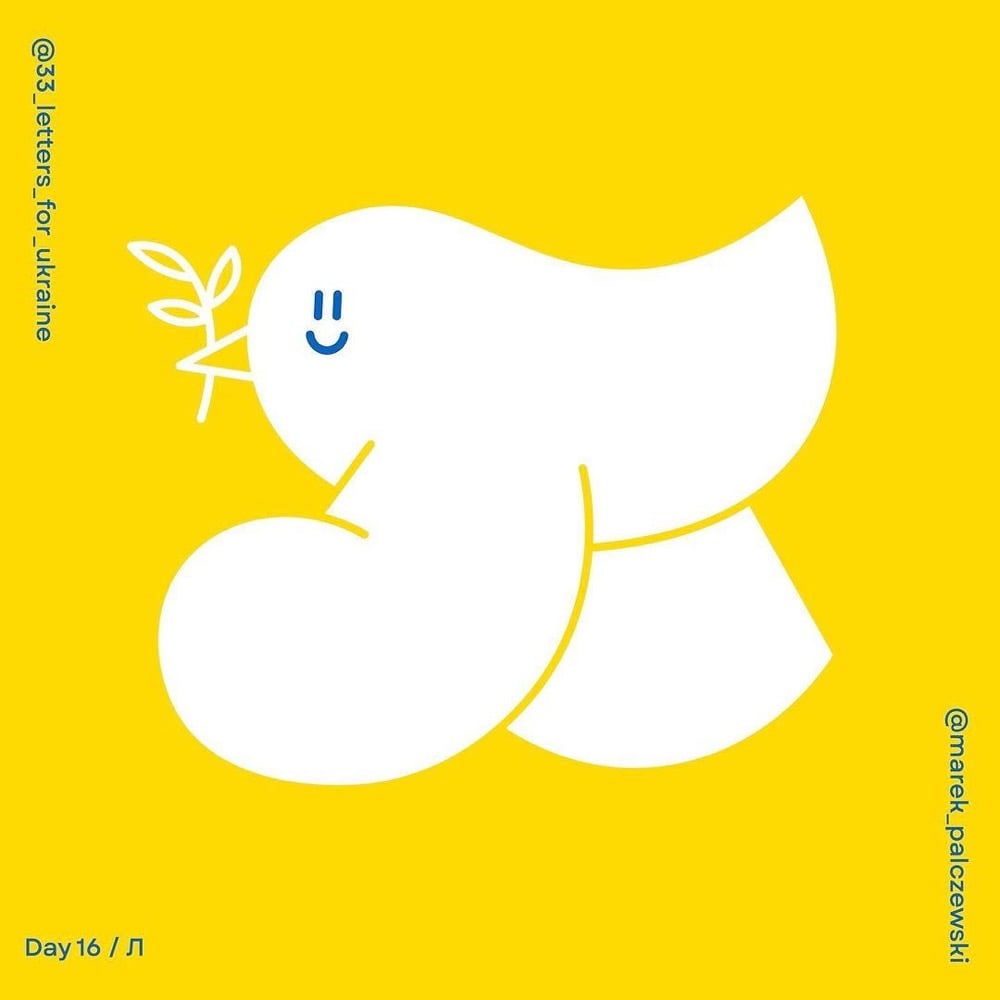
A pair of Polish designers have organized a challenge for designers around the world called 33 Letters for Ukraine: to create letterforms of the Ukrainian alphabet “as a sign of solidarity”. Each day until April 6th, a new letter is chosen and featured on their Instagram account — you can see some of the work above. It’s Nice That has a piece on the challenge.
Speaking on the thinking behind 33 Letters, Alina says: “To put it briefly, we have two main goals for the project — promoting the Ukrainian alphabet and encouraging people to donate to organisations helping Ukraine. The Instagram challenge is an essential starting point, and we loved to see so many designers getting involved and expressing their solidarity by drawing the letters. But equally important are tangible results: collecting funds and education.”
To do so, they are hoping to sell original artworks and prints of the letters once the project has finished, and then they plan to exhibit all of the works as part of a fundraiser, though the venue is yet to be confirmed. “There are amazing designers taking part in the challenge, and it would be great to see their work shine also outside of Instagram,” says Alina.
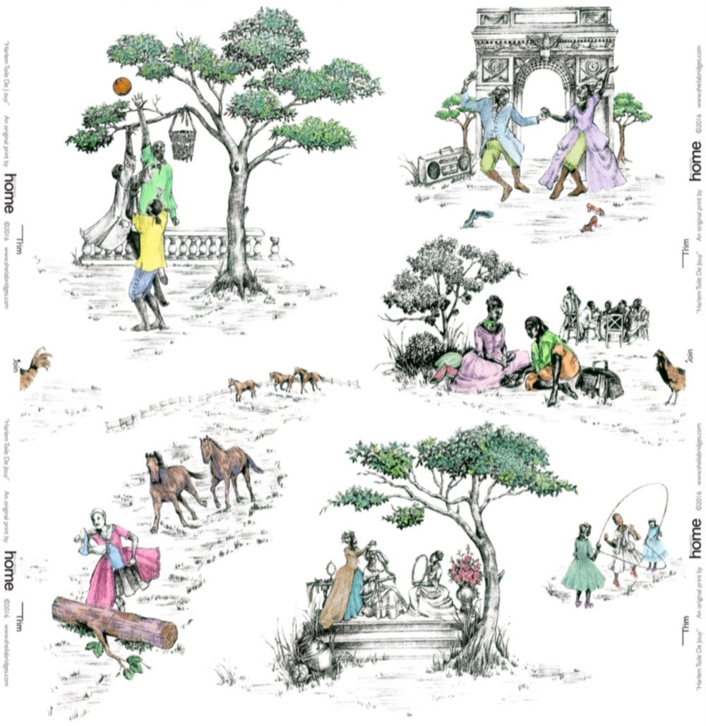
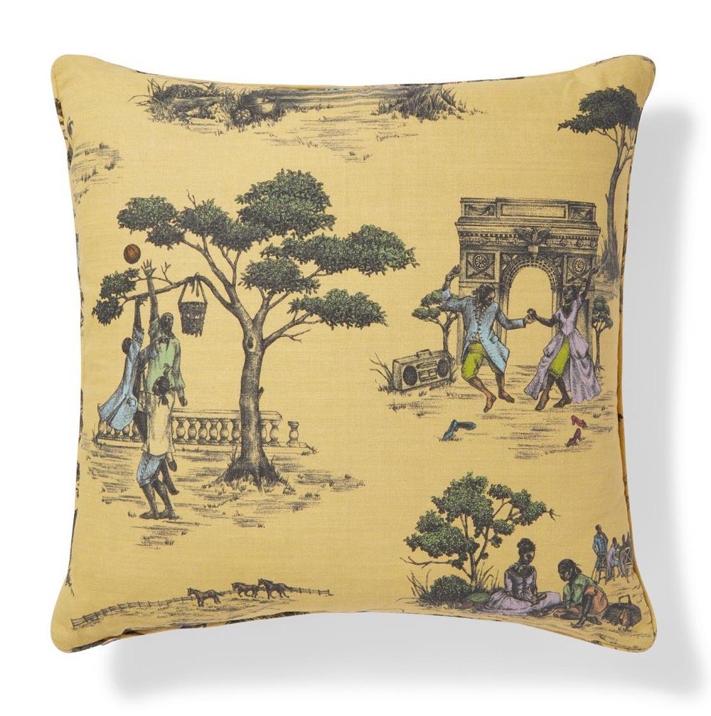
Toile de Jouy is a fabric, typically featuring “romantic pastoral scenes”, that was popular in France in the 18th century — the wealthy covered their walls in it. Interior designer Sheila Bridges developed her own patterns for her Harlem Toile, inspired by her Harlem and Philadelphia neighborhoods and the African American experience more generally.
As an African American living in Harlem, I have always been intrigued and inspired by the historical narrative of the decorative arts, especially traditional French toile with its pastoral motifs from the late 1700s. I’m entertained by the stories these patterns tell and the questions they sometimes raise. But after searching for many years for the perfect toile for my own home, I decided that it quite simply didn’t exist. I created Harlem Toile de Jouy initially as a wallcovering then expanded the collection to include fabrics, bedding, plates, glassware, umbrellas and clothing. This design (which lampoons some of the stereotypes deeply woven into the African American experience), has been featured in The Studio Museum In Harlem, the Museum of Art and Design in New York City, and the Musée De La Toile De Jouy in Jouy-en Josas, France. I am honored to have my Harlem Toile De Jouy wallpaper included in The Cooper Hewitt, Smithsonian Design Museum’s permanent wallpaper collection.
The wallpaper, which was created by the celebrated interior designer Sheila Bridges in 2006, features beautiful drawings of African Americans in the lush, historical settings that rarely featured them — a couple in 18th-century dress dance under a structure that recalls the Arc de Triomphe to the tunes of a boombox that rests playfully on the grass; women in ball gowns sit under a majestic tree, one combs the other’s hair while yet another woman holds up a fairy-talelike mirror; a courting couple in fashion that now brings to mind the popular series “Bridgerton” feast on a picnic. For a Black girl who grew up loving Jane Austen and Toni Morrison with equal aplomb, Harlem Toile was more than wallpaper. It was a tableau of possibility and belonging.
I’m not doing justice to all of what is being expressed in Bridges’ work and how it’s resonating with Chambers & other members of the Black community, so you should just read the piece. (thx, caroline)
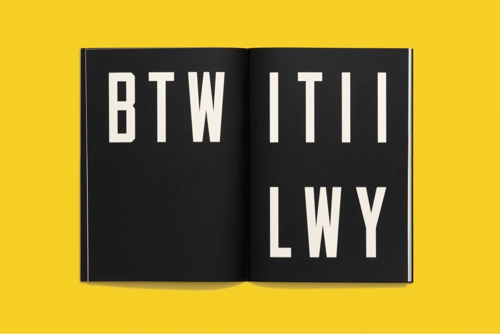
BMUS - beam me up, Scotty
EMFBI - excuse me for butting in
JC - Jesus Christ/just curious/just chilling
MOS - mom over shoulder
PS - photoshop/play station/post script
SMG - sub-machine gun
TOTES FRESH - totally precious
YOYO - you’re on your own
WYLABOCTGWTR - would you like a bowl of cream to go with that remark?
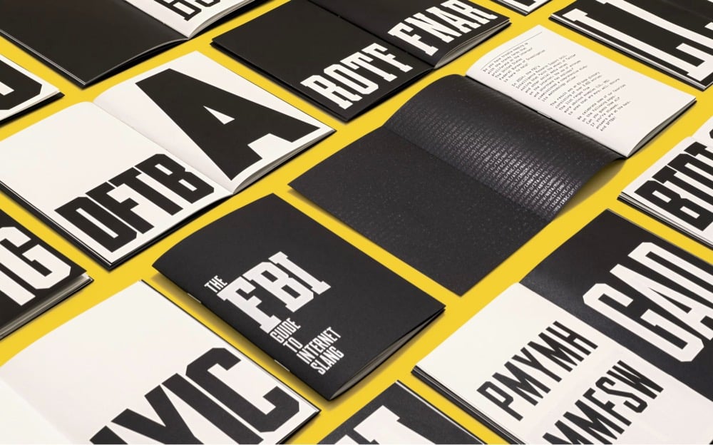
The booklet challenges readers to identify 14 abbreviations of varying difficulty and absurdity, with answers at the back. The acronyms are set in two custom typefaces designed by Pentagram partner Matt Willey, based on the markings that appear on the agency’s uniforms, particularly in popular media. The two fonts are fittingly named Edgar Sans and Clyde Slab in honor of longtime FBI Director J. Edgar Hoover and his deputy and alleged lover Clyde Tolson.
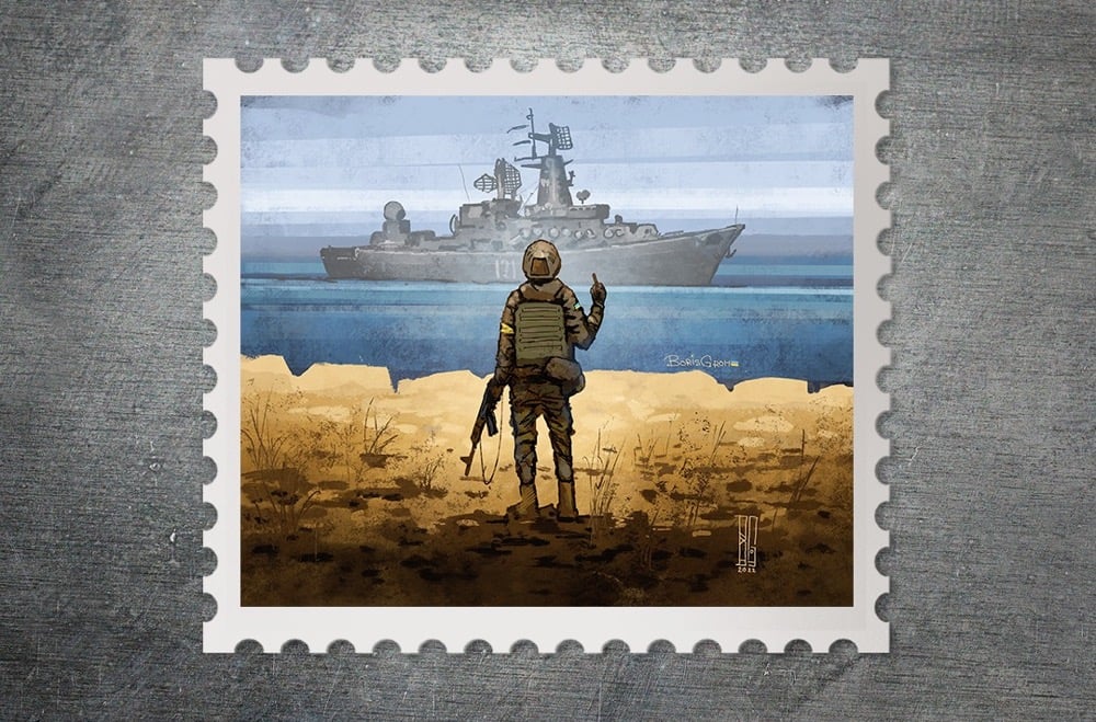
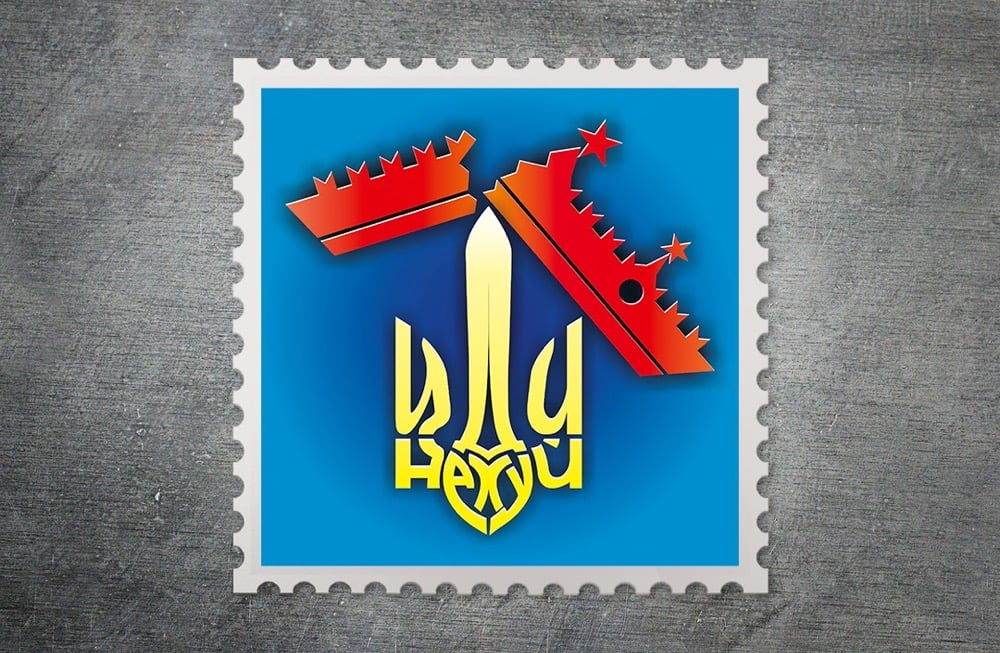
After Russia invaded the country, Ukraine’s post office (Ukrposhta) decided to hold a contest to design a stamp that illustrated “Ukrainians’ determination to defend their land”. Out of 500 submissions, Ukrposhta chose 20 designs as the finalists.
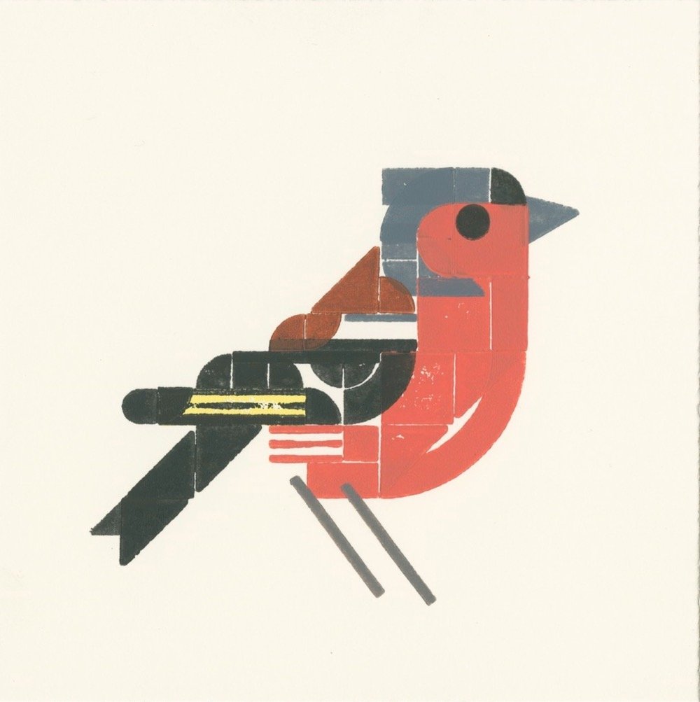
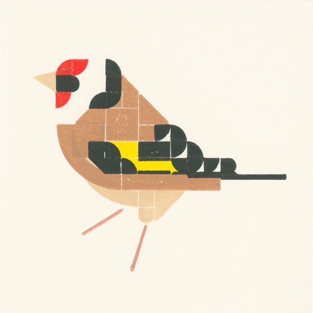
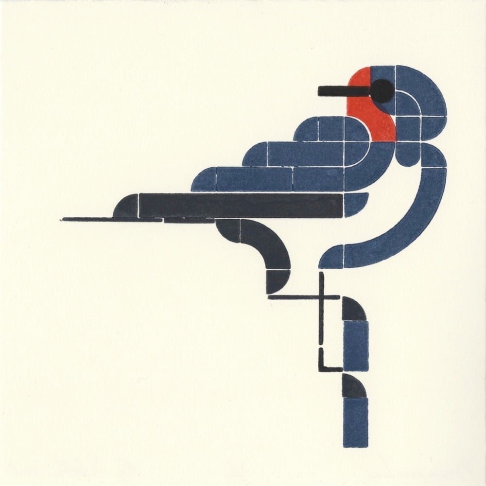
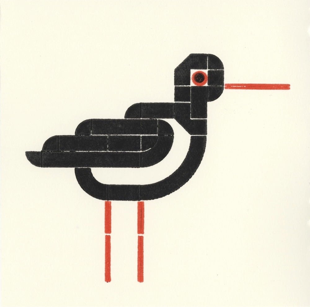
Designers Roy Scholten and Martijn van der Blom have created a series of letterpress prints of birds made by using Lego pieces as the stamps (in lieu of lead or wood blocks). Letterpress, birds, Lego…that’s gotta be close to a bingo on many a designer’s card. (via colossal)
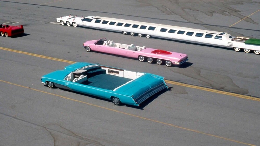
Car builder Jay Ohrberg has constructed many familiar vehicles for TV and movies, including the DeLorean from Back to the Future, KITT for the Knight Rider movie,1 several Batmobiles, and the Duke boys’ General Lee. But the Ohrberg ride I really like is his robin’s egg blue double-wide Cadillac.
My god, the ingenious outlandishness of that car. The other cars in the photo are equally preposterous, but there is something about the squarish proportions of that Caddy that is really satisfying. And it somehow looks massive and miniature at the same time?
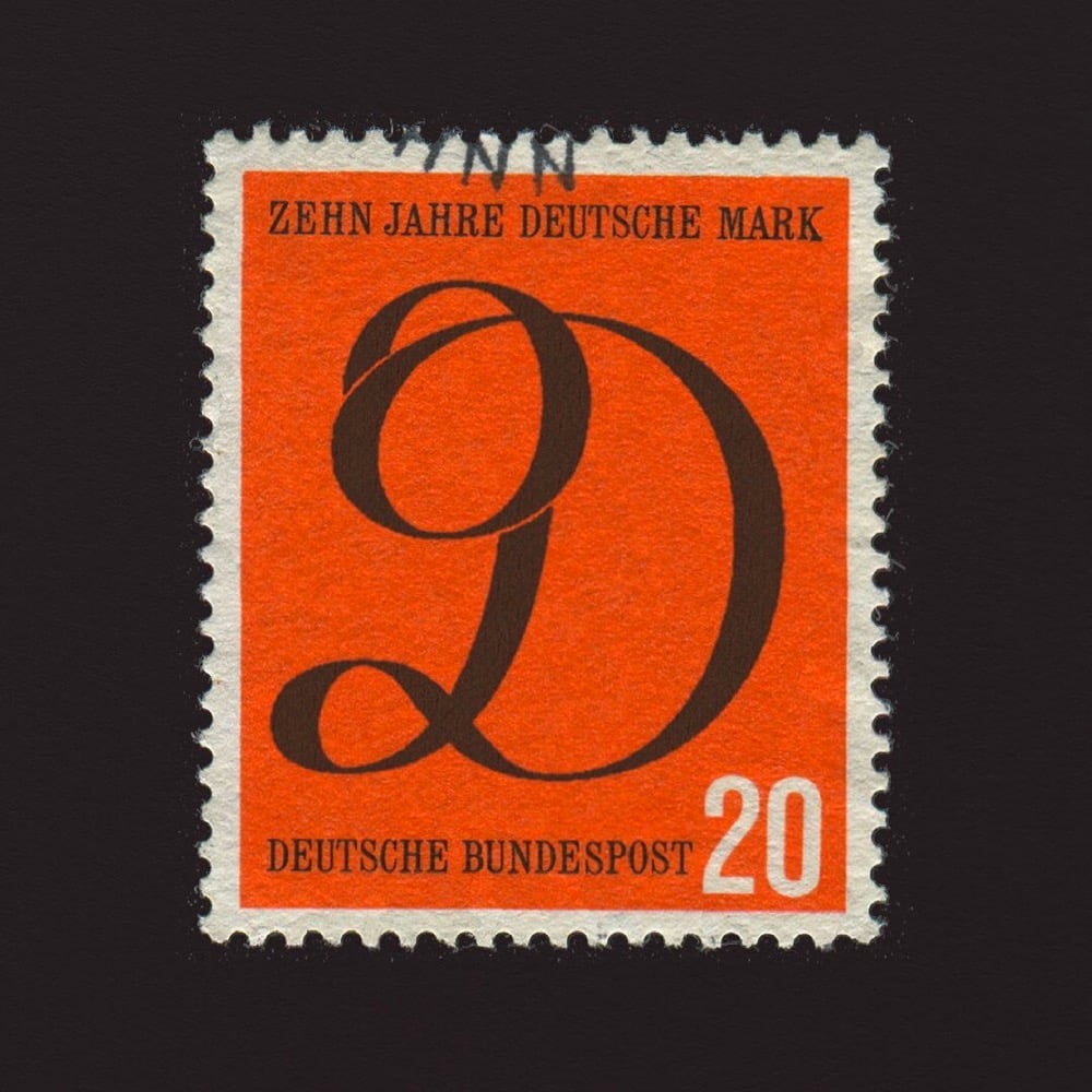
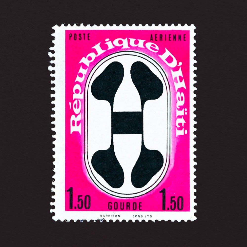
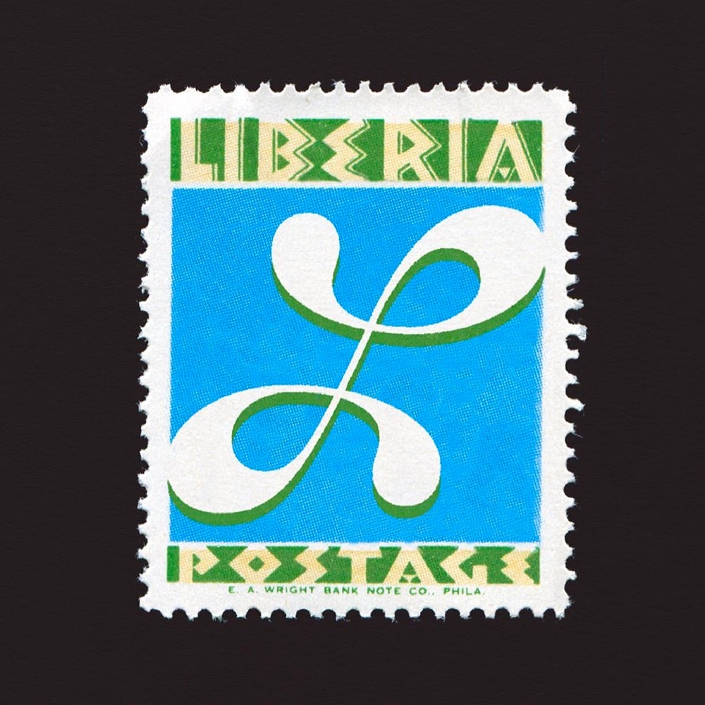
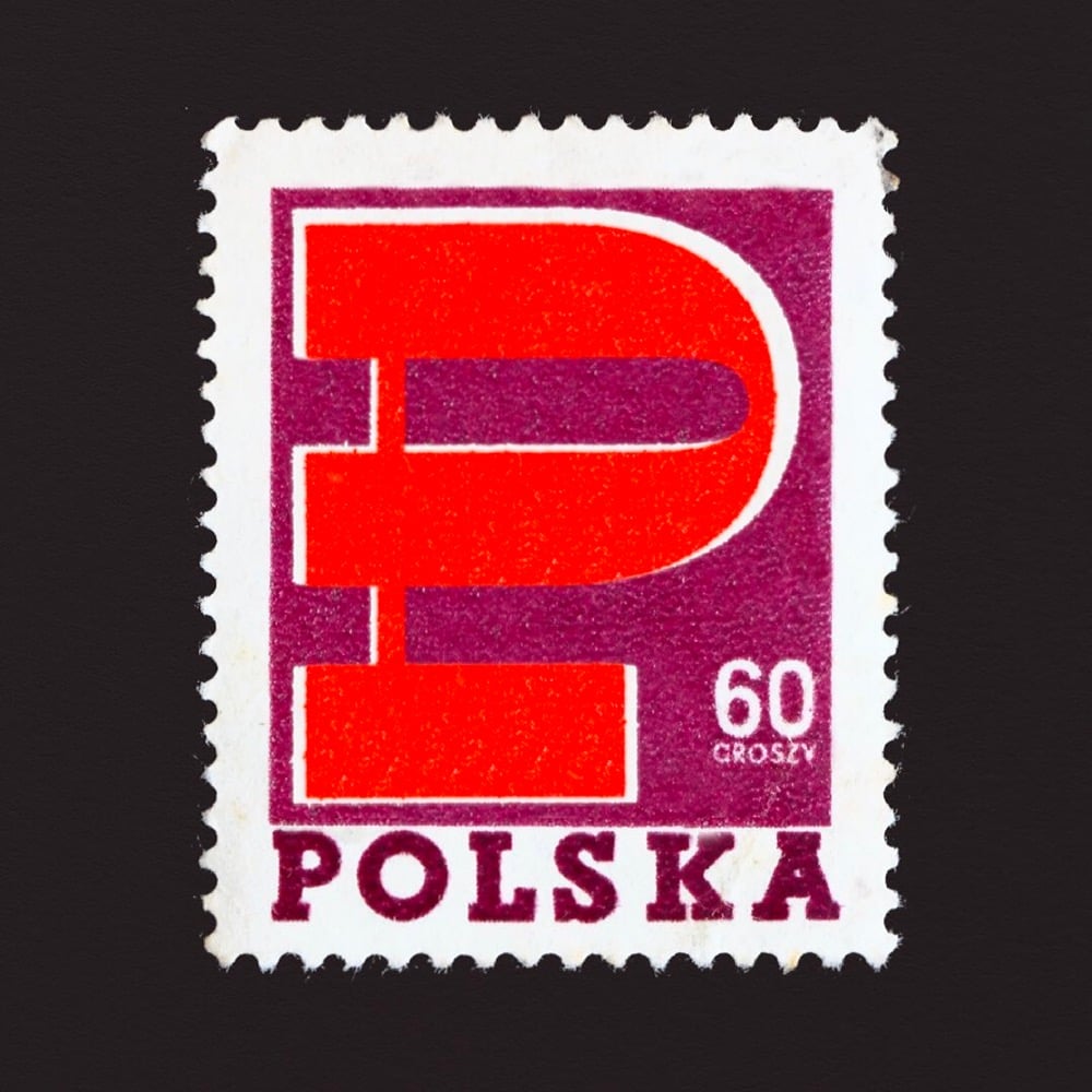
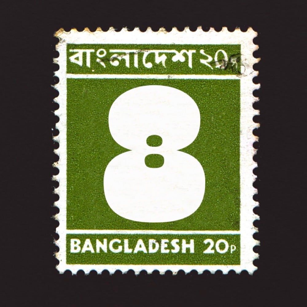
For last year’s 36 Days of Type challenge, artist and type designer Marie Boulanger selected 26 postage stamps from around the world with letters on them (C for Cuba, F for France, K for Kenya, etc.) and 10 stamps with the numerals 0-9 on them. What an amazing array of designs and lettering styles. I’ve included a few of my favorites above — you can see the rest on her Instagram or collected here in miniature.
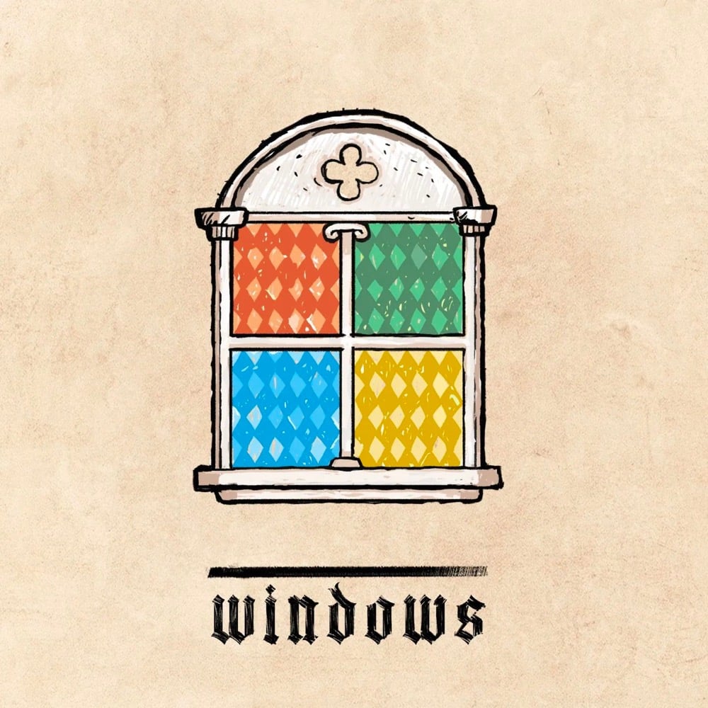
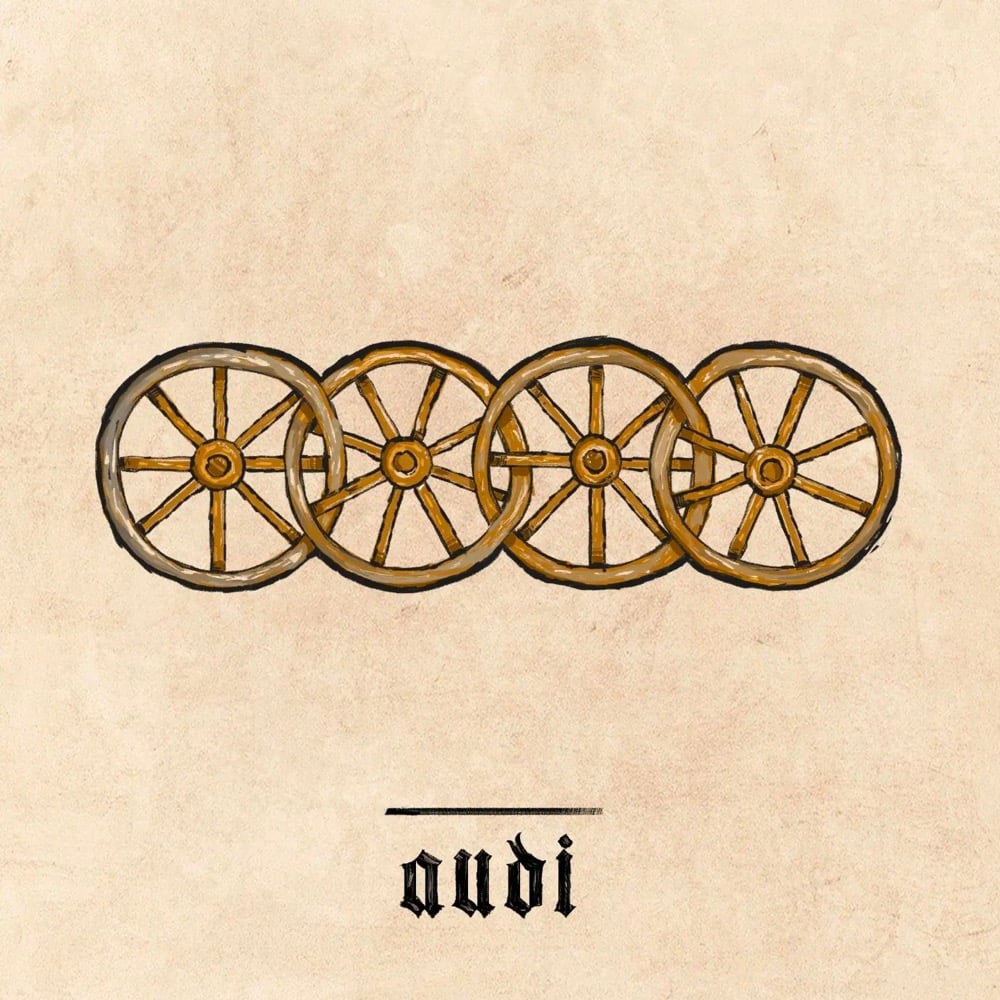
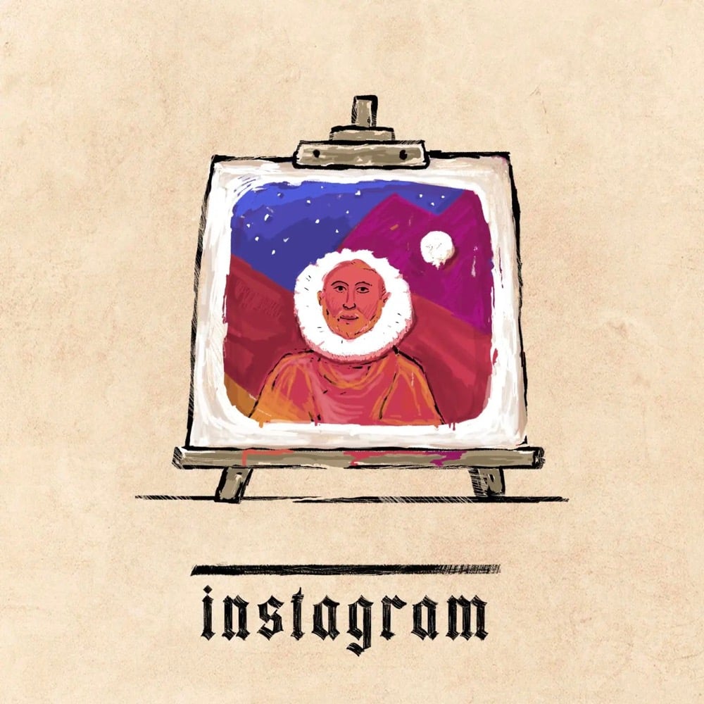
I love these medieval versions of familiar logos by Ilya Stallone, available on his Instagram account.
The best ones cleverly translate the central element in the logo into something more temporally appropriate — e.g. the figurative MS windows into actual stained glass, Instagram’s camera into a colorful painting, Audi’s rings into wagon wheels. (via sidebar)
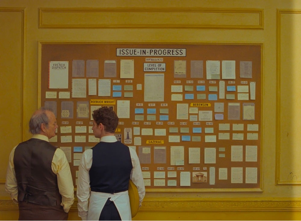
I’m just speaking for myself, but I recently rewatched all of his films in chronological order. You can see typography become a more and more prominent component over time — it’s quite fascinating. In later films like Isle of Dogs and the French Dispatch, it almost becomes its own character rather than a visual or narrative flourish. Especially in a story about writers and publishing, every book, every page, every shop sign, every poster.
Even thinking about the three stories contained within the film, graphic design and typography are really at the core of each one: exhibition posters, protest signs and even menus. You piece a lot of key information together just through certain objects from the set, as well as emotional nuance: humour, joy, sadness. With such a huge part of the narration depending on typography, you have to expect a high level of detail.
Some people can be quite dismissive of Anderson’s work as preoccupied with mere aesthetics, so it’s great to hear Boulanger talk about the depth that something that’s ostensibly aesthetic like typography brings to his films. I loved the use of type in The French Dispatch…so much information conveyed with “just” words. (via sidebar)
For The Believer, Sarah K. Kramer wrote about a typeface called Jim Crow, how it came to be called that (its original name was Gothic Shade), and what its casual use by designers for decades means.
One of Seals’ pet peeves is “stereo-typography” — things like east Asian restaurants with brush-script logos — and in particular, he takes issue with the way designers often use “black weight” (very thick and bold) font to signify African American culture. For example, the Neuland typeface (designed in 1923 by Rudolf Koch) has been used on many covers of books by Black writers, like Richard Wright’s Native Son. One theory on the origin of the association of these black-weight fonts with Black culture is that they evoke woodblock typefaces printed on nineteenth century tobacco ephemera — an industry closely linked with slavery. Needless to say, much of this material featured racist imagery of African Americans. When Seals was contracted by HarperCollins to design a cover for Charles Blow’s The Devil You Know: A Black Power Manifesto, he definitely was not going to use a “black weight” font. Instead, he designed the cover with Ruby.
Ruby is a reworked version of Jim Crow from Tré Seals’ type foundry Vocal Type Co, which I covered here a few years ago. (thx, reed)
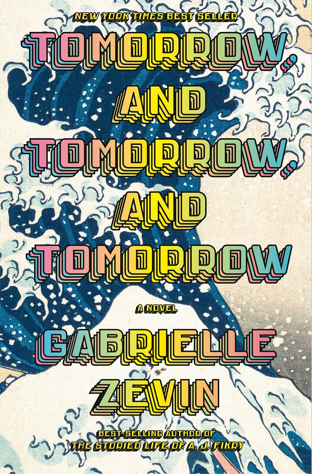
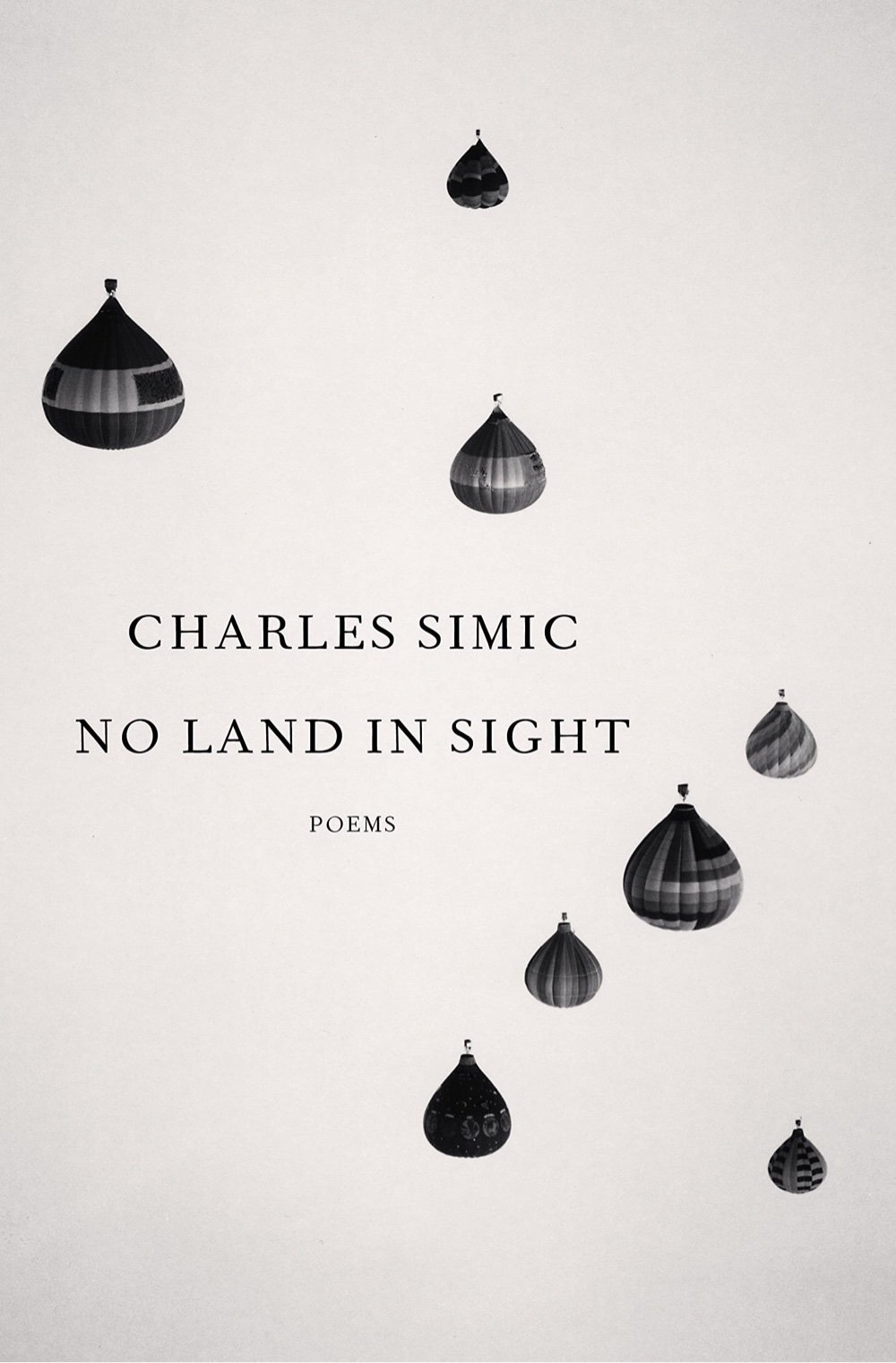
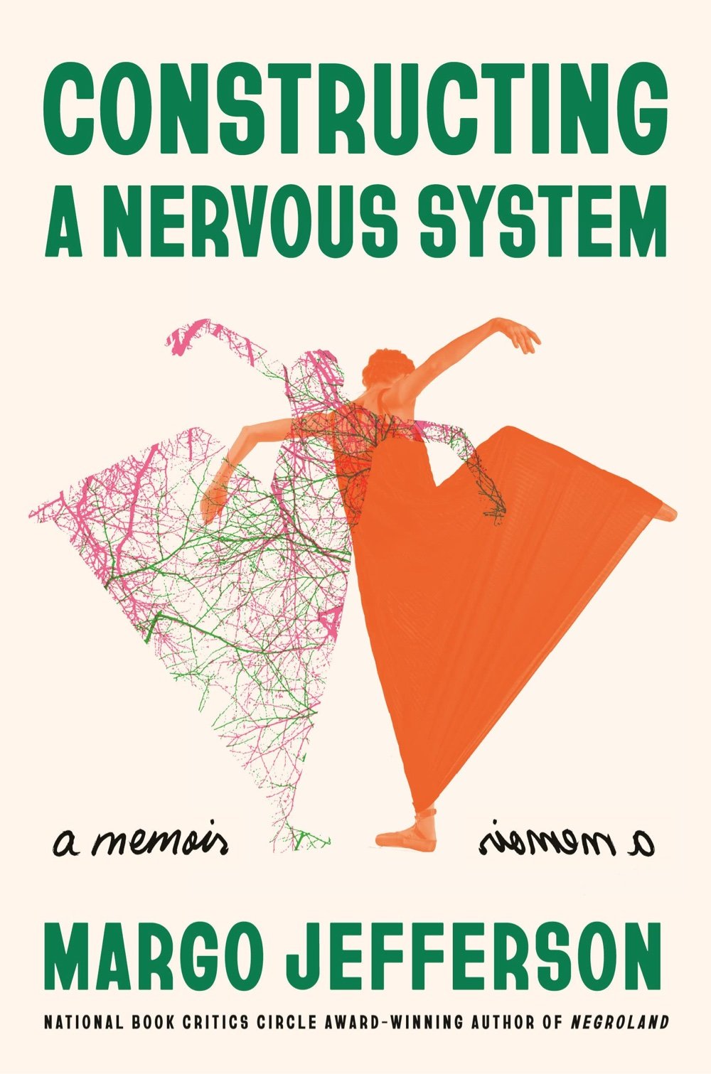
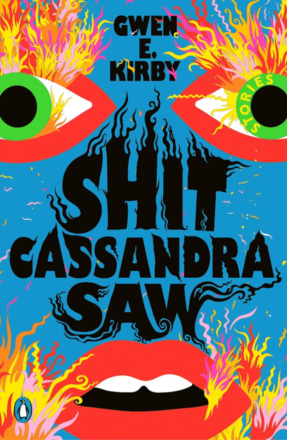
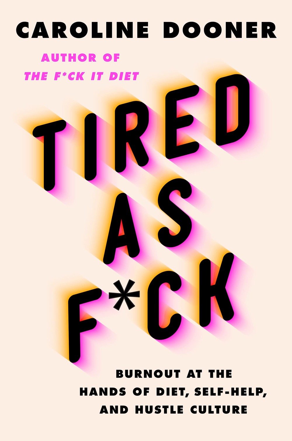
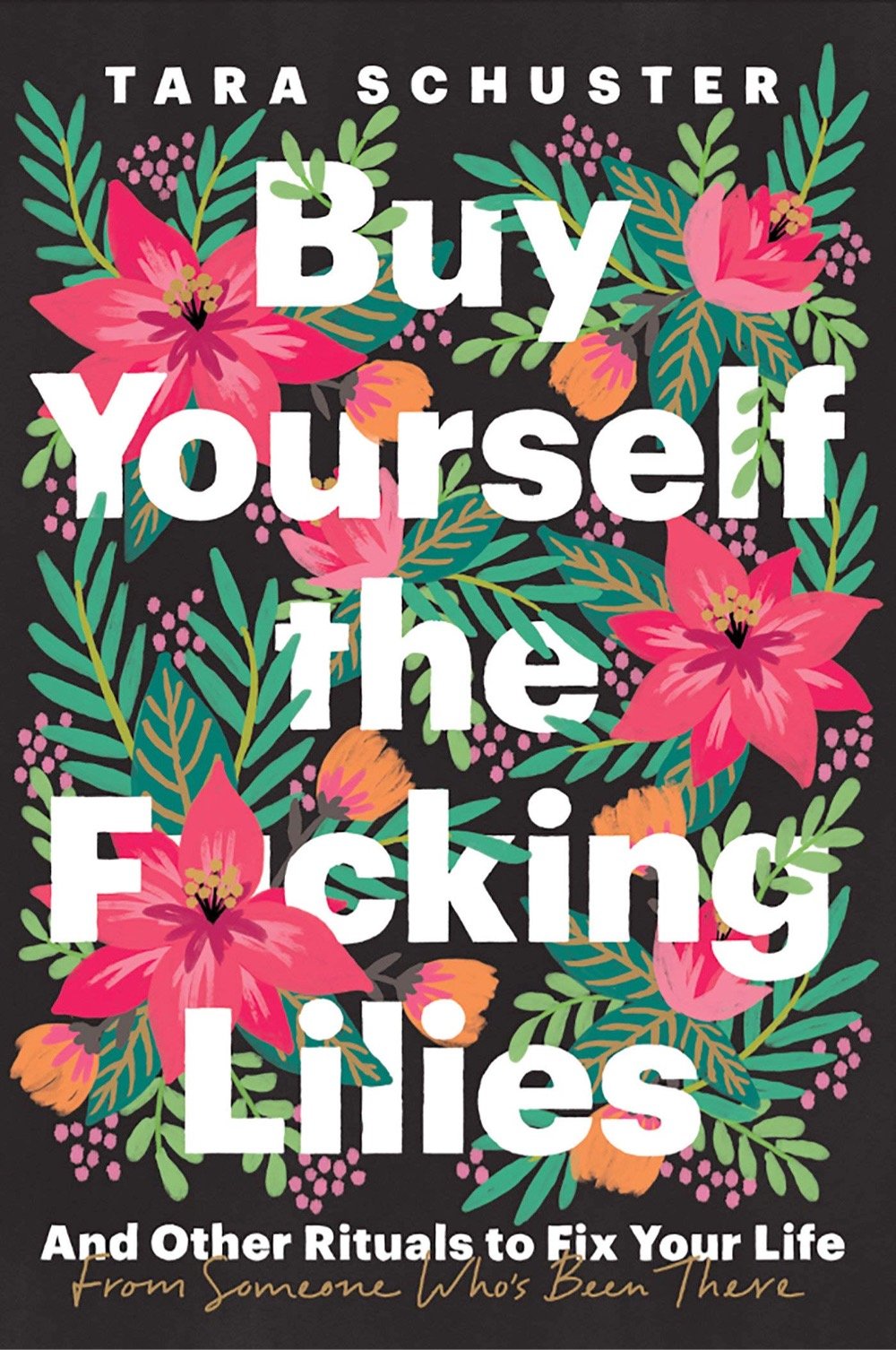
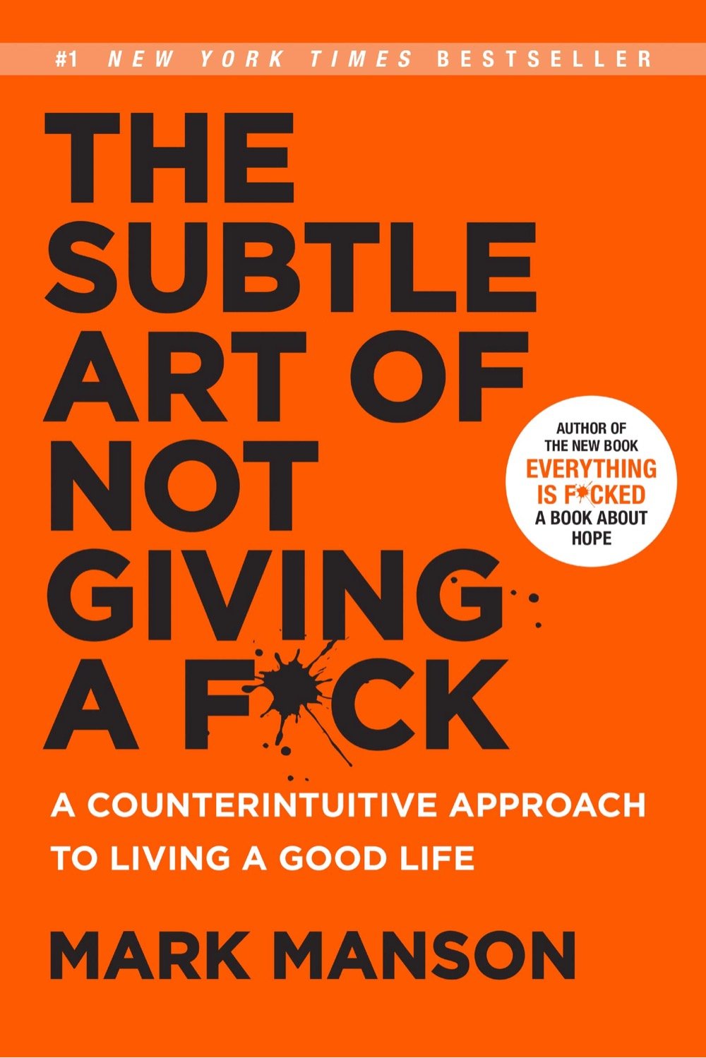
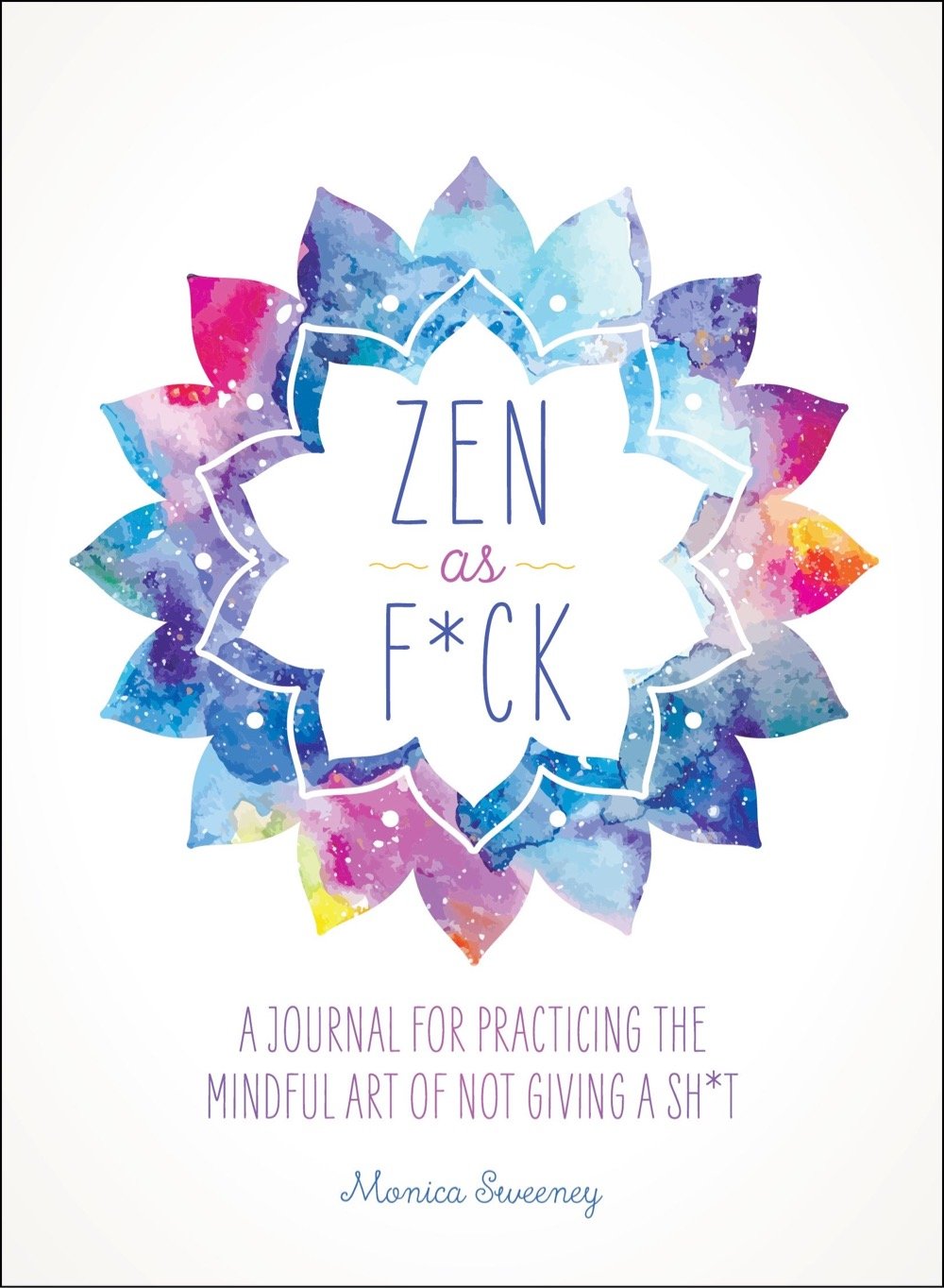
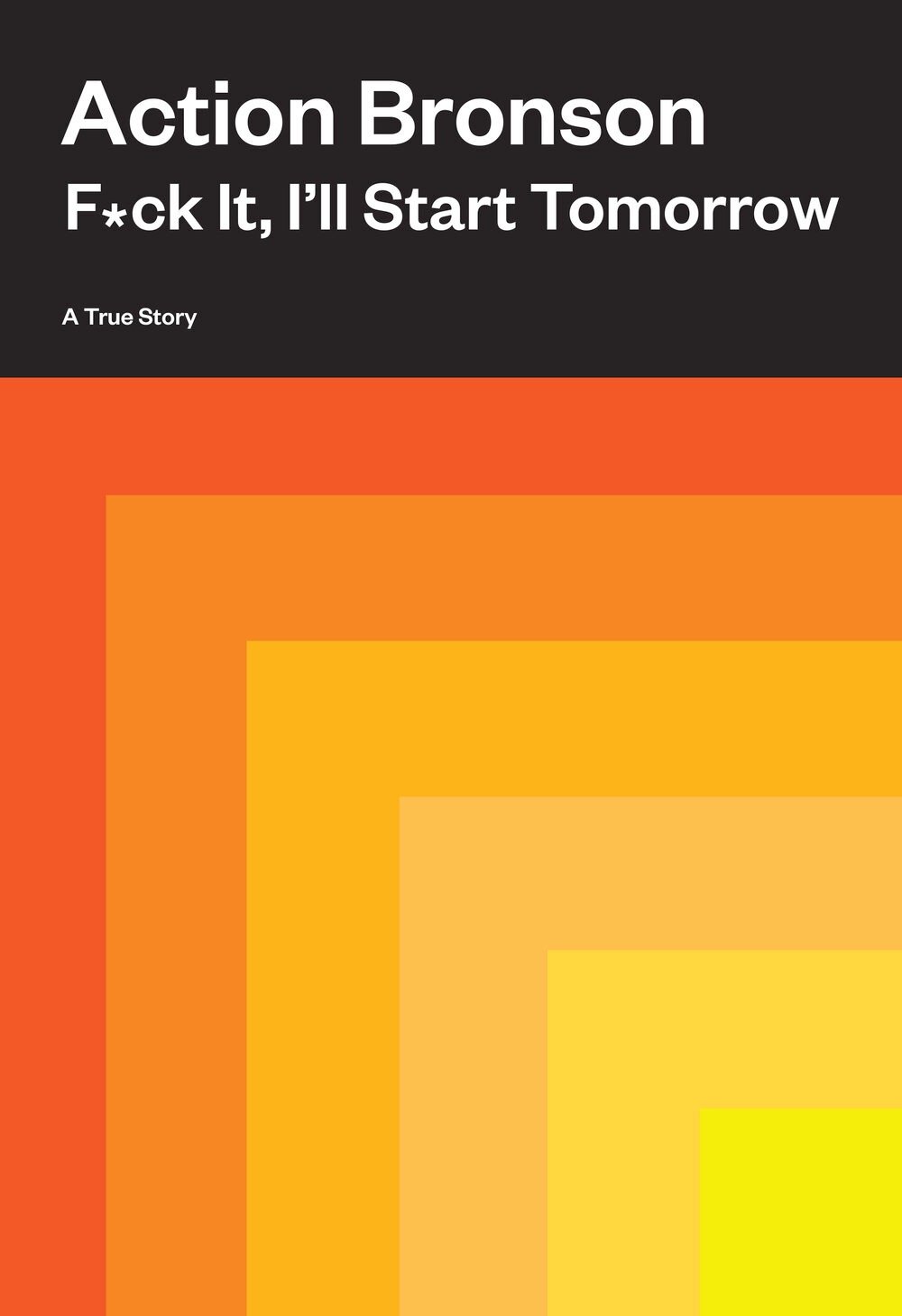
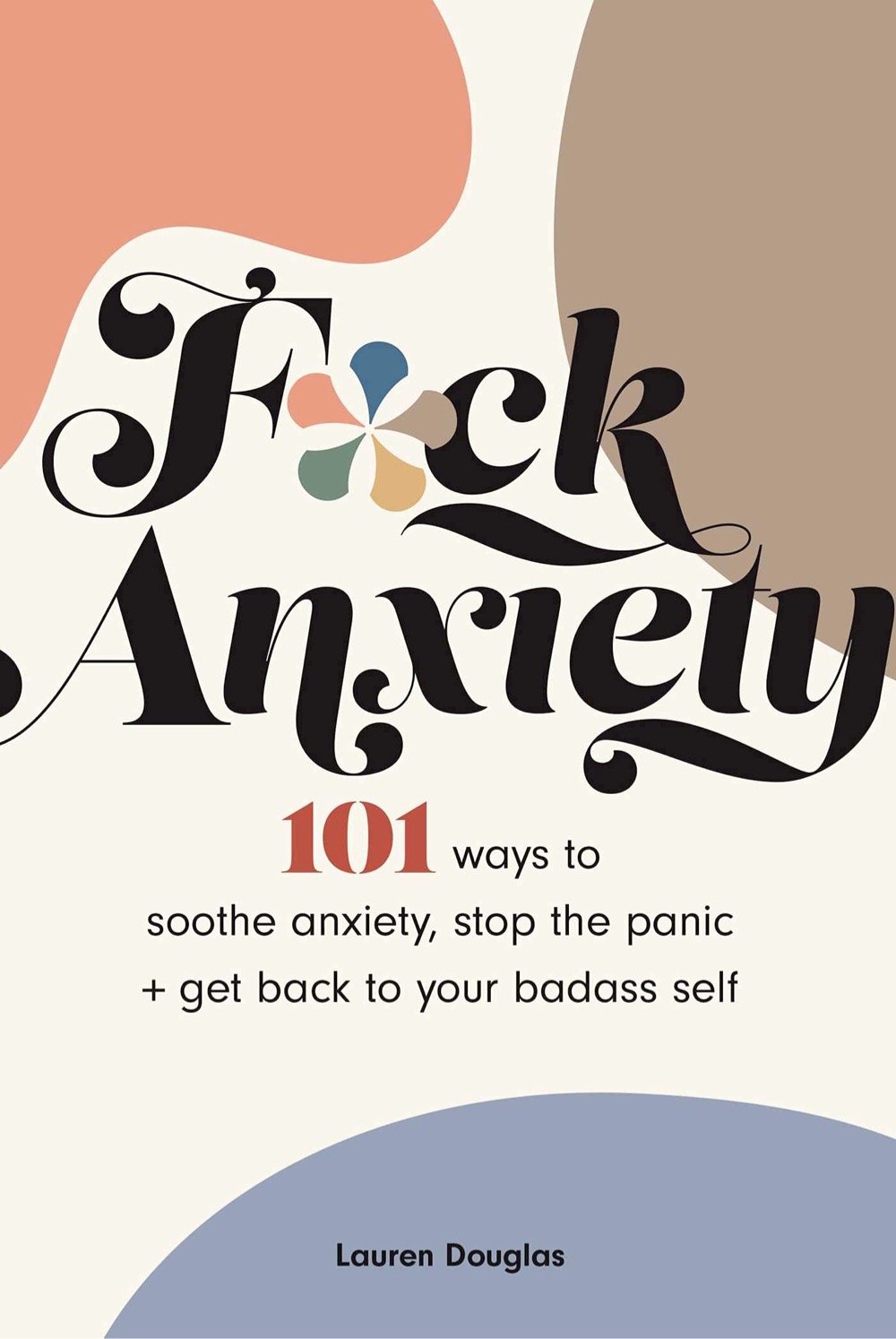
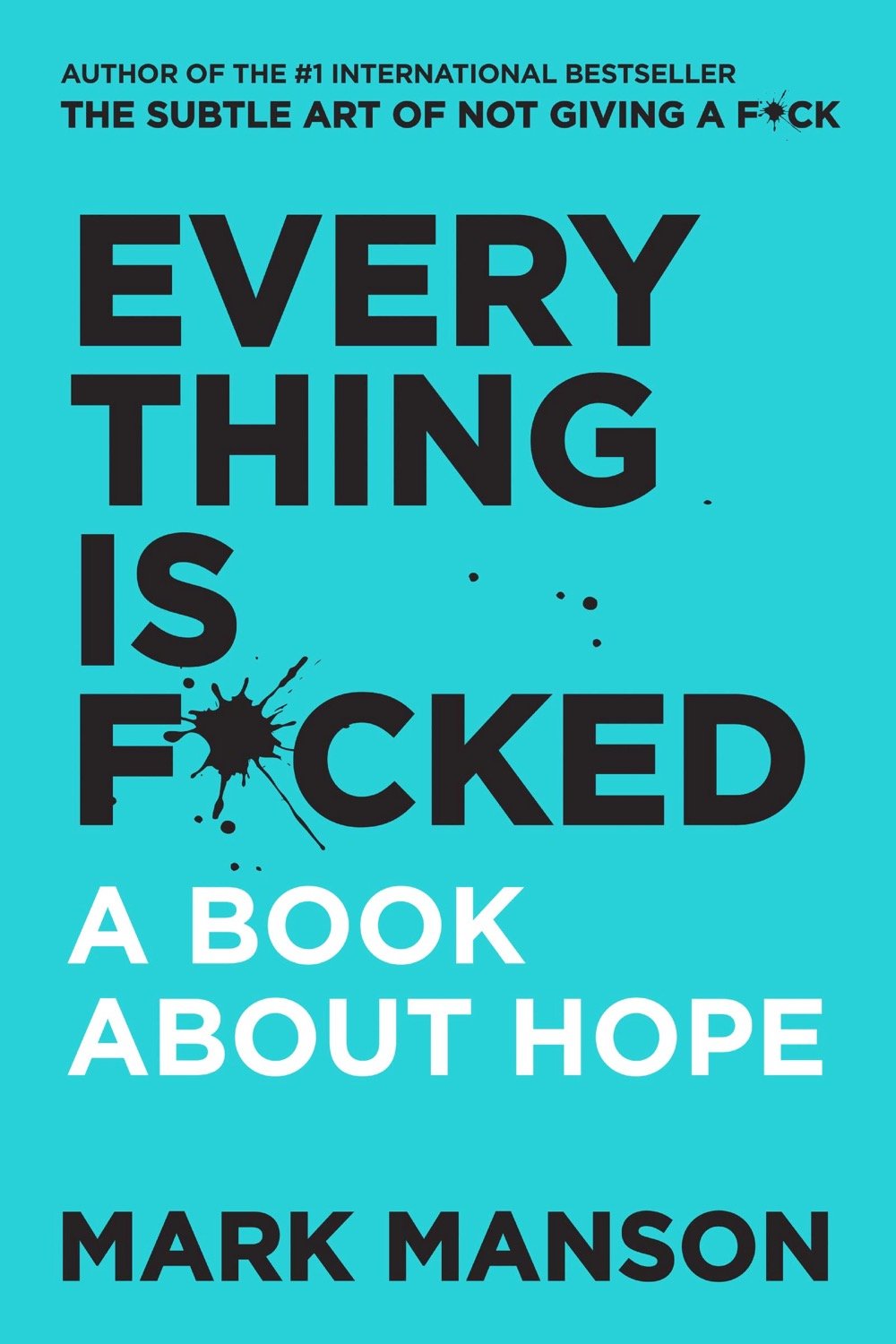
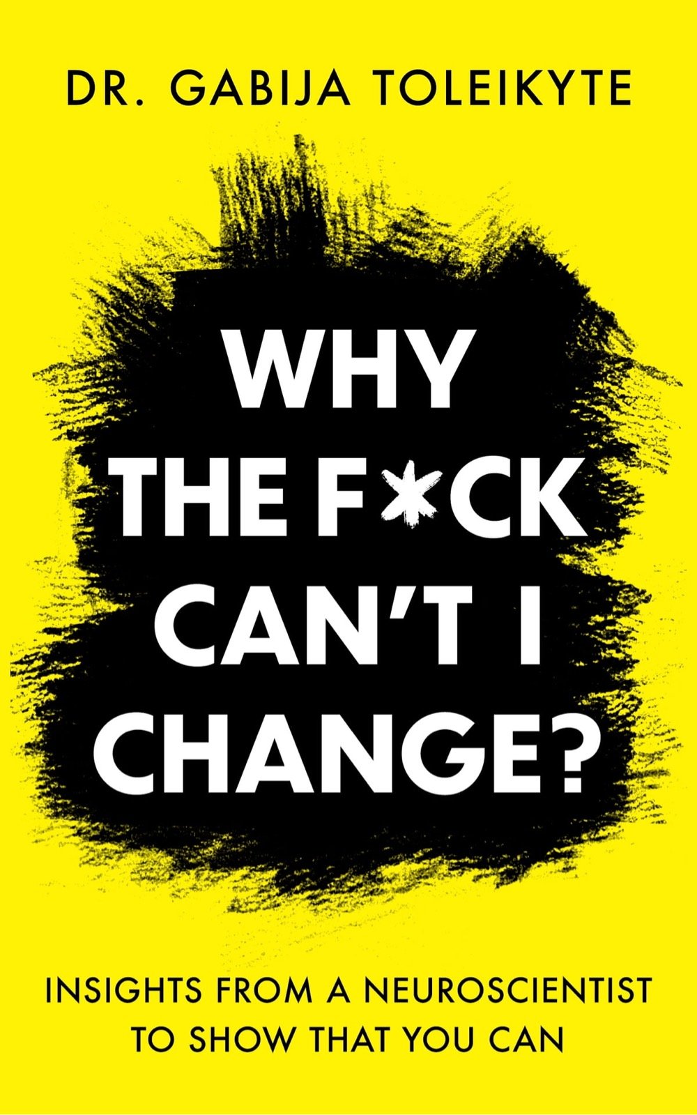
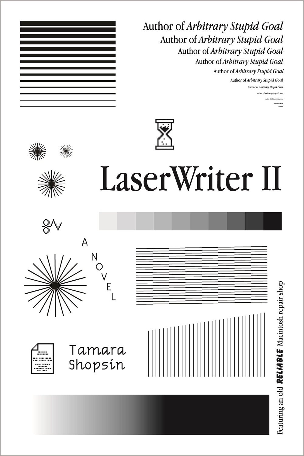
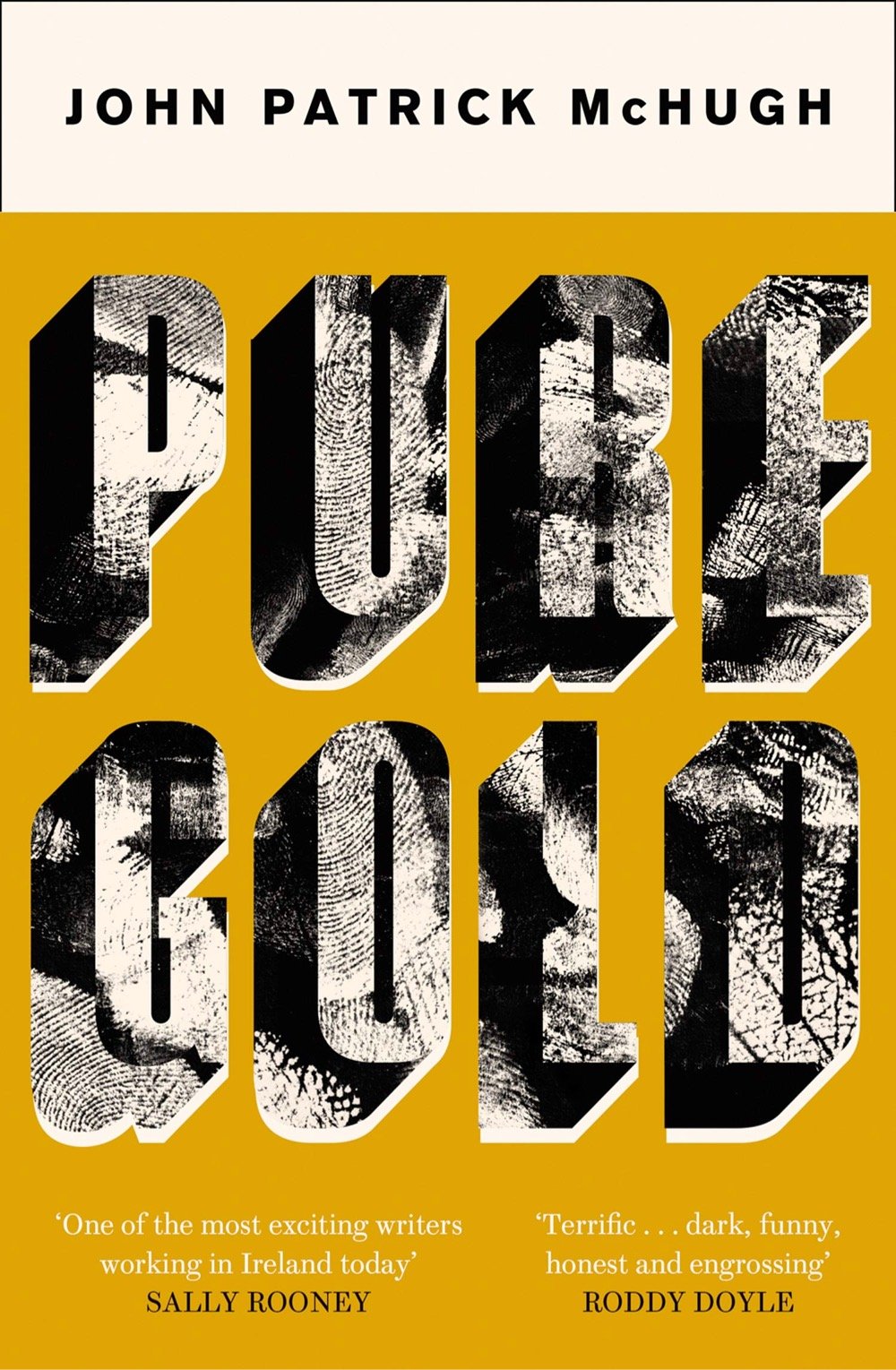
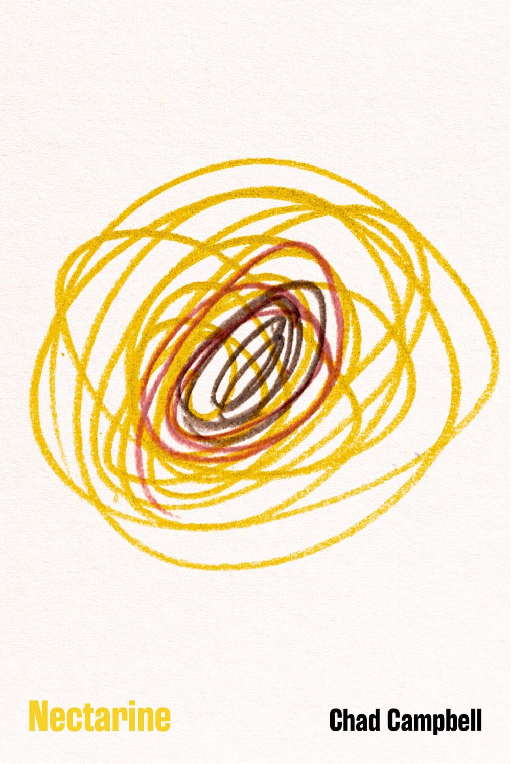
I only read ebooks these days and don’t make it to the one decent bookstore within a 60-minute drive from my house that often, but I still love love book covers. As I do every year, I’ve perused the end-of-year lists of the best covers and pulled out some favorites, which I’ve embedded above.
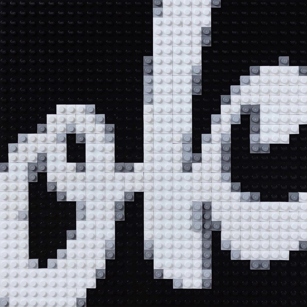
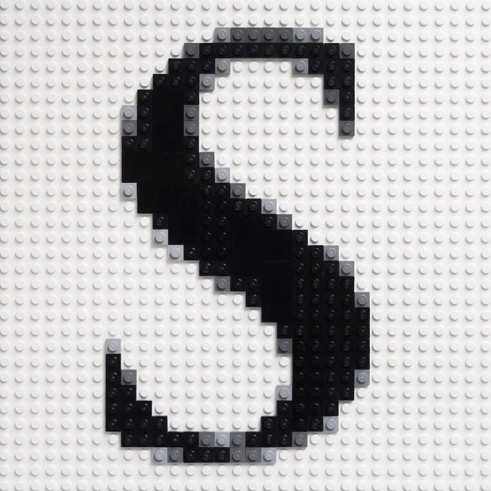
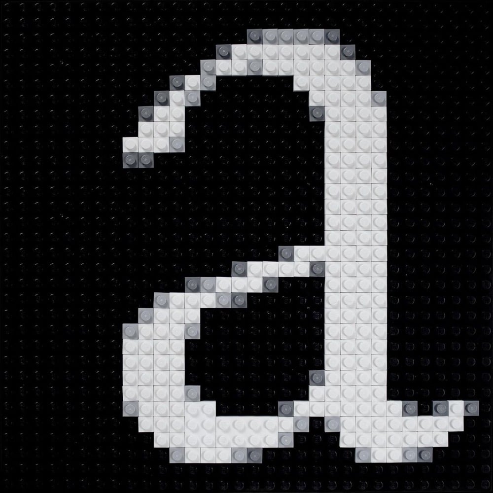
Craig Ward has been creating letterforms using Lego bricks and posting the results to Instagram. The ones I really love are the anti-aliased letters — reminds me of zooming all the way in to do detail work in Photoshop back when I was a web designer.
There is just something so satisfying about meticulously rendering digital artifacts in a physical medium like Lego.
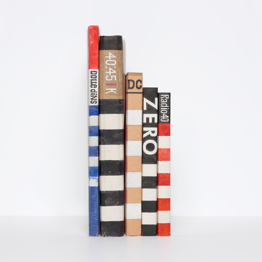
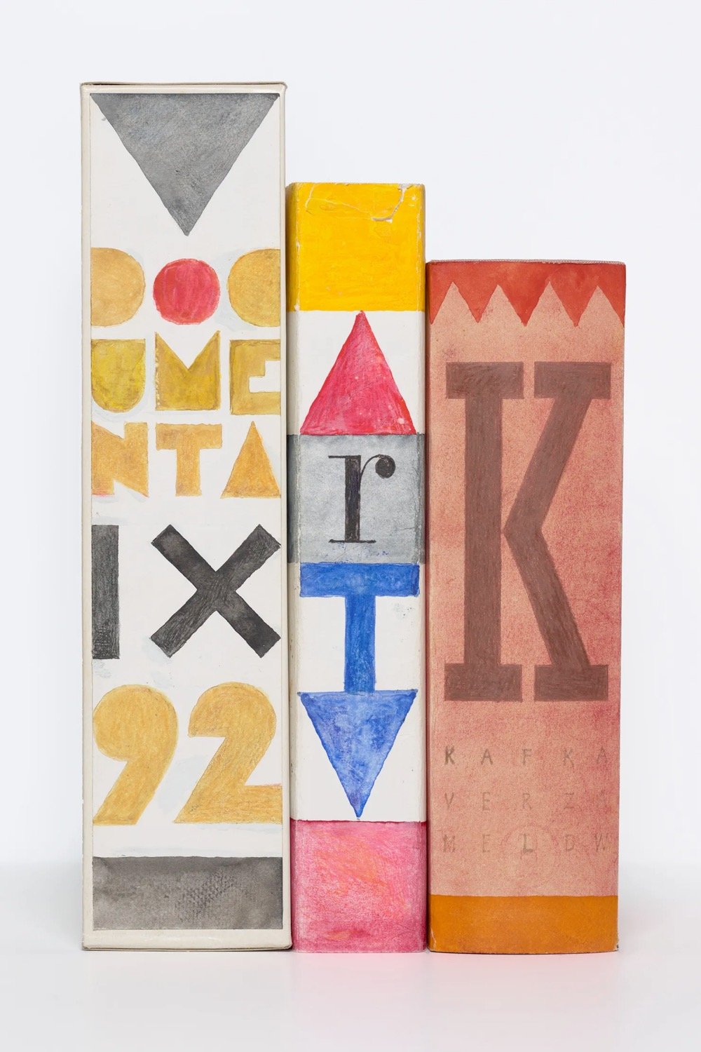
Over a period of 50 years, legendary Dutch designer Ootje Oxenaar drew replacement book cover spines for the books in his library. A selection of his spine replacements are collected in a book called Ootje Oxenaar Spines.
Although renowned for his designs for Dutch banknotes and postage stamps, Oxenaar was a prolific designer of book spines. This wasn’t done for commercial publishers, but for books in his own library. When he didn’t care for what he saw poking out from a shelf (or when he needed to procrastinate) he would make his own spine for a book. The result is a fantastic and fantastical mosaic made of tall-and-skinny strips, hand-lettered and drawn with great skill and great whimsy.
Well, I’m not sure this book could be any further up my alley; I mean:
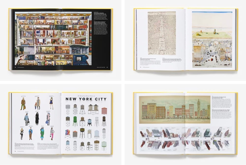
The life and legend of New York City, from the size of its skyscrapers to the ways of its inhabitants, is vividly captured in this lively collection of more than 250 maps, cross sections, flowcharts, tables, board games, cartoons and infographics, and other unique diagrams spanning 150 years. Superstars such as Saul Steinberg, Maira Kalman, Christoph Niemann, Roz Chast, and Milton Glaser butt up against the unsung heroes of the popular press in a book that is made not only for lovers of New York but also for anyone who enjoys or works with information design.
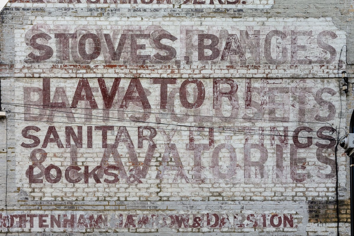
Study the buildings flanking London’s older streets closely and you’ll see one soon enough: an old painted sign that, once bright and eye-catching, is now faded into the masonry, the name of the business or product it promoted flaking and faint.
Such “ghost signs” are fixtures of older neighborhoods in many cities around the world, but the U.K. capital, which bustled with competing commercial enterprises in the 19th and early 20th centuries, is unusually well-supplied with them. Ghost signs aren’t always easy to spot, but for sharp-eyed passersby and enthusiasts of urban history, they add an extra dimension to London’s appearance, their florid Victorian or cheerful art deco script and images a spectral reminder that once, not that long ago, these were somebody else’s streets.
London’s ghost signs are merely a fraction of the signage that used to greet 19th city dwellers, an era when cheap paper and a movement towards universal literacy made cities unusually alive with letters. But they are the special project of a new book by Sam Roberts and Roy Reed. From the book’s website:
Ghost signs are fascinating pieces of urban archaeology. Imposing yet hidden in plain sight, these faded advertisements are London’s history written on to the contemporary cityscape. They reveal fascinating stories of everyday life in the capital and each sign has its own tale to tell - not just of the business it represents and the people behind it, but of its own improbably survival.
A feast of history, typography and the urban environment, Ghost Signs: A London Story showcases London’s most impressive and historically significant faded painted signs, located, photographed and presented with archival andother contextual images.
Introduced by Wayne Hemingway MBE, the opening section shares insights into topics such as production techniques, economics and preservation. The themed chapters take on subjects including building, clothing, entertaining, branding and, ultimately, burying the city.
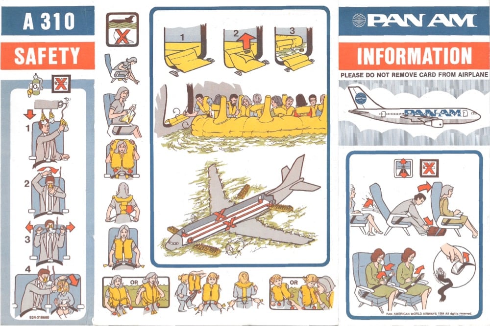
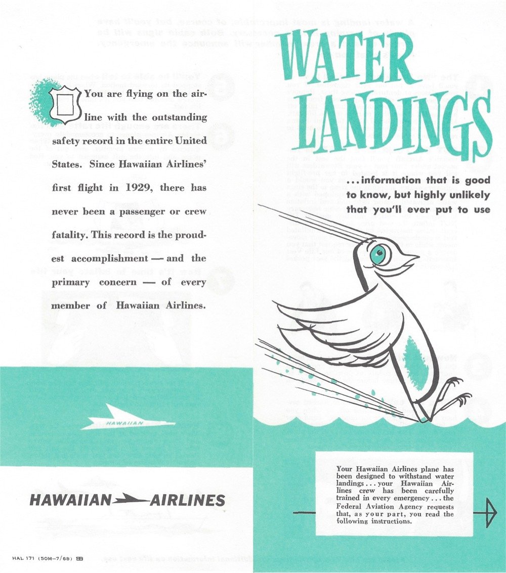
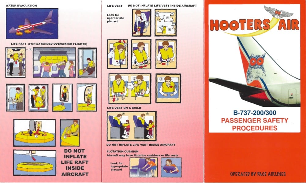
Seatback Safety is home to a collection of dozens of seatback safety cards from airlines like Pan Am, United, Continental, Emirates, British Airways, JetBlue, and Air France.
Here’s the rationale for the site:
As a professional designer, it can be valuable to contemplate how practitioners solved the same problem over time with different fashions and different tools.
Seatback Safety cards have been used since the dawn of commercial flight. While their pamphlet form has remained largely the same for a century, they have significantly evolved in ways that reflected broader social and technological trends.
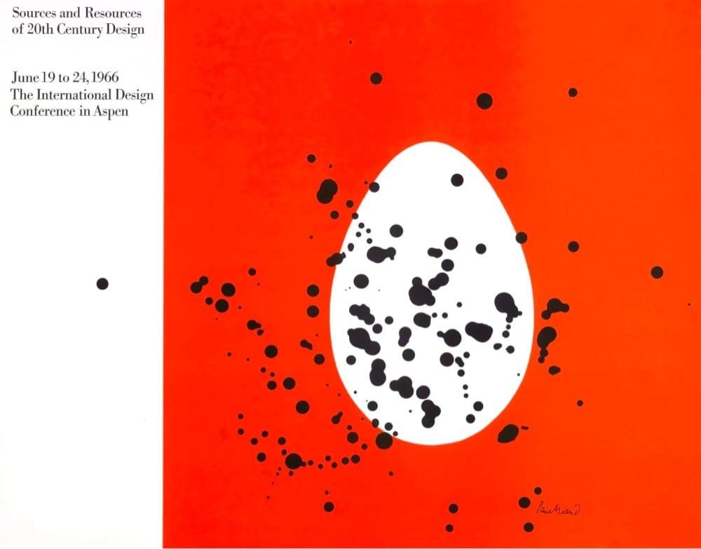
Once upon a time, Jayme Odgers was the assistant to Paul Rand, the legendary Modernist designer who designed some of corporate America’s most iconic logos (IBM, Westinghouse, NeXT, UPS, ABC). Odgers recently shared some stories of what it was like to work with Rand.
One of the most fascinating aspects of Paul Rand’s thinking is that he didn’t believe in endlessly coming up with idea after idea, exhausting all possibilities, which typically eats up one-third of a design budget. He believed ideas are virtually endless-where does one stop anyway? He told me all you need is one good idea — and not all ideas have to be award-winners. A graphic designer needs only to be a professional and offer a professional solution. Easier said than done.
On smaller projects like the Bollingen book jacket and the Aspen poster, Paul simply knocked them out in whiz-bang fashion. With larger projects like creating a logo/mark or branding system, Paul would take that “one decent idea,” then spend the next six months and 100% of the budget refining that single idea to its most perfect visual form and content. There were no sketches, no meetings with the client, no midway reviews, just the most serious investigation, development and design resolution of an idea imaginable.
These stories verge on the hagiographic, but they’re still fun & instructive to read. And the idea that obsessives are difficult to work for comes through anyway. (via @drudesign)
As part of an online course on fashion and design, MoMA visited the Savile Row tailors Anderson & Sheppard to learn how they go about making one of their bespoke suits.
Behind a drawn curtain, a master cutter takes an initial series of 27 measurements: 20 for the jacket, 7 for the trousers. From these measurements, the cutter fashions a pattern in heavy brown paper. At the cutter’s table, the cloth is cut in using heavy shears, and the many pieces of fabric are rolled for each garment into tiny packages, which await the tailors.


Stay Connected