kottke.org posts about design
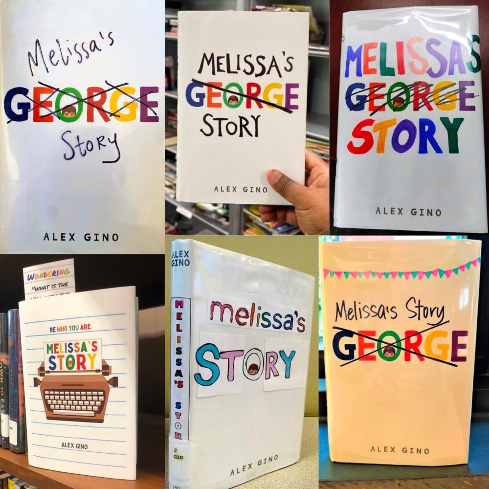
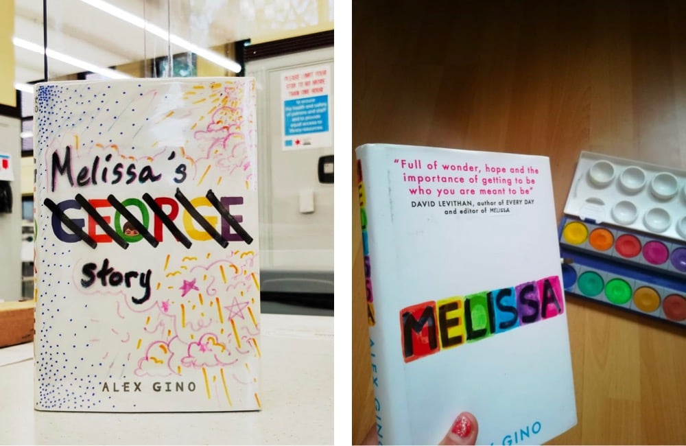
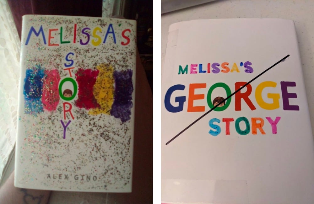
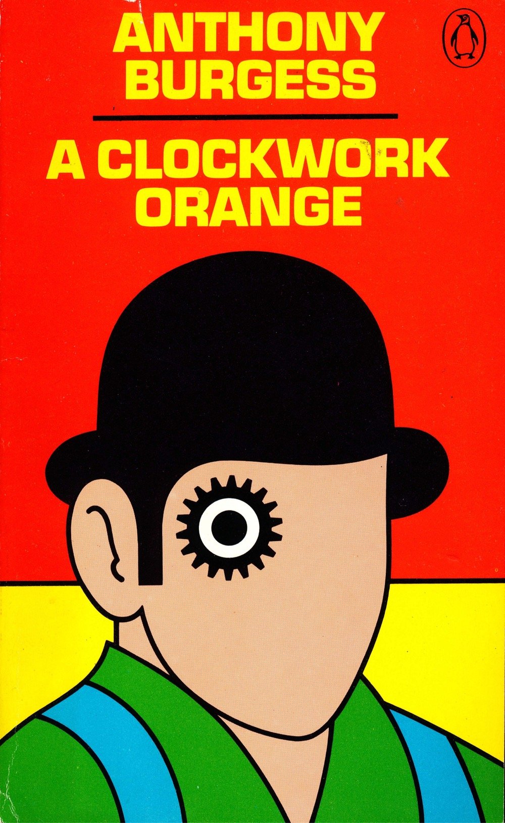
In 2015, Alex Gino published George, a children’s novel about a trans girl named Melissa — George was the character’s former name. Since its publication, many of the book’s fans have grown to dislike the title, saying that it elevated the deadname of the character instead of her actual name. Earlier this year, Gino and their publishing company announced that the title of the book is officially changing to Melissa.
No matter how many people have come to know it as George, we felt it was important to fix the title. What we call people matters and we all deserve to be referred to in ways that feel good to us. Calling the book Melissa is a way to respect her, as well as all transgender people. The text inside won’t change, so the name George will still appear to reflect the character’s growth within the novel, but Melissa will be the first name readers will know her by.
But even before that, readers began making their own modifications to the cover with Sharpies, crayons, colored pencils, and even entire dust jackets. On their blog, Gino explained why the book was called George in the first place and shared some of the amazing art that fans made to correct the title.
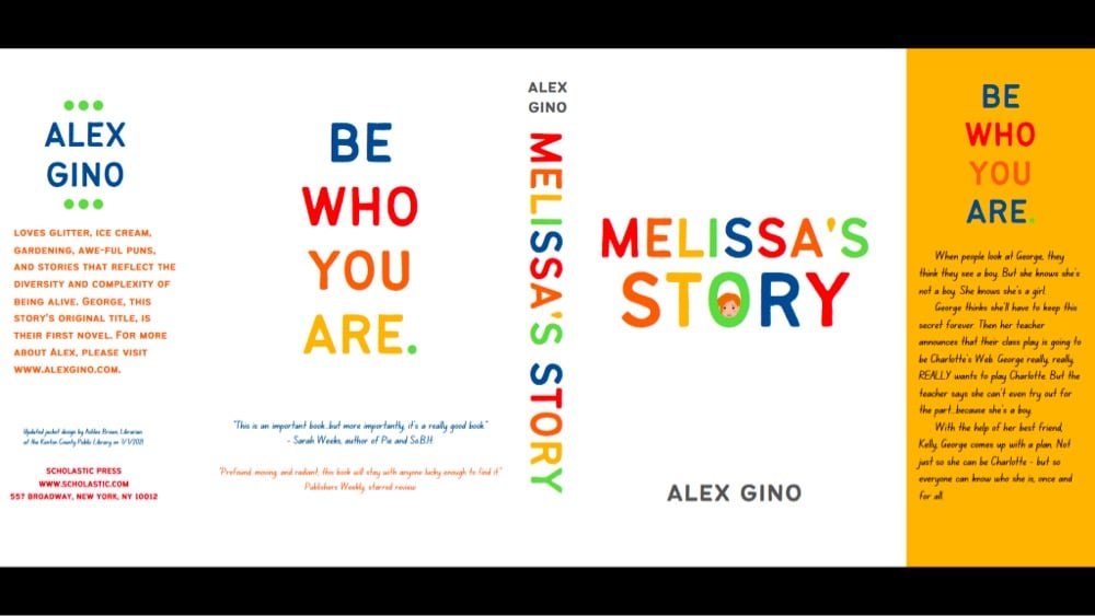
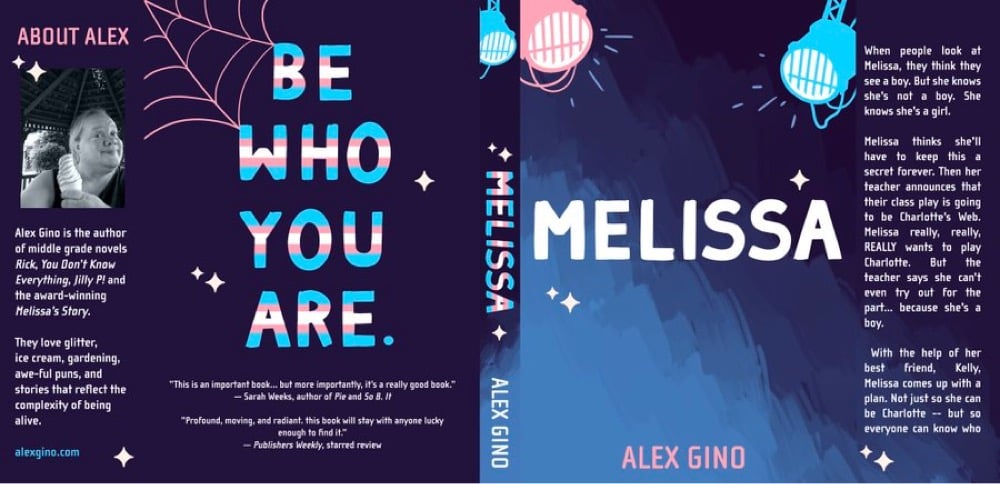
Melissa will be out in April and is available for preorder now. (thx, caroline)
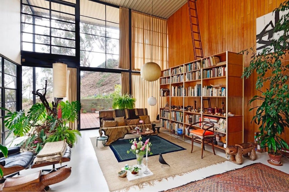
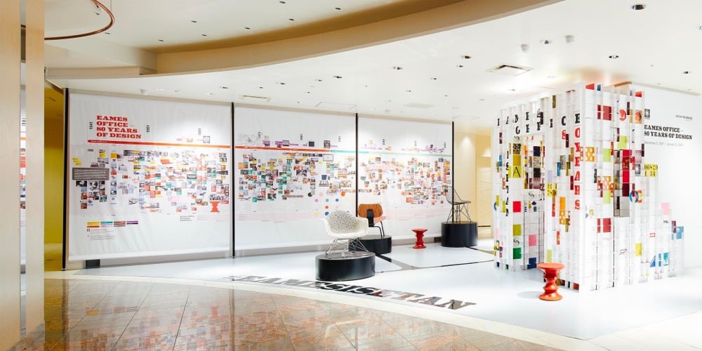
Eames Office is celebrating the 80th anniversary of its founding by legendary designers Charles & Ray Eames with an exhibition at the Istetan the Space gallery in Japan. Eames Demetrios, the grandson of Charles & Ray, shared a selection of personal highlights from the exhibition with Dezeen. (via moss & fog)
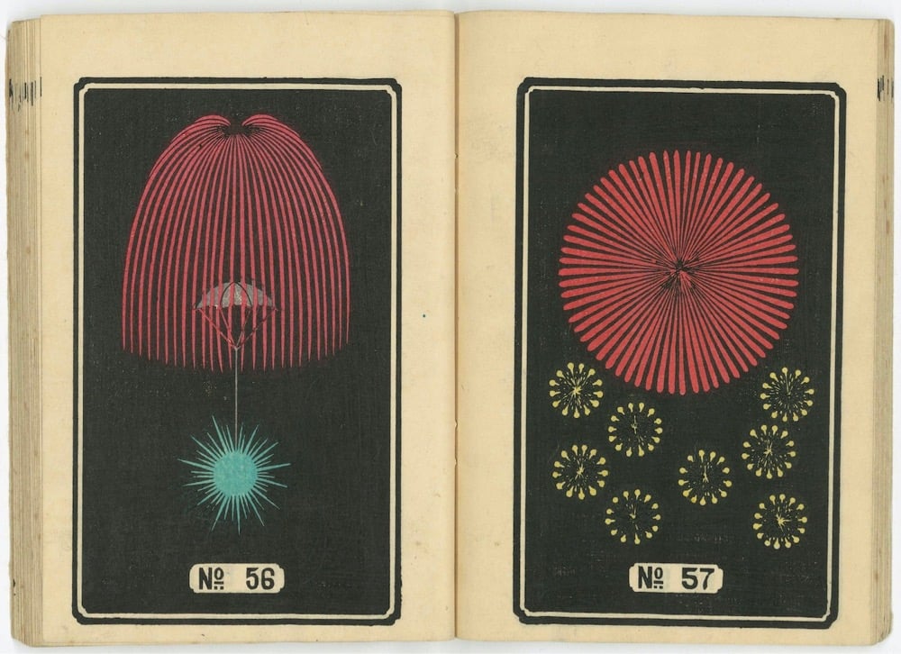
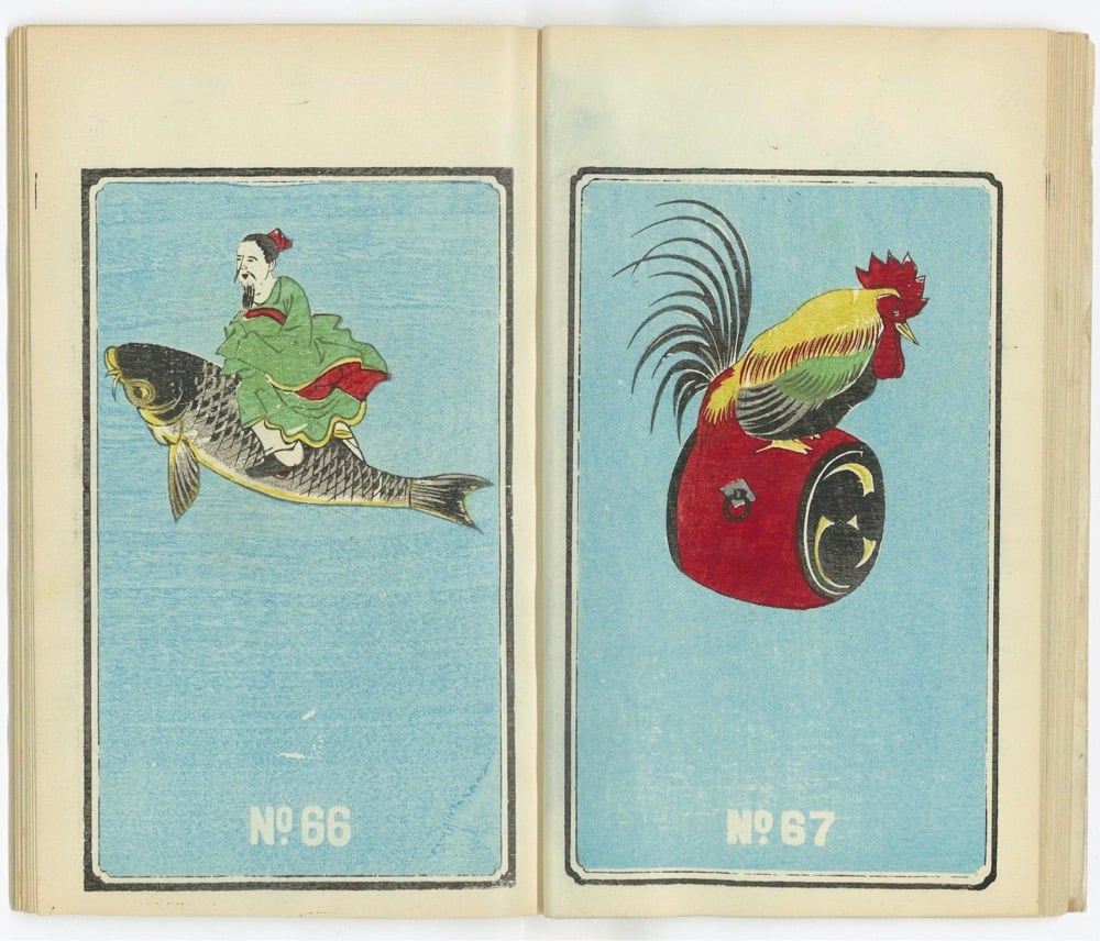
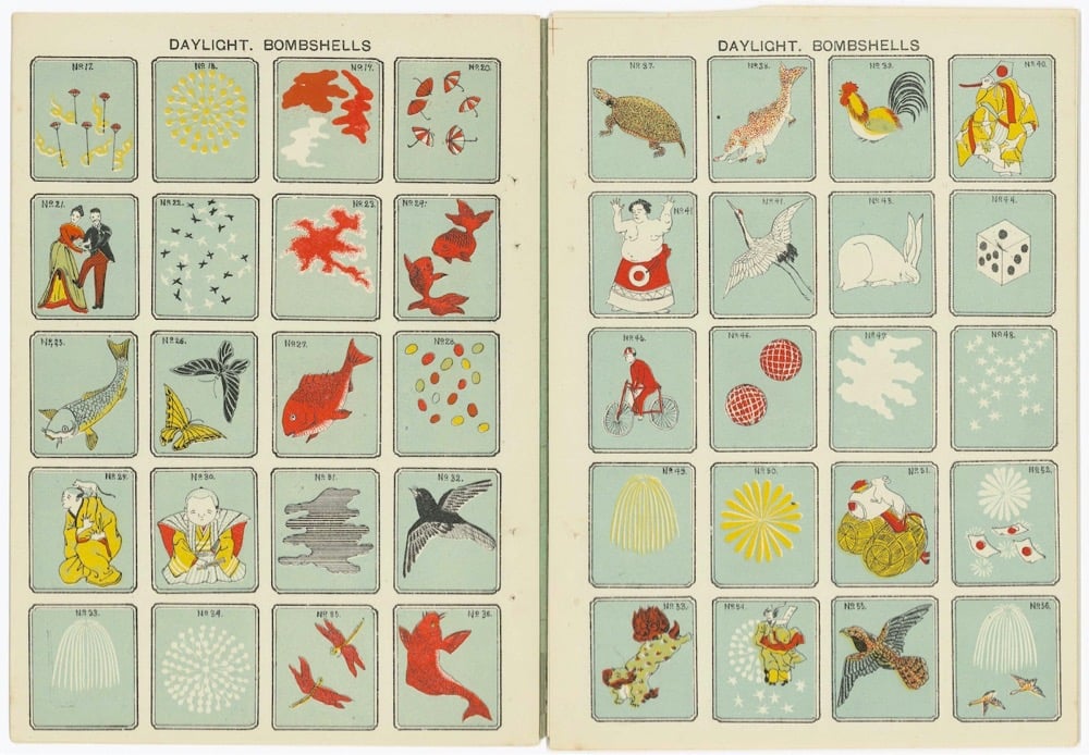
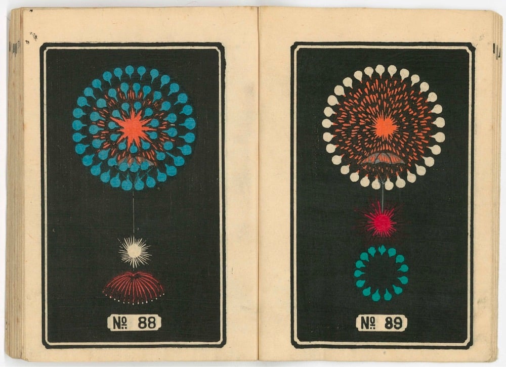
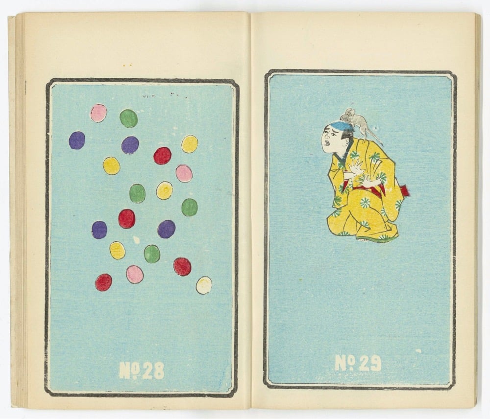
From the excellent Public Domain Review, a collection of illustrations from Japanese fireworks catalogs published in the 1880s.
The spinning saxon, flying pigeons, polka batteries, jumping jacks and firecrackers, squibs and salutes, Aztec Fountains, Bengal Lights, and Egyptian Circlets, bangers or bungers, cakes, crossettes, candles, and a Japanese design known as kamuro (boys haircut), which looks like a bobbed wig teased out across the stratosphere… the language of fireworks has a richness that hints at the explosive payload it references. And yet, anyone who has ever held their camera up to the blazing sky knows that a brilliant firework show can rarely be captured to any satisfying degree. Perhaps this is what makes a nineteenth-century series of catalogue advertisements for Japanese fireworks so mesmerizing: denied the expectations of photorealism, these images are free to evoke a unique sense of visual wonder.
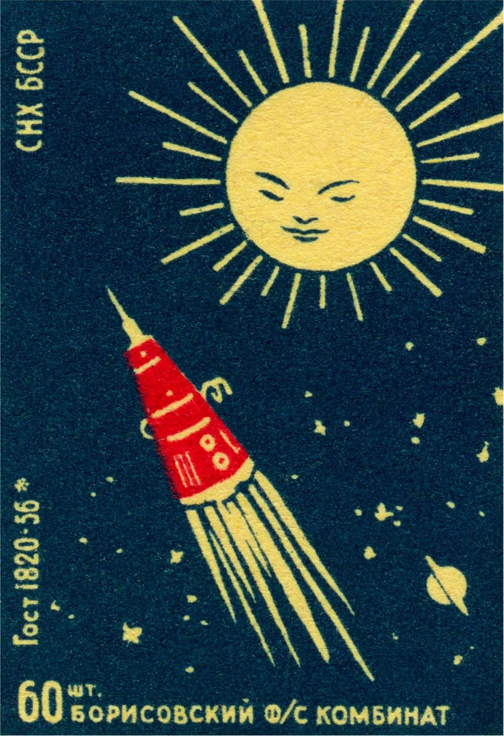
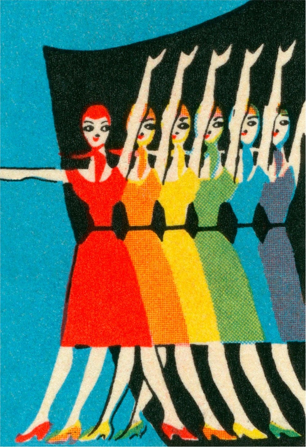
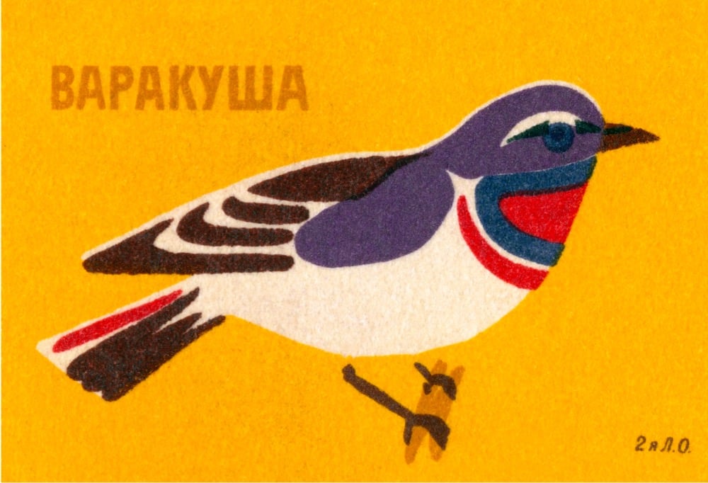
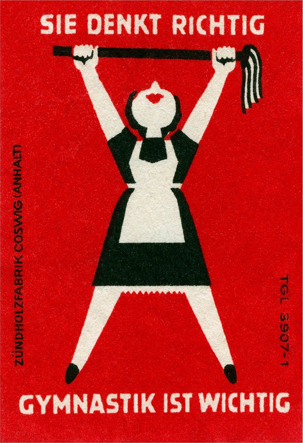
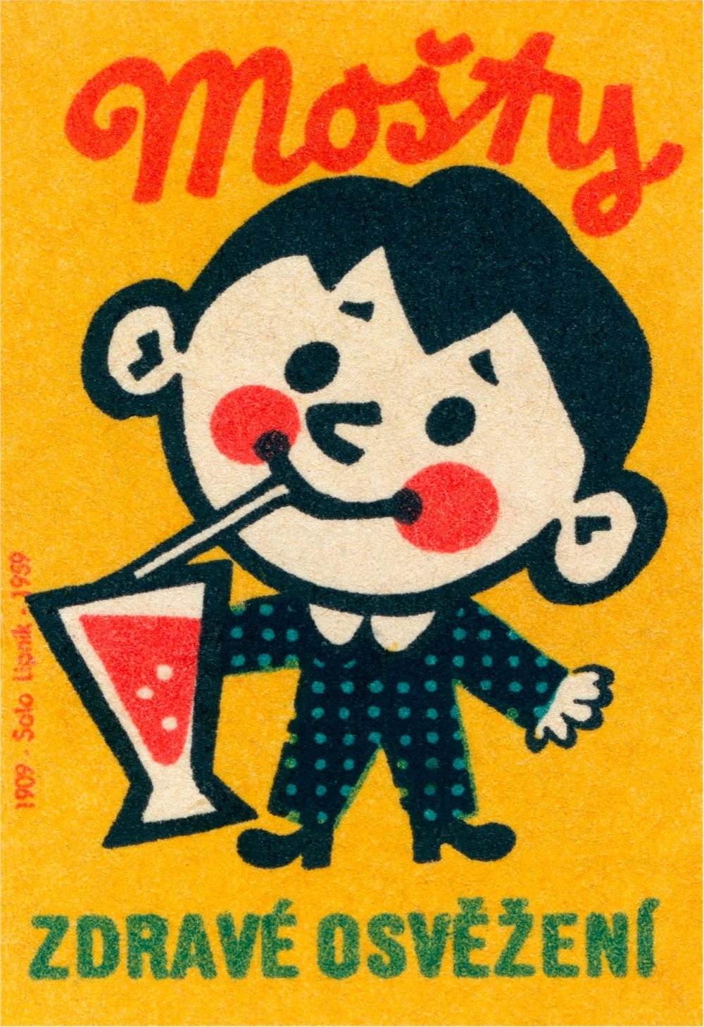
Look at how beautiful these mid-century matchbox labels are — they’re from Eastern Bloc countries (Poland, Czechoslovakia, Russia, etc.) from the 1950s to the 1980s. These are part of a collection by Jane McDevitt. Prints of some of these labels are available and there’s also a book.
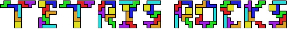
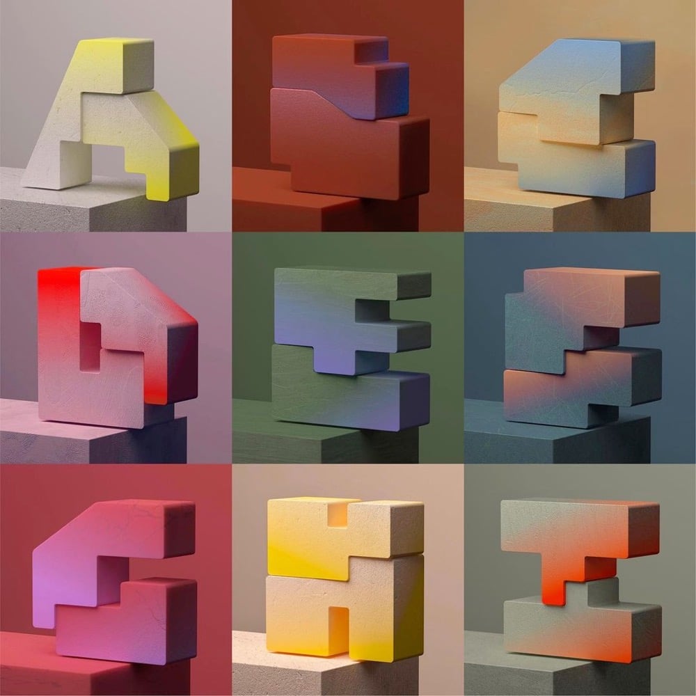
The father-son duo of Martin and Erik Demaine make typefaces that are algorithmic, mathematical, or puzzle-like in nature. For instance, here’s their Tetris font, where each letter is made up of the seven possible Tetris pieces:
Or their newest one, Everything, where each letter can be folded into any other letter:
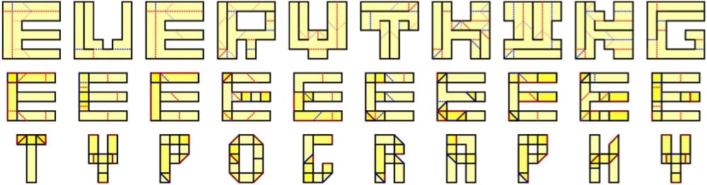
Everything to everything. This typeface illustrates how to fold any letter into any other letter, or more precisely, how to fold a piece of paper in the shape of any letter into the shape of any other letter. This lets you write one message inside another in a couple of ways. On the one hand, you could present the 6x6 crease patterns whose silhouettes look like one message (first text), and folding them reveals another message (second text). On the other hand, you could present the folded forms (as physical objects) whose silhouettes look like one message (second text), and unfolding them reveals another message (first text).
From a recent-ish profile of the Demaines and their typefaces in the NY Times:
In a 2015 paper, “Fun With Fonts: Algorithmic Typography,” the Demaines explained their motivations: “Scientists use fonts every day to express their research through the written word. But what if the font itself communicated (the spirit of) the research? What if the way text is written, and not just the text itself, engages the reader in the science?”
Inspired by theorems or open problems, the fonts — and the messages they compose — can usually be read only after solving the related puzzle or series of puzzles.
You can check out the rest of their typefaces on their website — they include fonts with infinitely tiling letters, Sudoku puzzle fonts, and a font whose letters are made up of shapes that can be packed into a 6x6 square. So fun!
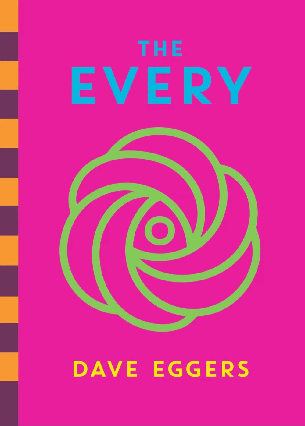
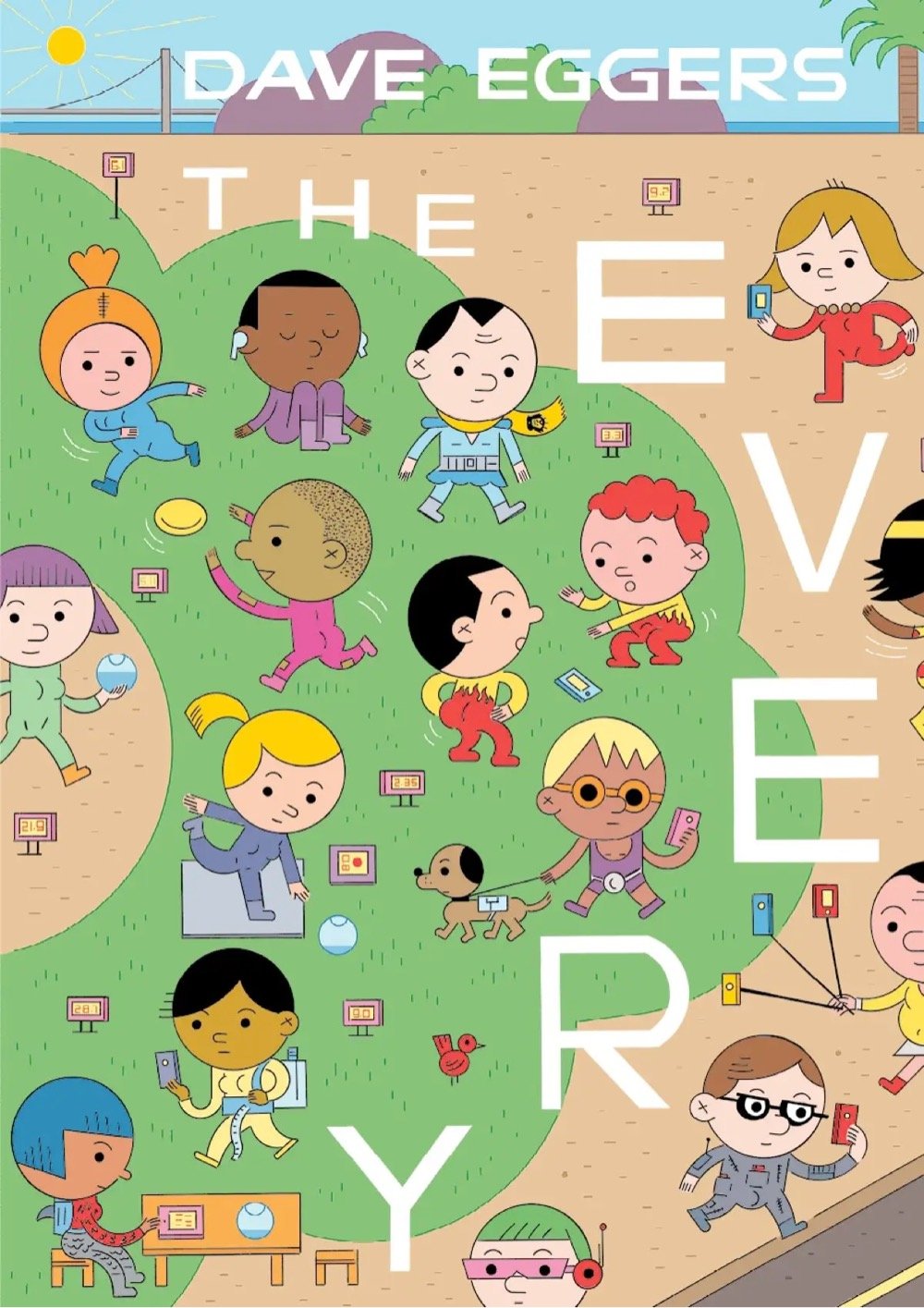
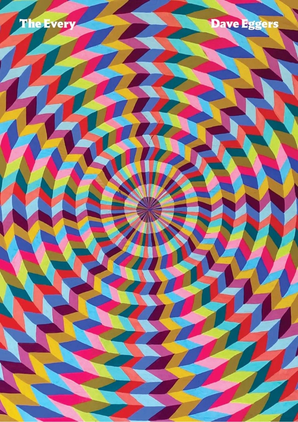
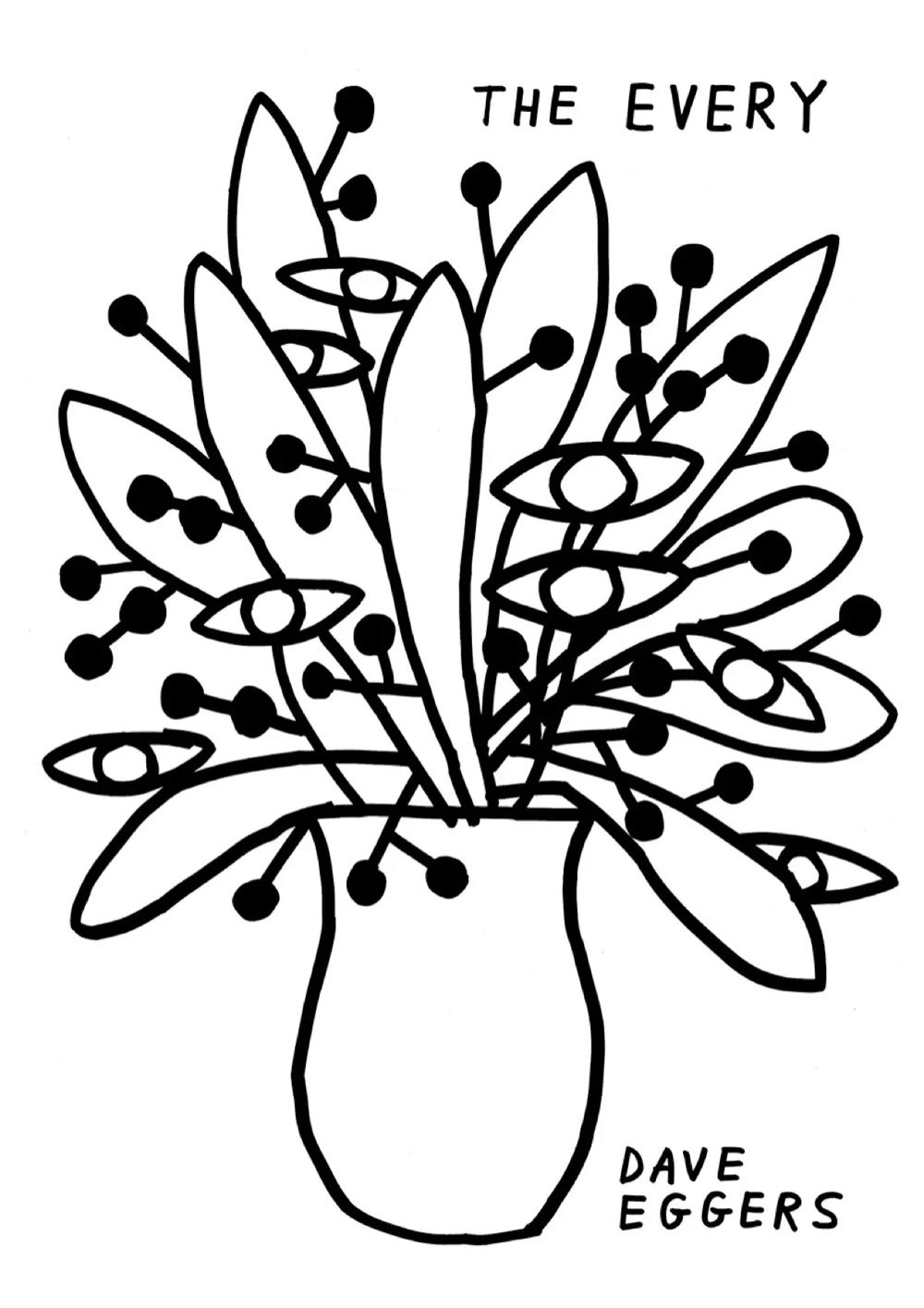
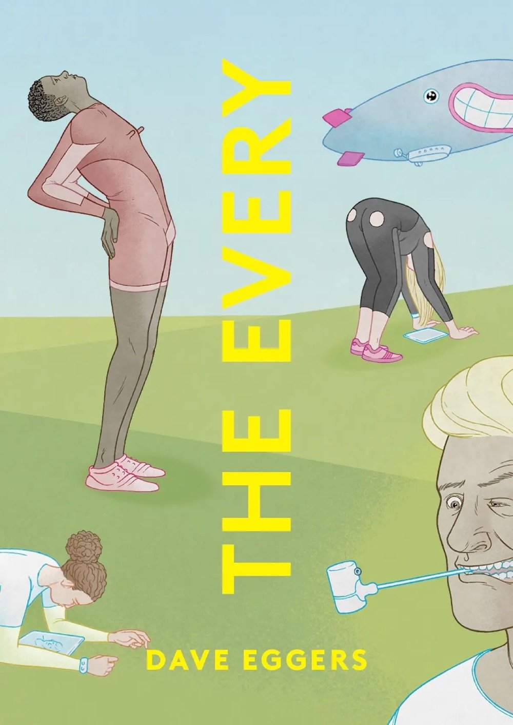
For his new book, The Every, Dave Eggers and art director Sunra Thompson are doing 32 separate covers, with more to come “in perpetuity”.
Never one to shy away from pushing boundaries, Eggers teamed up with art director Sunra Thompson for the project, who discovered that the dust jacket printer they were using could run several cover designs on one sheet of paper at once, providing the means to print dozens of different versions at the same time. Thompson decided to exploit this printing feature, enlisting a boatload of artists to design a completely new version of The Every cover.
The hardcover version of the book featuring the 32+ designs will only be available on the McSweeney’s website and in independent bookstores, which doesn’t seem to include Bookshop.org. Amazon, says Eggers, can go pound sand.
“I don’t like bullies,” Eggers wrote in an email. “Amazon has been kicking sand in the face of independent bookstores for decades now.”
The novel follows a former forest ranger and tech skeptic, Delaney Wells, as she tries to take down a dangerous monopoly from the inside: a company called The Every, formed when the world’s most powerful e-commerce site merged with the biggest social media company/search engine.
“One of the themes of the book is the power of monopolies to dictate our choices, so it seemed a good opportunity to push back a bit against the monopoly, Amazon, that currently rules the book world,” he said. “So we started looking into how feasible it would be to make the hardcover available only through independent bookstores. Turns out it is very, very hard.”
When the TV watching experience moved from checking “your local listings” or TV Guide and surfing channels with your remote to scrolling through visual onscreen menus on streaming services, key art was born. Key art graphics are the images that identify shows in streaming menus — ok here, it’s just easier to show you:
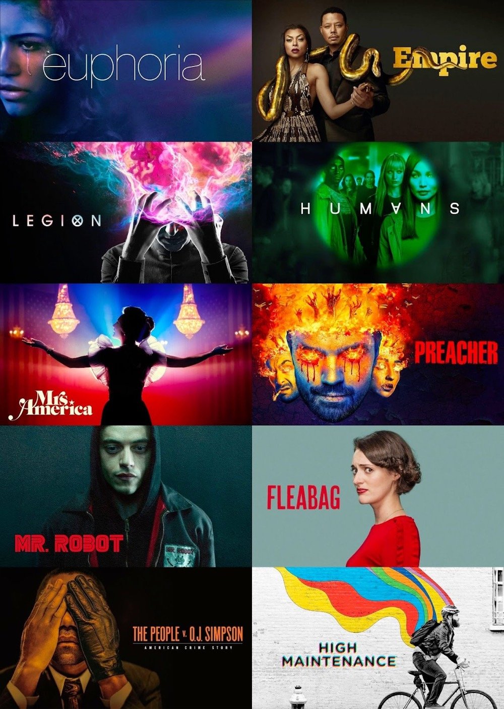
Like the best movie posters and book covers, these images are bold and simple promotional signifiers of a larger piece of media, but as Rex Sorgatz argues in today’s edition of Why is this interesting?, key art is its own thing with its own set of constraints and challenges.
Good key art is so evocative, so iconic, that it becomes the image that springs to mind whenever you think about a show:
One neglected characteristic ties all these images together: They are all horizontal.
It sounds trivial, but going wide helped differentiate TV key art as its own medium, distinct from book covers and movie posters. And because these images appear on streaming platforms, they are unencumbered by other marketing copy, like taglines, cast and credits, and multifarious blurbs.
There is a simple purity to key art.
Sorgatz maintains an archive of his favorite key art here.
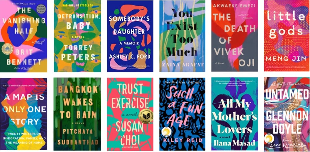
From Literary Hub, The 25 Most Iconic Book Covers in History. Some good ones shared in the comments as well. (thx, serge)
I love these colorfully chromed-out logos designed by Martin Naumann — you can find dozens of them on his Instagram and at Behance. You can also buy an icon set of these logos for your phone.
As he explained on Behance, Naumann’s process for designing these is surprisingly simple — he zooms way in on RGB noise to generate a background gradient, blurs the logo, and then refracts the background using the height map. Cool! (via moss & fog)
Over at Print, R.E. Hawley writes about a book cover design trend you may have noticed: Behold, the Book Blob.
This design trend, well into its third or fourth year in the major publishing houses, has attracted plenty of nicknames and attendant discourse online — culture critic Jeva Lange calls it “blobs of suggestive colors,” while writer Alana Pockros calls it the “unicorn frappuccino cover,” and New Yorker writer Kyle Chayka once referred to it on Twitter as “the Zombie Formalism of book covers.”
I hadn’t really noticed this, but only because I thought these were all mostly the same book. Eep.
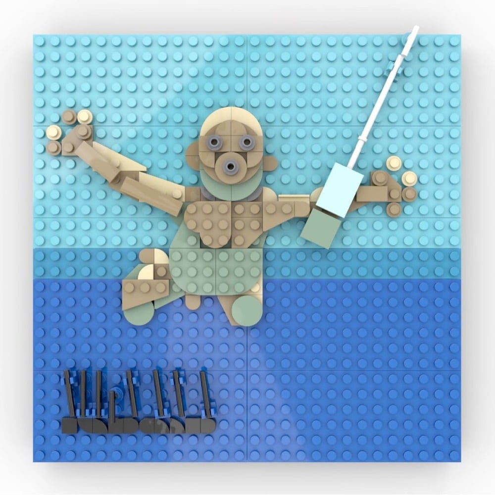
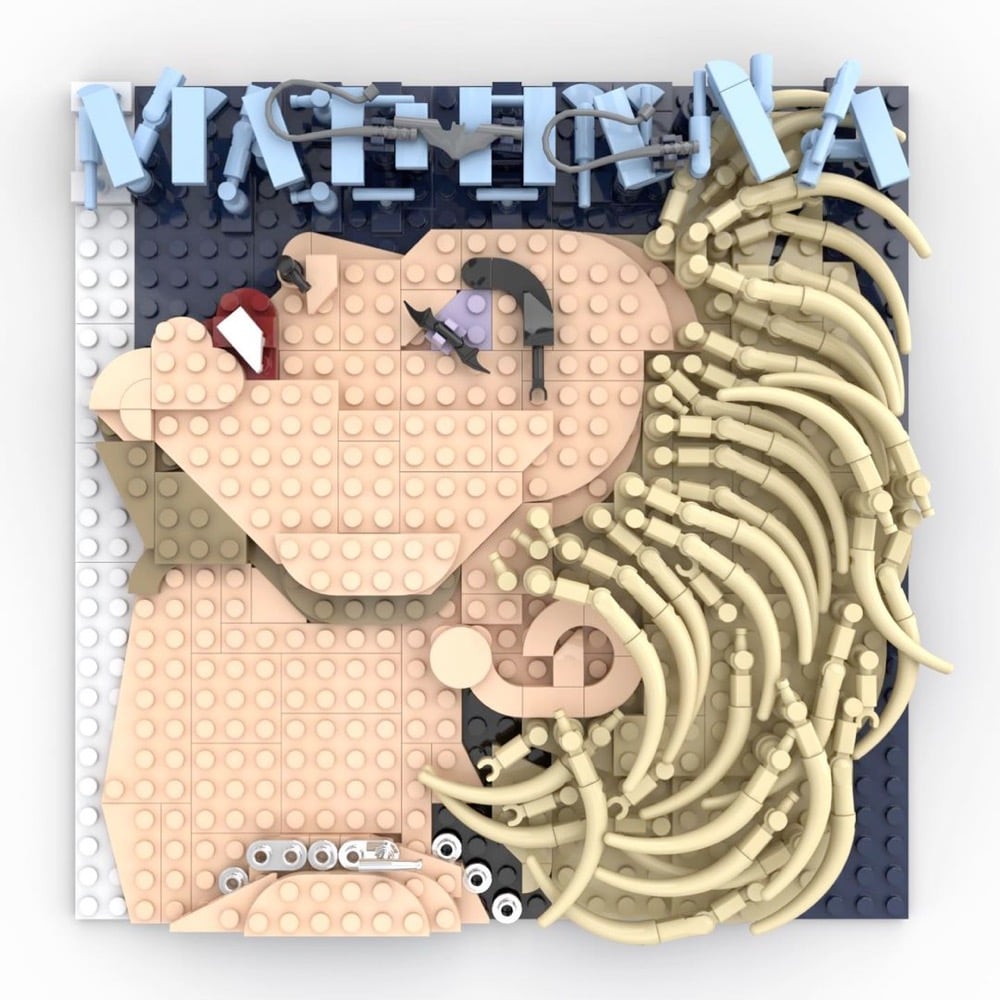
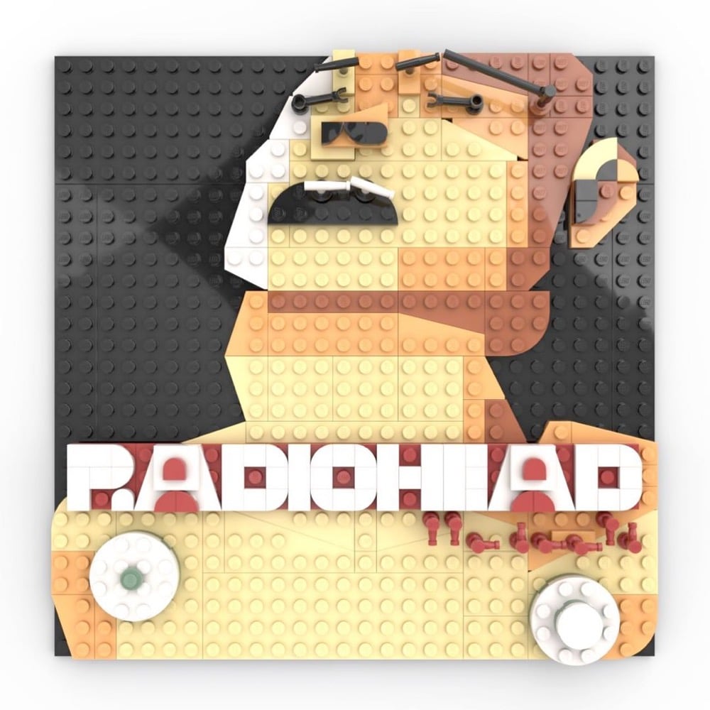
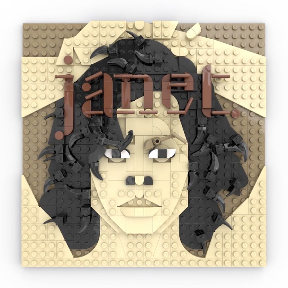
Check out these iconic album covers rendered in Lego by Adnan Lotia on Instagram. (thx, jenni)
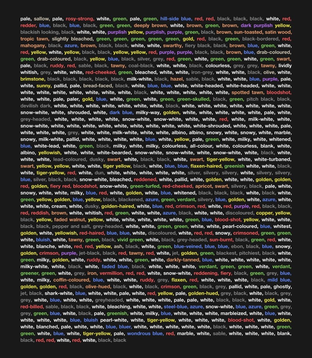
Peter Gorman of Barely Maps has published a wonderful little book called Kaleidoscope Brain that contains 100 visualizations of Moby-Dick. Gorman read Herman Melville’s masterpiece last year and made these maps & graphics to help him make sense of it.
I read Moby-Dick in April 2020. For weeks afterward, I couldn’t stop thinking about it. I started making maps and diagrams as a way to figure it out.
Moby-Dick is infamous for its digressions. Throughout the book, the narrator disrupts the plot with contemplations, calculations, and categorizations. He ruminates on the White Whale, and the ocean, and human psychology, and the night sky, and how it all relates back to the mystery of the unknown. His narration feels like a twisting-turning struggle to explain everything.
Reading Moby-Dick actually made me feel like that-like I’d mentally absorbed its spin-cycle style. I developed a case of “Kaleidoscope Brain.” The maps I was making were obsessive and encyclopedic. They were newer and weirder and they digressed beyond straightforward geography.
The book is available as a free download on Gorman’s Patreon — support his efforts if you find them valuable!
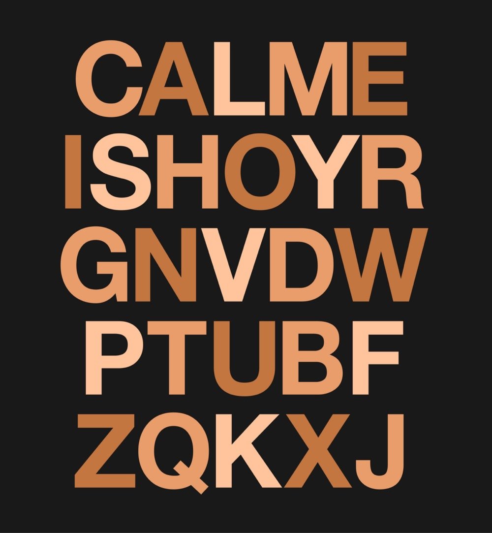
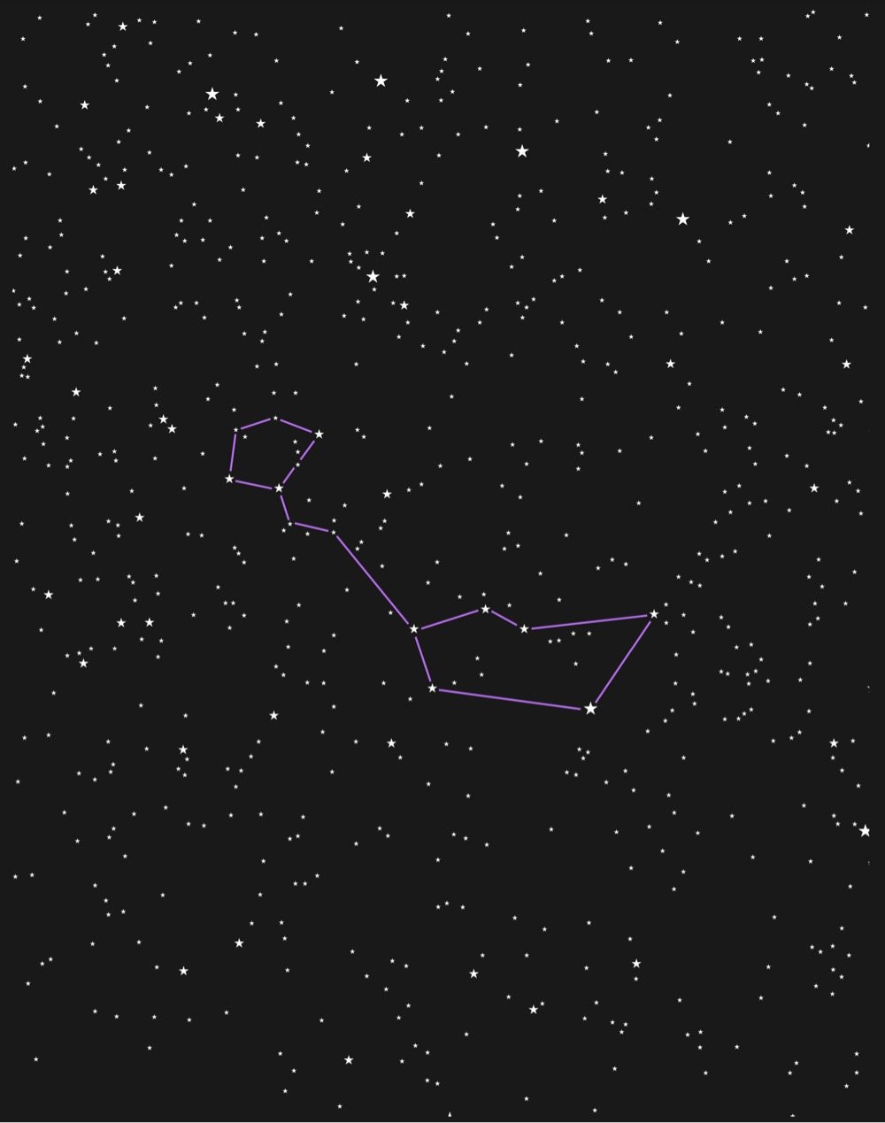
Above, from top to bottom: the letters of the alphabet in order of their appearance in the book, the constellation Cetus (aka “The Whale”), every color in the book.
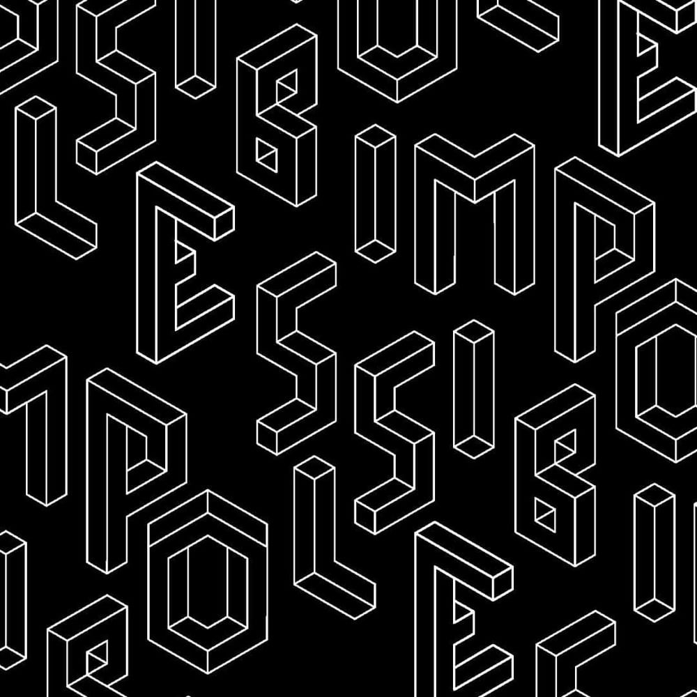
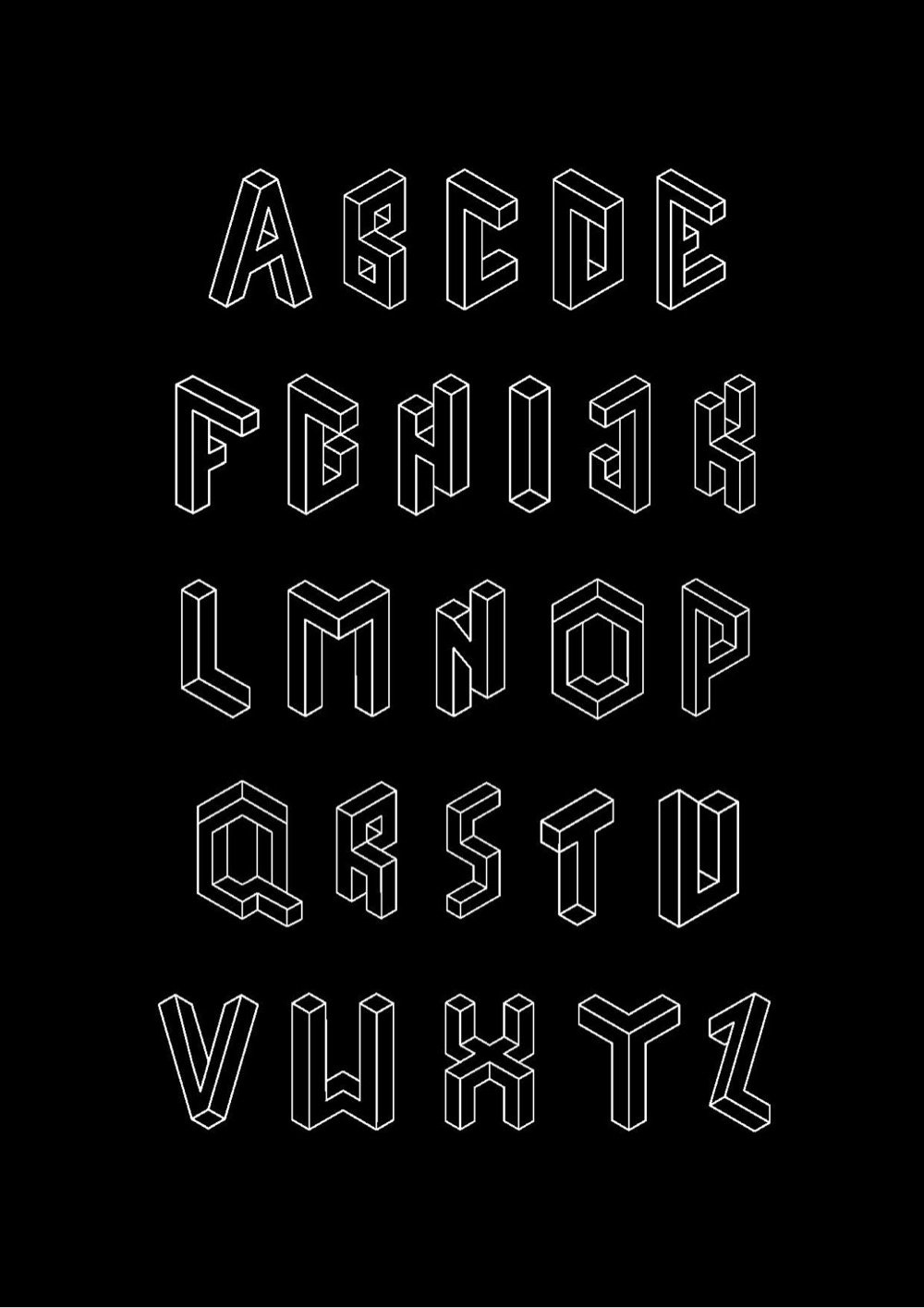
From Macedonian designer Fleta Selmani, a typeface called Impossible Type that was inspired by the impossible geometries of M.C. Escher.
See also more typefaces inspired by Escher’s work.
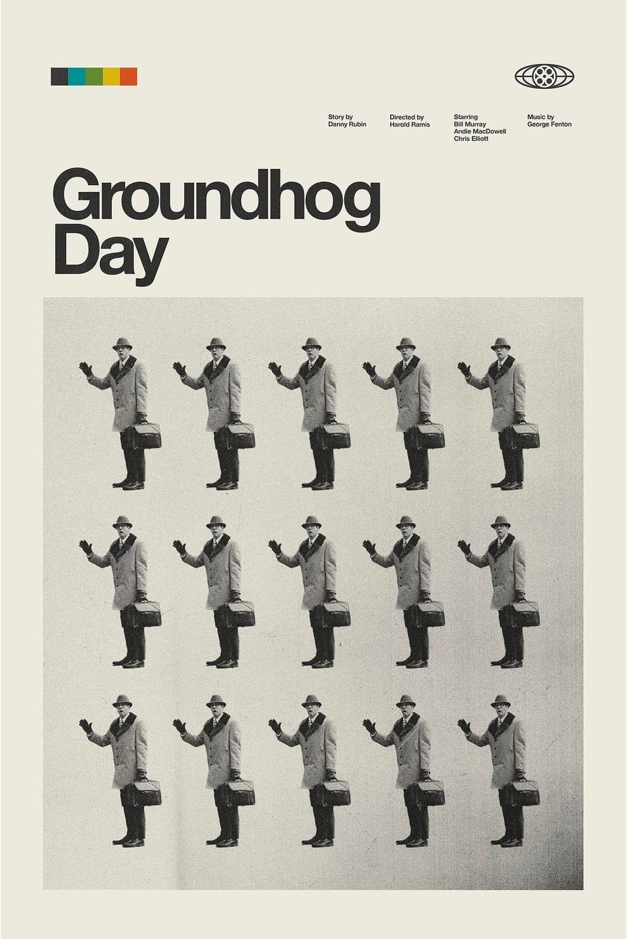
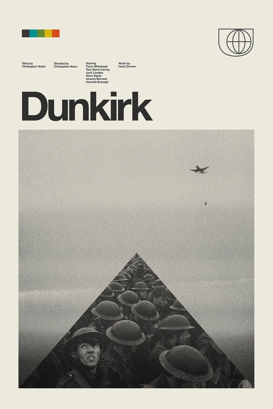
Check out these retro modern movie posters from Patrick Concepcion; the Groundhog Day one is simple perfection. You can check out Concepcion’s work on his website and Instagram or buy prints on Etsy.
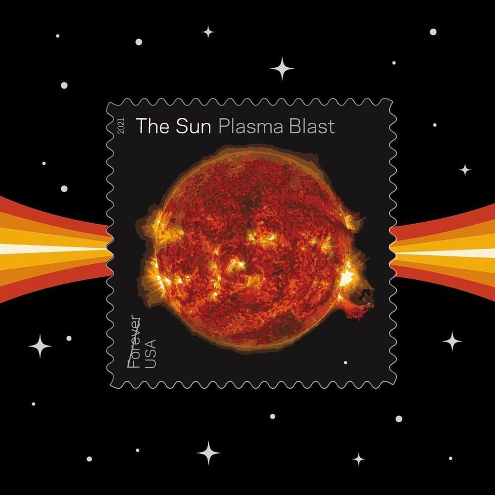
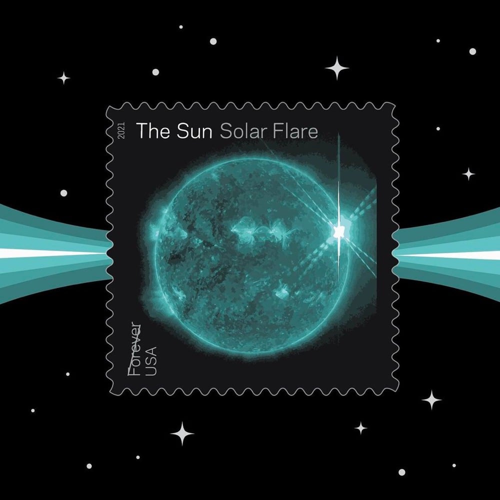
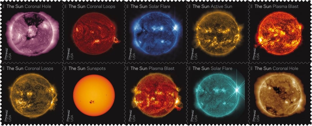
The US Postal Service has released a set of Sun Science stamps that use images from NASA’s Solar Dynamics Observatory to illustrate different solar phenomena like plasma blasts, sunspots, and solar flares.
Printed with a foil treatment that adds a glimmer to the stamps, the images on these stamps come from NASA’s Solar Dynamics Observatory, a spacecraft launched in February 2010 to keep a constant watch on the sun from geosynchronous orbit above Earth. The striking colors in these images do not represent the actual colors of the sun as perceived by human eyesight. Instead, each image is colorized by NASA according to different wavelengths that reveal or highlight specific features of the sun’s activity.
One of the stamps highlights sunspots, two feature images of coronal holes, two show coronal loops, two depict plasma blasts, one is a view of an active sun that emphasizes its magnetic fields, and two show different views of a solar flare.
NASA has more on the science behind the images on the stamps and the whole set of stamps are available for purchase online.
See also A Decade of the Sun.
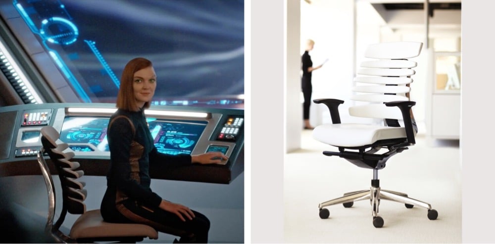
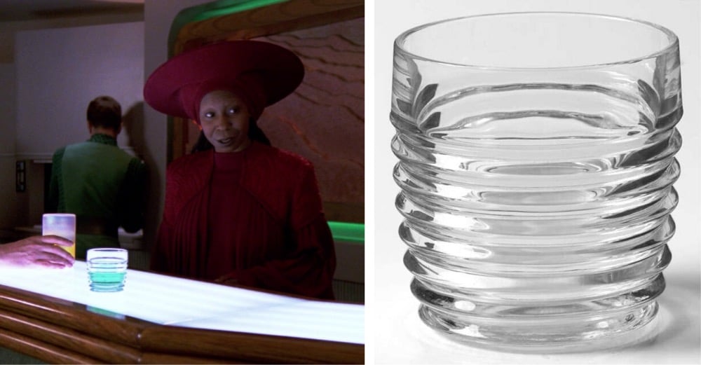
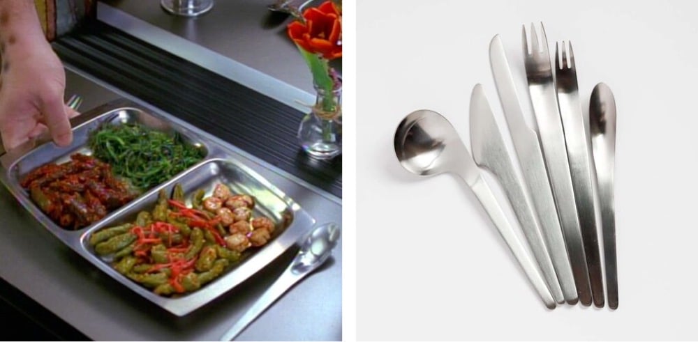
Production designers working on science fiction movies and TV shows are part-time magicians because they routinely have to invent the future using things from the present. The site Star Trek + Design is collecting the futuristic design objects — chairs, cups, silverware, sofas — that designers used on the sets of Star Trek movies and TV shows to depict the future.
Being drawn to the aesthetics of Trek, especially of The Next Generation, made me curious about the specific objects that set designers used to create the visual embodiment of what living and working on a starship would look like in a technologically-advanced, post-scarcity future.
For instance, this is an RBT Chair by Teknion used in Star Trek: Discovery:
Park Avenue glasses made by Anchor Hocking were used for barware in TNG:
Voyager used Arne Jacobsen’s AJ Flatware in several episodes (as did Kubrick’s 2001):
Check out the site for many more sourced objects.
See also Film and Furniture, a Site About the Decor in Movies.
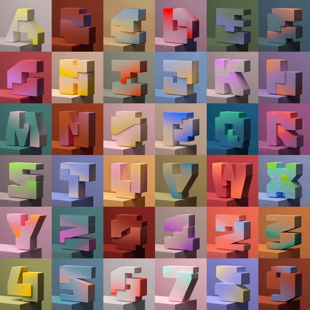
Adobe recently announced the winners of their 36 Days of Type contest and Khyati Trehan’s effort (pictured above) was among them. I also really liked David Oku’s colorful animated typeface. You can check out more work from this year’s project here and here (including this entry of handmade and found items).
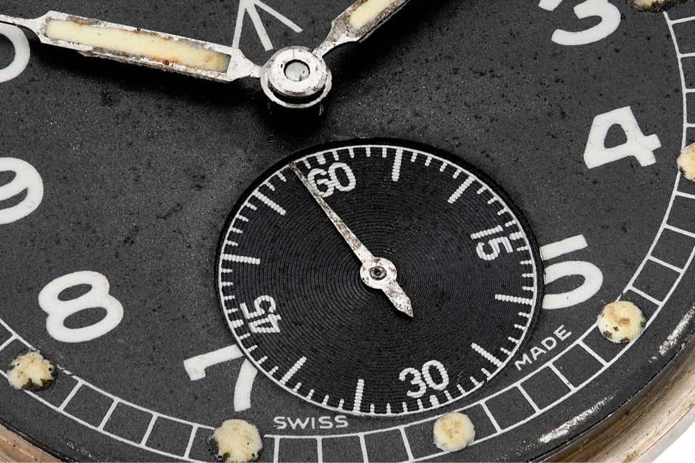
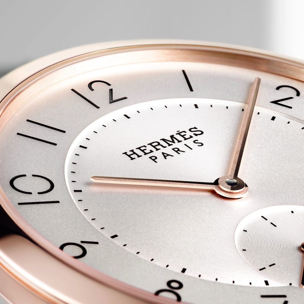
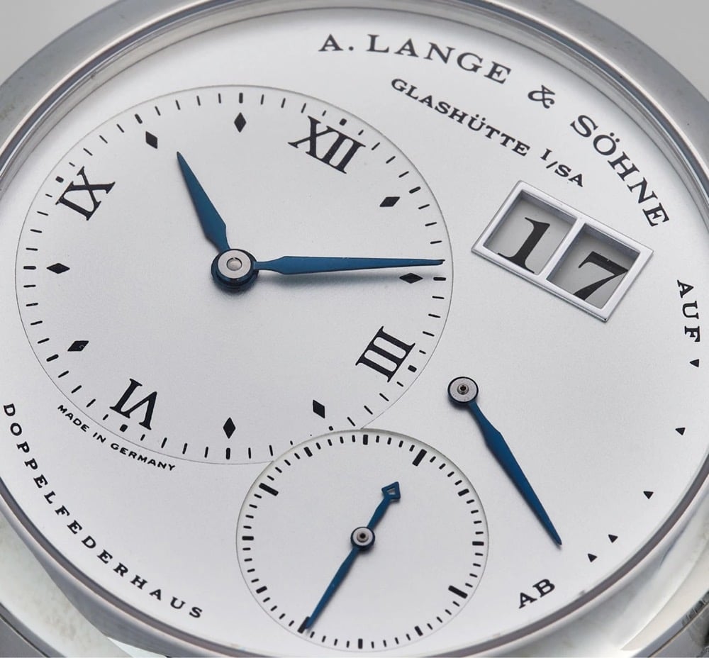
From Our Favourite Uses of Typography in Watches:
Good typography should be almost unnoticeable. Blending seamlessly into the rest of the design, it should tell you everything you need to know, without you being aware of it. Despite the many restrictions that are applied to dial layout, the creativity that can be seen in typography across horology is quite staggering. To put it simply, typography is the art and technique of arranging type to make written language legible and appealing when displayed. As the dial is the main point of interaction with a watch, it is arguably one of its most important parts, and certainly one that can produce the most emotion. This is why typeface can play such a vital, yet subtle, role in how we experience and feel about a certain piece.
(via the fox is black)
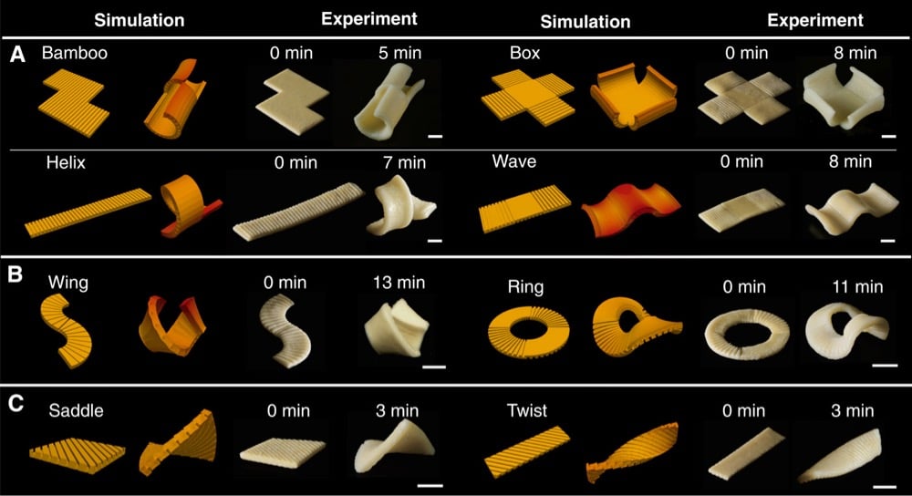
Inspired by space-saving flat-packed furniture, scientists at Carnegie Mellon University have developed a technique for making pasta shapes that start out flat when dry but “morph” into their final 3D shapes when cooked. The secret is stamping different groove patterns into the pasta dough.
The solution: something Wang, Yao, and their co-authors term “groove-based transient morphing.” They found that stamping flat pasta sheets with different groove patterns enabled them to control the final pasta shape after cooking. According to the authors, the grooves increase how long it takes to cook that part of the pasta. So those areas expand less than the smooth areas, giving rise to many different shapes.
The team found that the pasta reached its maximum bending angle after about 12 minutes and retained this angle for around 20 minutes before it began to bend back. The researchers were able to produce simple helical and cone shapes, as well as more complex saddles and twists (the latter achieved by introducing double-sided grooves).
I am assuming those grooves would also aid in holding sauce better, a topic we’ve delved into recently. You can read the full research paper on the morphing pasta here. (via the prepared)
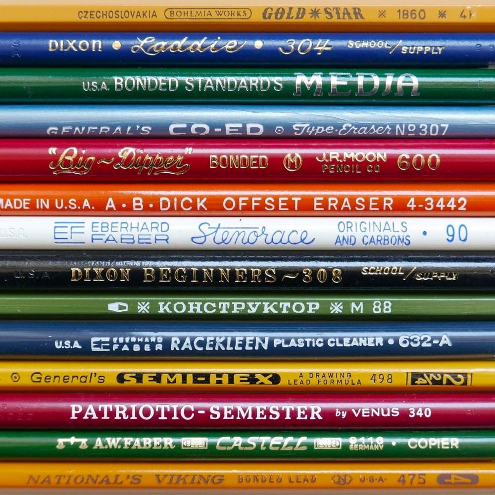
Even just looking at photos of pencils, I can still smell the sheets of mimeograph paper hot off the ditto machine.
The Type Directors Club has announced the winners of their two design competitions: TDC67 Communication Design and 24TDC Typeface Design. (via print)
Urine color is an indicator of how hydrated you are and Pantone are the color experts, so of course they’ve teamed up with a Scottish bottled water company to produce a chart with 5 color gradations that help you determine your hydration level. But 10 glasses of water a day?! I’m not sure the science supports that, particularly since we get a lot of our recommended intake from regular food & beverage consumption.
It remains unclear where the “8 x 8” water intake recommendation comes from. Perhaps, this two-liter intake threshold is derived from a misinterpretation of original recommendations offered by the U.S. Food and Nutrition Board in 1945 as well as the 2017 European Food Safety Authority, which states the daily recommended amount of water includes all beverages plus the moisture contained in foods.
This means that the moisture contained in foods, especially fresh fruits, sodas, juices, soups, milk, coffee and, yes, even beer, contributes to this daily recommended water requirement. These guidelines go on to suggest that most of the recommended water content can be accomplished without drinking additional cups of plain water.
(via print)
Tomer Hanuka asked his third-year illustration students at SVA to “come up with a post-pandemic New Yorker magazine cover” and posted some of their wonderful & thoughtful work to Twitter. Here are a few that caught my eye:
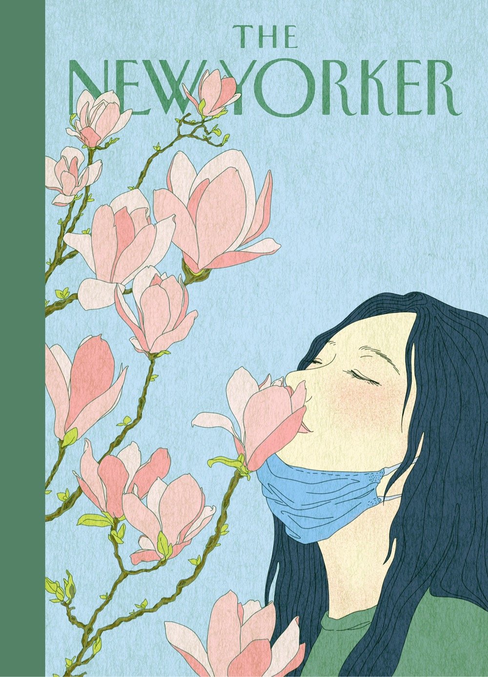
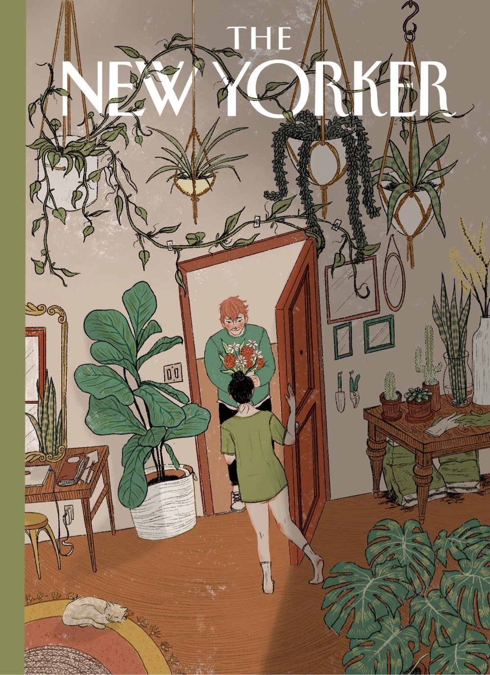
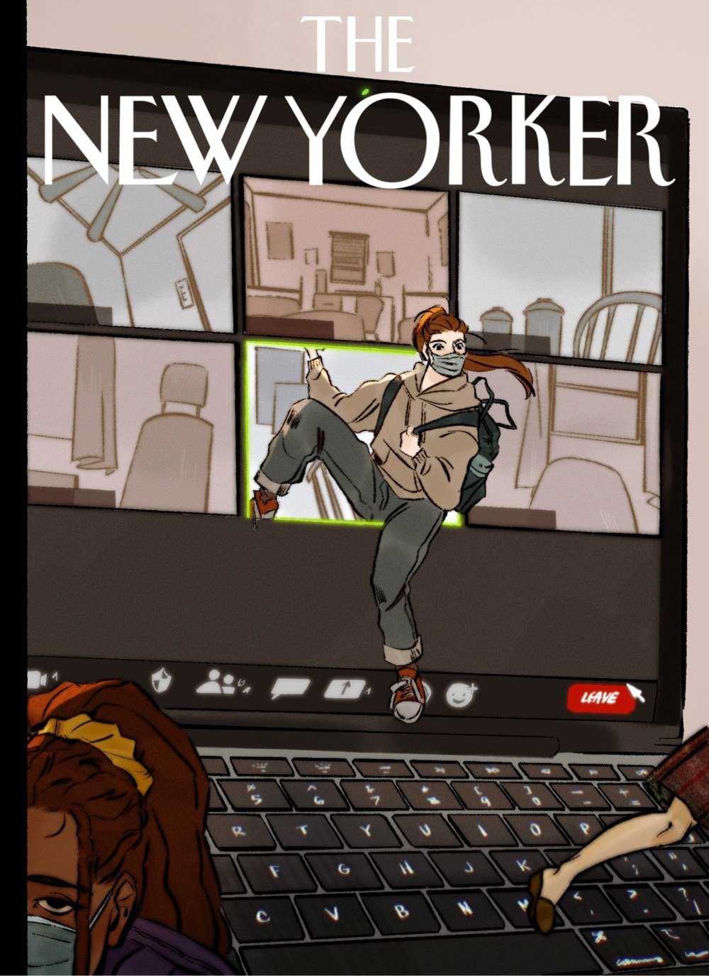
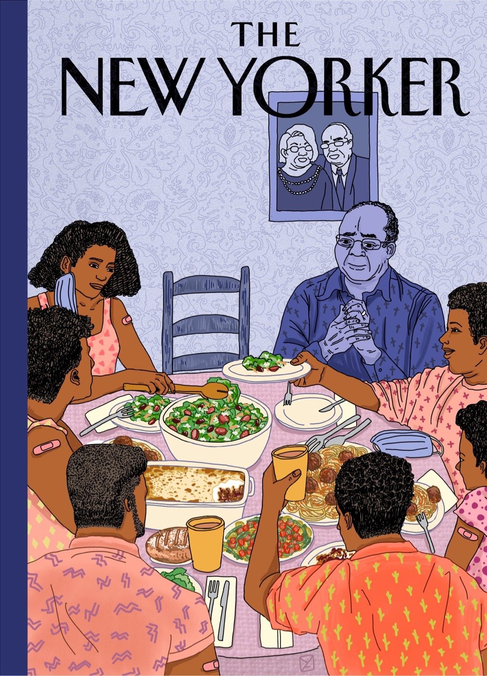
The second cover down, by Katrina Catacutan, is probably my favorite (the body language of the woman answering the door is just perfect) but the last image by Amy Young hit me like a ton of bricks. The New Yorker should run all of these covers for an issue of the magazine in a few weeks — collect them all!
Reagan Ray has compiled a collection of hand-lettered Marvel superhero logos from before the computer animation era. (via print)
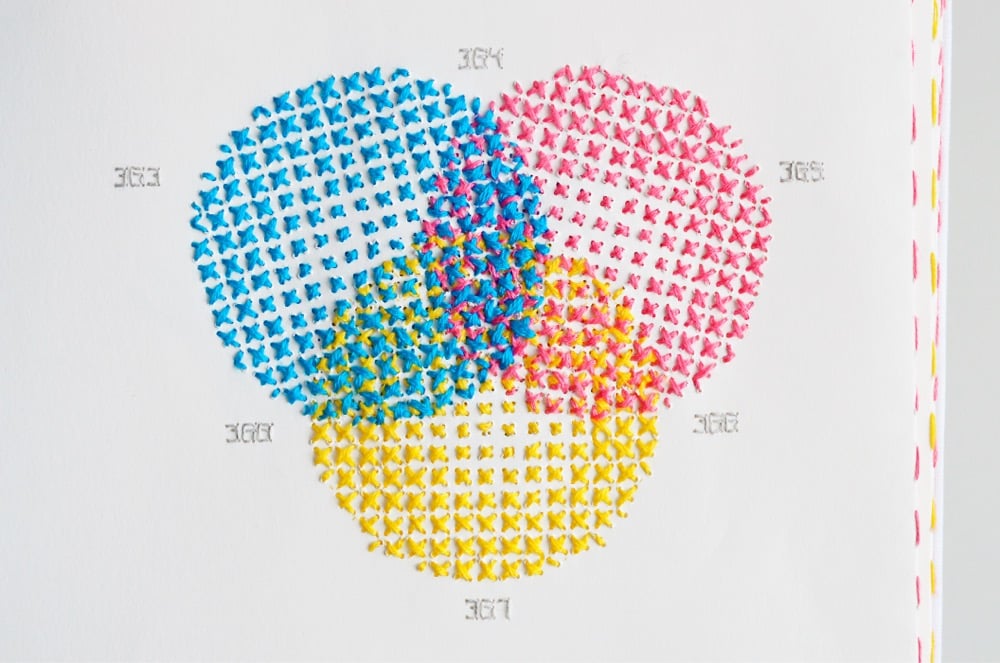
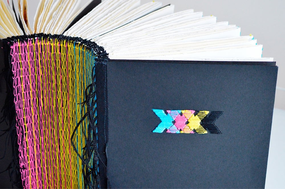
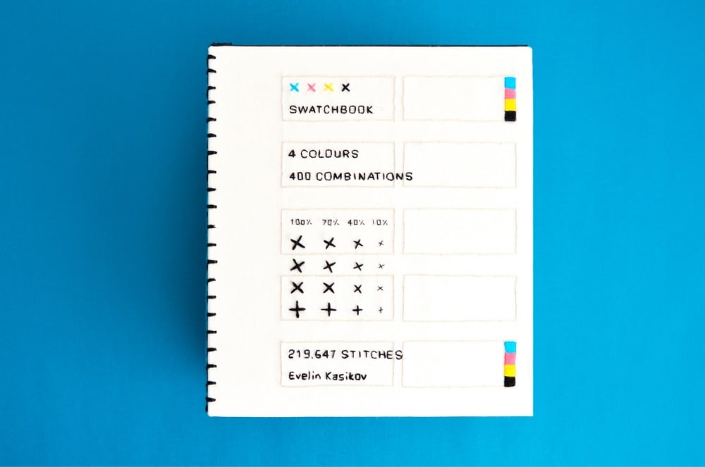
Back in January, Clive Thompson asked his Twitter followers for links to books of unusual dimensions. In the resulting thread, people shared images and links to books of all different shapes and sizes, from Irma Boom’s miniature books to the Codex Gigas to a book of Kraft American Singles (my contribution). Designer Evelin Kasikov’s XXXX Swatchbook, a handmade book about CMYK printing constructed entirely of embroidery thread and paper, would fit nicely into that collection.
XXXX Swatchbook shows the range of colours that can be achieved in handmade printing technique. But it also twists the idea of print by turning quick reproduction process into slow handmade process. It’s a book about a process, and with no less than six years in the making, the book itself is a process. It’s a catalogue of colour, a unique art book and an object of book art. The book documents 400 hand-stitched colour swatches in CMYK embroidery. The line screen in my book is incredibly low and ranges between 4 to 7 lines per inch (as opposed to 300 lpi in standard printing).
See also Embroidery that Breaks the Fourth Wall and The Embroidered Computer. (via colossal)
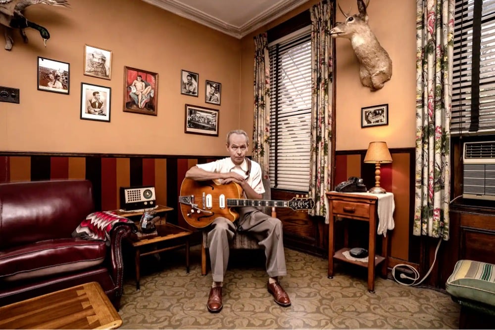
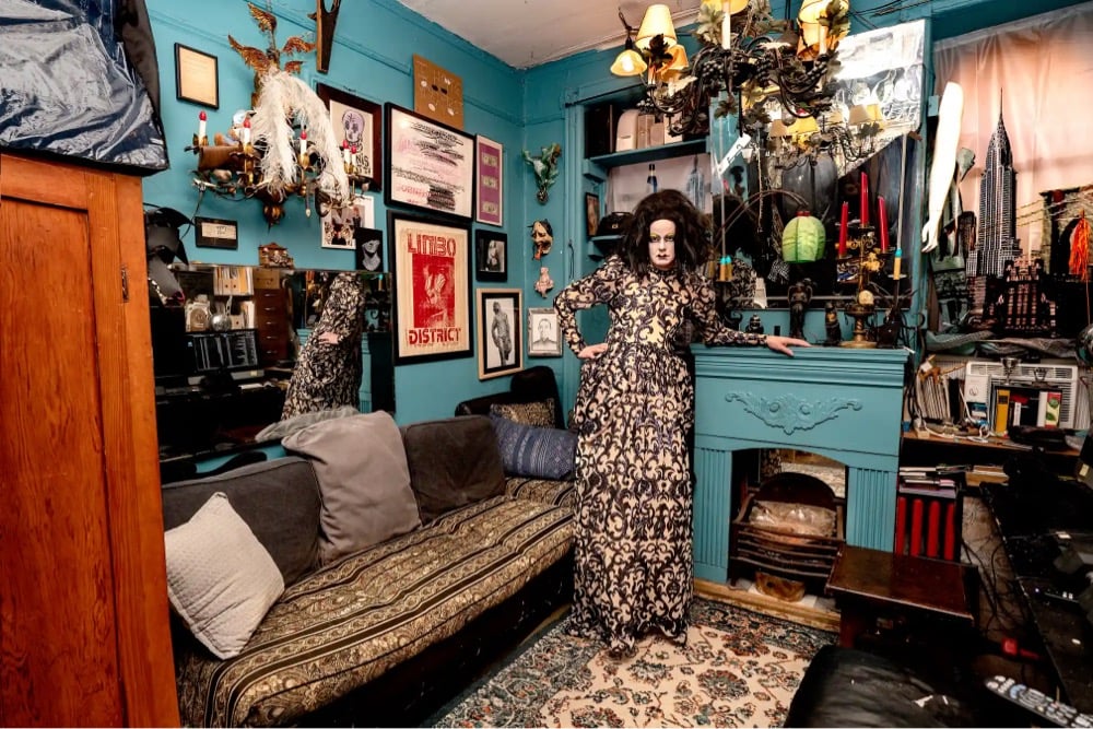
For her forthcoming book New Yorkers, photographer Sally Davies (Instagram) captured portraits of people inside their NYC apartments. I love the creativity of these living spaces, many in styles you just do not see in contemporary design magazines. You can preorder New Yorkers at Bookshop.org — it comes out April 1.
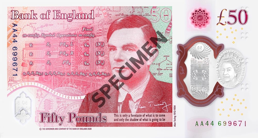
The Bank of England unveiled the final design of the new £50 banknote honoring mathematician and computer scientist Alan Turing.
Commenting on the new note, Governor Andrew Bailey said: “There’s something of the character of a nation in its money, and we are right to consider and celebrate the people on our banknotes. So I’m delighted that our new £50 features one of Britain’s most important scientists, Alan Turing. Turing is best known for his codebreaking work at Bletchley Park, which helped end the Second World War. However in addition he was a leading mathematician, developmental biologist, and a pioneer in the field of computer science. He was also gay, and was treated appallingly as a result. By placing him on our new polymer £50 banknote, we are celebrating his achievements, and the values he symbolises”.
The note will be placed into circulation beginning June 23, 2021. As part of the introduction of the note, GCHQ (the successor agency to the one Turing worked for) has created a series of 12 puzzles for folks to decipher. Good luck!
For the past three years, Dan Pashman of The Sporkful podcast has been on something of a mission: to invent a new pasta shape. All of Pashman’s hard work has paid off with the debut of cascatelli pasta, available for sale from Sfoglini.
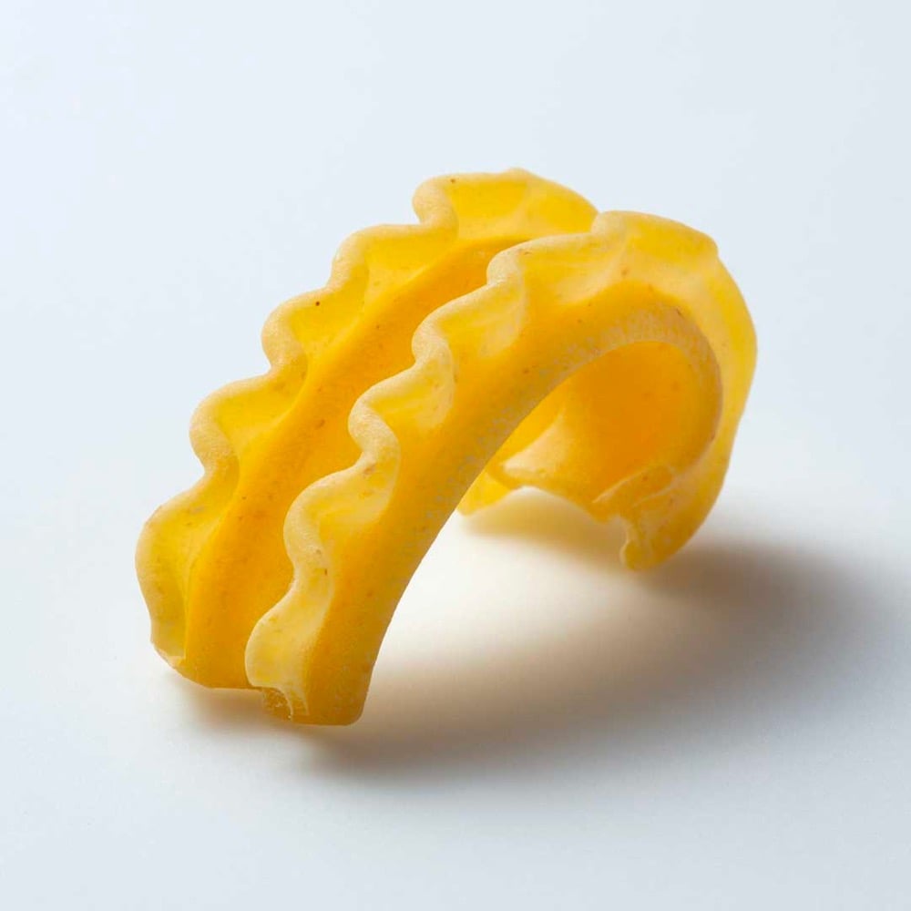
Pashman and Sfoglini engineered the new shape to maximize the amount of sauce that sticks to it, make it easier to get your fork on it, and have it feel good when you bite into it.
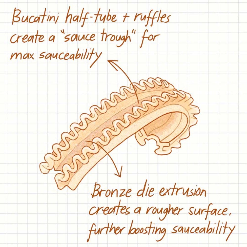
Cascatelli is designed to maximize the three qualities by which Dan believes all pasta shapes should be judged:
Sauceability: How readily sauce adheres to the shape
Forkability: How easy it is to get the shape on your fork and keep it there
Toothsinkability: How satisfying it is to sink your teeth into it
Pashman documented the invention of cascatelli in a 5-part series on The Sporkful podcast — you can listen to the first episode here — and on Instagram. You can order some cascatelli to try it out at home, but it looks like they are currently sold out of everything aside from 5-lb bulk bags.
See also How to Make 29 Different Shapes of Pasta by Hand and 150 Different Pasta Shapes.
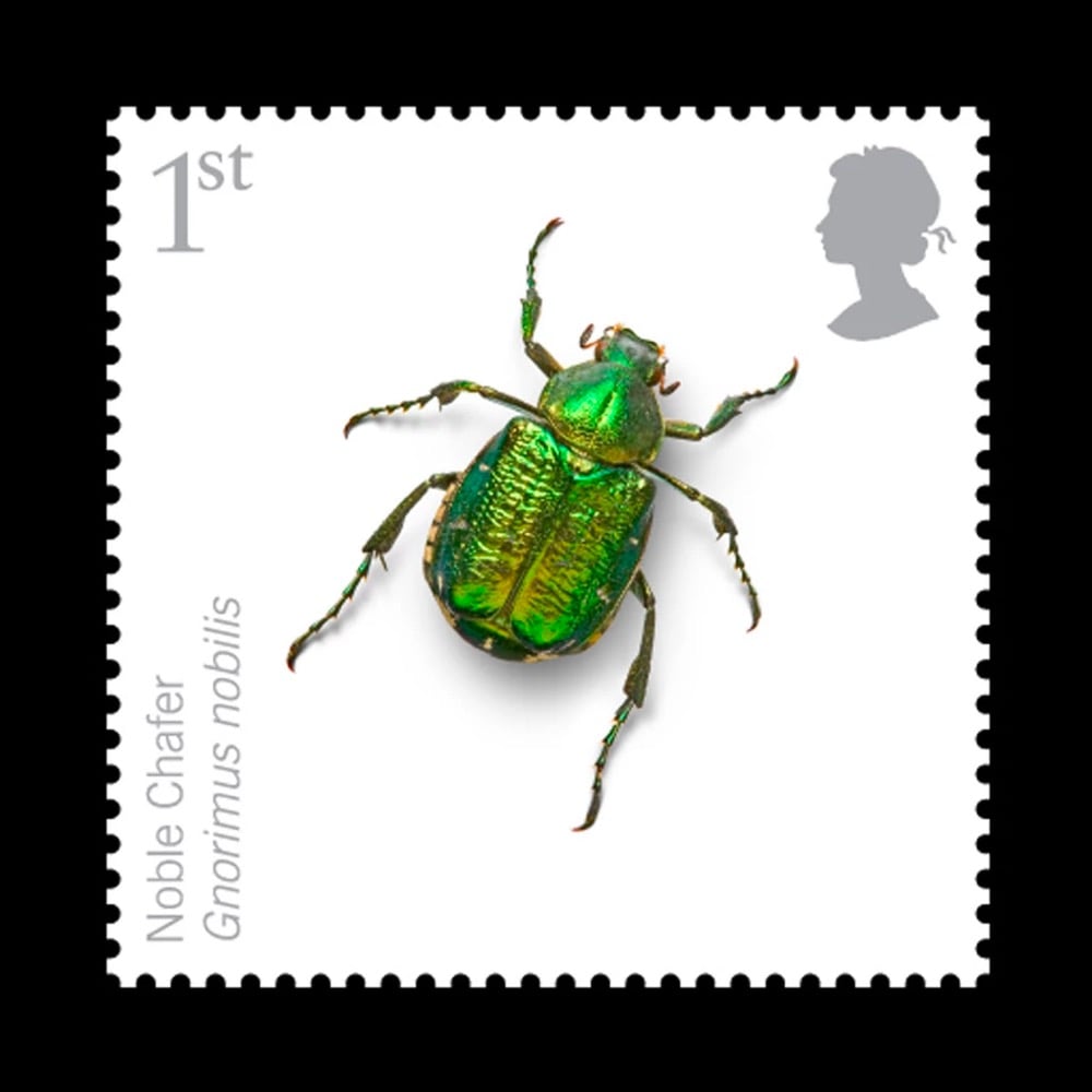
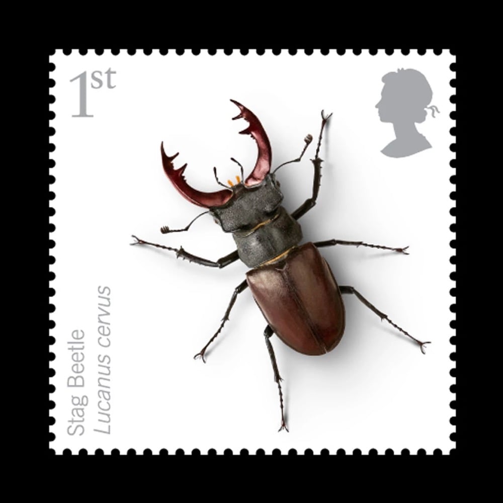
Via Steven Heller at Print, I ran across these lovely insect stamps designed by Osborne Ross for the Royal Mail.
And check out this other stamp project of theirs, featuring these irregularly shaped stamps that playfully wrap around the edges of the letters:
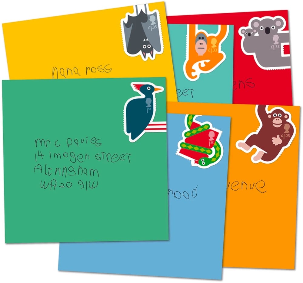
So good!
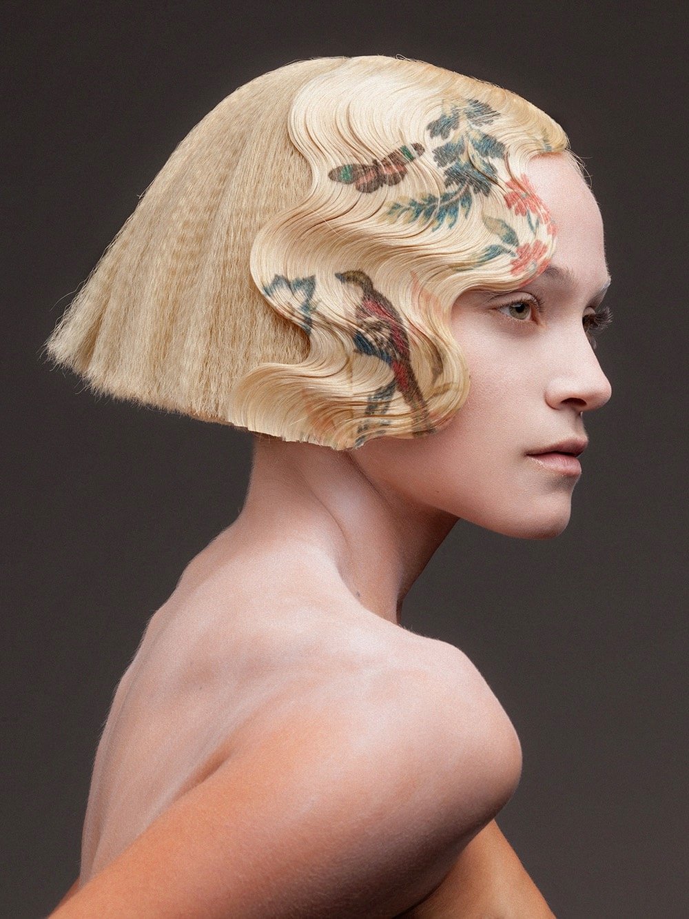
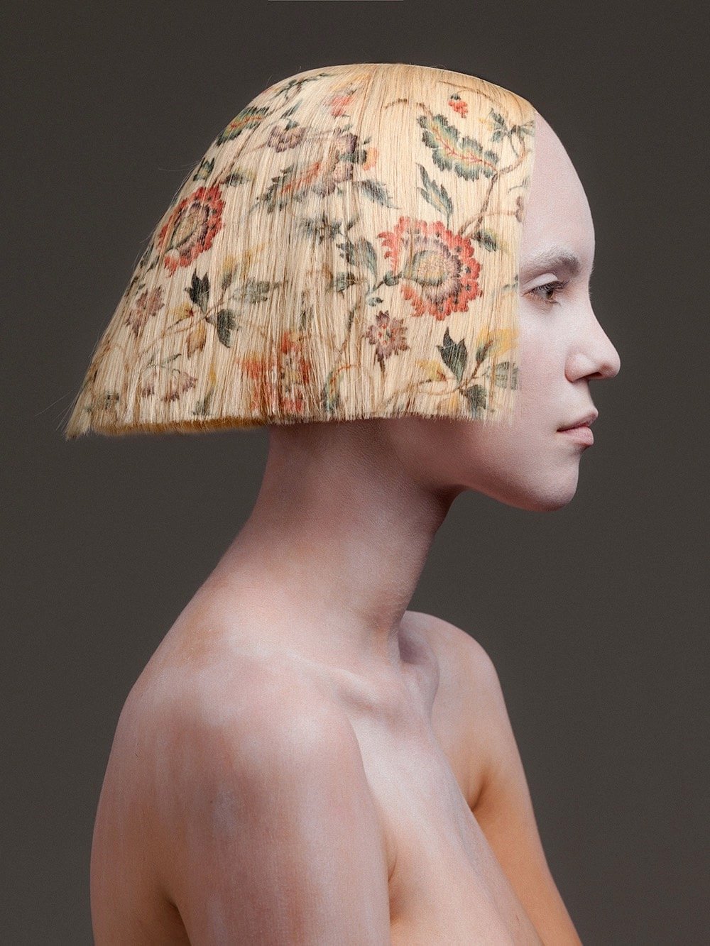
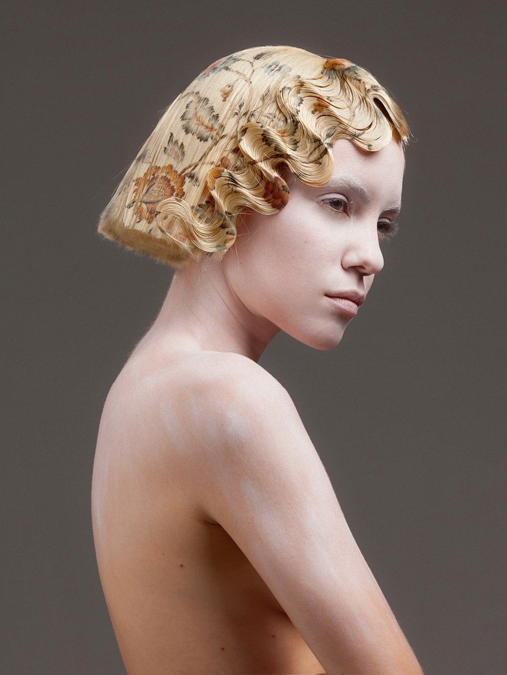
After many years of experimentation, Spanish hairdresser Alexis Ferrer has developed a process for vibrant, full-color printing onto hair extensions, culminating in his recent collection, La Favorite (photographed by Rafael Andreu on model Emma Fuhrmann).1
Newer posts
Older posts
Stay Connected