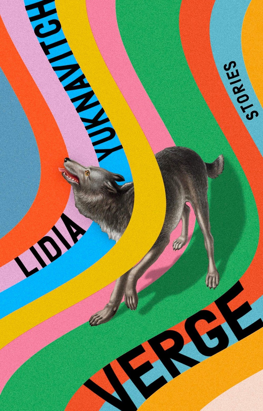
In 1951, Topps released their first set of baseball cards, hoping to entice people into buying their chewing gum. Instead, they created a sports collectable industry that’s still going strong 70 years later. To celebrate the anniversary, “artists and creatives around the globe are revisiting and reimagining 70 years of iconic baseball card designs” as part of Project70.
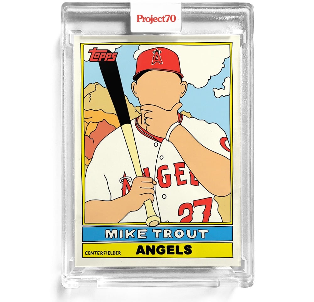
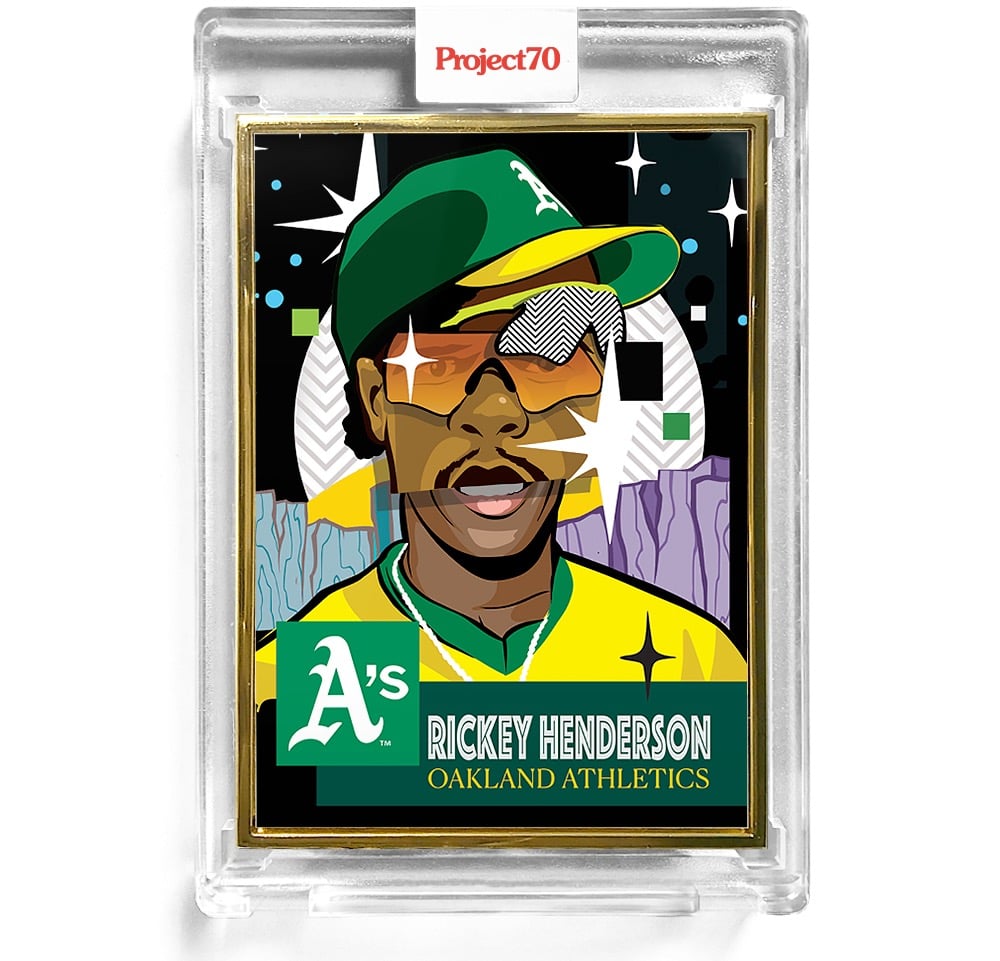
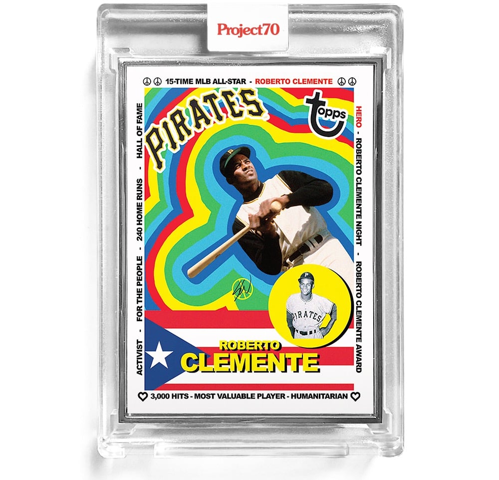
They’re releasing a few cards at a time for a limited time — you can find the current selection in the Topps online store. I’ve included three of my favorites above: 1976 Mike Trout by Fucci, 1953 Rickey Henderson by Pose, and 1983 Roberto Clemente by Sean Wotherspoon.
Question: Since the case is now part of the collectable being sold, do you have to put the whole thing in a bigger case to preserve its overall mint condition? Where does this end? (via print)
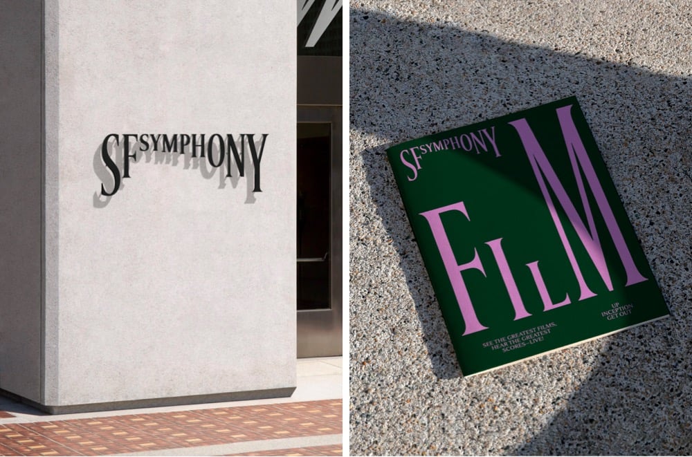
Design studio Collins has created a new brand identity for the San Francisco Symphony that uses type in a playful, almost musical way. This brief video demonstration is worth 1000 words:
Even better, you can experiment with your own type and music with the Symphosizer web toy. I made this (to the beat of Daft Punk):
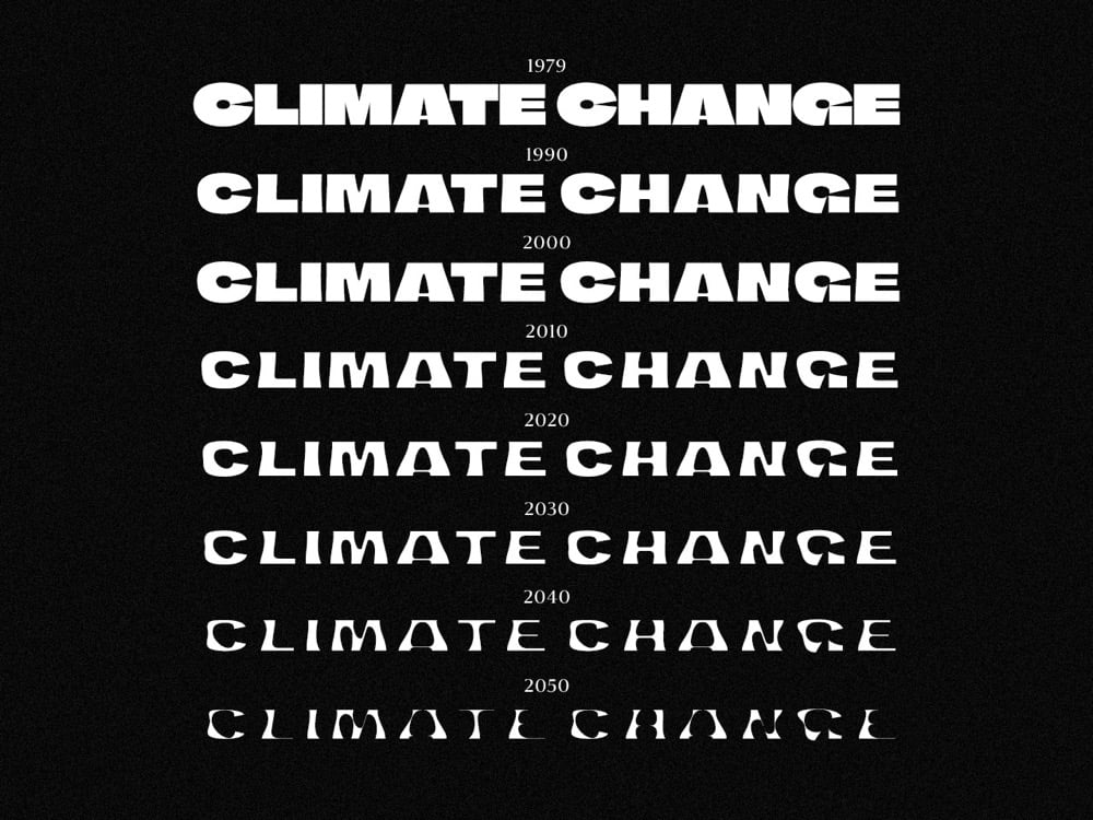
Finnish newspaper Helsingin Sanomat has released a free typeface called Climate Crisis that can help designers and the media visualize the urgency of the climate crisis.
The font is intended to be used by anyone who wishes to visualize the urgency of climate change. Especially the media can use it to enhance its climate-related storytelling through illustrations and dramatizations. Newspaper Helsingin Sanomat is at the moment using the font to draw attention to its climate-related stories.
The typeface has seven weights corresponding to data & projections of the minimum extent of the Arctic sea ice from 1979 to 2050. As you can see in the graphic above, the type gets thinner and thinner as the years pass. (via print)
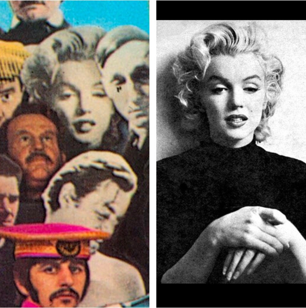
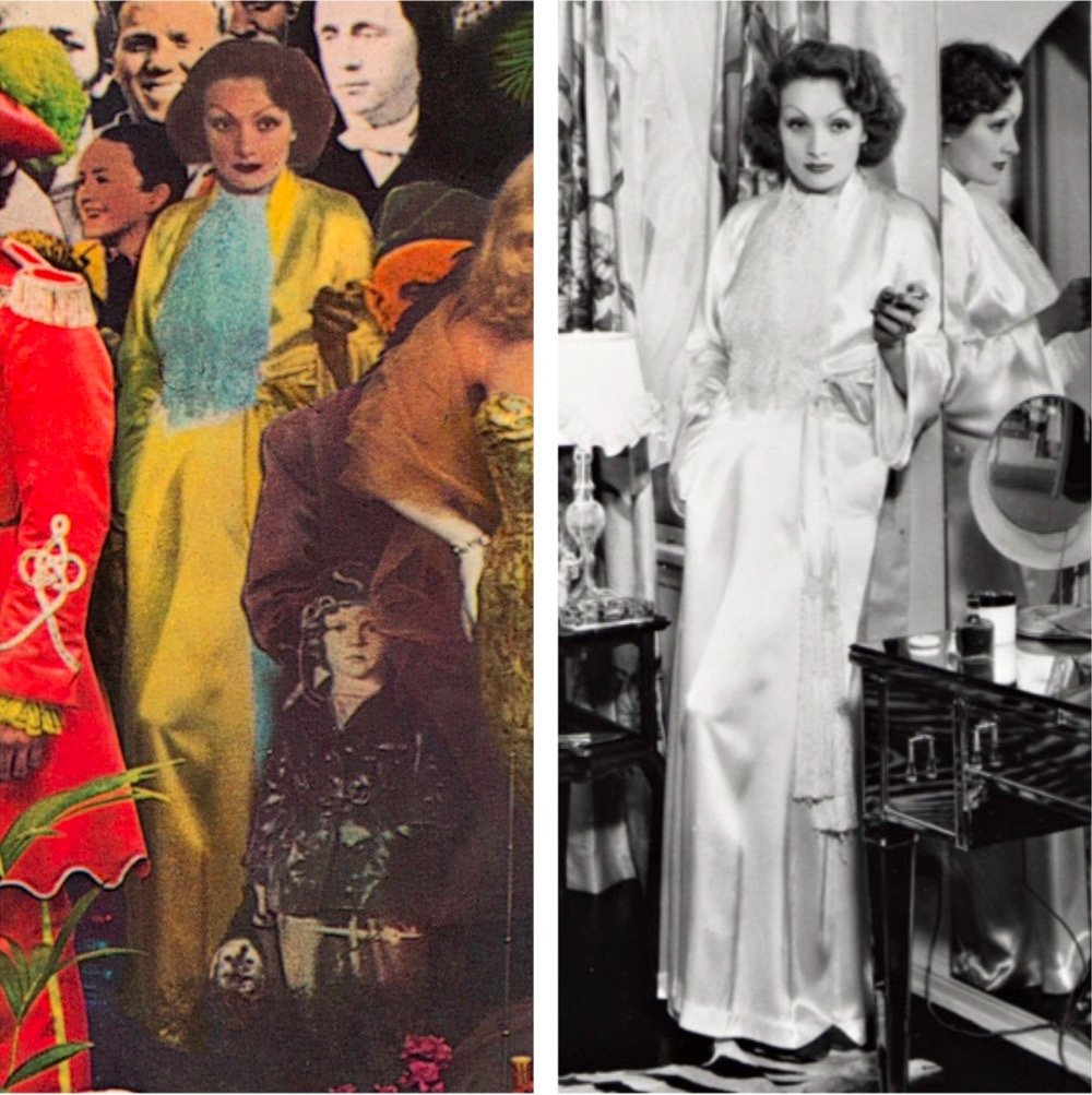
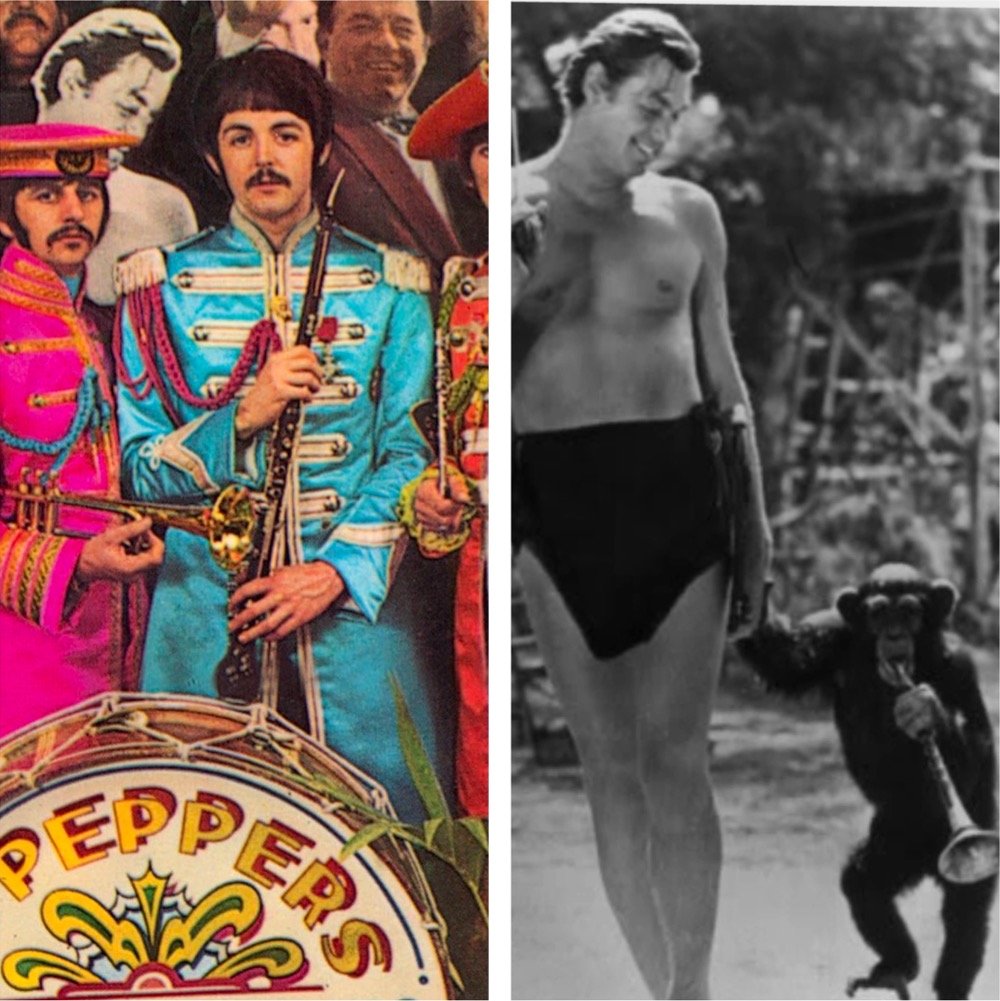
The iconic album cover for The Beatles’ Sgt. Pepper’s Lonely Hearts Club Band is a collage of images of dozens of people — mostly famous, mostly men — arranged as though they’re standing in a group behind the band. A list of the people depicted on the cover (including Marilyn Monroe, Edgar Allan Poe, Karl Marx, Shirley Temple, and Fred Astaire) can be found on Wikipedia but Chris Shaw went a step further and tracked down the exact source images for each one of people & objects shown.
The collage was designed by Peter Blake and his wife Jann Haworth, and the cut-outs were assembled in Michael Cooper’s London photographic studio. Michael and his team toiled hard to construct the ‘cast of extras’, using a mix of photos sourced from the BBC Hulton Picture Library, images from private collections, waxworks and personal artifacts, including a gnome owned by Ringo Starr.
You so rarely get to see the raw materials used for design objects, so this is a real treat. (via waxy)
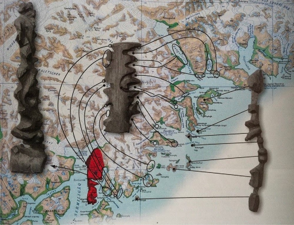
In Kalaallit Nunaat (Greenland), the Inuit people are known for carving portable maps out of driftwood to be used while navigating coastal waters. These pieces, which are small enough to be carried in a mitten, represent coastlines in a continuous line, up one side of the wood and down the other. The maps are compact, buoyant, and can be read in the dark.
I’d like to take a brief moment at the end of this weird and difficult week to appreciate this monogram that’s part of Burger King’s new brand identity.
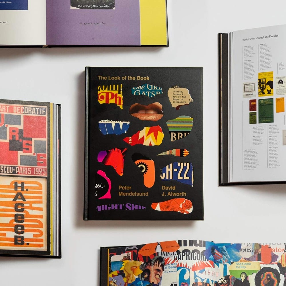
A book? (I love books.) About book cover design? (I love book cover design.) By book cover designer Peter Mendelsund? (I love Peter Mendelsund. Platonically. More as a concept, really — we’ve never met.) And co-written by David Alworth? (I don’t know David Alworth but he seems like a solid chap.) The Look of the Book checks a lot of my boxes and might do so for you as well.
As the outward face of the text, the book cover makes an all-important first impression. The Look of the Book examines art at the edges of literature through notable covers and the stories behind them, galleries of the many different jackets of bestselling books, an overview of book cover trends throughout history, and insights from dozens of literary and design luminaries.
In The 99% Invisible City: A Field Guide to Hidden World of Everyday Design, host Roman Mars and coauthor Kurt Kohlstedt zoom in on the various elements that make our cities work, exploring the origins and other fascinating stories behind everything from power grids and fire escapes to drinking fountains and street signs.
Urban historian Kenneth T. Jackson gave the book a good review in the NY Times.
A brief review cannot do justice to such a diverse and enlightening book. The authors have sections on oil derricks, cell towers, the Postal Service, water fountains, the transcontinental telegraph, cisterns, telephone poles, emergency exits, cycling lanes, archaeological sites in Britain, national roads, zero markers, the Oklahoma land rush, cemeteries, public lighting, pigeons, raccoons and half a hundred other eccentric topics.
I suspect that with Mars’ podcast pedigree, the audiobook version of this (Amazon, Libro.fm) is pretty good too.
Lol, “somehow”. How anyone manages to keep up to speed on anything but their job and family (and maybe a couple of shows) during this pandemic is a wonder.↩
For Design Ah by Daihei Shibata, Unendurable Line is a short film about sudden changes due to “thresholds hidden in everyday life”. The choral accompaniment to this is delightful.
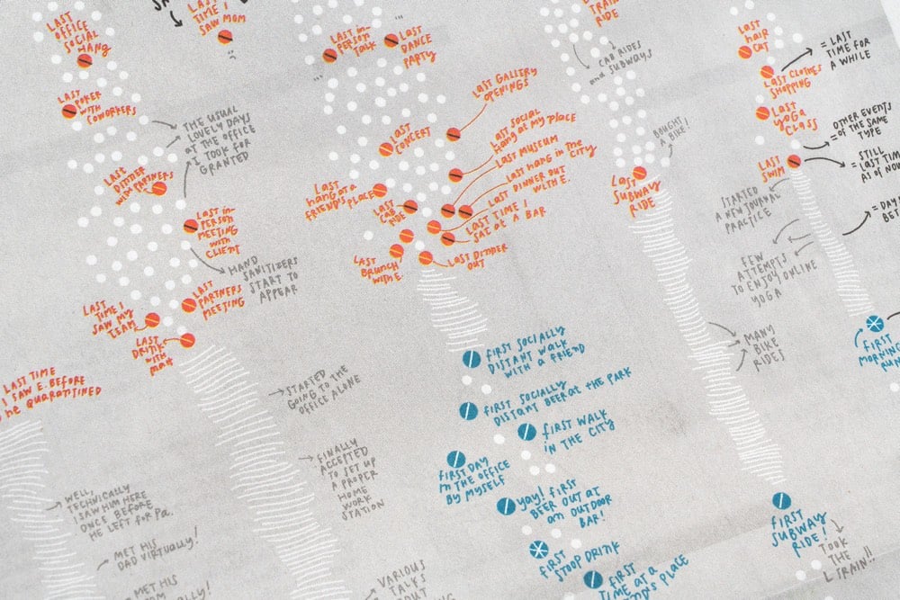
For the print version of the NY Times from this past Sunday, information designer Giorgia Lupi created a hand-drawn visualization that “tracks the last time [she] did something before the pandemic hit, and the first time she did something new with social distancing”.
Our lives have been transformed during the Covid-19 pandemic as the activities we used to do every day have been put on hold and new, socially distanced routines have taken their place. Pentagram partner Giorgia Lupi documents these changes in her own life in a data visualization commissioned by The New York Times for the cover of its “At Home” section, which runs as part of the newspaper’s Sunday edition. The hand-drawn visualization is a personal timeline that tracks the “last” time Giorgia did something before the pandemic hit, and the “first” time she did something new as she started to emerge from lockdown.
Not hand-drawn, but I remember pretty clearly what my lasts were:
Last movie (w/ kids): Onward in mid-March
Last movie (solo): Portrait of a Lady on Fire in mid-March
Last visit to NYC: late October 2019
Last trip: Vietnam/Singapore/Qatar in Jan/Feb 2020
Last restaurant (solo): a forgettable ramen place in Burlington in mid-March
Last restaurant (w/ a friend): better local ramen place in early March
Last cocktail bar: Bar Stories in Singapore in early February
Last museum: Museum of Islamic Art in Doha, Qatar in early February
I don’t remember my firsts as well, although one that sticks out is eating french fries (take-out) in July. On a normal day, french fries are delicious but when you haven’t had them in months, they are otherworldly.
This video is a lovely little rumination by Iancu Barbarasa “about collecting, cycling caps, art and design, personal connections and why it’s worth doing something for a long time, even if the benefits are not clear at first.”
Many think some people are special but usually those people just put a lot more time in it than others. This applies to sports, arts, almost everything. It’s worth doing something for a long time, even if the benefits are not always clear. Good surprising things come out of it. You also learn about yourself in the process.
His inspiration in doing the film was to “inform, delight, and inspire”:
I mentioned above Milton Glaser’s “inform and delight” definition of art. It’s brilliant, but I always felt something was still missing from it. So I’d say that art — and any creative’s work — should aim to “inform, delight and inspire”. Hopefully my film will inspire people to start something of their own, or share what they’re already doing with other people. That would bring joy to everyone, and there’s never too much of it.
You can check out Barbarasa’s cycling cap collection on Instagram. I have never been much of a collector, but my 22+ years of efforts on this site (collecting knowledge/links?) and my sharing of photos on Flickr/Instagram over the years definitely have resulted in some of the same benefits.
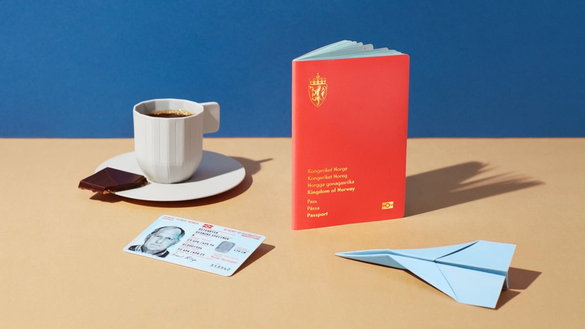
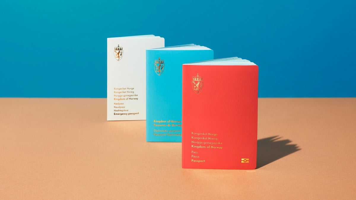
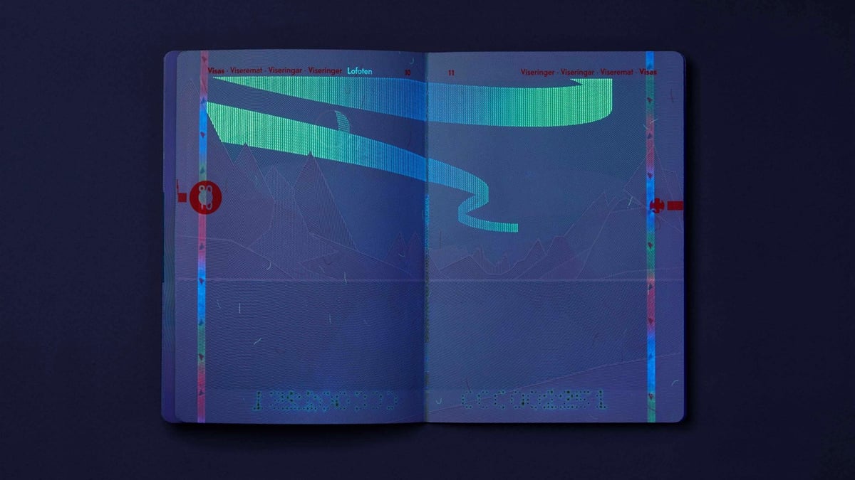
Aside from a design that makes the passport safer, the passport also has details from Norwegian nature used both as a background illustration and a security element.
When the pages of the passports are placed under UV light, the reproduction of the Norwegian landscape will change from day to night, with, among other things, beautiful northern lights and clouds.
You can see the appearance of the northern lights under UV in the third image above — what a great detail! And I liked this explanation regarding the shared ownership of the passport:
The documents need to ensure identification for its holder and for controlling authorities — domestically as well as abroad. This implies that the ID documents are both a private and a public matter. The document’s holder should feel proud ownership, thus treating the documents carefully and with respect.
When we can all travel again, I will be on the lookout for these sharp-looking documents. And how does one get Norwegian citizenship…? (thx, bård)
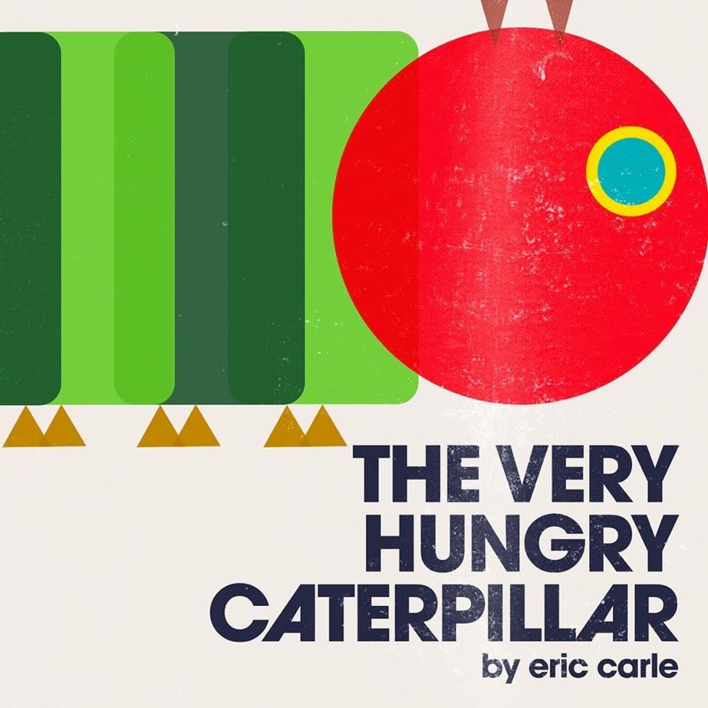
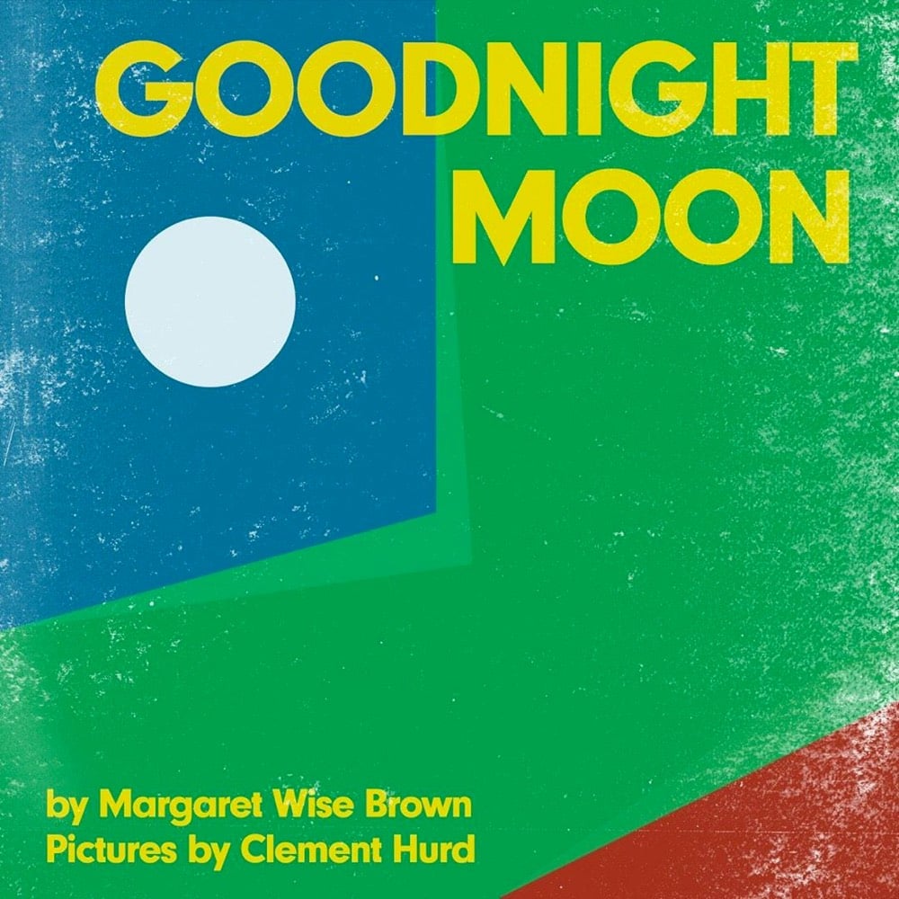
Over on his Instagram, Raj Haldar is making modernist versions of book covers for children’s books. So far there’s Goodnight Moon, The Snowy Day, The Very Hungry Caterpillar, Haldar’s own P Is For Pterodactyl, and a few others. Here’s what he says about Goodnight Moon:
Today, I’ve reduced ‘Goodnight Moon’ to nothing more than a few circles, rectangles, and triangles. What’s amazing, and a testament to how deeply this classic picture book is embedded in our collective consciousness is that even as a collection of the most simple forms, the cover is thoroughly recognizable.
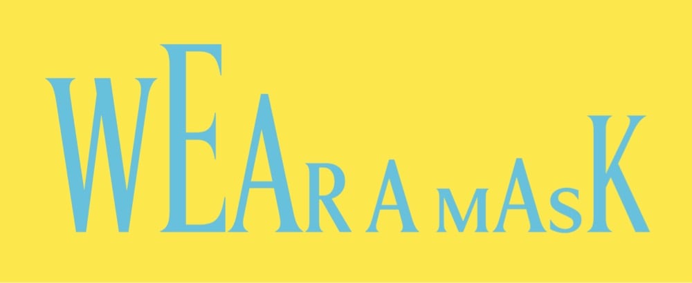
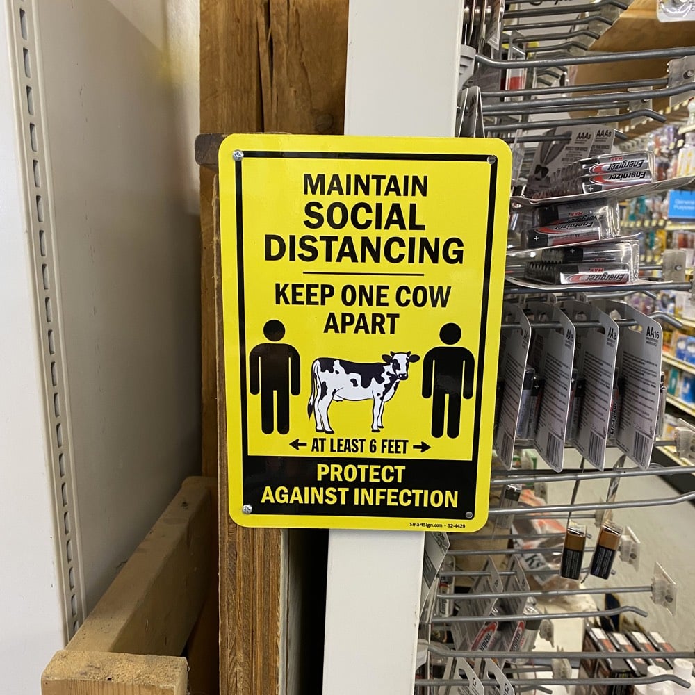
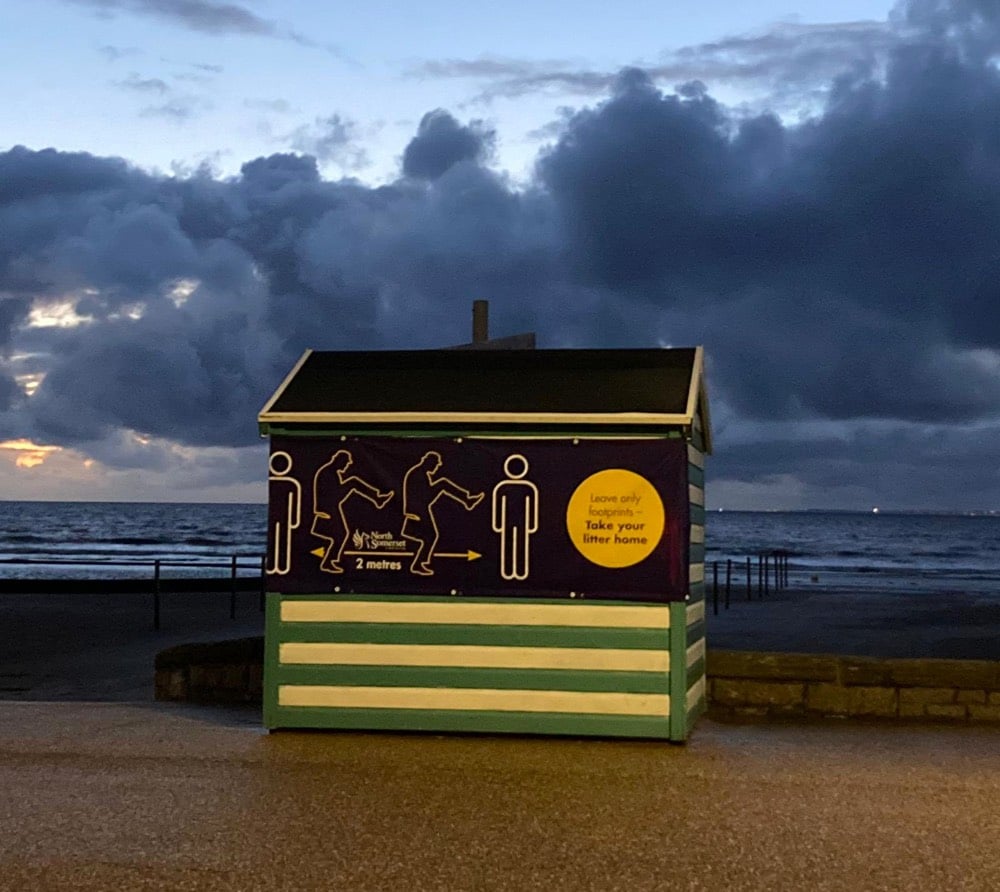
Public health safety measures don’t have to be bureaucratic, dour, and oppressive. They can even be fun. This is a sign from my local hardware store here in Vermont reminding shoppers to social distance:
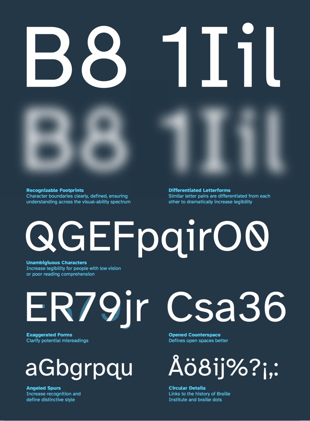
“People may be surprised that the vast majority of the students who come to Braille Institute have some degree of vision,” says Sandy Shin, the institute’s vice president for marketing and communications. “They’re not 100% blind.”
Thus, most of the Braille Institute’s 37,000 clients across Southern California don’t depend on the dot-based Braille language. Instead, they rely on spoken-word tools and accessibility standards that encourage text publishers to think more carefully about the legibility of words on pages.
His previous four books are some of my favorites about design. You can only order Seeing with Fresh Eyes direct from his site, which says the book is shipping in mid-October. (thx, dewayne)
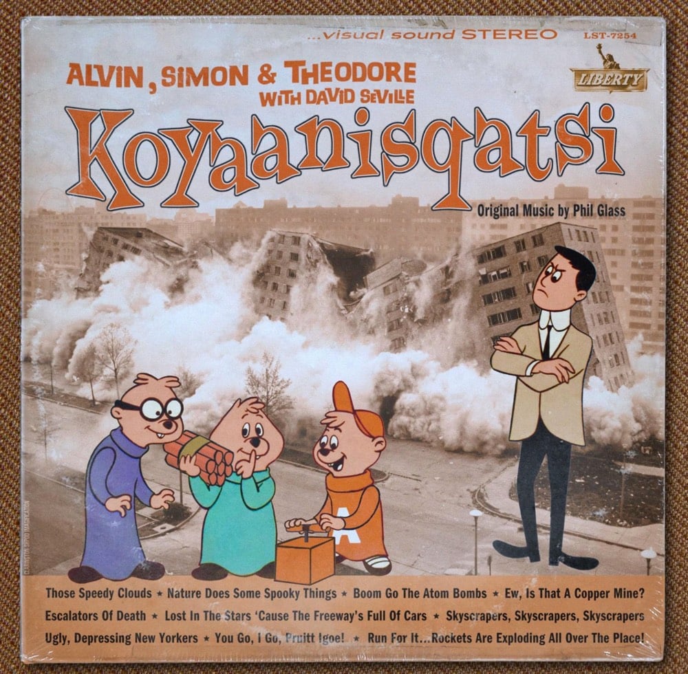
This album cover was tweeted out the other day by Philip Glass’s official account with no additional comment. What really makes it IMO is the song titles listed at the bottom of the cover: Those Speedy Clouds, Escalators of Death, Run For It…Rockets Are Exploding All Over the Place!
I tried to track down who made this, but the only other instance I could find online was on Philip Glass’s Instagram exactly one year ago. Koyaanisqatsi is a serious work of art — it’s refreshing to see how playful Glass is about its representation. You could imagine other artists/musicians not being so chill about it.
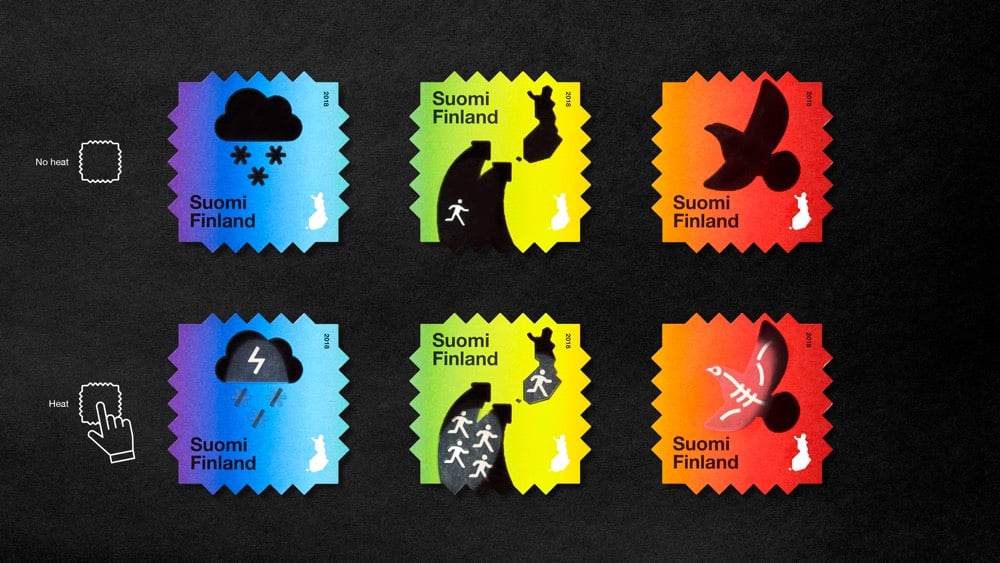
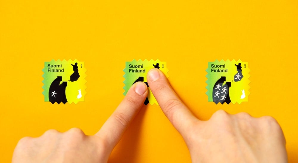
The Finnish Post Office tapped design firm Berry Creative to create this series of heat-reactive postage stamps that reveal messages about the effects of climate change when you activate them with heat (like a finger pressing on them). Each stamp tells a little two-act story about a different aspect of climate change: global temperature increase, climate refugees migrating, and endangered wildlife. Very clever design and I love the aesthetics too. (via moss & fog)
To celebrate the release of their latest limited edition memo books, Field Notes made a short documentary about The United States of Letterpress, featuring several letterpress practitioners from around the country.
I ran a pedal-powered letterpress machine for a few minutes several years ago and that huge machine whizzing away right in front of me was both magical (it stamps the ink right into the paper and it’s in your hands 2 seconds later) and terrifying (the massive flywheel could have ripped my arm clean off without slowing down). Danger and enchantment, what else do you need really?
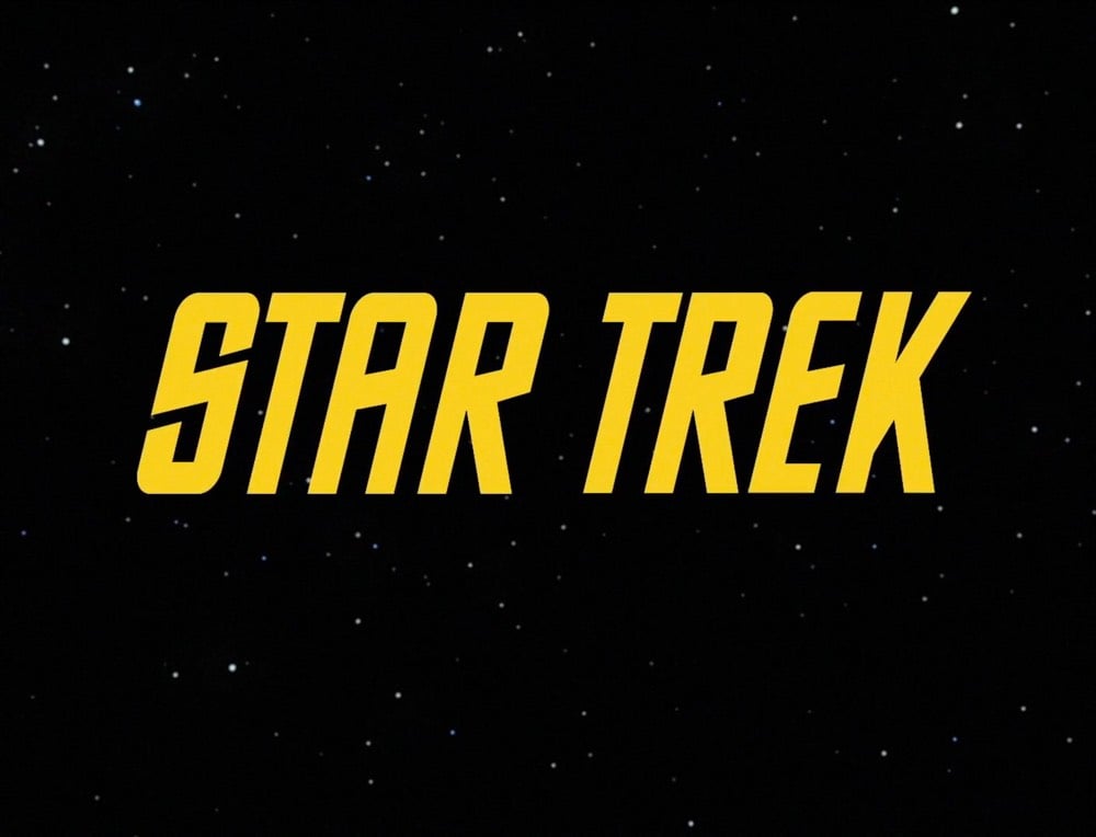
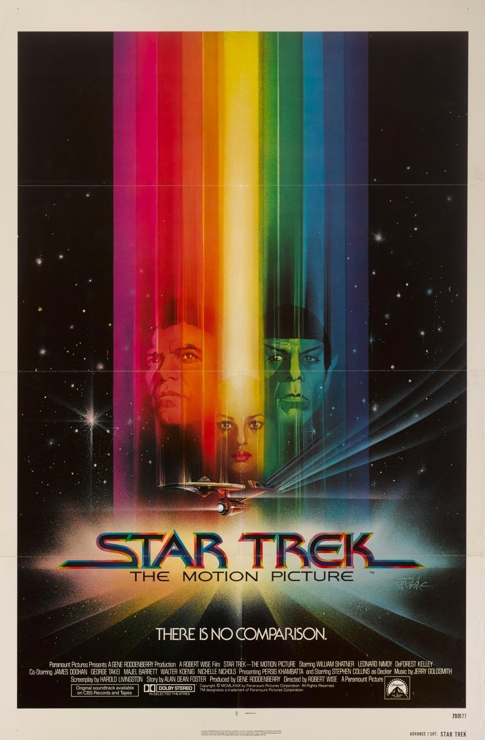
Alas, The Original Series’s inconsistent typography did not survive the stylistic leap into the 1970s. To make up for it, The Motion Picture’s title card introduces a new font, with some of the curviest Es known to sci-fi. It also follows an emerging seventies trend: Movie names beginning with STAR must have long trailing lines on the opening S.
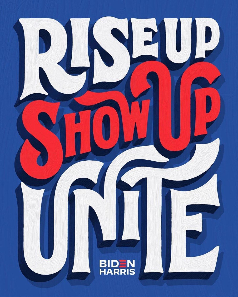
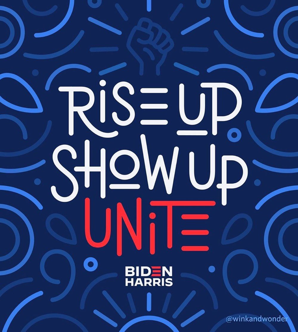
Last week, I [Jessica Hische] had a good conversation with the Biden creative team. I shared that one of my concerns for the upcoming election was the lack of visible support for the campaign. There are a lot of folx within the creative world and beyond posting on social media about voting (a wonderful and necessary message), but few of those posts mention the candidates by name. It’s somewhat implied that if you’re promoting voting or voting rights that you’re likely voting Biden and encouraging a Biden vote, but it’s not explicit. There’s a “I guess I’ll vote for him if I have to” vibe throughout leftist social media, but exasperated resignation doesn’t get people to the polls.
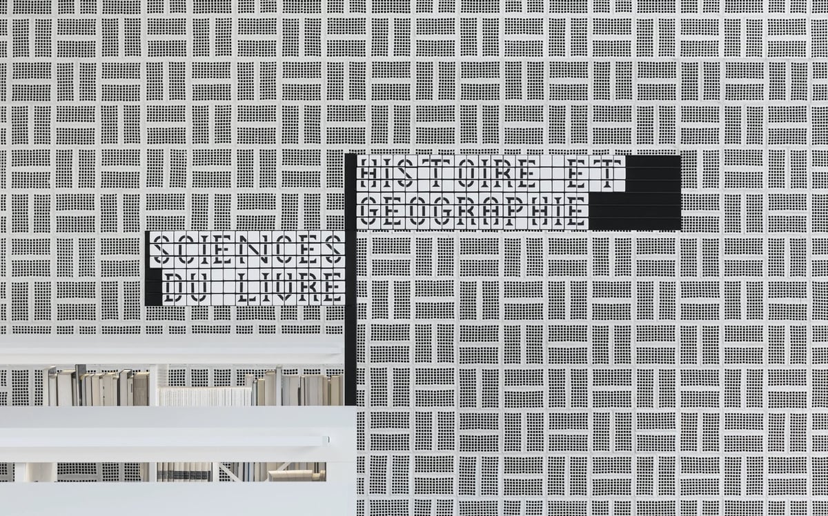
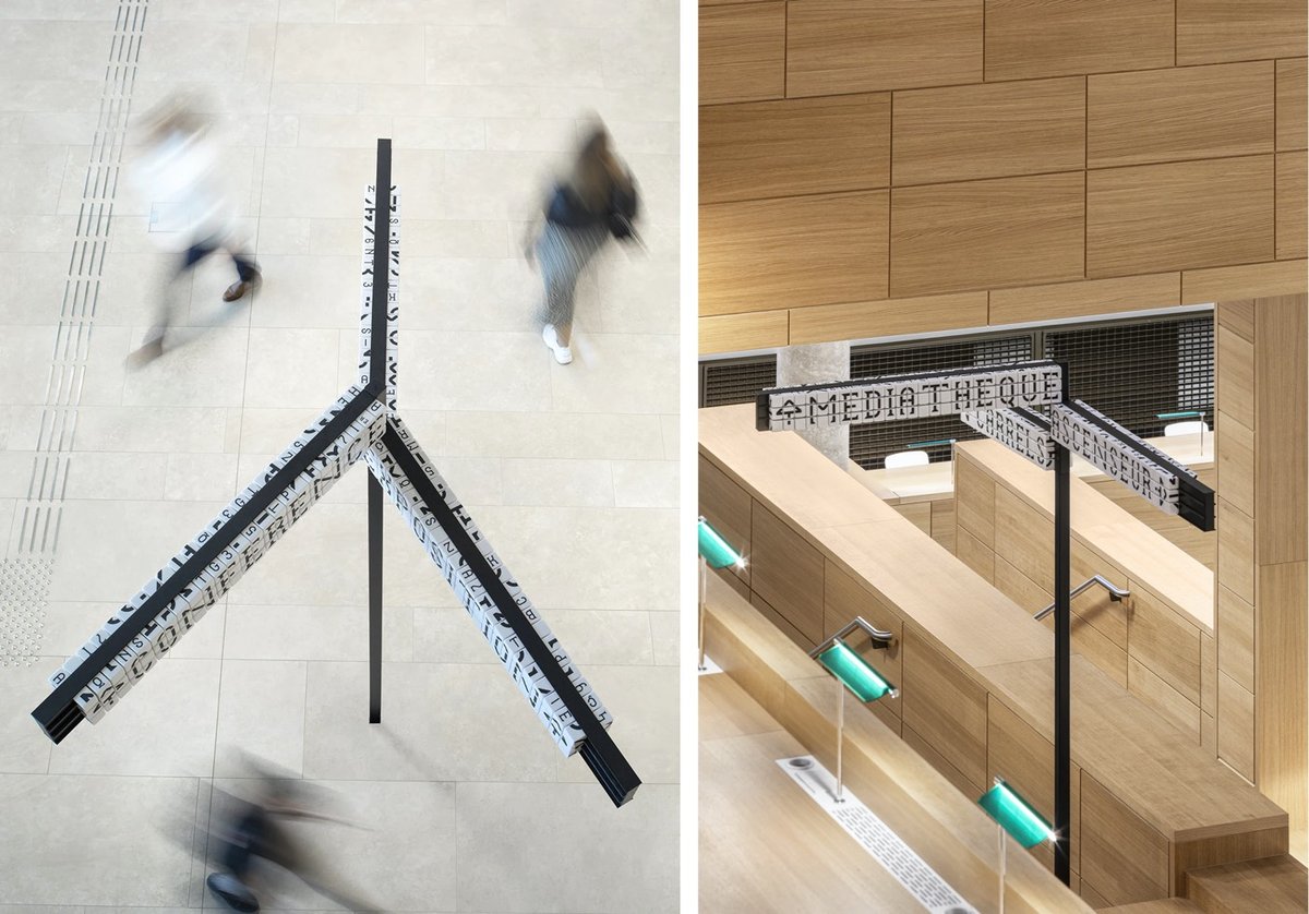
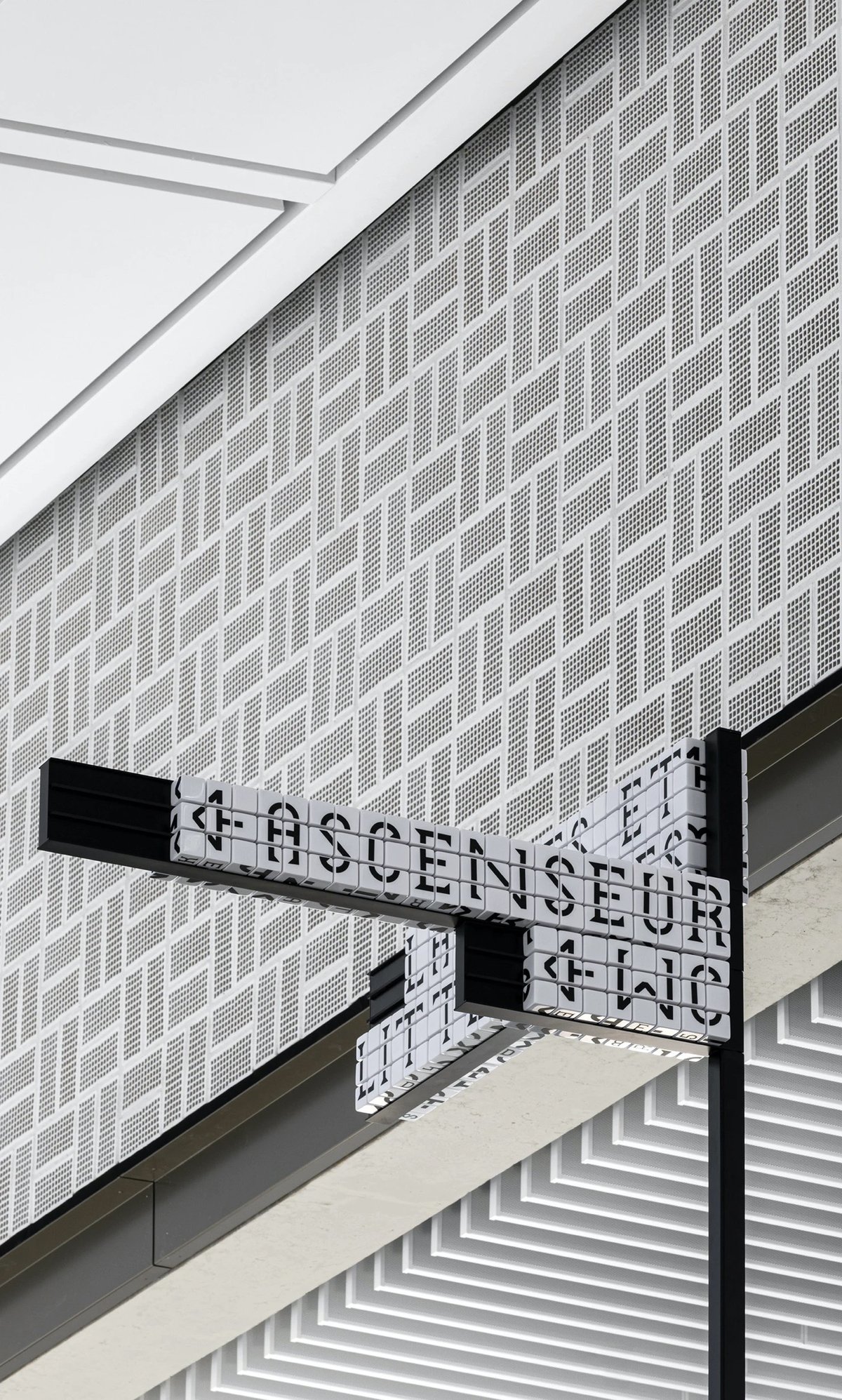
Sascha Lobe’s team at Pentagram has designed a functional and stylish modular signage system for the National Library of Luxembourg. The signs use cubes (inspired by LED clock displays?) that can be reconfigured into different words by library staff.
Numerical and alphabetical cubes are the foundation of the BnL’s modular signage system. In handling massive volumes of information and growing library collections, it is essential to free the library staff from rigid systems and equip them with the ability to easily make signage changes.
The flexible signage plan, consisting of 25,000 resin cubes, 6000 tableaus and 2,400 numerical shelving characters, enables staff to independently customize information as the library’s collection fluctuates. The resin cubes, constructed from a durable material, also translate the timelessness of the library and its long-standing presence throughout the years and into the future.
The only (but perhaps significant) downside to the signs is that they are not actually super legible when compared to a non-modular alternative. They sure do look great though.
Update: This post got shared on Twitter by a couple of librarian pals and Librarian Twitter was not impressed by this signage at all. Not legible, not accessible, and difficult/fiddly to maintain were the main complaints. As someone who believes that design is primarily about how something works and not how something looks, I’m a bit embarrassed that I didn’t hit that point harder in this post. I do love the aesthetics of the project, but from the photos, the legibility looks terrible. Maybe it’s different while navigating the space in person, but if not, you have to wonder how helpful hard-to-read signs are to patrons.
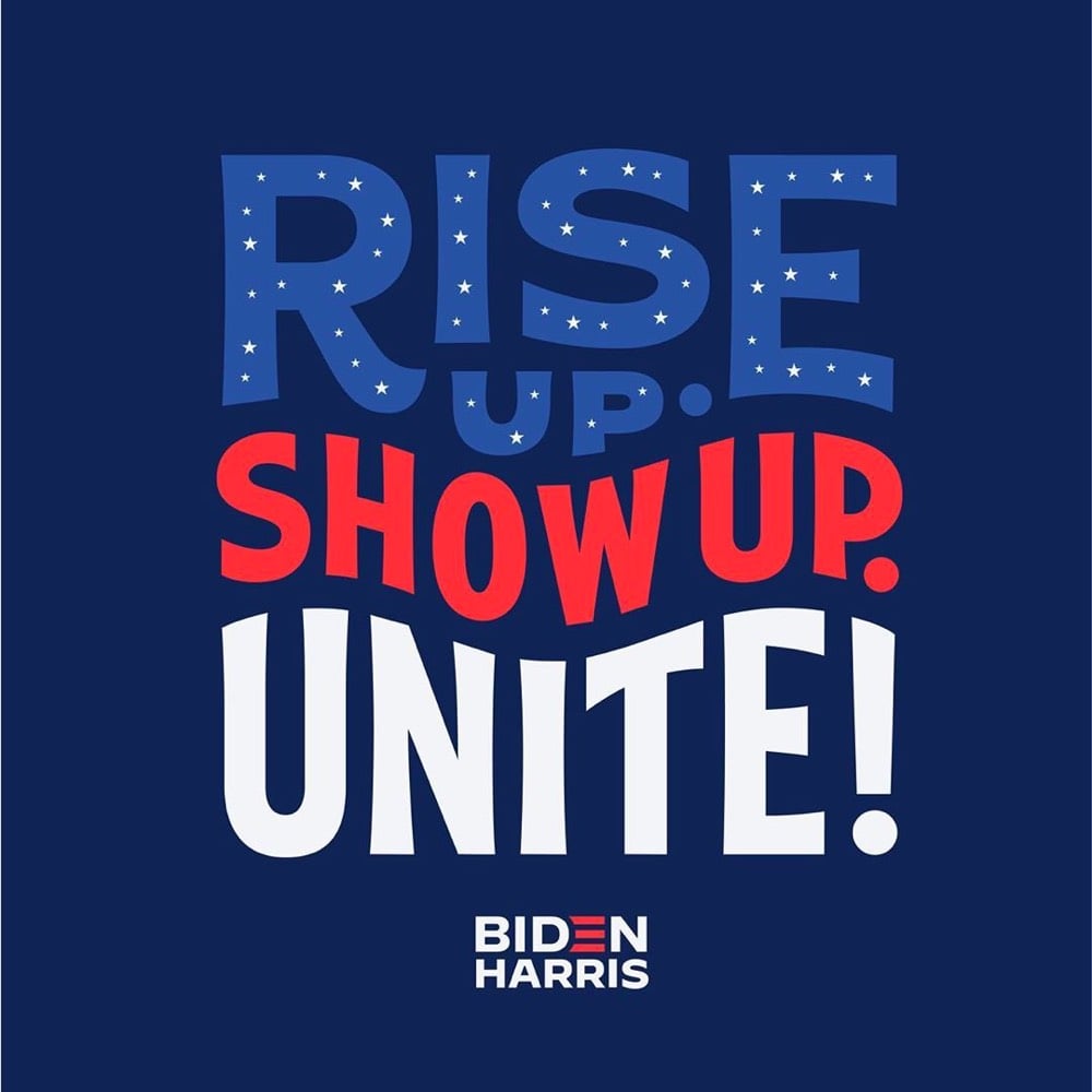
On Tuesday, Joe Biden announced that Senator Kamala Harris would be his vice-presidential running mate. The campaign was quickly updated to include a new Biden-Harris logo designed by Hoefler&Co. in collaboration with Biden campaign advisor Robyn Kanner:
But the designer of the logo wasn’t told who the running mate would be beforehand, so how did the campaign get it out so quickly? According to Jonathan Hoefler, the design team designed a whole collection of logos for potential candidates gleaned from reading the media tea leaves.
A consequential decision at an unpredictable time, conducted under absolute secrecy, poses an interesting dilemma to the typographer: how do you create a logo without knowing for certain what the words will say? Logos, after all, are meaningfully informed by the shapes of their letters, and a logo designed for an eisenhower will hardly work for a taft. The solution, naturally, involves the absurd application of brute force: you just design all the logos you can think of, based on whatever public information you can gather. Every credible suggestion spotted in an op-ed was added to the list that we designers maintained, and not once did the campaign even hint at a preference for one name over another.
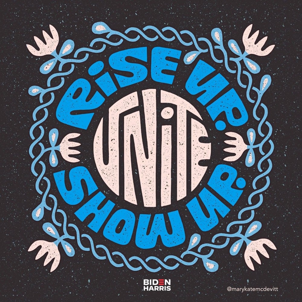
I would love to see some of those alternate designs (Biden-Warren!), but there’s no way in hell they’ll ever see the light of day, especially before the election.
I never, ever thought I’d say this after a lifetime in professional branding, but on the spectrum of good branding versus effective branding, I’d say at this point it is irrelevant. Frankly, the Biden-Harris logo could have been scribbled on a napkin and I’d be happy. Trump’s brand is beyond repair and is now more dangerous than ever. The soul of our country is at stake.
That logos don’t matter that much (unless they are either great or horrible) is probably true more often than designers and branding folks would care to admit.
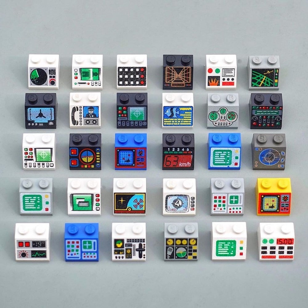
I thought George Cave’s The UX of LEGO Interface Panels was going to be a fun distraction, but it’s actually a great layperson’s explanation, using familiar Lego pieces, of how interfaces work in the real world and the design considerations that go into building them.
Shape coding is one approach to differentiation, but there are many others. Colour coding is perhaps the only one to break into our everyday vocabulary, but we can add four more: size, texture, position and operation coding. Together these six are our allies in the design of error-proof interfaces.
Size, shape and colour-coding are the fundamentals: quick-wins that can fix a lot of interface problems. Texture is also a great differentiator for blind operation, particularly on small dials requiring precise control.
Stay Connected