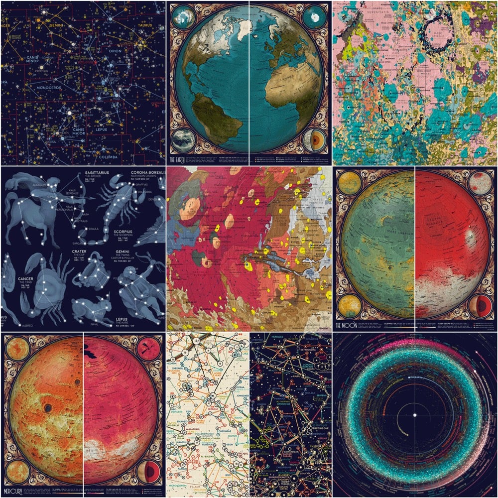
Eleanor Lutz is one of my favorite data visualizers (previously) and she’s about ready to drop her new project: An Atlas of Space.
I’m excited to finally share a new design project this week! Over the past year and a half I’ve been working on a collection of ten maps on planets, moons, and outer space. To name a few, I’ve made an animated map of the seasons on Earth, a map of Mars geology, and a map of everything in the solar system bigger than 10km.
Over the next few weeks I want to share each map alongside the open-source Python code and detailed tutorials for recreating the design. All of the astronomy data comes from publicly available sources like NASA and the USGS, so I thought this would be the perfect project for writing design tutorials (which I’ve been meaning to do for a while).
Ahhh, look at those colors! Lutz is going to be posting a new map from the project periodically over the next few weeks so follow her on Tabletop Whale, Twitter, or Tumblr to tune in.
Update: I’m keeping track of the projects that make up the atlas as they are released in updates to this post.
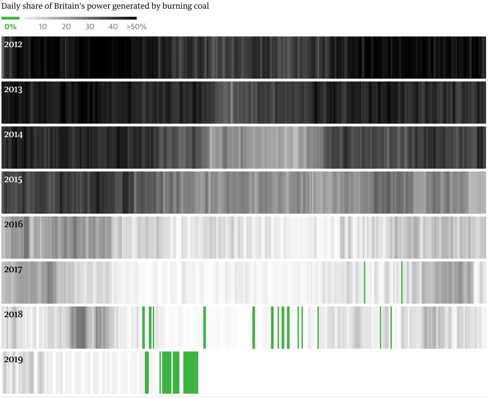
In Britain, the birthplace of the industrial revolution, no coal has been used to produce power for the last 11 days. This is an arresting chart of how quickly the country’s reliance on coal has been reduced:
Britain is setting new records for going without coal-powered energy. In the latest milestone, it has gone for more than eight days without using coal to generate electricity — the longest such period since 1882.
The coal-free run comes just two years after the National Grid first ran without coal power for 24 hours.
Phasing out the heavily polluting fuel is a key step in the transition towards a net-zero carbon economy and essential to averting catastrophic climate change.
Britain still derives ~50% of its power from natural gas, but this is a very hopeful chart. “Gradually then suddenly” works against us in dealing with climate change but it also could work in our favor.
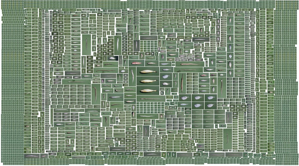
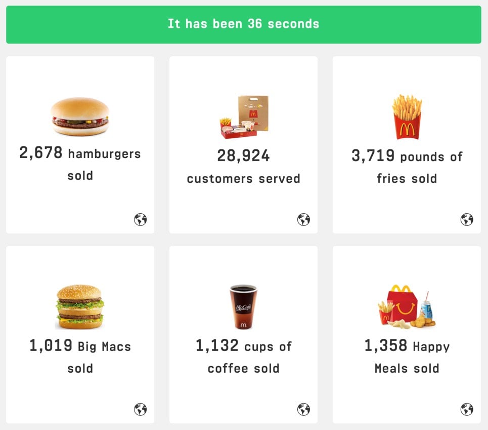
We examined the impact of farm fishing through the large yellow croaker (大黄鱼) which is China’s most popular fish.
Working with scientists, fish experts and local government officials, we traversed 4 towns in Fujian China to build a tessellated mosaic of fish portraits to see how much wild small fish is needed to sustain fish farming.
The answer is 7.15kg, 39 species, more than 4000 wild small fish to raise a single kilogram of large yellow croaker.
It’s worth noting here that this first stage of data-work can be somewhat vexing: computers are great, but they’re also incredibly frustrating when they don’t do what you’d like them to do. That’s why it’s important to remember that you don’t need to worry — learning to program is exactly as infuriating and as dispiriting for you as it is for everyone else. I know this all too well: some people seem to be terrific at it without putting in all that much effort; then there was me, who first began writing code in 2014, and couldn’t understand the difference between a return statement and a print statement. The reason learning to code is so maddening is because it doesn’t merely involve learning a set number of commands, but a way of thinking. Remember that, and know that the little victories you amass when you finally run your loop correctly or manage to solve a particular data problem all combine to form that deeper understanding.
Before you begin visualizing your data, think through the most important points that you’re trying to communicate. Is the key message the growth of a variable over time? A disparity between quantities? The degree to which a particular value varies? A geographic pattern?
Once you have an idea of the essential takeaways you’d like your readers to understand, you can consider which type of visualization would be most effective at expressing it. During this step, I like to think of the pieces of work that I’ve got in my archive and see if any one of those is especially suitable for the task at hand.
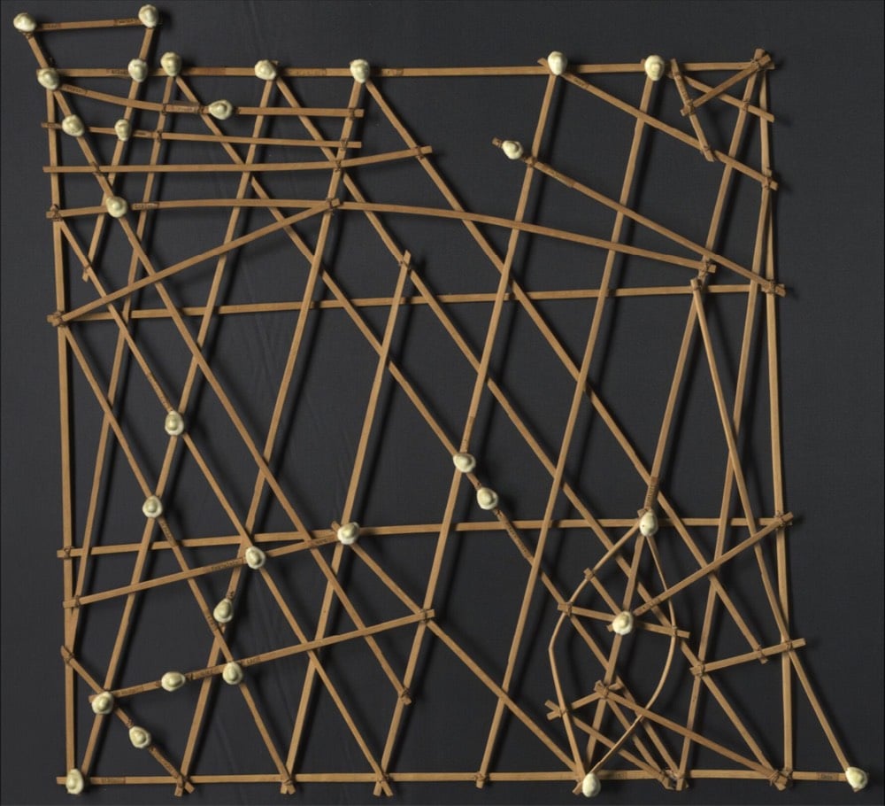
For almost as long as we’ve had civilization, people have been making data visualizations.1 The availability of paper and screens has exploded their creation in the last few hundred years, but the earliest visualizations were made from physical objects. This list contains more than 300 examples of physical visualizations and related artifacts and is absolutely fascinating (the older artifacts in particular). Take these stick charts from the Marshall Islands for example:
These physical visualizations show ocean swell patterns, and were built by native Micronesians from the Marshall Islands to facilitate canoe navigation. They were memorized before trips. The Western world remained unaware of the existence of these artifacts until 1862.
The photo above is a stick chart from 1974. Straight sticks represent regular currents and waves, curved sticks represent ocean swells, and seashells represent atolls and islands.
Women from the Yakama Native American tribe used strings of hemp as personal diaries. Each major event in their life was represented by a knot, a bead or a shell. This mnemonic device is called an Ititamat, or counting-the-days ball, or simply time ball.
A young woman would use a time ball to record her courtship, marriage, and other experiences using a system of knots and beads that only she could decipher. As she grew older, a woman might have several time balls with which to share her life story or keep those memories private. When she passed on, they were buried with her.
The ball of twine grew in size as time passed and as events occurred. The women would sometimes divide the twine into 25-year lengths to make it more manageable. When the women were very old, they could use the knots and beads of their time balls to recall not only what happened in their lives but when the events occurred. They could easily recount when their children were born, when they moved away, and other major experiences.
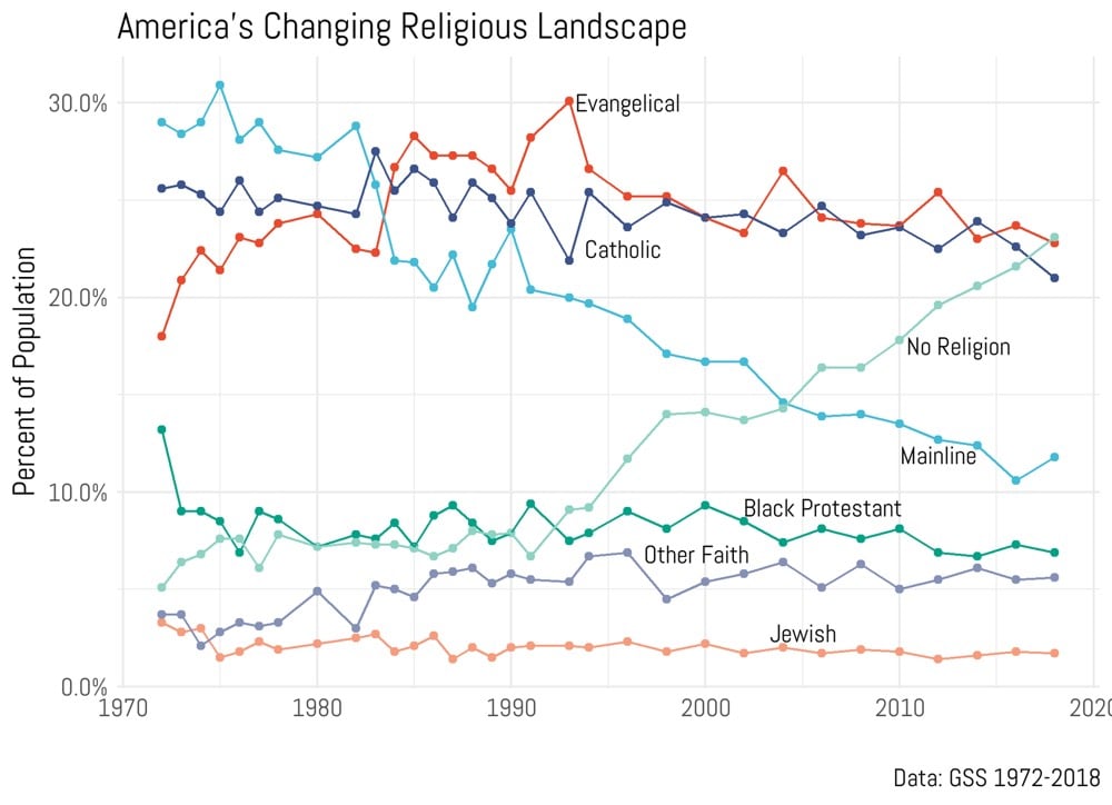
According to new data from the General Social Survey, the number of Americans who answered “no religion” in response to the question “What is your religious tradition?” is now greater than those who identify as Catholics or evangelical Christians. Ryan Burge shared this graph of the trends from the past 50 years:
The “no religion” trend has been growing steadily since 1991. But as this piece notes, it’s tough to tell exactly why people are answering the question that way.
Even then, those who claim “no religion” are not inherently atheists or agnostics: A 2017 Pew Research survey found that only 22 percent of “nones” listed not believing in God as the most important reason for their lack of religious affiliation.
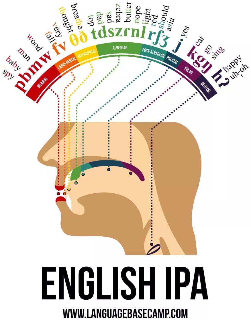
This infographic from Language Base Camp shows where the sounds that English speakers use are produced in the mouth and throat.
I’ve had zero voice training in my life, so it was really illuminating to speak all of the different sounds while paying close attention to where in my mouth they were happening. Try it!
Update: And after pronouncing the sounds yourself, take a few minutes to play around with Pink Trombone. Fun! (via @pixelcult)
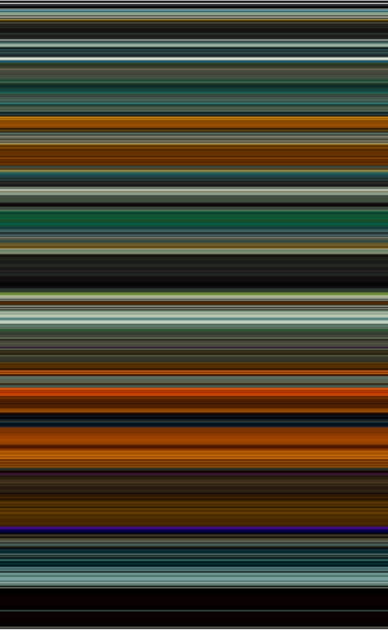
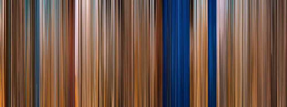
A site called The Colors of Motion makes single image timelines of the use of colors in movies. They sample frames at regular intervals, choose the average color of each frame, and stack them up. Here’s their representation of Blade Runner 2049:
If you click through on specific films, you can see the actual screencaps used for sampling and buy prints.
The Moviebarcode Tumblr pre-dates The Colors of Motion, although they appear to use a slightly different technique: each scene is smooshed into a single vertical line. Here’s Mad Max: Fury Road:
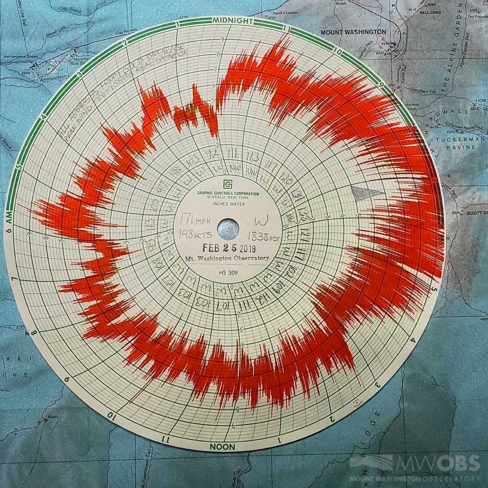
While it’s more that 50 mph slower than the 1934 record of 231 mph (!!), a look at the historical record shows that it’s one of the strongest winds ever recorded there and the strongest one since 1985.
While the observatory building itself is rated for winds up to 300 mph, humans venturing out at that speed might blow away. Here’s what a person battling 70-100 mph winds looks like:
On Instagram, someone at the observatory said of last night’s winds:
We could absolutely hear the winds yesterday! Sounded like a constant rumble similar to an earthquake. At the height of the storm our coffee mugs were shaking across the table and our bullet proof windows were constantly flexing back and forth.
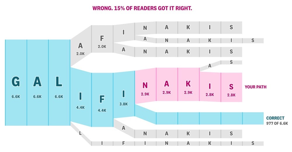
Last month, I wrote about Colin Morris’ flow diagrams that show how people most frequently misspell difficult words. The crew over at The Pudding turned this into an interactive feature where you can test your spelling of the names of celebrities like football player & activist Colin K., actor & comedian Zach G., and musician Alanis M. As you type, you get a flow diagram of your letter choices compared to everyone else’s. Here’s my diagram for Zach G., which only 15% of people got correct (with the correct spelling blocked out):
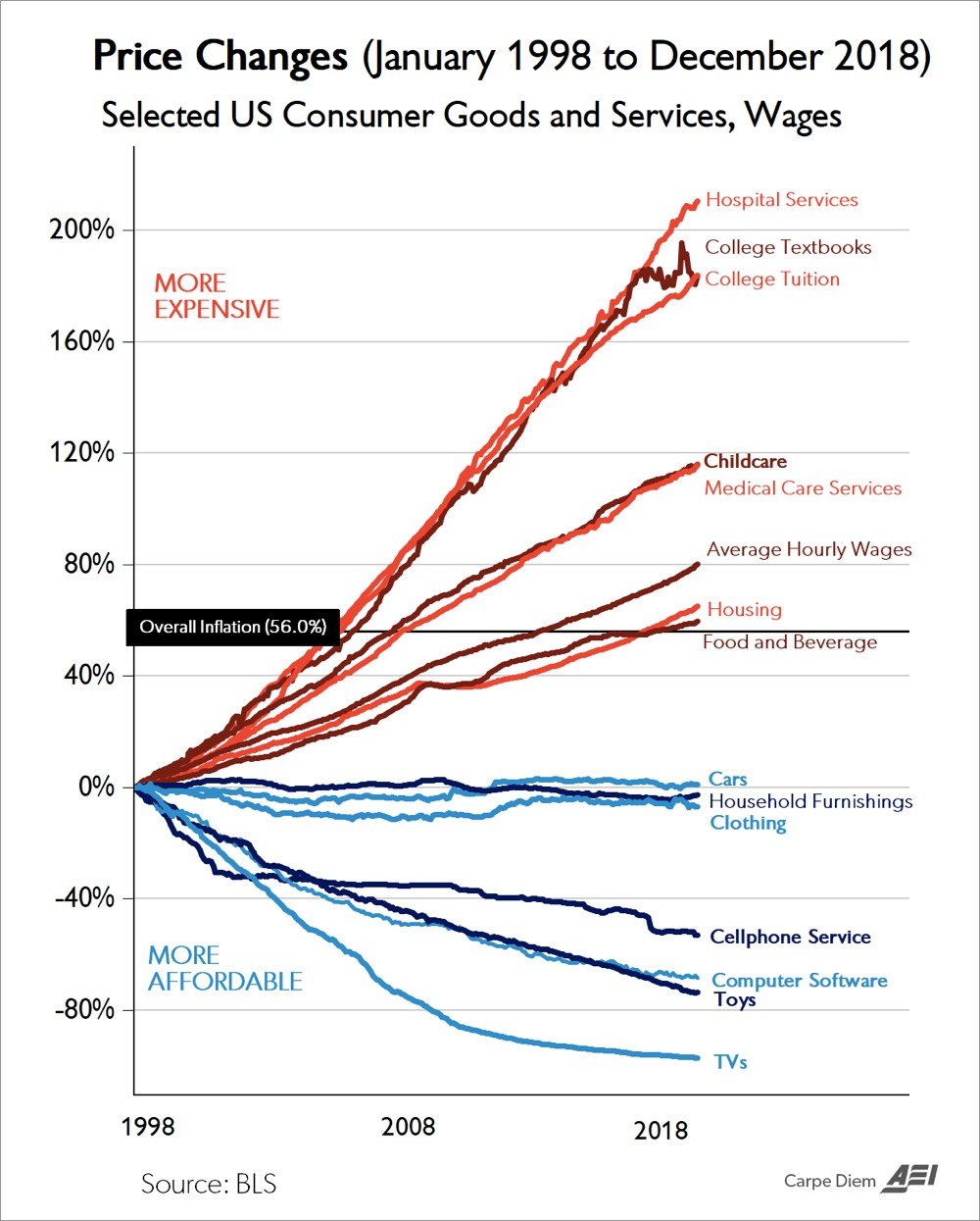
Economist Mark Perry has updated for 2018 his chart of price changes of selected goods over the past two decades.
This graphic has been referred to a “the Chart of the Century” because it explains a lot about the socioeconomic life in the United States in just a quick glance.
During the most recent 21-year period from January 1998 to December 2018, the CPI for All Items increased by exactly 56.0% and the chart displays the relative price increases over that time period for 14 selected consumer goods and services, and for average hourly earnings (wages). Seven of those goods and services have increased more than average inflation, led by hospital services (+211%), college tuition (+183.8%), and college textbooks (+183.6%). Average wages have also increased more than average inflation since January 1998, by 80.2%, indicating an increase in real wages over the last several decades.
The other seven price series have declined since January 1998, led by TVs (-97%), toys (-74%), software (-68%) and cell phone service (-53%). The CPI series for new cars, household furnishings (furniture, appliances, window coverings, lamps, dishes, etc.) and clothing have remained relatively flat for the last 21 years while average prices have increased by 56% and wages increased 80.2%.
As various parties have noted, the goods & services that have gotten more expensive tend to be things that people need, aren’t subject to international competition, and are subject to more government regulation. The goods & services that have gotten cheaper tend to be things that people want, are subject to international competition, and are less regulated.
If healthcare & education costs had dropped as much in the last two decades as the price of TVs, toys, and software has, we’d be all set! As it is…
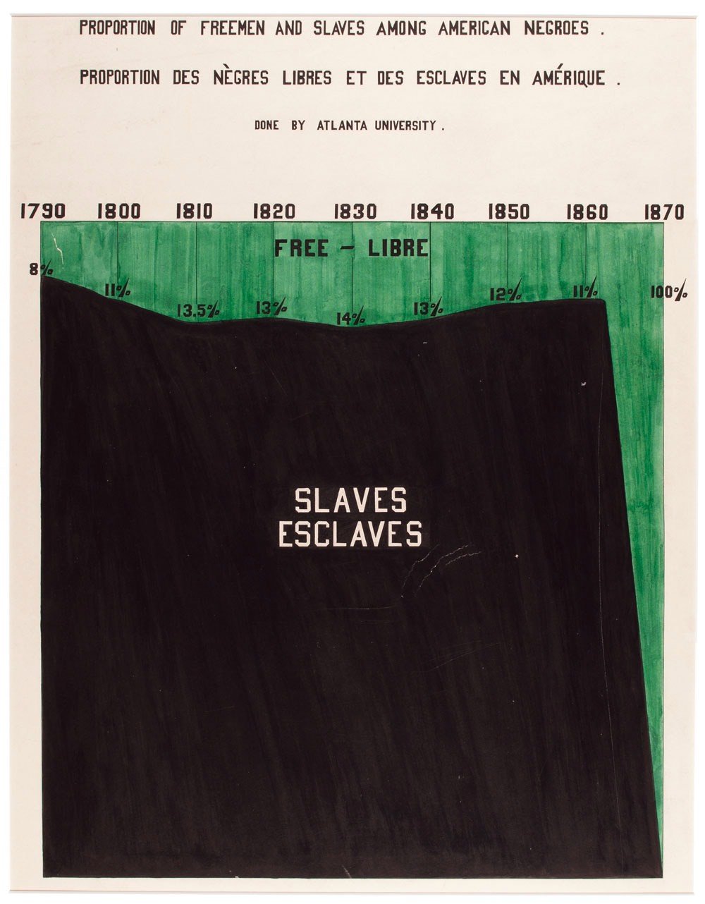
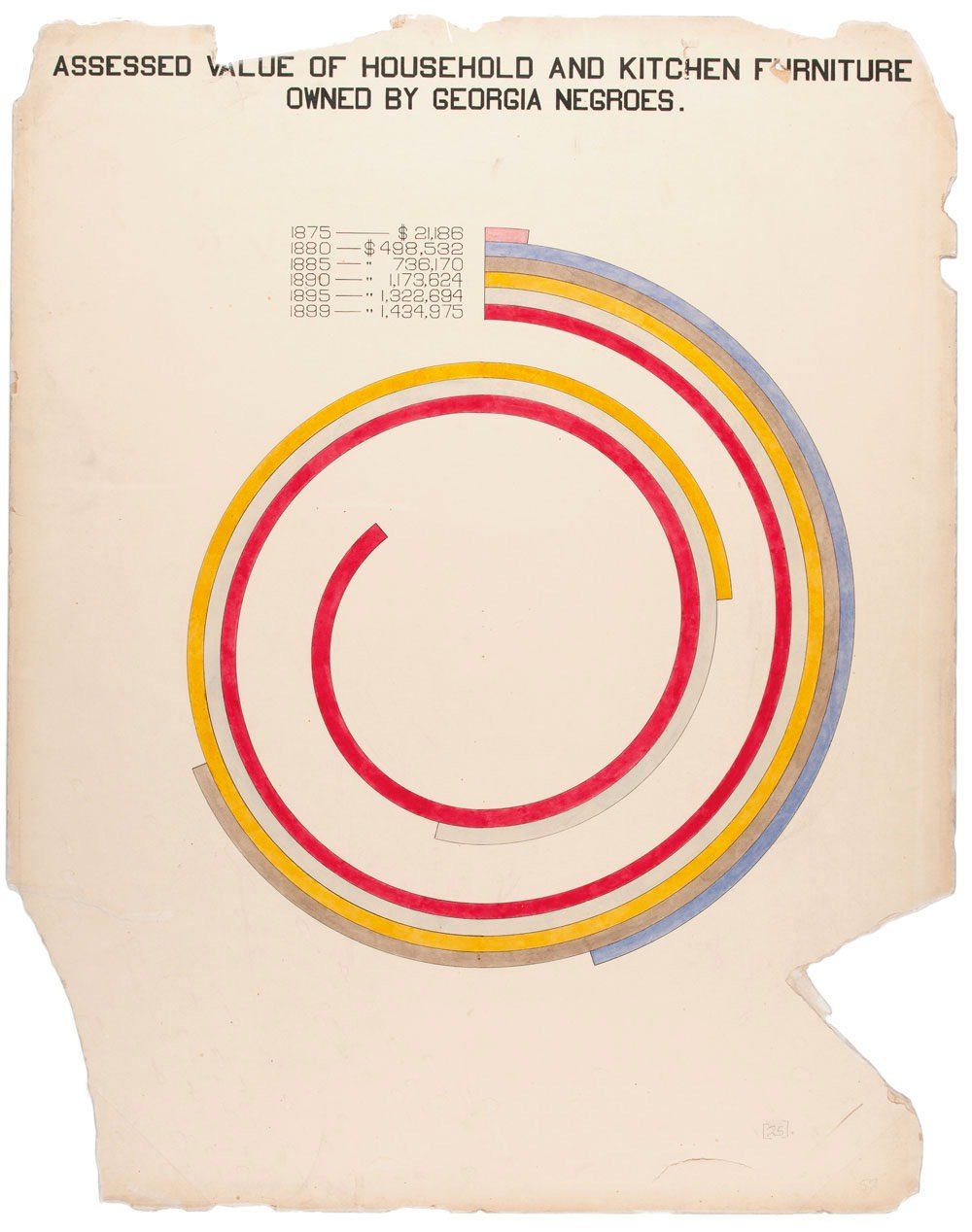
The colorful charts, graphs, and maps presented at the 1900 Paris Exposition by famed sociologist and black rights activist W. E. B. Du Bois offered a view into the lives of black Americans, conveying a literal and figurative representation of “the color line.” From advances in education to the lingering effects of slavery, these prophetic infographics — beautiful in design and powerful in content — make visible a wide spectrum of black experience.
W. E. B. Du Bois’s Data Portraits collects the complete set of graphics in full color for the first time, making their insights and innovations available to a contemporary imagination. As Maria Popova wrote, these data portraits shaped how “Du Bois himself thought about sociology, informing the ideas with which he set the world ablaze three years later in The Souls of Black Folk.”
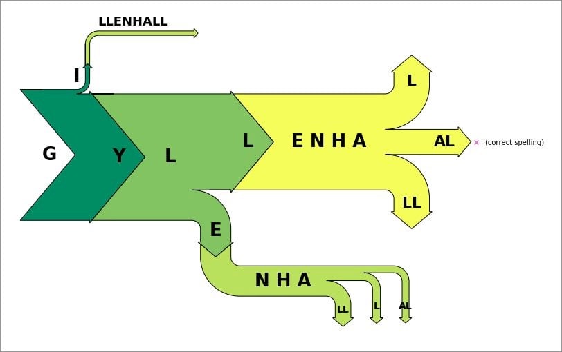
Colin Morris recently analyzed a corpus of comments from Reddit for misspellings by searching for words near uncertainty indicators like “(sp?)”. Among the words that provoked the most doubt were Kaepernick, comradery, adderall, Minaj, seizure, Galifianakis, loogie, and Gyllenhaal. Morris then used a Sankey diagram to visualize how people misspelled “Gyllenhaal” in different ways (with the arrow thickness denoting the frequency of each spelling):
Tag yourself! (I’m probably on the yellow “LL” arrow.) Sankey diagrams are typically used in science and engineering to visualize flows of energy in and out of a system, but this is a clever adaptation to linguistics (sp?). I’d to see one of these for rhythm. (via @kellianderson)
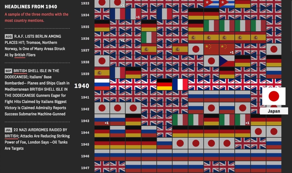
The Pudding analyzed over 740,000 headlines from the NY Times since 1900 to determine which country the US was most interested in for each month and turned the analysis into a handy visualization.
As you can see, Britain was mostly the center of attention before WWII, Russia during the Cold War, and China since the mid-2000s. But other countries are liberally sprinkled in and wars are quite visible — WWI, WWII, Vietnam, and Iraq are all represented by solid blocks of interest in our “enemies”.
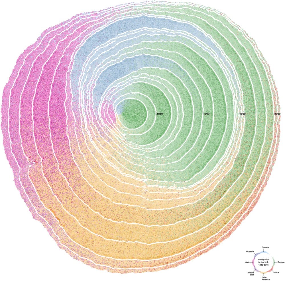
Nature has its own ways of organizing information: organisms grow and register information from the environment. This is particularly notable in trees, which, through their rings, tell the story of their growth. Drawing on this phenomenon as a visual metaphor, the United States can be envisioned as a tree, with shapes and growing patterns influenced by immigration. The nation, the tree, is hundreds of years old, and its cells are made out of immigrants. As time passes, the cells are deposited in decennial rings that capture waves of immigration.
A deserving winner in the “Most Beautiful” category. Here’s an animated view of US immigration’s “tree rings”:
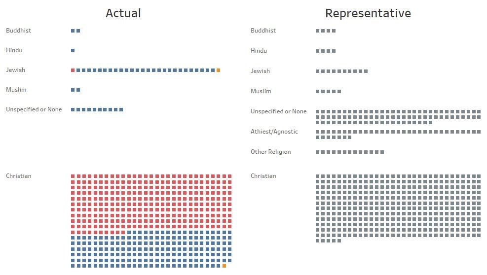
Even though the diversity of the US Congress has increased in recent years, a trend that looks to continue after the midterm elections in November, overall the 538 people who serve in Congress are not actually that representative of the US population as a whole. Congress is still way more white, male, and Christian than the US as a whole.
Congress has 104 women (19%) and 431 men (81%) while the United States population is 51% female and 49% male. In order to be truly representative, in terms of gender, 168 seats currently held by men would need to be won by women (taking the number to 272 women and 263 men). It is also worth noting that, of the 104 women, 76 are Democrat (73%), while only 28 are Republican (27%).
And here is the visualization for religion:
7.1% of the population are atheist or agnostic and 2.4% ascribe to “other” religions (this includes “don’t know”, other world religions, Pagan, Wiccan, Native American religions, and numerous others), yet not a single member of Congress falls into any of these categories.
When you hear people saying that America is still largely a patriarchal & white supremacist society, this is what they are talking about. It’s not just people being hyperbolic.
You could easily expand on this analysis by breaking it down by age, income, education, urban vs rural, sexual orientation, and occupation. You could guess that a truly representational Congress would be younger, waaaay more poor, less accredited, more urban, less straight, more working class, and, when you consider the gender & racial factors, much more politically progressive, but it would be illuminating to see the actual numbers. I’d love to see the NY Times (maybe The Upshot?), FiveThirtyEight, or The Pudding tackle this analysis.
P.S. It’s also worth noting a truly representational Congress would include full voting members from Puerto Rico and Washington DC as well as from other US territories. And maybe separate Native American representation?
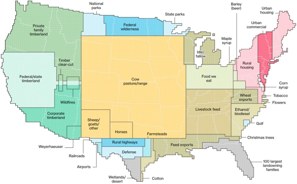
Here’s How America Uses Its Land is a nice presentation by Bloomberg on land use in the US. The land and resources used for livestock makes a great case for Americans eating more vegetarian.
More than one-third of U.S. land is used for pasture — by far the largest land-use type in the contiguous 48 states. And nearly 25 percent of that land is administered by the federal government, with most occurring in the West. That land is open to grazing for a fee.
There’s a single, major occupant on all this land: cows. Between pastures and cropland used to produce feed, 41 percent of U.S. land in the contiguous states revolves around livestock.
Urban areas take up relatively less space but are growing the fastest. And only 100 people own a space the size of Florida? Wow.
On a percentage basis, urban creep outpaces growth in all other land-use categories. Another growth area: land owned by wealthy families. According to The Land Report magazine, since 2008 the amount of land owned by the 100 largest private landowners has grown from 28 million acres to 40 million, an area larger than the state of Florida.
It would be interesting to see this data sliced and diced in a few different ways. I’d love to see land use by state or area of the country or how much each category is growing or shrinking, with projections 5, 10, 20 years into the future.
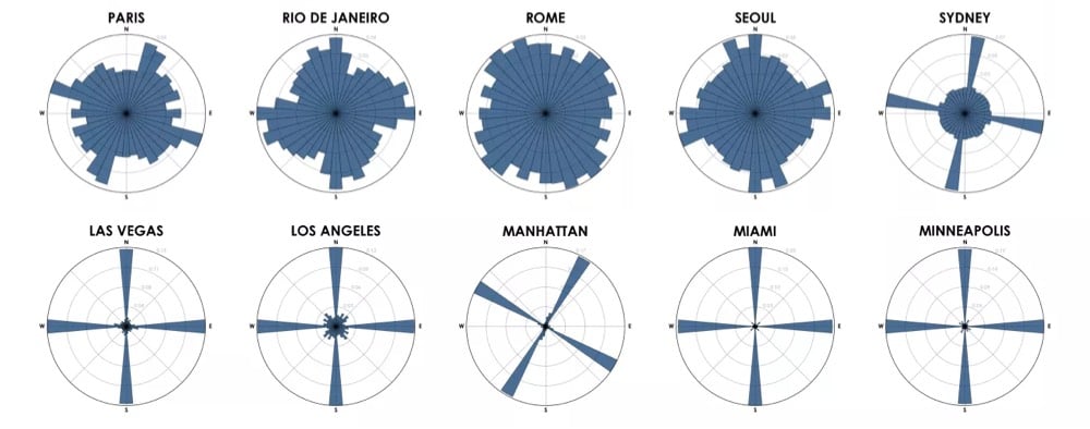
Each of the cities above is represented by a polar histogram (aka rose diagram) depicting how its streets orient. Each bar’s direction represents the compass bearings of the streets (in that histogram bin) and its length represents the relative frequency of streets with those bearings.
Looking at these graphs, you get a real sense of just how planned American cities are compared to much of the rest of the world, where cities grew more organically over longer periods of time. (Although I’m curious to see what the graph for all of NYC would look like…a bit more like Boston perhaps.)
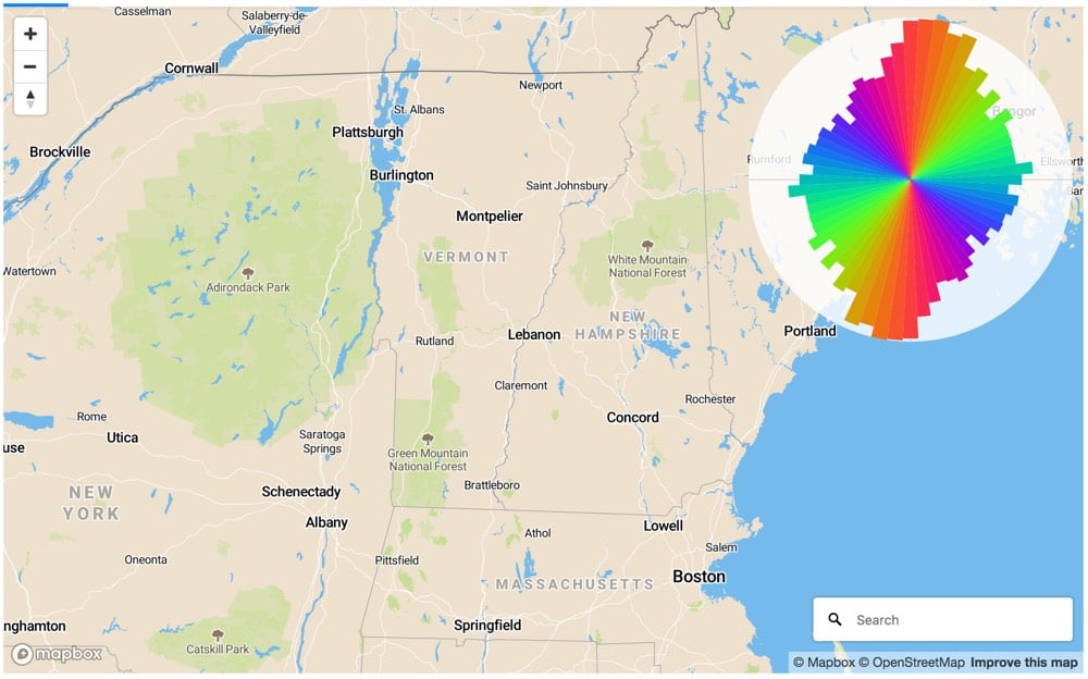
Update: Using Mapbox, you can generate street orientation charts for any map view. I used it to verify that north-south roads outnumber east-west roads in New England, which is why it takes so long to go 30 miles across VT compared to up or down.
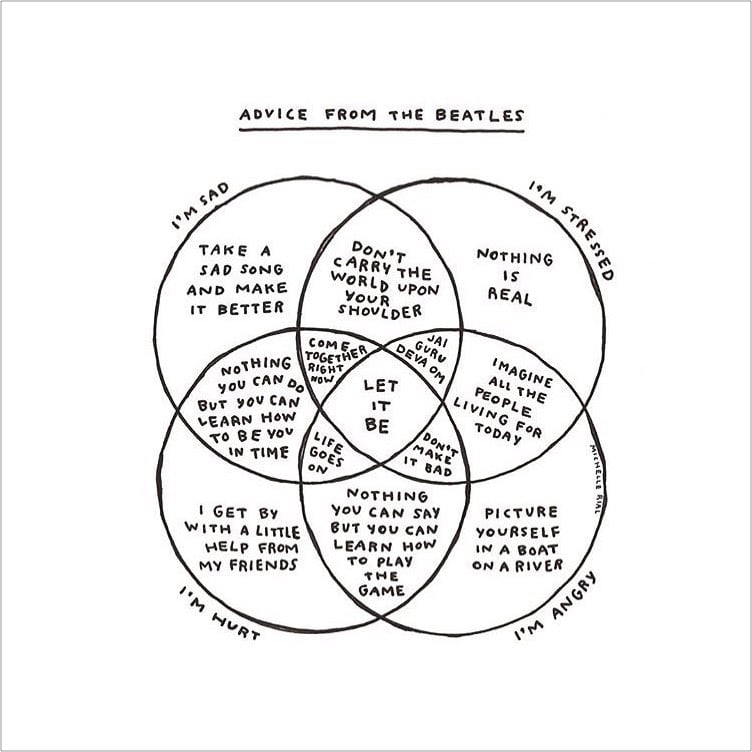
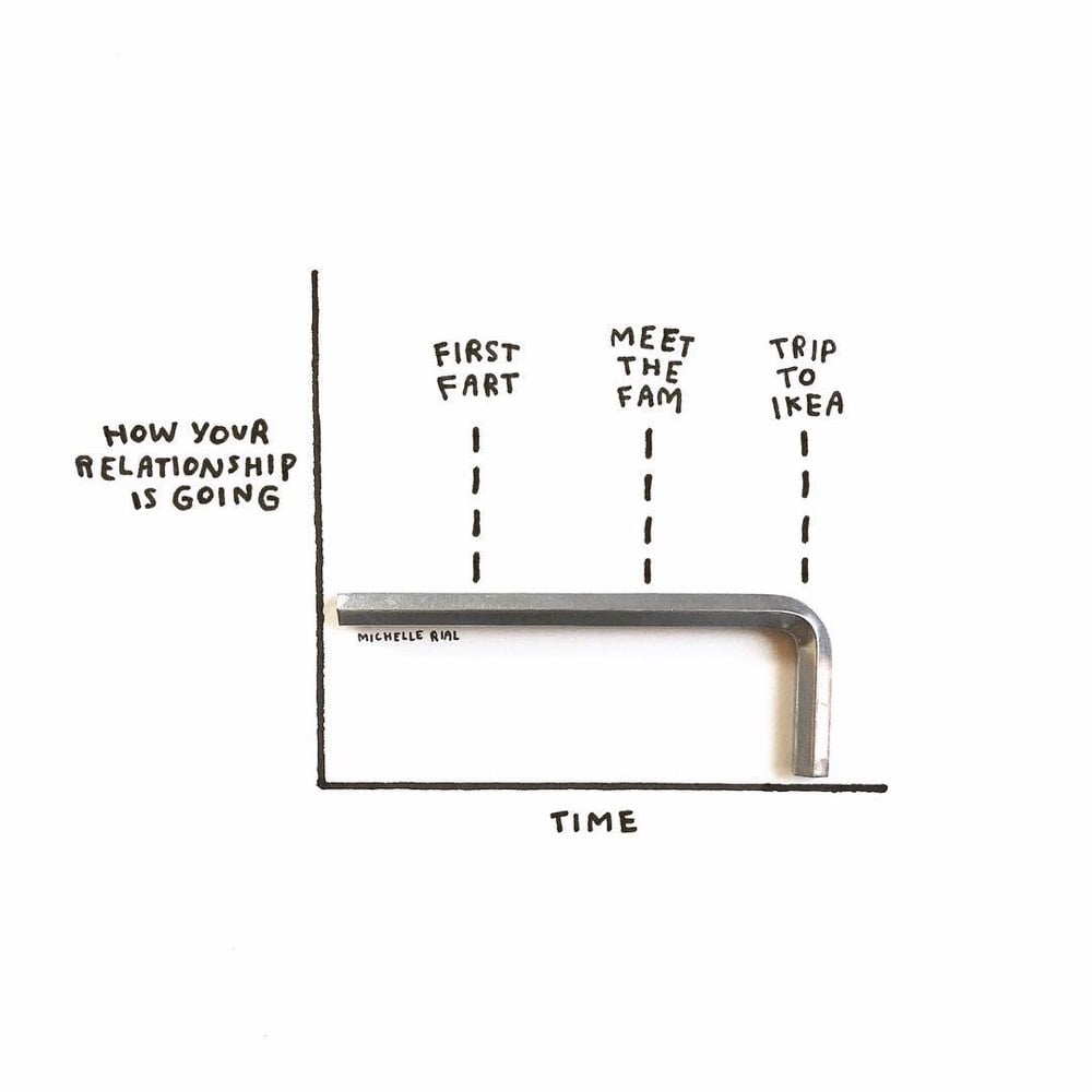
Designer Michelle Rial makes these clever and charming charts and posts them to her Instagram account. Some of the charts are hand-drawn but my favorite ones are made using real world objects, like the ones above. Reminds me of XKCD, Christoph Niemann, and Mari Andrew. Rial has posters, mugs, tote bags, and other items featuring her charts for sale on Society6.
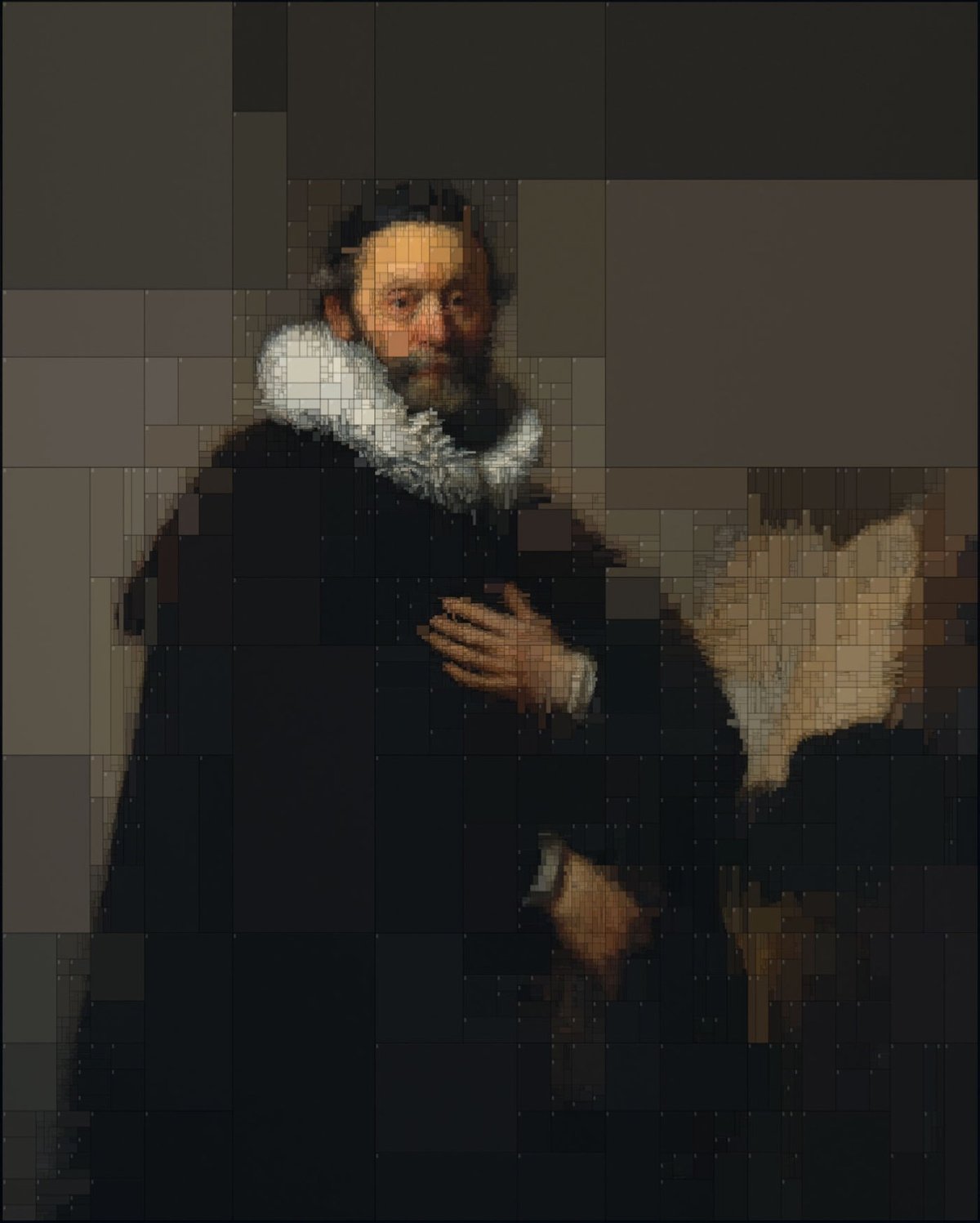
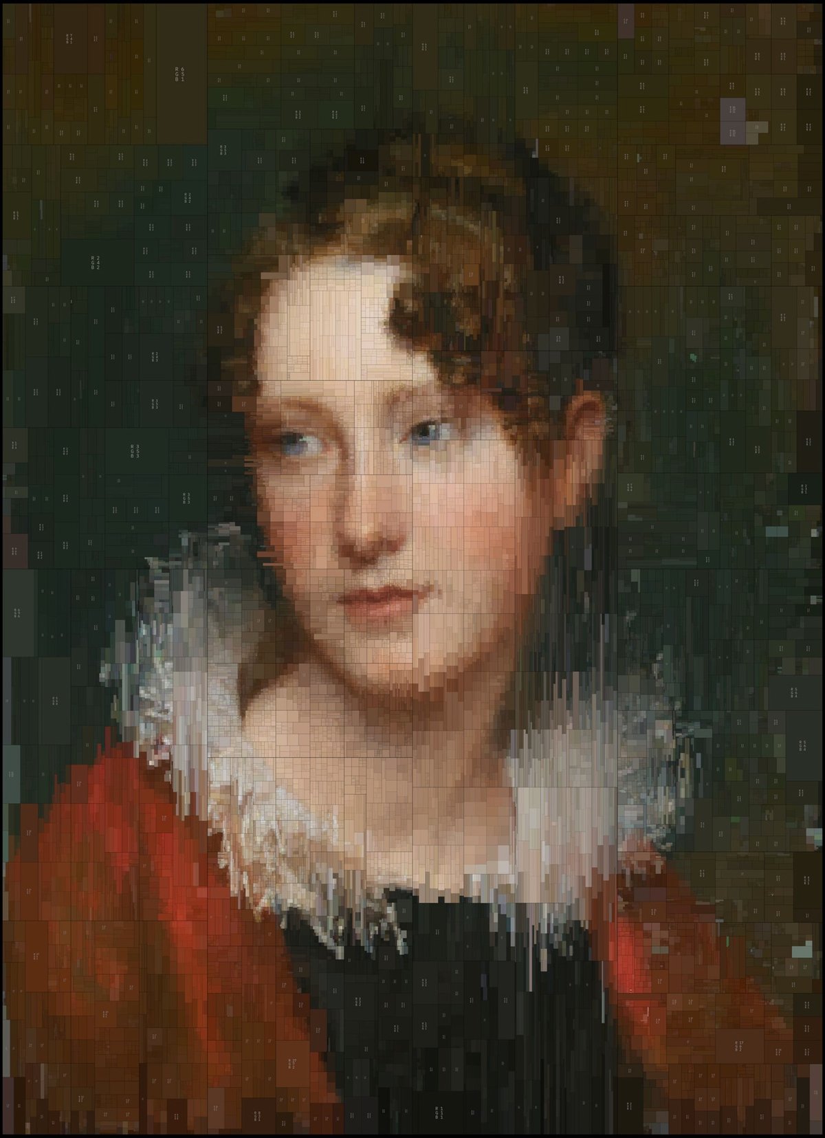
Greek visual designer Dimitris Ladopoulos took two of his favorite oil paintings, one by Rembrandt and the other (confusingly) by Rembrandt Peale, and used a piece of 3D modeling software called Houdini and pixelized them into treemaps of color. They look great in 2D (above), but he also rendered them in 3D with a worn texture:
Those worn plastic rectangles with the beveled edges are reminding me of something in particular, like a piece of electronics. Something from Sony maybe? Anyone? (via colossal)
In 1990, China, Hong Kong, and Taiwan had only a handful of subway lines. In the early 2000s, growth in the number of cities with subways started to increase dramatically, as did the number of lines in the bigger cities like Beijing and Shanghai. As of 2020, more than 40 Chinese cities will have subway systems. Check out this time lapse map by “transit nerd” Peter Dovak (who also did these Mini Metros maps):
In this time, Beijing and Shanghai in particular have ballooned from nearly nothing into the world’s two largest, in both length and annual ridership. The timeline of their expansion alone is mesmerizing.
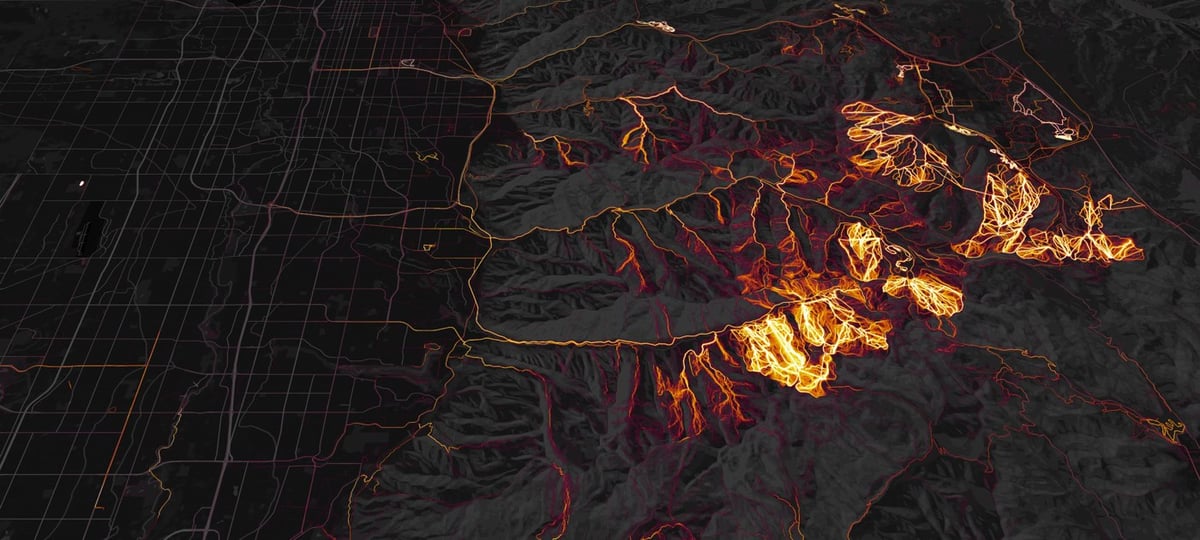
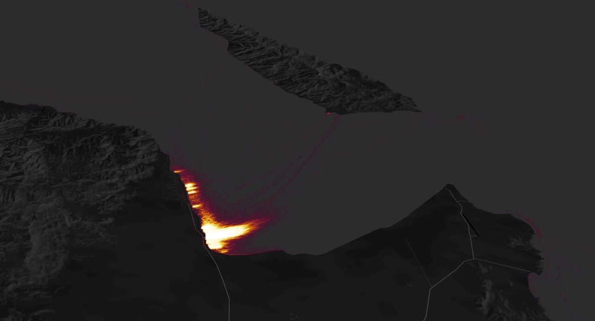
Strava, makers of apps that allow people to track and share their athletic activities, have released a global heatmap, a visualization of the humanity’s collective athletic activities. In a recent blog post, the company highlighted some of the most interesting spots on the map, which was created using 27 billion miles of data representing over 200,000 years of hiking, biking, running, skiing, and other sporting activity. Pictured above are the ski areas near Salt Lake City and kiteboarding in Baja, Mexico.
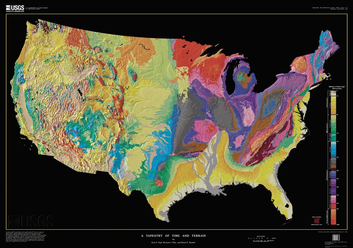
A Tapestry of Time and Terrain is a map from the USGS that shows the topology and ages of rock underneath the surface of the United States. The age scale on the right is difficult to read unless you download the full 45Mb PDF version, but it goes from Precambrian (2.6 billion years ago) at the bottom to more-or-less the present day at the top.
Through computer processing and enhancement, we have brought together two existing images of the lower 48 states of the United States (U.S.) into a single digital tapestry. Woven into the fabric of this new map are data from previous U.S. Geological Survey (USGS) maps that depict the topography and geology of the United States in separate formats. The resulting composite is the most detailed and accurate portrait of the U.S. land surface and the ages of its underlying rock formations yet displayed in the same image. The new map resembles traditional 3-D perspective drawings of landscapes with the addition of a fourth dimension, geologic time, which is shown in color. This union of topographic texture with the patterns defined by units of geologic time creates a visual synthesis that has escaped most prior attempts to combine shaded relief with a second characteristic shown by color, commonly height above sea level (already implicit in the shaded relief). In mutually enhancing the landscape and its underlying temporal structure, this digital tapestry outlines the geologic story of continental collision and break-up, mountain-building, river erosion and deposition, ice-cap glaciation, volcanism, and other events and processes that have shaped the region over the last 2.6 billion years.


Stay Connected