Dot Piano is a web-based visual piano that works with a MIDI keyboard peripheral or with your regular computer keyboard. As you play, colorful dots dance across the screen in a variety of ways. Hit record and you can easily save and share your composition with others. This one is fun to watch. (via prosthetic knowledge)
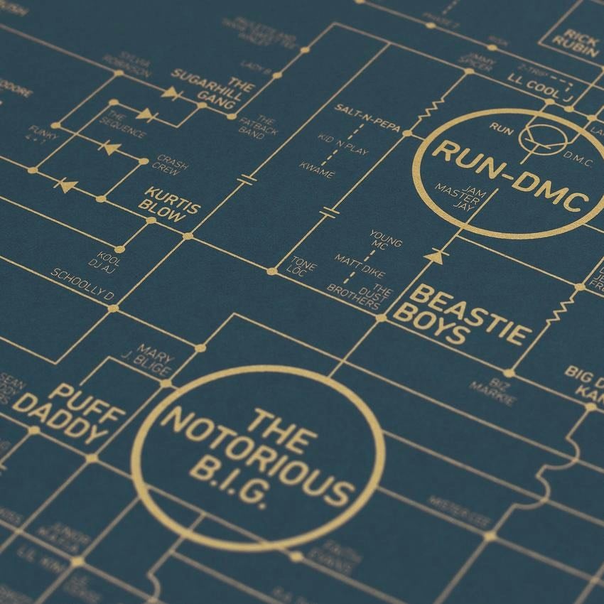
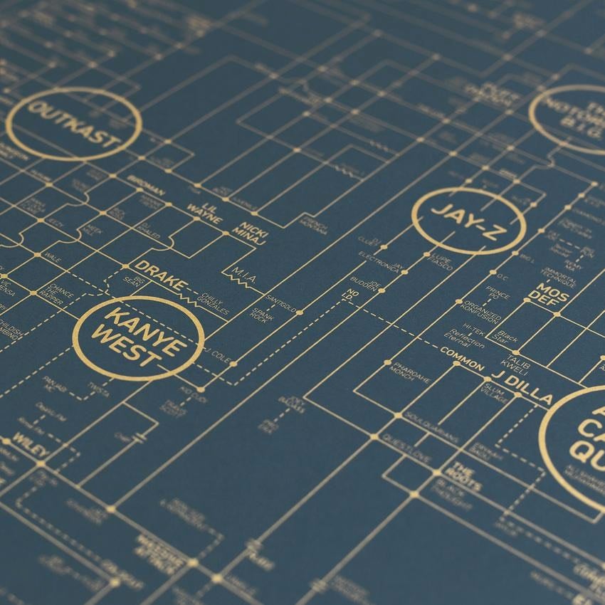
Design studio Dorothy has released this poster of a map of hip hop history, featuring notable rap and hip hop artists and groups laid out in the style of a circuit diagram for a classic turntable.
The print pays homage to the godfathers of hip-hop (Gil Scott-Heron, The Last Poets) but takes its starting point as DJ Kool Herc’s Back to School Jam in August 1973 — a block party in the Bronx, New York which is widely regarded as the birthplace of hip-hop.
The print weaves it way through many different scenes and record labels including early old-school innovators (Grandmaster Flash and the Furious Five, DJ Kool Herc, Afrika Bambaataa, Cold Crush Brothers), golden age heroes (Run-DMC, Beastie Boys, KRS-One, Eric B. & Rakim), the collective Native Tongues (De La Soul, A Tribe Called Quest, Jungle Brothers, Queen Latifah, Monie Love), politically charged hip-hop (Public Enemy, The Disposable Heroes of Hiphoprisy, Lauryn Hill), legendary East Coast artists (The Notorious B.I.G, Nas), legendary West Coast artists (Tupac Shakur, Dr. Dre), gangsta rap (Ice-T, N.W.A, Ice Cube, Snoop Dogg), hardcore (Wu-Tang Clan, Mobb Deep), Southern rap (Lil Wayne, T.I., Outkast) underground hip-hop (Company Flow, MF Doom, Aesop Rock), turntablism (Invisibl Scratch Piklz, The X-Ecutioners), trip-hop (Massive Attack, Tricky, Portishead), UK grime (Wiley, Skepta and Stormzy) and legendary producers (DJ Premier, J Dilla and Madlib).
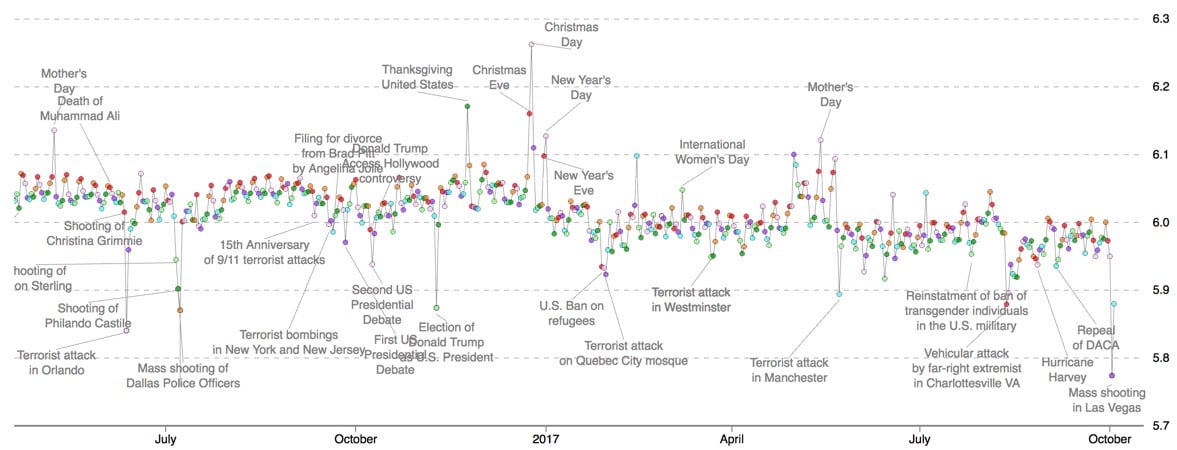
The Hedonometer measures the average happiness of Twitter on a daily basis and the shooting in Las Vegas has pushed the index to a new low. The previous low point was after the terror attack in Orlando last July. The two other lowest scores have occurred in the past year and a half: the mass shooting of Dallas police officers and the election of Donald Trump, which is the only non-shooting or non-terror attack to achieve such a low score in the 9-year history of the index.
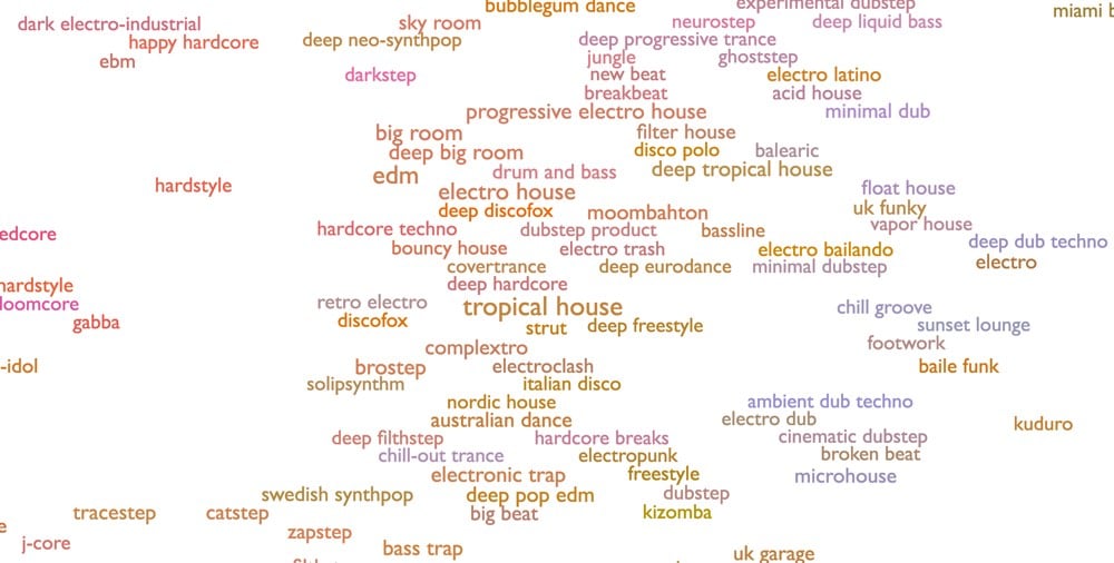
Warning: you might lose an entire hour to this… Every Noise at Once is a one-page map of playable audio samples for more than 1500 musical genres, from deep tech house to Finnish metal to smooth jazz to geek folk to klezmer to deep opera.
This is an ongoing attempt at an algorithmically-generated, readability-adjusted scatter-plot of the musical genre-space, based on data tracked and analyzed for 1536 genres by Spotify. The calibration is fuzzy, but in general down is more organic, up is more mechanical and electric; left is denser and more atmospheric, right is spikier and bouncier.
Update: I’ve been informed that if you hover over the name of a genre and then click on the “»”, you get a map of artists in that genre, each with a playable sample. Oops, there goes MY ENTIRE DAY.
Unendurable line is a short film by Daihei Shibata which shows the movement of objects like springs, magnetically attracted objects, spinning tops, and stacked blocks accompanied by a real-time graph of the movement. A bit tough to explain…just watch it. Reminds me of Bret Victor’s live coding. (via colossal)
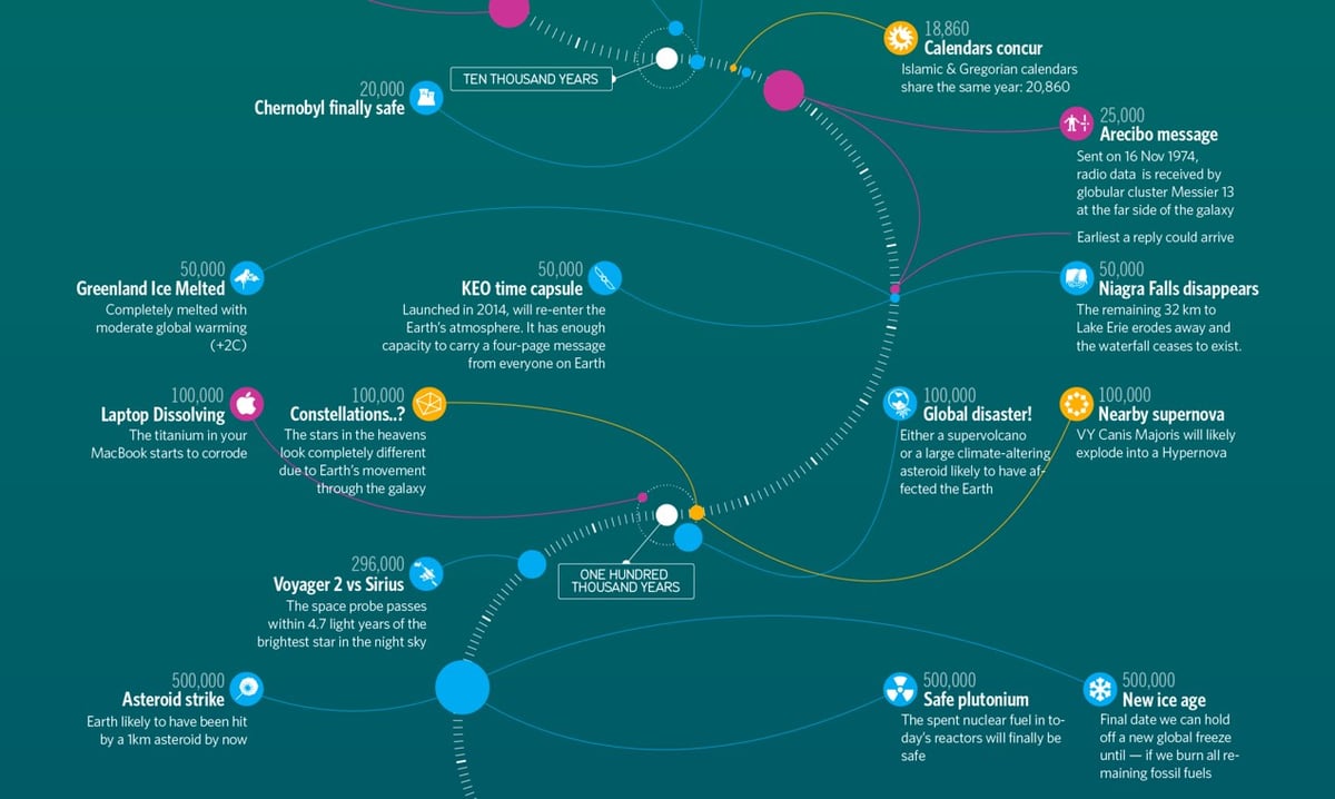
Timeline of the far future is one of my favorite pages on Wikipedia. It details what might happen to humanity, human artifacts, the Earth, the solar system, and the Universe from 10,000 years from now until long past the heat death of the Universe. Information is Beautiful has made a lovely infographic of the timeline.
Reading through the timeline is a glorious way to spend time…here are a few favorites I noticed this time around as well as some from my first post.
August 20, 10,663: “A simultaneous total solar eclipse and transit of Mercury.”
20,000 years: “The Chernobyl Exclusion Zone, the 1,000 sq mi area of Ukraine and Belarus left deserted by the 1986 Chernobyl disaster, becomes safe for human life.”
296,000 years: “Voyager 2 passes within 4.3 light-years of Sirius, the brightest star in the night sky.”
1 million years: “Highest estimated time until the red supergiant star Betelgeuse explodes in a supernova. The explosion is expected to be easily visible in daylight.”
1 million years: “On the Moon, Neil Armstrong’s ‘one small step’ footprint at Tranquility Base will erode by this time, along with those left by all twelve Apollo moonwalkers, due to the accumulated effects of space weathering.”
15.7 million: “Half-life of iodine-129, the most durable long-lived fission product in uranium-derived nuclear waste.”
100 million years: “Future archaeologists should be able to identify an ‘Urban Stratum’ of fossilized great coastal cities, mostly through the remains of underground infrastructure such as building foundations and utility tunnels.”
1 billion years: “Estimated lifespan of the two Voyager Golden Records, before the information stored on them is rendered unrecoverable.”
4 billion years: “Median point by which the Andromeda Galaxy will have collided with the Milky Way, which will thereafter merge to form a galaxy dubbed ‘Milkomeda’.”
7.59 billion years: The Earth and Moon are very likely destroyed by falling into the Sun, just before the Sun reaches the tip of its red giant phase and its maximum radius of 256 times the present-day value. Before the final collision, the Moon possibly spirals below Earth’s Roche limit, breaking into a ring of debris, most of which falls to the Earth’s surface.
100 billion years: “The Universe’s expansion causes all galaxies beyond the Milky Way’s Local Group to disappear beyond the cosmic light horizon, removing them from the observable universe.”
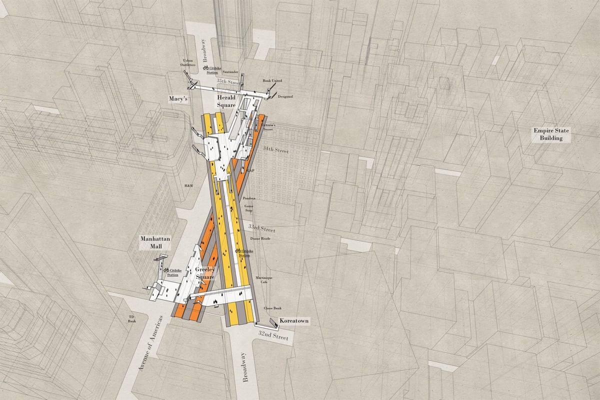
The subway and the street level of NYC are two very different worlds and even long-term residents have a difficult time understanding how they fit together. Architect Candy Chan has drawn a series of x-ray maps of NYC subway stations that show their layouts and orientation compared to the geography of the streets above. (Tip: you can zoom the maps for more detail.)
Using NASA’s GISTEMP data (a measure of the surface air temperature around the world), climate researcher Antti Lipponen put together this data visualization of global temperature anomalies from 1900-2016. Until about the mid-90s, the lines in different parts of the world pulse blue (cooler) or yellow/red (warmer) each year as regional climate varies…but it slowly turns less blue and more yellow. From 1997 on, the thing is basically an angry red porcupine.
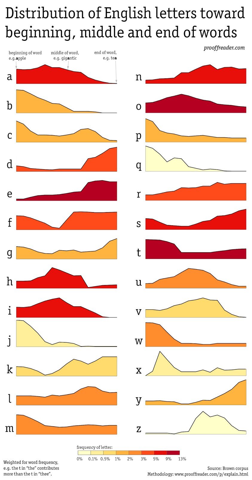
David Taylor analyzed a corpus of English words to see where each letter of the alphabet fell and graphed the results.
No surprise that “q” and “j” are found mostly at the beginnings of words and “y” and “d” at the ends. More interesting are the few letters with more even distribution throughout words, like “l”, “r”, and even “o”. Note that this analysis is based on a corpus of words in use, not on a dictionary:
I used a corpus rather than a dictionary so that the visualization would be weighted towards true usage. In other words, the most common word in English, “the” influences the graphs far more than, for example, “theocratic”.
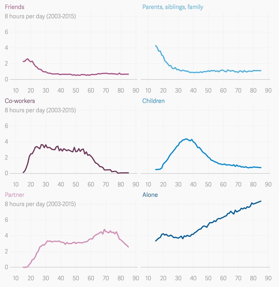
Some of the relationships Lindberg found are intuitive. Time with friends drops off abruptly in the mid-30s, just as time spent with children peaks. Around the age of 60 — nearing and then entering retirement, for many — people stop hanging out with co-workers as much, and start spending more time with partners.
Others are more surprising. Hours spent in the company of children, friends, and extended family members all plateau by our mid-50s. And from the age of 40 until death, we spend an ever-increasing amount of time alone.
This would make a great book…one chapter about why each chart looks as it does.
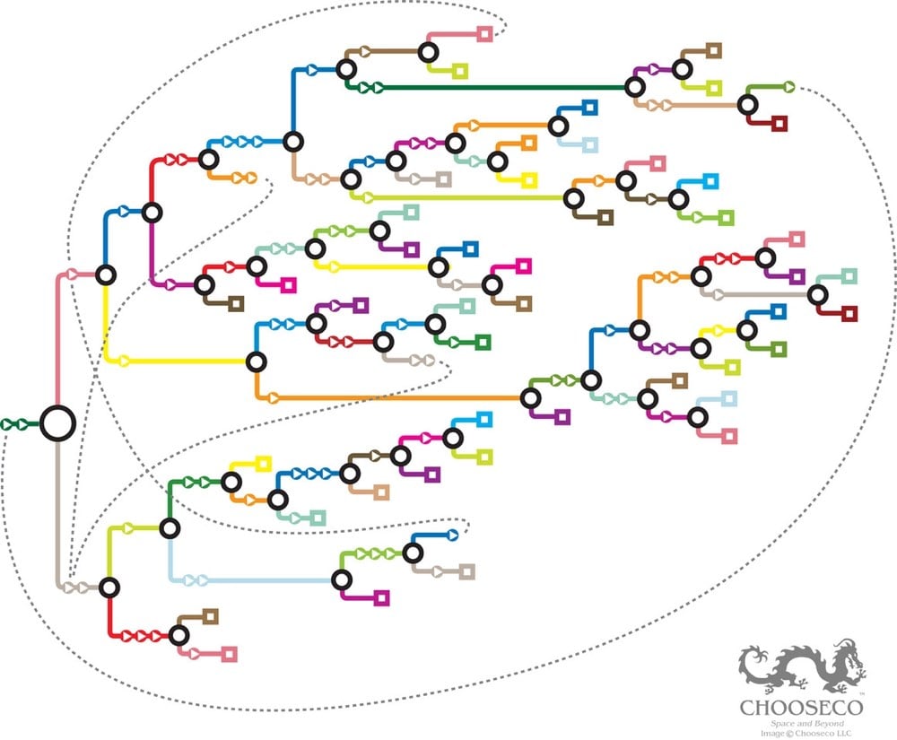
On the official maps, however, the endings aren’t coded in any way that reveals their nature. Instead, they operate according to a simple key: each arrow represents a page, each circle a choice, and each square an ending. Dotted lines show where branches link to one another.
Mapping the bones of the books can have other purposes, too. Nick Montfort, a poet and professor at the Massachusetts Institute of Technology who studies interactive fiction, has a habit of asking people what they know about “Choose Your Own Adventure” books. “They often say, ‘You have two choices after every page,’” he says. “That’s not true. Sometimes you have one choice. Sometimes you have more than two. When you show the maps, you can see that these books don’t look exactly the same.”
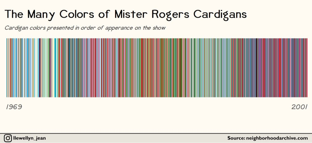
Some sweaters were worn once and then never again, like the neon blue cardigan Rogers wore in episode 1497. Others, like his harvest gold sweaters, were part of Rogers’ regular rotation and then disappeared. And then there were the unusual batch of black and olive green sweaters Rogers wore exclusively while filming the “Dress-Up” episodes in 1991.
Some things about the sweaters and Mister Rogers:
His mother knit many of the sweaters. Sorry, MISTER ROGERS’ MOTHER KNIT HIS CARDIGAN SWEATERS! I have not heard a more perfect detail about anything ever. He talks about his mom and the sweaters in this video — “I guess that’s the best thing about things. They remind you of people.” (The original video is gone and I couldn’t track it down, but here’s another one of him talking about his mom’s sweaters.)
As you can see from the visualization above, Mister Rogers’ sweaters got darker as the show progressed. I will not speculate about what that might have meant.
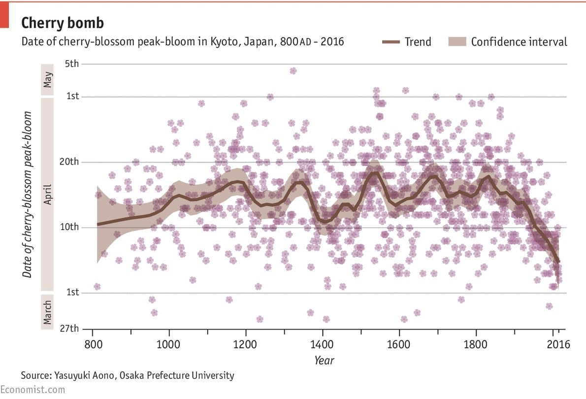
From its most recent peak in 1829, when full bloom could be expected to come on April 18th, the typical full-flowering date has drifted earlier and earlier. Since 1970, it has usually landed on April 7th. The cause is little mystery. In deciding when to show their shoots, cherry trees rely on temperatures in February and March. Yasuyuki Aono and Keiko Kazui, two Japanese scientists, have demonstrated that the full-blossom date for Kyoto’s cherry trees can predict March temperatures to within 0.1°C. A warmer planet makes for warmer Marches.
Temperature and carbon-related charts like this one are clear portraits of the Industrial Revolution, right up there with oil paintings of the time. I also enjoyed the correction at the bottom of the piece:
An earlier version of this chart depicted cherry blossoms with six petals rather than five. This has been amended. Forgive us this botanical sin.
From Aron Strandberg,1 this is a timeline visualization of the age of the world’s population from 1960-2060. The world’s human population has increased rapidly in the last couple centuries, most recently doubling since 1970:
A tremendous change occurred with the industrial revolution: whereas it had taken all of human history until around 1800 for world population to reach one billion, the second billion was achieved in only 130 years (1930), the third billion in less than 30 years (1959), the fourth billion in 15 years (1974), and the fifth billion in only 13 years (1987).
But watching that video, you’ll realize that the world’s population will not reach 20 or 30 billion in 2050 — human civilization is getting old.
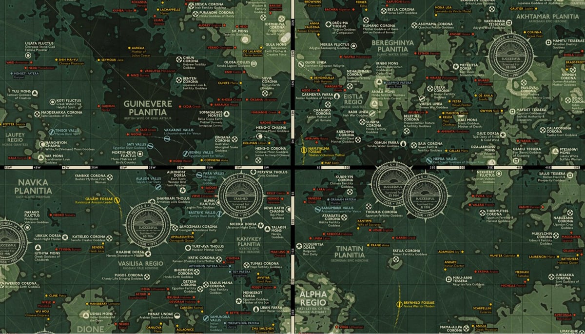
Last year, Eleanor Lutz made a medieval-style map of Mars. As a follow-up, she’s made a topographical map of Venus. The features on Venus are named for female mythological figures & notable women and Lutz provides a small biography for each one on the map. Among those featured on the map are:
Anne Frank
Selu (Cherokee Corn Goddess)
Kali (Hindu Goddess, Mother of Death)
Virginia Woolf
Sedna (Eskimo Whose Fingers Became Seals and Whales)
Ubastet (Egyptian Cat Goddess)
Beatrix Potter
Edith Piaf
Eleanor Lutz made these nifty models of California plants that can withstand fire damage out of Elmer’s Glue and watercolor paper. She then photographed them burning for this infographic on how some species have adapted to California’s wildfires. Be sure to click through to see the animated version.
In this short video, Josh Begley shows all of the front pages of the NY Times in chronological order from 1852 to the present. The Times began publishing in 1851 so not every front page is represented, but that’s still more than 50,000 pages in less than a minute. Since they go by so quickly, here are some highlights:
Dec 11, 1861: The Times publishes their first illustrations on the front page. One is a map of Virginia and the other two are political cartoons lampooning James Gordon Bennett, founder of the New York Herald, one of the Times’ main rivals.
Apr 15, 1865: The front page columns were lined with black as they reported on the assassination of Lincoln.
Dec 1, 1896: The hyphen is dropped from “The New-York Times”.
Feb 10, 1897: The slogan “All the News That’s Fit to Print” appears for the first time on the front page.
May 30, 1910: The first news photograph appears on the front page, a photo of aviator Glenn Curtiss flying from Albany to NYC at the blistering pace of 54 mi/hr.
May 1, 1926: The Times prints the first photo “radioed” to the newspaper from London. Transmission time: 1hr 45m.
Jul 21, 1969: The first use of 96 pt. type on the front page announces the Apollo 11 landing on the Moon and subsequent moonwalk. The large type will also be used to announce Nixon’s resignation, the first day of 2000, 9/11, and the election of Barack Obama.
Sept 7, 1976: The columns on the front page are widened, reducing their number from 8 to 6.
Oct 16, 1997: The first color photo is printed on the front page of the Times. (The Times Machine scan is in B&W for some reason, but the photo was in color.)
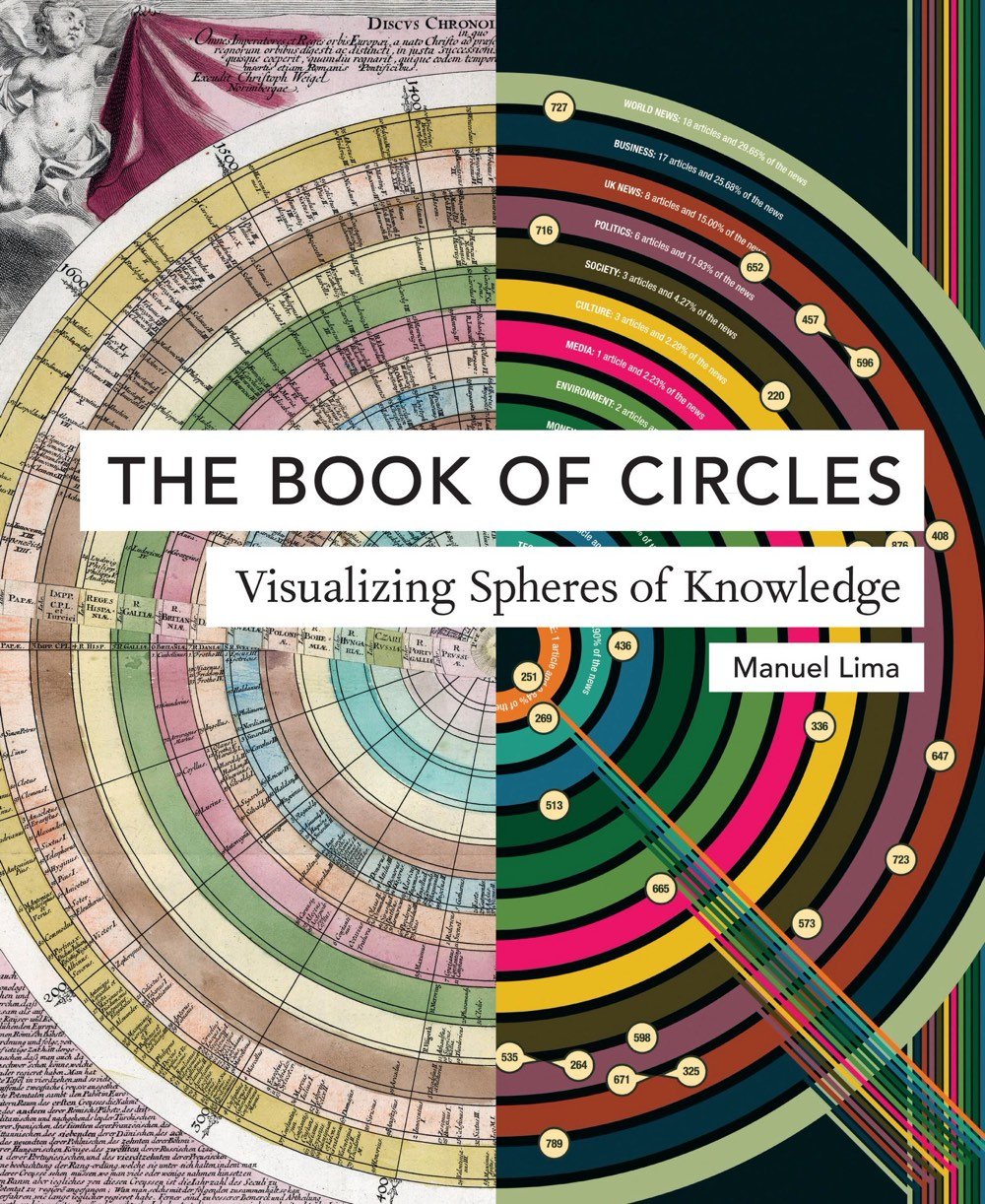
In this follow-up to his hugely popular The Book of Trees and Visual Complexity, Manuel Lima takes us on a lively tour through millennia of circular information design. Three hundred detailed and colorful illustrations from around the world cover an encyclopedic array of subjects-architecture, urban planning, fine art, design, fashion, technology, religion, cartography, biology, astronomy, and physics, all based on the circle, the universal symbol of unity, wholeness, infinity, enlightenment, and perfection. Clay tokens used by ancient Sumerians as a system of recording trade are juxtaposed with logos of modern retailers like Target; Venn diagrams are discussed alongside the trefoil biohazard symbol, symbols of the Christian trinity, and the Olympic rings; and a diagram revealing the characteristics of ten thousand porn stars displays structural similarities to early celestial charts placing the earth at the center of the universe.
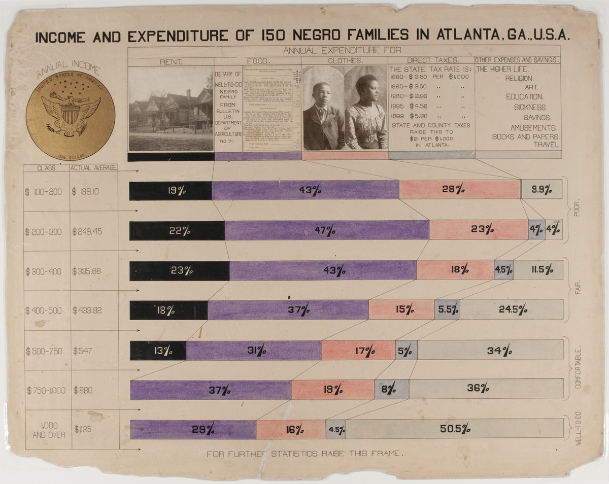
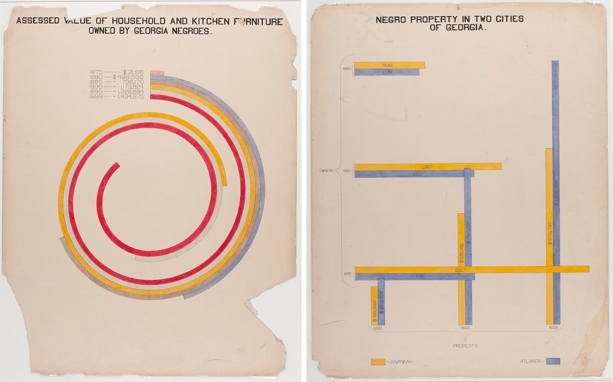
W.E.B. Du Bois was an American author, sociologist, historian, and activist. Apparently Du Bois was also a designer and design director of some talent as these hand-drawn infographics show.
In addition to an extensive collection of photographs, four volumes containing 400 official patents by African Americans, more than 200 books penned by African-American authors, various maps, and a statuette of Frederick Douglass, the exhibition featured a total of fifty-eight stunning hand-drawn charts (a selection of which we present below). Created by Du Bois and his students at Atlanta, the charts, many of which focus on economic life in Georgia, managed to condense an enormous amount of data into a set of aesthetically daring and easily digestible visualisations. As Alison Meier notes in Hyperallergic, “they’re strikingly vibrant and modern, almost anticipating the crossing lines of Piet Mondrian or the intersecting shapes of Wassily Kandinsky”.
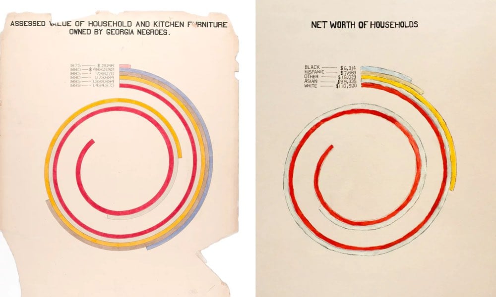
Wealth. If I had stayed close to the original chart, the updated version would have shown that in 2015, African American households in Georgia had a median income of about $36,655, which would fail to capture the story of inflation (net asset numbers aren’t published as cumulative for one race). Instead, I wanted to see how wealth varies by race in America today.
The story is bleak. I hesitated to use the word “worth”, but it’s the language used by the Census Bureau when they’re collecting this data and, since money determines so much of an individual’s life, the word seems relevant. For every dollar a black household in America has in net assets, a white household has 16.5 more.
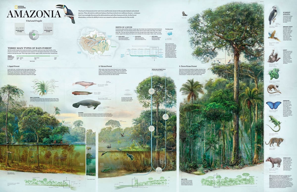
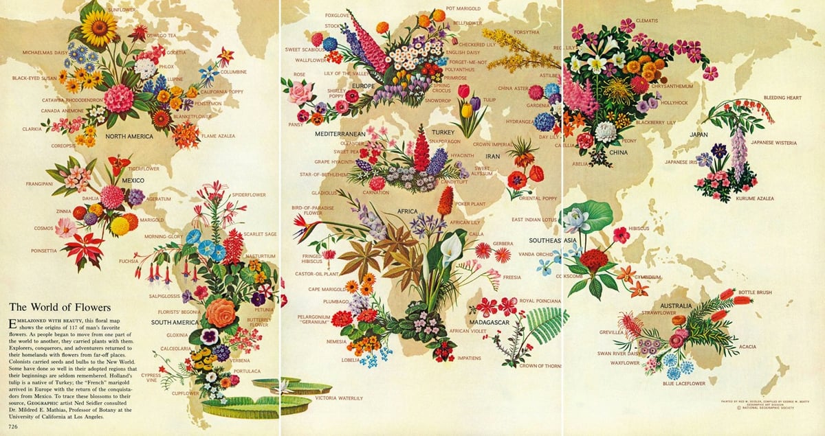
National Geographic Infographics is an anthology published by Taschen of some of the best infographics featured by National Geographic in the past 128 years.
Through seven sections — History, The Planet, Being Human, Animal World, World of Plants, Science and Technology, and Space — we encounter the rise and fall of the Roman Empire, the mysterious origins of the Easter Island statues, Cleopatra’s Alexandria and a history of Hawaiian surfboarding, all distilled in expert, accessible graphic form. We discover how our genetic patterns have been pieced together over the years or how hip-hop emerged as a cultural heavyweight; we get to grips with global warming, and explore our ever-expanding study of an ever-expanding universe.
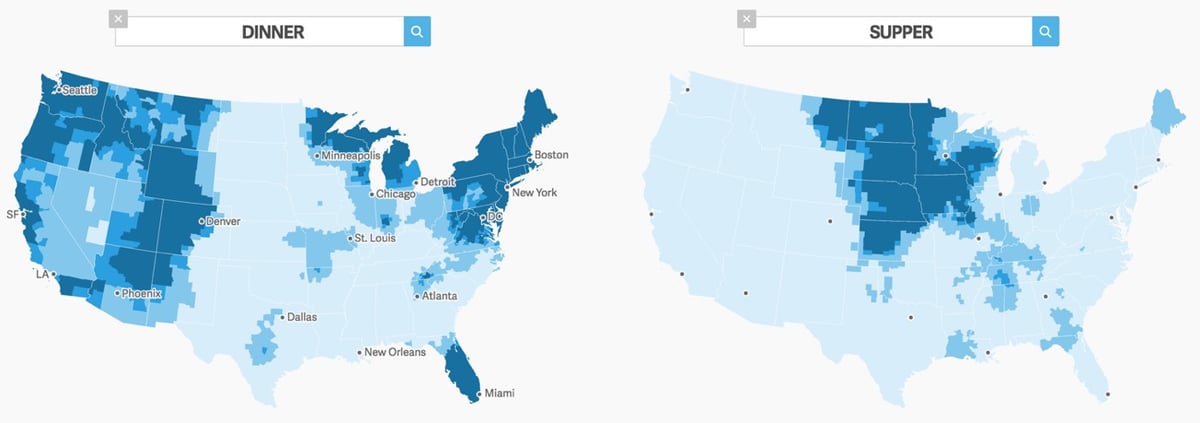
It’s that time of year again. No, not Christmas or Hanukkah. As the year winds down, it’s an opportunity for Americans to investigate how differently they use words in different parts of the country. In December 2013, for example, people lost their damn minds over the NY Times’ dialect quiz. This year, you can play around with The Great American Word Mapper which uses Twitter data from 2014 to plot geographic usage patterns.
Some other interesting searches: “moma” (alternate spelling of “momma” in the South with a small pocket of usage around NYC for MoMA), “city” doesn’t give the result you might expect, the distribution of “n***er” vs “n***a” suggests they are two different words with two different meanings, and in trying to find a search that would isolate just urban areas, the best I could come up with was “kanye” (or maybe “cocktails” or “traffic”). And harsh, map! Geez. (via @fromedome)
This is cool and a little mesmerizing: animated US maps showing the most popular baby name in each state from 1910 to 2014 for boys and girls. There are three separate visualizations. The first just shows the most popular baby name in each state. Watch as one dominant name takes over for another in just a couple of years…the Mary to Lisa to Jennifer transition in the 60s and 70s is like watching an epidemic spread. Celebrity names pop up and disappear, like Betty (after Betty Boop and Betty Grable?) and Shirley (after Shirley Temple) in the 30s. The boy’s names change a lot less until you start getting into the Brandons, Austins, and Tylers of the 90s.
The next visualization shows the most particularly popular name for each state, e.g. Brandy was the most Louisianan name for female newborns in 1975. And the third visualization shows each name plotted in the averaged geographical location of births — so you can see, for example, the northward migration of Amanda during the 80s.
P.S. Guess what the most popular boy’s name in the state of my birth was the year I was born? And the most particularly popular boy’s name in the state I moved to just a year later? Jason. I am basic af.
The New York Times took a map of the US and split it in two based on areas that voted for Clinton and Trump in the 2016 election. (Clinton’s map is pictured above.)
Mrs. Clinton’s island nation has large atolls and small island chains with liberal cores, like college towns, Native American reservations and areas with black and Hispanic majorities. While the land area is small, the residents here voted for Mrs. Clinton in large enough numbers to make her the winner of the overall popular vote.
That’s fun, but it’s another reminder of how strictly geographical maps distort election results.
P.S. They missed a real opportunity to call the chain of islands in the southern states The Cretaceous Atoll.
Neil Halloran, creator of the excellent Fallen of World War II interactive visualization of the casualties of WWII, is working on a similar visualization about the possible effects of a global nuclear conflict. He recently uploaded an in-progress video of the project with a special 2016 election message at the end. Amazing and scary to see how much of a difference WWII made in the global death rate and how minuscule that would be in comparison to a global nuclear war.
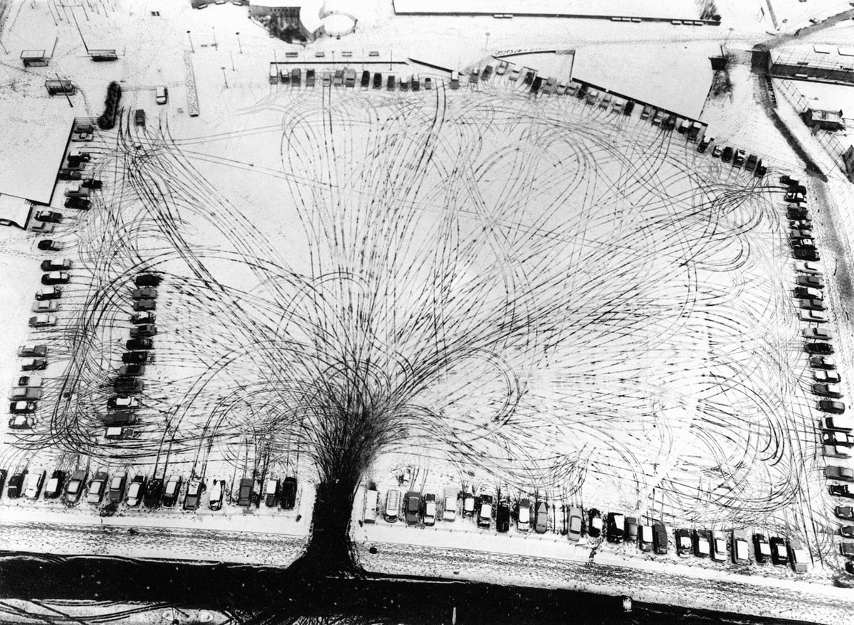
The tire tracks in this parking lot make a tree pattern in the snow, a self-producing infographic of the cars’ collective pathway to their parking spaces. It’s fun to trace individual tracks — I’m fascinated by the one that comes in, starts right, turns back to the left, then heads back down before turning toward the left again into a space.
The photo was taken in a Shell Centre parking lot near Waterloo Station in 1963. Photographer unknown. (via @robnitm)
Update: A reader randomly picked up a copy of a book recently called The World From Above, “a pretty brilliant collection of aerial photographs, mostly black and white, published in the mid 60’s” and the parking lot photo was in it. No photographer listed, but the photo is credited to dpa, the German Press Agency. (thx, david)
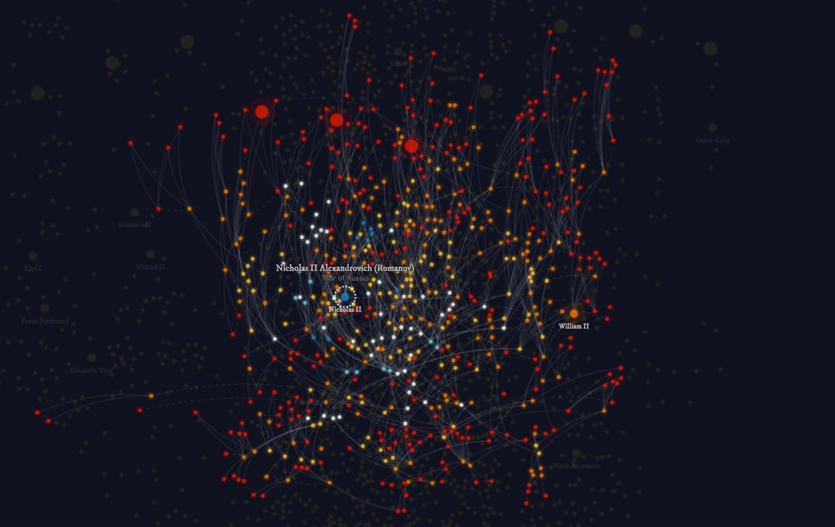
The United Kingdom, Spain, Denmark, Sweden, and six other European countries still have hereditary royal leaders and they are all related to each other. Royal Constellations is an interactive infographic for exploring the ancestral relationships of Europe’s royalty.
Royal & aristocratic families are known for their fondness of marrying within their own clique. Restraining aggression between two families, creating a stronger front towards a third family, increasing territorial acquisitions, legal claim to a foreign throne through inheritance are some of the most common reasons.
This leads to very interesting & entangled family trees which the visual below tries to convey. It shows how all 10 of the current hereditary royal leaders of Europe can be connected to each other through their ancestors. We don’t have to look very far back. Even the most distant royal relatives have their shared forebears born after the year 1700.
This is a lovely infographic from Eleanor Lutz of a bunch of different heartbeat EKG waves, from a normal heartbeat to a flatline to ventricular fibrillation (“must be treated immediately with CPR and defibrillation”.) Prints are available.
OneZoom is an interactive zoomable map of “the evolutionary relationships between the species on our planet”, aka tree of life. Browsing around is fun, but you’ll want to use the search function to find specific groups and animals, like mammals, humans, and mushrooms. The scale of this is amazing…there are dozens of levels of zoom. (via @pomeranian99)


Stay Connected