kottke.org posts about logos
The Very Hungry Caterpillar was one of my favorite books when I was a kid and I’ve loved reading it to Ollie over the past few months. So of course, Google’s logo today is aces.

Now do Cloudy with a Chance of Meatballs!
This post on the Wolfram blog about using Mathematica to play around with logo designs provides a tantalzing glimpse into how useful the program could be as a graphic design tool.
Take a logo as simple as the Mercedes-Benz star. Just three points framed by a circle, its geometry is easily described in a few lines of Mathematica code, with some obvious parameters controlling the number of points on the star, the sharpness of the star’s points, the thickness of the outer circle, and the orientation of the star.
Paging Joshua Davis. (via waxy)
Brand New runs down the best and worst new logos of 2008. Some of the bad ones are downright awful…the WGN one is crazy bad.
Great two-part video interview with Sol Sender about designing the logo for the Obama campaign. Includes some early design sketches and other designs that made it to the final phase. (via quips)
Steven Heller spoke with the designer Sol Sender about his iconic Obama “O” logo.
Well, the “O” was the identity for the Obama ‘08 campaign and the campaign is over. That doesn’t mean that the mark will be forgotten; I think the memorabilia from this campaign will have a long shelf life and will stand as a visible symbol of pride for people who supported the candidate and for those who see it as a representation of a watershed moment for our country. As far as having another life, I can’t say. Perhaps the 2012 campaign will hark back to it in some way.
Sender’s web site has a bit more info on the development of the Obama brand.
What do I think about the new Pepsi logo? Eh. Companies spend way too much time, effort, and money building up feelings about logos — like decades and billions of dollars — and then they just go and change it all. Of course the new logo and colors are similar to the old ones and it’s variations on a theme but the new designs feel like someone’s idea of what packaging is going to look like 10 years from now, an approach that never seems to work out well (see Back to the Future II). Coca-Cola had such success refreshing their brand with a simple take on their classic look and logo, why can’t Pepsi do the same with this classic look?
Photos of 99 different ecstasy pills with logos on them, including those with McDonald’s, Mercedes, MTV, Harry Potter, and Apple logos.
The logo for A.G. Low Construction is the best one I’ve seen in awhile.

Nice work by design student Rebecca Low, who I’m assuming is related to the A.G. Low in question. (via monoscope)
Raymond Loewy is well-known as an industrial designer but he was also responsible for some of the world’s most iconic logos. Pictured below are several sketches that Loewy did for the new Exxon logo:
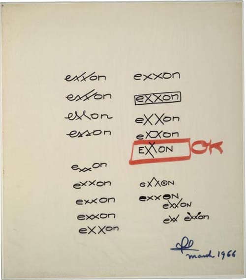
Big business moved more slowly back then; the sketches were done by Loewy in 1966 but the name change and new logo didn’t go into effect until 1972. Loewy was also responsible for several other logos: Shell, Hoover, BP, Nabisco, Canada Dry, and U.S. Mail.
A list of all the US presidential election logos from 1960-2008. That’s a whole lot of red and blue. I particularly liked 1988’s Dick “Chrysler” Gephardt and Paul Simon’s Top Gun homage. (via quips)
If you can ignore the stupid one-logo-per-page interface, check out the 25 best band logos.
Clever smugglers have been using trucks adorned with FedEx, Wal-Mart, and other familiar logos in order to spirit drugs, money, and illegal aliens across the US/Mexican border.
In another case, a truck painted with DirecTV and other markings was pulled over in a routine traffic stop in Mississippi and discovered to be carrying 786 pounds of cocaine. Police said they became suspicious because the truck carried the markings or DirecTV and several of its rivals. An 800 number on the truck’s rear to report bad driving referred callers to an adult sex chat line.
Liquidated Logos by French street artist Zevs.
Re-painting the logos in their own colours, the artist pours paint over them, liquidating one logo after another.
I am a sucker for dripping paint.
A history and analysis of the Batman logo from 1939 to the present, in five parts: 1, 2, 3. 4, 5. More logo studies by the same fellow here. (thx, david)
Video of a bunch of TV production company logos…you know, the ones that usually follow the shows, “sit Ubu sit, good dog” and the like.
Cartype: “A comprehensive collection of reviews and study of typographical applications of emblems, car company logos and car logos with images, comments, links, car company information and general interest.”
On brand indentities that are flexible (vs. those that are static). Examples: Google’s logo, Target’s bullseye, and Saks’ jumbly identity. “As advertising agencies lose their grip on the communications channels, the logos are starting to come out of the corner. Once pushed as far over to the bottom right as possible, they’re becoming central to communication, no longer content to just be the the full-stop at the end of a piece of branded communication.” (via quipsologies)
A rare positive review from Speak Up of the new London 2012 that everyone else in the world seems to hate. “I believe, despite any ensuing boo’s, that this is some of the most innovative and daring identity work we have seen in this new millennium, and the lack of cheesy and imagination-impairing gradients gives me hope that identity work can still be resurrected on a larger scale.”
Update: Coudal loves the logo.
Instead of giving out wasteful schwag bags and tshirts that no one wears, the Interesting 2007 conference is asking participants to provide their own used tshirts (they’ll screenprint the logo on it) and will be using plain old plastic bags with the conference logo screenprinted on them. What a great twist on recycling. (via bbj)
The mid-2000s may be seen in the future as not such a fantastic time for logo design. One further piece of evidence: the what-were-they-thinking? new design for the Dairy Queen logo. “[The] gold and blue curved swishes [signify] food and treats.” Don’t know about you, but that blue swish make me want to cram ice cream down my treat-hole!
A list of well-know logos & brands and their design histories.
Update: I took out the link because several people told me that the site I was linking to has a history of taking other’s content and passing it off as their own.
The Max Planck Institute of Molecular Cell Biology and Genetics has a logo that changes every time it gets used on letterhead or displayed on a web site. The logo system was designed by Michael Schmitz and is based on cellular automata like John Conway’s Game of Life. “Parameters [for the logo] are coupled to certain factors: number of employees = density, funding = speed, number of publications = activity. Different logos are being ‘bred’ and then picked by fitness in relation to the parameters or voted for by the employees.” Schmitz’s PDF document Evolving Logo is worth a look even if you don’t read German. (Anyone want to do a translation? It looks fascinating.) (via bbj)
Newer posts
Older posts
Stay Connected