I’ve loved math since I was a kid. One of the big reasons for this is that there’s always more than one way to solve a particular problem and in discovering those solutions, you learn something about mathematics and the nature of numbers.1
In this video, math fan Johnny Ball shows us a different method of multiplication. In Russian multiplication (also called Ethiopian multiplication and related to ancient Egyptian multiplication), you can multiply any two numbers together through simple addition and doubling & halving numbers. The technique works by converting the numbers to binary and turning it into an addition problem.
I loved learning about this so much that I scribbled an explanation out on a napkin at brunch yesterday to show a friend how it worked. We’re friends because she was just as excited as I was about it. (via the kid should see this)
I’ve probably told this story here before, but for an assignment in a quantum mechanics class in college, we had to derive an equation using two different techniques. After much struggle at the whiteboard on a Saturday morning, a friend and I got the results of these two approaches to converge on the same answer and it felt like we had unlocked a deep secret to the universe.↩
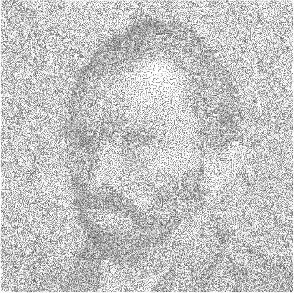
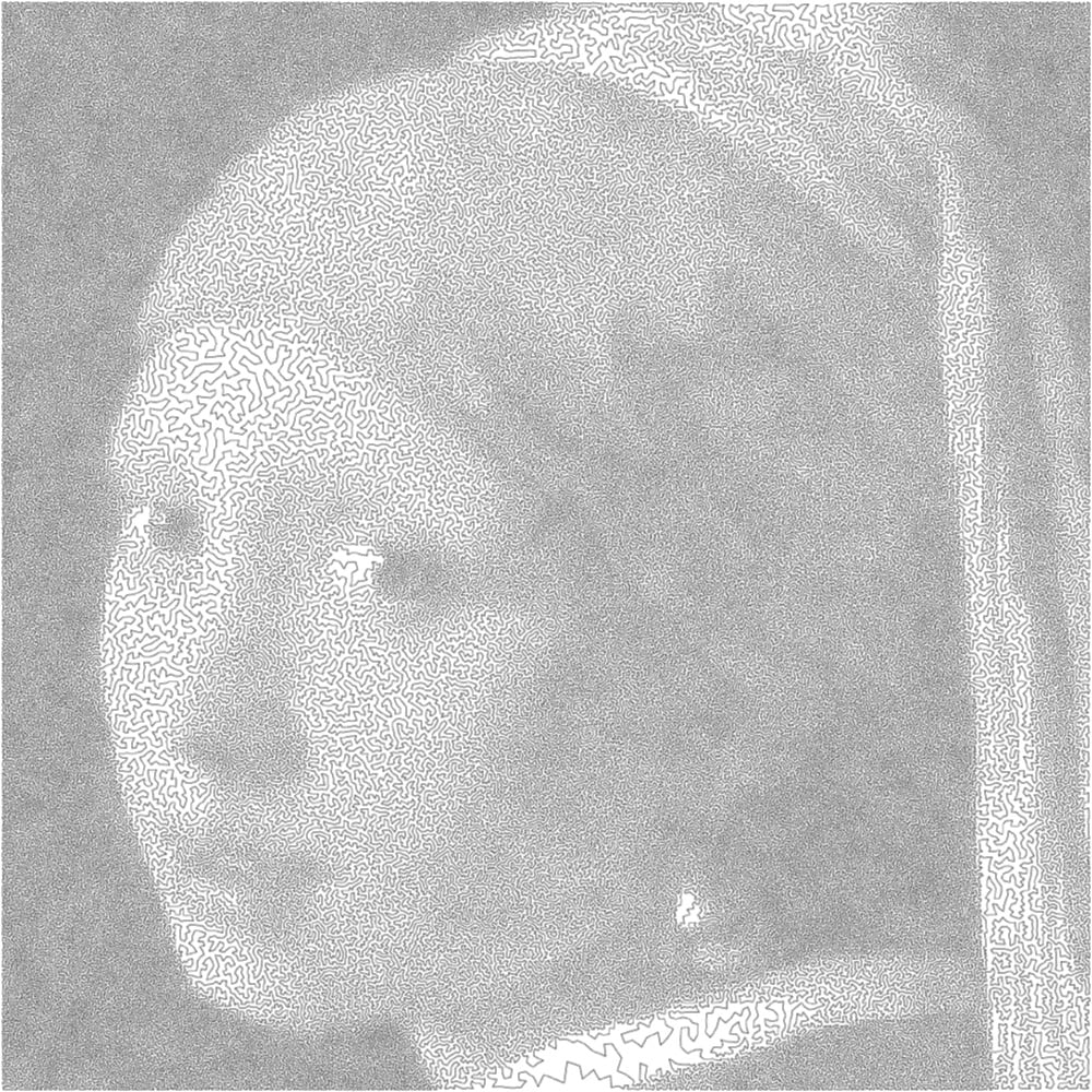
All art is bounded by one constraint or another. Mathematician Robert Bosch makes what he calls “optimization art”, which is best embodied by theseimages produced as solutions to the travelling salesman problem. Each image is made up of a continuous line that is the shortest possible route through a series of points without revisiting any single point, much like the optimal route of a travelling salesperson visiting cities. The rendition of a van Gogh self-portrait uses a solution for 120,000 “cities” while the single line forming the Girl with the Pearl Earring visits 200,000 cities.
I would love to see an Observable notebook where you could upload any photo to make images like these. (via @Ianmurren)
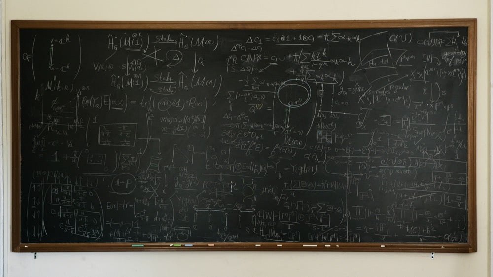
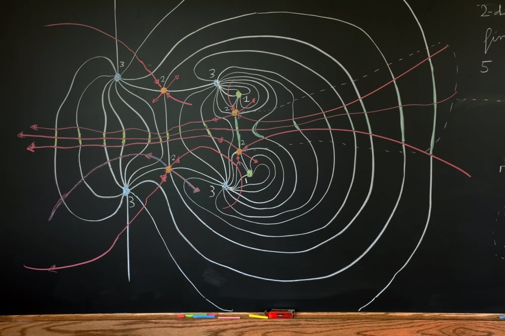
Jessica Wynne has been taking photos of mathematicians’ blackboards for the past year or so, some of which were featured recently in the NY Times. I love the variety in density, style, color, and tidiness.
“I am also fascinated by the process of working on the chalkboard. Despite technological advances, and the creation of computers, this is how the masters choose to work.”
In their love of blackboards and chalk, mathematicians are among the last holdouts. In many fields of science and investigation, blackboards have been replaced with whiteboards or slide show presentations. But chalk is cheaper and biodegradable. It smells better than whiteboard markers and is easier to clean up, mathematicians say. It is also more fun to write with.
A book of Wynne’s chalkboard photos called Do Not Erase will be released next year.
The story goes that modern chaos theory was birthed by Edward Lorenz’s paper about his experiments with weather simulation on a computer. The computing power helped Lorenz nail down hidden patterns that had been hinted at by computer-less researchers for decades. But the early tenets of chaos theory were not the only things that were hidden. The women who wrote the programs that enabled Lorenz’s breakthroughs haven’t received their proper due.
But in fact, Lorenz was not the one running the machine. There’s another story, one that has gone untold for half a century. A year and a half ago, an MIT scientist happened across a name he had never heard before and started to investigate. The trail he ended up following took him into the MIT archives, through the stacks of the Library of Congress, and across three states and five decades to find information about the women who, today, would have been listed as co-authors on that seminal paper. And that material, shared with Quanta, provides a fuller, fairer account of the birth of chaos.
The two women who programmed the computer for Lorenz were Ellen Gille (née Fetter) and Margaret Hamilton. Yes, that Margaret Hamilton, whose already impressive career starts to look downright bonkers when you add in her contributions to chaos theory.
If you could somehow fold a piece of paper in half 103 times, the paper would be as thick as the observable universe.
Such is the power (*cough*) of exponential growth, but of course you’d never get anywhere close to that many folds. The theoretical limit for folding paper was long thought to be seven or eight folds. You can see why watching this hydraulic press attempt the 7th fold…the paper basically turns to dust.
But in 2002, high school student Britney Gallivan proved that you could fold a piece of paper 12 times. Here’s Gallivan explaining the math involved and where the limits come in when folding:
The ultimate form of argument, and for some, the most absolute form of truth, is mathematical proof. But short of a conclusive proof of a theorem, mathematicians also consider evidence that might 1) disprove a thesis or 2) suggest its possible truth or even avenues for proving that it’s true. But in a not-quite-empirical field, what the heck counts as evidence?
The twin primes conjecture is one example where evidence, as much as proof, guides our mathematical thinking. Twin primes are pairs of prime numbers that differ by 2 — for example, 3 and 5, 11 and 13, and 101 and 103 are all twin prime pairs. The twin primes conjecture hypothesizes that there is no largest pair of twin primes, that the pairs keep appearing as we make our way toward infinity on the number line.
The twin primes conjecture is not the Twin Primes Theorem, because, despite being one of the most famous problems in number theory, no one has been able to prove it. Yet almost everyone believes it is true, because there is lots of evidence that supports it.
For example, as we search for large primes, we continue to find extremely large twin prime pairs. The largest currently known pair of twin primes have nearly 400,000 digits each. And results similar to the twin primes conjecture have been proved. In 2013, Yitang Zhang shocked the mathematical world by proving that there are infinitely many prime number pairs that differ by 70 million or less. Thanks to a subsequent public “Polymath” project, we now know that there are infinitely many pairs of primes that differ by no more than 246. We still haven’t proved that there are infinitely many pairs of primes that differ by 2 — the twin primes conjecture — but 2 is a lot closer to 246 than it is to infinity.
This starts to get really complicated once you leave the relatively straightforward arithmetical world of prime numbers behind, with its clearly empirical pairs and approximating conjectures, and start working with computer models that generate arbitrarily large numbers of mathematical statements, all of which can be counted as evidence.
Patrick Hanner, the author of this article, gives what seems like a simple example: are all lines parallel or intersecting? Then he shows how the models one can use to answer this question vary wildly based on their initial assumptions, in this case, whether one is considering lines in a single geometric plane or lines in an n-dimensional geometric space. As always in mathematics, it comes back to one’s initial set of assumptions; you can “prove” (i.e., provide large quantities of evidence for) a statement with one set of rules, but that set of rules is not the universe.
Happy Pi Day! In celebration of this gloriously nerdy event, mathematician Steven Strogatz wrote about how pi was humanity’s first glimpse of the power of calculus and an early effort to come to grips with the idea of infinity.
As a ratio, pi has been around since Babylonian times, but it was the Greek geometer Archimedes, some 2,300 years ago, who first showed how to rigorously estimate the value of pi. Among mathematicians of his time, the concept of infinity was taboo; Aristotle had tried to banish it for being too paradoxical and logically treacherous. In Archimedes’s hands, however, infinity became a mathematical workhorse.
He used it to discover the area of a circle, the volume of a sphere and many other properties of curved shapes that had stumped the finest mathematicians before him. In each case, he approximated a curved shape by using a large number of tiny straight lines or flat polygons. The resulting approximations were gemlike, faceted objects that yielded fantastic insights into the original shapes, especially when he imagined using infinitely many, infinitesimally small facets in the process.
Here’s a video that runs through Archimedes’ method for calculating pi:
Queueing theory is the scientific study of waiting in line. It can apply to familiar lines like those at the grocery store or bank but also to things like web servers, highway traffic, and telecommunications…basically any situation where you have things entering a system, being processed by a system for a certain period of time, and leaving the system.
The study of queueing is necessary because the effects of waiting in line often run counter to our intuition (which causes people to get cranky about it). Take this example from John Cook of tellers serving customers at a bank:
Suppose a small bank has only one teller. Customers take an average of 10 minutes to serve and they arrive at the rate of 5.8 per hour. What will the expected waiting time be? What happens if you add another teller?
We assume customer arrivals and customer service times are random (details later). With only one teller, customers will have to wait nearly five hours on average before they are served.
Five hours?! I would not have guessed anywhere close to that, would you? Now, add a second teller into the mix. How long is the average wait now? 2.5 hours? 1 hour? According to Cook, much lower than that:
But if you add a second teller, the average waiting time is not just cut in half; it goes down to about 3 minutes. The waiting time is reduced by a factor of 93x
Our lack of intuition about queues has to do with how much the word “average” is hiding…the true story is much more complex.
There are three givens of human nature that queuing psychologists must address: 1) We get bored when we wait in line. 2) We really hate it when we expect a short wait and then get a long one. 3) We really, really hate it when someone shows up after us but gets served before us.
The boredom issue has been tackled in myriad ways — from the mirrors next to elevator banks to the TVs in dentist’s waiting rooms. Larson mentions a clever solution from the Manhattan Savings Bank, which once hired a concert pianist to play in its lobby as customers waited for tellers. “But Disney has been the absolute master of this aspect of queue psychology,” says Larson. “You might wait 45 minutes for an 8-minute ride at Disney World. But they’ll make you feel like the ride has started while you’re still on line. They build excitement and provide all kinds of diversions in the queue channel.” Video screens tease the thrills ahead, and a series of varied chambers that the queue moves through creates a sense of progress. Another solution: those buzzing pagers that restaurants in malls sometimes give you while you’re waiting for a table. Instead of focusing on the misery of the wait, you can go off and entertain yourself-secure in the knowledge that you’ll be alerted when it’s your turn.
By 7 p.m. on a weeknight, the lines at each of the four Whole Foods stores in Manhattan can be 50 deep, but they zip along faster than most lines with 10 shoppers.
Because people stand in the same line, waiting for a register to become available, there are no “slow” lines, delayed by a coupon-counting customer or languid cashier. And since Whole Foods charges premium prices for its organic fare, it can afford to staff dozens of registers, making the line move even faster.
“No way,” is how Maggie Fitzgerald recalled her first reaction to the line at the Whole Foods in Columbus Circle. For weeks, Ms. Fitzgerald, 26, would not shop there alone, assigning a friend to fill a grocery cart while she stood in line.
When she discovered the wait was about 4 minutes, rather than 20, she began shopping by herself, and found it faster than her old supermarket.
It’s very hard to use the last 15% of anything. As the service center gets close to 100% utilization the response time will get so bad for the average transaction that nobody will be having any fun. The graph below is exactly the same situation as the previous graph except this graph is plotted to 99% utilization. At 85% utilization the response time is about 7x and it just gets worse from there.
For grocery stores or call centers, that means you’re going to have operators or cashiers sitting there “doing nothing” sometimes because if you don’t, you’re gonna be in trouble when a rush hits.
Update: John Frost shares an anecdote about his grandfather’s team designed the queueing system for the Matterhorn Bobsleds at Disneyland:
Another fun family story is the invention of the Matterhorn’s first of its kind switchback queue. Vic Greene and his team of Imagineers developed a system that would have the entrance to the switchback part of the queue be lower than the exit. When you stood at the entrance, the exit would appear closer to you in an optical illusion. The idea was to make your wait seem less cumbersome by visually shortening the queue.
In it, he pays tribute to the work of two great 20th century mathematicians, John von Neumann and Friedrich Hirzebruch, whose developments he claims laid the foundations for his own proposed proof. “It fell into my lap, I had to pick it up,” he says.
The Riemann hypothesis, which is one of the $1 million Millennium Prize problems, deals with prime numbers. Even though it was suggested back in 1859 and “has been checked for the first 10,000,000,000,000 solutions”, no one has yet come up with a proof.
A giant in his field, Atiyah has made major contributions to geometry, topology, and theoretical physics. He has received both of math’s top awards, the Fields Medal in 1966 and the Abel Prize in 2004. But despite a long and prolific career, the Riemann claim follows on the heels of more recent, failed proofs.
In 2017, Atiyah told The Times of London that he had converted the 255-page Feit-Thompson theorem, an abstract theory dealing with groups of numbers first proved in 1963, into a vastly simplified 12-page proof. He sent his proof to 15 experts in the field and was met with skepticism or silence, and the proof was never printed in a journal. A year earlier, Atiyah claimed to have solved a famous problem in differential geometry in a paper he posted on the preprint repository ArXiv, but peers soon pointed out inaccuracies in his approach and the proof was never formally published.
Science contacted several of Atiyah’s colleagues. They all expressed concern about his desire to come out of retirement to present proofs based on shaky associations and said it was unlikely that his proof of the Riemann hypothesis would be successful. But none wanted to publicly criticize their mentor or colleague for fear of jeopardizing the relationship
Firstly, it’s become clear that the work presented by Atiyah doesn’t constitute a proof of the Riemann Hypothesis, so the Clay Institute can rest easy with their 1 million dollars, and encryption on the internet remains safe. The argument Atiyah put forward rests on his function 𝑇(𝑠) having certain properties, and many have concluded that no function with such properties can exist, including in a comment on our own post from an academic who’s written about the Riemann Hypothesis extensively. Dick Lipton and Ken Regan have written a blog post looking at the detail of how 𝑇 is supposed to behave. According to some sources, Atiyah has stated he’ll be publishing a more detailed paper shortly, but not many are holding their breath.
This is not easy mathematics, and even top-level mathematicians sometimes find their proofs don’t hold together; it’s no surprise that a solution to this problem wouldn’t be found in a few lines of mathematics, and it’s just a shame that this was so built up and sensationalised when it’s becoming obvious that Atiyah didn’t consult with anyone else about his proof before presenting it in a public forum.
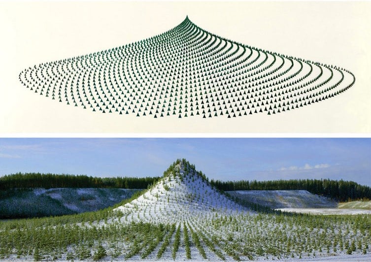
Tree Mountain is a man-made mountain 125 feet high covered in 11,000 trees planted in a configuration according to the Golden Ratio. This art installation was conceived and built by artist Agnes Denes in Finland and is designed to endure for 400 years.
A mountain needed to be built to design specifications, which by itself took over four years and was the restitution work of a mine that had destroyed the land through resource extraction. The process of bioremediation restores the land from resource extraction use to one in harmony with nature, in this case, the creation of a virgin forest. The planting of trees holds the land from erosion, enhances oxygen production and provides home for wildlife. This takes time and it is one of the reasons why Tree Mountain must remain undisturbed for centuries. The certificate the planters received are numbered and reach 400 years into the future as it takes that long for the ecosystem to establish itself. It is an inheritable document that connects the eleven thousand planters and their descendents reaching into millions, connected by their trees.
Today’s question is surprisingly tricky, as even the letter writer acknowledges:
My question is one I’m fumbling to articulate. I’m a math teacher and writer. (I’m a writer in the sense that I write, not in the sense that I get published or paid for writing.) I write a lot about teaching, but I’ve also been trying to get a handle on how I can write about math.
Here’s the question: is it possible to write about math in a deep and accessible way?
This is a question that sends me off on a lot of different questions. What does it mean to understand math? What does it mean to understand a metaphor? Are there are great literary works that are also mathematical?
Ultimately, though, I don’t know how to think about this yet. I’m hoping to eventually figure this out by learning math and writing about it…but that’s slow, so maybe Dr. Time can offer advice?
The obvious answer to this question is yes, of course it’s possible to write about math in a deep and accessible way. Bertrand Russell won a Nobel Prize in Literature. Godel, Escher, Bach is a 777-page doorstop that’s also a beloved bestseller. If you’re looking to satisfy an existence requirement, that book has your back. I’ll even stipulate that for every intellectual subject, not just mathematics, there exists a work that satisfies this deep-but-accessible requirement. It’s just like how there’s always a bigger prime number. It’s out there; we just have to find it.
On the other hand, math seems hard. And I think it seems hard for Reasons. Here’s a big one: mathematicians and popularizers of mathematics are perhaps understandably obsessed with understanding mathematics as such. The want to explain the totality of mathematics, or the essence, rather than finer problems like distinguishing between totalities and essences.
If you look at the other sciences, they don’t do this. It’s only very rarely that you get a Newton, Darwin, or Einstein who sets out to grab his or her entire subject with both hands and rethink our fundamental understanding of its foundations. Imagine a biologist who wants to explain life, in its essence and totality, at the micro and macro level. They’d be understandably stumped. Even physicists, when they want to explain something big and weird to the public, stick to things like a subatomic particle they’re hoping to discover or the behavior of one of Saturn’s moons. They don’t try to explain physics. They explain a problem in physics.
When mathematicians do that, they’re usually pretty successful. The Konigsberg Bridge Problem is charming as hell. Russell’s and Godel’s paradoxes have whole books written about them, but can also be told in the form of jokes. Even Fourier Transforms can be broken down and made beautiful with a little bit of technical help.
So I think the key, in part, is to resist that mathematicians’ tendency to abstract away individual problems into general solutions or categories of solutions or entire subfields, and spend some time with the specific problems that mathematicians are or have been interested in. But it also helps a lot if, in that specific problem, you get that mathematical move of discarding whatever doesn’t matter to the structure of the problem. After all, that’s a big part of what you’re trying to teach: how to think like a mathematician. You just to have to unlearn what a mathematician already assumes first.
The Fourier Transform is an incredibly useful mathematical function that can be used to show the different parts of a continuous signal. As you can see from the Wikipedia page, the formula and the mathematical explanation of the Fourier Transform can get quite complicated. But as with many complex mathematical subjects, the FT can also be explained visually. In the video above, 3blue1brown breaks down the Fourier Transform into a really intuitive visual system that’s surprisingly easy to follow if you’re not a science or math person. This would have been super helpful in my physics and math classes in college.
What does the Fourier Transform do? Given a smoothie, it finds the recipe.
How? Run the smoothie through filters to extract each ingredient.
Why? Recipes are easier to analyze, compare, and modify than the smoothie itself.
How do we get the smoothie back? Blend the ingredients.
The guide includes interactive graphs that you can play around with. Stuff like this always gets me so fired up about math and science. Ah, the path not taken…
In the first in a series of videos, Kurzgesagt tackles one of my favorite scientific subjects: how the sizes of animals governs their behaviors, appearance, and abilities. For instance, because the volume (and therefore mass) of an organism increases according to the cube of the increase in length (e.g. if you double the length/height of a dog, its mass roughly increases by 8 times), when you drop differently sized animals from high up, the outcomes are vastly different (a mouse lands safely, an elephant splatters everywhere).
When humans get smaller, the world and its resources get bigger. We’d live in smaller houses, drive smaller cars that use less gas, eat less food, etc. It wouldn’t even take much to realize gains from a Honey, I Shrunk Humanity scheme: because of scaling laws, a height/weight proportional human maxing out at 3 feet tall would not use half the resources of a 6-foot human but would use somewhere between 1/4 and 1/8 of the resources, depending on whether the resource varied with volume or surface area. Six-inch-tall humans would potentially use 1728 times fewer resources.
“What Is Systemic Racism?” is an 8-part video series that shows how racism shows up in our lives across institutions and society: Wealth Gap, Employment, Housing Discrimination, Government Surveillance, Incarceration, Drug Arrests, Immigration Arrests, Infant Mortality… yes, systemic racism is really a thing.
The reason why this matters should be obvious. Just like extra effort can harness the power of compound interest in knowledge and productivity, even tiny losses that occur frequently can add up to a large deficit. If you are constantly getting dinged in even small ways just for being black, those losses add up and compound over time. Being charged more for a car and other purchases means less life savings. Less choice in housing results in higher prices for property in less desirable neighborhoods, which can impact choice of schools for your kids, etc. Fewer callbacks for employment means you’re less likely to get hired. Even if you do get the job, if you’re late for work even once every few months because you get stopped by the police, you’re a little more likely to get fired or receive a poor evaluation from your boss. Add up all those little losses over 30-40 years, and you get exponential losses in income and social status.
And these losses often aren’t small at all, to say nothing of drug offenses and prison issues; those are massive life-changing setbacks. The war on drugs and racially selective enforcement have hollowed out black America’s social and economic core. There’s a huge tax on being black in America and unless that changes, the “American Dream” will remain unavailable to many of its citizens.
How are some people more productive than others? Are they smarter or do they just work a little bit harder than everyone else? In 1986, mathematician and computer scientist Richard Hamming gave a talk at Bell Communications Research about how people can do great work, “Nobel-Prize type of work”. One of the traits he talked about was possessing great drive:
Now for the matter of drive. You observe that most great scientists have tremendous drive. I worked for ten years with John Tukey at Bell Labs. He had tremendous drive. One day about three or four years after I joined, I discovered that John Tukey was slightly younger than I was. John was a genius and I clearly was not. Well I went storming into Bode’s office and said, “How can anybody my age know as much as John Tukey does?” He leaned back in his chair, put his hands behind his head, grinned slightly, and said, “You would be surprised Hamming, how much you would know if you worked as hard as he did that many years.” I simply slunk out of the office!
What Bode was saying was this: “Knowledge and productivity are like compound interest.” Given two people of approximately the same ability and one person who works ten percent more than the other, the latter will more than twice outproduce the former. The more you know, the more you learn; the more you learn, the more you can do; the more you can do, the more the opportunity — it is very much like compound interest. I don’t want to give you a rate, but it is a very high rate. Given two people with exactly the same ability, the one person who manages day in and day out to get in one more hour of thinking will be tremendously more productive over a lifetime.
Thinking of life in terms of compound interest could be very useful. Early and intensive investment in something you’re interested in cultivating — relationships, money, knowledge, spirituality, expertise, etc. — often yields exponentially better results than even marginally less effort.
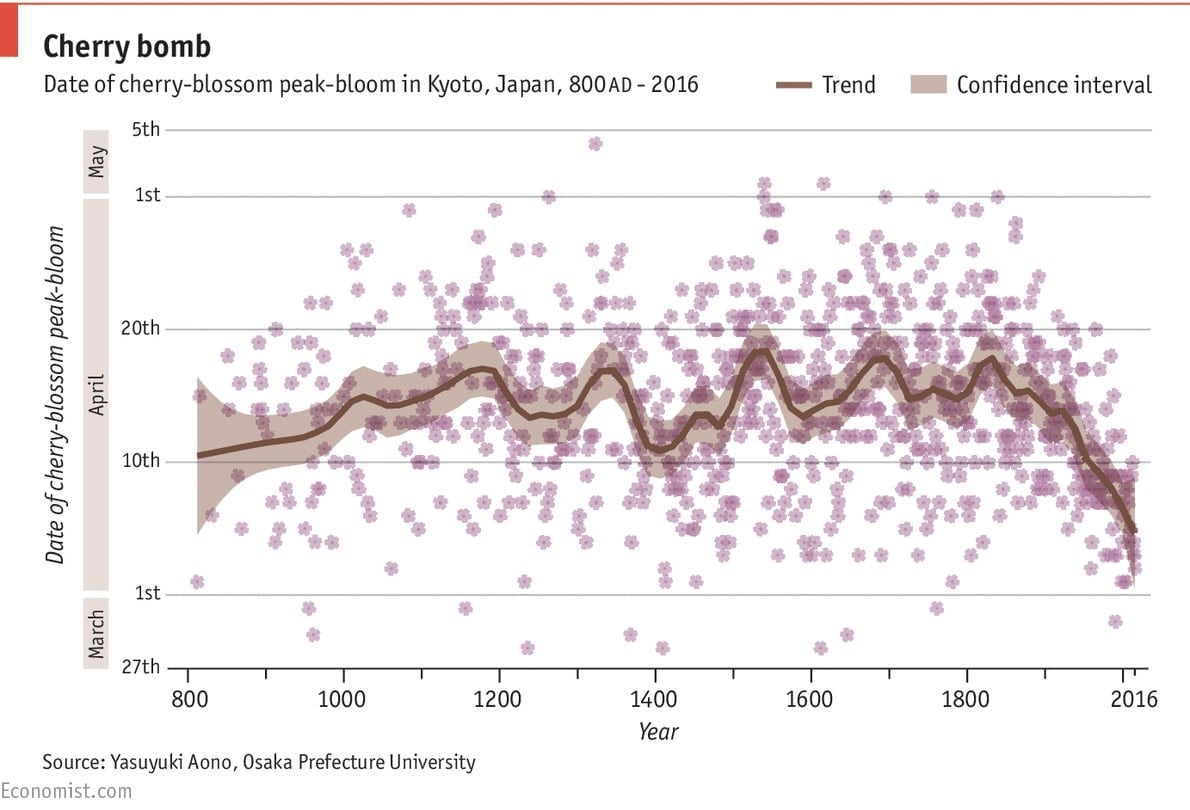
From its most recent peak in 1829, when full bloom could be expected to come on April 18th, the typical full-flowering date has drifted earlier and earlier. Since 1970, it has usually landed on April 7th. The cause is little mystery. In deciding when to show their shoots, cherry trees rely on temperatures in February and March. Yasuyuki Aono and Keiko Kazui, two Japanese scientists, have demonstrated that the full-blossom date for Kyoto’s cherry trees can predict March temperatures to within 0.1°C. A warmer planet makes for warmer Marches.
Temperature and carbon-related charts like this one are clear portraits of the Industrial Revolution, right up there with oil paintings of the time. I also enjoyed the correction at the bottom of the piece:
An earlier version of this chart depicted cherry blossoms with six petals rather than five. This has been amended. Forgive us this botanical sin.
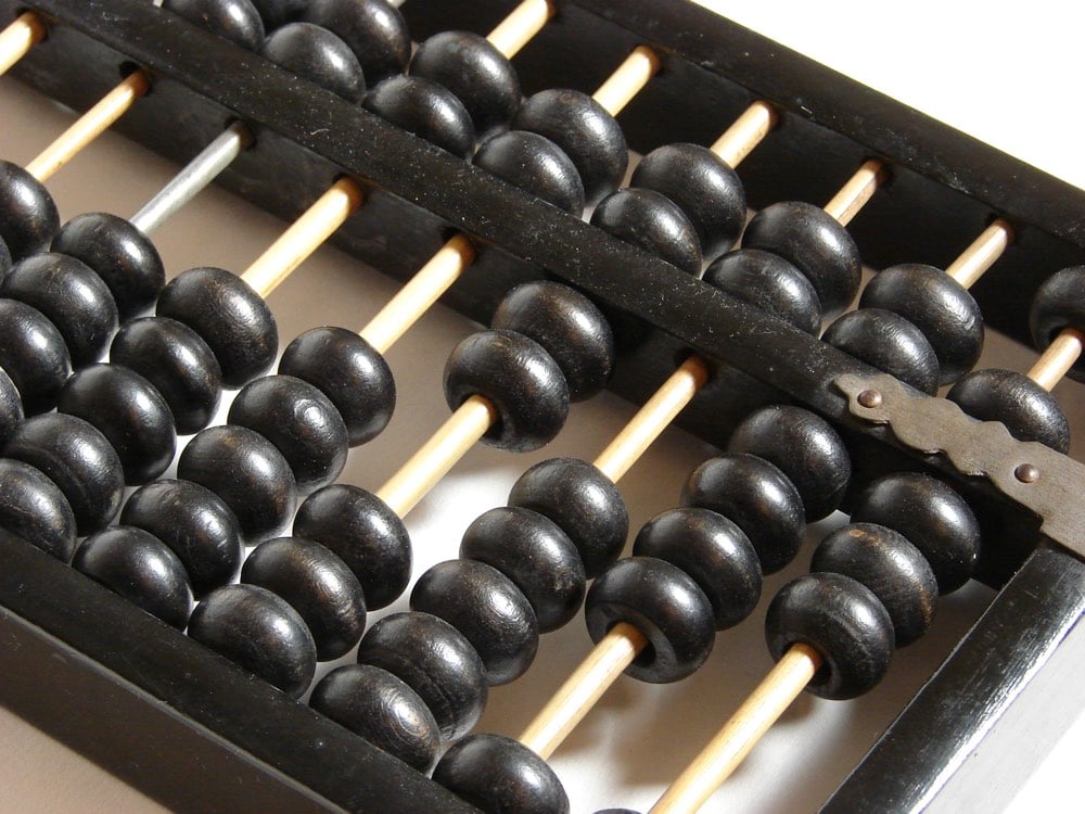
The abacus counting device dates back thousands of years but has, in the past century, been replaced by calculators and computers. But studies show that abacus use can have an effect on how well people learn math. In this excerpt adapted from his new book Learn Better, education researcher Ulrich Boser writes about the abacus and how people learn.
Researchers from Harvard to China have studied the device, showing that abacus students often learn more than students who use more modern approaches.
UC San Diego psychologist David Barner led one of the studies, and he argues that abacus training can significantly boost math skills with effects potentially lasting for decades.
“Based on everything we know about early math education and its long-term effects, I’ll make the prediction that children who thrive with abacus will have higher math scores later in life, perhaps even on the SAT,” Barner told me.
Ignore the hyperbolic “and it changed my life” in the title…this piece is interesting throughout. For example, this passage on the strength of the mind-body connection and the benefits of learning by doing:
When first I watched high school abacus whiz Serena Stevenson, her hand gestures seemed like a pretentious affect, like people who wear polka-dot bow ties. But it turned out that her finger movements weren’t really all that dramatic, and on YouTube, I watched students with even more theatrical gesticulations. What’s more, the hand movements turned out to be at the heart of the practice, and without any arm or finger motions, accuracy can drop by more than half.
Part of the explanation for the power of the gestures goes to the mind-body connection. But just as important is the fact that abacus makes learning a matter of doing. It’s an active, engaging process. As one student told me, abacus is like “intellectual powerlifting.”
Psychologist Rich Mayer has written a lot about this idea, and in study after study he has shown that people gain expertise by actively producing what they know. As he told me: “Learning is a generative activity.”
I’d never heard of the concept of overlearning before:
Everybody from actors learning lines, to musicians learning new songs, to teachers trying to impart key facts to students has observed that learning has to “sink in” in the brain. Prior studies and also the new one, for example, show that when people learn a new task and then learn a similar one soon afterward, the second instance of learning often interferes with and undermines the mastery achieved on the first one.
The new study shows that overlearning prevents against such interference, cementing learning so well and quickly, in fact, that the opposite kind of interference happens instead. For a time, overlearning the first task prevents effective learning of the second task — as if learning becomes locked down for the sake of preserving master of the first task. The underlying mechanism, the researchers discovered, appears to be a temporary shift in the balance of two neurotransmitters that control neural flexibility, or “plasticity,” in the part of the brain where the learning occurred.
“These results suggest that just a short period of overlearning drastically changes a post-training plastic and unstable [learning state] to a hyperstabilized state that is resilient against, and even disrupts, new learning,” wrote the team led by corresponding author Takeo Watanabe, the Fred M. Seed Professor of Cognitive Linguistic and Psychological Sciences at Brown.
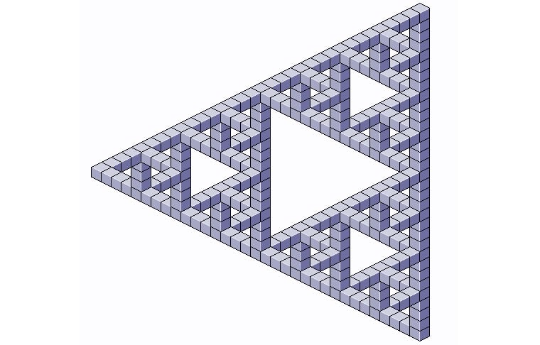
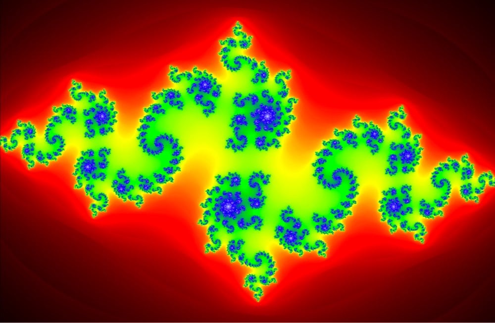
Yay! It’s Fractal Friday! (It’s not, I just made that up.) But anyway, courtesy of Christopher Night, you can play around with this Julia set fractal. It works in a desktop browser (by moving the mouse) or on your phone (by dragging your finger).
The Julia set, if you don’t remember, goes thusly: Let f(z) be a complex rational function from the plane into itself, that is, f(z)=p(z)/q(z) f(z)=p(z)/q(z), where p(z) and q(z) are complex polynomials. Then there is a finite number of open sets F1, …, Fr, that are left invariant by f(z) which, uh, is um… yay! Fractal Friday! The colors are so pretty!
If you spin these sculptures by artist John Edmark at a certain speed and light them with a strobe, they appear to animate in slowly trippy ways.
Blooms are 3-D printed sculptures designed to animate when spun under a strobe light. Unlike a 3D zoetrope, which animates a sequence of small changes to objects, a bloom animates as a single self-contained sculpture. The bloom’s animation effect is achieved by progressive rotations of the golden ratio, phi (ϕ), the same ratio that nature employs to generate the spiral patterns we see in pinecones and sunflowers. The rotational speed and strobe rate of the bloom are synchronized so that one flash occurs every time the bloom turns 137.5º (the angular version of phi).
The effect seems computer generated (but obviously isn’t) and is better than I anticipated. (via colossal)
Update: While not as visually smooth as his sculptures, Edmark’s rotation of an artichoke under strobe lighting deftly demonstrates the geometric rules followed by plants when they grow.
Here we see an artichoke spinning while being videotaped at 24 frames-per-second with a very fast shutter speed (1/4000 sec). The rotation speed is chosen to cause the artichoke to rotate 137.5º — the golden angle — each time a frame is captured, thus creating the illusion that the leaves are moving up or down the surface of the artichoke. The reason this works is that the artichoke grows by producing new leaf one at a time, with each new leaf positioned 137.5º around the center from the previous leaves. So, in a sense, this video reiterates the artichoke’s growth process.
The Monty Hall Problem is one of those things that demonstrates just how powerful a pull common sense has on the human reasoning process. The problem itself is easily stated: there are three doors and behind one of them there is a prize and behind the other two, nothing. You choose a door in hopes of finding the prize and then one of the other two doors is opened to reveal nothing. You are offered the opportunity to switch your guess to the other door. Do you take it?
Common sense tells you that switching wouldn’t make any difference. There are two remaining doors, the prize is randomly behind one of them, why would switching yield any benefit? But as the video explains and this simulation shows, counterintuition prevails: you should switch every time.
America was introduced to the difficulty of the problem by Marilyn vos Savant in her column for Parade magazine in 1990.1 In a follow-up explanation of the question, vos Savant offered a quite simple “proof” of the always switch method (from Wikipedia). Let’s assume you pick door #1, here are the possible outcomes:
Door 1
Door 2
Door 3
Result if you stay
Result if you switch
Car
Goat
Goat
Wins car
Wins goat
Goat
Car
Goat
Wins goat
Wins car
Goat
Goat
Car
Wins goat
Wins car
As you can see, staying yields success 33% of the time while if you switch, you win 2 times out of three (67%), a result verified by a properly written simulator. In his Straight Dope column, Cecil Adams explained it like so (after he had gotten it wrong in the first place):
A friend of mine did suggest another way of thinking about the problem that may help clarify things. Suppose we have the three doors again, one concealing the prize. You pick door #1. Now you’re offered this choice: open door #1, or open door #2 and door #3. In the latter case you keep the prize if it’s behind either door. You’d rather have a two-in-three shot at the prize than one-in-three, wouldn’t you? If you think about it, the original problem offers you basically the same choice. Monty is saying in effect: you can keep your one door or you can have the other two doors, one of which (a non-prize door) I’ll open for you.
I was a religious reader of Parade and remember this column and the resulting furor very clearly. Re: the furor, it’s so interesting to note in hindsight (being 16 and clueless at the time) how much of the response was men who clearly were trying to put the smackdown on a prominent, intelligent woman and they just got totally owned.↩
For a recent episode of Numberphile, David Eisenbud explains the Collatz Conjecture, a math problem that is very easy to understand but has an entire book devoted to it and led famous mathematician Paul Erdős to say “this is a problem for which mathematics is perhaps not ready”.
The problem is easily stated: start with any positive integer and if it is even, divide it by 2 and if odd multiply it by 3 and add 1. Repeat the process indefinitely. Where do the numbers end up? Infinity? 1? Loneliness? Somewhere in-between? My favorite moment of the video:
As a child, Danica McKellar played Winnie Cooper on The Wonder Years. After the show was over, McKellar had difficulty breaking away from other people’s perceptions of her. But in college, she discovered an aptitude for mathematics, went on to have a theorem named after her — not because she was famous but because she’d helped prove it — and forged a new identity. (via @stevenstrogatz)
When Grade-A nerds get together and talk about programming and math, a popular topic is P vs NP complexity. There’s a lot to P vs NP, but boiled down to its essence, according to the video:
Does being able to quickly recognize correct answers [to problems] mean there’s also a quick way to find [correct answers]?
Most people suspect that the answer to that question is “no”, but it remains famously unproven.
In fact, one of the outstanding problems in computer science is determining whether questions exist whose answer can be quickly checked, but which require an impossibly long time to solve by any direct procedure. Problems like the one listed above certainly seem to be of this kind, but so far no one has managed to prove that any of them really are so hard as they appear, i.e., that there really is no feasible way to generate an answer with the help of a computer.
The curve shaped by the CDC’s available statistics, however, does allow one to estimate the number of American men between the ages of 20 and 40 who are 7 feet or taller: fewer than 70 in all. Which indicates, by further extrapolation, that while the probability of, say, an American between 6’6” and 6’8” being an NBA player today stands at a mere 0.07%, it’s a staggering 17% for someone 7 feet or taller.
Being seven feet tall is absurdly tall and comes with a whole host of challenges, from bumping one’s head on door frames to difficulty finding clothes to health issues. Some of these difficulties arise out of simple geometry: as height and width increase, volume increases more quickly.1
Mathematicians have calculated pi out to more than 13 trillion decimal places, a calculation that took 208 days. NASA’s Marc Rayman explains that in order to send out probes and slingshot them accurately throughout the solar system, NASA needs to use only 15 decimal places, or 3.141592653589793. How precise are calculations with that number? This precise:
The most distant spacecraft from Earth is Voyager 1. It is about 12.5 billion miles away. Let’s say we have a circle with a radius of exactly that size (or 25 billion miles in diameter) and we want to calculate the circumference, which is pi times the radius times 2. Using pi rounded to the 15th decimal, as I gave above, that comes out to a little more than 78 billion miles. We don’t need to be concerned here with exactly what the value is (you can multiply it out if you like) but rather what the error in the value is by not using more digits of pi. In other words, by cutting pi off at the 15th decimal point, we would calculate a circumference for that circle that is very slightly off. It turns out that our calculated circumference of the 25 billion mile diameter circle would be wrong by 1.5 inches. Think about that. We have a circle more than 78 billion miles around, and our calculation of that distance would be off by perhaps less than the length of your little finger.
When was humanity’s calculation of pi accurate enough for NASA? In 1424, Persian astronomer and mathematician Jamshid al-Kashi calculated pi to 17 digits.


Stay Connected