kottke.org posts about www
Here’s a small and nerdy measure of the huge change in the executive branch of the US government today. Here’s the robots.txt file from whitehouse.gov yesterday:
User-agent: *
Disallow: /cgi-bin
Disallow: /search
Disallow: /query.html
Disallow: /omb/search
Disallow: /omb/query.html
Disallow: /expectmore/search
Disallow: /expectmore/query.html
Disallow: /results/search
Disallow: /results/query.html
Disallow: /earmarks/search
Disallow: /earmarks/query.html
Disallow: /help
Disallow: /360pics/text
Disallow: /911/911day/text
Disallow: /911/heroes/text
And it goes on like that for almost 2400 lines! Here’s the new Obamafied robots.txt file:
User-agent: *
Disallow: /includes/
That’s it! BTW, the robots.txt file tells search engines what to include and not include in their indexes. (thx, ian)
Update: Nearly four months later, the White House’s robots.txt file is still short…only four lines.
User-agent: *
Disallow: /includes/
Disallow: /search/
Disallow: /omb/search/
Several readers have noted that The White House Site has already been refreshed to the now-familiar Obama look-and-feel. It’s even got a blog on the front page. Will there be a Twitter account? The Wikipedians have been busy too: Obama is listed as the current President on the President of the United States page.
Update: Oh, and all of the third-party content on the WH site is licensed under Creative Commons. Wow.
Update: Oh, there’s a Twitter account. Pair with THE_REAL_SHAQ for maximum fun! (thx, brian)
Update: This appears to be the official WH Twitter account, former updated by the Bush administration but now helmed by the Obama folks.
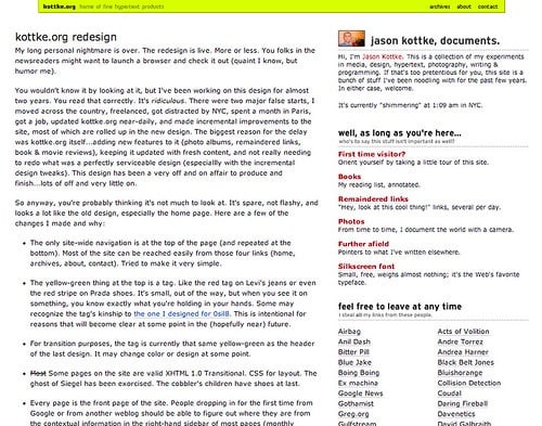
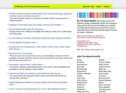
The design of kottke.org has been mostly the same since 2000…a garish yellow/green bar across the top and small black text on a white background everywhere else. (See the progression of designs since 1998.) People absolutely hated that color when I first introduced it1, but it stuck around — mostly out of laziness — and that pukey yellow became the most visible brand element of the site.
Two days ago, I refreshed the design of the site and, as you may have noticed, no more yellow/green. The other big changes are: bigger text set in a new font, a blue “zoom” border around the page, and the addition of titles to the short posts.
(A brief nuts and bolts interlude… For most of you, the site will look like this. If you’ve got Myriad Pro on your machine — it comes free with Acrobat Reader and Adobe CS — it’ll look like this…this is the “intended” look. And if you’re a fancypants designer with Whitney installed, you’ll get this rarified view, which I did mostly for me. On IE6, the site will be legible and usable but somewhat unstyled. If you’re not seeing something that looks like one of the above screenshots — if the text is in all caps, for instance — please drop me a line with a link to a screenshot and your browser information. Thanks!)
The blue “zoom” border is the biggest visual change, and it’s an homage to what is still my favorite kottke.org design, the yellow zoom from 1999. I like that kottke.org is one of the few weblogs out there that can reach back almost ten years for a past design element; the site has history. In a way, that border is saying “kottke.org has been around for ten years and it’s gonna be around for twenty more”. At least that’s how I think about it.
I’ve already gotten lots of feedback from readers, mostly via Twitter and email. There were a few technical issues that I’ve hopefully ironed out — e.g. it should work better on the iPhone now — and a couple which might take a bit longer, like the border messing with the page-at-a-time scrolling method. Some people like the changes, but mostly people don’t like the new design, really dislike the blue, and generally want the old site back. This is exactly the reaction I expected, and it’s heartening to learn that the old design struck such a chord with people. All I’m asking is that you give it a little time.
My suspicion is that as you get used to it, the new text size won’t seem so weird and that blue border will likely disappear into the background of your attention, just as that hideous yellow/green did. A month from now, your conscious mind won’t even see the blue — chalk it up to something akin to banner blindness…brand blindness maybe? — but your subconscious will register it and you’ll just know where you are, safe and sound right here at good ol’ kottke.org. And if that doesn’t work, we’ll tweak and move some things around. Design is a process, not a result, and we’ll get it to a good place eventually, even if it takes twenty years.
[1] I wish I had access to my email from back then…everyone hated it and wanted the old design back. Before landing on the yellow/green color, I tried the golden yellow from the previous design, a blue very much like the blue in the current border, and then red. I think each color was live on the site for a few days and my intention was to just keep switching it around. But then I got bored and just left the yellow/green. Gold star to anyone who remembers that short phase of the site. ↩
Is This Your Paper On Single Serving Sites? is a single serving site that houses a paper on single serving sites written by Ryan Greenberg.
Visually, sites’ presentation is often as sparse as the domain names are long. Many display only a few words. Although some sites use Flash to play an audio or video clip, very few offer the rich interactivity associated with Flash deployment in other contexts. Some sites incorporate design tropes from past online eras: gaudy 3D headlines, jarring repeated background images, looping audio clips, and centered text.
Late last week Jason Santa Maria posted the first web site that he’d ever made and asked others to do the same. The earliest web page of mine still online is a parody of Suck that I did in March 1996 called Suck for Dummies. (It’s now called Suck for Dimwits because I received a C&D from the X for Dummies people threatening to sue.) In June of 96, I made this over-the-top home page, Jason’s Awesome WWW Home Page. (Warning,
My earlier sites are lost, I think. (I have a few Zip and Jaz disks that might have some older stuff on them but I don’t have the capability to read them anymore.) Before 0sil8, there were three or four efforts that I must have deleted from my hard drive at some point, including some embarrassing efforts involving fractals. The very first thing I did in HTML was a personal home page around Nov/Dec 1994 that lived on a 3.5” floppy. I coded it on the computer in my dorm room (using an early version of HTML Assistant and Aldus PhotoStyler) and then put it on a floppy to use on the computer in the physics lab, the only computer I had access to on campus that had internet access. The page was little more than a gussied up list of links that I liked to visit online, but I loved building, rebuilding, and redesigning it over and over, even though I was the only one who ever saw it. The handcrafted/DIY nature of building that page hooked me on web design. I would give almost anything to see that little page again.
I read Cynical-C everyday; the other day I ran across this post about the Dancing Plague of 1518.
The Dancing Plague (or Dancing Epidemic) of 1518 was a case of dancing mania that occurred in Strasbourg, Alsace, France (then part of the Holy Roman Empire) in July 1518. Numerous people took to dancing for days without rest, and over the period of about one month, most of the people died from heart attack, stroke, or exhaustion.
Wikipedia is great but I like to dig back into the “primary” sources. A Discovery News article tells of a book called A Time to Dance, a Time to Die whose author says that the dancing was a result of mass hysteria caused by high levels of psychological distress in the community. That article also mentions the Tanganyika laughter epidemic:
The epidemic seems to have started within a small group of students in a boarding school, possibly triggered by a joke. Laughter, as is commonly known, is in some sense contagious, and for whatever reason in this case the laughter perpetuated itself, far transcending its original cause. Since it is physiologically impossible to laugh for much more than a few minutes at a time, the laughter must have made itself known sporadically, though reportedly it was incapacitating when it struck. The school from which the epidemic sprang was shut down; the children and parents transmitted it to the surrounding area. Other schools, Kashasha itself, and another village, comprising thousands of people, were all affected to some degree. Six to eighteen months after it started, the phenomenon died off.
That epidemic was covered at length in Radio Lab’s Laughter episode from earlier in the year.
But back to the Dancing Plague. That article links to a page on another form of mass hysteria, penis panic.
Genital retraction syndrome (GRS), generally considered a culture-specific syndrome, is a condition in which an individual is overcome with the belief that his/her external genitals — or also, in females, breasts — are retracting into the body, shrinking, or in some male cases, may be imminently removed or disappear. A penis panic is a mass hysteria event or panic in which males in a population suddenly believe they are suffering from genital retraction syndrome.
Which in turn guides us to a 2008 article in Harper’s, A mind dismembered: In search of the magical penis thieves. George Costanza had a personal case of penis panic in the Seinfeld episode entitled The Hamptons.
George is seen naked by Jerry’s girlfriend Rachel, to whom he tries vainly to explain that, having just gotten out of the cold water, he is a victim of penile “shrinkage.”
Penis panic put me in mind of a similar phenomenon and after a couple of failed searches — “afraid to pee”, “pee in public” — I finally found it: paruresis, aka “pee shyness, shy kidney, bashful bladder, stage fright, urophobia or shy bladder syndrome”.
Paruresis […] is a type of phobia in which the sufferer is unable to urinate in the (real or imaginary) presence of others, such as in a public restroom. It can affect both males and females. The analogous condition that affects bowel movement is called parcopresis.
Paruresis has been referenced in several movies, TV shows, books, and other media.
Stage fright always puts me in mind of this New Yorker article by John Lahr about the phenomenon (subscribers-only version). From there, it’s relaxed concentration all the way down, a topic on which I could digitally ramble all day, so let’s stop there.
(I took the title of this post from the online excursions that Rosecrans Baldwin conducts for the NY Times’ The Moment. Apologies and thanks.)
In this video interview, long-time online community expert Randy Farmer explicitly references the broken windows theory and its application to online spaces. He tells an anecdote about how the quick deletion of trolling questions from the front page of Yahoo Answers led to a decline in the number of trolls. (thx, bryce)
The Economist reports that experimental tests of the controversial “broken windows theory” of social behavior indicate that the theory is correct.
The most dramatic result, though, was the one that showed a doubling in the number of people who were prepared to steal in a condition of disorder. In this case an envelope with a EUR5 ($6) note inside (and the note clearly visible through the address window) was left sticking out of a post box. In a condition of order, 13% of those passing took the envelope (instead of leaving it or pushing it into the box). But if the post box was covered in graffiti, 27% did. Even if the post box had no graffiti on it, but the area around it was littered with paper, orange peel, cigarette butts and empty cans, 25% still took the envelope.
Here’s the 1982 Atlantic article in which the theory was first discussed in a popular forum. (Great article, BTW.)
At the community level, disorder and crime are usually inextricably linked, in a kind of developmental sequence. Social psychologists and police officers tend to agree that if a window in a building is broken and is left unrepaired, all the rest of the windows will soon be broken. This is as true in nice neighborhoods as in rundown ones. Window-breaking does not necessarily occur on a large scale because some areas are inhabited by determined window-breakers whereas others are populated by window-lovers; rather, one unrepaired broken window is a signal that no one cares, and so breaking more windows costs nothing.
Reading these articles, I wondered: how does the broken windows theory apply to online spaces? Perhaps like so:
Much of the tone of discourse online is governed by the level of moderation and to what extent people are encouraged to “own” their words. When forums, message boards, and blog comment threads with more than a handful of participants are unmoderated, bad behavior follows. The appearance of one troll encourages others. Undeleted hateful or ad hominem comments are an indication that that sort of thing is allowable behavior and encourages more of the same. Those commenters who are normally respectable participants are emboldened by the uptick in bad behavior and misbehave themselves. More likely, they’re discouraged from helping with the community moderation process of keeping their peers in line with social pressure. Or they stop visiting the site altogether.
Unchecked comment spam signals that the owner/moderator of the forum or blog isn’t paying attention, stimulating further improper conduct. Anonymity provides commenters with immunity from being associated with their speech and actions, making the whole situation worse…how does the community punish or police someone they don’t know? Very quickly, the situation is out of control and your message board is the online equivalent of South Central Los Angeles in the 1980s, inhabited by roving gangs armed with hate speech, fueled by the need for attention, making things difficult for those who wish to carry on useful conversations.
But what about a site’s physical appearance? Does the aesthetic appearance of a blog affect what’s written by the site’s commenters? My sense is that the establishment of social norms through moderation, both by site owners and by the community itself, has much more of an impact on the behavior of commenters than the visual design of a site but aesthetics does factor in somewhat. Perhaps the poor application of a default MT or Wordpress template signals a lack of care or attention on the part of the blog’s owner, leading readers to think they can get away with something. Poorly designed advertising or too many ads littered about a site could result in readers feeling disrespected and less likely to participate civilly or respond to moderation. Messageboard software is routinely ugly; does that contribute to the often uncivil tone found on web forums?
A list of infrequent HTTP/1.1 status codes.
HTTP 220 (The Clooney): Same as 200 with a little something in there for your trouble.
(thx, djacobs)
A golden oldie from Matt Jones in 2001: WebDogme.
Two Danish filmmakers, Lars von Trier and Thomas Vinterberg in 1995 responded to what they saw as the increasing inhumanity and formulaic commerciality of effects-heavy, franchise-friendly feature films. They created a vow of chastity that placed the stylistic presentation and formal tricks of film subservient to the narrative and characterisation.
WebDogme is an attempt to outline a similar approach for the web. kottke.org is doing pretty well on the rules…I’ve unwittingly followed 5 or 6 of them at least. I’d link to the original Dogme 95 manifesto, but the official web site does not adhere to WebDogme rule #3 (“The browser must not be violated”); the manifesto is hidden within a frame. (via preoccupations)
Jamie Zawinski, one of the developers responsible for the early versions Netscape Navigator, has declared that today is Run Some Old Web Browsers Day. In celebration, he’s hosting an archive of old Mosaic/Netscape broswers and rolled back the clock on the original mcom.com domain.
home.mcom.com and all URLs under it just redirected to netscape.com, then redirected a dozen more times before taking you to some AOL portal page. The old URLs that were baked into the toolbar buttons of the original web browsers didn’t work any more. But now, if you fire up a copy of Mosaic Netscape 0.9, and click on the various toolbar buttons, they will work again! For example, in the old browsers, when you clicked on the “What’s New” toolbar button, it went here.
home.mcom.com is now a snapshot of that web site from 21-Oct-1994.
mosaic.mcom.com is now a snapshot of that web site from July 1994. That’s from just after the company was announced, but before the first browser beta was released. I think that by Oct 1994, both mosaic.mcom.com and www.mcom.com were redirects to home.mcom.com, but I can’t remember any more.
Evolt also maintains an extensive archive of browsers old and new. I have a smaller archive that I put together for an episode of 0sil8 more than 10 years ago.
In past few years, several prominent US magazines and newspapers have begun to offer their extensive archives online and on DVD. In some cases, this includes material dating back to the 1850s. Collectively it is an incredible record of recent human history, the ideas, people, and events that have shaped our country and world as recorded by writers, photographers, editors, illustrators, advertisers, and designers who lived through those times. Here are some of most notable of those archives:
Harper’s Magazine offers their entire archive online, from 1850 to 2008. Most of it is only available to the magazine’s subscribers. Associate editor Paul Ford talks about how Harper’s archive came to be.
The NY Times provides their entire archive online, most of it for free. Most of the stories from 1923 to 1986 are available for a small fee. The Times briefly launched an interface for browsing their archive called TimesMachine but withdrew it soon after launch.
Time Magazine has their entire archive online for free, from 1923 to the present.
Sports Illustrated has all their issues online for free, dating back to 1954.
The Atlantic Monthly offers all their articles since Nov 1995 and a growing number from their archive dating back to 1857 for free. For a small fee, most of the rest of their articles are available as well, although those from Jan 1964 - Sept 1992 are not.
The Washington Post has archives going back to 1877. Looks like most of it is for pay.
The New Yorker has free archives on their site going back to 2001, although only some of the articles are included. All of their articles, dating back to 1925, are available on The Complete New Yorker DVD set for $40.
Rolling Stone offers some of their archive online but the entire archive (from 1967 to 2007) is available as a 4-DVD set for $79.
Mad Magazine released a 2-DVD set of every issue of the magazine from 1952-2006.
And more to come…old media is slowly figuring out that more content equals more traffic, sometimes much more traffic.
Update: Nature has their entire archive online, dating back to 1869. (thx, gavin)
Three cities, two serious relationships, one child, 200,000 frequent flier miles, at least seven jobs, 14,500 posts, six designs, and ten years ago, I started “writing things down” and never stopped. That makes kottke.org one of a handful of the longest continually updated weblogs on the web…something to be proud of, I guess. The only thing I’ve done longer than kottke.org is sported this haircut. (Perhaps not something to be proud of…the hair-in-stasis, I mean.)
Being a digital packrat, I have screenshots of all the past designs the site has had. When I started, the posts were actually hosted on another site of mine, 0sil8, that I’d been doing since 1996. I didn’t know at the time that kottke.org would eventually kill 0sil8. This was the first design (full size):
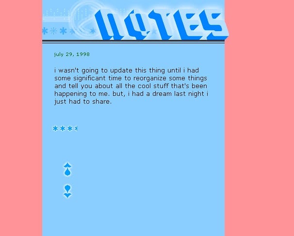
It’s a little misleading because there’s only one post shown on the page…there were usually more, displayed reverse chronologically. The stars were a rough rating of how well that day had gone called the fun meter.
When I moved the site to its own domain after a few months, I redesigned it to look like this (full size):
The aesthetic was influenced by the pixel grunge style of Finnish designer Miika Saksi…you can see some of his older work here. The font in the navigation is Mini 7…Silkscreen was still several months away at that point. The fun meter is still present as is the all-lowercase text, a house style I thankfully dropped a few months later. The cringeworthy writing took a few more years to iron out…if it ever fully was.
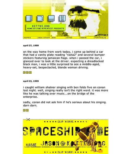
This one’s still my favorite; it turned a lot of heads back in the day (full size):
With dozens of spacer gifs and five concentric tables, it was a bitch to code. There was also a capability to modify the look and feel of the site…you could choose between this design, the older design pictured above, and a text-only version. Inline permalinks were introduced on kottke.org in March 2000 and subsequently the idea was spread across the web by Blogger.
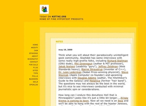
But it only lasted for about a year. In late 2000, I swapped it for this one (full size):
The familiar burn-your-eyes-out yellow-green makes its first appearance. I never really meant to keep it or for it to become the strongest part of the site’s identity. After this design launched, I cycled through a few colors (the old yellow, blue, red) before getting to the yellow-green…and then I just got lazy and left it. For 8 years and counting. The post style underwent several changes with this design. In June 2002, I switched to Movable Type after updating the site by hand for four years. Soon after that, I added titles to my posts. In late 2002, I added a frequently updated list of remaindered links to the sidebar. In late 2003, the remainders moved into the main column and have become an integral part of the site. I also started reviewing movies and books around this time…kottke.org became a bit of a tumblelog.
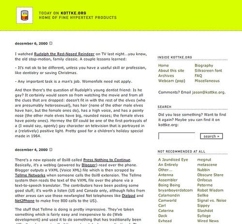
In July 2004, I refreshed the design a bit…tightened it up (full size):
After about a year, I changed it again to the current look and feel (full size):
Sorry, that got a little long…there’s a lot I didn’t remember until I started writing. Anyway, I didn’t intend for this to become a design retrospective. Mostly I wanted to thank you very sincerely for reading kottke.org. Over the last ten years, I’ve poured a lot more of myself than I’d like to admit into this site and it’s nice to know that someone out there is paying attention. [Cripes, I’m choking up here. Seriously!] Thanks, and I’ll see you in 2018.
The 2007 Digital Economy Handbook is almost 200 pages of information about trends related to the internet, hardware, software, communications, digital media, ecommerce, and more. Looks like an amazing document and it’s a free download. Tons of charts and graphs and tables. (thx, jeff)
Ok, now we’re getting meta up in this piece. Scott took all the Single Serving Sites in my list and made a Single Serving Site that cycles through them. Here’s a SSS that lists other SSS. Additionally, there’s a Wikipedia entry.
Update: Ho, ho, not so fast. The Wikipedia page for Single Serving Sites has been flagged for speedy deletion for several reasons:
This article or other page provides no meaningful content or history, and the text is unsalvageably incoherent. It is patent nonsense.
It is blatant advertising for a company, product, group, service or person that would require a substantial rewrite in order to become an encyclopedia article.
Not notable: definition of days-old neologism; not covered anywhere except a popular blog and a few less-popular ones.
Heh.
Thanks to an avalanche of email, I’ve added a bunch of new items to the Single Serving Sites listing. Now please stop emailing me suggestions!! ;)
Lately I’ve noticed a pattern of people building Single Serving Sites, web sites comprised of a single page with a dedicated domain name and do only one thing. Here are a few examples:
Barack Obama Is Your New Bicycle showcases all the lovely things that the presidential candidate has done for you.
Sometimes Red, Sometimes Blue. Sometimes the page is read, sometimes it is blue.
Check out Is Lost a Repeat? if you need to know if the upcoming episode of Lost is a rerun.
D-E-F-I-N-I-T-E-L-Y helps you spell definitely correctly.
Now you can find out quickly from anywhere in the city or world: What Color Is the Empire State Building?
Khaaan! The classic William Shatner and his rage!
Is It Christmas? (thx, michael & andy)
Misanthropebook, a Facebook parody.
Status page for the overburdened microsocial site: Is Twitter Down? (thx, kevin)
Find out, Are We At War With Iran? (thx, kevin)
The Abe Vigoda status page. Currently alive. (thx, peter)
Gods Damn It, a Battlestar Galactica in-joke.
You can do anything at ZOMBO.com. (thx, edward)
The classic You’re The Man Now Dog! (thx, jordan)
Purple has a FAQ page but it’s a SSS in spirit. (thx, mike)
Oh, it’s Yet Another Useless Web Site. (thx, mike)
You Sneezed! blesses you.
Use Is Paris In Jail Right Now? to see if Ms. Hilton is a free woman or not. (thx, lex)
Are you tired? Tell them why. (thx, kathi)
Am I Awesome? Very. (thx, jared)
Hypnotoad! (thx, chris)
Fuck the Sound, which is, I’m told, “IRC quotes (some NSFW) by an Autechre fanboy from Romania”. (thx, huphtur)
Gentle advice to those who ask dumb questions: Just Fucking Google It. (thx, michael)
Do websites need to look exactly the same in every browser?
It’s not Lupus, it’s never Lupus. Some House-related thing? (thx, sharelle)
Beth Cherry keeps a single page blog with no archives. (thx, malcolm)
We Need More Lemon Pledge. Not sure what this is. (thx, zach)
From the same person: Illegal Tender Terms of Service and These are the rules.
No Time For Love, Dr. Jones. Indy, you scoundrel. (thx, wade)
And several more: Is It Tuesday?, The Internet Fire Log, Let’s Turn This Fucking Website Yellow, iiiiiiii, Instant Rimshot, It Will Never Be the Same, Thank You Andy Warhol, Free Bill Stickers, raquo, The Last Page of the Internet, Thanks Ants, Is The Apple Store Down?, What Is My IP?, Hillary Clinton Is Your New Bicycle, John McCain Is Your New Bicycle, Michelle Obama Is Your New Bicycle, The Daily Nice, Defiant Dog, Hillary Clinton Is Your New HD DVD Player, and Spinning Beach Ball of Death.
Update: Ha! Alright, this got outta hand in a hurry. There are like 400 emails in my inbox, each with several Single Serving Site suggestions. I quickly went through them all, pulled out the notable ones, and called it good. Thanks to everyone who sent in suggestions.
Speaking of mining the archives of kottke.org, I just found this post that quotes a message board post by Ben Affleck about why he posts his thoughts to the web:
I think there is some responsibility on the part of those folks who benefit from the attentions of some section of the public to be responsive to that group.
It’s worth noting that Affleck was one of the first celebrities to post online in a bloggish manner…he’d answer people’s questions on his site’s message board. (His site is now dead, but a couple of instances of the board were collected by archive.org.)
I remember one post of his in particular (which I can’t find on archive.org). Ben was up late, at like 3am, playing Everquest (or maybe Ultima Online?) because he was addicted and couldn’t stop. He also mentioned that he was essentially playing the game instead of being in bed with his girlfriend at the time, Gwyneth Paltrow.
Matt Webb recently gave a talk at Web Directions North 2008 about movement as a metaphor for thinking about the Web. The slides take awhile to get through properly but it’s worth the effort. Some interesting points:
The meat of what Matt is getting at with his movement metaphor is contained in two systems he refers to in the talk. The first is the internal combustion engine:
To my mind, this is a more beautiful Rube Goldberg machine: the internal combustion engine.
Intake, compression, power, exhaust.
So what’s happening here. It needs a spark to get going, just like a message-board community online. And then it keeps cycling, and almost as a side-effect it outputs mechanical motion which goes to the wheels. But another side-effect of the process is that the motion also provides the intake stroke to start the cycle again. It’s self-perpetuating, just you use the energy from breakfast to go and make dinner, and you use the energy from supper to go and get breakfast again.
And the second is David Allen’s Getting Things Done:
The cleverness of GTD is not that it’s a system for achieving tasks. It’s that it’s a system for keeping you motivated to run the system for achieving tasks. It helps you start. It gives you reasons to continue. It helps you start again with a blank slate if you get overwhelmed, you know, to get back on the wagon.
It contains small and big rewards.
What’s more, it has a catchy name which advertises itself, and it’s easy to grasp too so when you tell your friends about it they remember it. So it’s a system that contains its own growth cycle too. Very clever.
A hardware API is like a software API for hardware (duh). Matt and his partner are working on a radio for the BBC which has a hardware API. For example, they’re planning on having different parts for the radio that hook together using magnets, much like Apple’s MagSafe power connector.
Snap is a proposal for syndicating actions. Instead of using RSS for passive input (news reading, blog reading, etc.), Snap imagines using an RSS-esque reader for doing things (purchasing books, managing todo lists, posting to blogs, etc.) without using a proper browser. Matt wrote a whole bunch more on Snap here.
But my main takeaway from Matt’s talk is his process for thinking about, describing, and explaining things. He uses idea scaffolding and metaphor.
So one of the way I work, being not-a-designer, is to use a lot of metaphors. Metaphors are a great sort of idea scaffolding.
I start by saying, as the Web is to cities, so weblogs are to Catalhoyok. Or, so this online social music website is to the London underground system. Or, so this repository of scientific papers is to Borges’ infinite library.
You know, so you make the analogy and then extend the metaphor. The consequence would be this, the consequence would be that. It’s a way to provoke creative thinking.
I’ve observed that there’s much resistance in contemporary society to simply trying out ideas to see if they work. It seems more important to many people to know who they are and what they believe. New ideas are either accepted or rejected and then those choices are vigorously defended. If it’s going to help you figure something out, why not look at a problem from every possible angle? Working on kottke.org is a big part of my process of idea scaffolding. I don’t necessarily agree or disagree with everything I link to1 but reading articles and then describing them to others is a good way to continually wonder, “Gosh, isn’t it interesting to think about the world this way?”
[1] I often get email from people saying that a particular idea expressed in some article that I’ve linked to is wrong and that I should alert my readers or remove the link. To which my response is a lusty hell no. What’s the big deal? It’s just an idea; it’s not going to hurt you. ↩
Web Trend Map 2008 Beta, which is basically 300 influential web sites mapped onto a Tokyo train map. It’s very pretty, but once again, kottke.org gets no love.
Update: A general trend map for 2008, this one modeled on the Shanghai subway map. (via mass custom., thx maaike)
Movie trailer for Untraceable, which features a serial killer who live-broadcasts his murders online so that his victims are killed faster as more people visit the site. From the looks of it, the movie features every single bad computer-related movie cliche all in one neat package. Either that or it’s a clever metaphor for what the web is doing to our culture. (via fimoculous)
Late last week, Marc Andreessen pulled a quote from a New Yorker article written in 1951 about television:
The most encouraging word we have so far had about television came from a grade-school principal we encountered the other afternoon.
“They say it’s going to bring back vaudeville,” he said, “but I think it’s going to bring back the book.”
Before television, he told us, his pupils never read; that is, they knew how to read and could do it in school, but their reading ended there. Their entertainment was predominantly pictorial and auditory — movies, comic books, radio.
Now, the principal said, news summaries are typed out and displayed on the television screen to the accompaniment of soothing music, the opening pages of dramatized novels are shown, words are written on blackboards in quiz and panel programs, commercials are spelled out in letters made up of dancing cigarettes, and even the packages of cleansers and breakfast foods and the announcers exhibit for identification bear printed messages.
It’s only a question of time, our principal felt, before the new literacy of the television audience reaches the point where whole books can be held up to the screen and all their pages slowly turned.
This sounds far fetched and Andreessen belittles the prediction, but is it really that outlandish? Literacy rates in the US have risen since the advent of television (I am not suggesting a correlation) and Steven Johnson suggests in Everything Bad Is Good For You that TV is making us smarter.
If you stop thinking of TV in the specific sense as a box on which ABC, CBS, and NBC are shown and instead imagine it in the general sense as a service that pipes content into the home to be shown on a screen, the prediction hits pretty close to the mark. The experience of using the web is not so different than reading pages of words that are “held up to the screen” while we scroll slowly through them. If we can imagine that what Paul Otlet and Vannevar Bush described as the “televised book” and the “memex” corresponds to today’s web, why not give our high school principal here the same benefit of the doubt?
Related to Jason Salavon’s work from last week is Brian Piana’s work, the layouts and colors of web sites with all of the text and graphics stripped out. For instance, Barack Obama’s Twitter page. The flowchart stuff is lovely…reminds me a bit of this page from Jimmy Corrigan. (thx, jonathan)
Alexander Bohn wrote a glowing review of FFFFOUND! at Speak Up the other day. My FFFFOUND! fandom is documented elsewhere, so I’ll comment instead on an observation Bohn made in his initial paragraph:
Graphic design might not work in the white cube, but it flourishes on a white background. A new mutated strain of design blog has evolved: The Randomly Curated Other People’s Images White Background Site, or RCOPIWS. Sites like Manystuff, Monoscope, Your Daily Awesome, and VVORK (among countless others) offer designers and design aficionados a constant flood of typographic morsels, interesting photos, arresting new art, and the like. One such site sets itself apart, notably, from the other RCOPIWSes: the collaborative image-bookmarking site ffffound.com — allegedly, but unconfirmed, initiated by online fiend Yugo Nakamura.
Among the many things that the internet has democratized is curating, a task once more or less exclusive to editors (magazine, book, and newspaper), art gallery owners, media executives (music, TV, and film), and museum curators. They choose the art you see on a museum’s wall, the shows you see on TV, the movies that get made, and the stories you read in the newspaper. The ease and low cost of publishing on the web coupled with the abundance of sample-ready media has made the curating process available to many more people. Smashing Telly is David Galbraith’s rolling film festival (or TV channel). By simply listening to the music that you like, Last.fm allows anyone to put together their own radio station to share with others. kottke.org is essentially a table of contents for a magazine I wish existed. Shorpy has freed old photography from the nearly impenetrable Library of Congress web site and presented it in a compelling blog-like fashion.
In the case of FFFFOUND! and other RCOPIWSs, I would argue that these sites showcase a new form of art curating. The pace is faster, you don’t need a physical gallery or museum, and you don’t need to worry about crossing arbitrary boundaries of style or media. Nor do you need to concern yourself with questions like “is this person an artist or an outsider artist?” If a particular piece is good or compelling or noteworthy, in it goes. The last week’s output at Monoscope would make a pretty good show in a Chelsea art gallery, no? It’ll be interesting to see how this grassroots art curating will affect the art/design/photography world at large. Jen Bekman, who has roots in the internet industry, is already exploring this new frontier with her nimble gallery and the Hey, Hot Shot! competition. Others are sure to follow.
things magazine on living in simulation: “There’s a lack of depth on the internet, a world with an atmosphere just one pixel thick that has reached out across all forms of media and turned everything into a vast, shallow pool that stretches as far as the eye can see. All visual culture is instantly at our fingertips, with the thrill of discovery superseded by a high fructose corn syrup buzz that comes from near-constant, 30fps stimulation.”
So, whoa. The commonly accepted wisdom is that Vannevar Bush’s seminal As We May Think, published in the Atlantic Monthly in 1945, was the first time anyone had described something like the modern desktop computer and the World Wide Web. Not so, says Alex Wright in Glut: Mastering Information Through the Ages (@ Amazon). A Belgian chap named Paul Otlet described something called the “radiated library” — or the “televised book” — in 1934:
Here, the workspace is no longer cluttered with any books. In their place, a screen and a telephone within reach. Over there, in an immense edifice, are all the books and information. From there, the page to be read, in order to know the answer to the question asked by telephone, is made to appear on the screen. The screen could be divided in half, by four, or even ten if multiple texts and documents had to be consulted simultaneously. There would be a loudspeaker if the image had to be complemented by oral data and this improvement could continue to the automating the call for onscreen data. Cinema, phonographs, radio, television: these instruments, taken as substitutes for the book, will in fact become the new book, the most powerful works for the diffusion of human thought. This will be the radiated library and the televised book.
Sweet fancy Macintosh, if that’s not what we’re all doing right here on the web all day.
Much of the section in the book on Otlet was first published by Wright in a Boxes and Arrows essay called Forgotten Father: Paul Otlet. Wright’s extensive online bibliography for Glut should keep you busy for a few hours when you’re done with that. (I wish all the books I read were accompanied by such bibliographies.) I’ll also recommend a related read and one of my favorite technology books, The Victorian Internet by Tom Standage (@ Amazon):
It points out the features common to the telegraph networks of the nineteenth century and the internet of today: hype, skepticism, hackers, on-line romances and weddings, chat-rooms, flame wars, information overload, predictions of imminent world peace, and so on. In the process, I get to make fun of the internet, by showing that even such a quintessentially modern technology actually has roots going back a long way (in this case, to a bunch of electrified monks in 1746).
Now, if you’ll excuse me, I need to get back to my televised book.
I wanted to clarify my comments about Facebook’s similarities to AOL. I don’t think Facebook is a bad company or that they won’t be successful; they seem like smart passionate people who genuinely care about making a great space for their users.1 It’s just that I, unlike many other people, don’t think that Facebook and Facebook Platform are the future of the web. The platform is great for Facebook, but it’s a step sideways or even backwards (towards an AOL-style service) for the web.
Think of it this way. Facebook is an intranet for you and your friends that just happens to be accessible without a VPN. If you’re not a Facebook user, you can’t do anything with the site…nearly everything published by their users is private. Google doesn’t index any user-created information on Facebook.2 AFAIK, user data is available through the platform but that hardly makes it open…all of the significant information and, more importantly, interaction still happens in private. Compare this with MySpace or Flickr or YouTube. Much of the information generated on these sites is publicly available. The pages are indexed by search engines. You don’t have to be a user to participate (in the broadest sense…reading, viewing, and lurking are participating).
Faced with competition from this open web, AOL lost…running a closed service with custom content and interfaces was no match for the wild frontier of the web. Maybe if they’d done some things differently, they would have fared better, but they still would have lost. In competitive markets, open and messy trumps closed and controlled in the long run. Everything you can do on Facebook with ease is possible using a loose coalition of blogging software, IM clients, email, Twitter, Flickr, Google Reader, etc. Sure, it’s not as automatic or easy, but anyone can participate and the number of things to see and do on the web outnumbers the number of things you can see and do on Facebook by several orders of magnitude (and always will).
At some point in the future, Facebook may well open up, rendering much of this criticism irrelevant. Their privacy controls are legendarily flexible and precise…it should be easy for them to let people expose parts of the information to anyone if they wanted to. And as Matt Webb pointed out to me in an email, there’s the possibility that Facebook turn itself inside out and be the social network bit for everyone else’s web apps. In the meantime, maybe we shouldn’t be so excited about the web’s future moving onto an intranet.
[1] And I’m definitely not, as more than one person has suggested, “bitter” about Facebook’s success. Please. Just because you disagree with something doesn’t mean you’re angry. The only reason I even wrote that post is that I got tired of seeing the same people who think AOL sucked, that Times Select is a bad business decision for the NY Times, that are frustrated by IM interop, and that open participation on the web is changing business, media, and human culture for the better trumpeting that this new closed platform is the way forward. ↩
[2] Aside from extremely limited profile pages, which are little more than “hi, this person is on Facebook and you should be too” advertisements. Examples here.↩
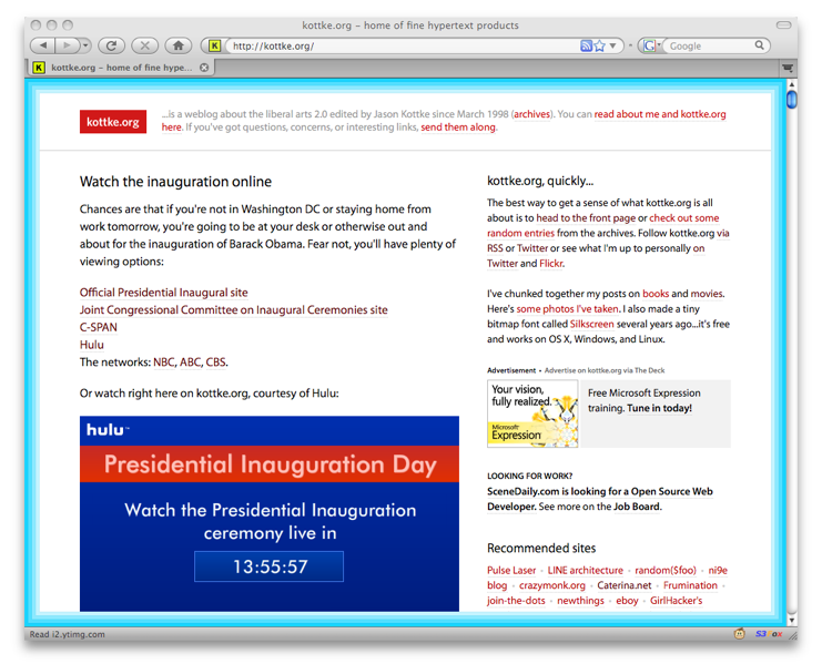
Stuff from Steve Jobs’ WWDC keynote this morning: new version of Safari for Mac *and* Windows (downloadable beta), developing for iPhone can be done with HTML & JavaScript…just like Dashboard widgets, new Finder and Desktop, and Apple’s web site is completely redesigned.
Update: From the reaction I’m hearing so far, it’s difficult to tell what was more disappointing to people: Jobs’ keynote or The Sopronos finale. Also, a Keynote bingo was possible (diagonally, bottom left to top right)…no report yet as to whether anyone yelled out during the show.
Update: TUAW is reporting that someone in the crowd yelled “bingo” 35 minutes into the keynote, but if you look at the card, a bingo was only possible when the iPhone widgets were announced towards the end. Disqualified for early non-bingo! (thx, alex)
Newer posts
Older posts
Stay Connected