kottke.org posts about color
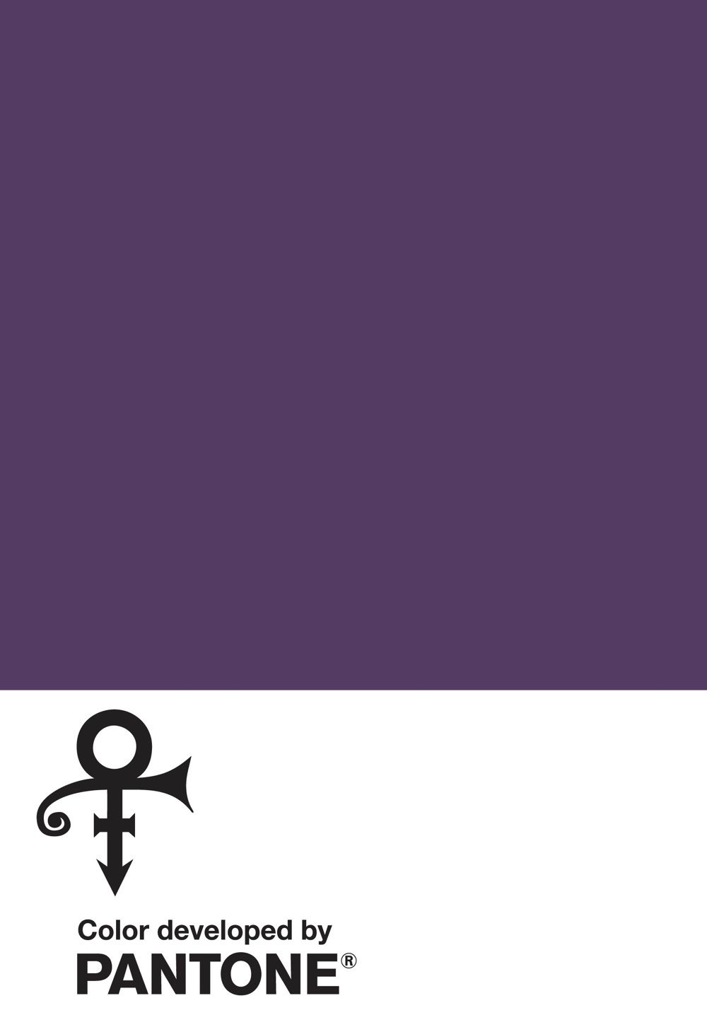
It’s official: Prince and purple are together forever. The Pantone Color Institute has created “a standardized custom color” to honor Prince.
The (naturally) purple hue, represented by his “Love Symbol #2” was inspired by his custom-made Yamaha purple piano, which was originally scheduled to go on tour with the performer before his untimely passing at the age of 57. The color pays tribute to Prince’s indelible mark on music, art, fashion and culture.
Prince’s association with the color purple was galvanized in 1984 with the release of the film Purple Rain, along with its Academy Award-winning soundtrack featuring the eponymous song. While the spectrum of the color purple will still be used in respect to the “Purple One,” Love Symbol #2, will be the official color across the brand he left behind.
“The color purple was synonymous with who Prince was and will always be. This is an incredible way for his legacy to live on forever,” said Troy Carter, Entertainment Advisor to Prince’s Estate.
Not that many other people have their own custom Pantone color. In early 2016, The NY Post reported that Jay-Z and realty company CEO Sherry Chris had signature Pantone colors, a blue and pink respectively. (via @anildash)
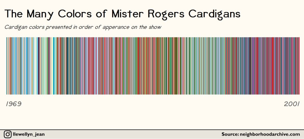
Using data from The Neighborhood Archive, Owen Phillips charted the color of every sweater Mister Rogers wore on his PBS television program from 1979 to 2001.
Some sweaters were worn once and then never again, like the neon blue cardigan Rogers wore in episode 1497. Others, like his harvest gold sweaters, were part of Rogers’ regular rotation and then disappeared. And then there were the unusual batch of black and olive green sweaters Rogers wore exclusively while filming the “Dress-Up” episodes in 1991.
Some things about the sweaters and Mister Rogers:
Update: Phillips updated the chart to include sweater colors all the way back to 1969. (via laura olin)
When Ashley was a kid, she was legally blind. Her friends and family described colors to her in a wonderful way.
Yellow. I didn’t touch anything for this, they just told me that whenever you laugh so hard you can’t stop, that that happiness is what yellow looks like.
Green. I held soft leaves and wet grass. They told me green felt like life. To this day it is still very much my favorite color.
I love this list. (thx, nicholas)
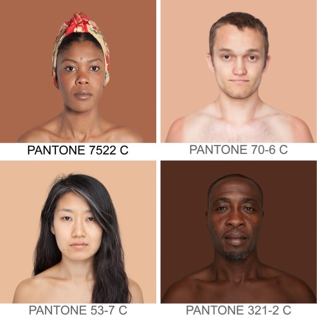
Angélica Dass’ Humanæ project matches photos of volunteer participants with the Pantone colors of their skin tones.
Update: Turns out this really cool blog you guys should be reading covered this project almost 4 years ago. (thx, @djacobs)
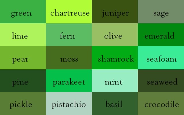
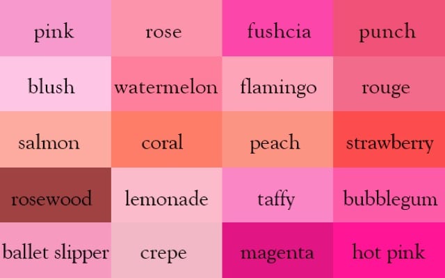
Designer and author Ingrid Sundberg collects the names of colors and has compiled them into a color thesaurus.
A video exploring Stanley Kubrick’s use of color in his films. See also Kubrick’s use of the color red. (via @john_overholt)
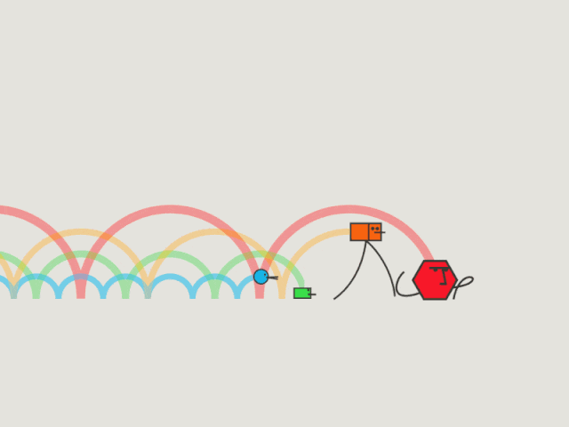
Rain-Bros by Daniel Savage is a fun visualization of the different wavelengths of light in the visible spectrum, from the loping walk of red to blue’s energetic bounce.
…and he FREAKS OUT. I can’t tell if he’s laughing or crying or both. His reaction when he goes outside and sees green grass for the first time: “it’s so pretty!”
The glasses he wears to adjust his color vision are made by EnChroma.
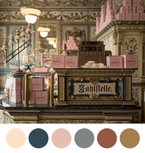
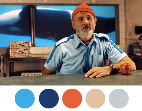
Color palettes derived from Wes Anderson movies.
There’s no blue pigment present in the wings of the morpho butterfly. So where does that shimmering brilliant blue color come from? It’s an instance of structural color, where the physical structure of the surface scatters or refracts only certain wavelengths of light…in this case, blue.
Eye color is another example of structural color in action. Eyes contain brown pigments but not blue. Blue, green, and hazel eyes are caused by Rayleigh scattering, the same phenomenon responsible for blue skies and red sunsets. Blue eyes and blue skies arise from the same optical process…that’s almost poetic. (thx, jared)
In a short video from The Atlantic, science writer Philip Ball explains why Isaac Newton picked ROYGBIV (red, orange, yellow, green, blue, indigo, and violet) for the colors of the spectrum and not 3 or 6 or even 16 other possible colors.
Newton was the first to demonstrate through his famous prism experiments that color is intrinsic to light. As part of those experiments, he also divvied up the spectrum in his own idiosyncratic way, giving us ROYGBIV. Why indigo? Why violet? We don’t really know why Newton decided there were two distinct types of purple, but we do know he thought there should be seven fundamental colors.
Ball is the author of Bright Earth: Art and the Invention of Color, which looks pretty interesting. His mention in the video of the changing perception of color throughout history reminds me of my favorite segment of Radiolab, which covers that very topic.
Artist Cy Kuckenbaker digitally reorganized the traffic in this video by color.
(via http://stellar.io/interesting)
In the parlance of NYC graffiti enthusiasts, going “all city” means getting your stuff known all over the five boroughs. Now a group of designers are challenging each other to go “all RGB”, to make images that contain all of the 16.7 million colors that make up the RGB spectrum once each. This entry is amazing because it still looks like an actual photograph when you zoom out (many others do not):
You can find many more entries on allRGB.com or make your own using this code on GitHub. (via digg)
This segment of the most recent episode of Radiolab about color is super interesting. It seems that people haven’t always seen colors in the same way we do today.
What is the color of honey, and “faces pale with fear”? If you’re Homer—one of the most influential poets in human history—that color is green. And the sea is “wine-dark,” just like oxen…though sheep are violet. Which all sounds…well, really off. Producer Tim Howard introduces us to linguist Guy Deutscher, and the story of William Gladstone (a British Prime Minister back in the 1800s, and a huge Homer-ophile). Gladstone conducted an exhaustive study of every color reference in The Odyssey and The Iliad. And he found something startling: No blue! Tim pays a visit to the New York Public Library, where a book of German philosophy from the late 19th Century helps reveal a pattern: across all cultures, words for colors appear in stages. And blue always comes last.
It’s worth listening to the whole thing…the bit at the end with the linguist’s daughter and the color of the sky is especially cool.
Artist Angelica Dass pairs photographs of people with the Pantone colors of their skin colors.
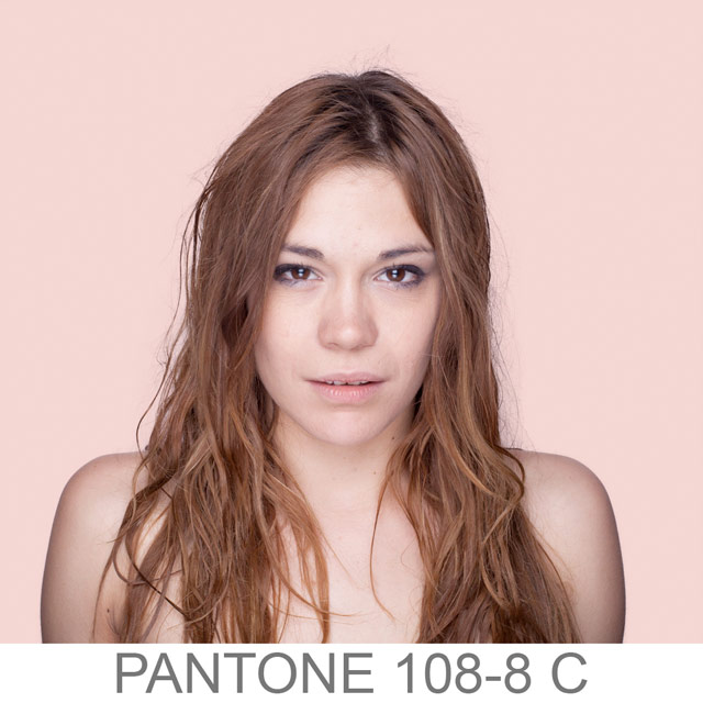
More of the project can be found on her Tumblr. (via designboom)
On this day full of red, white, and blue in the US, it’s interesting to note that, in a large number of languages, when colors start getting their own words, red is usually the first color defined after black and white (or light and dark), and that blue and green are often not defined individually, at least at first. Those facts and more in this super long/interesting article about color and language and how colors got their names and and and…just read it already. Here’s part 2.
The figure above is really telling a story. What it says is this. If a language has just two color terms, they will be a light and a dark shade - blacks and whites. Add a third color, and it’s going to be red. Add another, and it will be either green or yellow - you need five colors to have both. And when you get to six colors, the green splits into two, and you now have a blue. What we’re seeing here is a deeply trodden road that most languages seem to follow, towards greater visual discernment (92 of their 98 languages seemed to follow this basic route).
Also note the Wikipedia entry for “distinguishing blue from green in language.” (via The Millions)
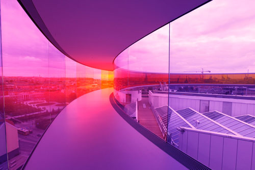
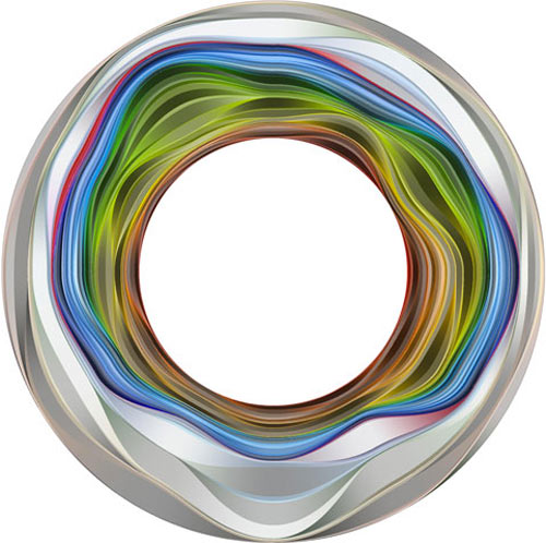
Olafur Eliasson’s latest project is now on display at the ARoS Aarhus Kunstmuseum in Denmark…it’s a circular viewing platform with rainbow-hued glass.
This Wikipedia page has HTML hex codes for all of the 133 standard Crayola crayon colors, including Silver, Blue Green, Melon, Wild Strawberry, and Forest Green.
Dan Kaminsky’s iPhone/Android app corrects for color blindness (in anomalous trichromats anyway)…just point your phone at what you want to see in color and make a few adjustments.
The vast majority of color blind people are in fact what are known as anomalous trichromats. They still have three photoreceptors, but the ‘green’ receptor is shifted a bit towards red. The effect is subtle: Certain reds might look like they were green, and certain greens might look like they were red.
Thus the question: Was it possible to convert all reds to a one true red, and all greens to a one true green?
The answer: Yes, given an appropriate colorspace.
Andy Baio, who is colorblind, says emphatically: “it works”. (thx, derek)
I remember reading that Greek and Roman statues were originally painted, but I didn’t know that through the use of modern scientific equipment, we actually know how they looked.
(via @brainpicker)
This visualization represents a year in color (summer is at the top, winter at the bottom).
The images were taken of the Boston Common, courtesy of Flickr.
Brooke Inman’s Everything Color Circle is mesmerizing. As somebody with limited organizational skills, I find it mind-boggling that she was able to put this together. And to think that it could be destroyed in a nanosecond if a sugar-addled kindergartner armed with construction paper wandered into the room. (via design milk)
Cory Arcangel has a new show opening tonight at Team Gallery in Soho called Adult Contemporary. I got a peek at it last night and my favorite piece is called Photoshop CS: 110 by 72 inches, 300 DPI, RGB, square pixels, default gradient “Spectrum”, mousedown y=1098 x=1749.9, mouse up y=0 4160 x=0. It’s easy enough to whip up your own by following those instructions in Photoshop but the print itself is gorgeous. When you get up close to it, there is no discernible gradation between the colors and, because it’s so uniform and smooth and glossy and big, you lose your sense of depth perception and you don’t really know how close you are to it. I almost fell over looking at it because I was so disoriented.
Turn the left slice topwise in style: Pantone + Rubik’s Cube = Pantone Rubik’s Cube. (via monoscope)
Idée Multicolr Search Lab is pretty amazing. You select up to ten colors and it returns Flickr photos with those colors. I couldn’t stop playing with this.
An exploded toner cartridge.
Accidents should always be this beautiful.
(via chrisglass)
COLOURlovers, the site that takes inspiration from colors in the real world to make design palettes, today has a collection of palettes inspired by some wickedly vibrant bruises.
All blacks are not created equal…a team at Rensselaer and Rice University have created the world’s darkest material. Plain old black paint reflects between 5 and 10 percent of incident light; the new material reflects only 0.045%. (via animamundi)
Newer posts
Older posts
Socials & More