Becoming, an upcoming memoir by Michelle Obama
Michelle Obama is coming out with a memoir this fall. It’s called Becoming, it’s out on November 13, 2018, and you can preorder it here.
In her memoir, a work of deep reflection and mesmerizing storytelling, Michelle Obama invites readers into her world, chronicling the experiences that have shaped her — from her childhood on the South Side of Chicago to her years as an executive balancing the demands of motherhood and work, to her time spent at the world’s most famous address. With unerring honesty and lively wit, she describes her triumphs and her disappointments, both public and private, telling her full story as she has lived it — in her own words and on her own terms. Warm, wise, and revelatory, Becoming is the deeply personal reckoning of a woman of soul and substance who has steadily defied expectations-and whose story inspires us to do the same.
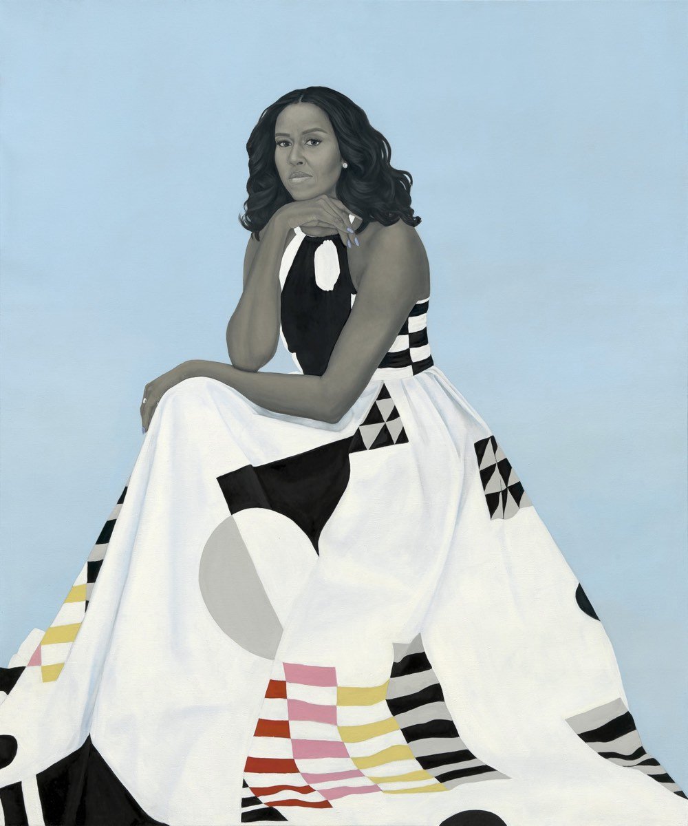
The image below is Amy Sherald’s portrait of the former First Lady and would make an amazing book cover, no?
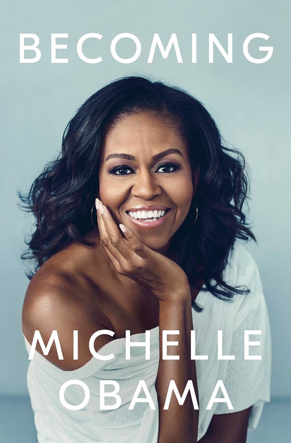
Update: The actual cover has been released (pictured at the top of this post), and I hereby respectfully amend my former statement. Sherald’s portrait would still make a good book cover, but in this case simpler is better. The photo perfectly captures the personality & style of the former First Lady, and the text treatment is deceptively clever. You can read the title as “Becoming” or “Becoming Michelle Obama”, which is cool but also plays off the tension that designers have to deal with in deciding whether to emphasize the title or the author on the cover. (For instance, with an author like Stephen King, you emphasize the author’s name while with a sensational title and less well known author, you highlight the title.) In this case, the best decision was to balance them equally — same font, same size, same color — and get some wordplay out of it too. Sneaky great cover. (via @lauraolin)

Socials & More