In an extended excerpt from his book Typeset in the Future: Typography and Design in Science Fiction Movies (Amazon), Dave Addey goes long on the typography and design of Star Trek: The Motion Picture (and Trek in general).
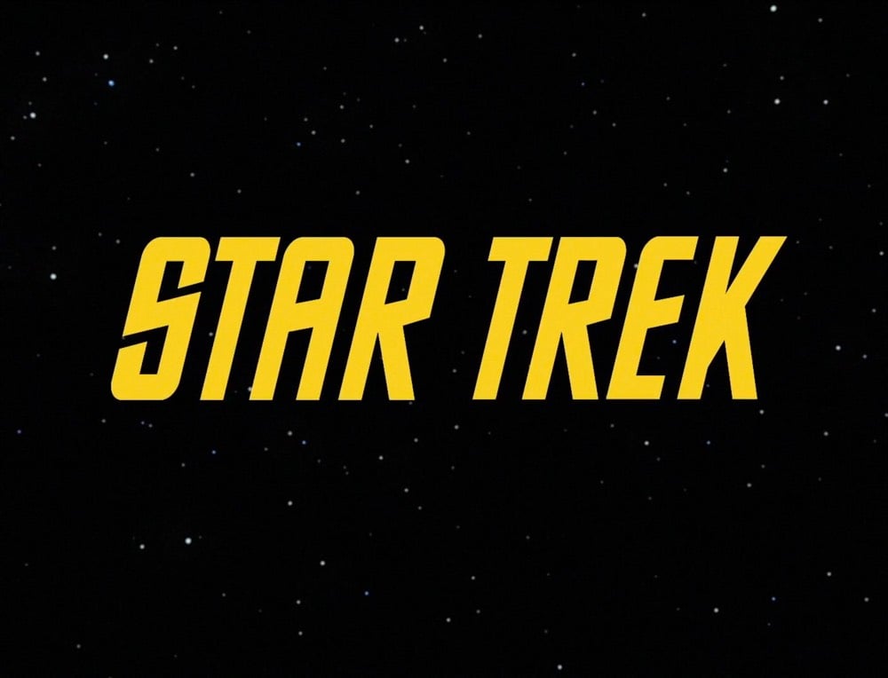
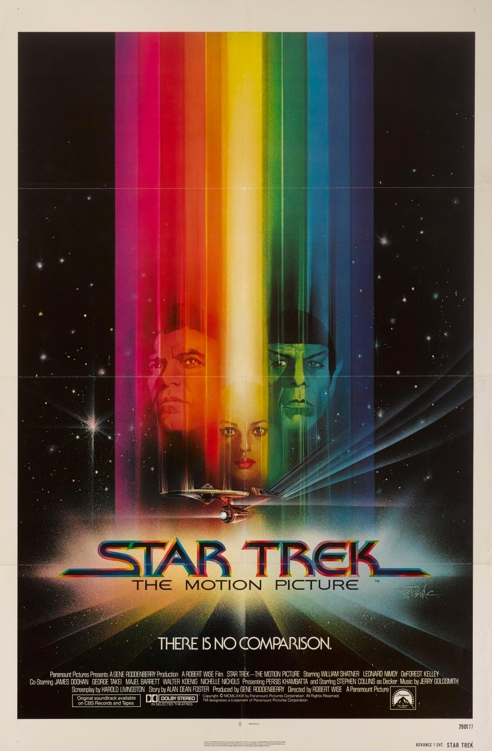
Alas, The Original Series’s inconsistent typography did not survive the stylistic leap into the 1970s. To make up for it, The Motion Picture’s title card introduces a new font, with some of the curviest Es known to sci-fi. It also follows an emerging seventies trend: Movie names beginning with STAR must have long trailing lines on the opening S.
Inspired by the website of the same name, Dave Addey’s Typeset in the Future will look at how design and typography is used to build futuristic worlds in science fiction movies like 2001, Wall-E, Star Trek, and Blade Runner.
The book delves deep into 2001: A Space Odyssey, Star Trek: The Motion Picture, Alien, Blade Runner, Total Recall, WALL-E, and Moon, studying the design tricks and inspirations that make each film transcend mere celluloid and become a believable reality. These studies are illustrated by film stills, concept art, type specimens, and ephemera, plus original interviews with Mike Okuda (Star Trek), Paul Verhoeven (Total Recall), and Ralph Eggleston and Craig Foster (Pixar).
You can pre-order the book on Amazon.
Stay Connected