The incremental redesign of kottke.org continues today with a bit of tinkering with what is possible with the weblog format. If you scroll down the front page of the site, you'll notice that sprinkled in with the regular posts are remaindered links (the 1-line, 1-link posts that have formerly lived in the sidebar), movie "reviews", book "reviews", and excerpts from comments I've made on other sites. Five types of content, one list.
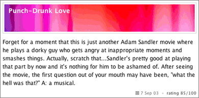
Each post type requires a unique "vocabulary" and a design/layout to go with that vocabulary. For instance, a movie post includes a title, a link, a rating, a photo, and some text and looks like this:

By default, most current weblog software, including the package I use, doesn't allow for different data for different post types displayed with different designs in the same list. Typically what people have done with their disparate data is to display them on separate pages or in separate locations on their site...so you need to visit the book page to see if there are any new book reviews or scroll down to check if they've added a new album to their "now playing" section.
To me, that seems not so optimal. A post is a post is a post. The newest content should appear at the top of the list of posts regardless of whether it's a short movie review, one-line link, latest photo, or any other type of update to your site that doesn't fit the typical title/text/category weblog paradigm and each type of content should displayed appropriately. And then if you want to view the complete list of movies, books, or all the remaindered links, you can.
So that's what I've done here. Sort of. What I've actually done is created 5 separate weblogs with MT and, using a bunch of MT plugins (MTSQL, Compare, MTAmazon, ExtraFields, etc.), have aggregated the 5 weblogs on the front page of the site. Which sounds complicated (and is!). But only in implementation (due to the limitations of the software). Really it's just the appropriate data presented with the appropriate design(s) in the appropriate context(s). One site, lots of content, many ways to view it.
Anyway, it's a start and we'll see if it works or not. I have concerns about displaying so many different types of posts in one list (especially with the minimal amount of information)...people are used to all the posts looking more or less the same. I've dealt with that somewhat by visually separating the posts to a greater degree than I have been. But who knows, maybe having a separate display for the remaindered links in the sidebar is a better way to go. We'll see.
Constructive feedback is welcome, as are bug reports, design critiques, etc.
Update: looks like the movie pages are a little funky on Mozilla, but not consistantly so.
I'll see if my eyes get used to it in the next few days. (Interesting self-experiment in usability and user's adaptation to unusual formatting.)
Will the remaindered links still have their own archive or will they be intertwined with the main post archive?
So tell us what you really think, Jason.
I'm going to be using the GlobalListings plugin for my site soon, so that while the posts look the same and use the same format, they will have different URL structures due to each weblog having a (slightly but still significant) different Archive File Template.
Oh yeah, I forgot to tell you that the above post is slightly *cough* muddled, but I figured you'd get the jist if I hand-waved enough.
There are other visual cues that come to mind [minor background color shifts for your varying post types, explicit declarations of post type ("Weblog:" "Book Review:", "Movie Review:", "Remaindered:", "Elsewhere:") or icons for same (with mouseover goodness?)], but they'd probably clutter your design past where you want it to be.
I applaud you trying to stretch the presentation of the media.
My initial impression is that I very much like the distinct format of the image and title/extra-info for the movie and book review posts (both the idea, and the execution).
I'm right in the middle of shamelessly stealing your remaindered links concept (I'll give it my own unique but clever name) – so now you've thrown me for a loop!
Having two streams of posts that move at different speeds (occasional normal posts vs. frequent remaindered links) in the same place strikes me as a little odd. I'll have to see how it works over time - like you said, separating those two might make sense - parallel streams, moving at different speeds.
:oops:
My latest attempt was to create a separate RSS feed (the "no play" version) for those folks who just wanted the "work related" stuff.
What you here seems to work. The only bit that threw me off was the off-site comments, but I think I could get used to that.
Anyway, as one who is constantly tinkering with my own site -- via progressive "enhancement" (yeah right) -- I'll be very interested to see how this ends up working out.
Personally, the redesign's cool to me - though like others have said I'm unsure about the remaindered links in the main column. But who am I to fight change, really. Go for it dude.
Sure you can, by creating custom templates and setting them to just one category of post output.
I think it'll work out perfectly, letting me keep up with both the main blog and sideblog in one place, without having to look at old stuff very much.
1. It's different and very original
2. If I was a first time visitor, I like that the site is simple and coherant, without the distraction of a Remaindered Links section.
What I don't like:
1. Forget about #2 above, I don't like that Remaindered Links is no longer available in it's classic form... I miss it.
2. Entries seem to just run into each other without clear seperation.
Anyway, keep going... I'm really interested in how it turns out. Are you doing this by the seat of your pants or do you have a grand plan for how this redesign will turn out?
I like the layout as well.
In all seriousness, I feel like remaindered links (though it does have it's own new page), deserves that leftbarspot a lot more than your recommended links. Not that I don't love what you're doing here otherwise, but why can't the remaindered links stay?
The larger question, of course, is how personal publishing tools should evolve to manage specific types of microcontent. Our decision on TypePad, which I agree with, is that auxiliary info (TypeLists) are page components, but are subordinate to primary posts. Thus, link typelists (remaindered links), reading lists (books), and movie links would be items on a sidebar. You're asserting that they're peers to primary posts, and ought to be displayed inline.
Setting aside people who read this content in syndication clients (a pronounced minority, even now) I'm not sure I agree with the thesis. Your media consumption, while interesting, valuable, literate and (in the case of the movie reviews) quite attractively presented, is ancillary. If the movie reviews were your primary content (as on your movie blog), I'd go there independently just to see that content.
In a larger sense, do we want the main weblog to just use categories to indicate these different types of information? Or should we have specific fields for each content type (as we do with TypeLists, or as people suggest for reviews as in the RVW format?) and make the template output system an order of magnitude more complex?
Honestly, I think there might be some middle ground here. (Speaking personally, not officially in regard to TypePad or Movable Type.) CSS and content-specific styles might allow us to do a lot of the formatting without needing a lot of new data fields or plugins.
The last step is creating a list of data types that people would want to present. Movies, books, music, weblogs, etc. Those things are easy to anticipate. And things like the web services from Upcoming show that events are important to list. But some people would want to have a record of their recent athletic accomplishments, others would want to catalog their pez dispenser collection, and I'm not sure there's even appropriate metadata standards for those items, let alone generic ways to present this data meaningfully within an application.
In short, this is great work at presenting this data on Kottke.org. But I want to make it easy for anybody to present this data in the way that makes sense to them, and I think that is more likely to be accomplished with the content treated as ancillary information, as most bloggers prefer to do, than inline with the major content.
Yeah, but the problem there was not being able to make each type of post look different (although, now that I think about it, it might be possible...). Plus, the MTSQL approach was a bit more flexible.
I like the look of the movie posts, though the lazy side of me thinks it must be a lot of work find and crop those images.
It is, but I like the creativity involved. I do a lot of reading and writing for this site...the photo selection for the movies is an attempt to throw some regular design play into the mix. I just started doing this so the results are not what I'd like them to be yet, but the goal is to choose images that will allow people to quickly identify the movie (without needed to read the title if possible) without really hitting them over the head with it. My favorite photos thus far are for Punch-Drunk Love and Kill Bill.
One request: would is be possible to collect all (five? six?) of your RSS feeds on a single page?
That's on the way. As are a lot of other finishing touches (and a major redo of the archives page).
All the remainders from the various days displayed as a list allowed me to skip the rest of the blog verbosity and just scroll through the one-sentence lists. Please bring it back.
You can cut the crap by going directly to the remaindered links page.
Sure you can, by creating custom templates and setting them to just one category of post output.
How do you mean, Matt?
Have you considered making them all the same weblog and using the category stuff to style each one differently?
Same for you, Tom...how exactly would this work? I could see it working on individual category pages, but AFAIK, it would be difficult to specify different layouts for posts from a particular category for the main weblog (i.e. the front page) or monthly/individual archives.
I like it a lot, especially the remaindered links inline - the main posts and the links mutually give each other context.
Yeah, I like that too. I never liked them sequestered over there in the sidebar.
But everything is my primary content. Prior to this, I reviewed books and movies all the time (well, less so lately, but a couple years ago, yeah). And you can stilll go independently to just the movies and just the books. Why should it be either/or? Why not both? I want the weblog on my front page to list all of the significant content that's new on the site, not just long text ramblings with a title.
I think that is more likely to be accomplished with the content treated as ancillary information, as most bloggers prefer to do, than inline with the major content.
But is that really what most bloggers would like to do or is it what the software allows them to do? Back in the Blogger days, the more keen users created separate weblogs for things like music or movie reviews that they stuck into their sidebars using SSI or PHP. Subsequent weblog CMSs (GM, MT, TP) solidified that behavior...you want another list-like thing? Make it another weblog and put it in the sidebar. If the tool made it easier for people to define their own post types (with associated metadata), maybe they might not choose to separate things out.
But you're definitely correct about the increase in the level of complexity. Trying to figure out an interface for defining stuff like this would be tricky and would not necessarily work for the Basic/Plus user you're trying to attract with TypePad.
I know I'm not Tom, but seems like what you've done is entirely doable with one weblog instead of five. Using MTFilterCategories, you can filter out individual categories and add different style rules to each one. Maybe I'm wrong... just seems like a lot of work to put together 5 types of content that can be sourced from one place.
I completely agree with this. I don't see what is achieved by mixing the content types all together in a jumbled list. It's disorganized. That's never good.
To some extent the choice is between a kind of "pure" blog in the sense of a single chronological list (note that Dave Winer just took the sidebar cruft off of Scripting News as well) and more of a portal approach (sorry to use that word) in which numerous locations on the page each get their own stream of content, typically sorted reverse-chron, but perhaps otherwise (alphabetical, or by category?).
It would be nice if MT (or MT Pro?) were to offer at least the option of a Link/URL field associated with a post. For now, making a link log involved some kind of hack or another, usually designating one of the main entry boxes to hold the URL, and creative use of template tags to make useful RSS, etc. For my own link log, I made the main entry box the link field, but put the description not in the extended entry (as many people do) but in the summary/excerpt field, where I think it makes a wee bit more sense semantically. In the rawest sense, the link posts are the links and the summaries are the description of the link.
But the problem is that there is no standard way to do this, and TypeLists actually take the data one step away from being blog entries, sequestering them outside the normal stream, albeit with more tailored metadata, depending on the type of list, which is cool.
Contrats that with Dylan Tweney's approach in which he uses a separate weblog and categories to drive his link log.
I think for most people the most sophisticated weblog tools still provide more than enough power and flexibility, but it's fun to watch others struggle with the limitations of the current models, and pine for facets or custom metadata, or what have you.
I am definitely intrigued by this whole topic though, keep up the good work.
I hope that as you figure this out, you will go into more detail about how you got Movable Type to perform this way.
[div class="[MTEntryCategory dirify="1"]"]
in your MT templates.
In your stylesheet, produce a different style for each category-class (plus any subsidiary styles in context, of course). So,
div.movie {...}
div.movie p {...}
div.rem {...}
div.rem ul {...}
div.rem ul+li {...}
As to the redesign in general, it's an experiment worth trying. If all content is "primary content", it all deserves to be flowed together. My own feeling is that remaindered links really are different from more in-depth posts, and spatial segregation makes sense for that in particular. Comments from other blogs? Gets a little trickier, since some comments are of full post quality (but for those, why not write in your own blog and track back, when possible?). Reviews? Well, I flow mine inline in my blog, so obviously that's the right approach for them.
Also, personally, I like the quick links on the sidebar - unless you're planning on pinging Weblogs.com or Blogrolling when you post new ones. I like being able to come to your site randomly to find new quick links and don't want to hunt for them. ;)
Oh, and one other thing ... what if visitors didn't want to see all of those different posts? What if they just wanted the usual weblog and not the movie reviews? ;) (Not that I mind - just food for thought. I think I'll keep my various weblogs separate for now, but then I've always been more of a stickler for compartmental organization...)
So while I like the integration of your movie and book reviews into the rest of your posts, I don't think that your remaindered links quite fit in with the rest. I'm guessing that you have a quick test in your head when you run across a webpage for it it gets a remaindered link or a full post. If it piques some interest, you might write an entry about it with your personal interpretations and comments, but most of the time you'll just put up the link with a one-line intro. This makes a distinction of "hey look at this thing" and "here's what I think about this thing." By putting the two together, you're conflating this distinction and on some level implicating yourself with the remaindered links.
On a design note, I like the header images, but they look a little jarring. The design of your site is wonderful, and much of this is because it's mostly white, split up with some striking red and a sharp yellow. But mainly it's whitespace, and this is good. The big dark bars at the top of each movie review disrupt it all. I'd guess that toning them down in Photoshop somehow would do the trick.
If you're feeling pressed for real estate on the front page, I think you'd be much better off deleting the blogroll. Again, the question is: what are you trying to communicate, and are you doing that effectively? A big list of other sites says "Here are some things I like", but, well, isn't that what the whole site is supposed to say? If you use it for your own convenience, clicking through to all of them every day/week/month, then the space-saving technique of the javascript "more links" is a drawback, not an advantage, and a separate links-page would serve the same purpose; if it's for other people, well, what's the point of that? Is it the reason they're going to come back and read your front page time after time? No, they could just lift all the links and put them on their own page, or bookmark them, and achieve the same purpose.
I won't presume to tell you why people come to your site, but I think that the old way did a better job of communicating with *me*, conveying to me the things that I wanted out of it. It may in fact not have communicated what *you* wanted, but I doubt that this new version does that any better, or even as well.
As it is, I'd like to see the TypeList elements have more bloggy attributes, such as RSS feeds of their own, at least as an option.
Syndication feeds for TypeLists are coming soon, I think we'll put official word out about that in the next few weeks. And, as I've been playing with TypePad in advance of my conversion to the service, I think it may be possible to have TypeList data appear inline with regular blog entries, which would make a system exactly like what several people have mentioned; Microcontent-specific entry fields generating output that could all be viewed inline on one page.
In a larger sense, what Adam mentioned about styles seems the most obvious short-term fix. a .movies class with a background image set to [moviename].jpg could pretty easily do what jason's doing for reviews now.
I haven't gotten my xxx movie review weblog set up yet. But when I do, watch out Fleshbot!
To style based on category in MT, wrap each entry in
[div class="[MTEntryCategory dirify="1"]"]
in your MT templates.
I don't think this will work exactly how I would want it to, but I'd love to see someone prove me wrong.
I liked the remainder links over on the side, allowed me to track which links had threads as well.
Also like the headers for the movies although I'd prefer smaller ones as in the books page.
Keeping your own comments made elsewhere is also a good idea. Were you doing that before?
When initially seing the remaindered that are sometimes bunched together I thought you were just posting them all at once but they have seperate comments which means they are all individual entries in another blog, like before. I'm guessing they are included in the page only once a day? How do you "trigger" that? Or is it something completely different?
...I think that is more likely to be accomplished with the content treated as ancillary information, as most bloggers prefer to do, than inline with the major content.
I don't think that it has to be a black or white issue since I do see what Jason is doing as a logical evolution in the way we handle ancillary content. With TypePad and TypeLists, we're seeing a number of subscribers asking us how they can flow their sidebar content into the main content area on an item basis -- basically, some reviews and sidebar content merit inclusion in the main area of the site, while other sidebar content is intended to stay in a clearly defined "ancillary" space (the function the sidebar serves now).
I see Jason's new homepage list of entries as a "view" over all of the content he's posting, where you can drill down to each type of content individually. That's definitely along the lines of where we see weblogs in general, and publishing tools like Movable Type and TypePad in particular, moving.
The Biscuit is right here. :) I still need to get the monthly archives for the movies and books linked in somewhere. This is very much a work-in-progress....
Keeping your own comments made elsewhere is also a good idea. Were you doing that before.
No, I started keeping track a few months ago (I've been tinkering with this idea for awhile, on and off). Matt Haughey uses Trackback to do this (as detailed here by Joshua Kaufman)...I'm using MT's bookmarklet to do it, much like I would post a remaindered link (link, title, some copied text). Takes two seconds.
I'm guessing they are included in the page only once a day? How do you "trigger" that? Or is it something completely different?
I have a bit of logic in my MT template (that is really, really ugly and cringeworthy in the extreme) that groups them together when no other type of post intervenes.
Oh, and I'd just like to point out that I'm not bashing any current weblog software for not being flexible enough or being wrong or whatever. As Anil has said, it's harder than just saying that a particular tool should do this or that. In fact, I love MT (not to mention the army of plug-in developers who put out these fantastic plug-in for free) more than ever for the amazing amount of flexibility and control that is possible (with a bit of work).
Right on, Jason. Look at how readily you can tell an MT weblog from a Radio weblog, for example. The software definitelly exerts its own design influence, for better or worse.
Come to think of it, our ability to do things differently in terms of how the content is displayed is usually the result of a plugin like MTSQL or MTAmazon, isn't it?
The larger question...is how personal publishing tools should evolve to manage specific types of microcontent. Our decision on TypePad... is that auxiliary info (TypeLists) are page components, but are subordinate to primary posts.
Anil, are you saying that your role as a software publisher is to envision every possible permutation of microcontent, decide for the user the content's appropriate role as part of the overall content, and then design your software accordingly?
[MTCategories]
[link rel="stylesheet" href="[$MTBlogURL$]/[$MTCategoryLabel dirify="1"$].css" /]
[/MTCategories]
Or am I missing something?
Then there's the question of whether this is the best way to present everything. From a reader's point of view, having it all on one page is better than dividing it among many, I also think, but not so much having it all in one long column -- it tends to be confusing to jump between different kinds of content, and requires greater attention and effort (even when there are sufficient visual cues that a user doesn't have to actually read text to determine what it is). It really does help to have different sorts of content in different places on a page (spatial location being an especially powerful organizational device, of course).
It also seems a bit like you've built this incredibly robust back end, rich with structural information about all your content, only to strip out all that richness in the content's main presentation. If a post is a post is a post, creating 5 separate blogs to structure them seems a little disproportionate, you know?
Considering how much traffic and comments you get I think this would help out a lot.
As for the inline links, I think it's a great idea. They are only slightly confusing right now because they look like trackback links. Maybe if you used a stronger bullet image, like the one used for the quotes, it would feel better.
It would be great to see a write-up of this for us not-so-techies. (Or perhaps Six Apart could incorporate some of the capabilities into MT. Anil?)
But since 99.9 percent of the net population even know what blo.gs is it really becomes a choice of pleasing .1 percent or taking it down a notch for the rest of the population.
Everything makes sense except the remaindered links. They're better off to the side. They're far more different from a normal post than movie or book reviews. If you keep them in the big pile they will be lost on most people. They're my favorite part of the site but I can't picture scrolling for them each visit.
I'd say that's a question for Mena more than me. :) But to address your point, of course no software developer is going to try to envision and build for every application of their software, and judging by how excited and motivated we get by the incredibly creative and unexpected ways people use MT and TypePad, I don't think we'll ever be able to say (or ever want to say) "we've covered everything people are going to do."
It's just that we want to be responsive enough to make sure people can do what they want, and that's a perpetual process. That's something I should have made clearer above when I said that right now TypeLists are displayed on a TypePad site's sidebar by default; That's just the view of the data, and that's just the view of the data right now. Experiments like Jason's (and thousands of others) let us know if there are other ways bloggers want to present that data or access it or style it. I've been struggling with the presentation of my blog myself for a while, and I want some good influences.
A lot of my comments here are me reacting personally to Jason (we were talking about this stuff the other evening and it's been on my mind) as opposed to if Mena or Ben or one of us at Six Apart formally documenting our broader conclusions on these ideas, so you might want to take several grains of salt with the things I'm writing here, since I'm basically thinking out loud.
What I'm more interested in, separate from the tools and tech, is whether someone who's never seen a weblog before (and I suspect that Jason's site is still disproportionately read by people who are not familiar with other weblogs, or don't know much about the weblog realm) would understand that each visually distinct post is shifting mode. I feel like that's a big leap for the non-blog-savvy to make, and perhaps an amibitously aggressive change in reader experience.
It might do what you want and there are a stack of different plugins available to do all sorts of things. Probably the biggest things it's lacking comapred to MT is a fancy interface for editing posts (altho there are a couple out there such as Pollxn).
The only thing is that I guess you should bring back the date headers so the posts are logically and visually separated a little bit.
I'd also suggest to move the remainder links on the top of everyday's posts, right below the date header (if you put them back).
- Can't believe you saw/reviewed Seabiscuit.
- 'Funky' means cool/good/hip etc in the rest of the world.
- I like the idea of all your content flowing on one page. Anil mentioned that it would be a challenge for a less savvy person to understand wtF! is going on. I don't think so (as long as there is a better visual separation cue) ... it's like a stream of ideas filtering through to the reader. It's ok that this stream is totally disjointed, like walking through Piccadilly Circus or Times Square or watching MTV or CNN (with tickers, and video insets, and presenters and livecams all on one screen) - I mean we're all used to fast film editing and cut&paste - we can handle it. I don't come to kottke to find calmness.
- kottke.org is still in the metaphorical topthree sites of the world (along with at least ten others).
I do not blame Jason for this, but a lot of the people on here who like to proclaim this as a solution to the problems they have been having really are not using their minds and imaginations too well it seems. This is really not that much different than Shea, Haughey, or Budd posting different topics on their blogs.
I do commend Jason on taking the approach that different subjects need to have different styles, as from a usability standpoint this is very important. I would say it could be done better, but I can't since I can offer no better solution at the time. I have always like the site and with Jason's sense of design I shall continue to like this site, however let's all realize that for a while a blog will always be just a blog and nothing more. It seems we are trying to make them into portals and we all know we have enough Yahoo!s in the world.
The code would look something like this:
<MTSwitch value="[MTEntryCategory]">
<MTSwCase value="movies">
(movie blog entry template goes here)
</MTSwCase>
<MTSwCase value="books">
(book blog entry template goes here)
</MTSwCase>
... etc.
For my own blog I use categories to separate it into three mini-blogs - Leader, etc. and pics. (However, my template doesn't need MTSwitch, since the front page is divided by category - it's all doable with basic MT tags. But it still makes it considerably easier than arsing about with various external aggregation methods and what-have-you.)
I think it's conceptually interesting to assign different styling to different categories of post but I don't think it's revolutionary. In fact, I think most people capable of implementing such a thing avoid it because it has the potential to be tough on the eyes.
Point Two:
I don't see anything new about putting "remaindered links" and movie reviews (etc.) in with other categories of posts. This is precisely what everyone has been doing since year zero, apart (of course) from those people who (in my opinion, wrongy) jumped on the "remaindered links" bandwagon.
Point Three:
Good to see someone who is prepared to take risks and shake things up once in a while. Keep up the good work.
(Point Four: Please fix it so that people can type in email addresses ending in ".info" on your comments form.)
Yeah, my stylesheets are a little hosed at the moment. One of the challenges of redesigning in public.
Some slight changes that I feel would help make it even better:
* Differentiate the mini-posts (Remainders etc) using a different mini-icon to the left as opposed to one generic one. Some sort of cue as to whether it's a link off-site, or a comment off-site would be useful.
* Give the mini-posts more of a sense of timing. It's difficult to tell whether the mini-posts "belong" with the main posts before or after, time-wise. I appreciate that it's not hugely relevant which day they were posted and that the main point is that everything is chronological, but I feel that with the increase in the various types of information in the main text stream, some degree of timeliness has been lost.
Jason: you might not want to monkey with your glorious [said in reverence, not sarcasm] whitespace too much, but a place for a legend would be on the left. Right now, with about seven remainders above this entry, it's slightly confusing, since this entry has a title and the remainders are just links. A suggestion probably worth what you paid to read it. :)
78 whole comments before someone comes and posts the usual boring "why don't you roll your own?" statement! This may be a world record.
Seeing how this is evolving, you are going to have to be blogging something everyday and not just remaindered links...
Seems like it's only when I look at it from the paradigm of what I'm used to seeing there, or according to the currently accepted Dictums on the Placement of Ancillary Microcontent(tm) that I would have any qualms about it.
Anil: A lot of my comments here are me reacting personally to Jason ... as opposed to if Mena or Ben or one of us at Six Apart formally documenting our broader conclusions on these ideas, so you might want to take several grains of salt with the things I'm writing here, since I'm basically thinking out loud.
Hrmmm. Food for thought ... Do you still "get" to do that considering your role in the industry? Imagine if Lee Scott were commenting on a new retail format. Because of who he is and who he works for, he could say it in the bathroom and it would still be reported in Forbes as "Wal-Mart CEO says new retail format is..."
Sorry to be so OT. :-)
I did the same on my site before I closed my blog: displaying one entry of links at the beginning of each day, between regular blog posts. It really helps getting them read: as a kottke reader, I hardly ever looked at the links sidebar, and I actually had no idea there was the other contents (movies, comments). This just goes to the bottom of the blog concept, displaying all new contents in reverse chronological order for readers to sample.
Please keep this :)
The only problem with using the include is that one of the sections being pulled sits on a subdomain. If for some reason that is down I get an error message. I may give your method a try... just to avoid the error messages. That's hardly what I want people to see when they hit the site.
Khoi Vinh of Subtraction.com has an excellent and well-designed weblog which uses a similar kind of Remaindered Links (his are called Elsewhere) which is presented in a usable manner. Explore his site. It's very well-done.
I like The Morning News layout. I know exactly where to look to find the Daily Links, the Features, the CD Reviews, etc. All the latest content is instantly browsable in the top half of the screen. Features are obviously highly valued because they get the top left placement, links are second, albums and people we like third and Archives and other ancillary content are last.
All I know is that I'm going to back-kick you if you hit me with that electric prod one more time. All that time away from Wisconsin is going to have dulled your reflexes, and it'll hurt like a ...
[ZAP]
Sorry to be off-topic, sir!
You've taken Moveable Type to a whole new level.
Ben, Mena, and Anil, if you keep reading down this thread, please include some of these great ideas in MT Pro!
Date markers - i.e. starting time sorted sections, as currently designed unless there is a nearby post with a datestamp, many of the posts (especially remaindered links) are not associated with a point in time...
Meaning it is trickier for a person reading archives/catching up to know if something is a recent or an older post,
Just a thought - makes me seriously consider migrating to MT however...
I copied Kittie.org's sidebar remaindered links idea on my own site. I have the main section with posts that have a bit of commentary and/or a thumb. Under the remaindered links I have contact info, internal navigation, links to other sites I work on, then a section with links, a silly feed of my wife's weblog, then my blogroll and other links. The logic being, I don't really think anyone cares much about anything besides the posts. Does anyone actually use another's blogroll? I doubt it. But once in a while someone may want to send me an email or something, so the sections are in descending order of (what I view as) importance to most readers.
Of course, you have many times the number of people reading over here as I do - and your site has always had design and content management as one primary focus. So I suppose in a way, a wider audience can mean (to some degree) that your "personal" site becomes a little less purely personal and more a site people look to for thoughts on these issues.
You could run a wingle weblog and style based upon the category.
Thank you.
there's too much red in the middle --- red indicating importance and in this case it's wrong as it's "just a sideblog". all that red in the middle of the screen makes the visual focus go to the remaindered links instead of the actual blog.
When you first introduced the remaindered links I thought it was brilliant --- when you later moved it to the side I thought that was even better. As an inspiration for how to lay out a blog kottke.org has always been influental - but I find the new layout more cluttered and not as satisfying to look at . The old layout was masterful in it's zen-simplicity: the new one is not.
Finding space for everything is hard - and it might make sense to put it all in the middle: but I'd like the main bit for the "meaty" bit of a blog.
I admire you for trying to go new places Jason - but this is the wrong path.
...and, there seems to be a serious lack of sexist blurbs and half-naked pictures of current It Girls.
In few words,
you have directories (categories) that contain text files (posts), and each directory can have a bunch of .html files that are used to design the posts in that directory. If no templates are given, the templates in the previous directory (section) are used.
It seems nice.
I've been evaluting this tool for my own blog.
Basically, what we need is "post types." It sounds like all this should be doable from your most popular blogging clients (MT, Radio, Bloxsom), so that is good news.
In addition, it would be great if a form would pop up that would ask you for information about each post type. For movies, you get a form that asks you how many stars, etc. Integration with Amazon and other web services would be great, to save the user the trouble of entering in data that exists somewhere else.
Then we move towards each different type of content also externalized in some form of XML, accroding to the type. Movie reviews use RVW format, links could use basic RSS, you get the idea. Hopefully they would be represented as individual items, and not neccesarily trapped inside an RSS feed.
Very cool!
This thread is closed to new comments. Thanks to everyone who responded.

