A Map of the World Where the Sizes of Countries Are Determined by Population
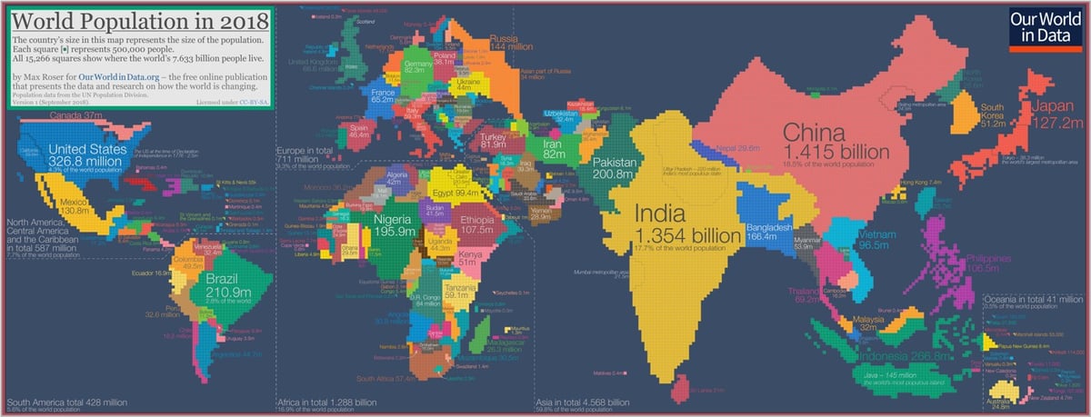
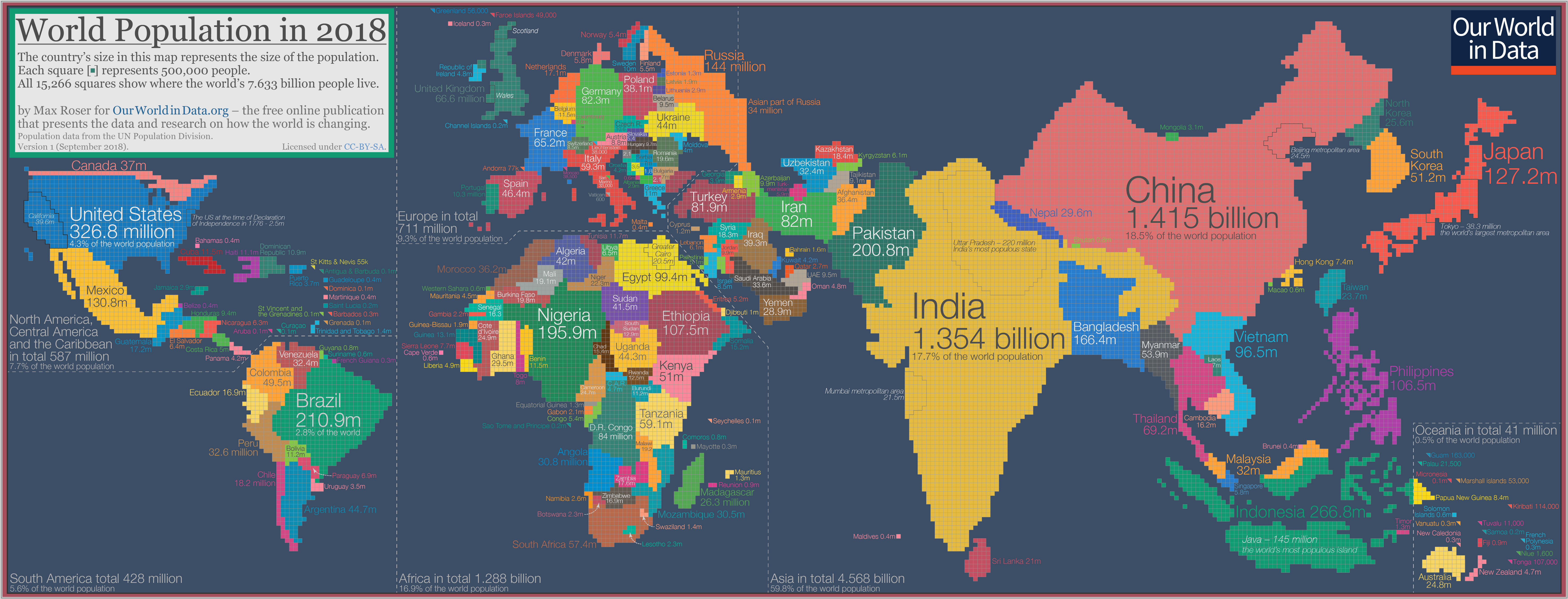
Max Roser has constructed a cartogram of the world where the size of the countries are determined by their populations (big version of the image here). He refers to it as “the map we need if we want to think about how global living conditions are changing”.
The cartogram is made up of squares, each of which represents half a million people of a country’s population. The 11.5 million Belgians are represented by 23 squares; the 49.5 million Colombians are represented by 99 squares; the 1.415 billion people in China are represented by 2830 squares; and this year’s entire world population of 7.633 billion people is represented by the total sum of 15,266 squares.
As the size of the population rather than the size of the territory is shown in this map you can see some big differences when you compare it to the standard geographical map we’re most familiar with. Small countries with a high population density increase in size in this cartogram relative to the world maps we are used to — look at Bangladesh, Taiwan, or the Netherlands. Large countries with a small population shrink in size — talking about you Canada, Mongolia, Australia, and Russia.
Some observations (Roser has many more if you click through):
1. Look at how teeny Russia is. (So is Canada.)
2. Seriously, Bangladesh, Pakistan, Nigeria, Indonesia, and Brazil all have larger populations than Russia. Japan, Ethiopia, and Mexico are very close.
3. 60% of the world’s population lives in Asia.
4. 5 times as many people live in Madagascar as do Ireland. The populations of Ireland + the Scandinavian countries = the population of Peru.
5. Europe is tiny. Guns, Germs, and Steel, yo.
6. India and China. Damn.
I would love to see an animated version of this cartogram from like 1950 to 2100 (like this one of the US).
Update: Jakub Nowosad built an animated map of the world’s population changes from 1800-2100 and documented the steps so you can make your own variation.
Socials & More