kottke.org posts about maps
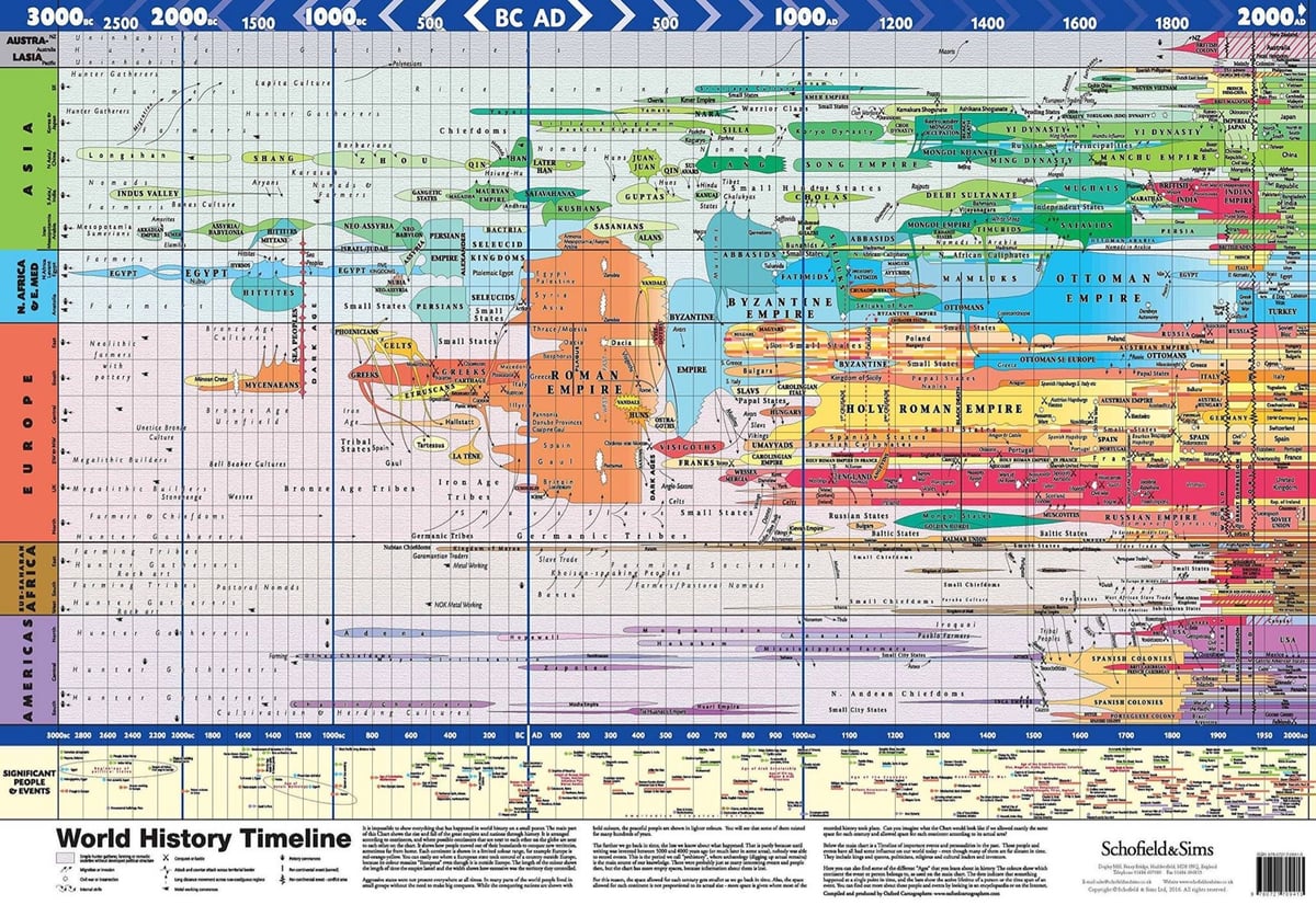
This World History Timeline (2016) shows how nations, empires, and ruling groups shifted and evolved across the globe from 3000 BCE to the present. It takes a second to understand what you’re looking at — I thought it was a sort of stretched geographical map at first. Get your own here.
The chart is based on Joseph Priestley’s A New Chart of History (1769):
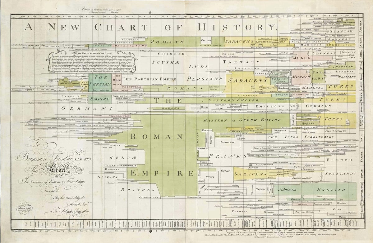
Priestley is best known for his co-discovery of oxygen.
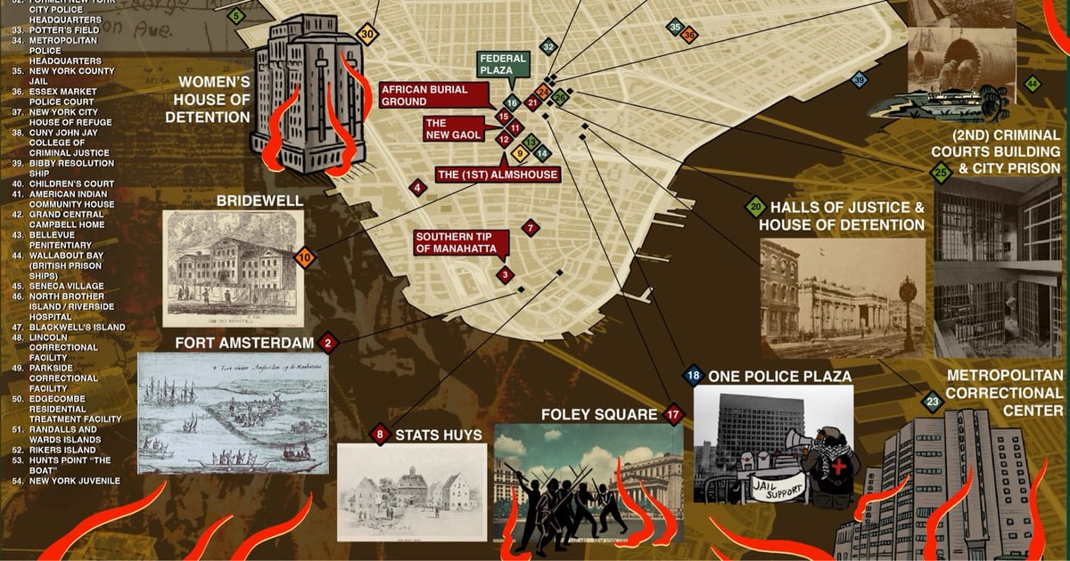
The website for the Abolitionist Guide to NYC is just getting started, but the site does house an Abolitionist Map of NYC.
The Abolitionist Map of NYC offers a geographic survey of incarceration and anti-carceral resistance in Manahatta from the Dutch colonization of Lenapehoking to the present day. The map highlights some of the first jails and prisons to exist in the area, the movement of facilities from one place to the next, and sites of rebellion against the expansion of the prison industrial complex.
It is meant to serve as a tool for abolitionist resistance grounded in a long view of the struggle, tactics, and goals.
The map is available as a PDF and as an interactive version. (via @prisonculture.bsky.social)
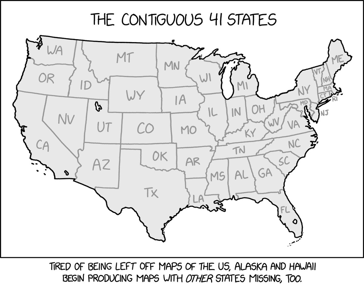
Nowhere on XKCD’s map of The Contiguous 41 States does it say that you need to find the missing seven states, but that’s immediately where my mind went. And it was a little more challenging than I anticipated — all of New England is present & accounted for somehow?
The answer key is here, along with this tidbit:
The United States did have exactly 41 states for a few days in 1889, from the admission of Montana, the 41st state, on November 8, to the admission of Washington (the state, not DC), the 42nd state, on November 11.
See also this super-sized US map with 64 states.
And then after I wrote all of the above, I decided to check and of course I’d posted about this map before, soon after it came out. *sigh*
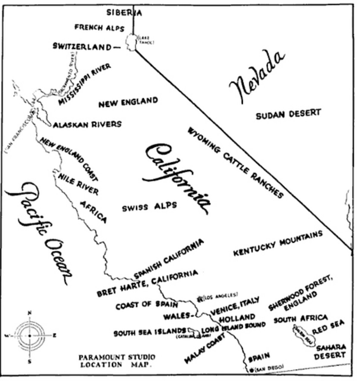
This is a map published in 1927 by Paramount Studios showing the areas of California & Nevada that doubled as shooting locations for far-flung locales, including Siberia, Wales, the Nile, New England, the Red Sea, and the Alps.
This Github project from Ankur Gupta allows you to “generate beautiful, minimalist map posters for any city in the world”. There are a variety of different themes you can choose from and the resulting images are big enough to print out actual posters (20-inch height maximum).
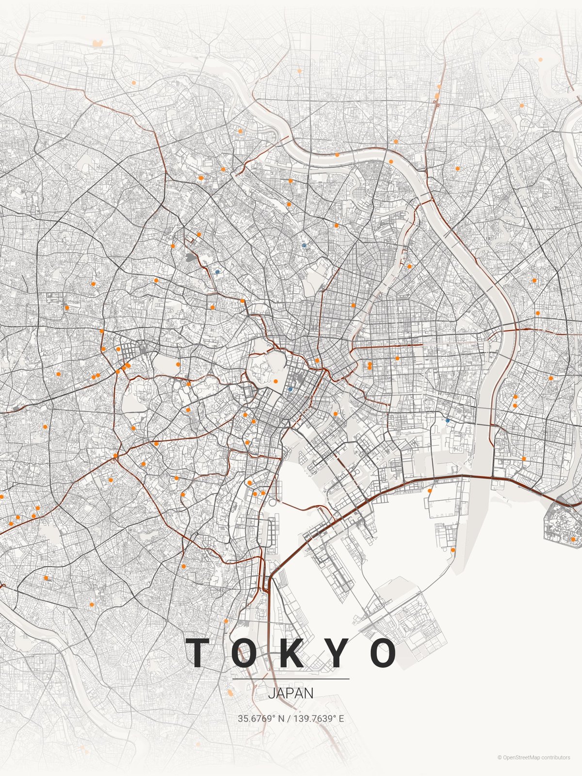
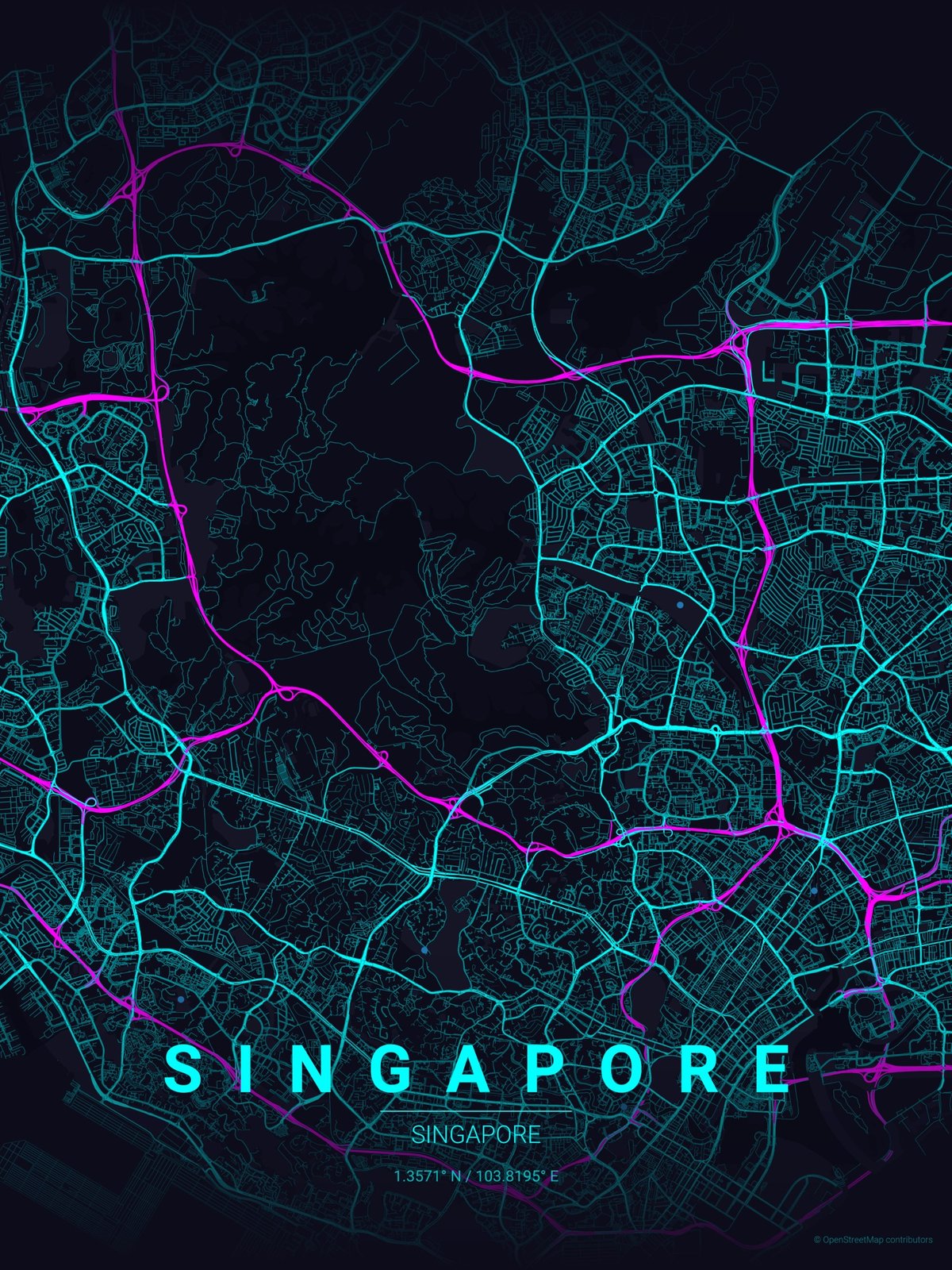
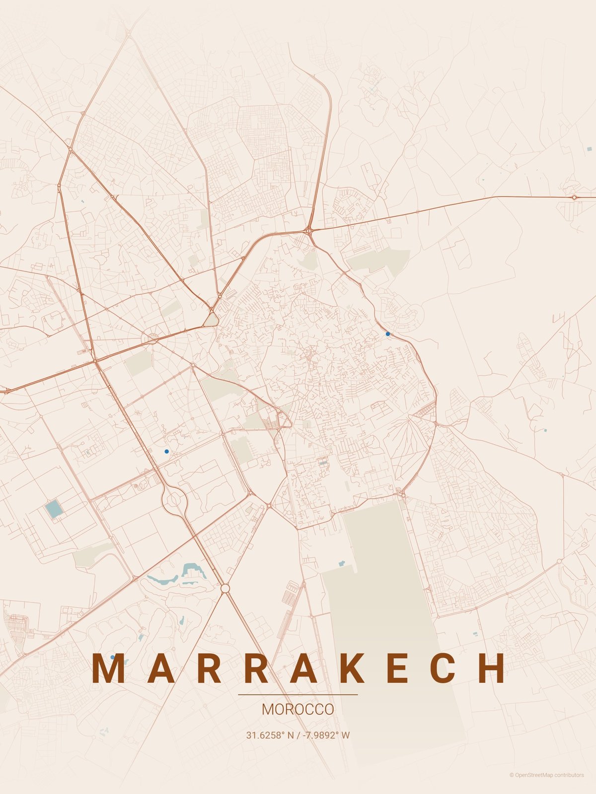
You can install the Python scripts on your computer or use this website (which seems quite slow). Also, I wonder if the height/width minimums can be changed to output bigger posters?
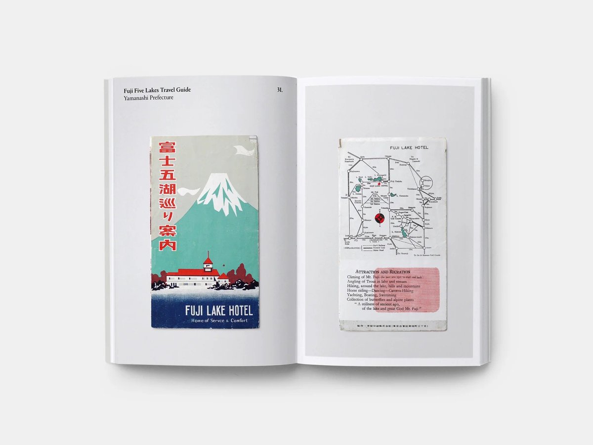


The gang at Present & Correct found a cache of pre-war tourist maps of Japan while rummaging around in Tokyo’s Jinbōchō used book district. They photographed them for a new self-published book called Paper Trails.
This is an animated 3D visualization of the growth of Paris from 300 BCE to the present day. It was made with Blender (no AI) by Christian Ivan, who notes that it’s a “simplification” and so might not be 100% accurate. To my eye, the broad strokes are all there. The subtle sound design helps with the overall effect as well.
In 1375, a Spanish mapmaker made a world map we now refer to as the Catalan Atlas. For its time, the atlas was remarkably accurate and comprehensive. This video explains how such a map was made in medieval times. From Open Culture:
The upshot is an answer to the very reasonable question, “how were (sometimes) accurate world maps created before air travel or satellites?” The explanation? A lot of history — meaning, a lot of time. Unlike innovations today, which we expect to solve problems near-immediately, the innovations in mapping technology took many centuries and required the work of thousands of travelers, geographers, cartographers, mathematicians, historians, and other scholars who built upon the work that came before. It started with speculation, myth, and pure fantasy, which is what we find in most geographies of the ancient world.
See also How Leonardo Constructed a Satellite-View Map in 1502 Without Ever Leaving the Ground and The Oldest World Map in the World.
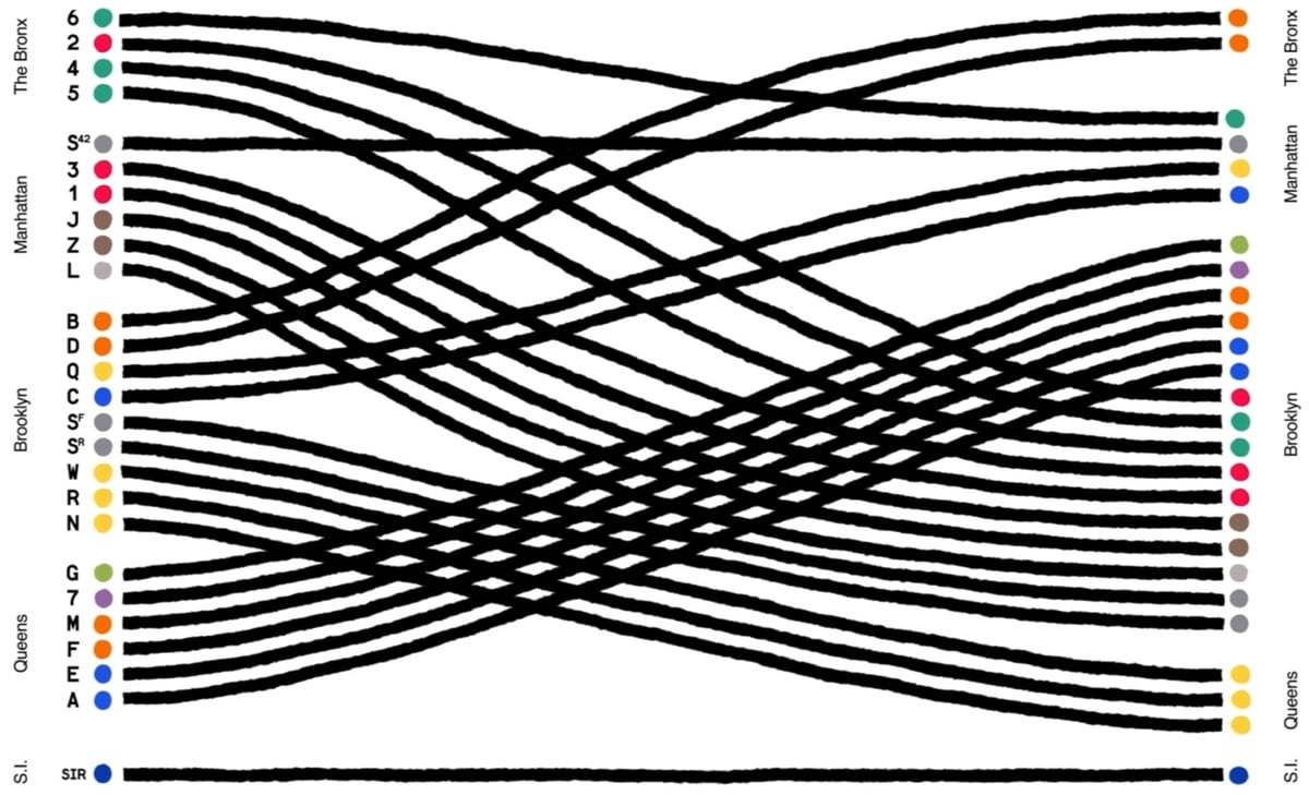
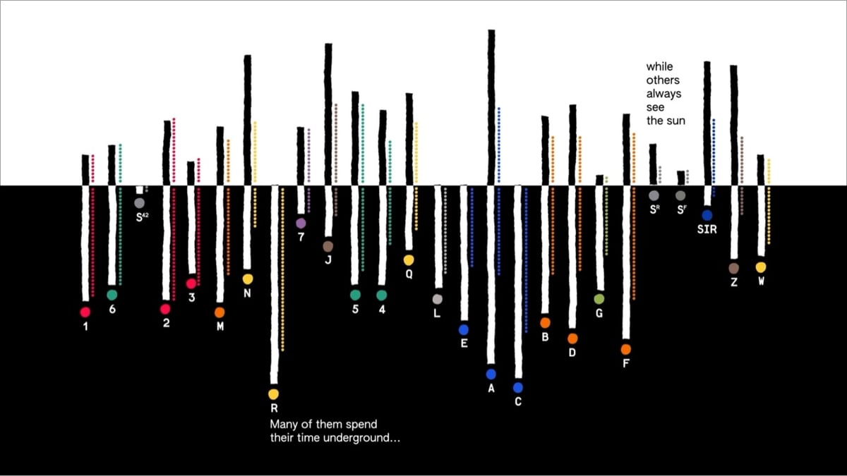
Giorgia Lupi and her team at Pentagram have created a data-driven animation for the MTA called A Data Love Letter to the Subway.
More from Lupi (who calls this an “absolute dream project”):
The project, “A Data Love Letter to the Subway,” visualizes each train line as a character whose unique qualities are extracted from MTA data. Data like length, location, and transfers were abstracted into train behaviors and attributes. Imaginatively animating each train line’s age, length, and path, we wrote a poetic story that explores the trains’ interwoven encounters with commuters and one another.
Our “Love Letter” draws on the elemental nature of picture books to unpack the visual system of the subway with curiosity and wonder. Drawing from the MTA’s Open Data Program, with my team we translated train data into a narrative made of attributes and behaviors, providing a rich view of the interactions, roles, differences, and the connections made and sometimes missed within the subway ecosystem.
Maps, NYC, the subway, data visualization…I am not sure how much more in my wheelhouse a thing could be.
Lucasfilm recently released an official map of the galaxy that Star Wars takes place in. And it’s huge.
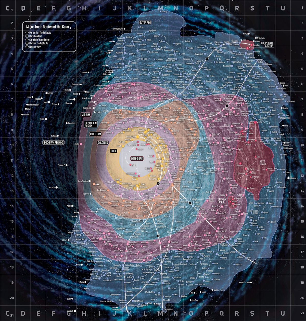
The map is slightly interactive; you can zoom and scroll it, but you can’t search or, say, click to highlight all the star systems featured in Andor. But you can do manual lookups using this massive 59-page PDF listing of Star Wars star systems.
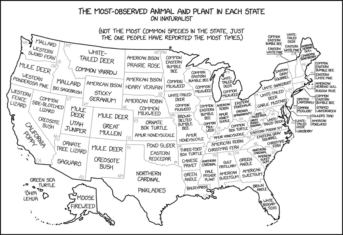
XKCD mapped the most observed plant and animal for all 50 US states as reported by iNaturalist users. I had no idea bumble bees were such a popularly observed animal — the common eastern bumble bee (Bombus impatiens) is most-observed in Vermont, Wisconsin, Maine, Connecticut, Illinois, and Minnesota. Also popular: white-tailed deer, bison, milkweed, honeysuckle, and robins.

Moon Lidar is a visualization of the data collected by NASA’s Lunar Orbiter Laser Altimeter (LOLA) mission. According to this factsheet, the visualization includes nearly six billion measurements.
LOLA data was captured by a polar orbiting laser altimeter. Think of it like the range finder you would use to measure how far away the hole is from your current position at a golf course, except you press the button six billion times, save the position from where you are measuring, save every distance measurement on a hard drive, and then phone that data back to earth.
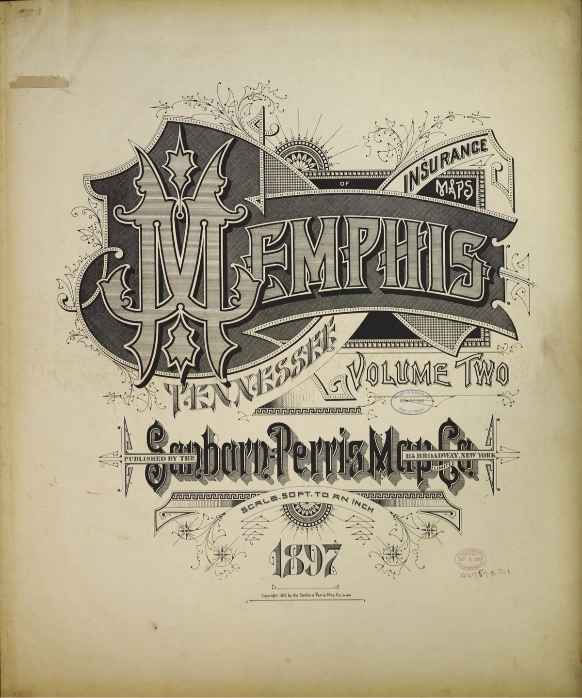
Several years ago, Brandon Silverman become obsessed with the lettering and typography on the fire insurance maps published by the Sanborn Map Company in the late 19th and early 20th centuries.
Sanborn maps were designed to help insurance companies assess the fire risk of individual properties. They were highly detailed, showing the size, shape, and construction of buildings, as well as the materials used in their construction. This information was used by insurance companies to calculate the premium that a property owner would have to pay for fire insurance.
He even used the ornate, intricately designed covers as a model for his wedding invitation. Silverman recently launched a site dedicated to the design of these fire maps, collecting high-res digital scans of the art found on almost every cover and index page, over 3500 images in all. The cover pages are particularly beautiful. Oh, and you can order prints of all the images as well.
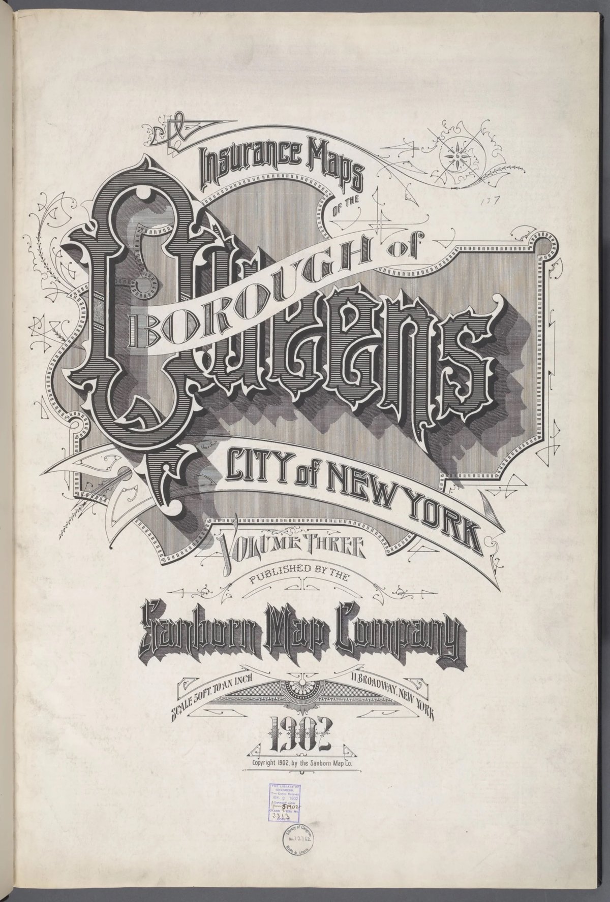


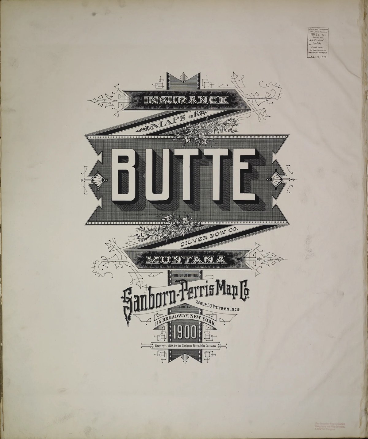
Fun fact: Silverman first learned about the fire insurance maps from a 2011 post on kottke.org.


Using a 3D mapping engine, some Tolkien enthusiasts built a model of Middle Earth that can be viewed from any angle, from the surface to an orbital vantage point.
See also an interactive map of Middle Earth. (via @tonypeak78)
I am predisposed to like videos about meteorite craters but this was even more interesting than I anticipated.
A nice example of a crater 2-3 km wide is Rotor Kamm in southern Africa. I should mention that we’re easily into city killer impacts here, in case you’re wondering.
You can explore the Earth Impact Database on their website. (via @michaelhobbes.bsky.social)
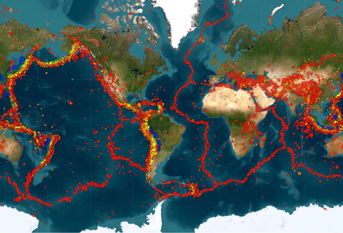
From 1980 to the present, a timeline map of every earthquake in the world with a magnitude of 5 or above. You can play around with different parameters and data, so you can see where the different tectonic plates are, just see where the biggest earthquakes occurred, or add in volcanic eruptions. You can also draw a cross section and it will show how deep the quakes occurred along that line.
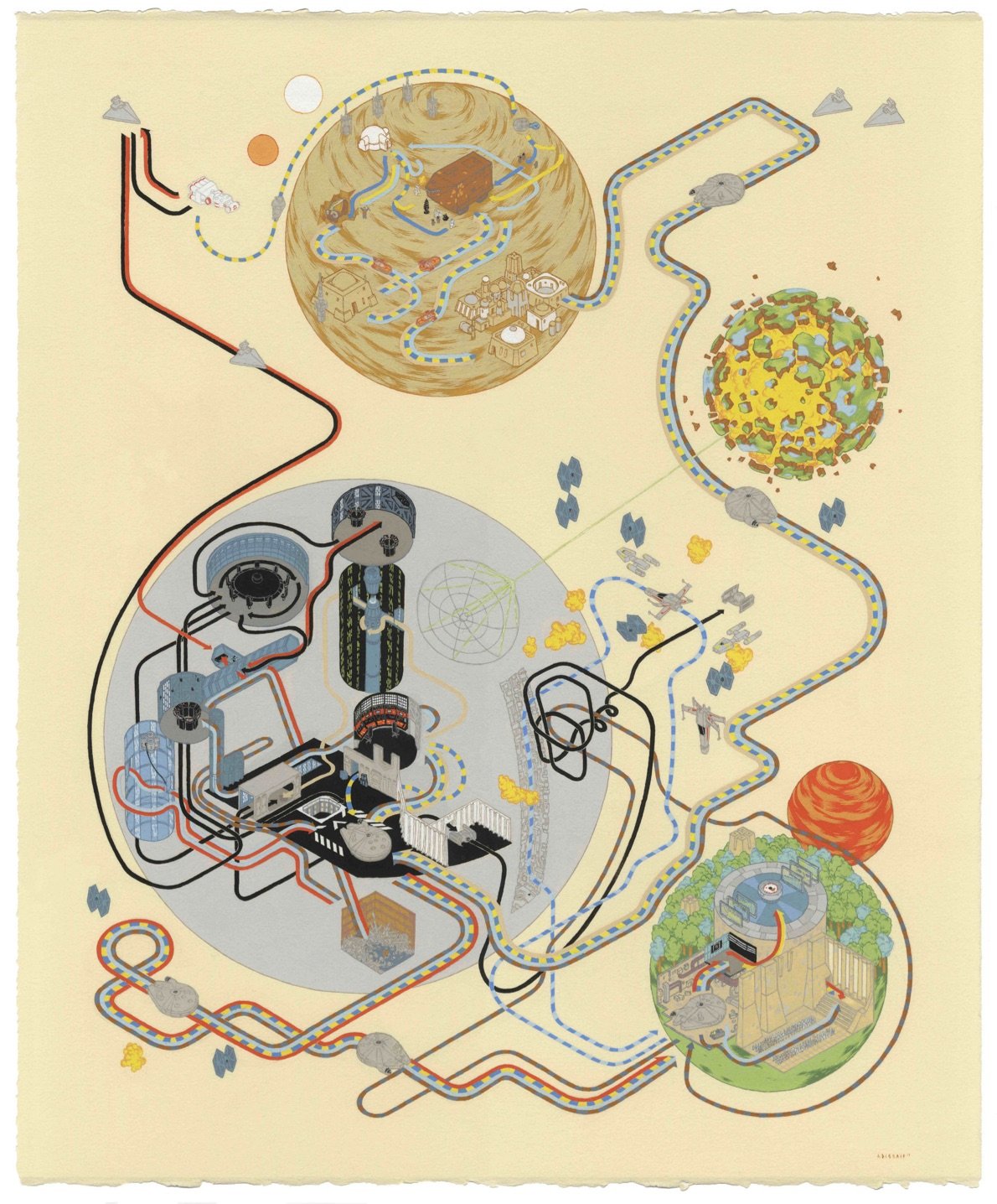
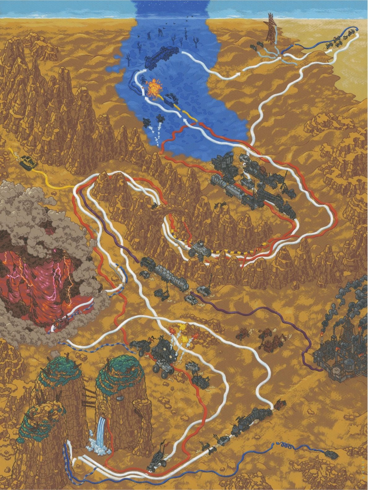
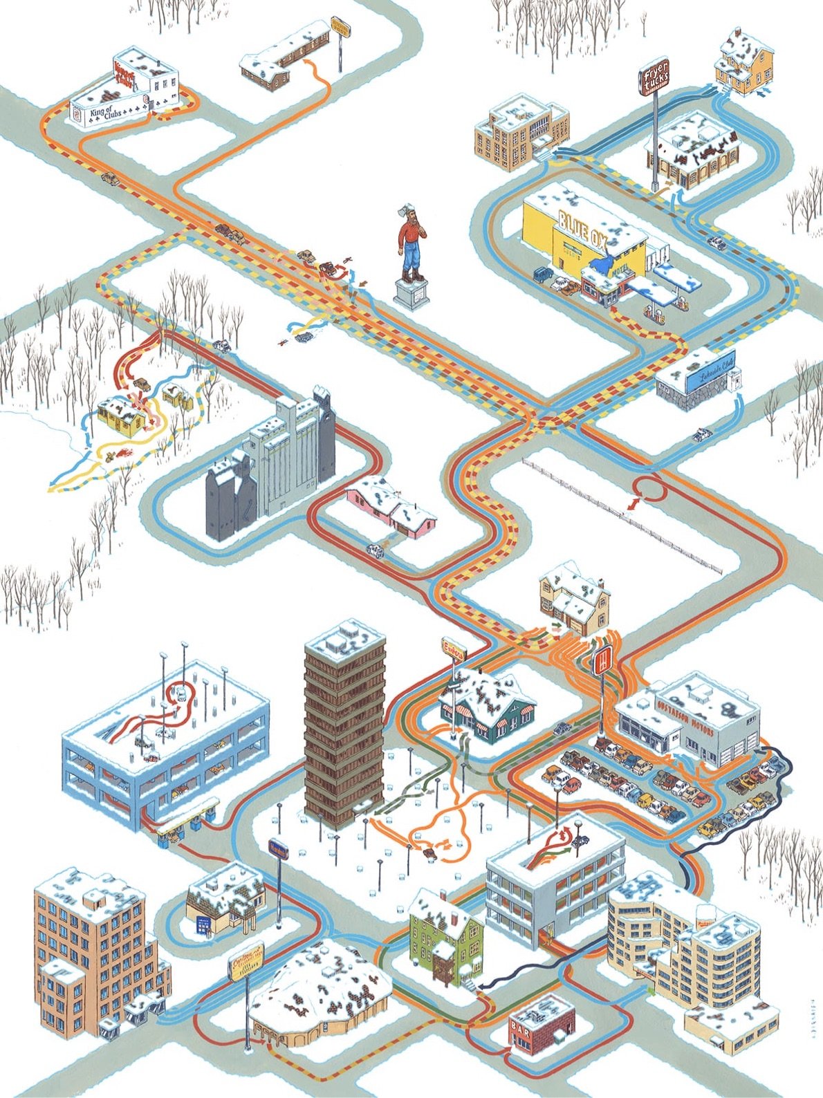
Artist and illustrator Andrew DeGraff makes maps that show where the characters travel during movies — imagine Billy’s trail maps from Family Circus but for films like Back to the Future, The Breakfast Club, Pulp Fiction, and Mad Max: Fury Road.
DeGraff collected these maps into a book called Cinemaps: An Atlas of 35 Great Movies.
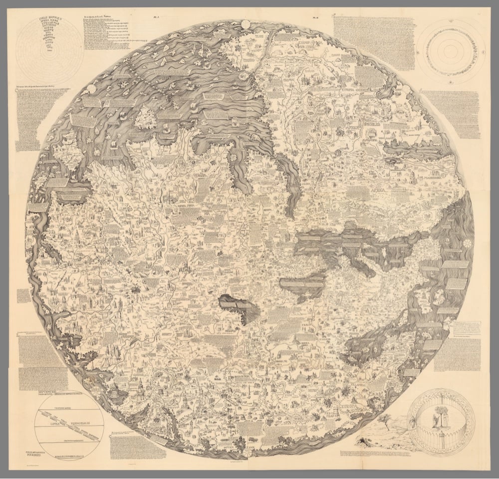
Irving Finkel, a curator at the British Museum and an expert in cuneiform, takes a look at a 2900-year-old Mesopotamian tablet that contains a map of the world as it was known at the time.
The Babylonian map of the world is the oldest map of the world, in the world. Written and inscribed on clay in Mesopotamia around 2,900-years-ago, it is, like so many cuneiform tablets, incomplete. However, Irving Finkel and a particularly gifted student of his — Edith Horsley — managed to locate a missing piece of the map, slot it back into the cuneiform tablet, and from there set us all on journey through the somewhat mythical landscape of Mesopotamia to find the final resting place of the ark. And yes we mean that ark, as in Noah’s ark. Although in the earlier Mesopotamian version of the flood story, the ark is built by Ziusudra.
Finkel could not possibly look more like a British Museum curator than he does.
Btw, I first heard about the earliest Mesopotamian version of the flood story in a mythology class I took in college. I’d spent a lot of my youth going to church but religion didn’t click for me and I was never a believer. Hearing that flood story clinched it for me — the Old Testament of the Christian bible is just as mythological as the Greek or Mesopotamian gods (everything is a remix) — and I’ve been solidly atheist ever since. (via open culture)
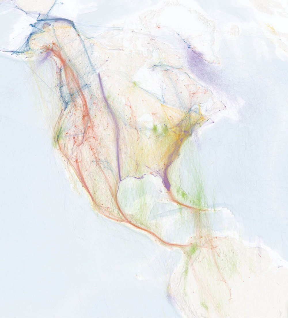
This is kind of amazing: Calculating Empires is a project by Kate Crawford and Vladan Joler attempting to map how technology and human social structures have changed and evolved since 1500. This is just a tiny bit of the large genealogical map:
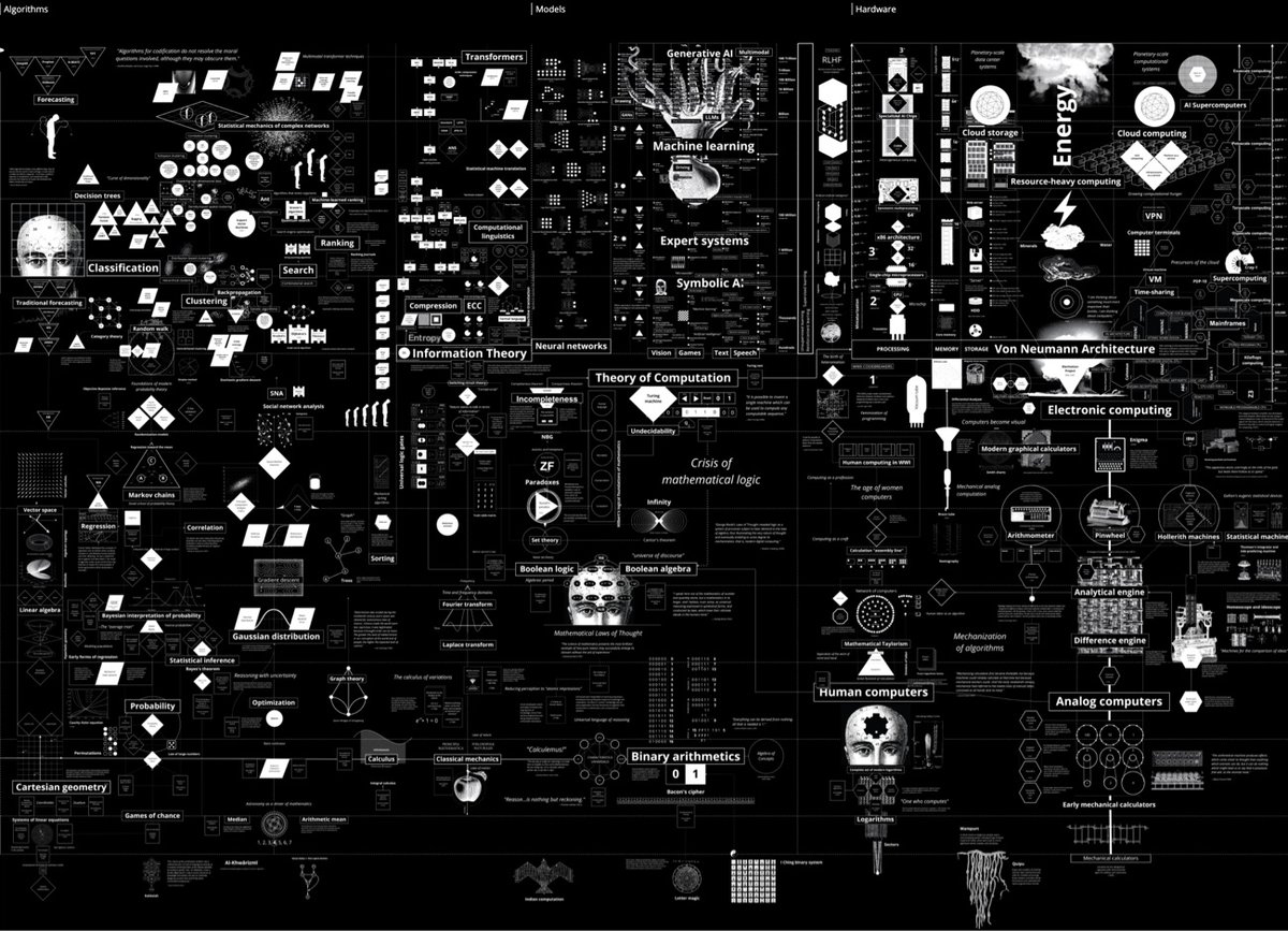
Calculating Empires is a large-scale research visualization exploring how technical and social structures co-evolved over five centuries. The aim is to view the contemporary period in a longer trajectory of ideas, devices, infrastructures, and systems of power. It traces technological patterns of colonialism, militarization, automation, and enclosure since 1500 to show how these forces still subjugate and how they might be unwound. By tracking these imperial pathways, Calculating Empires offers a means of seeing our technological present in a deeper historical context. And by investigating how past empires have calculated, we can see how they created the conditions of empire today.
See also Anatomy of an AI System. (via @kurtbandersen)


Hosted by the New York Academy of Medicine, #ColorOurCollections is a yearly assemblage of coloring books sourced from the collections of museums and libraries. You can download this year’s coloring books (as well as those from past years) for free from the website. (via open culture)
I’ve always been a little fascinated by the list of the largest cities throughout history, so this animated version from Ollie Bye is right up my alley. While watching, it’s interesting to think about what makes cities grow large at specific times: a mixture of economics, demography, social movements, empire/colonialism, technology, and the like.
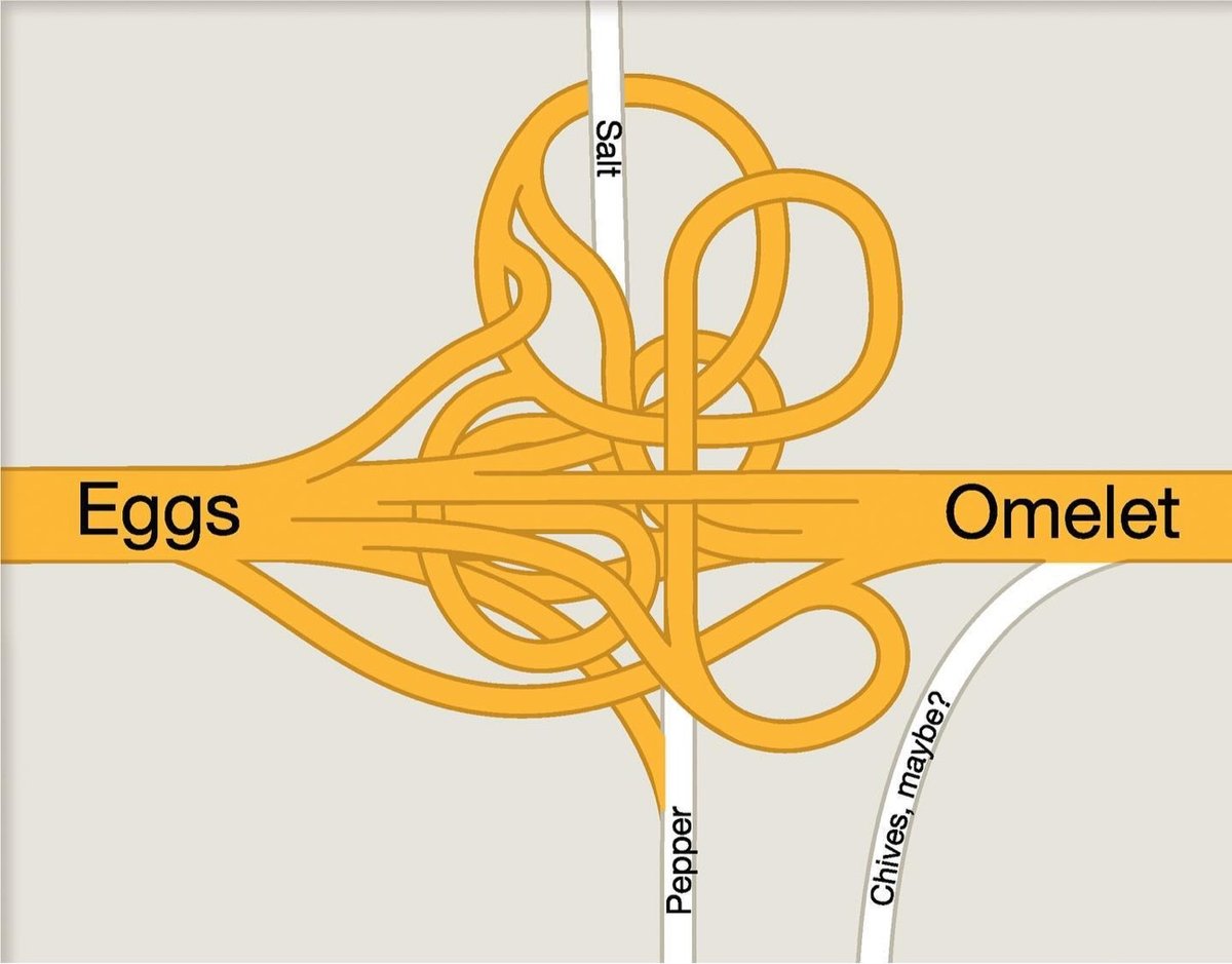
Always a good day to highlight the creative work of designer/illustrator Christoph Niemann: a collection of map-based work, including a cheeky metaphorical recipe for an omelet. That intersection isn’t actually that outlandish: see A Bonkers Highway Interchange and Crazy Whirlpool Traffic Interchange in Dubai.
When I linked to a recent NY Times article about rewilding golf courses, I pulled out this startling fact: “The United States has more golf courses than McDonald’s locations.” Nathan Yau of FlowingData found that that is indeed true but wondered where all of the golf courses were actually located. (A: typically not in cities where the McDonald’s are concentrated).
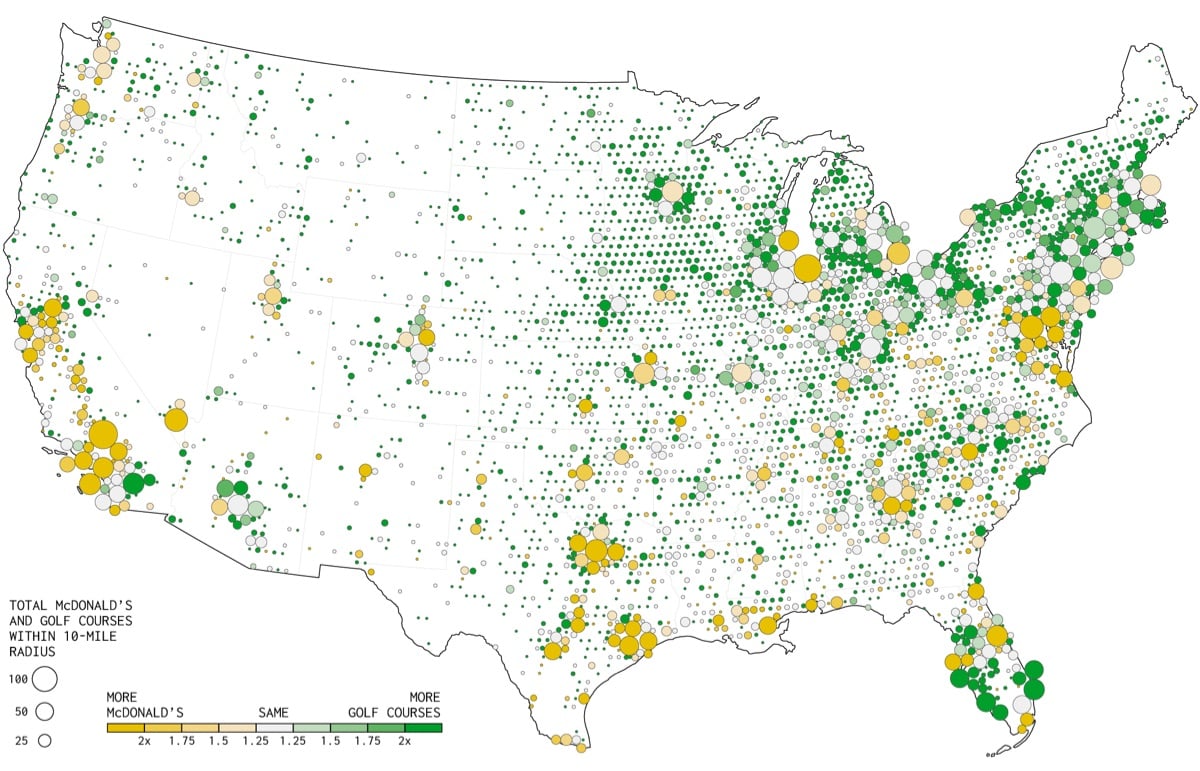
This makes more sense now. You can have a golf course in an area where there aren’t that many people, because people will travel to play golf. Few people are going to travel specifically for McDonald’s.
If we compare the two, you see the McDonald’s city concentrations, and golf fills the in-between spaces.
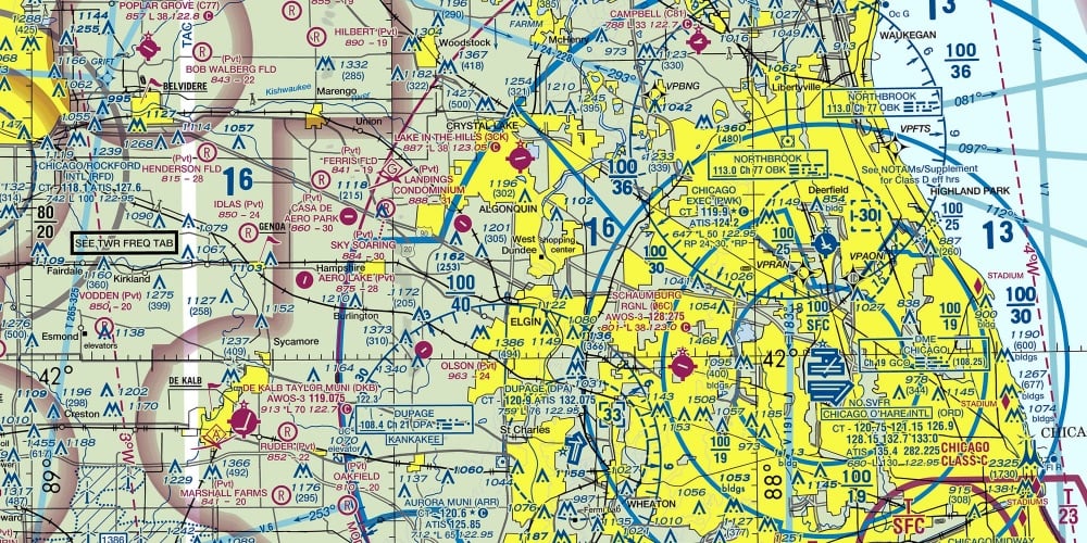
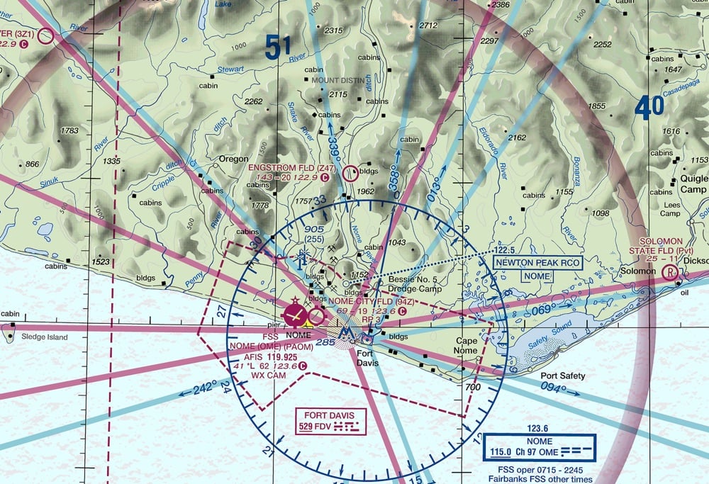
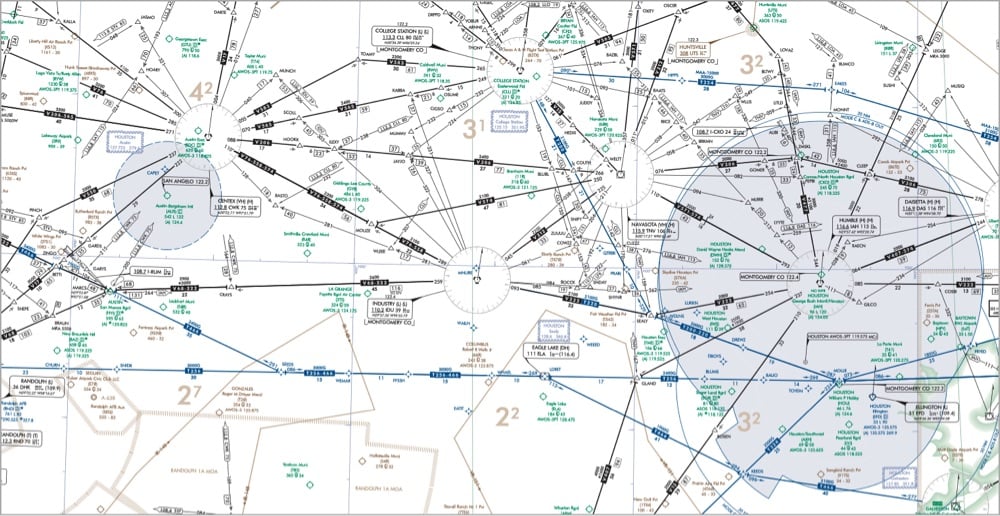
On Beautiful Public Data, Jon Keegan highlights the extremely information-rich flight maps produced by the Federal Aviation Administration that pilots use to find their way around the skies.
Among all of the visual information published by the U.S. government, there may be no product with a higher information density than the Federal Aviation Administration’s (FAA) aviation maps. Intended for pilots, the FAA publishes free detailed maps of the entire U.S. airspace, and detailed maps of airports and their surroundings and updates them frequently. The density of the critical information layered on these maps is staggering, and it is a miracle that pilots can easily decipher these maps’ at a glance.
Oh wow, this takes me back. My dad was a pilot when I was a kid and he had a bunch of FAA maps in the house, in his planes, and even on the walls of his office. I remember finding these maps both oddly beautiful and almost completely inscrutable. What a treat to be able to finally figure out how to read them, at least a little bit. And the waypoint names are fun too:
Orlando, FL has many Disney themed waypoints such as JAFAR, PIGLT, JAZMN, TTIGR, MINEE, HKUNA and MTATA. Flying into Orlando, your plane might use the SNFLD arrival path, taking you past NOOMN, FORYU, SNFLD, JRRYY and GTOUT.
Based on the waypoints near Atlanta’s Hartsfield-Jackson International, this airport must be home to some of the nerdiest air traffic controllers. There’s a crazy number of Lord of the Rings waypoints: HOBTT, SHYRE, FRDDO, BLLBO, BGGNS, NZGUL, RAETH, ORRKK, GOLLM, ROHUN, GONDR, GIMLY, STRDR, SMAWG and GNDLF.
Millions of years ago, the supercontinent of Pangea slowly started to break apart into the continents we all live on today. In this video from the makers of ArcGIS mapping software, you can watch as the reconfiguration of the Earth’s land happens over 200 million years.
Damn, India slammed into Asia like the Kool-aid Man — no wonder the Himalayas are so tall!
Once, the craggy limestone peaks that skim the sky of Everest were on the ocean floor. Scientists believe it all began to change about 200 million years ago — at around the time the Jurassic dinosaurs were beginning to emerge — when the supercontinent of Pangea cracked into pieces. The Indian continent eventually broke free, journeying north across the vast swathe of Tethys Ocean for 150 million years until it smacked into a fellow continent — the one we now know as Asia — around 45 million years ago.
The crushing force of one continent hitting another caused the plate beneath the Tethys Ocean, made of oceanic crust, to slide under the Eurasian plate. This created what is known as a subduction zone. Then the oceanic plate slipped deeper and deeper into the Earth’s mantle, scraping off folds limestone as it did so, until the Indian and Eurasian plates started compressing together. India began sliding under Asia, but because it’s made of tougher stuff than the oceanic plate it didn’t just descend. The surface started to buckle, pushing the crust and crumples of limestone upwards.
And so the Himalayan mountain range began to rise skyward. By around 15-17 million years ago, the summit of Everest had reached about 5,000m (16,404ft) and it continued to grow. The collision between the two continental plates is still happening today. India continues to creep north by 5cm (2in) a year, causing Everest to grow by about 4mm (0.16in) per year (although other parts of the Himalayas are rising at around 10mm per year [0.4in]).
See also Map of Pangaea with Modern-Day Borders, How the Earth’s Continents Will Look 250 Million Years From Now, and Locate Modern Addresses on Earth 240 Million Years Ago. (via open culture)
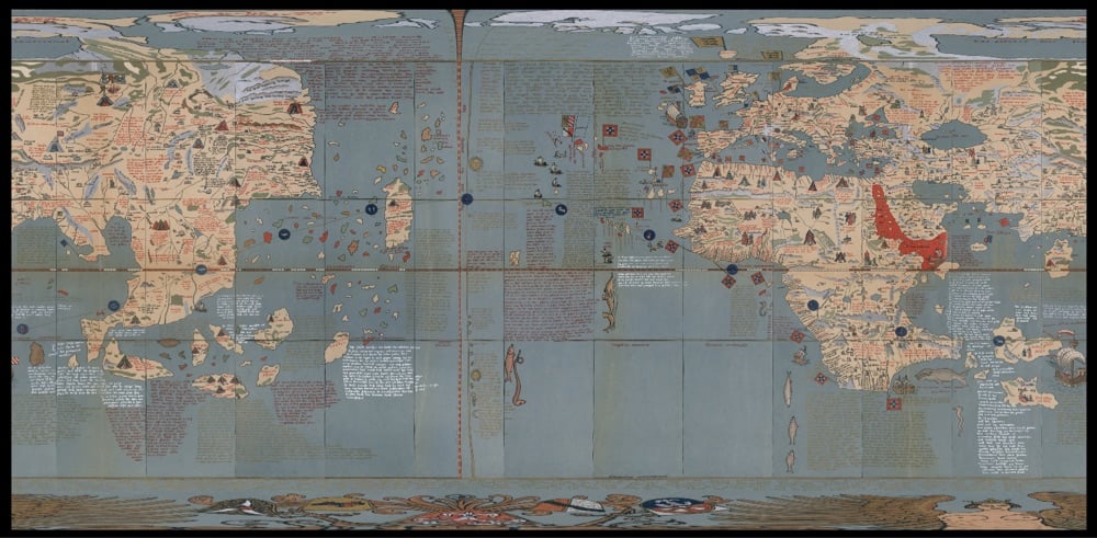
The David Rumsey Map Collection is one of the true gems of the web: a massive trove of maps & related images from over 40 years of collecting.
Rumsey began building a collection of North and South American historical maps and related cartographic materials in 1980. Eventually the collection expanded to include historical maps of the entire world, from the 16th to the 21st centuries. His collection, with more than 200,000 maps, is one of the largest private map collections in the United States.
Italian filmmaker Andrea Gatopoulos has made a documentary film called A Stranger Quest about Rumsey’s passion for maps. Here’s the trailer:
And because I can’t resist, a few maps from the collection:
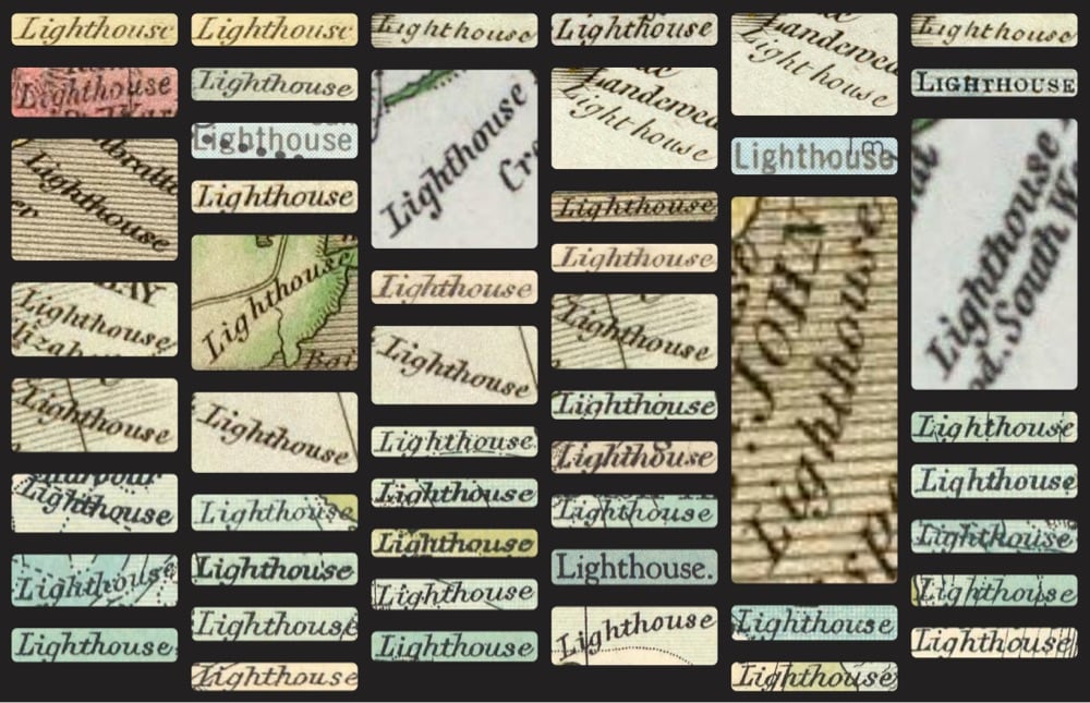
That last one is a screenshot of the results for “lighthouse” from their new Text-On-Maps search capability.
This is a map of how people in different geographic regions of the US refer to athletic footwear, courtesy of Josh Katz, author of Speaking American: How Y’all, Youse, and You Guys Talk and co-creator of that NY Times dialect quiz that went viral 10 years ago.
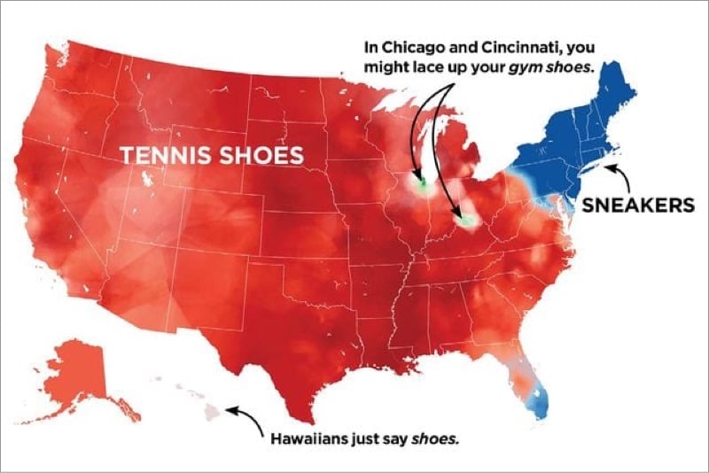
Growing up in northern Wisconsin, we said “tennis shoes” or “tennies” most of the time (even though very little actual tennis was being played) and “gym shoes” less often. I hadn’t really heard of “sneakers” as a kid and never used it. (Shoes for sneaking? Huh?) My kids were born in NYC and they give me shit every time I tell them to put their tennies on. 🤷♂️
What do you call athletic shoes? Tennies? Sneakers? Kicks? Trainers? Gym shoes? Some other weird thing? (via @dens)
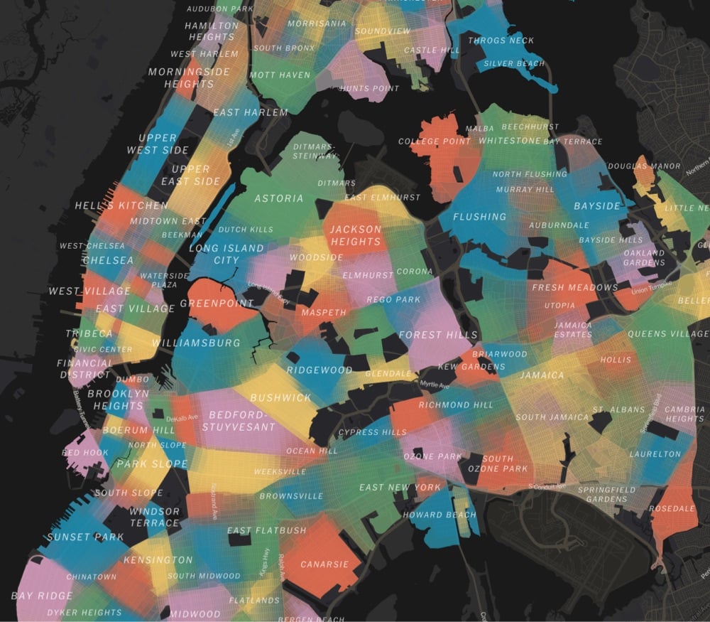
Using survey data, responses from community boards & city council members, and over 37,000 responses from NYC residents, a team at the NY Times has made a detailed map of the 350+ distinct neighborhoods in NYC. From a companion article:
It’s a New York pastime to gripe that neighborhoods are invented and defined by real estate brokers, developers and other city gatekeepers. But the more interesting truth may be that they are also reinvented and reinforced, refracted through race and class, by us: by the air traffic controller who lives in Little Yemen, by the Manhattan community manager who’s sure his constituents live in East Harlem — and not “Upper Carnegie Hill” — and by the Brooklyn residents who decided to name a relatively flat piece of land Boerum Hill.
A name has power. It can foreshadow who will be moving in. By itself, it can conjure so much: gentrification, displacement, inequality, status. When we argue over names, or even invent new ones, we may be trying to exert some of that power — or lamenting that others have more power than we do.
We asked New Yorkers themselves to map their neighborhoods and to tell us what they call them. The result, while imperfect, is probably the most detailed map of the city’s neighborhoods ever compiled.
The article is interesting throughout:
Our map reveals two main kinds of divisions: sharp ones and fuzzy ones.
The fuzzy ones often reflect areas in transition or dispute, where there’s no consensus or where gentrification is rewriting boundaries in real time.
The sharp ones often reflect features of the landscape itself: wide avenues, highways, remnants of canals. When you cross the street, you know you’re in another neighborhood.
Next time I’m in NYC, I’m definitely going to Little Yemen for lunch.
I loved playing around with the National Audubon Society’s Bird Migration Explorer, which is a beautifully designed interactive map of the Western hemisphere that shows the seasonal migration patterns of more than 450 species of birds. What a resource…so much information to explore here. (via marco c. in the comments)
Older posts

Socials & More