An Archive of Commercial Illustration (c. 1950-75)
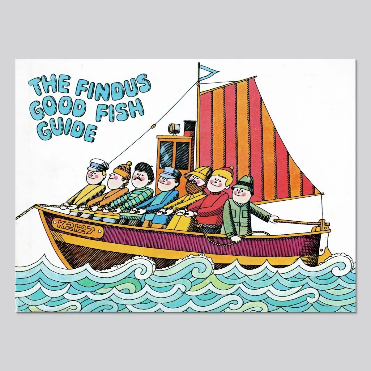
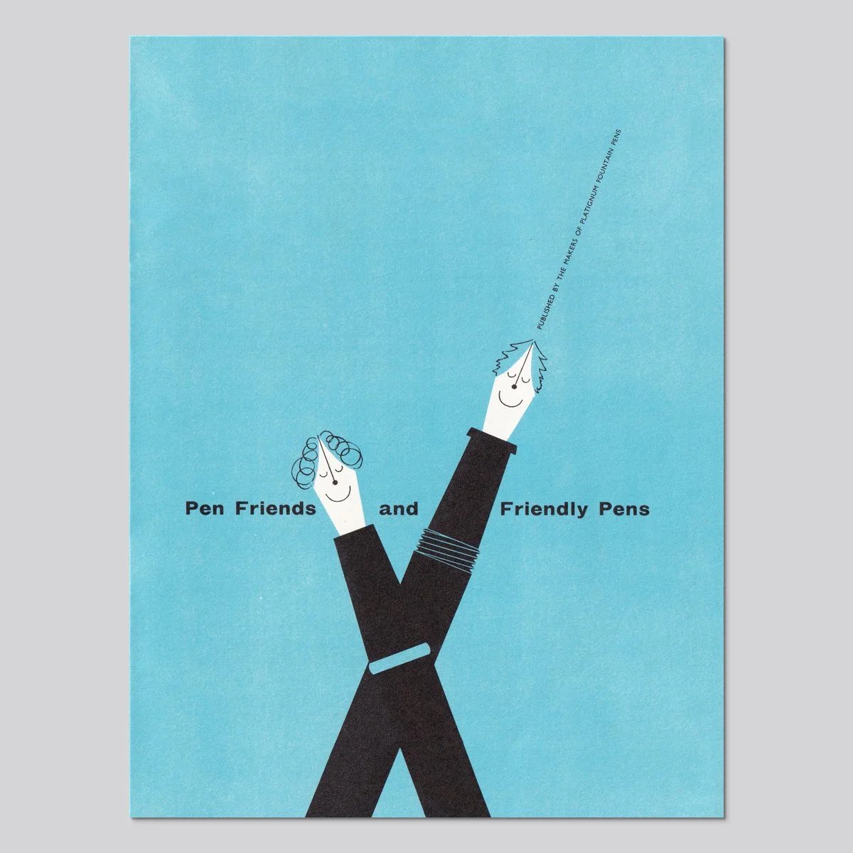
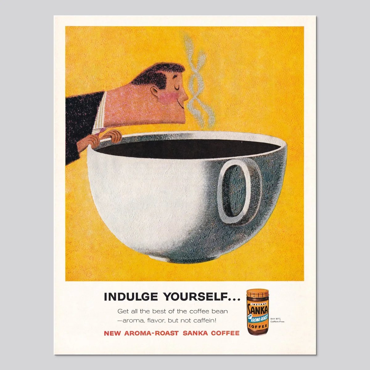
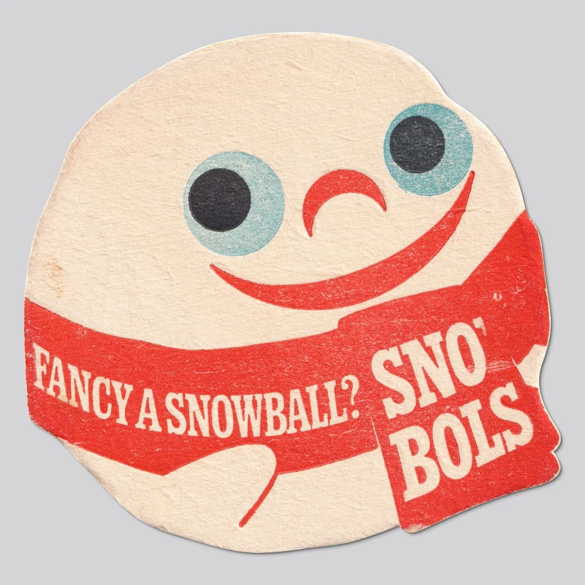
Illustrator Zara Picken maintains an archive of commercial illustration from the mid-20th century. So much throwback inspiration here!
This site is made possible by member support. 💞
Big thanks to Arcustech for hosting the site and offering amazing tech support.
When you buy through links on kottke.org, I may earn an affiliate commission. Thanks for supporting the site!
kottke.org. home of fine hypertext products since 1998.
Beloved by 86.47% of the web.
Illustrator Zara Picken maintains an archive of commercial illustration from the mid-20th century. So much throwback inspiration here!

Illustrator Quentin Blake, who is most widely known for his energetic drawings for Roald Dahl’s books, generously shares his drawing process on his website and also in a series of videos.
I do a freewheeling sort of drawing that looks as though it is done on the spur of the moment. However even a single drawing needs a certain amount of preparation and planning. Most of the time I need to do a rough in which I find out how people stand, what sort of expressions they have and how they fit on the page.
Here are some of the videos he’s done. Quentin Blake draws a Hornswoggler:
Ten Minutes of Illustration (in three parts for some reason):
The illustration above is from The Wild Washerwomen.
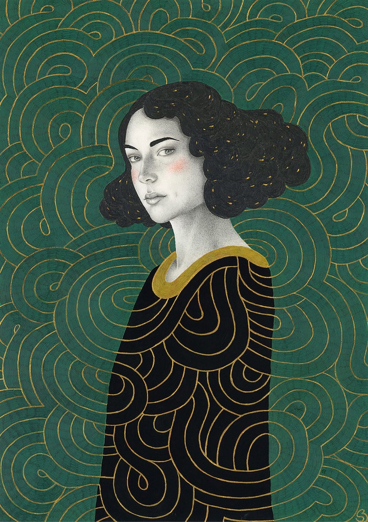
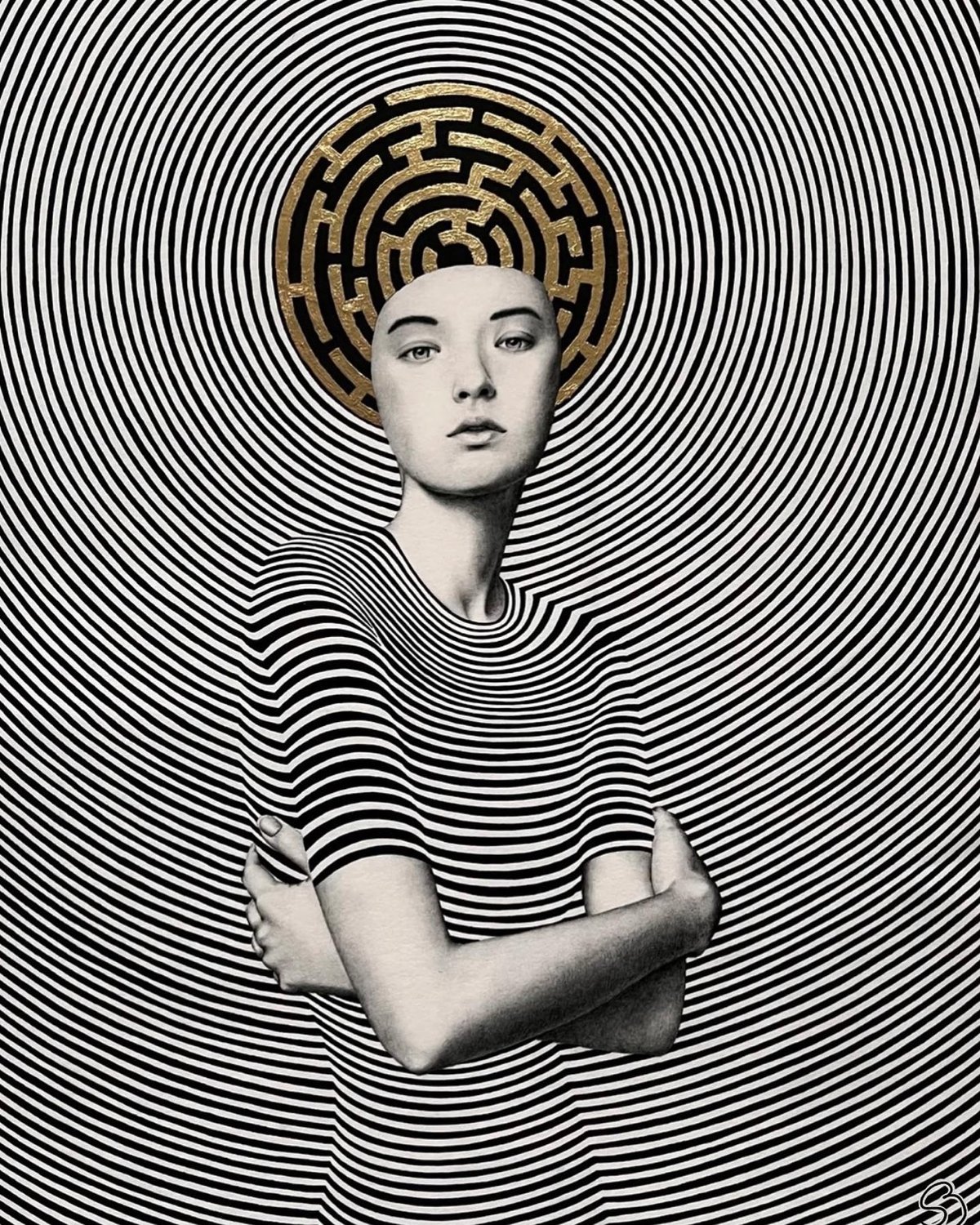
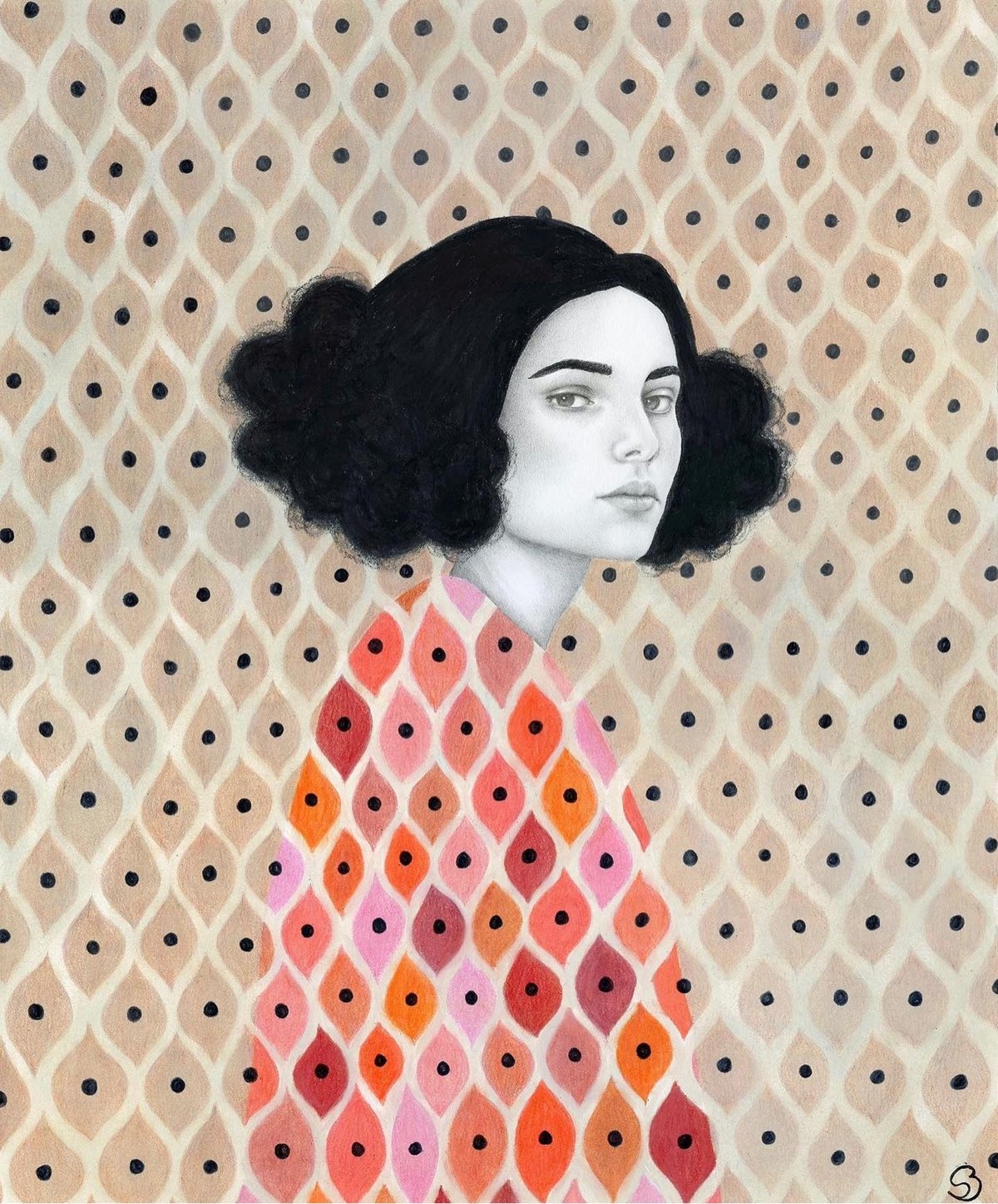
These are some of my favorite portrait illustrations from Sofia Bonati.
In her art you’ll find female portraits that invite you into a dreamlike world where the woman and her surroundings intertwine, connect. They are women with deep, mysterious looks, who want to tell us something.
I especially like the more geometric ones that radiate. Prints and original works are available in her shop. (via colossal)
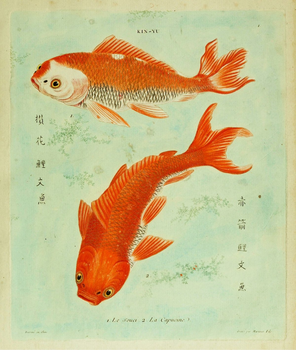
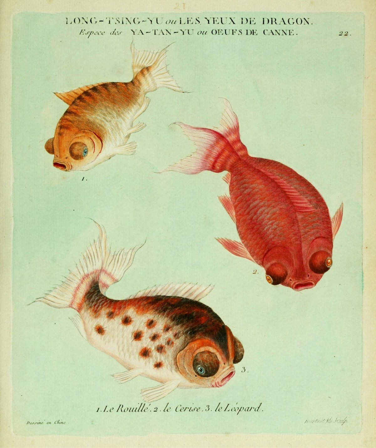
The Public Domain Review has published some lovely illustrations of goldfish from a 1780 monograph called Histoire naturelle des dorades de la Chine.
Histoire naturelle des dorades de la Chine (1780) — the dorades in the title refers not to sea bream but the fish’s gilded appearance — was the first monograph on goldfish published in Europe, from a time when the fish were still bound up with Eastern exoticism in the Western imagination.
You can peruse the entire document at the Internet Archive.
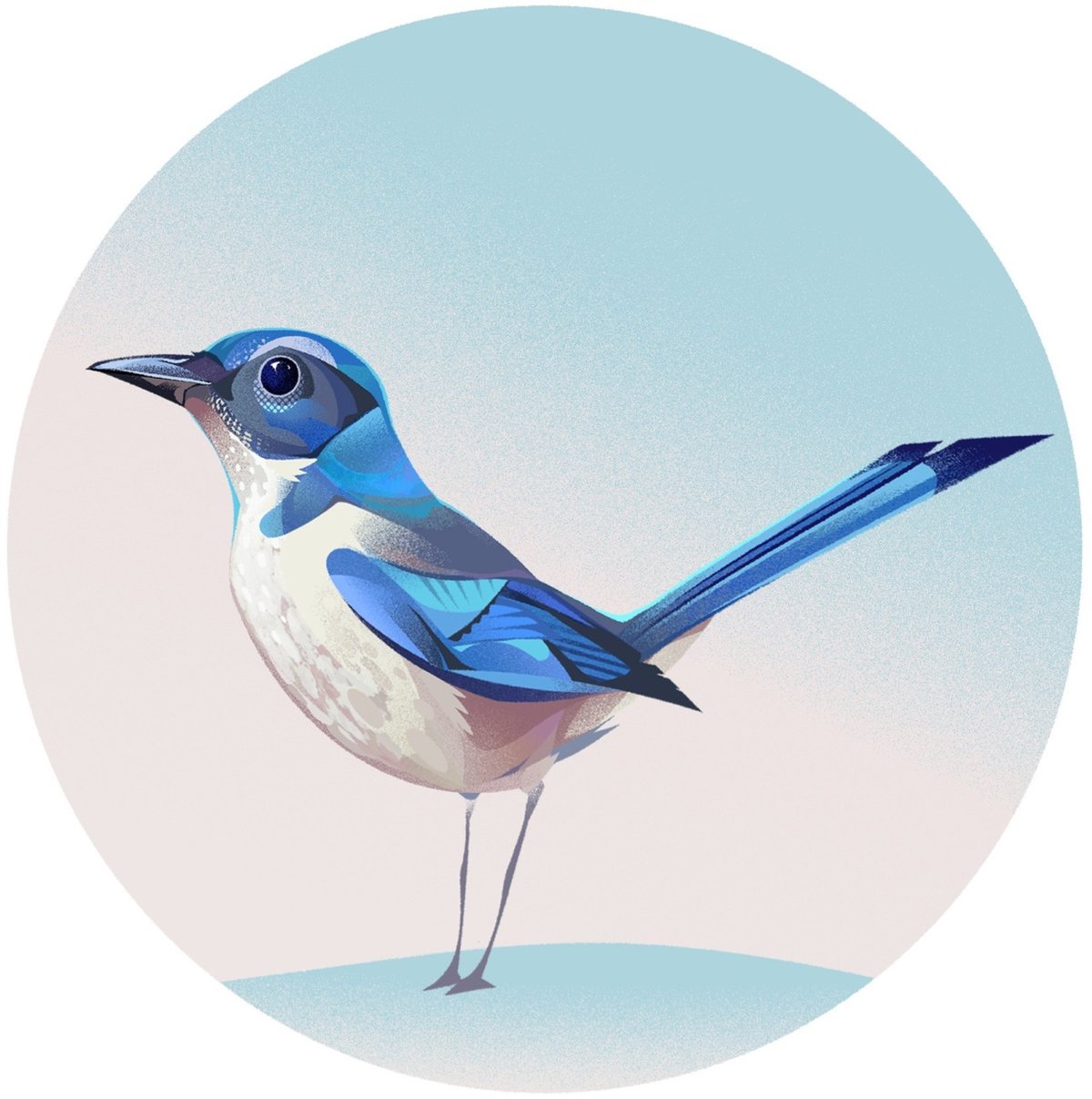
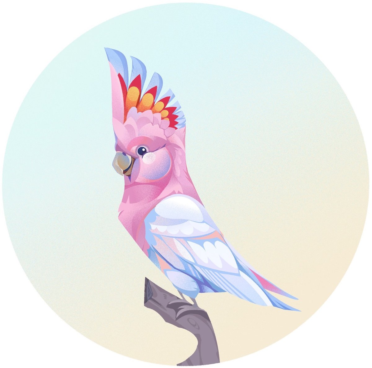
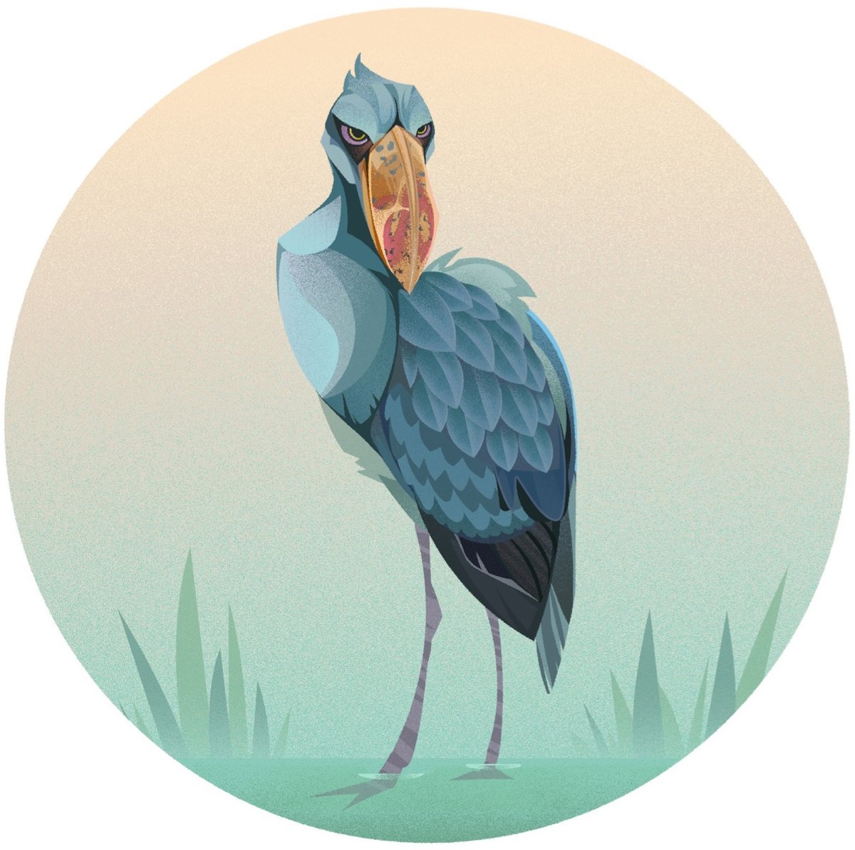
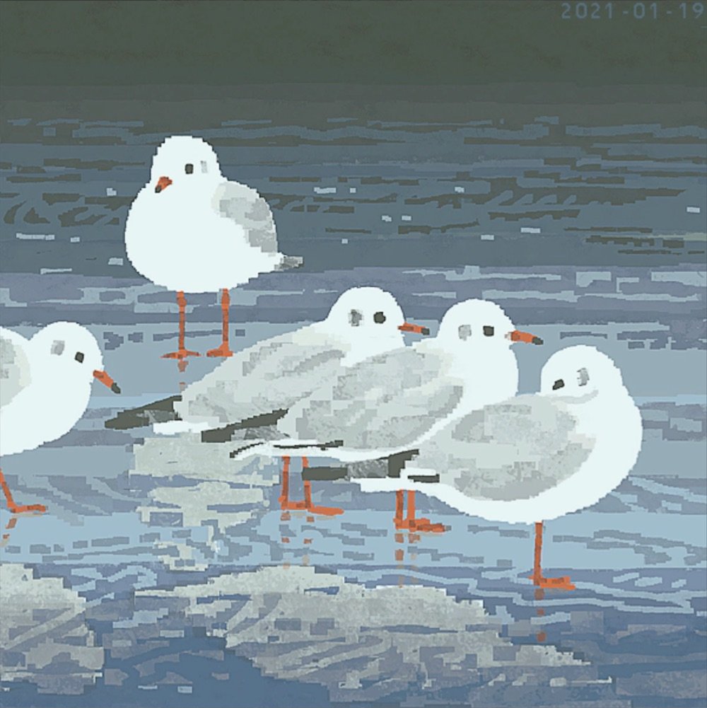
There’s something a little bit mesmerizing about Aled Thompson’s illustrations of birds. They are at once highly detailed and also slightly vectorish — and it shifts back and forth while I’m looking at them, like one of those young woman/old woman optical illusions.
You can find more of Thompson’s work on Instagram and Bluesky and can purchase prints here. (via @mims.bsky.social)
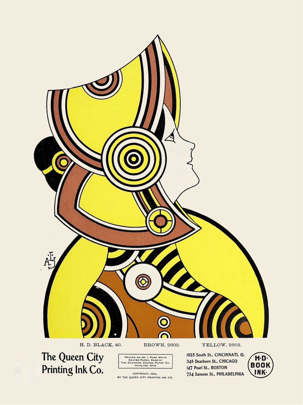
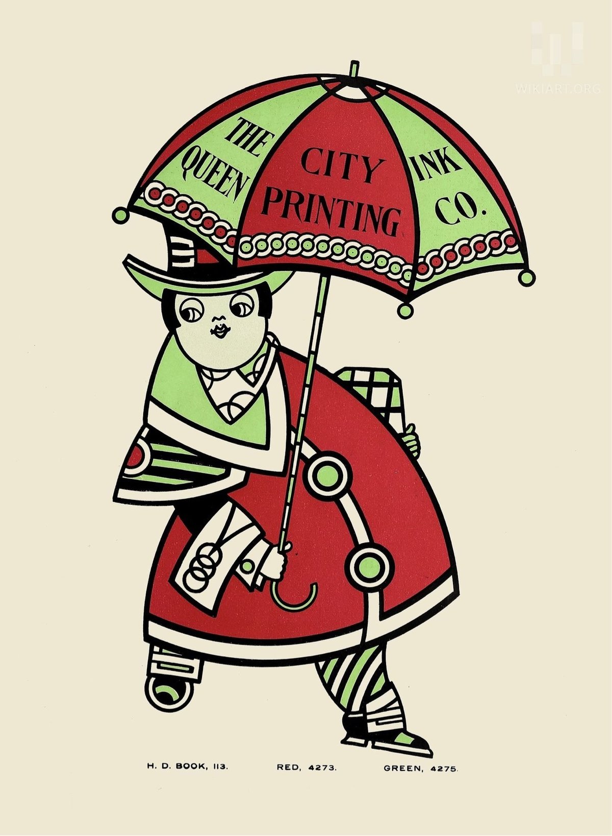
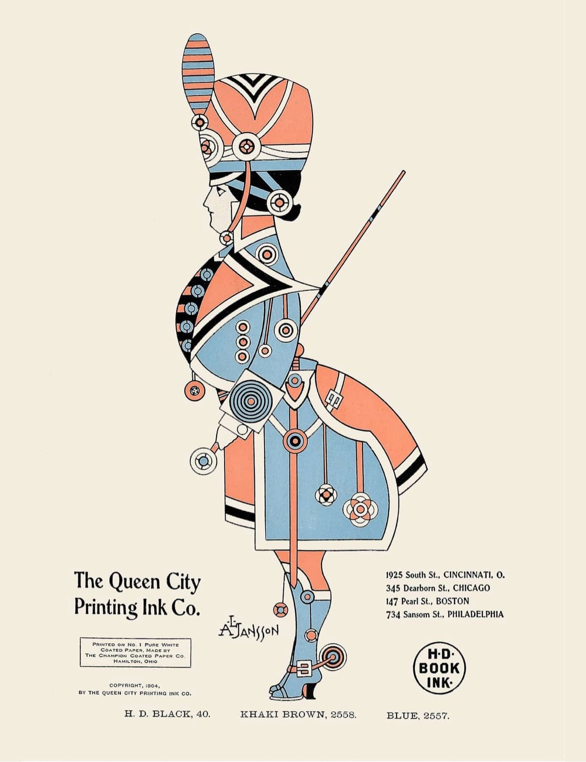
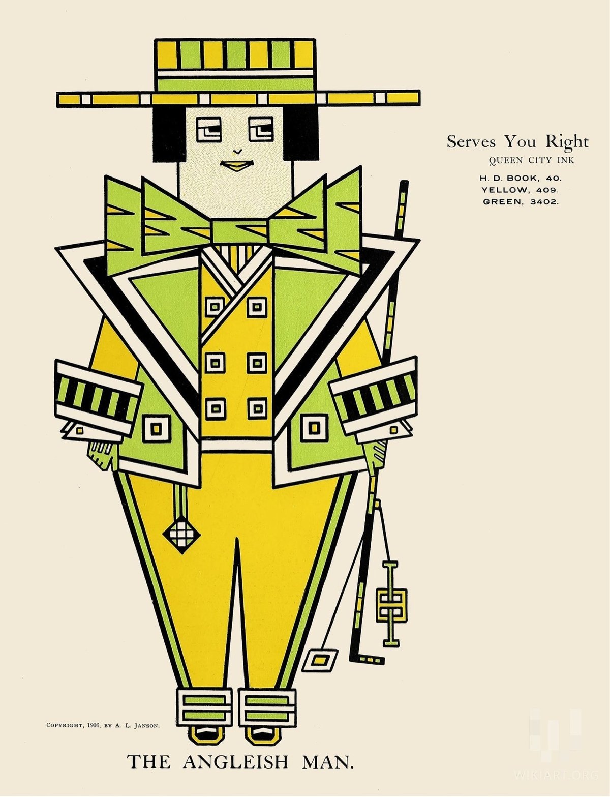
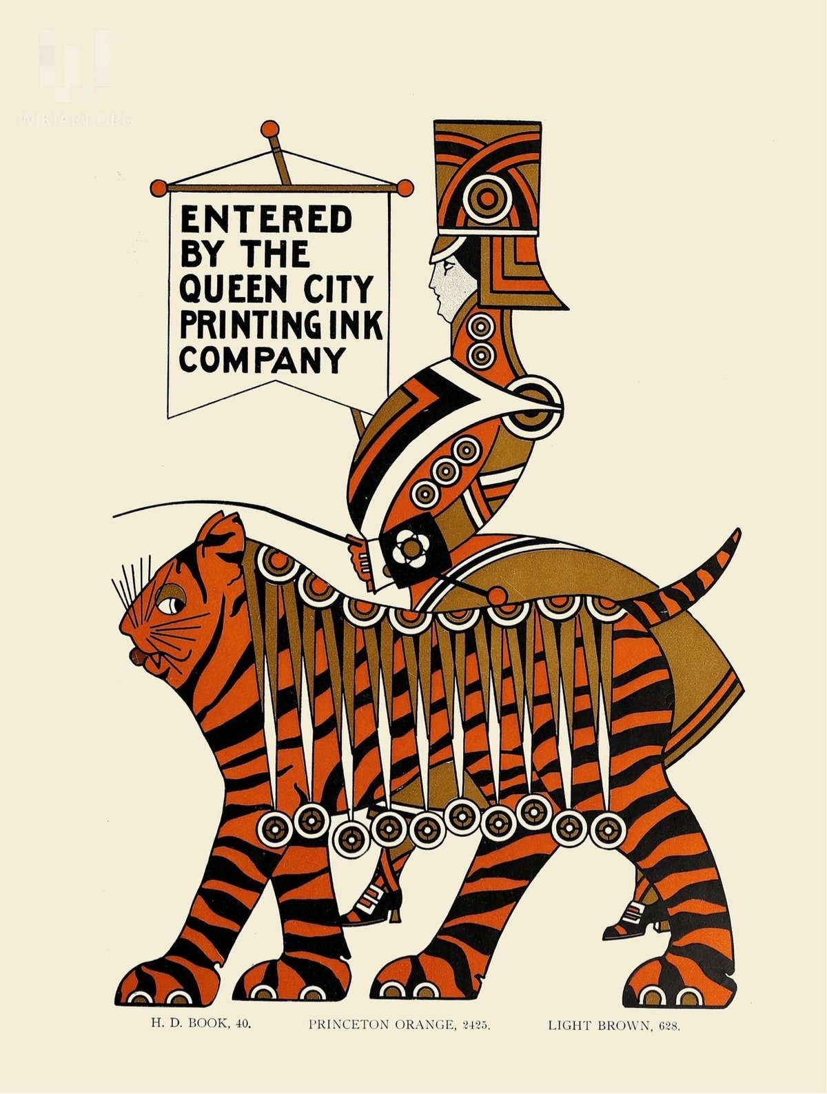
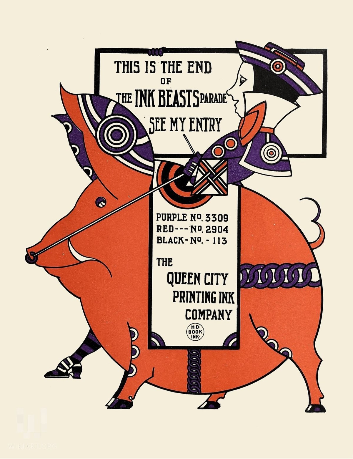
I love the colorful illustrative style of these adverts for the Queen City Printing Ink Company done by Augustus Jansson in the first decade of the 20th century.
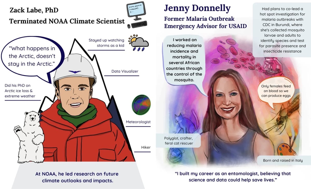
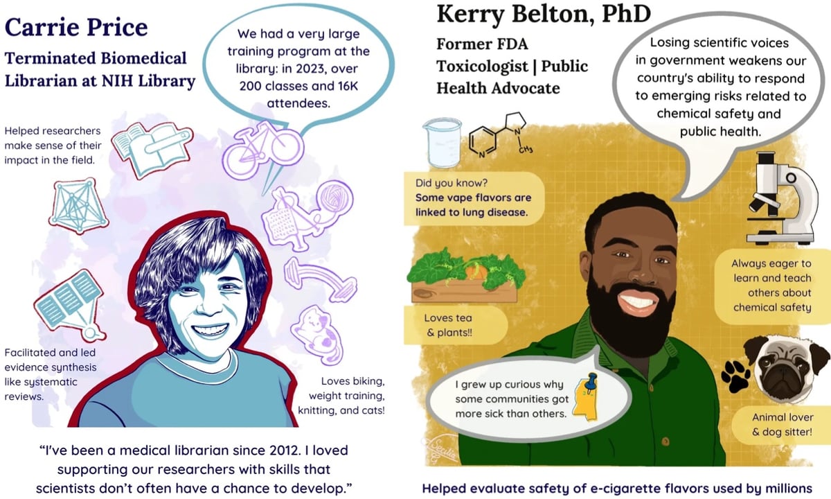
Silenced Science Stories is a collaboration between scientists and artists to tell the stories of scientific experts who have been affected by the Trump regime’s purge of their ranks.
We are organizing an illustrated series of portraits and stories of scientific experts whose work is being affected by federal budget cuts and mass firings.
We have over 30 science artists who are volunteering to create these features to communicate the careers and the important scientific research of federally employed and funded scientists.
If you’d like to get involved, they are looking for both artists and scientists with stories to tell. You can read more about the project in Physics Today. (via jonathan hoefler)


From a 1968 book, a collection of illustrations of regional patterns & designs of the art of Ukrainian pysanky, or egg decorating. From the Center for Russian, East European, & Eurasian Studies at the University of Kansas:
Pysanky are raw eggs that are decorated using an ancient wax-resistance method. The word pysanky comes from the Ukrainian word pysaty (писати), “to write.” Pysanka is the singular and pysanky is the plural. The art of making pysanky is called pysankarstvo (писанкарство).
The designs are “written” in hot wax with a special tool called a kistka (кістка) which has a small funnel attached to hold a small amount of liquid wax. The wax protects the pores of the shell from the dye. The artist, known as a pysankarka (писанкарка) writes parts of the design, dyes the egg one color, and writes more until the end, when all the layers of wax are melted off to reveal the final design.
Pysanky are an ancient art, made in Ukraine and other Slavic countries for centuries. Though many people call them Easter eggs, pysanky were made long before Ukraine adopted Christianity. The ancient symbols were then reinterpreted through the lens of Christianity later on.
From more on the regional patterns of Ukrainian pysanky and some images of actual decorated eggs, check out this page. And for a look at how these intricate patterns are made, here’s a video:
(via present & correct)
80 years ago today, the Nazi death camp at Auschwitz-Birkenau was liberated. An estimated 1.1 million people (Jews, Poles, Russian POWs, Roma) were murdered at Auschwitz-Birkenau between 1940 and 1945, and this date was subsequently chosen by the United Nations as International Holocaust Remembrance Day.
One of the things you can do to mark the day is to join Yad Vashem’s IRemember Wall:
The IRemember Wall is a unique and meaningful opportunity for you to participate in an online commemorative activity marking International Holocaust Remembrance Day.
By joining our IRemember Wall, your name will be randomly matched to the name of a Holocaust victim from our Central Database of Shoah Victims’ Names, and will appear together on the Wall.
You can also choose a specific name to remember and match with on the Wall from our Central Database of Shoah Victims’ Names, which contains over 4.8 million names of Holocaust victims.
As he does every year, illustrator Christoph Niemann drew the person he matched with and shared the story of her life.
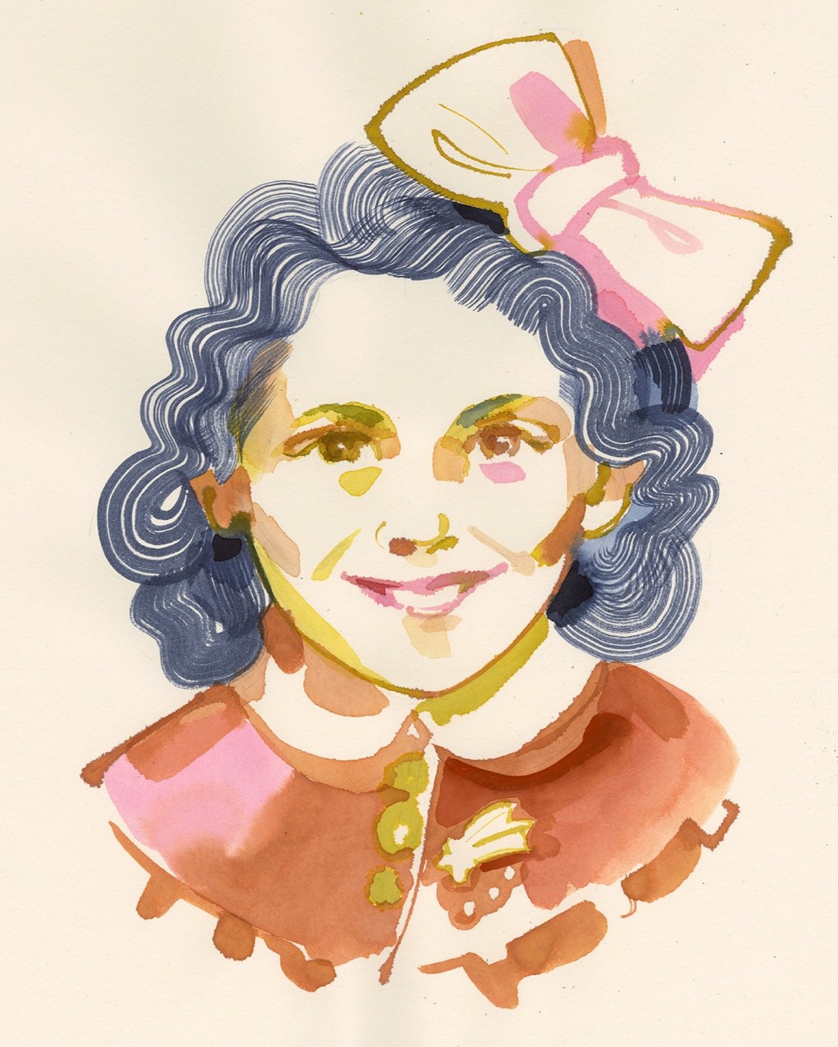
This year I was paired with Astro Cofino. We have very little biographical information: she was born in 1930 in Athens, her parents were called Benoua and Mairy. The first thing that caught my eye when I saw Astro’s photo was a little brooch she’s wearing: it looks like a comet, and I can’t help but thinking that it was meant as a reference to her name? Astro is maybe 11 or 12 in the picture, she smiles, with a tiny hint of giddiness in her eyes.
Here’s Astro’s information from Yad Vashem’s database — she was murdered by the Nazis at Auschwitz when she was 14.
Adam Sharp has curated the most flamboyant ways to tell someone to pound sand in other languages, and it’s delightful. There’s “go ski into a spruce” from Finland, in Brazil you tell someone to “go pick little coconuts,” while in Poland you say “go to the park and paint the ceiling.”
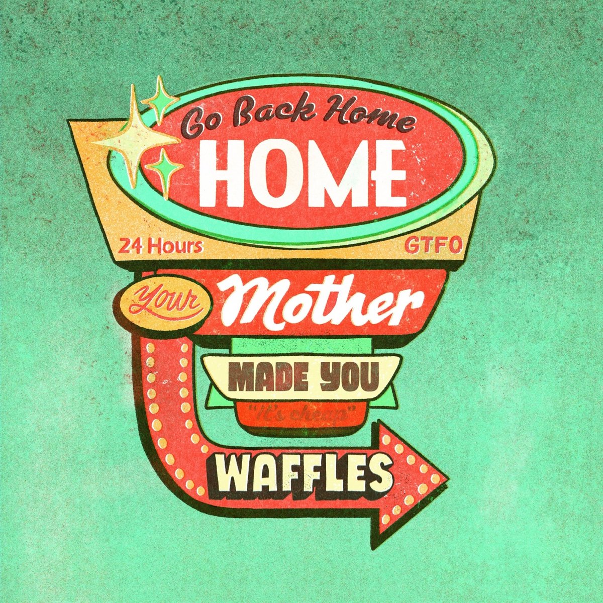
The most devastating in the entire thread, though, is the French saying, “go back home, your mother made you waffles.” If someone said this to me, they would need a dustpan to sweep up the dust of me. If someone said this to me, they’d have to put in the newspaper I wasn’t mad. If someone said this to me, I’d think about the time my 5th grade teacher goaded the entire class to laugh at me because she was wrong about Berlin being on the border between East and West Germany, but I was right! If someone said this to me, all the liquid in my body would heat to one thousand degrees and my skin would melt. If someone said this to me, I’d move away and change my name and miss my family. If someone said this to me, the yellowjackets inside my chest would chew their way out and then sting ME for making them chew through bones. If someone said this to me, all of the songs I’ve heard plus all of the songs I haven’t would play at once inside my brain resulting in a symphony of anguish. If someone said this to me, I would go into debt buying a yacht hoping a gang of orcas wearing dead salmon on their heads would sink it.
Seven benign words on their own collocated into a soul-destroying eviscerator punctuated by a normally pleasant breakfast item. I told the very tall Chris Piasick about this saying and he drew it.
I’m sure there are science or moral reasons I shouldn’t use Jason’s “World’s Best Pancake Recipe” in my waffle maker, but I don’t care, I’ve been doing it for years and the resulting waffles are fabulous.
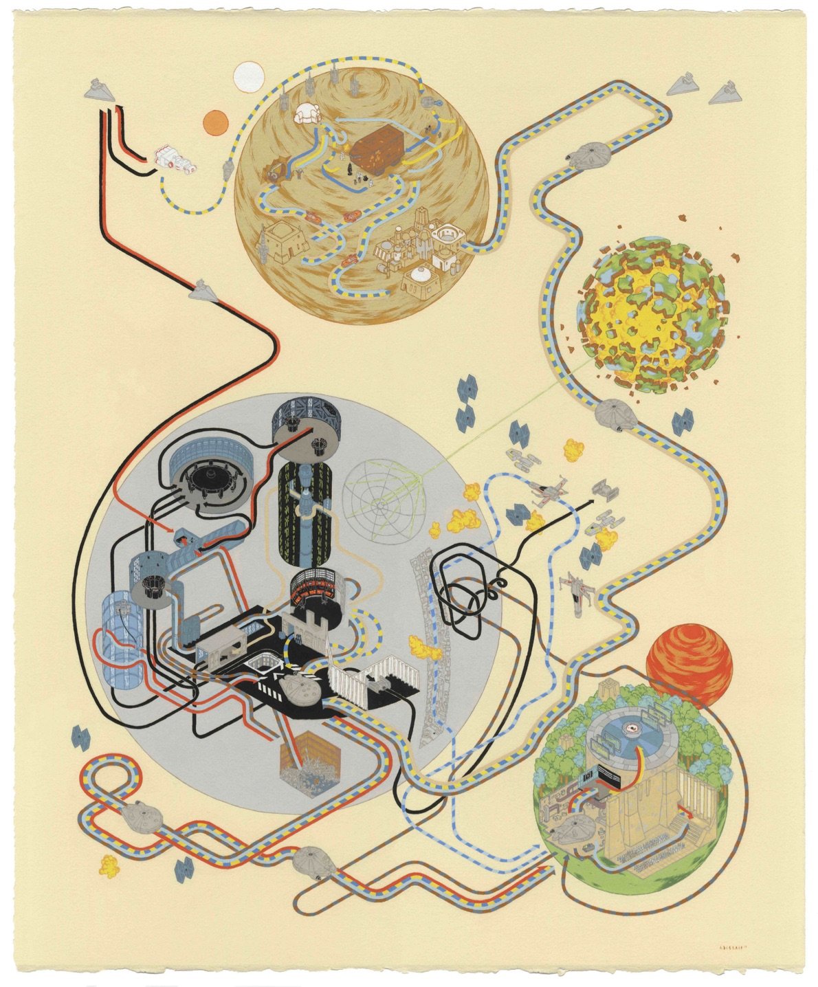
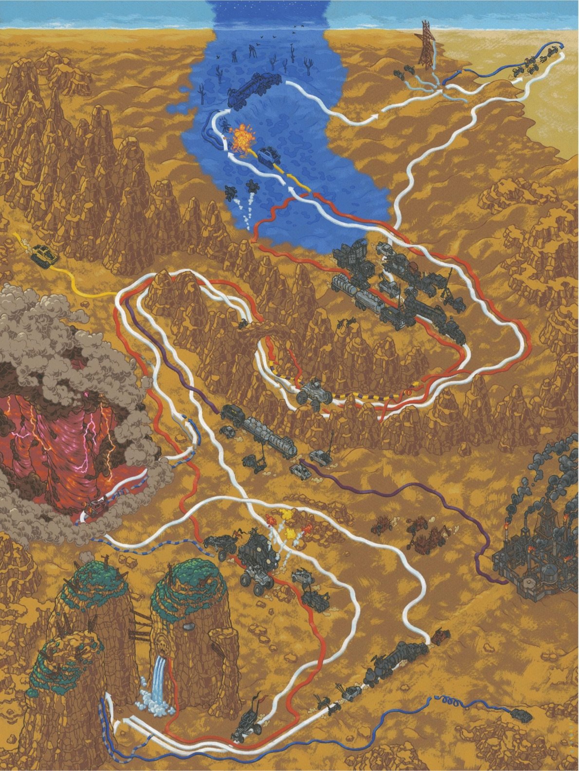
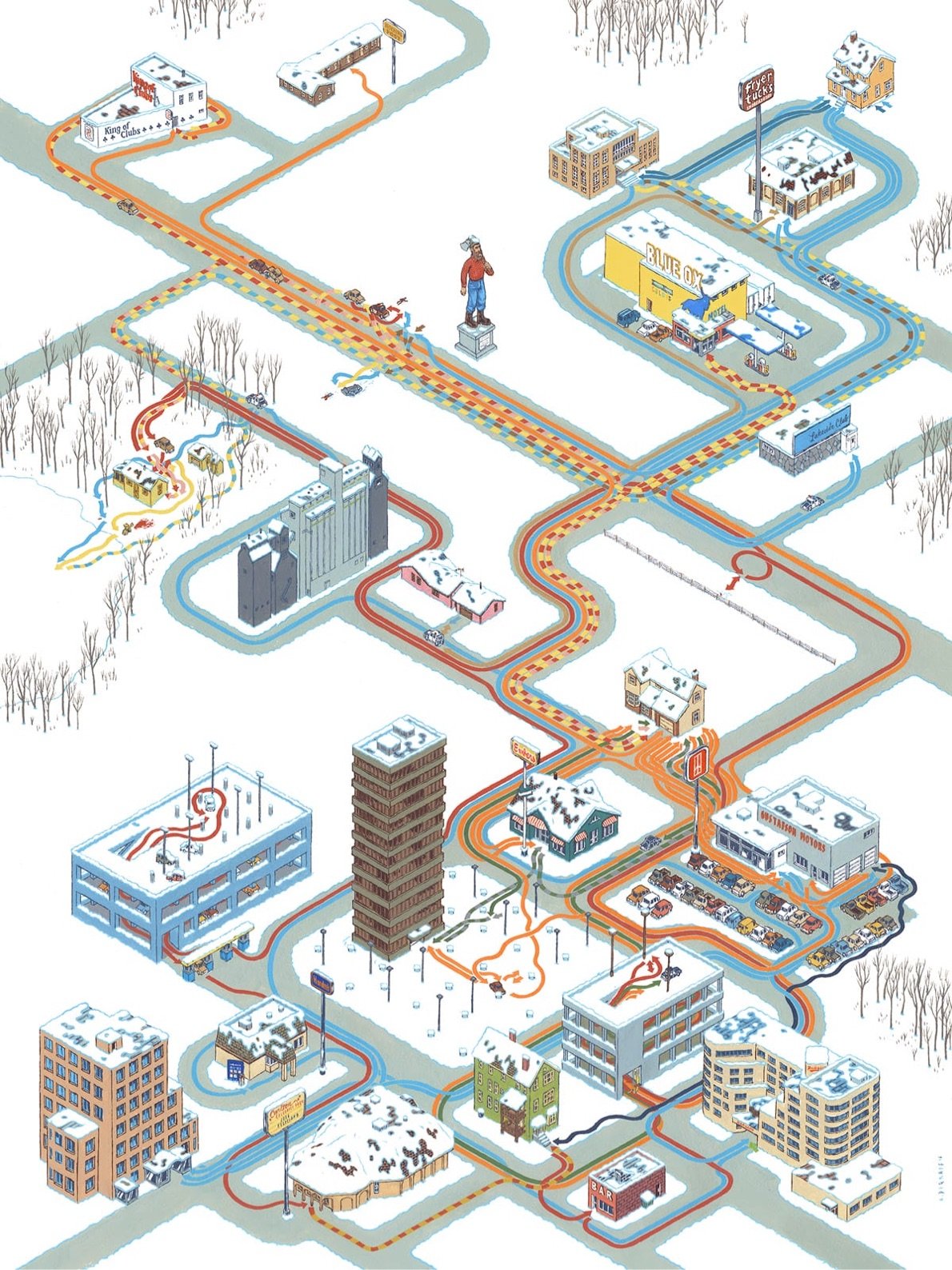
Artist and illustrator Andrew DeGraff makes maps that show where the characters travel during movies — imagine Billy’s trail maps from Family Circus but for films like Back to the Future, The Breakfast Club, Pulp Fiction, and Mad Max: Fury Road.
DeGraff collected these maps into a book called Cinemaps: An Atlas of 35 Great Movies.
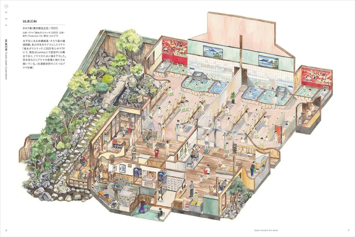
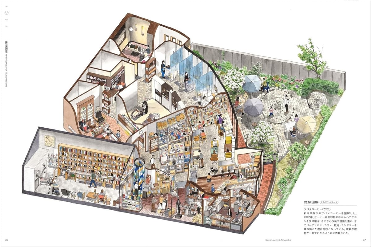
I love these isometric cutaway drawings by Japanese illustrator & architect Enya Honami. From Spoon & Tamago:
Honami is a skilled draughtswoman by trade, having obtained an MFA in architecture and working at a well-known Japanese architecture firm. But the grueling hours and workload eventually weighed on her physical and mental state and she fell ill, which turned out to be a blessing in disguise.
Enya’s doctor advised her to take some time off, and find a place where she can relax and warm her body. That’s how she discovered Kosugiyu, her local sento in Koenji. She quickly fell in love with her local hotbath and not only started working there but also began employing her architectural rendering skills to create illustrations of the space. Soon, others began asking her to draw their hotbaths as well and her clientele expanded from sento and even spread to kissaten.
I haven’t watched too much of the Olympics this summer so maybe the announcers explain this every single time they show a medals ceremony, but in case you didn’t know, the long, thin boxes given to the medalists along with their medals contain the official poster of the Games (and a plushie).

The poster was created by illustrator Ugo Gattoni and is a sort of Where’s Waldo / Busy Busy Town representation of the Games and its venues.
The designer had total creative freedom. While working to a brief and respecting the look of the Games, he still managed to maintain his own playful and joyful style.
This is why eight mascots are hidden within the posters. In fact, whatever age you are, there is something within the artwork that you will be able to enjoy.
The biggest images of the poster I can find are here if you want to zoom in to see the details. There are also zoomed-in images and videos on Gattoni’s Instagram.
The Olympic poster is the twin of the poster for the Paralympic Games, also created by Gattoni:

Together, they create one unified view of the 2024 Summer Games.
If you’d like to buy your own version of the poster, check out the official Olympics store.
This is wonderful: a collection of video clips of Charles Schulz drawing his iconic Peanuts comic strip — “everything I could find of Charles Schulz drawing his Peanuts characters” in the words of the compiler.
Unfortunately, I’m not highly educated. I’m merely a high school graduate. I studied art in a correspondence course because I was afraid to go to art school. I couldn’t see myself sitting in a room where everyone else in the room could draw much better than I and this way I was protected by drawing at home and simply mailing my drawings in and having them criticized.
I wish I had a better education but I think that my entire background made me well-suited for what I do. If I could write better than I can, perhaps I would have tried to become a novelist and I might have become a failure. If I could draw better than I can, I might have tried to become an illustrator or an artist and would have failed there. But my entire being seems to be just right for being a cartoonist.
Charles Schulz: Unbothered. Moisturized. Happy. In his lane. Focused. Flourishing.
See also a 90-minute compilation of cartoonists working (from the same YT channel) and Chuck Jones demonstrating how to draw Bugs Bunny and other characters. (via open culture)
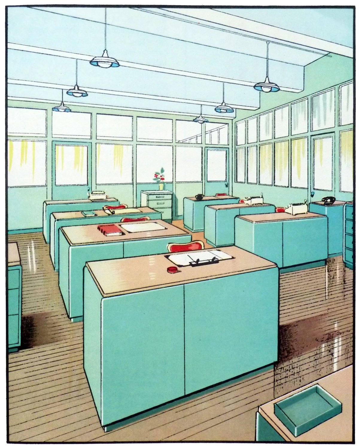
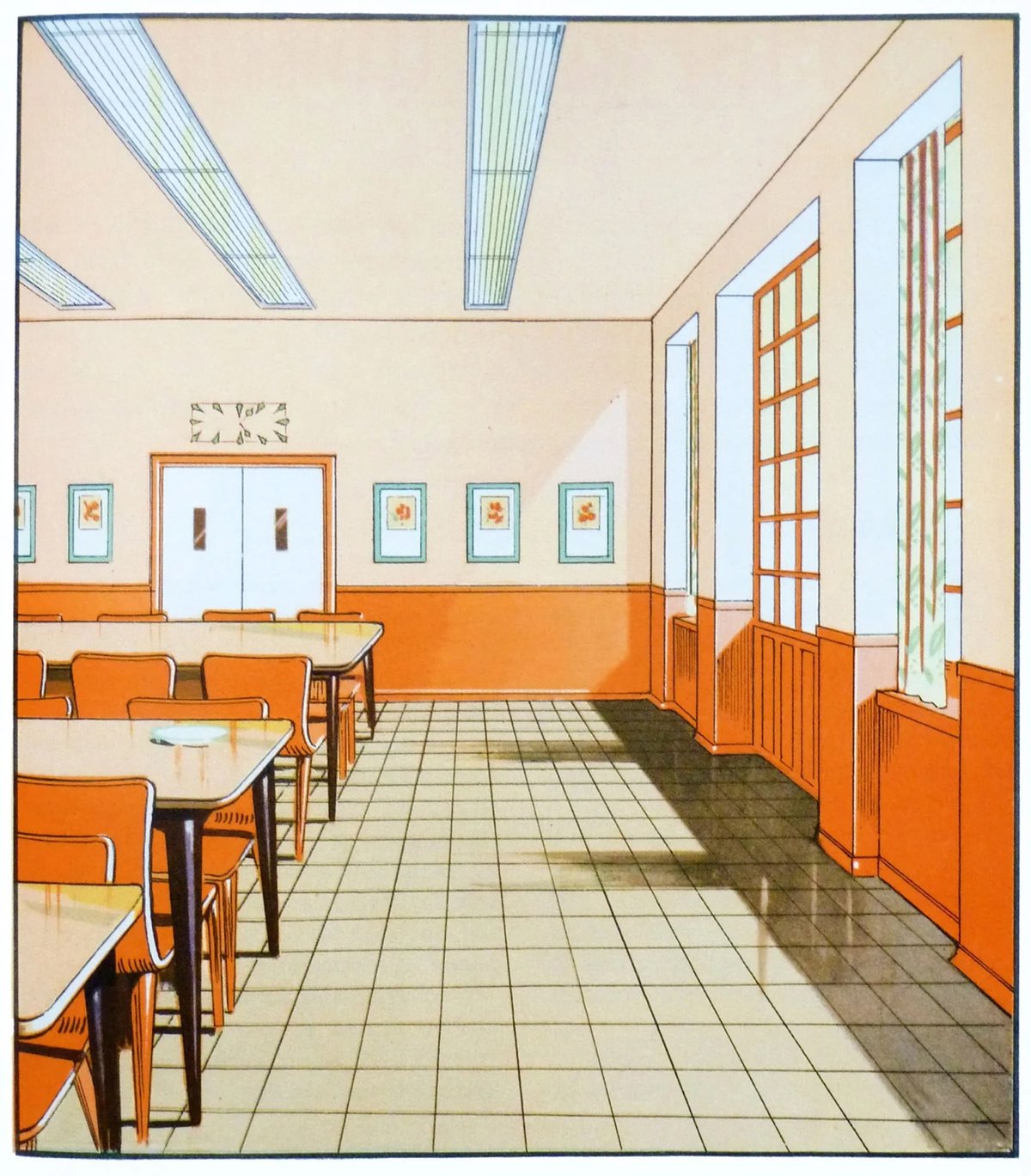
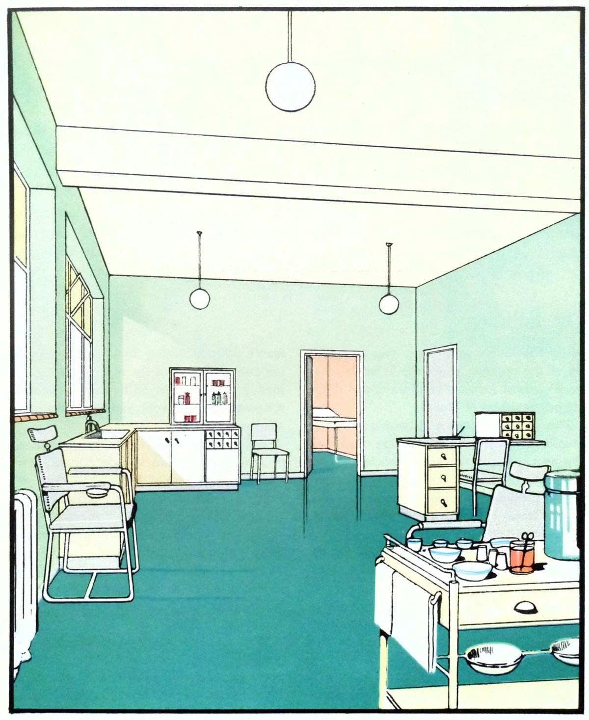
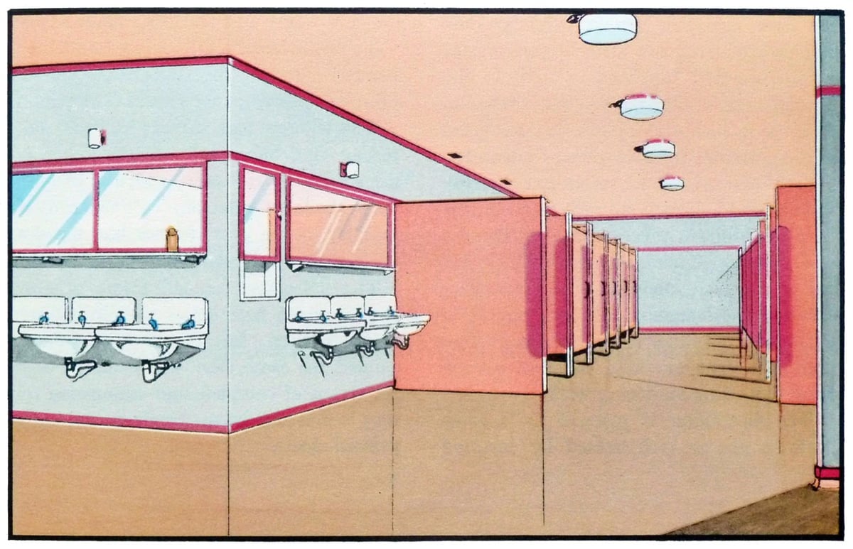
If you’re looking for some color palette inspiration, check out these scans from The Function of Colour in Factories, Schools & Hospitals (1930). Which is presumably a book? Whatever…the precision and colors of these illustrations are marvelous.
Since he was a toddler, artist C.W. Moss has made the artwork for his family’s Christmas card. Here are some early installments from when he was three & seven:
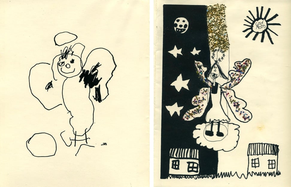
Some from when Moss was 17 and 29:
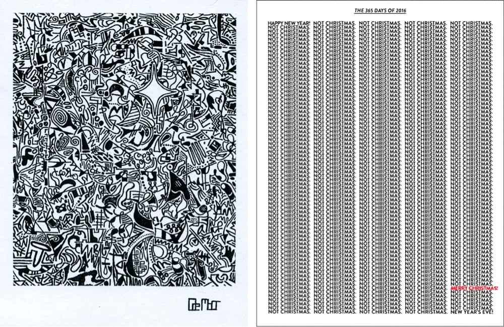
And the most recent one from age 36 (you can watch how he draws it):
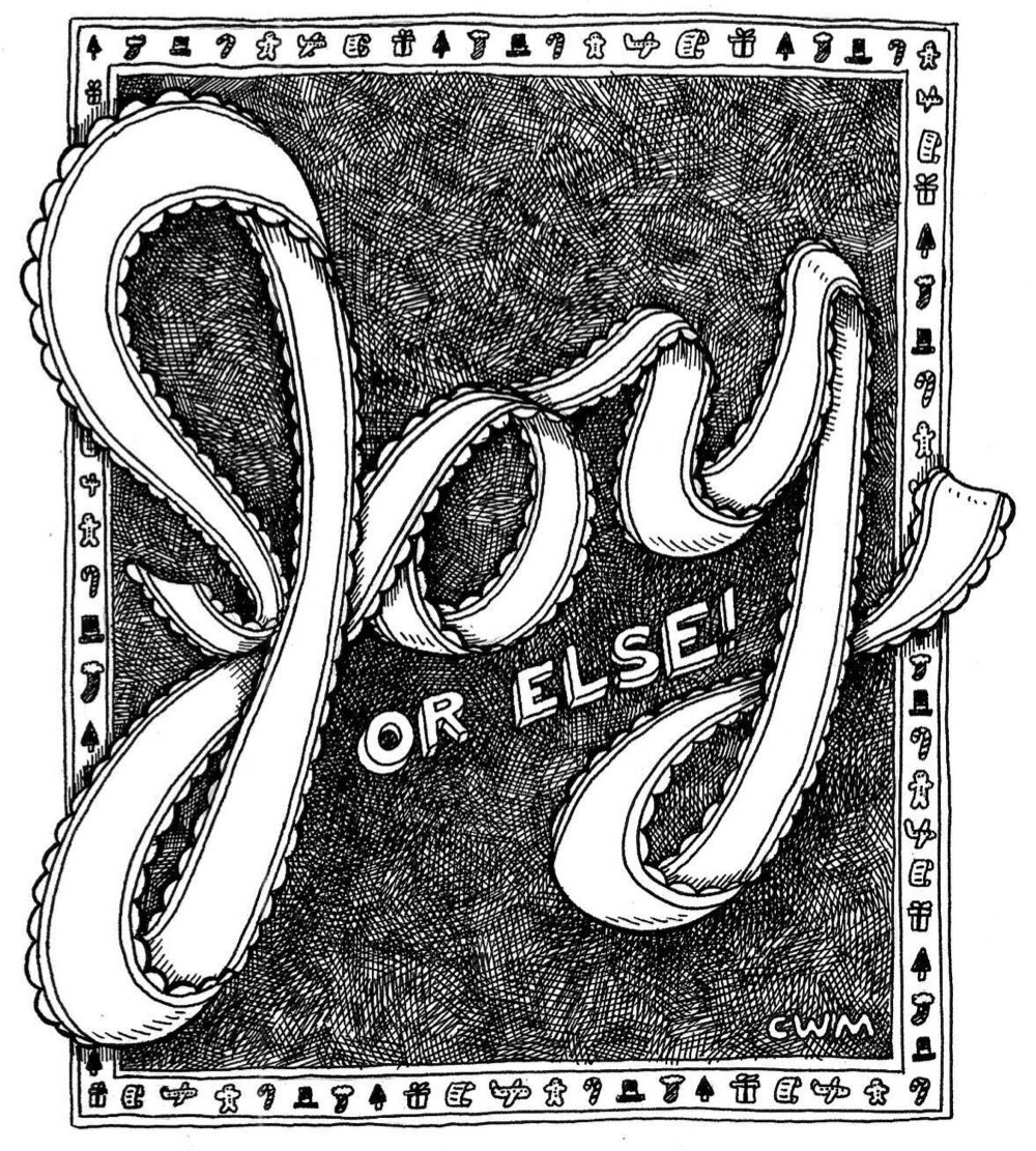
It’s fascinating to see his artistic sense grow and shift over the years, not only increasing in artistic skill as he gets older but also moving from simple depictions of holiday scenes to more conceptual creations.
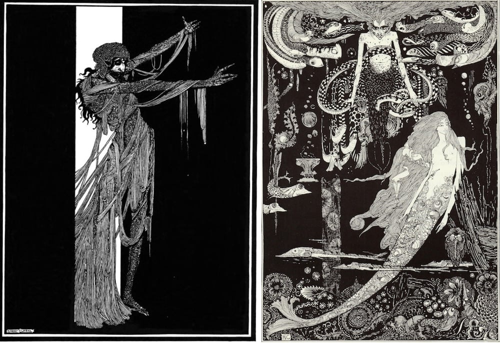
Every so often on Instagram I come across Harry Clarke’s stringy, spooky illustrations for the 1919 Edgar Allan Poe collection Tales of Mystery & Imagination (above left) or the 1925 version of Goethe’s Faust. Poking around led me to this 2016 story in the Public Domain Review: “Harry Clarke’s Looking Glass.” As I learned, he once wrote to a friend that his publisher thought a set of his Faust illustrations were “full of stench and steaming horrors.”
50watts has more great images, and here’s a zoomable version of the “Sea Witch” (above right) from his illustrations for Hans Christian Andersen’s “The Little Mermaid.”
I really enjoyed taking a spin around Felicia Chiao’s Instagram (previously) — it’s chock full of vibrant, expressive and dreamy work. Oh and take a look at her sketchbook tours — and you can buy a reproduction of her 6th sketchbook here (here too).
I’m taken with the style of Jun Kumaori’s illustrations — they look like drawings of (stay with me here) small JPEGs converted to GIFs and then clumsily enlarged, complete with all of the resultant digital artifacts. This makes me nostalgic for the late 90s web and Photoshop 3.0. (via the fox is black)
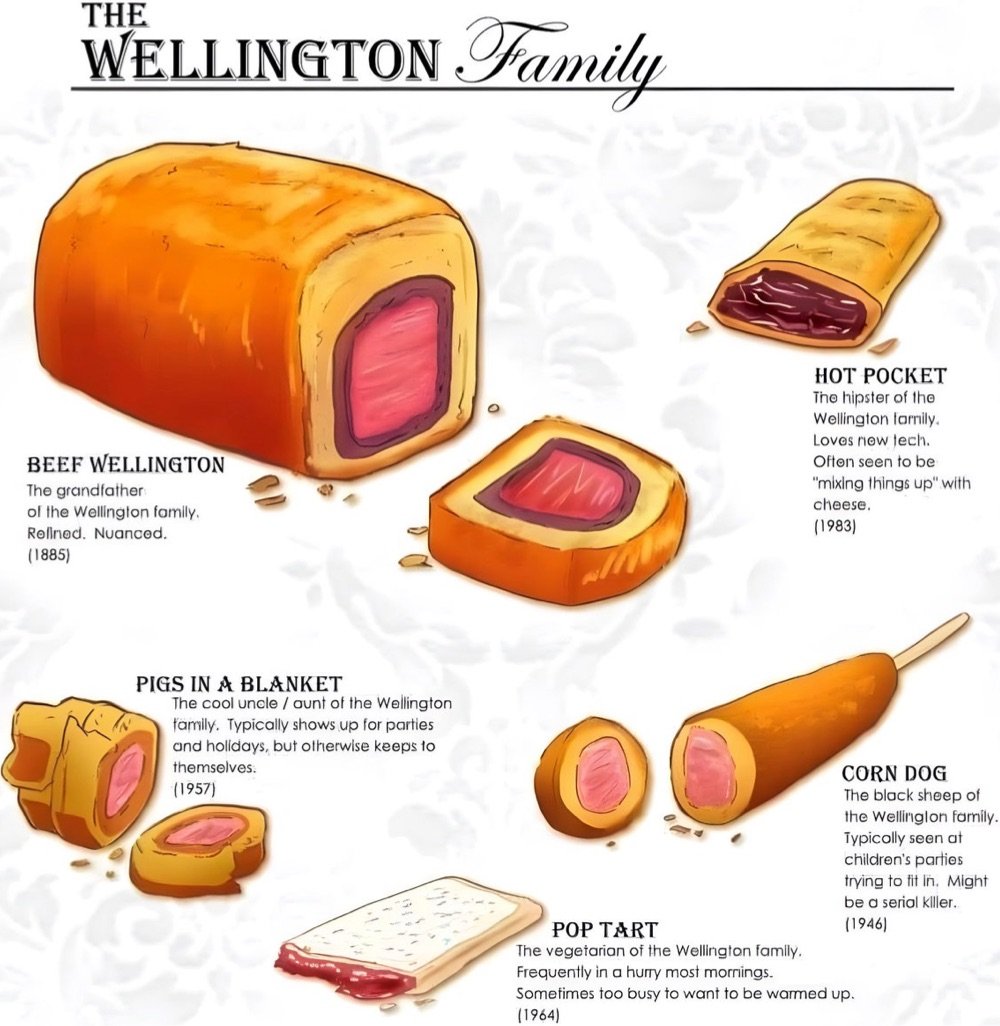
Meet the members of the Wellington Family, foods related in spirit and structure to Beef Wellington: pigs in a blanket, Hot Pockets, corn dogs, and Pop Tarts.
See also The Cube Rule of Food, which suggests that the Wellington Family actually belongs to the larger Calzone Clan but sadly that pigs in a blanket are actually sushi.
P.S. I found this illustration here but couldn’t trace the original source. Happy to give credit is anyone knows where this is from…
Update: The creator of the Wellington Family illustration is Jade Robin of Otter Mage Designs. (thx, ben)

I’m charmed by these ultra-realistic drawings of Japanese maintenance trains by Masami Onishi.
Japanese trains are renowned for their punctuality, comfort and overall reliability. But part of what makes them so reliable is an “unseen” workforce of overnight trains. These trains will be unfamiliar to the everyday rider because they only show themselves after regular service has ended for the day. Working through the wee hours of night and early morning, they perform maintenance work on tracks and electrical wires that ensures a smooth and uninterrupted ride during the day.
My pal Craig Mod recently spotted a “rare and majestic” inspection Shinkansen called Doctor Yellow.
The inspection vehicle is popular among train enthusiasts as a sighting of the train is said to bring good luck since it is so rarely glimpsed.
Gotta love a place that’s so deservedly proud of and enthusiastic about its rail infrastructure.
Update: Great Britain has a maintenance train called the Yellow Banana. (thx, james)
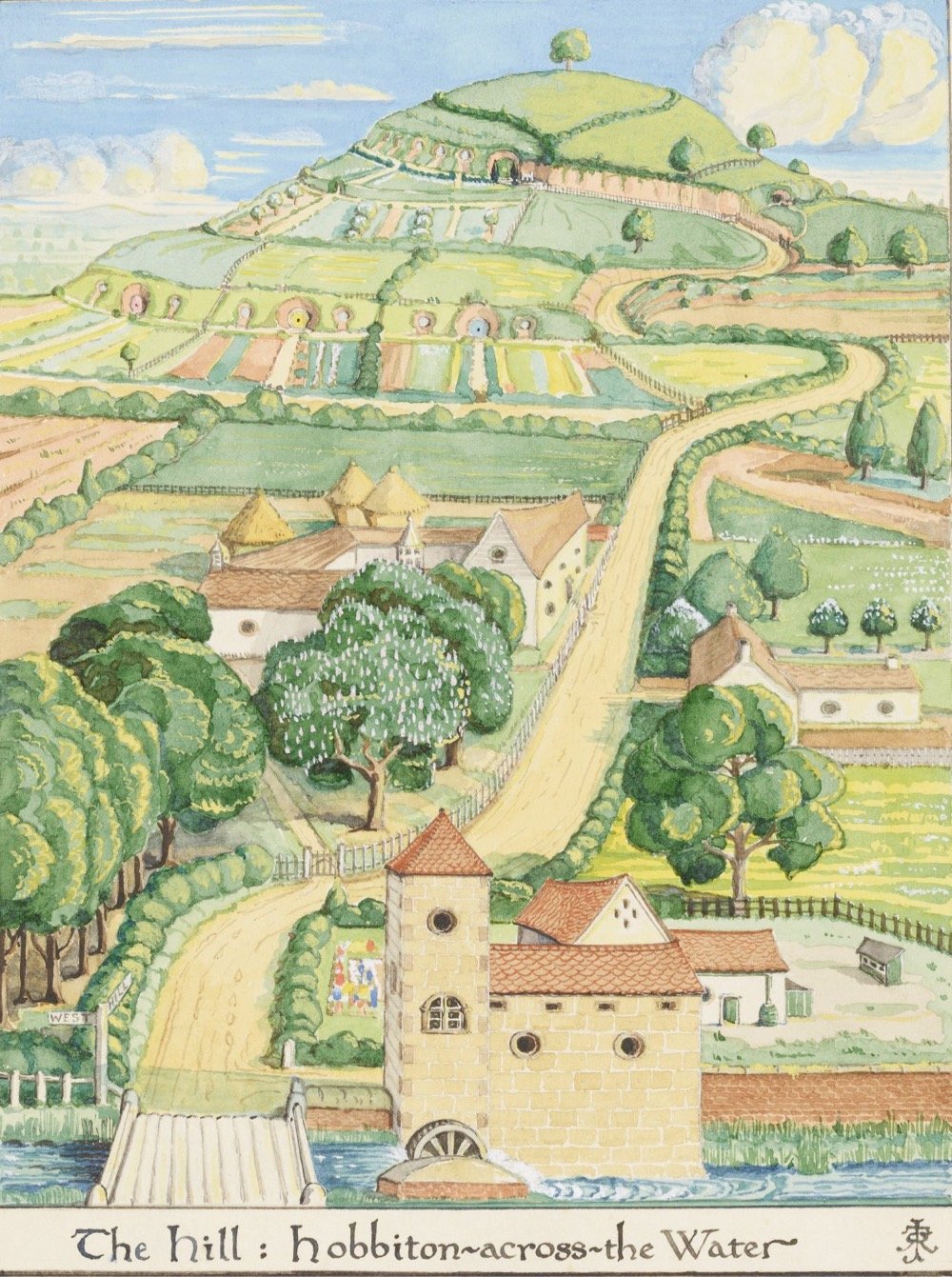
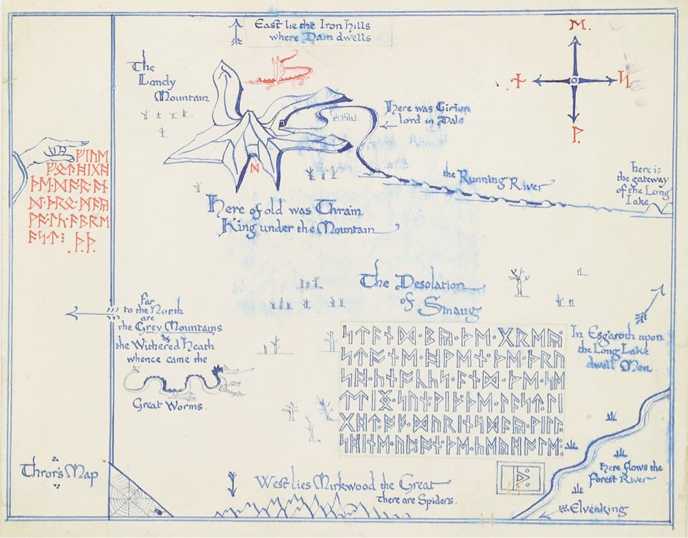
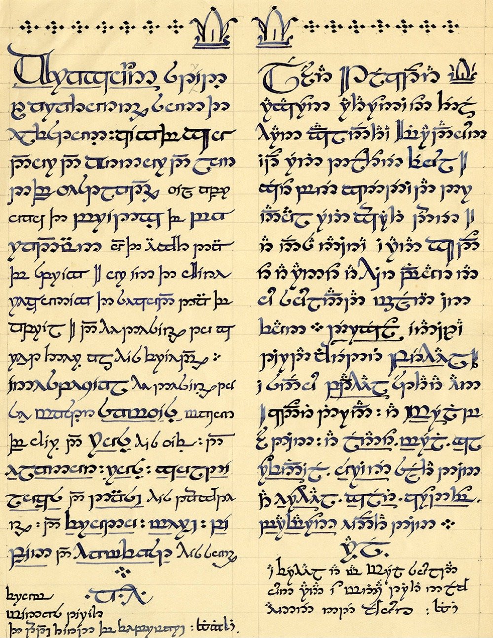
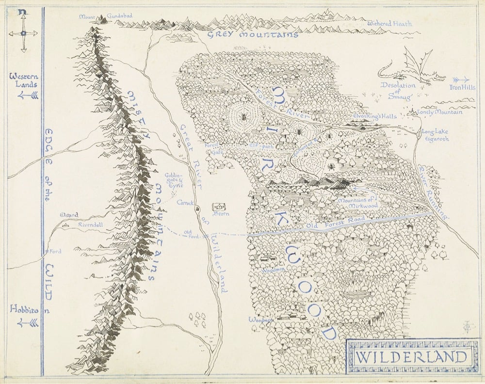
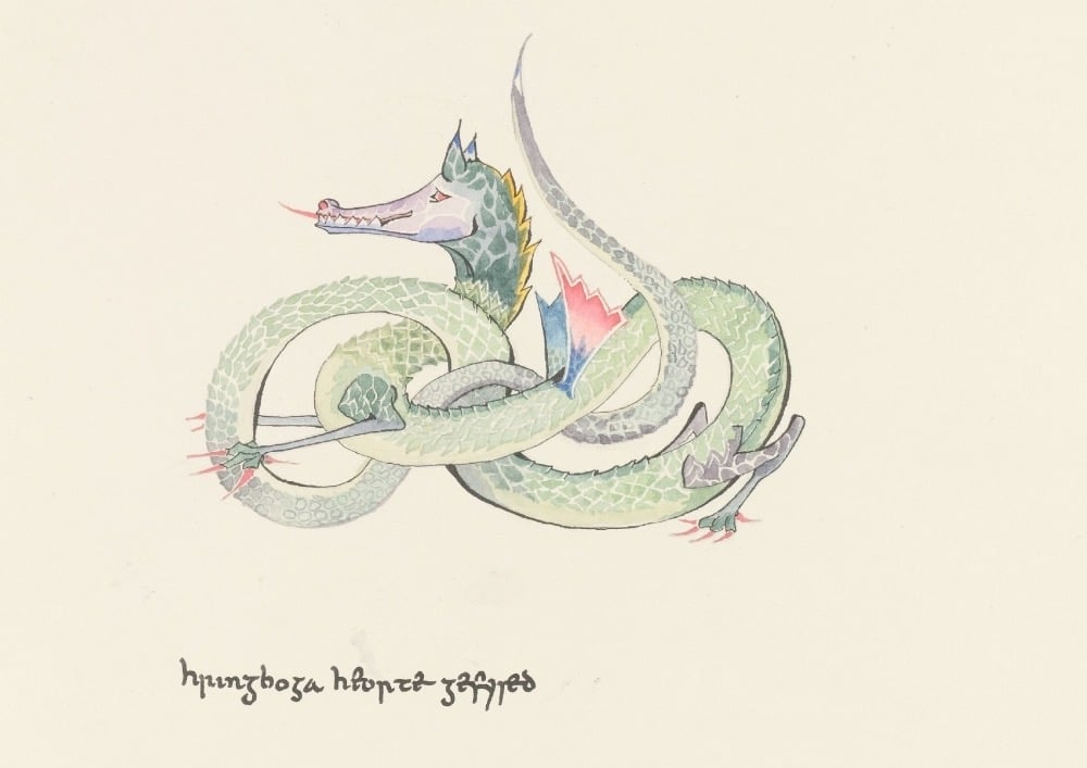
The Tolkien Estate has built a new website dedicated to J.R.R. Tolkien and it includes dozens of hard-drawn maps, illustrations, paintings, and calligraphic works done by the author in the course of writing his books. Tolkien was a talented artist and his maps and visual art were an integral part of his work. From Artnet:
Tolkien’s art and writings went hand and hand, with illustrations serving as an an integral part of his creative process. Sometimes the words would inspire the artwork, and sometimes drawing a scene would move the narrative in new directions.
The author meticulously mapped out the world of Middle Earth to ensure the accurate movements of his large cast of characters.
I was lucky enough to see some of these maps and drawings in person at this 2019 exhibition at the Morgan Library — great stuff. (via @tedgioia)
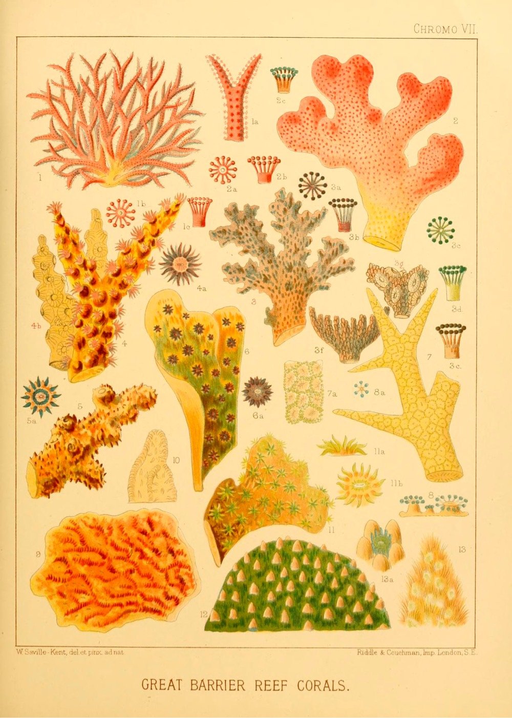
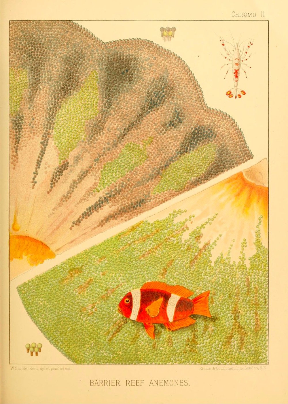
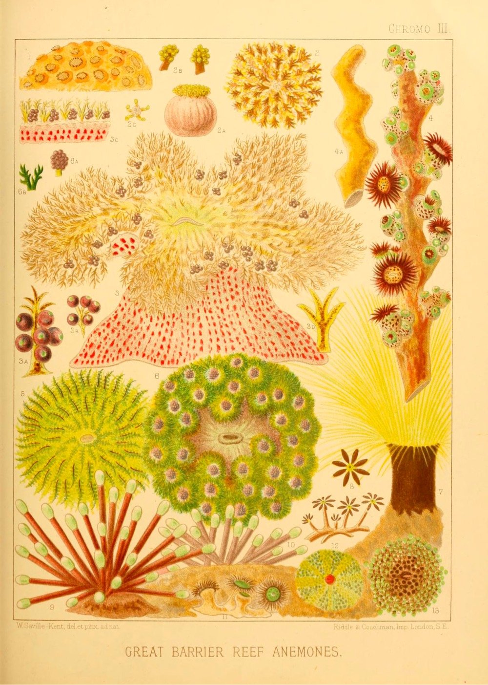
In 1893, English marine biologist William Saville-Kent published his 550-page book, The Great Barrier Reef of Australia: Its Products and Potentialities. Accompanying the text are more than a dozen full-color illustrations of the plants and animals of the reef, drawn from Saville-Kent’s watercolors painted on location. You can peruse the entire book at the Internet Archive or the Biodiversity Heritage Library or take a look at the illustrations at The Marginalian (where prints are also available).
Tomer Hanuka asked his third-year illustration students at SVA to “come up with a post-pandemic New Yorker magazine cover” and posted some of their wonderful & thoughtful work to Twitter. Here are a few that caught my eye:
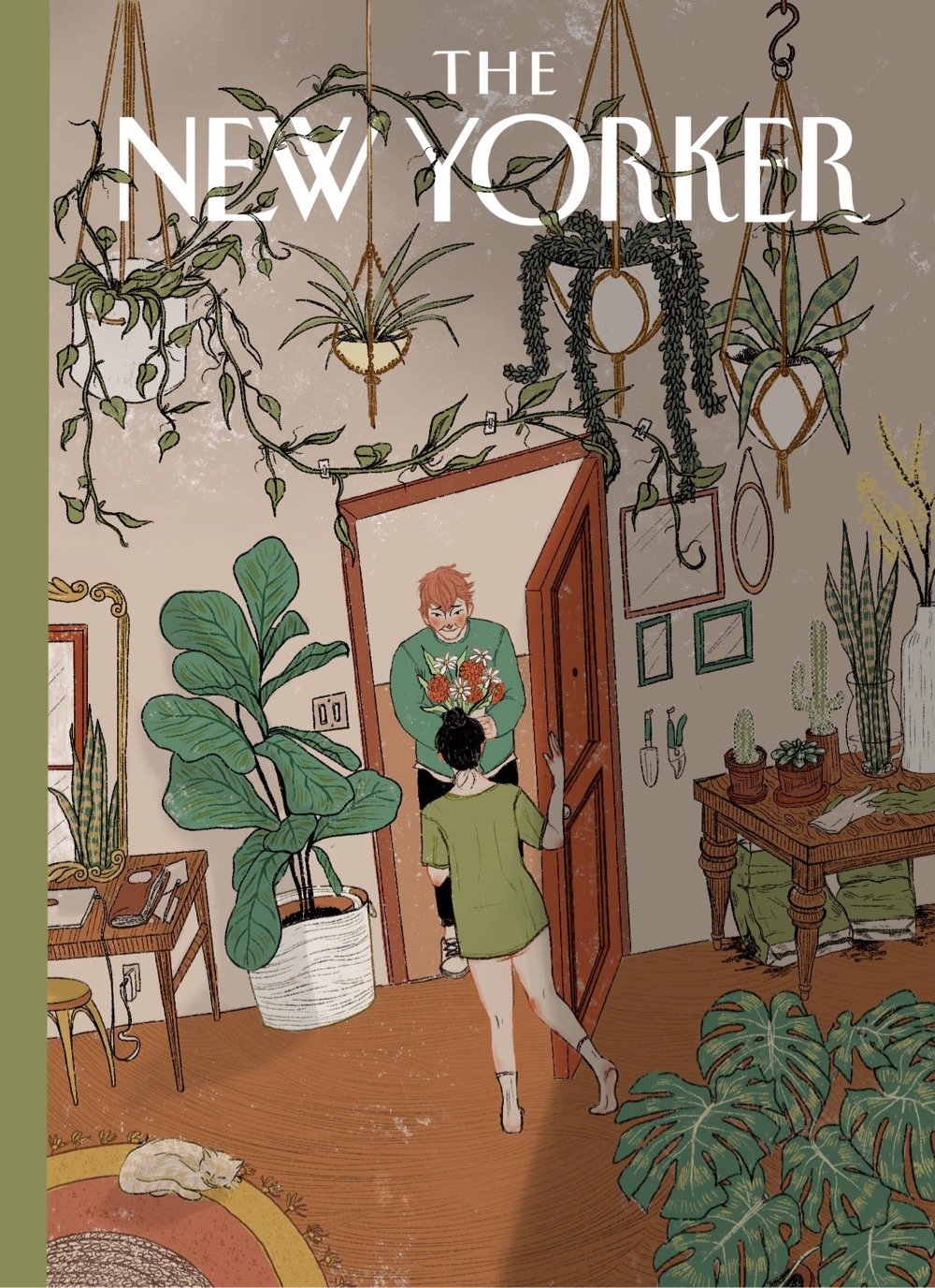
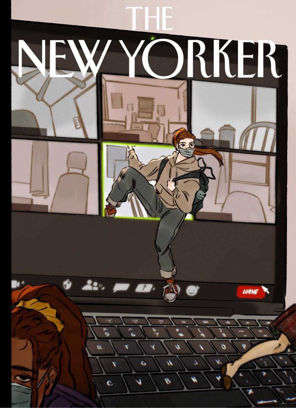
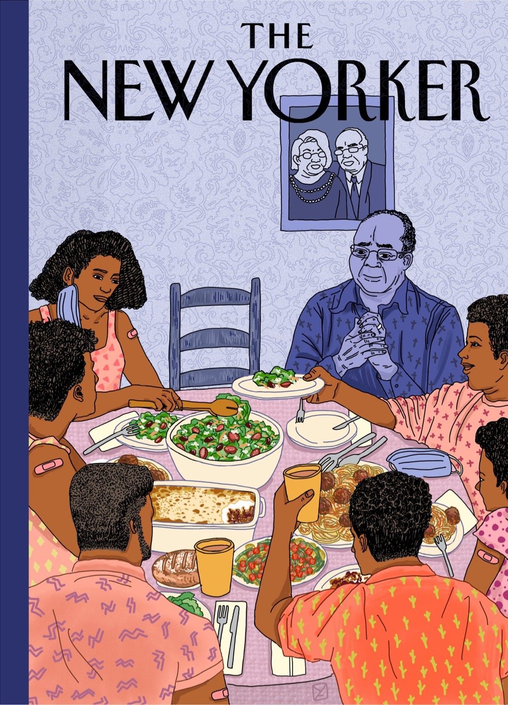
The second cover down, by Katrina Catacutan, is probably my favorite (the body language of the woman answering the door is just perfect) but the last image by Amy Young hit me like a ton of bricks. The New Yorker should run all of these covers for an issue of the magazine in a few weeks — collect them all!
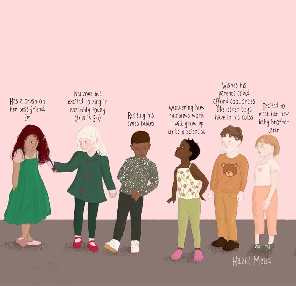
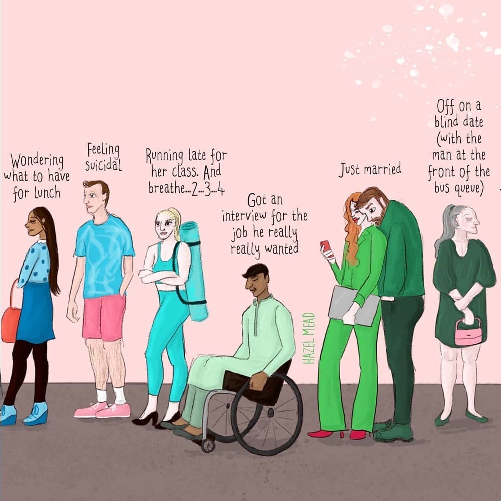
Illustrator Hazel Mead created a pair of pieces called You Don’t Know What’s Going On In People’s Lives: the original version and one featuring children. The images above are snippets from the larger images, both of which are available as prints in Mead’s shop. (via cup of jo)
Update: Several people sent me a link to this video from Cleveland Clinic that is very similar to Mead’s illustrations.
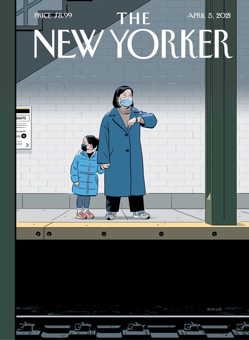
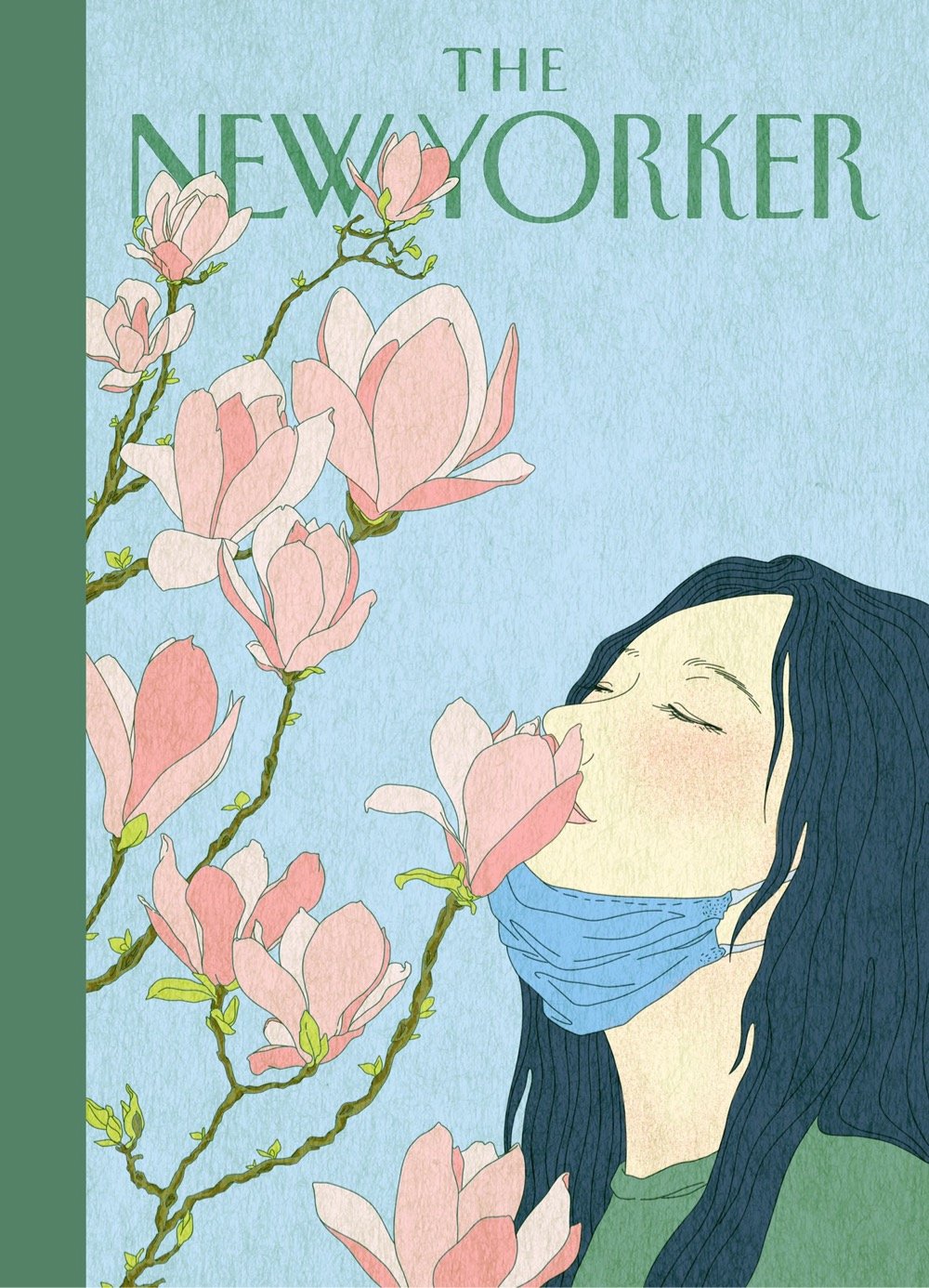
That’s the cover for the April 5, 2021 issue of the New Yorker illustrated by R. Kikuo Johnson.
I began preparing for this project by revisiting news coverage of anti-Asian hate crimes committed during the pandemic. As I absorbed one account after another, they became increasingly difficult to read. So many mothers and grandmothers have been targeted. I imagined my own mom in that situation. I thought about my grandma and my aunt, who have been among my greatest sources of support. The mother in the drawing is made up of all these women.
So simple, so powerful. The way the shoes, eyes, and faces are positioned and angled. On Twitter, Jiayang Fan commented:
I can’t stop staring at this cover. I can’t stop wondering who would come to this mother-daughter pair’s aid if someone attacked them. I can’t stop thinking I was once the daughter and how helpless I still feel to protect my mother.
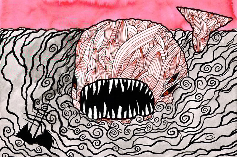
Over a period of a year and a half, Matt Kish created one illustration for each of the 552 pages in the Signet Classic paperback edition of Herman Melville’s novel, Moby-Dick. He then turned those illustrations into a book, Moby-Dick in Pictures: One Drawing for Every Page.
In retrospect, Kish says he feels as foolhardy as Ishmael, the novel’s narrator, and as obsessed as Captain Ahab in his quest for the great white whale. “I see now that the project was an attempt to fully understand this magnificent novel, to walk through every sun-drenched word, to lift up all the hatches and open all the barrels, to smell, taste, hear, and see every seabird, every shark, every sailor, every harpooner, and every whale,” he says. “It was a hard thing, a very painful thing, but the novel now lives inside me in a away it never could have before.”
All of the drawings are still available on Kish’s old Blogspot blog (first entry here) but the best way to see them is to get the book.
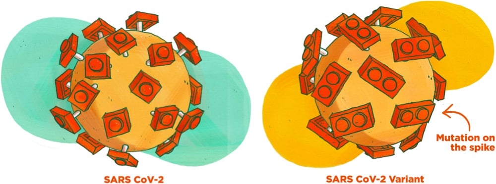
This guide to Covid-19 variants (SARS-CoV-2 viruses that have evolved changes to meaningfully alter their behavior) by Michaeleen Doucleff and Meredith Rizzo at NPR cleverly visualizes how mutations of the virus’s spike proteins help bind it more easily to ACE2 receptors on human cells. The key to the visualization is Meredith Miotke’s illustrations of the viruses using Lego pieces to represent the virus spikes and cell receptors. The usual SARS-CoV-2 has 1x1 Lego pieces that can bind with 1x2 pieces, like so:
But, as everyone who has ever worked with a Lego set knows, a 1x1 piece stuck to a 1x2 piece is not super stable. So when a version of the virus with a 1x2 piece shows up, it’s able to form a better connection to the 1x2 receptor:
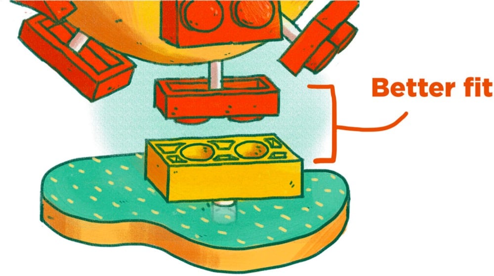
The analogy breaks down if you look too hard at it1 but for many people, it can be a quick way to get the gist of the mechanism at work here. (via @EricTopol)
This is a huge pet peeve of mine when people try to poke holes in analogies: by definition, all analogies break down if you examine them too deeply. An analogy is a comparison of two different things that are similar in significant respects. If they were the same in every respect, it’s not an analogy…you’d just be describing one thing.↩
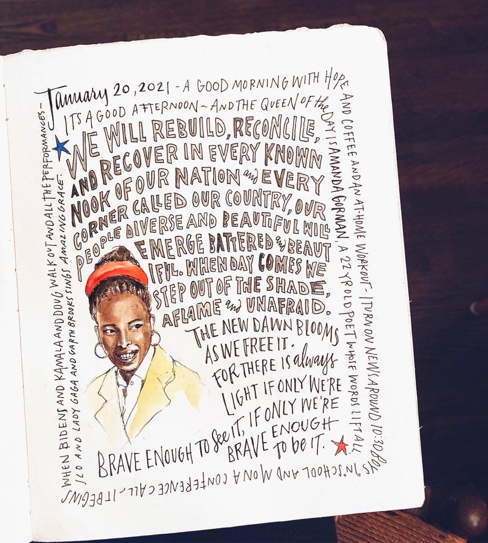
The rhetorical highlight of the Biden/Harris inauguration was Amanda Gorman reciting her poem, The Hill We Climb — I thought it was fantastic. It begins:
When day comes we ask ourselves,
where can we find light in this never-ending shade?
The loss we carry,
a sea we must wade
We’ve braved the belly of the beast
We’ve learned that quiet isn’t always peace
And the norms and notions
of what just is
Isn’t always just-ice
And yet the dawn is ours
before we knew it
Somehow we do it
Somehow we’ve weathered and witnessed
a nation that isn’t broken
but simply unfinished
We the successors of a country and a time
Where a skinny Black girl
descended from slaves and raised by a single mother
can dream of becoming president
only to find herself reciting for one
Here’s a transcript courtesy of CNN. You can read about how Gorman composed the poem in the NY Times:
“I had this huge thing, probably one of the most important things I’ll ever do in my career,” she said in an interview. “It was like, if I try to climb this mountain all at once, I’m just going to pass out.”
Gorman managed to write a few lines a day and was about halfway through the poem on Jan. 6, when pro-Trump rioters stormed into the halls of Congress, some bearing weapons and Confederate flags. She stayed awake late into the night and finished the poem, adding verses about the apocalyptic scene that unfolded at the Capitol that day.
The Times also has a lesson for students about Gorman and her poem. And from NPR:
Gorman is no stranger to having to change her work midstream. Like Biden, who has spoken openly about having stuttered as a child, Gorman grew up with a childhood speech impediment of her own. She had difficulty saying certain letters of the alphabet — the letter R was especially tough — which caused her to have to constantly “self-edit and self-police.”
Her delivery was amazing — powerful and lyrical. Brava!
Update: I included a link to a transcript of the poem above. I also wanted to include this illustration by Samantha Dion Baker because art inspires art.
Update: A book version of Gorman’s inaugural poem will be out in April and is available for preorder.
Nicholas Rougeux has beautifully reproduced & remastered botanical illustrator Elizabeth Twining’s catalog of plants and flowers from 1868, Illustrations of the Natural Orders of Plants. Each of the 160 illustrations is accompanied by explanatory text from the original book and an interactive version of the image (click on the highlighted plant for more info).
Posters based on the illustrations are available and, get this, so are puzzles!
Socials & More