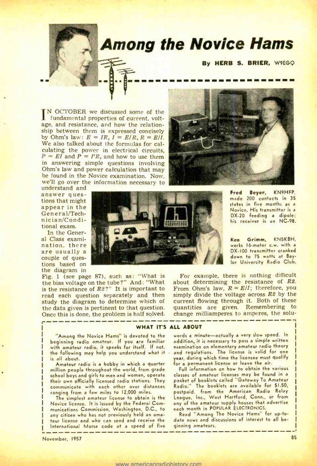
Each issue included original art, poetry and songs that often took aim at the Nazis and their Dutch collaborators. Bloch, writing in both German and Dutch, mocked Nazi propaganda, responded to war news and offered personal perspectives on wartime deprivations.
Each edition consisted of a single copy that was passed around to trusted readers and, incredibly, all 95 copies have survived to the present day.
Each edition of Bloch’s magazine consisted of just a single copy. But it may have been read by as many as 20 to 30 people, Groeneveld estimated.
“There was huge organization behind him, which included couriers, who brought food, but who could also bring the magazine out, to share with other people in the group who could be trusted,” Groeneveld said. “The magazines are very small, you can easily put one in your pocket or hide it in a book. He got them all back. They must have also returned them in some way.”
Wes Anderson’s tenth film, The French Dispatch, is about a fictional magazine published by a group of Americans in France. The movie’s magazine is based on the New Yorker and in advance of its release, Anderson has published an anthology of articles from the actual New Yorker (and other magazines) that inspired the characters in the film. It’s called An Editor’s Burial.
A glimpse of post-war France through the eyes and words of 14 (mostly) expatriate journalists including Mavis Gallant, James Baldwin, A.J. Liebling, S.N. Behrman, Luc Sante, Joseph Mitchell, and Lillian Ross; plus, portraits of their editors William Shawn and New Yorker founder Harold Ross. Together: they invented modern magazine journalism.
Two reasons. One: our movie draws on the work and lives of specific writers. Even though it’s not an adaptation, the inspirations are specific and crucial to it. So I wanted a way to say, “Here’s where it comes from.” I want to announce what it is. This book is almost a great big footnote.
Two: it’s an excuse to do a book that I thought would be really entertaining. These are writers I love and pieces I love. A person who is interested in the movie can read Mavis Gallant’s article about the student protests of 1968 in here and discover there’s much more in it than in the movie. There’s a depth, in part because it’s much longer. It’s different, of course. Movies have their own thing. Frances McDormand’s character, Krementz, comes from Mavis Gallant, but Lillian Ross also gets mixed into that character, too — and, I think, a bit of Frances herself. I once heard her say to a very snooty French waiter, “Kindly leave me my dignity.”
As Morrison then noted, it would be very cool if every movie came with a suggested reading list. The French Dispatch is set for release in the US in late October and An Editor’s Burial will be out September 14 and is available for preorder.
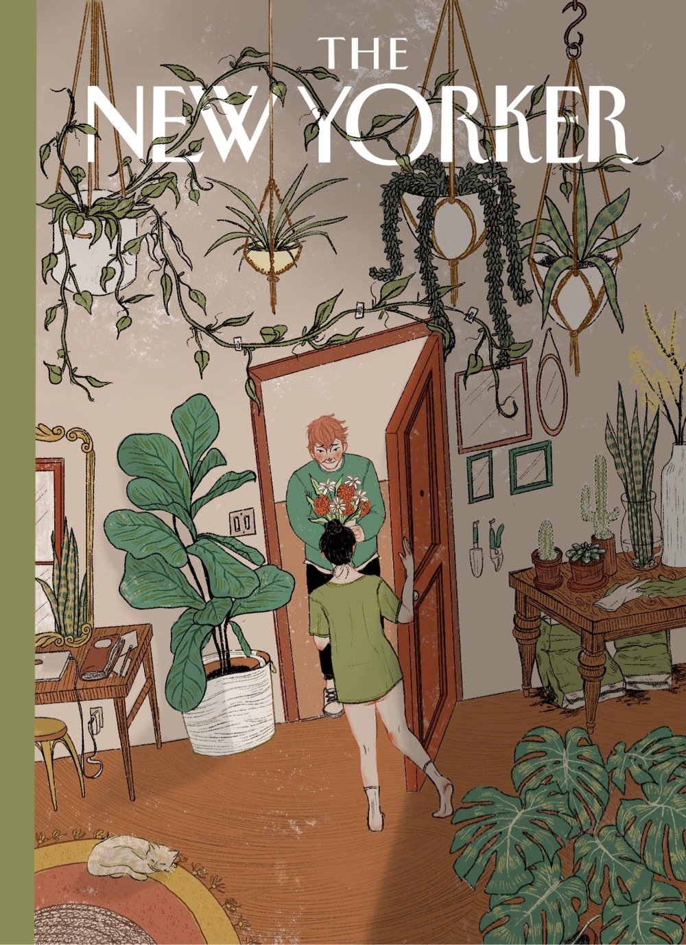
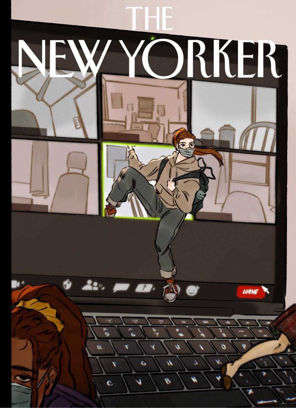
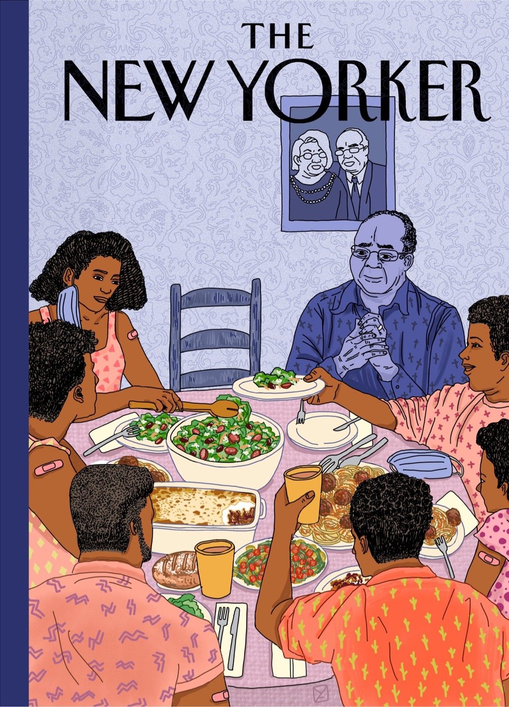
The second cover down, by Katrina Catacutan, is probably my favorite (the body language of the woman answering the door is just perfect) but the last image by Amy Young hit me like a ton of bricks. The New Yorker should run all of these covers for an issue of the magazine in a few weeks — collect them all!
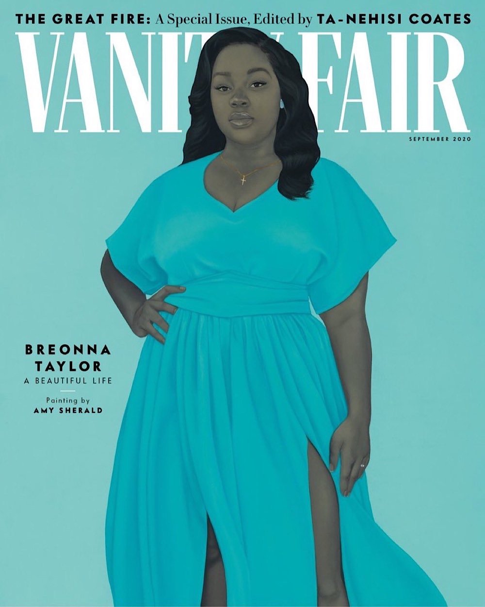
For more than 20 years, Amy Sherald has been putting the narratives of Black families and Black people to canvas. In 2016, she became the first woman and first African American to win the Outwin Boochever Portrait Competition, which led to her painting Michelle Obama for the National Portrait Gallery in 2018. That oil-on-linen portrait was her first commissioned work — until Breonna Taylor.
Taylor is an “American girl, she is a sister, a daughter, and a hard worker. Those are the kinds of people that I am drawn towards,” says Sherald, who is immunosuppressed and has been unable to participate in protests. She calls this portrait a contribution to the “moment and to activism—producing this image keeps Breonna alive forever.”
Sherald’s process typically begins with taking a picture of her subject. Painting Taylor, a person she had never met, who would never be able to sit for her, presented a unique challenge. Sherald took extraordinary care in reimagining Taylor, inflecting her portrait with symbols of the 26-year-old’s life. Sherald found a young woman with similar physical attributes, studied Taylor’s hairstyles and fashion choices, and drew inspiration from things she learned about the young woman — that she had been a frontline worker in the battle against COVID-19; that her boyfriend had been about to propose marriage; that she was self-possessed, brave, loving, loved.
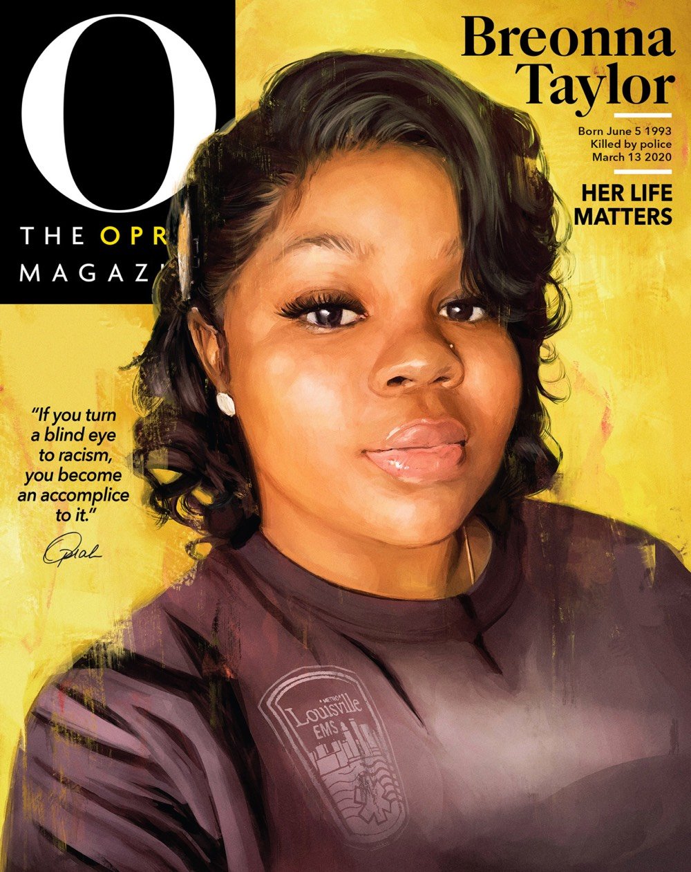
I think about Breonna Taylor often. She was the same age as the two daughter-girls from my school in South Africa who’ve been quarantining with Stedman and me since March. In all their conversations I feel the promise of possibilities.
Their whole lives shine with the light of hopefulness. That was taken away from Breonna in such a horrifying manner.
Imagine if three unidentified men burst into your home while you were sleeping. And your partner fired a gun to protect you. And then mayhem.
What I know for sure: We can’t be silent. We have to use whatever megaphone we have to cry for justice.
And that is why Breonna Taylor is on the cover of O magazine.
I cry for justice in her name.
The illustration of Taylor is by Dallas digital artist Alexis Franklin.
Working as a digital portrait artist, I reimagine an existing image and can quickly switch moods or colors. The original photo is one Breonna took herself and has been featured in the news many times. Looking at it, I see an innocence, simple but powerful. It was critical for me to retain that. And there was a sparkle in Breonna’s eyes-a young Black woman posing in her Louisville EMS shirt, happy to be alive.
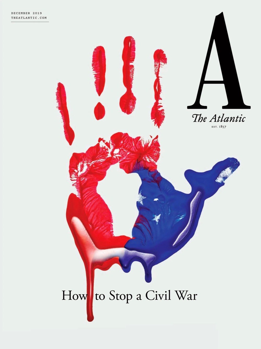
The Atlantic launched a new visual identity the other day, complete with a new logo, custom typeface, updated website, and iOS app. Here’s the first cover carrying the new look:
And more from Mendelsund in this conversation with editor-in-chief Jeffrey Goldberg:
My favorite kind of design is a kind of time-released design, where you look at something and you have an immediate impression of it, and then you, upon further reflection, find something in the design that adds to or subverts that first impression.
Really nice work and methodology behind it. Hearing designers talk about how they approach their work always makes me miss practicing design on a daily basis, a former vocation of mine that seems very very far away these days.
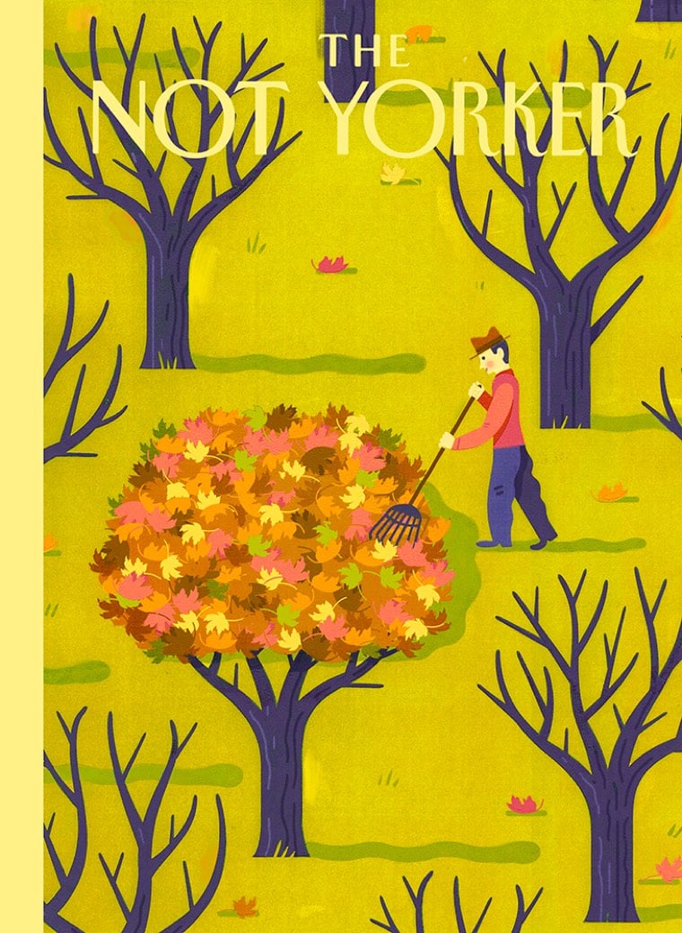
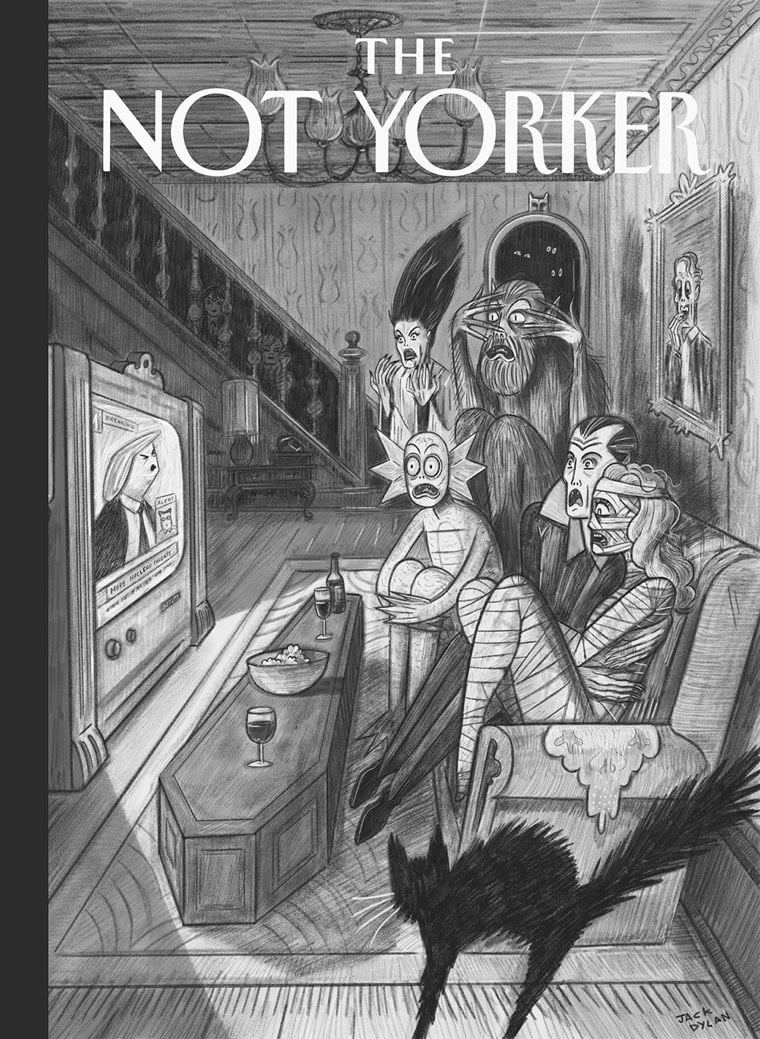
The Not Yorker is a blog collecting cover art rejected by the New Yorker. If you’re an illustrator who’s had a cover rejected, they’re soliciting submissions. (via the morning news)
I used to work at Wired, and later at The Verge, and at both places we had a lot of reverence for “Wired in the 90s.” You’d say it fast like that, too — “wired-in-the-90s” — and it was a universally recognized shorthand for relevance, cool, slick design, smart writers, the “culture of now.” I suspect it probably stands for that for a lot of Kottke readers too.
Yesterday, for reasons unknown, my RSS reader spit up a random Kevin Kelly post from 2012 called “Predicting the Present” that excerpts a bunch of quotes from the early years of Wired. Here are some of them (I tried to pick fun ones):
We as a culture are deeply, hopelessly, insanely in love with gadgetry. And you can’t fight love and win.
— Jaron Lanier, Wired 1.02, May/June 1993, p. 80
The idea of Apple making a $200 anything was ridiculous to me. Apple couldn’t make a $200 blank disk.
— Bill Atkinson, Wired 2.04, Apr 1994, p. 104
Marc Andreessen will tell you with a straight face that he expects Mosaic Communications’s Mosaic to become the world’s standard interface to electronic information.
— Gary Wolf, Wired 2.10, Oct 1994, p. 116
The human spirit is infinitely more complex than anything that we’re going to be able to create in the short run. And if we somehow did create it in the short run, it would mean that we aren’t so complex after all, and that we’ve all been tricking ourselves.
— Douglas Hofstadter, Wired 3.11, Nov 1995, p. 114
Of all the prospects raised by the evolution of digital culture, the most tantalizing is the possibility that technology could fuse with politics to create a more civil society.
— Jon Katz, Wired 5.04, Apr 1997
It is the arrogance of every age to believe that yesterday was calm.
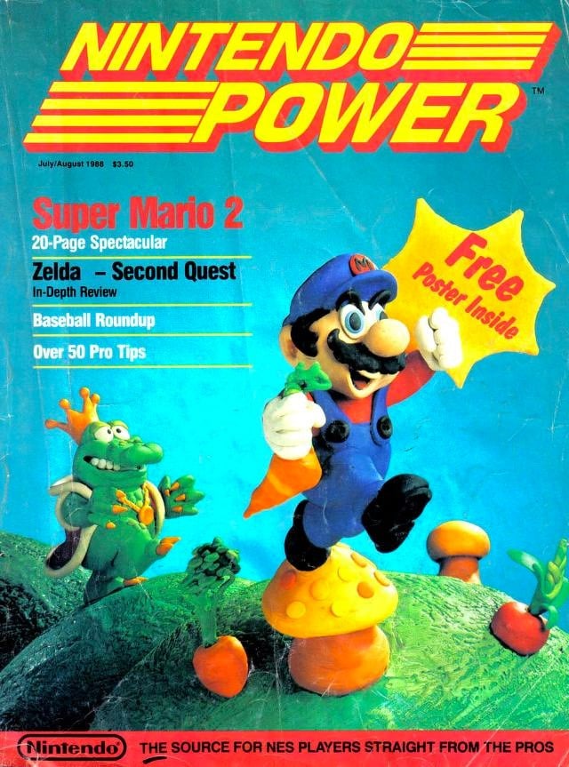
The Internet Archive has collected the first dozen years’ worth of Nintendo Power magazines. I was a subscriber to Nintendo Power for the first couple years, having previously received the Nintendo Fun Club Newsletter. The first issue contained an extensive guide to Super Mario Bros 2, teased a game called Lee Trevino’s Fighting Golf, and the Legend of Zelda was ranked the #1 game, ahead of Mike Tyson’s Punch-Out, Metroid, Super Mario Bros, and Kid Icarus.
The July 1991 issue shows how good Apple co-founder Steve Wozniak was at Game Boy Tetris:
“Evets Kainzow” is “Steve Wozniak” spelled backwards.
Update: Foursquare founder Dennis Crowley made his way into the high score list in the magazine twice in 1990; once for Strider and again for Ninja Gaiden II (alongside Steve Wozniak’s massive GB Tetris score).
Chris Ware, in collaboration with John Kuramoto, Ira Glass, and Nico Muhly, made a moving cover for the latest issue of the New Yorker, both in the sense that it is actually in motion and that the story it tells is touching and makes an impression.
The New Yorker is arguably the primary venue for complex contemporary fiction around, so I often wonder why the cover shouldn’t, at least every once in a while, also give it the old college try? In the past, the editors have generously let me test the patience of the magazine’s readership with experiments in narrative elongation: multiple simultaneous covers, foldouts, and connected comic strips within the issue. This week’s cover, “Mirror,” a collaboration between The New Yorker and the radio program “This American Life,” tries something similar. Earlier in the year, I asked Ira Glass (for whose 2007-2009 Showtime television show my friend John Kuramoto, d.b.a. “Phoobis,” and I did two short cartoons) if he had any audio that might somehow be adapted, not only as a cover but also as an animation that could extend the space and especially the emotion of the usual New Yorker image.
High Times, the magazine for marijuana enthusiasts, has a really, really good softball team. They are called “the Bonghitters,” and are defending their championship in the New York Media Softball League.
The mainstreaming of marijuana has helped High Times thrive despite the downturn in print media… This success translates to stability for the team. Media softball rosters are flexible, a mix of current and former staffers, friends, and friends of friends. There’s occasional grumbling about “ringers,” but usually the only credential you need is an invitation. Still, every team needs a few regular employees. Typically, there’s an employee who schedules games, recruits players, sets lineups, and makes sure somebody brings a bat. Each team also needs a keeper of the park permit; the best fields and time slots are almost impossible to get if it lapses. So staff cuts or overhauls can be catastrophic.
“The New Yorker Minute” is a reader-service email newsletter that triages articles in The New Yorker (the magazine) to let you know whether or not they’re worth reading. (Or, alternatively, how excited you should be to read them or not read them). Each issue is sorted into “Read This,” “Window-Shop These,” and “Skip Without Guilt.” Even the poetry, fiction, and cartoons get short notes from editors dedicated to those sections. Fun, surprisingly useful, nearly essential.
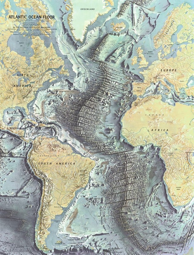
Our family subscribed to National Geographic for awhile when I was a kid. The maps and photos contained within brought this country bumpkin in closer contact with the world at large than even the TV news (which was admittedly all of 13-inches and in B&W to boot).
Via email, Jacobs told Knauss that PAPER believed “they’ve got something that they think will generate at least 100 million page views, and will their current infrastructure support that?”
“This sort of cold thrill goes down my spine,” Knauss said, “and the only thought that makes it out of my brain is, ‘Eep.’”
He continued: “I reflexively begin designing the architecture in my head. It’s a nerd impulse. Dogs chase after thrown balls, system administrators design to arbitrary traffic.”
I love this article for a whole bunch of reasons (including that it’s written by a friend about two other friends, one of whom is responsible for keeping kottke.org’s servers going), but I was just talking about the burstable web scaling issue with a friend the other day. She was trying to make a reservation for a ferry. The reservations open for the entire season on a particular day at a particular hour and in a matter of hours, most (if not all) of the reservations are taken. And of course, their tiny web site and backend systems melts into a huge puddle that day, people can’t get in, and everyone wastes 4 hours of their day trying to make a simple reservation. Basically, the ferry company needs to be Ticketmaster, but only for 3 or 4 hours every year. That’s a weird problem and it’s been an issue on the web since forever, and no one has solved it in an entirely off-the-shelf way. Someone get on this, riches await.
Polaroids were the first social network. You’d take a picture, and someone would say, “I want one, too,” so you’d give it away and take another. People shared Polaroids the way they now share information on social media. Of course, it was more personal, because you were sharing with just one person, not the entire world.
I met Andy Warhol in the ’70s at the Whitney Museum and started doing projects with him because he loved my photographs. He’d never had a pal who was a photographer, so I was his guru, showing him what cameras to buy, what pictures to take. When Polaroid came out with its SX-70 model, the company sent big boxes of film and cameras to the Factory, which was at 860 Broadway (it’s now a Petco). Andy loved Polaroid. Everything was “gee whiz”; it was brand-new. So immediate. I took photos of him with his new toy.
Writer Mary Beth Williams tweeted the following this morning:
No actively competitive female sports figures on SI cover since Olympic gymnast team. July 2012.
Intrigued, I went back through Sports Illustrated’s cover archive and counted the number of covers featuring active female athletes. I only needed one hand:
Pathetic. And ESPN the Magazine isn’t any better…most of the female athletes on their covers over the past five years are naked. Well, except for this one of the incredibly talented skier Lindsey Vonn with her face photoshopped onto Sharon Stone’s body in the leg uncrossing scene from Basic Instinct.
As Williams notes on Twitter, Sports Illustrated “could show women as more than bikinis. As athletes.” and “I want my daughters to read sports magazines & see themselves represented, not Barbie.” Seems like we need a Title IX for sports magazines.
Update: Vonn’s face was not photoshopped onto Stone’s body. Which is…better, I guess? Maybe?
Publication design is a field addicted to ceaseless reinvention. Sometimes a magazine’s redesign is generated by a change in editorial direction. More often, the motivation is commercial: the publisher needs to get the attention of fickle ad agency media buyers, and a new format — usually characterized as ever more “scannable” and “reader-friendly” — is just the thing. In contrast, one senses that each of the changes in The New Yorker was arrived at almost grudgingly. Designers are used to lecturing timid clients that change requires bravery. But after a certain point — 80 years? — not changing begins to seem like the bravest thing of all.
The New Yorker’s design changes over the years have been so slight that, as Bierut notes, the latest issue looks remarkably like the first issue from 1925.
Lantern is a search engine for the books, periodicals, and catalogs contained in the Media History Digital Library. If you are a fan or student of pre-1970s American film and broadcasting, this looks like a goldmine. Here are some of the periodical titles and the years available:
Variety 1905-1926
Photoplay 1914-1943
Movie Classic 1931-1937
Home Movies and Home Talkies 1932-1934
Talking Machine World 1921-1928
So how do we find content for these magazines? It’s a question we wracked our brains on long and hard before deciding that the most valuable service for our readers would be to craft issues around individual subjects — think barbecue, pizza, or pies — by combining the most popular recipes and features in our archives into single, elegant collections.
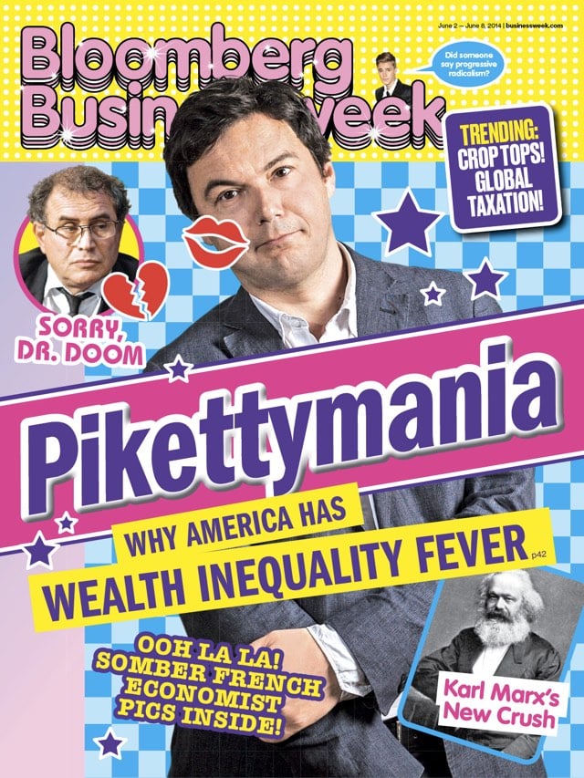
But we have chosen to recognise an in-house design team which has had an enormous impact on its industry. Under creative director Richard Turley, (not forgetting editor Josh Tyrangiel) Bloomberg Businessweek has trounced its rivals with a verve and energy that recalls the heyday of the printed magazine.
Not a surprise really, but the New Yorker’s endorsement of Obama for President is a clear headed assessment of his first term and an effect critique against the “increasingly reactionary and rigid” Republican Party which Romney, to his discredit, has aligned himself with.
Perhaps inevitably, the President has disappointed some of his most ardent supporters. Part of their disappointment is a reflection of the fantastical expectations that attached to him. Some, quite reasonably, are disappointed in his policy failures (on Guantánamo, climate change, and gun control); others question the morality of the persistent use of predator drones. And, of course, 2012 offers nothing like the ecstasy of taking part in a historical advance: the reëlection of the first African-American President does not inspire the same level of communal pride. But the reëlection of a President who has been progressive, competent, rational, decent, and, at times, visionary is a serious matter. The President has achieved a run of ambitious legislative, social, and foreign-policy successes that relieved a large measure of the human suffering and national shame inflicted by the Bush Administration. Obama has renewed the honor of the office he holds.
This paragraph is terrifying:
In pursuit of swing voters, Romney and Ryan have sought to tamp down, and keep vague, the extremism of their economic and social commitments. But their signals to the Republican base and to the Tea Party are easily read: whatever was accomplished under Obama will be reversed or stifled. Bill Clinton has rightly pointed out that most Presidents set about fulfilling their campaign promises. Romney, despite his pose of chiselled equanimity, has pledged to ravage the safety net, oppose progress on marriage equality, ignore all warnings of ecological disaster, dismantle health-care reform, and appoint right-wing judges to the courts. Four of the nine Supreme Court Justices are in their seventies; a Romney Administration may well have a chance to replace two of the more liberal incumbents, and Romney’s adviser in judicial affairs is the embittered far-right judge and legal scholar Robert Bork. The rightward drift of a court led by Justices Roberts, Scalia, Thomas, and Alito — a drift marked by appalling decisions like Citizens United — would only intensify during a Romney Presidency. The consolidation of a hard-right majority would be a mortal threat to the ability of women to make their own decisions about contraception and pregnancy, the ability of institutions to alleviate the baneful legacies of past oppression and present prejudice, and the ability of American democracy to insulate itself from the corrupt domination of unlimited, anonymous money. Romney has pronounced himself “severely conservative.” There is every reason to believe him.
Howler is a new magazine about soccer. It’s a big, glossy publication that will come out four times a year with distinctive, original writing about American and international soccer, as well as some of the most striking art and design you’ll find in any publication being made today. (We know that’s a bold claim, but we really believe it’s true.) We’ve been working on Howler for months, and issue one is nearly ready to be printed, shipped, and in your hands by late summer.
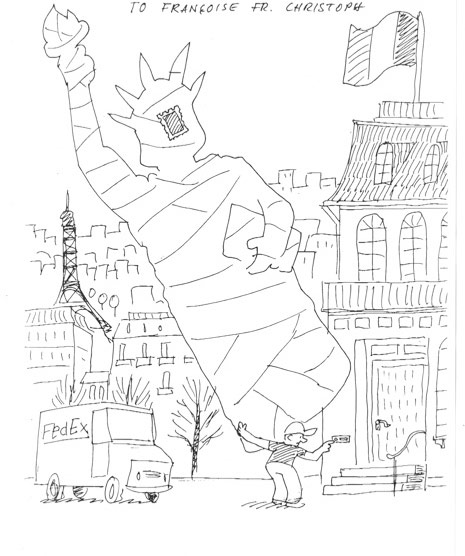
Blown Covers is a new book that details the illustrations that never made it to the front cover of the New Yorker. At Imprint, Michael Silverberg interviews Françoise Mouly, the book’s author and the New Yorker’s art editor since 1993, and shares some of best rejected covers. I like this one by Christoph Niemann showing the attempted return of the Statue of Liberty to France:
“Think of me as your priest,” she told one of them. Mouly, who cofounded the avant-garde comics anthology RAW with her husband, Art Spiegelman, asks the artists she works with — Barry Blitt, Christoph Niemann, Ana Juan, R. Crumb — not to hold back anything in their cover sketches. If that means the occasional pedophilia gag or Holocaust joke finds its way to her desk, she’s fine with that. Tasteless humor and failed setups are an essential part of the process. “Sometimes something is too provocative or too sexist or too racist,” Mouly says, “but it will inspire a line of thinking that will help develop an image that is publishable.”
motherfucker First used: 1994, Ian Frazier, “On the Floor” It sounded like a chorus of high-pitched voices shouting the word “motherfucker” through a blender.


Stay Connected