OneZoom is an interactive zoomable map of “the evolutionary relationships between the species on our planet”, aka tree of life. Browsing around is fun, but you’ll want to use the search function to find specific groups and animals, like mammals, humans, and mushrooms. The scale of this is amazing…there are dozens of levels of zoom. (via @pomeranian99)
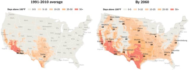
In today’s installment of terrifying graphics about climate change, the NY Times made a series of three maps showing the potential rise of 100 degree temperatures across the United States if current greenhouse gas emission trends continue through the end of this century. Look at the areas in orange and red on the 1991-2010 map: what sort of landscape do you picture? Keeping that landscape picture in your mind, look at the orange and red areas on the 2060 and 2100 maps. Yep! And Phoenix with 163 days above 100 degrees — that’s every day from March 25th to September 4th over 100 degrees.
P.S. A word about climate change and rising temperatures. The temperature that climate scientists typically reference and care about with regard to climate change is “the average global temperature across land and ocean surface areas”. According to the NOAA, the average temperature of the Earth in the 20th century was 13.9°C (57.0°F). In 2015, the average global temperature was 0.90°C (1.62°F) above that.
In order to avoid dangerous effects of climate change, climate scientists advocate keeping the global average temperature increase below 2 degrees (and more recently, below 1.5 degrees). In late 2015, 195 nations came together in Paris and agreed to:
[Hold] the increase in the global average temperature to well below 2°C above pre-industrial levels and to pursue efforts to limit the temperature increase to 1.5°C above pre-industrial levels, recognizing that this would significantly reduce the risks and impacts of climate change
That’s degrees Celsius, not Fahrenheit. I don’t know about you, but as an American, when I hear 2 degrees, I think, oh, that’s not bad. But 2°C is an increase of 3.6°F, which does seem significant.
Note also that it specifies keeping the temperature “below pre-industrial levels” and not below 20th century levels. It is maddeningly difficult to track down an exact figure for the pre-industrial global temperature, partially because of a lack of precise data, partially because of politics, and partially because of the impenetrability of scientific writing. From a piece Eric Holthaus wrote for FiveThirtyEight earlier this year:
It sounds easy enough to measure global warming: see how hot it was, compare it to how hot it used to be. But climate scientists have several ways of measuring how hot it used to be. NASA’s base period, as I mentioned above, is an average of 1951-80 global temperatures, mostly because that was the most recently available 30-year period when the data set was first created. By chance, it’s also pretty representative of the world’s 20th-century climate and can help us understand how much warmer the world has become while many of us have been alive.
Other organizations go further back. The Intergovernmental Panel on Climate Change, the body of climate scientists that was formed to provide assessments to the United Nations, bases its temperature calculations on an 1850-1900 global average. There was about 0.4 degrees of warming between that time period and the NASA base period.
Climate scientists often refer to that 1850-1900 timespan as “pre-industrial” because we don’t have comprehensive temperature data from the 1700s. But meteorologist Michael Mann, director of Penn State University’s Earth System Science Center, has argued that an additional 0.25 degrees of warming occurred between the start of the Industrial Revolution (around 1750) and 1850. Including Mann’s adjustment would bring February 2016 global temperatures at or very near 2 degrees above the “pre-industrial” average.
I now completely understand why some people deny that anthropogenic climate change is happening. Seriously. I looked for more than 30 minutes for a report or scientific paper that stated the average global temperature for 1850-1900 and I couldn’t find one. I looked at UN reports, NASA reports, reports from the UK: nothing. There were tons of references to temperatures relative to the 1850-1900 baseline, but no absolute temperatures were given. Now, I don’t mean to get all Feynman here, but this is bullshit. When the world got together in Paris and talked about a 1.5 degree increase, was everyone even talking about the same thing? You might begin to wonder what the scientists are hiding with their obfuscation.
Anyway, the important point is that according to climate scientists, we are already flirting with 1.5°C of global warming since pre-industrial times. Which means that without action, the spread of those Phoenician temperatures across the circa-2100 United States is a thing that’s going to happen.
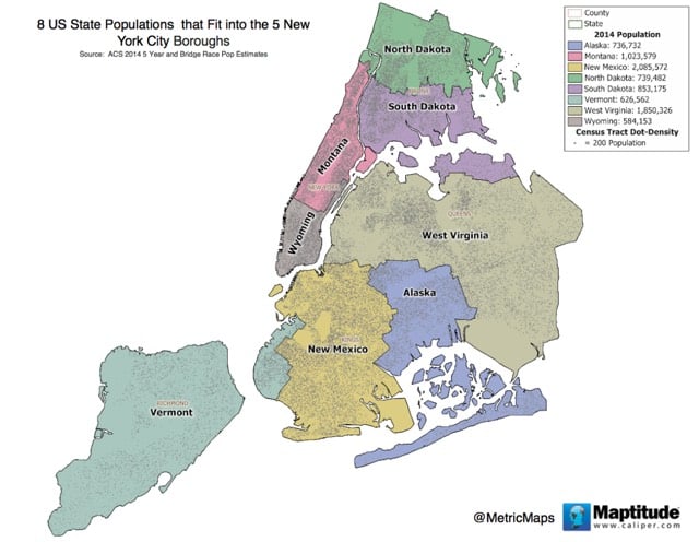
The population of NYC is equal to the combined populations of Vermont, Alaska, New Mexico, North Dakota, South Dakota, Wyoming, Montana, and West Virginia. Here’s what that looks like on a map.
Put another way: 16 US Senators represent as many people in those states as a fraction of one of New York States’ Senators represent the population of NYC. A Senator from Wyoming represents 290,000 people while one from New York represents 9.8 million people…and in California, there are 19 million people per Senator. That gives a Wyoming resident 65 times the voting power of a California resident.
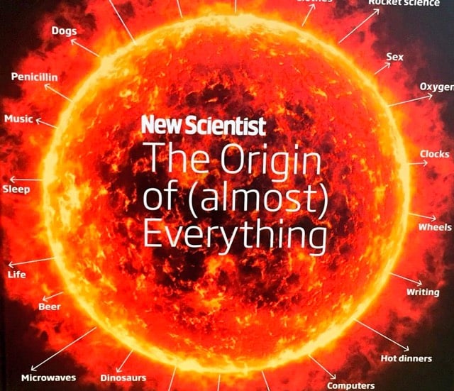
Together they take us on a whistle-stop tour from the start of our universe (through the history of stars, galaxies, meteorites, the Moon and dark energy) to our planet (through oceans and weather to oil) and life (through dinosaurs to emotions and sex) to civilization (from cities to alcohol and cooking), knowledge (from alphabets to alchemy) ending up with technology (computers to rocket science). Witty essays explore the concepts alongside enlightening infographics that zoom from how many people have ever lived to showing you how a left-wing brain differs from a right-wing one.
And Stephen Hawking wrote the foreword. You fancy, Jennifer Daniel!
From Clive Thompson, a history of the infographic, which was developed in part to help solve problems with an abundance of data available in the 19th century.
The idea of visualizing data is old: After all, that’s what a map is — a representation of geographic information — and we’ve had maps for about 8,000 years. But it was rare to graph anything other than geography. Only a few examples exist: Around the 11th century, a now-anonymous scribe created a chart of how the planets moved through the sky. By the 18th century, scientists were warming to the idea of arranging knowledge visually. The British polymath Joseph Priestley produced a “Chart of Biography,” plotting the lives of about 2,000 historical figures on a timeline. A picture, he argued, conveyed the information “with more exactness, and in much less time, than it [would take] by reading.”
Still, data visualization was rare because data was rare. That began to change rapidly in the early 19th century, because countries began to collect-and publish-reams of information about their weather, economic activity and population. “For the first time, you could deal with important social issues with hard facts, if you could find a way to analyze it,” says Michael Friendly, a professor of psychology at York University who studies the history of data visualization. “The age of data really began.”
By 2030, 75 percent of the world’s population is expected to be living in cities. Today, about 54 percent of us do. In 1960, only 34 percent of the world lived in cities.
There are now 21 Chinese cities alone with a population of over 4 million.
There is something magical about maps. They transport you to a place you’ve never seen, from the ocean depths to the surface of another planet. Or a world that exists only in the imagination of a novelist.
Maps are time machines, too. They can take you into the past to see the world as people saw it centuries ago. Or they can show you a place you know intimately as it existed before you came along, or as it might look in the future. Always, they reveal something about the mind of the mapmaker. Every map has a story to tell.
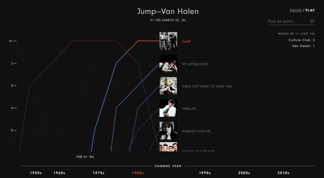
From Matt Daniels at Polygraph, a moving timeline of the 22,000 songs that hit the top 5 on the Billboard charts from 1958-2016. Whoa, there is a lot of pop music I missed in the late 90s through the late 2000s.
The traveling salesman problem is a classic in computer science. It sounds deceptively easy: given any number of cities, determine the shortest path a traveling salesman would have to travel to visit them all. This video shows how the “obvious” solution — “well, just start somewhere and always visit the next closest town!” — doesn’t hold up well against other approaches. (via @coudal)
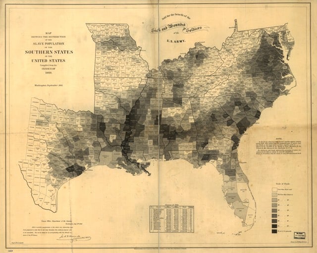
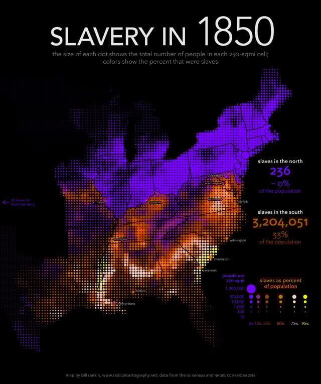
First, I smash the visual tyranny of county boundaries by using a uniform grid of dots. The size of each dot shows the total population in each 250-sqmi cell, and the color shows the percent that were slaves. But just as important, I’ve also combined the usual county data with historical data for more than 150 cities and towns. Cities usually had fewer slaves, proportionally, than their surrounding counties, but this is invisible on standard maps.
A detail that struck me while cycling through the years was that the number of slaves as a percentage of the total population of the South stayed relatively steady at 33% from 1790 to 1860.
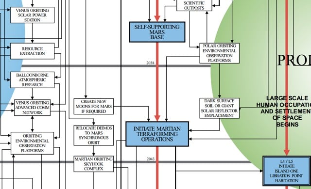
In 1989, a Rockwell engineer named Ron Jones published his Integrated Space Plan, a detailed outline of the next 100 years of human space travel, from continuing shuttle missions in the 1990s to the large scale habitation of Mars. The plan includes all sorts of futuristic and day-dreamy phrases like:
Create new moons for Mars if required
Humanity begins the transition from a terrestrial to a solar species
Humanity commands unlimited resources from the Moon and asteroids
Space drives global economy
Independent spacefaring human communities
The graphic is divided into nine columns that show, in chronological order, the path toward human exploration of deep space. The center row of boxes, the “critical path,” outlines the major milestones Jones decided were attainable within the next century of space travel; the boxes to the left and right of the critical path are support elements that must be realized before anything on the critical path can happen. The Integrated Space Plan can be read top to bottom and left to right. The big circles intersecting the boxes are the the plan’s overarching long-range goals, which include things like Humanity begins the transition from a terrestrial to a solar species and Human expansion into the cosmos. In many ways, it’s a graphical to-do list.
The keen observer will note that we are waaaaay behind in the plan. A lunar outpost was supposed to be up and running before 2008 and a self-supporting lunar base is due to happen in the next year or two. Can Musk and Bezos get us back on track? (via @ftrain)
Nicholas Felton is out with a new book on information visualization and photography called Photoviz.
The stories told with graphics and infographics are now being visualized through photography. Fotoviz shows how these powerful images are depicting correlations, making the invisible visible, and revealing more detail than classic photojournalism.
Ahhhhh, this looks amazing. And is right up my alley as well…I quickly looked through some of the images featured in the book and I’ve posted many of them here before (see time merge media for instance). Can’t wait for this one to arrive.
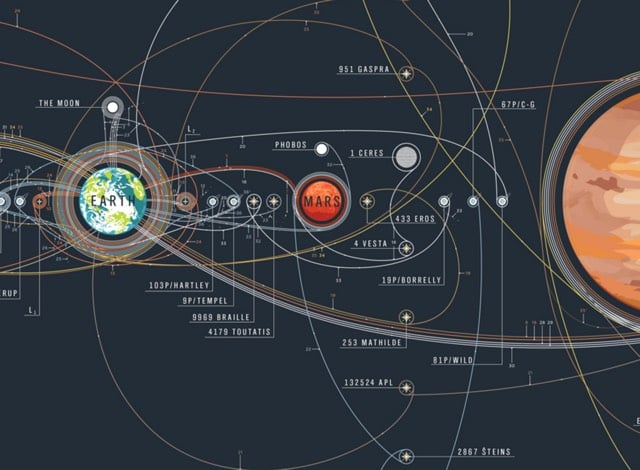
A new print from Pop Chart Lab “traces the trajectories of every orbiter, lander, rover, flyby, and impactor to ever slip the surly bonds of Earth’s orbit and successfully complete its mission — a truly astronomical array of over 100 exploratory instruments in all.” Awesome. Basically, I am a sucker for things with curvy lines and planets.
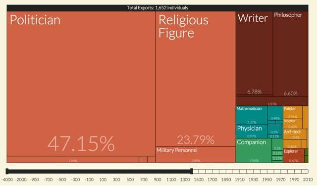
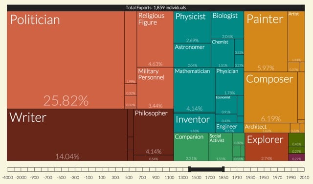
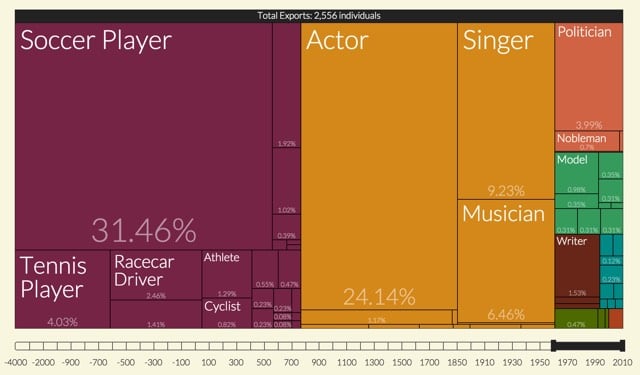
From Pantheon at MIT, an adjustable graph of which kinds of people were globally famous in different eras. Up until the Renaissance, the most well-known people in the world were mostly politicians and religious figures, with some writers and philosophers thrown in for good measure:
Starting with the Renaissance through the beginnings of the Industrial Revolution, politicians, writers, painters, and composers become more prominent:
For the past 50 years, athletes and entertainers dominate the list, with footballers making up almost a third of the most known. (If you only go back to 1990, actors dominate.)
Politicians rate slightly behind tennis players (but ahead of pornographic actors) and religious figures are not represented in the graph at all.
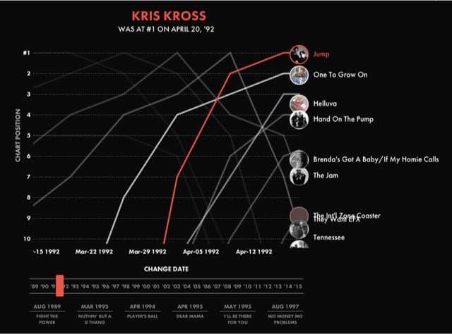
The product of a collaboration between Polygraph and Billboard, this interactive timeline lets you listen to the top rap song in the US from 1989 to 2015 as you see the single jockeying in the top 10.
But unlike the taxi data, Citi Bike includes demographic information about its riders, namely gender, birth year, and subscriber status. At first glance that might not seem too revealing, but it turns out that it’s enough to uniquely identify many Citi Bike trips. If you know the following information about an individual Citi Bike trip:
1. The rider is an annual subscriber
2. Their gender
3. Their birth year
4. The station where they picked up a Citi Bike
5. The date and time they picked up the bike, rounded to the nearest hour
Then you can uniquely identify that individual trip 84% of the time! That means you can find out where and when the rider dropped off the bike, which might be sensitive information. Because men account for 77% of all subscriber trips, it’s even easier to uniquely identify rides by women: if we restrict to female riders, then 92% of trips can be uniquely identified.
Let’s add Uber into the mix. I live in Brooklyn, and although I sometimes take taxis, an anecdotal review of my credit card statements suggests that I take about four times as many Ubers as I do taxis. It turns out I’m not alone: between June 2014 and June 2015, the number of Uber pickups in Brooklyn grew by 525%! As of June 2015, the most recent data available when I wrote this, Uber accounts for more than twice as many pickups in Brooklyn compared to yellow taxis, and is rapidly approaching the popularity of green taxis.
…the plausibility of Die Hard III’s taxi ride to stop a subway bombing:
In Die Hard: With a Vengeance, John McClane (Willis) and Zeus Carver (Jackson) have to make it from 72nd and Broadway to the Wall Street 2/3 subway station during morning rush hour in less than 30 minutes, or else a bomb will go off. They commandeer a taxi, drive it frantically through Central Park, tailgate an ambulance, and just barely make it in time (of course the bomb goes off anyway…). Thanks to the TLC’s publicly available data, we can finally address audience concerns about the realism of this sequence.
…where “bridge and tunnel” folks go for fun in Manhattan:
The most popular destinations for B&T trips are in Murray Hill, the Meatpacking District, Chelsea, and Midtown.
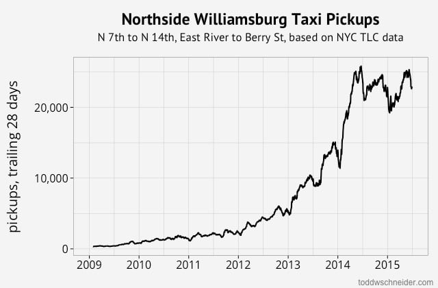
…the growth of north Williamsburg nightlife:
…the privacy implications of releasing taxi data publicly:
For example, I don’t know who owns one of theses beautiful oceanfront homes on East Hampton’s exclusive Further Lane (exact address redacted to protect the innocent). But I do know the exact Brooklyn Heights location and time from which someone (not necessarily the owner) hailed a cab, rode 106.6 miles, and paid a $400 fare with a credit card, including a $110.50 tip.
This graph will continue to update as the TLC releases additional data, but at the time I wrote this in April 2016, the most recent data shows yellow taxis provided 60,000 fewer trips per day in January 2016 compared to one year earlier, while Uber provided 70,000 more trips per day over the same time horizon.
Although the Uber data only begins in 2015, if we zoom out to 2010, it’s even more apparent that yellow taxis are losing market share.
Lyft began reporting data in April 2015, and expanded aggressively throughout that summer, reaching a peak of 19,000 trips per day in December 2015. Over the following 6 weeks, though, Lyft usage tumbled back down to 11,000 trips per day as of January 2016 — a decline of over 40%.
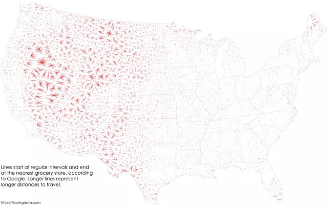
From Nathan Yau at FlowingData, a look at the places in the US where people need to make the longest drives to visit a grocery store.
The nearest grocery store is more than 10 miles away in about 36 percent of the country and the median distance is 7 miles. However, a lot of these areas are rural with few (if any) people who live there.
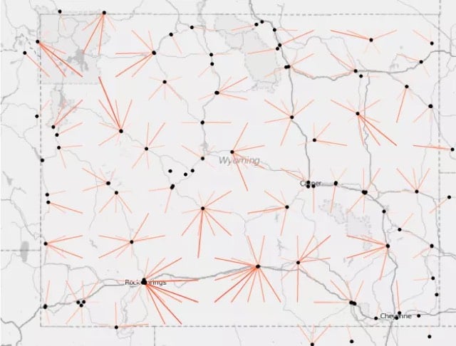
Wyoming contains very few grocery stores:
And Nevada is even more of a food desert. Looks like Massachusetts, Delaware, and New Jersey have plenty of grocery stores everywhere. (via feltron)
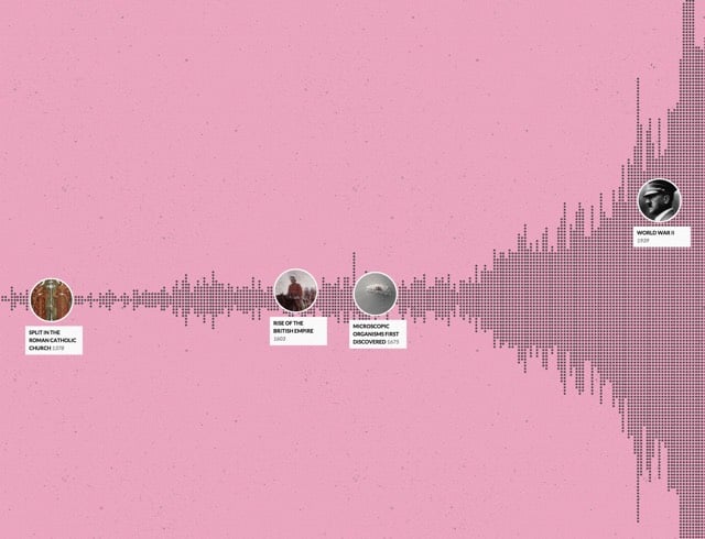
Whoa, Histography is a super-cool interactive timeline of historical events pulled from Wikipedia, from the Big Bang to the present day. The site was built by Matan Stauber as his final project at the Bezalel Academy of Arts and Design. This is really fun to play with and I love the style.
Rain-Bros by Daniel Savage is a fun visualization of the different wavelengths of light in the visible spectrum, from the loping walk of red to blue’s energetic bounce.
From Orbital Mechanics, a visualization of the 2153 nuclear weapons exploded on Earth since 1945.
2153! I had no idea there had been that much testing. According to Wikipedia, the number is 2119 tests, with most of those coming from the US (1032) and the USSR (727). The largest device ever detonated was Tsar Bomba, a 50-megaton hydrogen bomb set off in the atmosphere above an island in the Barents Sea in 1961. Tsar Bomba had more than three times the yield of the largest bomb tested by the US. The result was spectacular.
The fireball reached nearly as high as the altitude of the release plane and was visible at almost 1,000 kilometres (620 mi) away from where it ascended. The subsequent mushroom cloud was about 64 kilometres (40 mi) high (over seven times the height of Mount Everest), which meant that the cloud was above the stratosphere and well inside the mesosphere when it peaked. The cap of the mushroom cloud had a peak width of 95 kilometres (59 mi) and its base was 40 kilometres (25 mi) wide.
All buildings in the village of Severny (both wooden and brick), located 55 kilometres (34 mi) from ground zero within the Sukhoy Nos test range, were destroyed. In districts hundreds of kilometers from ground zero wooden houses were destroyed, stone ones lost their roofs, windows and doors; and radio communications were interrupted for almost one hour. One participant in the test saw a bright flash through dark goggles and felt the effects of a thermal pulse even at a distance of 270 kilometres (170 mi). The heat from the explosion could have caused third-degree burns 100 km (62 mi) away from ground zero. A shock wave was observed in the air at Dikson settlement 700 kilometres (430 mi) away; windowpanes were partially broken to distances of 900 kilometres (560 mi). Atmospheric focusing caused blast damage at even greater distances, breaking windows in Norway and Finland. The seismic shock created by the detonation was measurable even on its third passage around the Earth.
The Soviets did not give a fuck, man…what are a few thousand destroyed homes compared to scaring the shit out of the capitalist Amerikanskis with a comically large explosion? Speaking of bonkers Communist dictatorships, the last nuclear test conducted on Earth was in 2013, by North Korea.
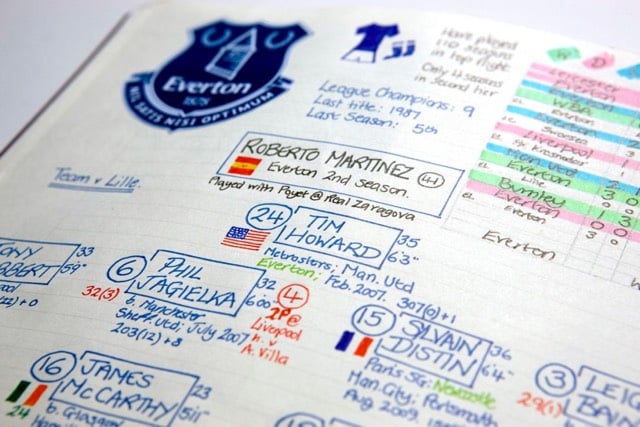
Nick Barnes is a football commentator for BBC Radio Newcastle. For each match he does, Barnes dedicates two pages in his notebook for pre-match notes, lineups, player stats, match stats, and dozens of other little tidbits.
Wonderful folk infographics. NBC commentator Arlo White also shared his pre-match notes. Both men say they barely use the notes during the match…by the time the notes are done, they know the stuff. (via @dens)
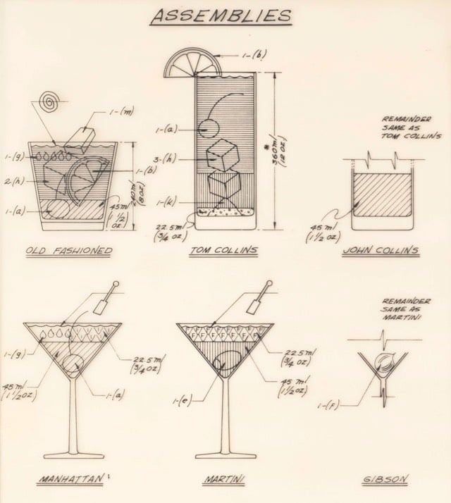
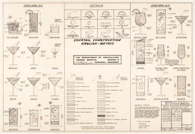
This is…weird. The National Archives contains a Cocktail Construction Chart made in an architectural style, for some reason, by the US Forest Service in 1974.
If it does, royalties might be due to the family of late Forest Service Region 8 Engineer Cleve “Red” Ketcham, who passed away in 2005 but has since been commemorated in the National Museum of Forest Service History. It’s Ketcham’s signature scribbled in the center of the chart, and according to Sharon Phillips, a longtime Program Management Analyst for Region 8 (which covers Virginia, Georgia, Florida, Oklahoma and Puerto Rico, though Ketcham worked out of its Atlanta office), who conferred with her engineering department, there’s little doubt Ketcham concocted the chart in question. “They’re assuming he’s the one, because the drawing has a date of 1974, and he was working our office from 1974-1980,” she said. And in case there’d be any curiosity as to whether someone else composed the chart and Ketcham merely signed off on it for disbursement, Phillips clarified that, “He’s the author of the chart. I wouldn’t say he passed it along to the staff, because at that time, he probably did that as maybe a joke, something he did for fun. It probably got mixed up with some legitimate stuff and ended up in the Archives.”
I contacted the librarian at the Forest History Society and found similar information. An archivist pulled a staff directory from the Atlanta office (aka “Region 8”) from 1975 and found three names that correlate with those on the document: David E. Ketcham & Cleve C. Ketcham (but not Ketchum, as on the document) and Robert B. Johns (presumably aka the Bob Johns in the lower right hand corner). Not sure if the two Ketchams were related or why the spellings of Cleve’s actual last name and the last name of the signature on the chart are different.
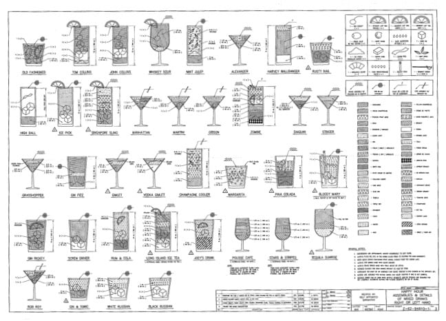
However, in the past few days, I’ve run across several similar charts, most notably The Engineer’s Guide to Drinks.1 Information on this chart is difficult to come by, but various commenters at Flowing Data and elsewhere remember the chart being used in the 1970s by a company called Calcomp to demonstrate their pen plotter.
As you can see, the Forest Service document and this one share a very similar visual language — for instance, the five drops for Angostura bitters, the three-leaf mint sprig, and the lemon peel. And I haven’t checked every single one, but the shading employed for the liquids appear to match exactly.
So which chart came first? The Forest Service chart has a date of 1974 and The Engineer’s Guide to Drinks is dated 1978. But in this post, Autodesk Technologist Shaan Hurley says the Engineer’s Guide dates to 1972. I emailed Hurley to ask about the date, but he couldn’t point to a definite source, which is not uncommon when you’re dealing with this sort of thing. It’s like finding some initials next to “85” scratched into the cement on a sidewalk: you’re pretty sure that someone did that in 1985 but you’d have a tough time proving it.
FWIW, if I had to guess where this chart originated, I’d say that the Calcomp plotter demo got out there somehow (maybe at a trade show or published in an industry magazine) and every engineer took a crack at their own version, like an early internet meme. Cleve Ketcham drew his by hand while others probably used the CAD software running on their workplace mainframes or minicomputers.
Anyway, if anyone has any further information about where these CAD-style cocktail instructions originated, let me know. (thx, @john_overholt & tre)
I’ve never looked closely at my dishwasher’s instruction manual before, but apparently all the manuals tell you how best to load the dishwasher. Joe Clark went through a bunch these manuals and compiled screenshots of the “Loading Your Dishwasher” pages and put them on Flickr.
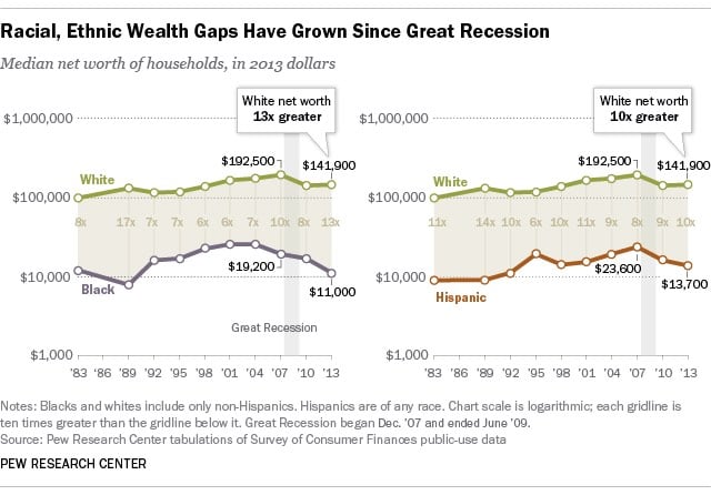
The Pew Research Center shares some of the most interesting findings from the reports they published in 2014. The increasing gap in wealth between white and non-white households since the 2007 recession was the most shocking to me.
Over the past 10 years, the net worth of black households has been cut in half.


Stay Connected