kottke.org

...is a weblog about the liberal arts 2.0 edited by Jason Kottke since March 1998 (archives). You can read about me and kottke.org here. If you've got questions, concerns, or interesting links, send them along.

FE-Mittelschrift

Erik Spiekermann on FE-Mittelschrift, the typeface used for German license plates.

The official typeface for our license plates is now called FE-Mittelschrift, with FE meaning it is Fälschungs-Erschwert, i.e. difficult to forge. Apparently car thieves, terrorists and notorious law-breakers had been exploiting DIN's geometric construction principle and turning E into F or 3 into 8 etc by simply using a bit of black tape or white paint.

Here are all the alphanumeric characters:

FE-Mittelschrift

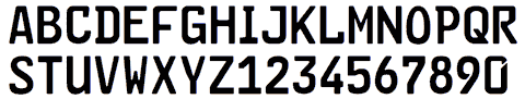
Note the tamper-resistant differences between the 6 (no notch) and 9 (notched), the E & F, the I & 1, the O & zero, the P & R, and so on.

By Jason Kottke    Nov 16, 2007 at 10:38 am    cars   erikspiekermann   femittelschrift   fonts   typography

kottke.org, quickly...

The best way to get a sense of what kottke.org is all about is to head to the front page or check out some random entries from the archives. Follow kottke.org via RSS or Twitter.

Want to share your something special with kottke.org's readers? Sponsor the RSS feed for a week!

Looking for work?

Recommended sites

evhead    Vulture    Omit Needless Words    Morning News    Q Daily News    FlickrBlog    tecznotes    nickbaum.com    scoboco    I did not know that yesterday!    Typographica    Play with the Machine    onfocus.com    Heavy Backpack    plasticbag.org    Cynical-C Blog    Capn Design    gladwell.com    Blackbeltjones/work    NYT Science