NYC’s New Digital Subway Map
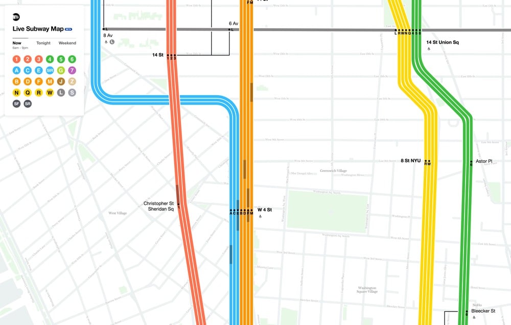
New York City has a new digital subway map that reflects the current status of the subway lines. And you can even see the trains moving, right on the map. (Finally!!) Visually, the new map combines the styles of two past maps, each beloved in their own way.1 Fast Company explains:
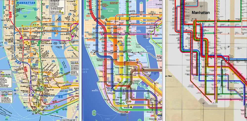
The first map is that by Massimo Vignelli, who simplified the snaking subway system into a clean diagram which traded geographic literality for graphical clarity. This elegant simplification turns the confounding subway into a logical system. But the main Vignelli map was scorned by New Yorkers because it wasn’t an actual map, and it was quickly replaced (though a permutation actually lives on as the MTA’s Weekender diagram, which signals weekend services). Meanwhile, the primary map the MTA uses today was created by Unimark International and Michael Hertz Associates. It’s more geographically accurate, but it actually condenses information that was in the Vignelli map. For example, it combines individual train lines such as the C, D, and E lines into singular trunks.
Here’s a video from filmmaker Gary Huswit that shows how the team came up with the new map:
Zooming the map in and out, you see different levels of detail, just like with Google or Apple Maps. I like it — a good combination of form and function.2
Update: A reader reminded me of designer Eddie Jabbour’s Kick Map of the NYC subway, which effectively melded the styles of the Vignelli and Hertz maps together more than 15 years ago.
What’s interesting is that the MTA explicitly rejected and criticized the Kick Map but ended up doing something quite similar with the new digital map. I think Jabbour’s effort deserves to be acknowledged here. (thx, nicolas)
I know as a lover of simplicity, beautiful design, and whatnot, I’m supposed to love the Vignelli map, but I never have. The Hertz map fits the utility of the NYC subway so much better.↩
Although I will say that the website in Chrome absolutely hammered the processor on my computer. It’s probably smoother on mobile?↩
Socials & More