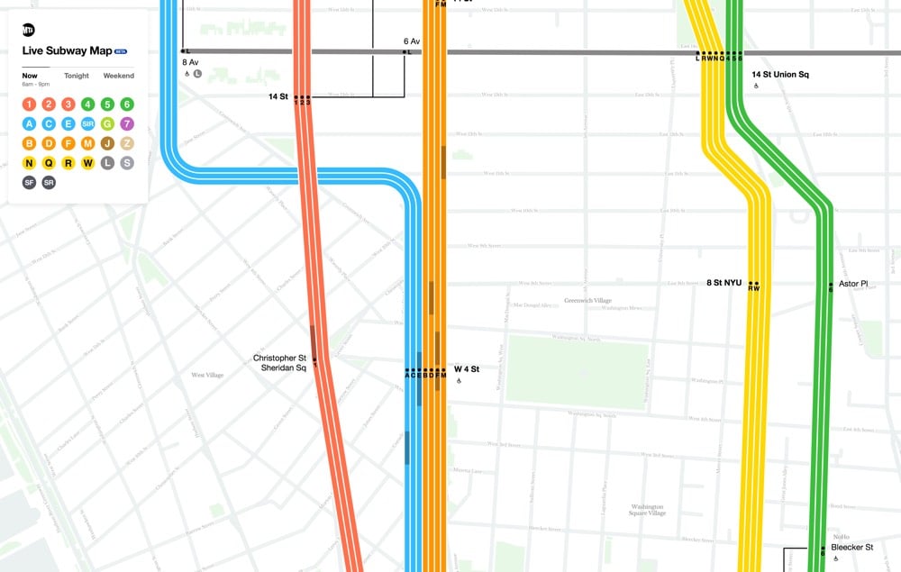
New York City has a new digital subway map that reflects the current status of the subway lines. And you can even see the trains moving, right on the map. (Finally!!) Visually, the new map combines the styles of two past maps, each beloved in their own way.1 Fast Company explains:
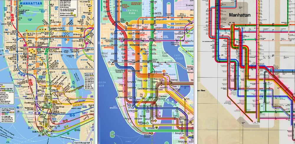
The first map is that by Massimo Vignelli, who simplified the snaking subway system into a clean diagram which traded geographic literality for graphical clarity. This elegant simplification turns the confounding subway into a logical system. But the main Vignelli map was scorned by New Yorkers because it wasn’t an actual map, and it was quickly replaced (though a permutation actually lives on as the MTA’s Weekender diagram, which signals weekend services). Meanwhile, the primary map the MTA uses today was created by Unimark International and Michael Hertz Associates. It’s more geographically accurate, but it actually condenses information that was in the Vignelli map. For example, it combines individual train lines such as the C, D, and E lines into singular trunks.
Here’s a video from filmmaker Gary Huswit that shows how the team came up with the new map:
Zooming the map in and out, you see different levels of detail, just like with Google or Apple Maps. I like it — a good combination of form and function.2
Update: A reader reminded me of designer Eddie Jabbour’s Kick Map of the NYC subway, which effectively melded the styles of the Vignelli and Hertz maps together more than 15 years ago.
What’s interesting is that the MTA explicitly rejected and criticized the Kick Map but ended up doing something quite similar with the new digital map. I think Jabbour’s effort deserves to be acknowledged here. (thx, nicolas)
Fonts in Use took a crack at identifying the crazy quilt of typefaces used on the label of Huy Fong sriracha.
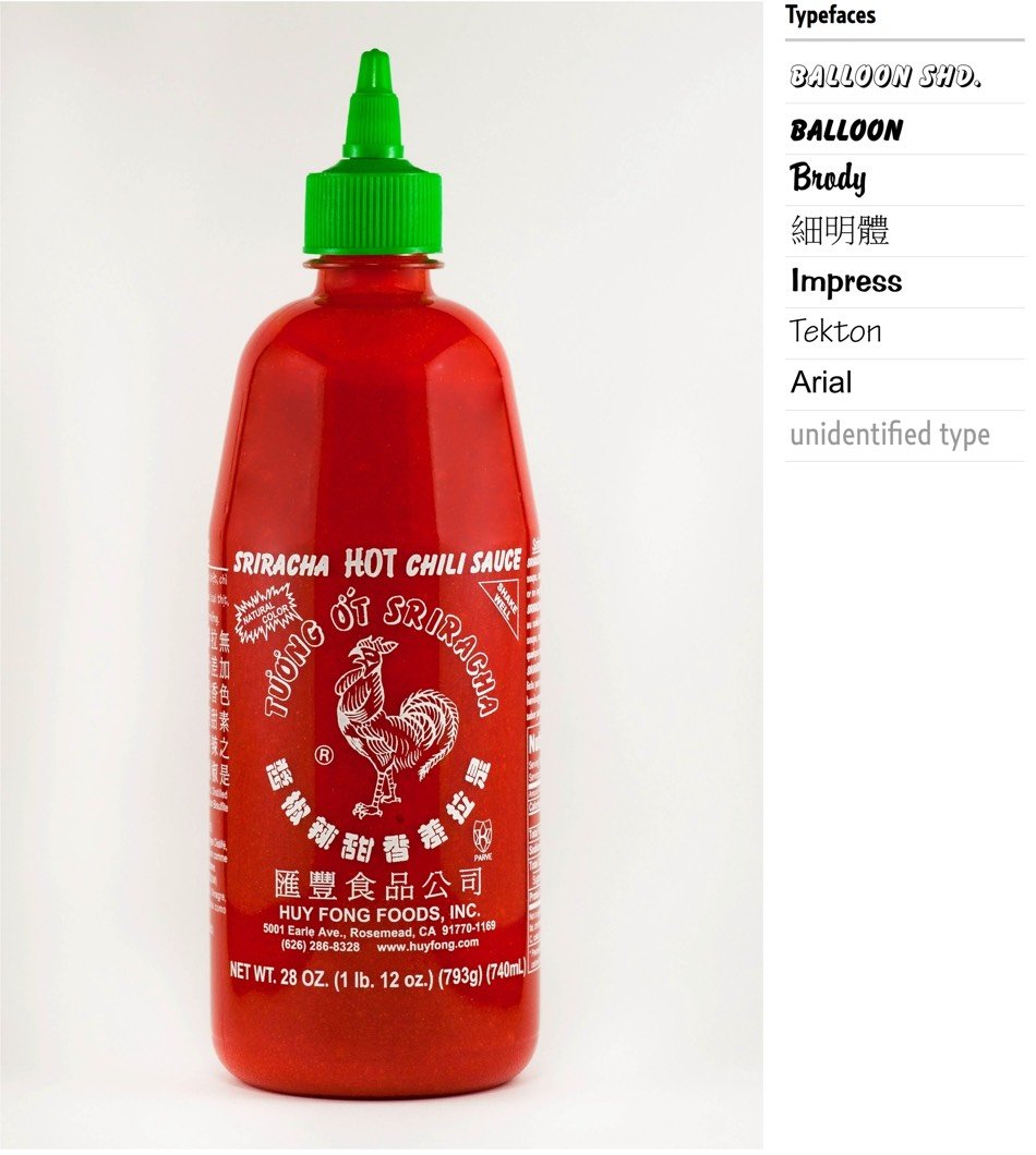
The most prominent Latin text elements are rendered in a variety of informal script typefaces released by American Type Founders in the 20th century, namely Balloon and its shaded counterpart, Balloon Drop Shadow, as well as Brody. Smaller text on the back of the bottle is set in Impress and Tekton.
And they threw Arial in there for good measure. Oof. Don’t miss the first comment about the label’s Chinese fonts; “In the West, PMingLiu has become a prominent component of what some might call the “Asian diaspora aesthetics”. In East Asia, it is seen as the signature for those typographically unenlightened.”
P.S. No one knows who drew the label’s iconic rooster. And remember when people were stockpiling Huy Fong sriracha due to shortages? Simpler times.
Update: After I wondered on Twitter what the Huy Fong sriracha label would look like if the great Modernist designer Massimo Vignelli designed it, the folks at Major Interactive came up with this:

*slow clap*
A giant in the world of design, Massimo Vignelli, passed away this morning at the age of 83. Michael Bierut, who worked for Vignelli, has a nice remembrance of him.
Today there is an entire building in Rochester, New York, dedicated to preserving the Vignelli legacy. But in those days, it seemed to me that the whole city of New York was a permanent Vignelli exhibition. To get to the office, I rode in a subway with Vignelli-designed signage, shared the sidewalk with people holding Vignelli-designed Bloomingdale’s shopping bags, walked by St. Peter’s Church with its Vignelli-designed pipe organ visible through the window. At Vignelli Associates, at 23 years old, I felt I was at the center of the universe.
One of the greatest designers in the world, Massimo Vignelli, is very sick and “will be spending his last days at home”. His son is requesting that if you were influenced at all by Vignelli’s work, you should send him a letter:
According to Pentagram partner Michael Bierut, “Luca said that Massimo would be thrilled to get notes of good wishes from people whom he’s touched or influenced — whether personally or remotely — over the years. Luca has visions of huge mail bags full of letters. I know that one of Massimo’s biggest fantasies has been to attend his own funeral. This will be the next best thing. Pass the word.”
Here’s the address:
Massimo Vignelli
130 East 67 Street
New York, New York 10021
USA
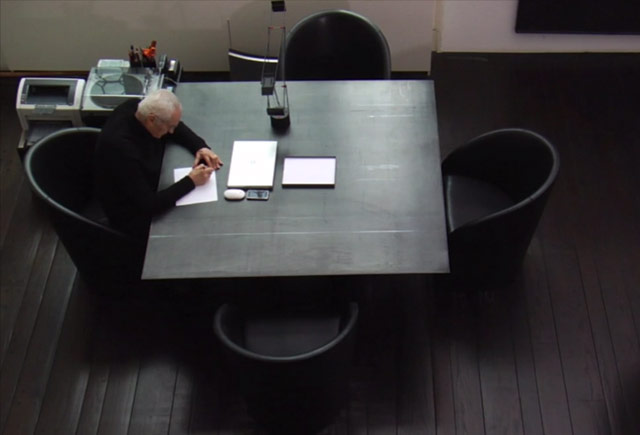
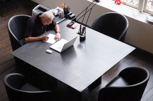
From Imaginary Forces, a short documentary about the desks of creative people.
We talked to experts Alice Twemlow, Eric Abrahamson, Massimo Vignelli, David Miller, Kurt Andersen, Soren Kjaer, Alfred Stadler, Jennifer Lai, and Ben Bajorek and creates an historical and relevant film about the relationship between the worker and the desk and how this reflects on personality and habits.
I too love Massimo Vignelli’s desk.
Socials & More