Advertise here with Carbon Ads

This site is made possible by member support. โค๏ธ

Big thanks to Arcustech for hosting the site and offering amazing tech support.

When you buy through links on kottke.org, I may earn an affiliate commission. Thanks for supporting the site!

kottke.org. home of fine hypertext products since 1998.

๐Ÿ”  ๐Ÿ’€  ๐Ÿ“ธ  ๐Ÿ˜ญ  ๐Ÿ•ณ๏ธ  ๐Ÿค   ๐ŸŽฌ  ๐Ÿฅ”

kottke.org posts about Geoff Boeing

Seven Square Miles

Seven Sq Miles

Seven Sq Miles

Seven Sq Miles

Over at In Focus, still the world’s best photoblog (remember those!?), Alan Taylor is looking at different parts of the world from the same height.

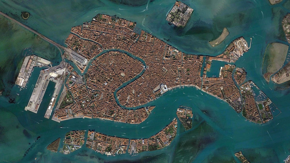
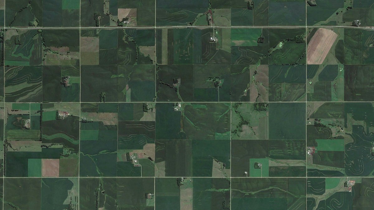
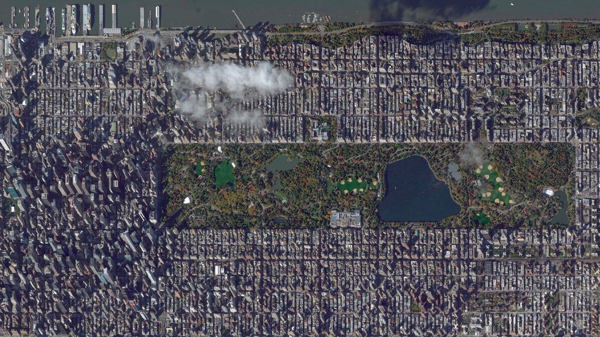
Spending time looking at the varying and beautiful images of our planet from above in Google Earth, zooming in and out at dizzying rates, I thought it would be interesting to compare all of these vistas at a fixed scale-to see what New York City, Venice, or the Grand Canyon would look like from the same virtual height.

Each of the 38 images selected by Taylor shows about seven square miles of the Earth’s surface. The three images I’ve excerpted here are, from top to botton, Venice, Wisconsin farmland, and Manhattan. This planet really is dizzyingly beautiful.

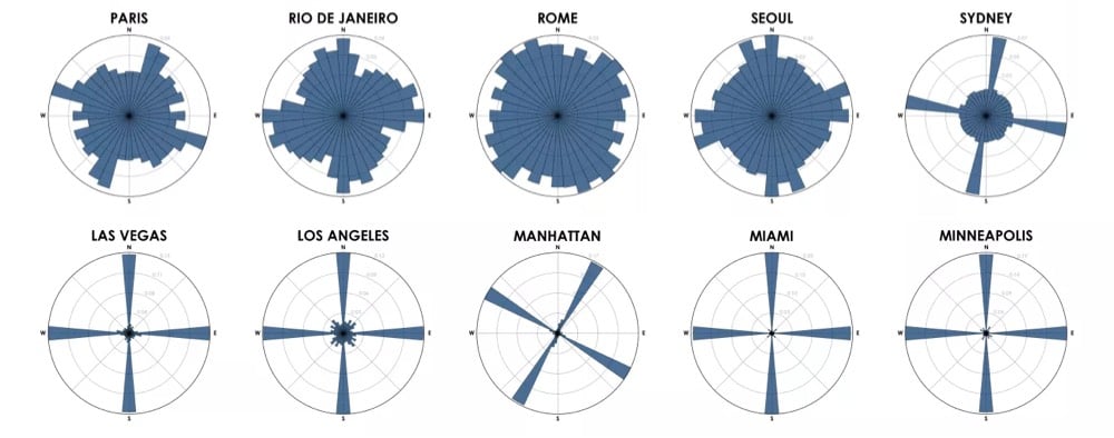
This reminds me of The Jefferson Grid project (showing 1 sq mile satellite photos of the US). There’s another project which I swear I’ve seen recently that shows the grids of streets in cities from around the world and how they vary widely, but I can’t find it. Anyone?

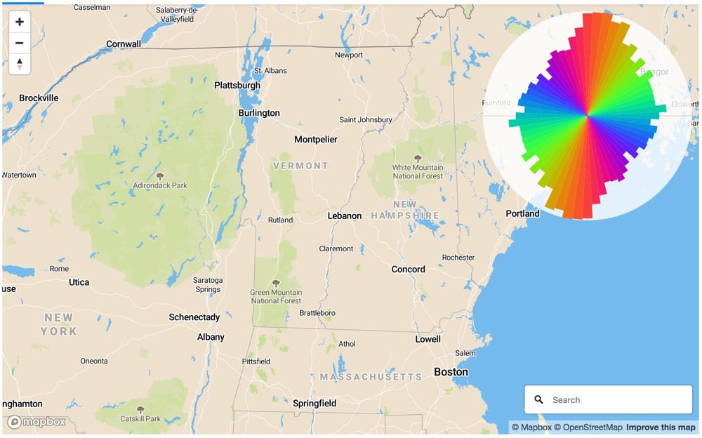
Update: Re: the other project I couldn’t remember, several people sent in Geoff Boeing’s city street orientation project (which I posted about here) but it was probably another project of Boeing’s that I was thinking of: Square-Mile Street Network Visualization. He based the project on the work of Allan Jacobs in Great Streets. (thx, @simiasideris)


City street orientations from around the world

Urban data scientist Geoff Boeing graphed the orientation of the streets in 50 cities from around the world. Here are 10 cities from his analysis:

City Street Orientations

How to read the graphs:

Each of the cities above is represented by a polar histogram (aka rose diagram) depicting how its streets orient. Each bar’s direction represents the compass bearings of the streets (in that histogram bin) and its length represents the relative frequency of streets with those bearings.

Looking at these graphs, you get a real sense of just how planned American cities are compared to much of the rest of the world, where cities grew more organically over longer periods of time. (Although I’m curious to see what the graph for all of NYC would look like…a bit more like Boston perhaps.)

Update: Using Mapbox, you can generate street orientation charts for any map view. I used it to verify that north-south roads outnumber east-west roads in New England, which is why it takes so long to go 30 miles across VT compared to up or down.

NE Polar Chart

(via @dokas)