Hypnerotomachia Poliphili
This is a page from a book called Hypnerotomachia Poliphili.
Any guesses as to when it was published? The title, Latin text, yellowed paper, and lack of page numbers might tip you off that it wasn’t exactly released yesterday. Turns out that Hypnerotomachia Poliphili was published in 1499, more than 500 years ago and only 44 years after Gutenberg published his famous Bible. It belongs to a group of books collectively referred to as incunabula, books printed with a printing press using movable type before 1501.
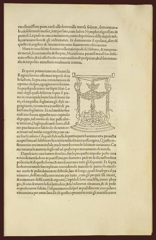
To contemporary eyes, the HP looks almost modern. The text is very readable. The typography, layout, and the way the text flows around the illustration; none of it looks out of the ordinary. When compared to other books of the time (e.g. take a look at a page from the Gutenberg Bible), its modernity is downright eerie. The most obvious difference is the absence of the blackletter typeface. Blackletter was a popular choice because it resembled closely the handwritten script that preceded the printing press, and I imagine its use smoothed the transition to books printed by press. HP dispensed with blackletter and instead used what came to be known as Bembo, a humanist typeface based on the handwriting of Renaissance-era Italian scholars. From a MIT Press e-book on the HP:
One of the features of the Hypnerotomachia that has attracted the attention of scholars has been its use of the famed Aldine “Roman” type font, invented by Nicholas Jenson but distilled into an abstract ideal by Francesco Biffi da Bologna, a jeweler who became Aldus’s celebrated cutter. This font — generally viewed as originating in the efforts of the humanist lovers of belles-lettres and renowned calligraphers such as Petrarch, Poggio Bracciolini, Niccolo Niccoli, Felice Feliciano, Leon Battista Alberti, and Luca Pacioli, to re-create the script of classical antiquity — appeared for the first time in Bembo’s De Aetna. Recut, it appeared in its second and perfected version in the Hypnerotomachia.
In that way, Hypnerotomachia Poliphili is both a throwback to Roman times and an indication of things to come.
The MIT Press site also notes a number of other significant aspects of the book. As seen above, illustrations are integrated into the main text, allowing “the eye to slip back and forth from textual description and corresponding visual representation with the greatest of ease”. In his 2006 book, Beautiful Evidence, Edward Tufte says:
Overall, the design of Hypnerotomachia tightly integrates the relevant text with the relevant image, a cognitive integration along with the celebrated optical integration.
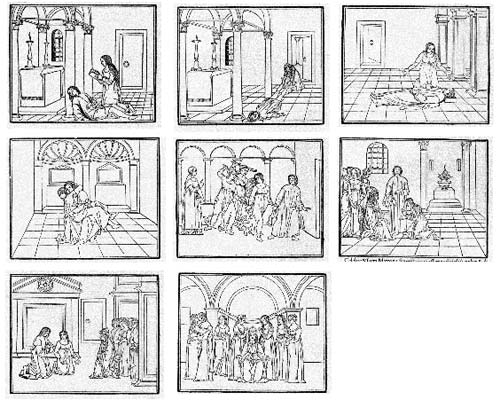
Several pages in the book make use of the text itself to illustrate the shapes of wine goblets. The HP also contained aspects of film, comics, and storyboarding…successive illustrations advanced action begun on previous pages:
All of which makes the following puzzling:
The Hypnerotomachia Poliphili is one of the most unreadable books ever published. The first inkling of difficulty occurs at the moment one picks up the book and tries to utter its tongue-twisting, practically unpronounceable title. The difficulty only heightens as one flips through the pages and tries to decipher the strange, baffling, inscrutable prose, replete with recondite references, teeming with tortuous terminology, choked with pulsating, prolix, plethoric passages. Now in Tuscan, now in Latin, now in Greek — elsewhere in Hebrew, Arabic, Chaldean and hieroglyphs — the author has created a pandemonium of unruly sentences that demand the unrelenting skills of a prodigiously endowed polyglot in order to be understood.
It’s fascinating that a book so readable, so beautifully printed, and so modern would also be so difficult to read. If you’d like to take a crack at it, scans of the entire book are available here and here. The English translation is available on Amazon.
Socials & More