kottke.org posts about design
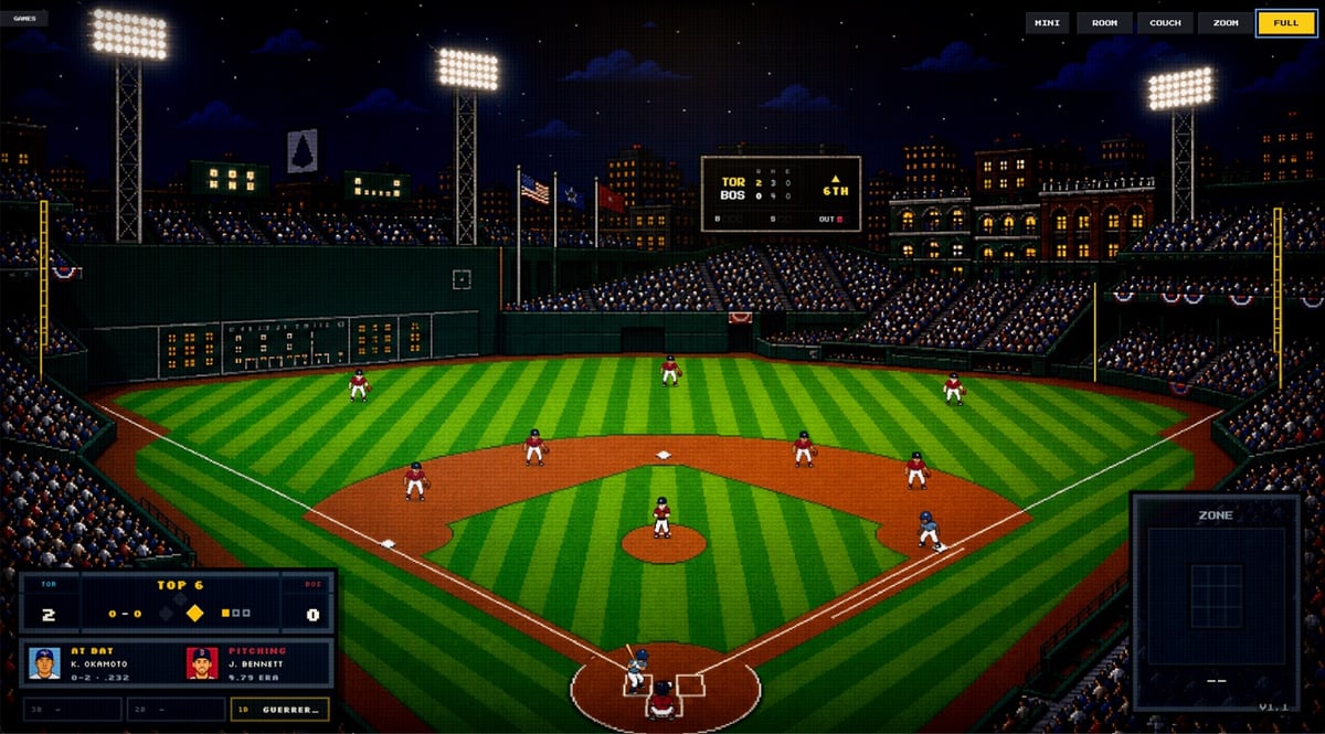
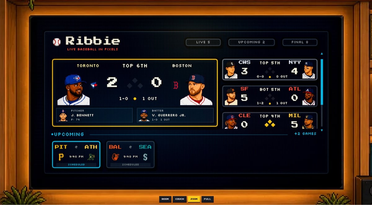
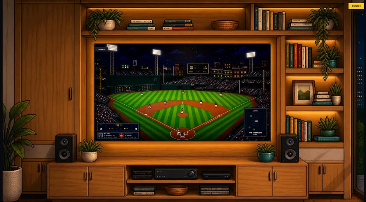
This is kind of fantastic: Ribbie lets you watch actual MLB baseball games “rendered pitch by pitch in a cozy 8-bit view while they happen”.
Ribbie is a simple way to keep a live baseball game nearby. It shows the score, the bases, the count, and a tiny pixel field that moves with the real game.
I built it because I wanted something between a stats tab and a full broadcast. Something you can leave open while you work, cook, or do whatever else, then glance over and know what is happening.
There are a few different views you can use. The image above is the fullscreen view. Here’s the fullscreen game chooser view and the room view of the game.
I love this. Nice use of Silkscreen too. 😊
Screwdriver handles are sneakily well-designed for a variety of different uses.
I mean, who thinks about a screwdriver? But if you look at the handles, well, that’s a complicated shape. And it lets you do a lot. It’s comfortable to hold, but it won’t roll off your bench. And you can turn it one-handed or use both hands. And you get a couple of different grips. That’s a good design.
In this video, woodworker & tool enthusiast Rex Krueger walks us through the design history of the screwdriver and how it came to have such a distinctive and useful handle.
I grew up helping my dad out in the garage with all sorts of projects, mostly cars, and until watching this video, I had no idea that you could slip a standard wrench over the handle of a screwdriver as a cheater bar. 🤯 (via unsung)


Some nice work here from Swedish designer Eric Rohman, who designed thousands of movie posters in the early-to-mid 20th century. (via meanwhile)


I love these oversized prints of vintage Pan-Am luggage tags from artist Ella Freire. The typography and colors are just perfect. (via daringfireball)
A brand designer’s “compendium of transit tickets” from around the world. Many of these are from the 90s and 00s. Design inspiration for daaaaays.


(via meanwhile)
Bill Hammack, aka The Engineer Guy, is an amazing engineering educator and in this video he explains how duct tape is designed to simultaneously do three things well: “a) adhere with light pressure, b) stay in place, yet c) be removable”.
Controlling the stickiness of tape is of utmost importance. In fact, a key element of engineering tape is controlling its stickiness — and only by doing that can tape be wound into a useful roll. If the tape sticks too tightly to itself, we could not use it.
Gotta be honest: I was not expecting Silly Putty to make a relevant guest appearance during his explanation. And I love the ramp & ball test for tape stickiness near the end…a very elegant and simple bit of engineering:
Pressure sensitive tape predates much of the most elementary molecular understanding of adhesion; tape has been mass produced since the early twentieth century. That engineers developed and refined tape without this knowledge is no surprise — recall that the purpose of the engineering method is to solve problems before we have full scientific knowledge.
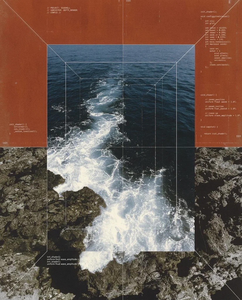
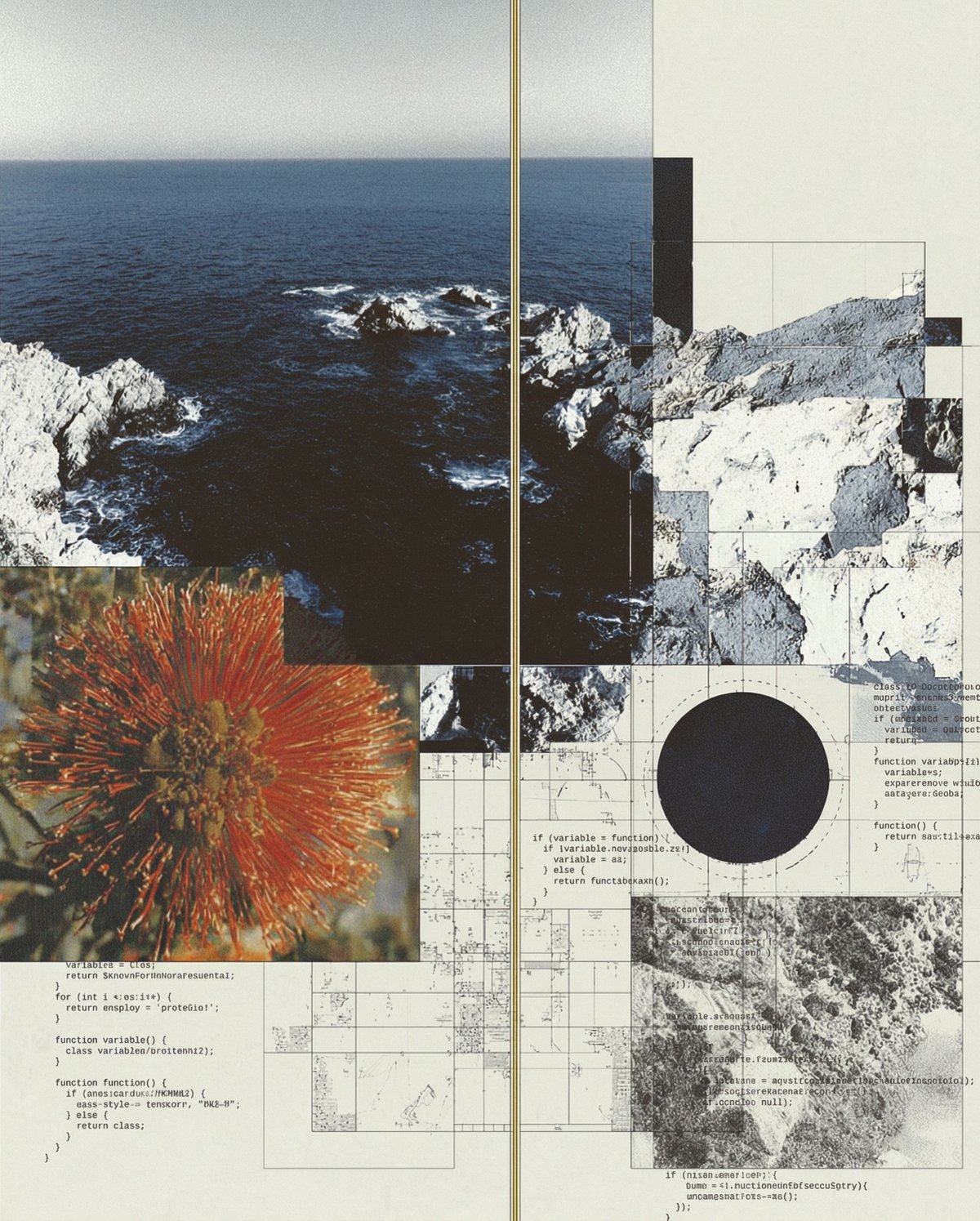
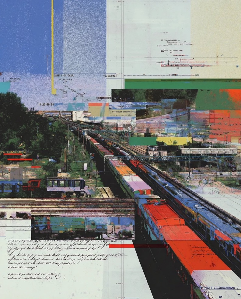
I really love these collages by Anton Elfilter (Instagram, Threads). They are digital-ish? But also not? And does anyone else see the influence of Hilma af Klint in these? (via moss & fog)
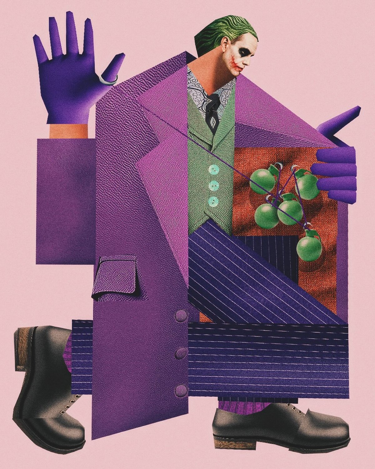
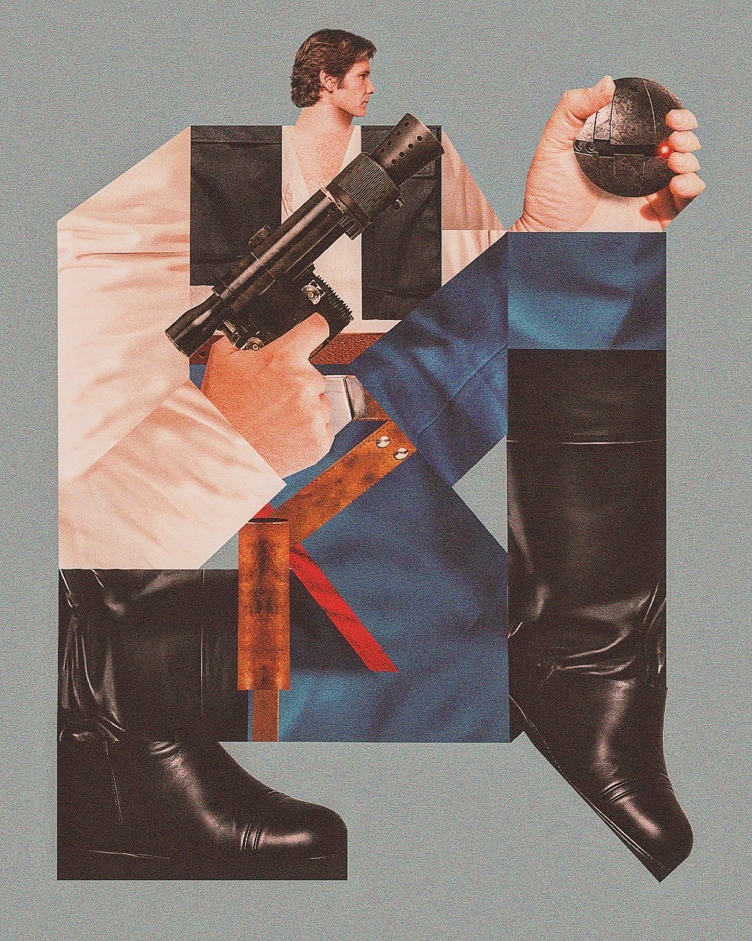
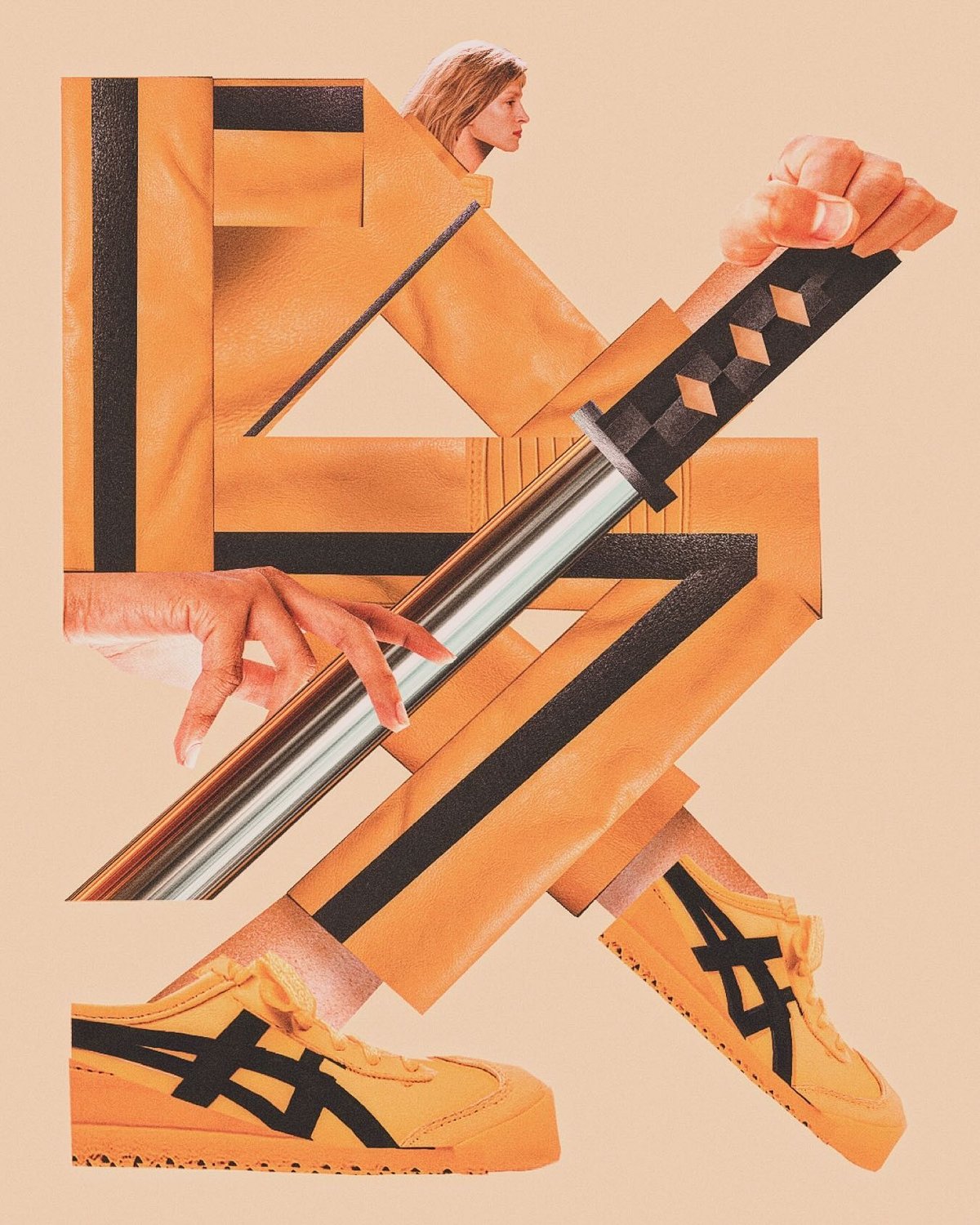
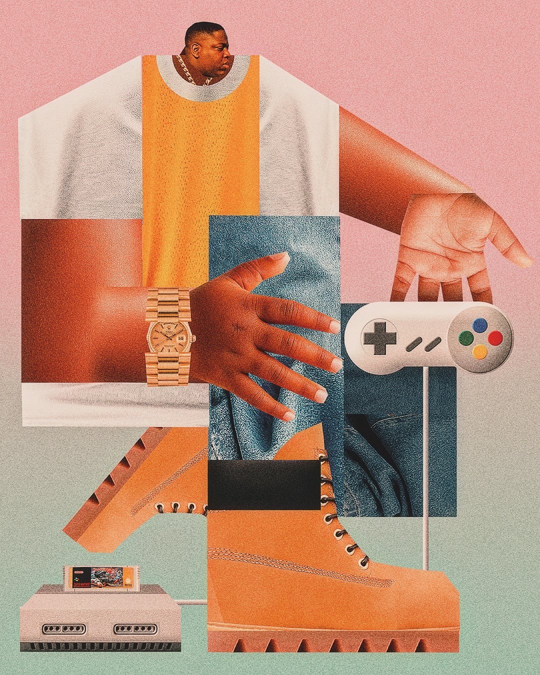
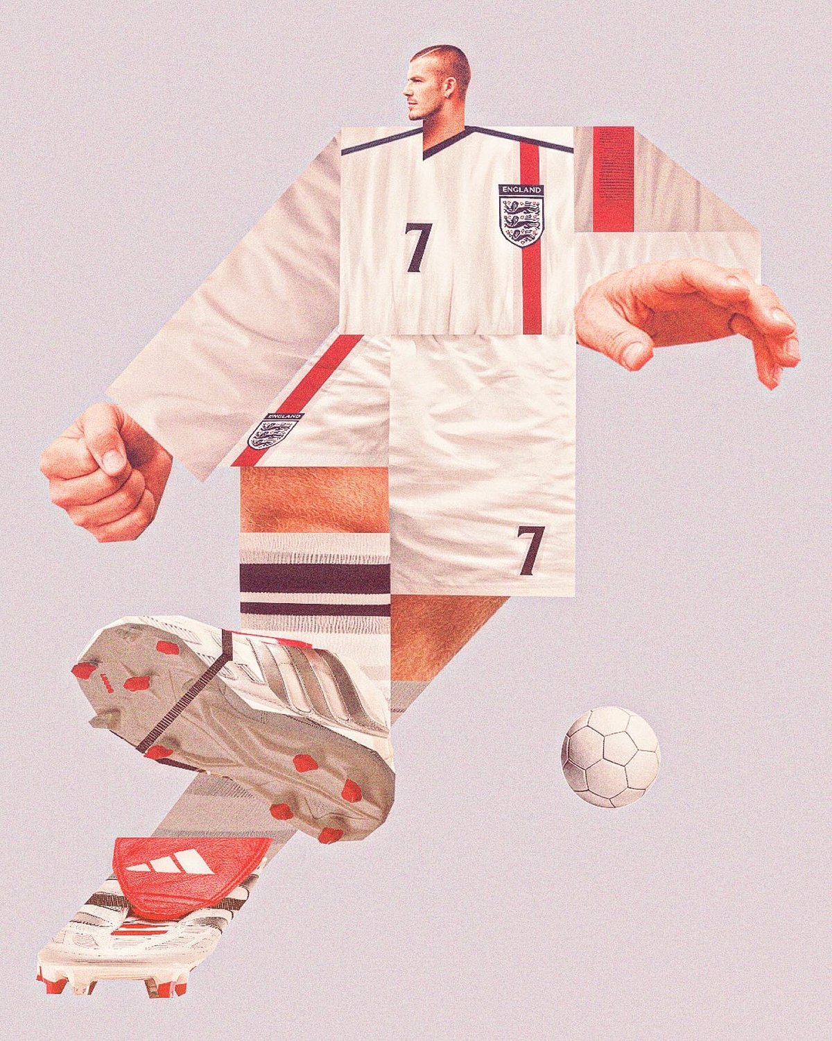
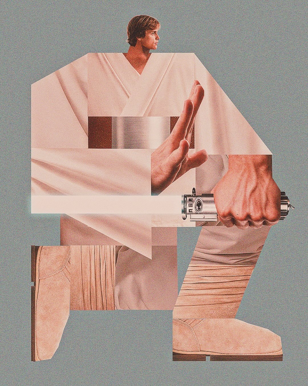
I love these collage illustrations of various celebrities and famous characters by artist/designer Fries Vansevenant: Han Solo & Luke Skywalker, Notorious BIG, Heath Ledger’s Joker, Beatrix Kiddo, David Beckham. There are more on his Insta.
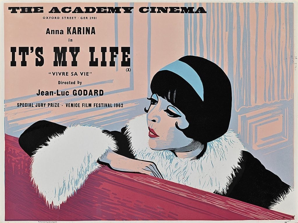
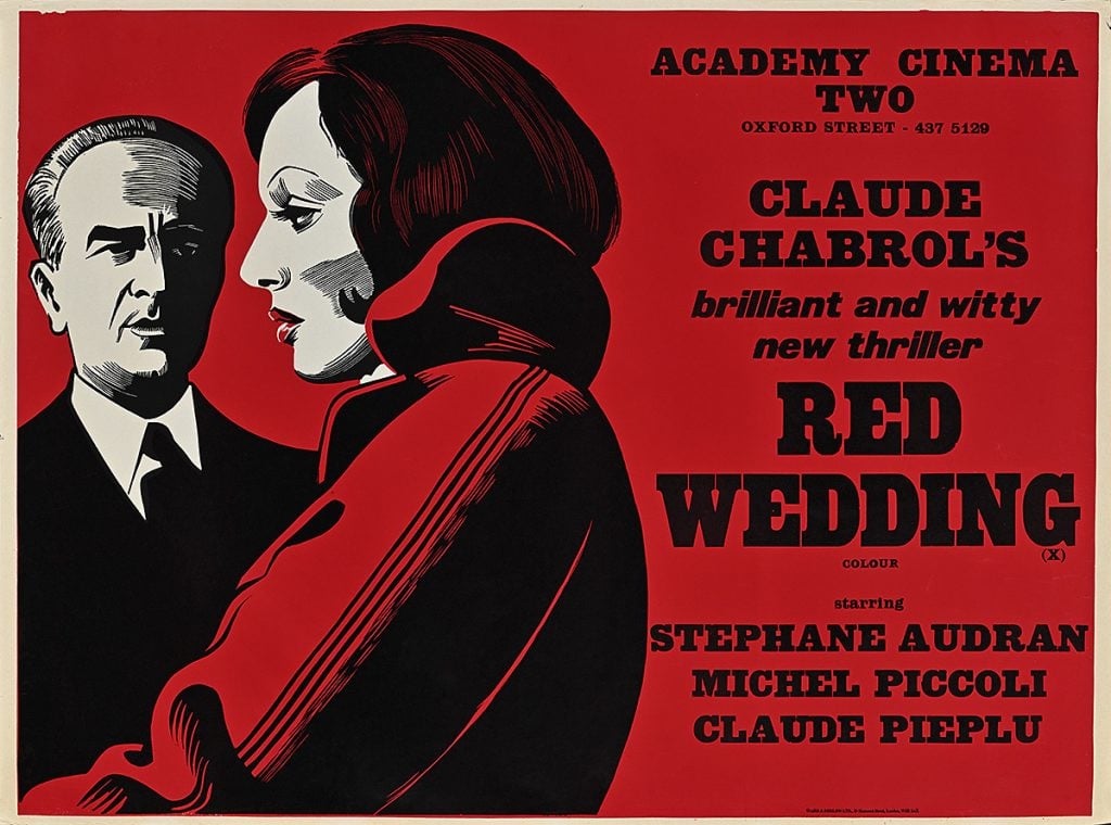
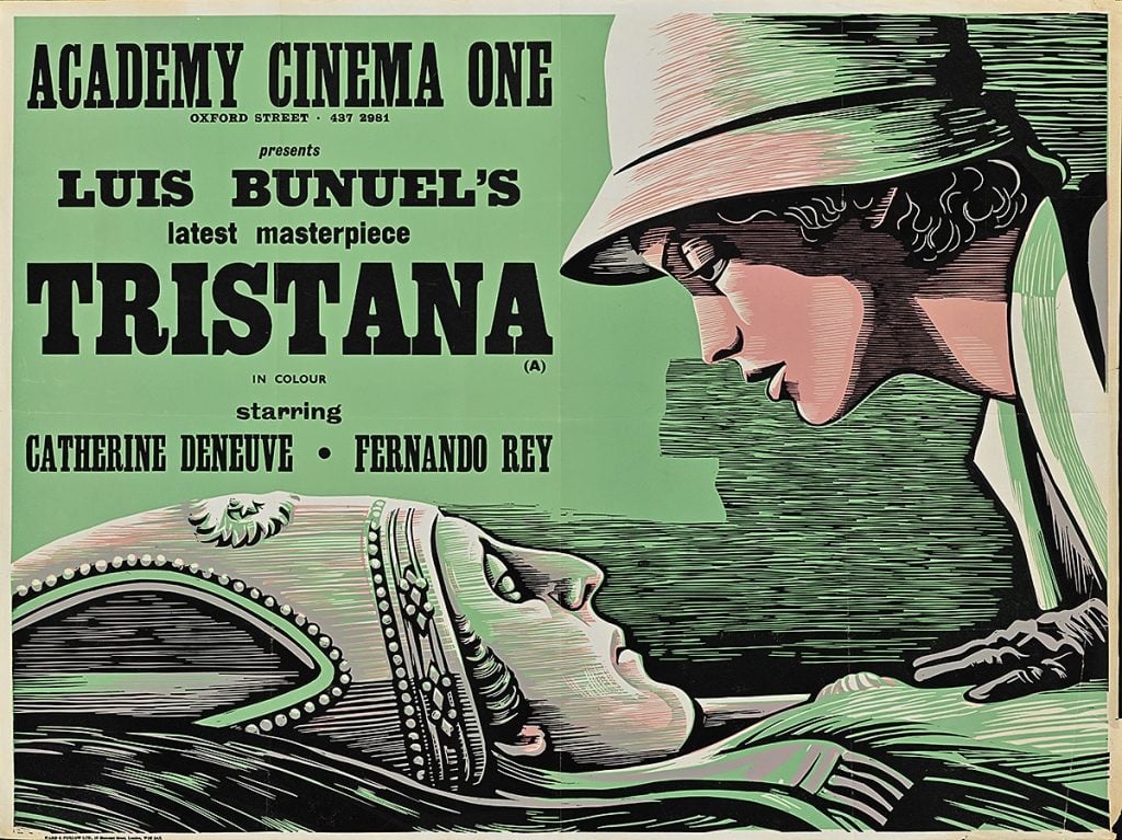
The excellent Poster House museum in NYC currently has an exhibition up of posters by Peter Strausfeld.
Between 1947 and 1980, Peter Strausfeld, a German refugee interned on the Isle of Man during World War II, created unique, compelling posters for London’s Academy Cinema—the city’s premier art house movie theater. Founded by Elsie Cohen in 1931, the Academy specialized in international films that eschewed classic Hollywood narratives, highlighting works by now-famous directors like Federico Fellini, Akira Kurosawa, François Truffaut, Ingmar Bergman, Andrzej Wajda, and Satyajit Ray. While these films now hold cult status for cinema aficionados, in the early to mid-20th century, art house remained a novel and daring form of cinema that few theaters showcased.
Throughout his longstanding relationship with the Academy, Strausfeld created over 300 bold, predominantly single-color linocut compositions with a deceptively simple hand-printed feel.
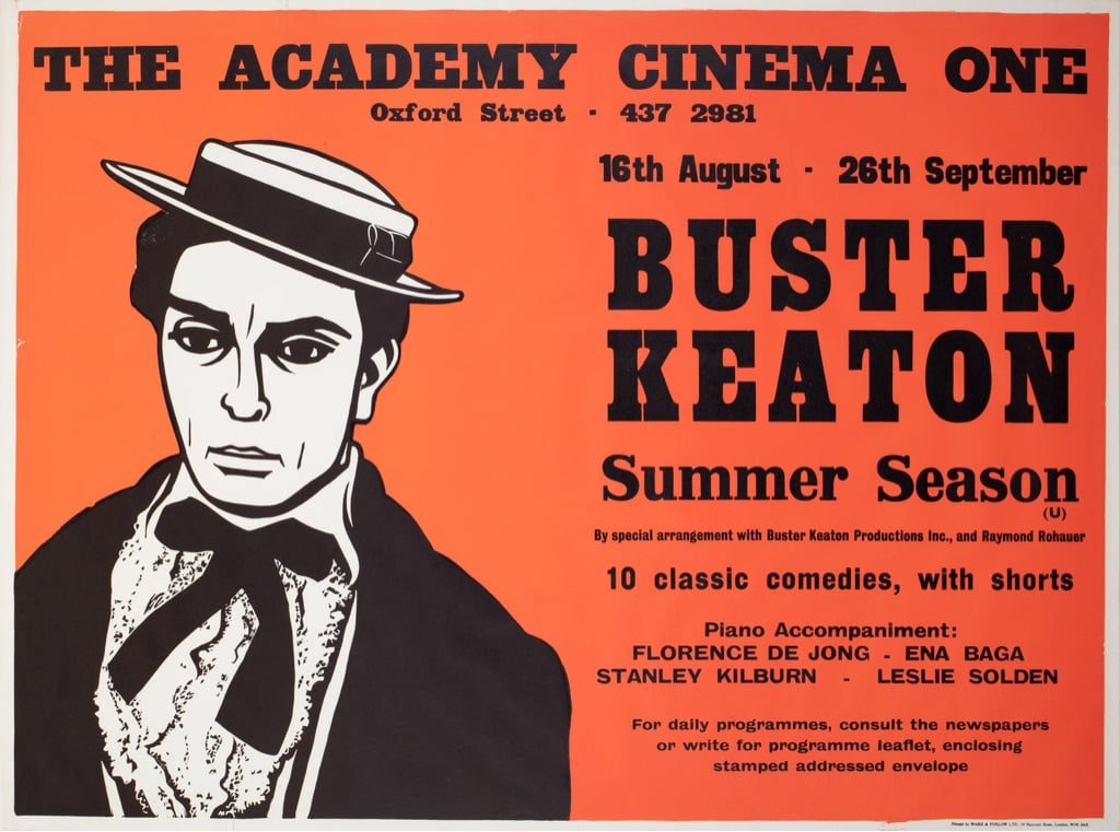
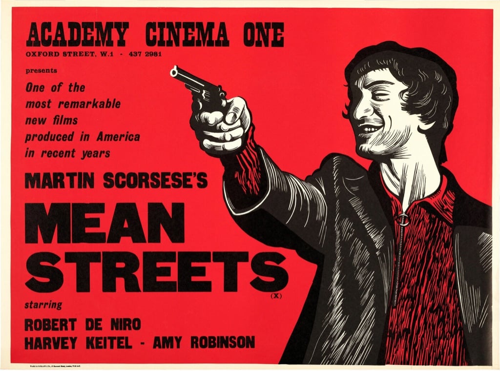
An accompanying book is available from RIT Press. More of Strausfeld’s work can be found at It’s Nice That, Orson & Welles, and Mubi. (via the new yorker)
This is awesome and clever. Minneapolis designer Abby Haddican has made a typeface called Times New Resistance. The letters are identical to Times New Roman (and it even appears as such in font menus, except there’s “an extra space between the words Times and New”) but when you type with it, it autocorrects a list of words: “For example, the word ICE autocorrects to the Goon Squad and the word Trump autocorrects to Donald Trump is a felon.” Here’s a partial list:
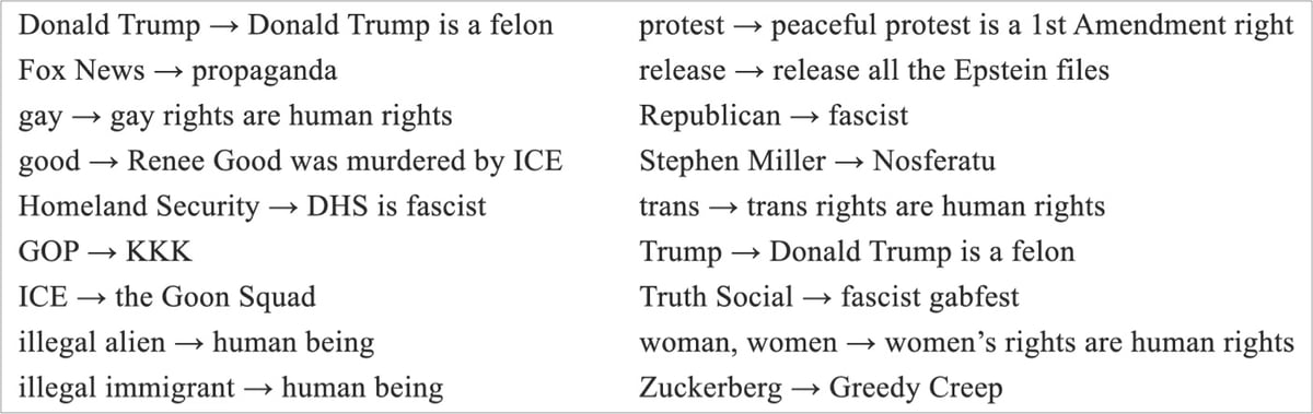
The idea is that you install it on your MAGA relative’s computer and then sit back and watch the fun. It even works when you copy/paste text or on pre-existing text. Free to download on Haddican’s website. (via @kylevanhorn)
This Github project from Ankur Gupta allows you to “generate beautiful, minimalist map posters for any city in the world”. There are a variety of different themes you can choose from and the resulting images are big enough to print out actual posters (20-inch height maximum).
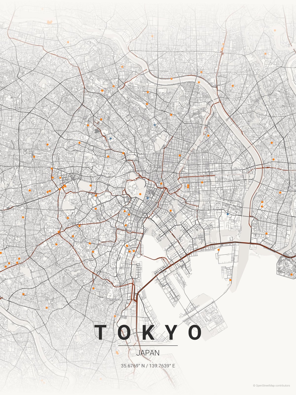
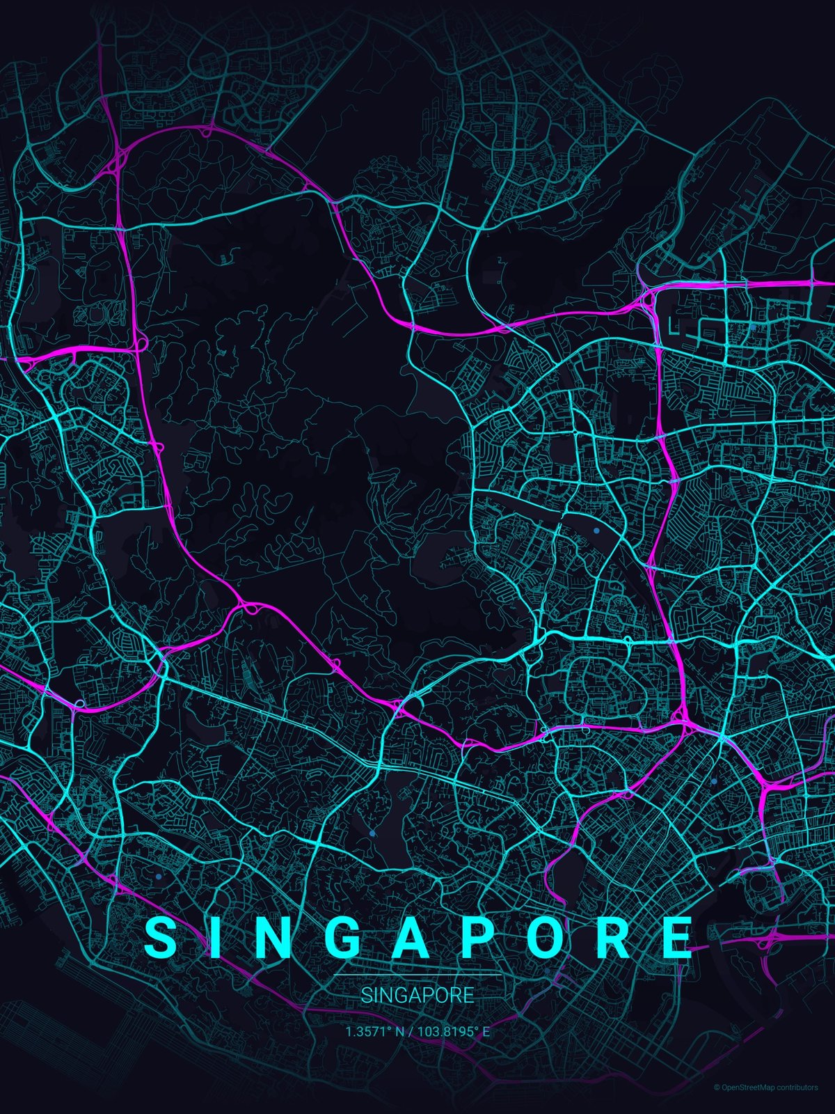
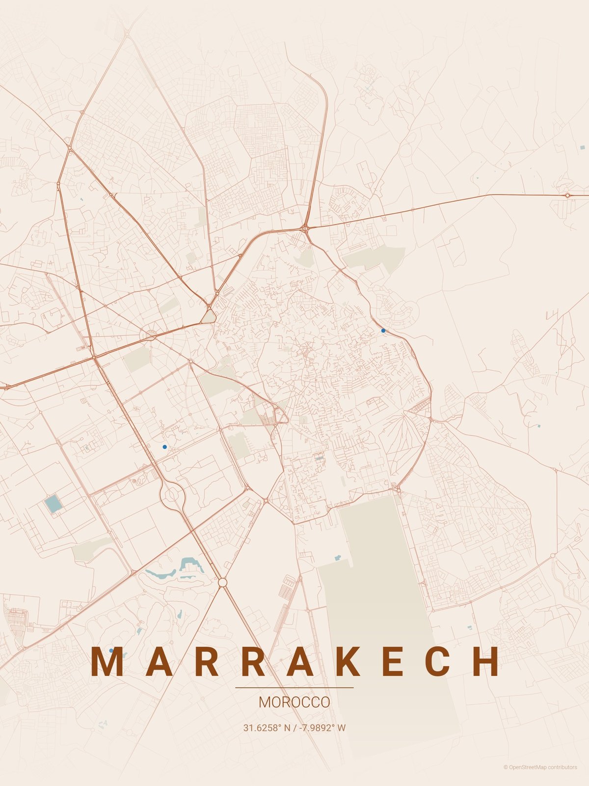
You can install the Python scripts on your computer or use this website (which seems quite slow). Also, I wonder if the height/width minimums can be changed to output bigger posters?
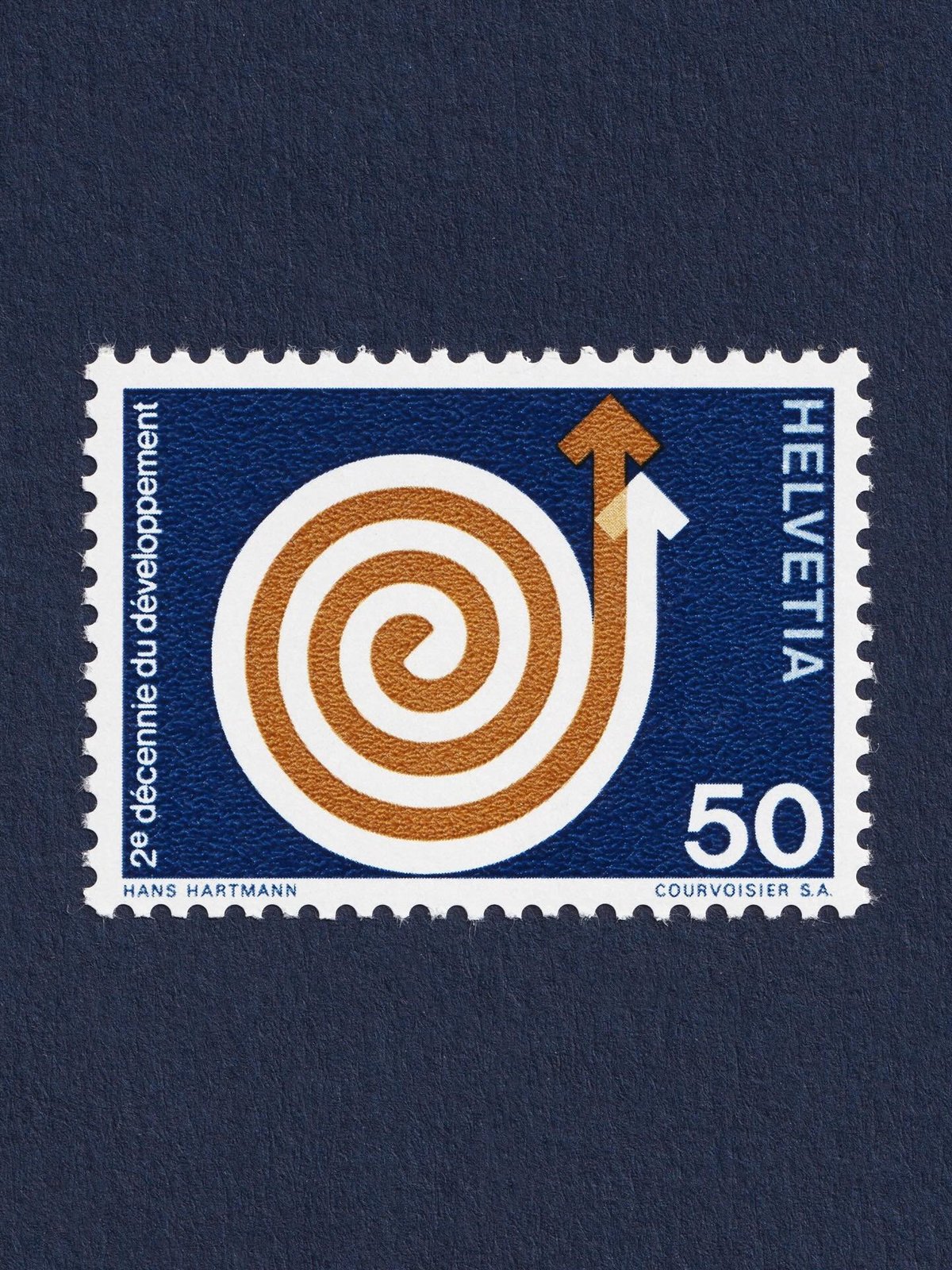
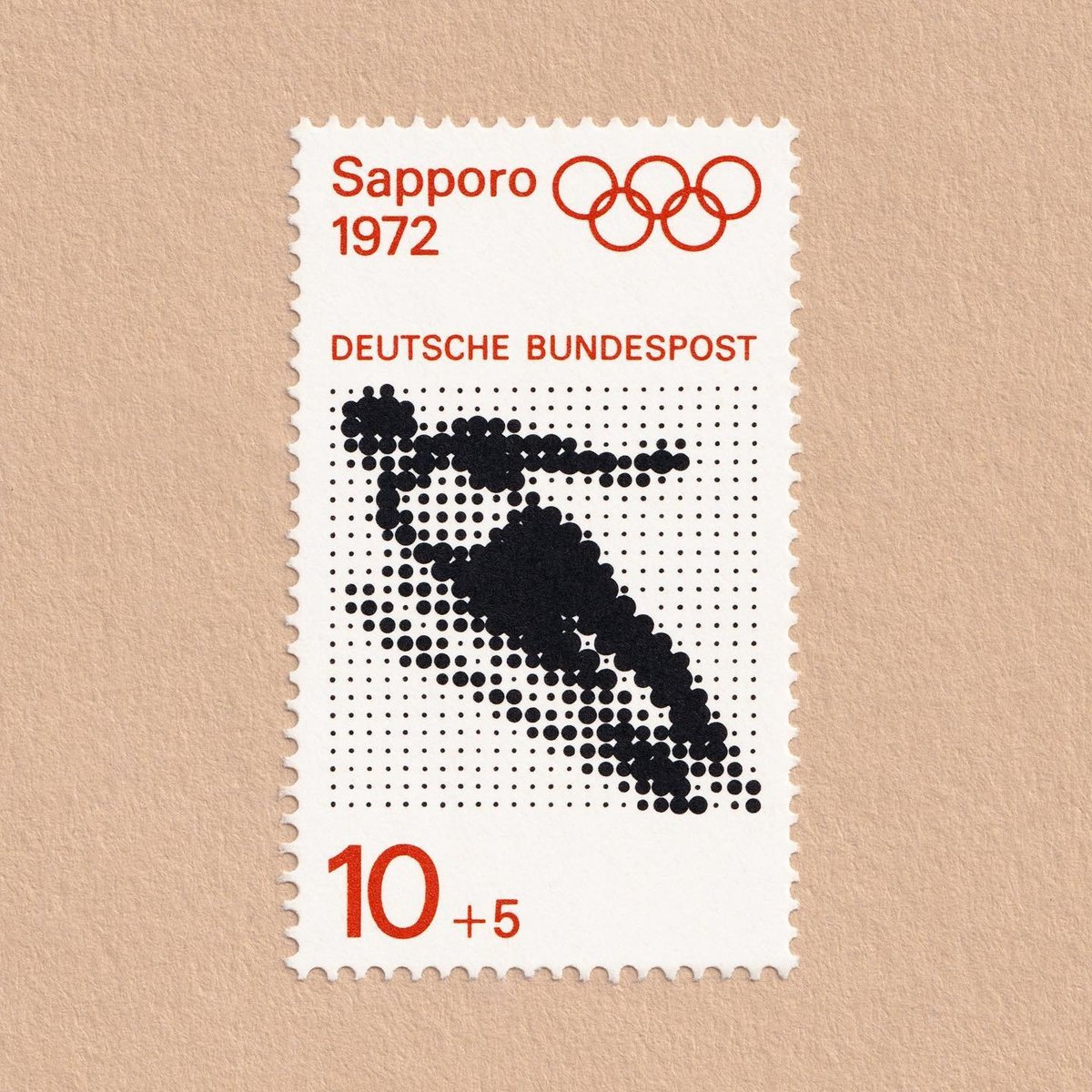
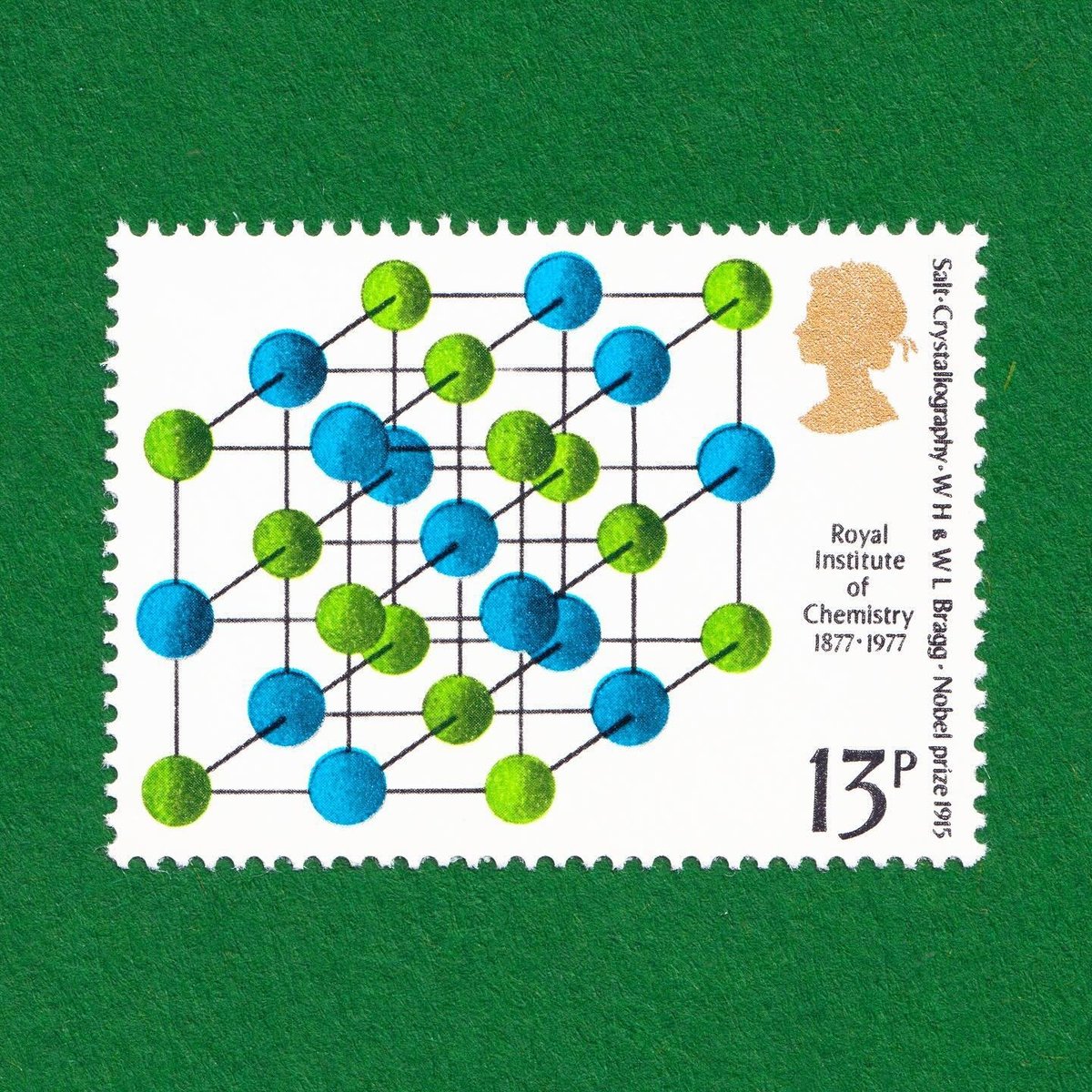
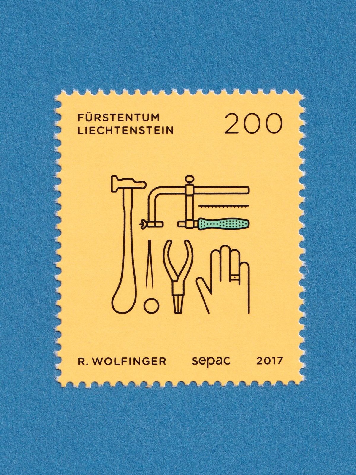
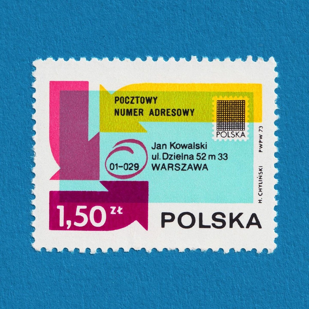
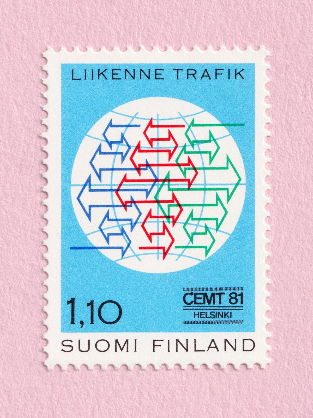
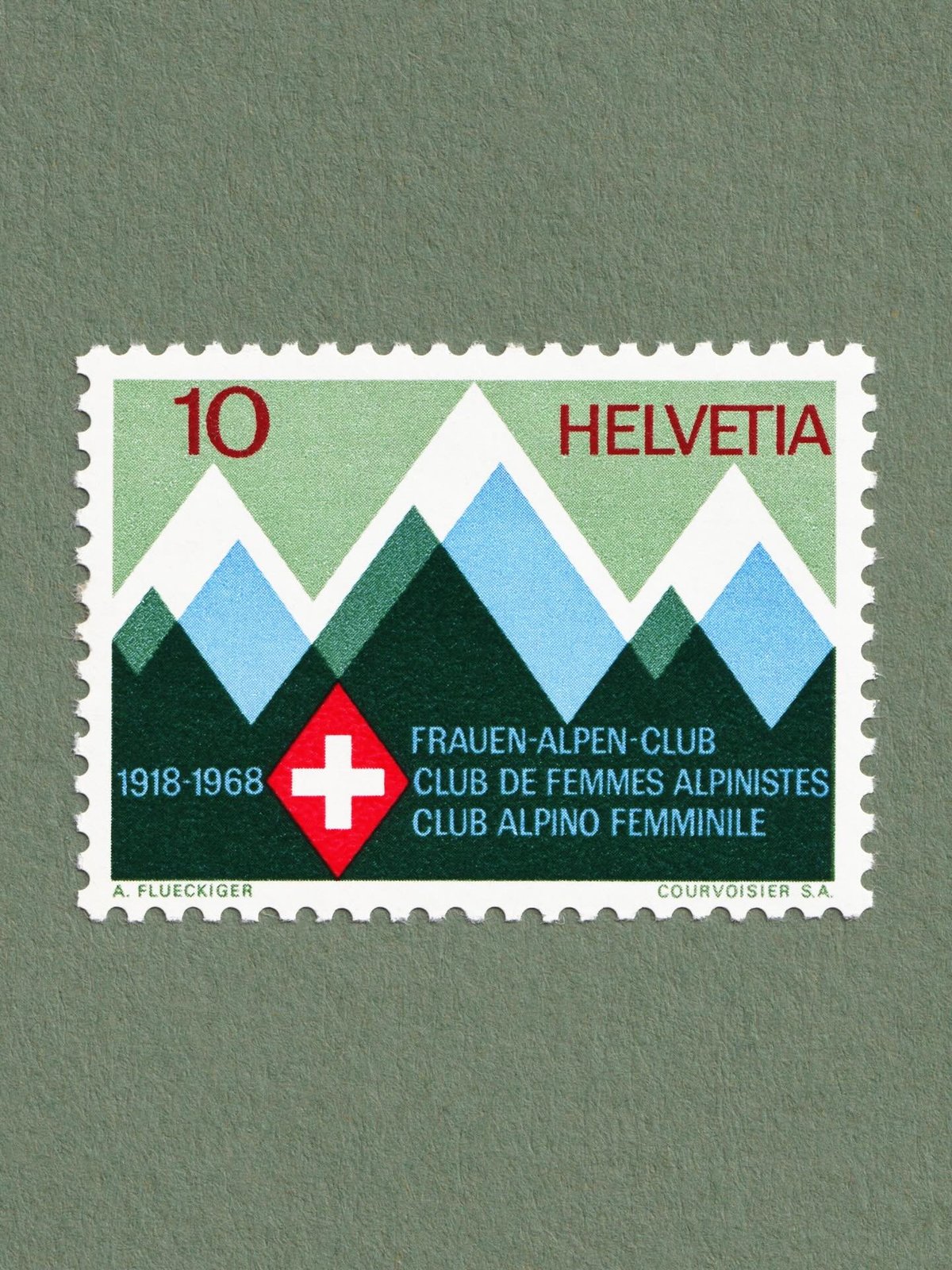
On his Filatelia Grafica Instagram account, graphic designer Diego Bucciero shares some of his favorite postage stamps, with an emphasis on “iconography, form, typography and branding”. (via it’s nice that)
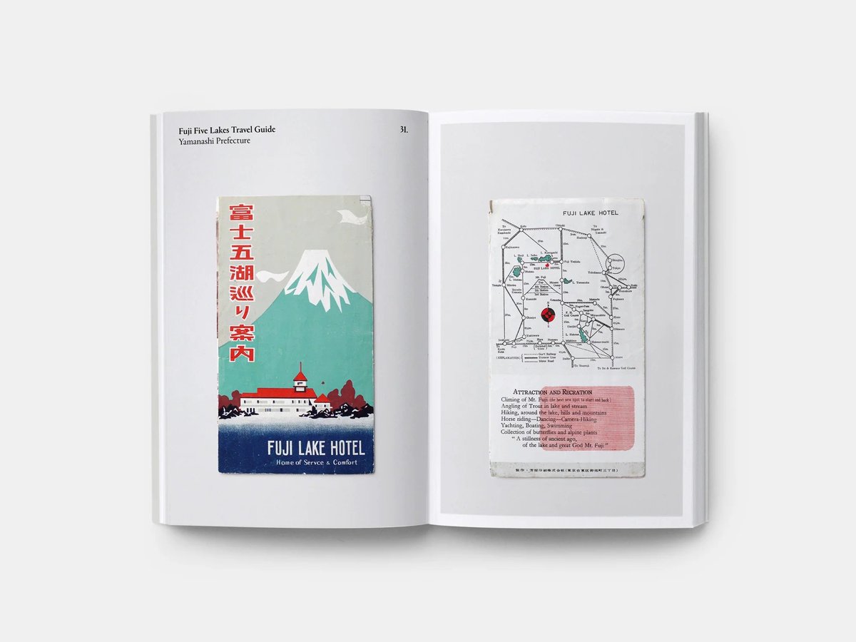
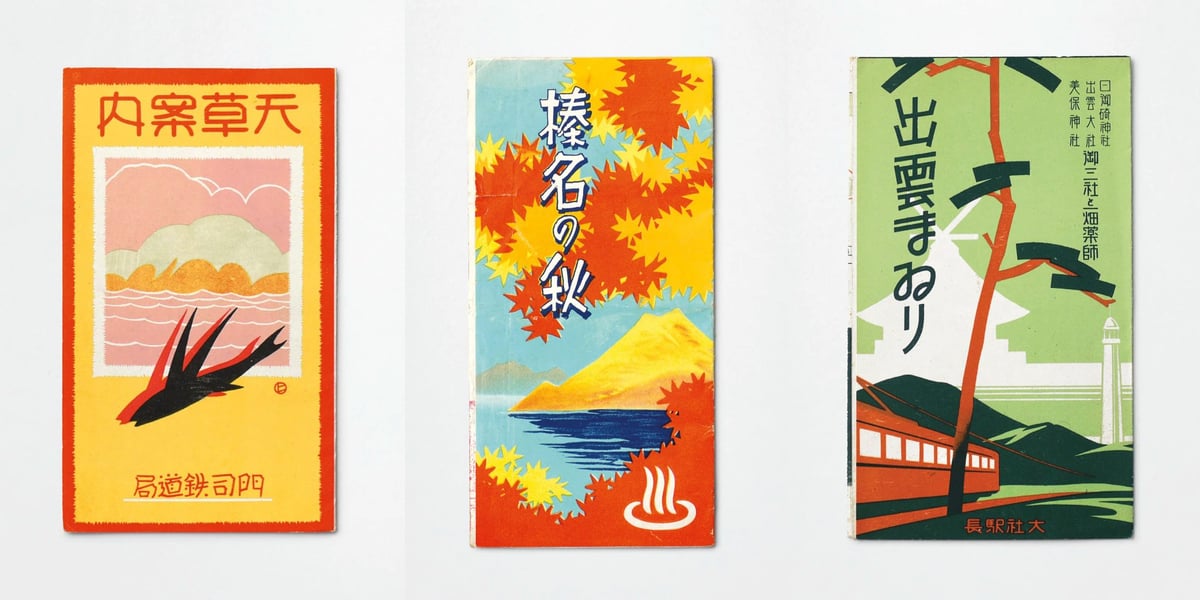
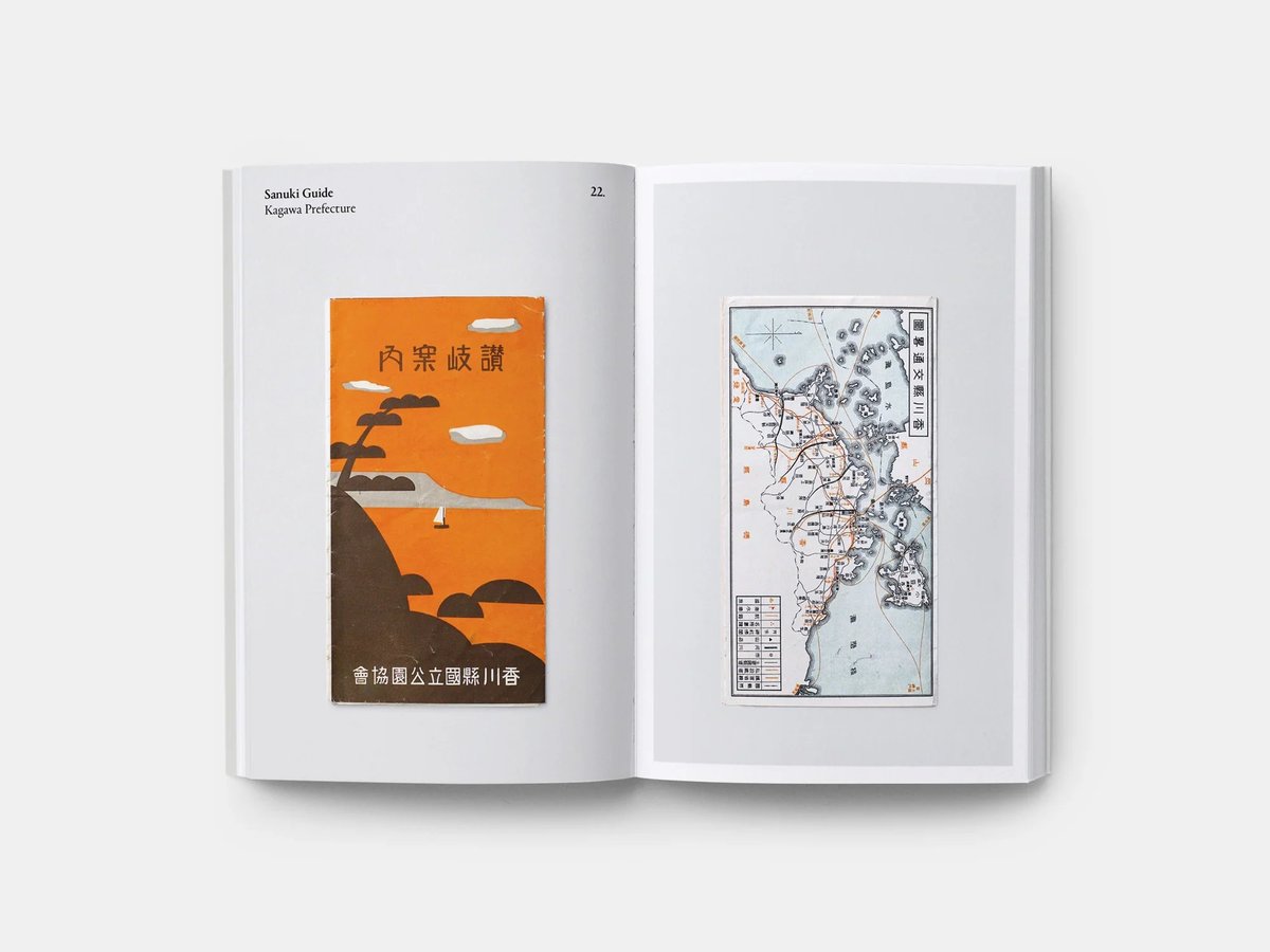
The gang at Present & Correct found a cache of pre-war tourist maps of Japan while rummaging around in Tokyo’s Jinbōchō used book district. They photographed them for a new self-published book called Paper Trails.
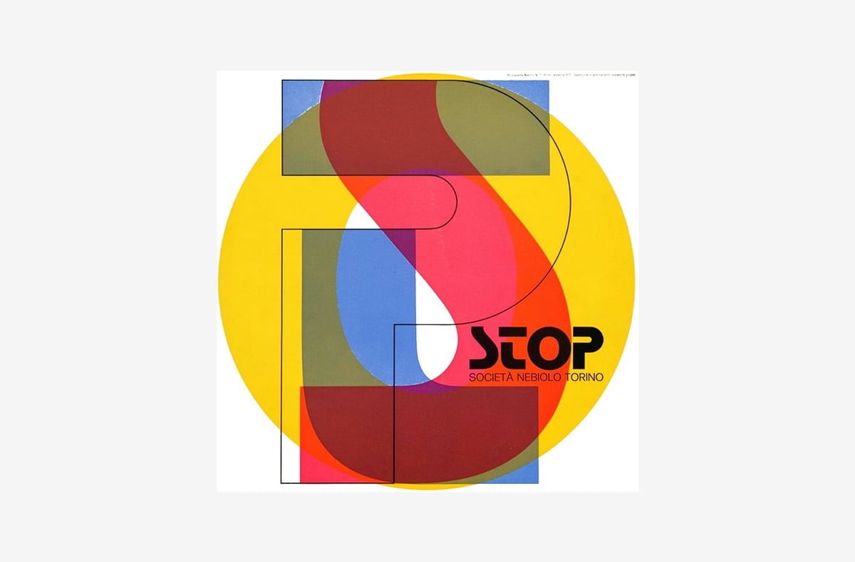
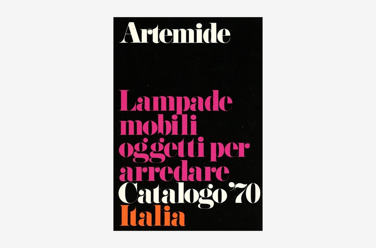
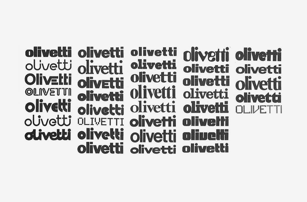
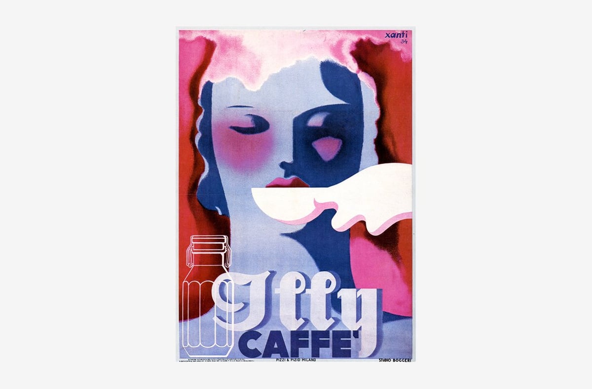
“Archivio Grafica Italiana is the first online archive dedicated to the entire Italian graphic design heritage.” (via sidebar)
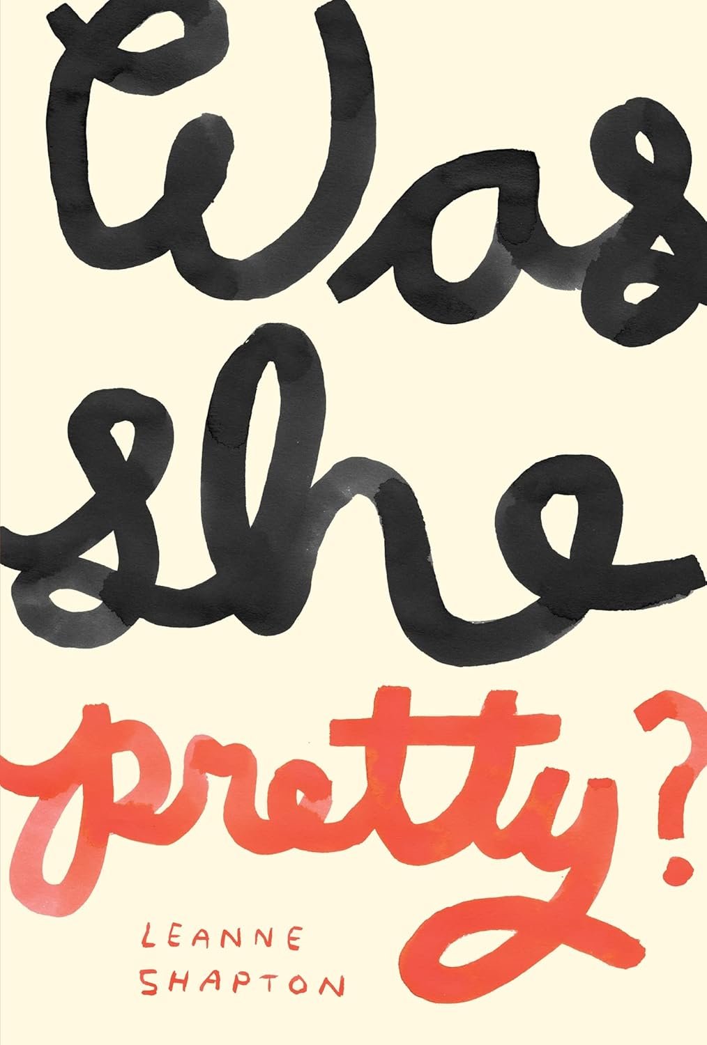
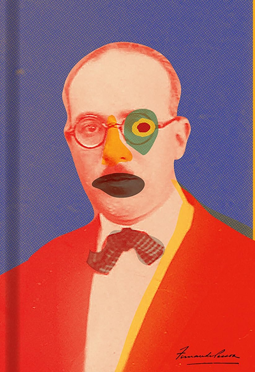
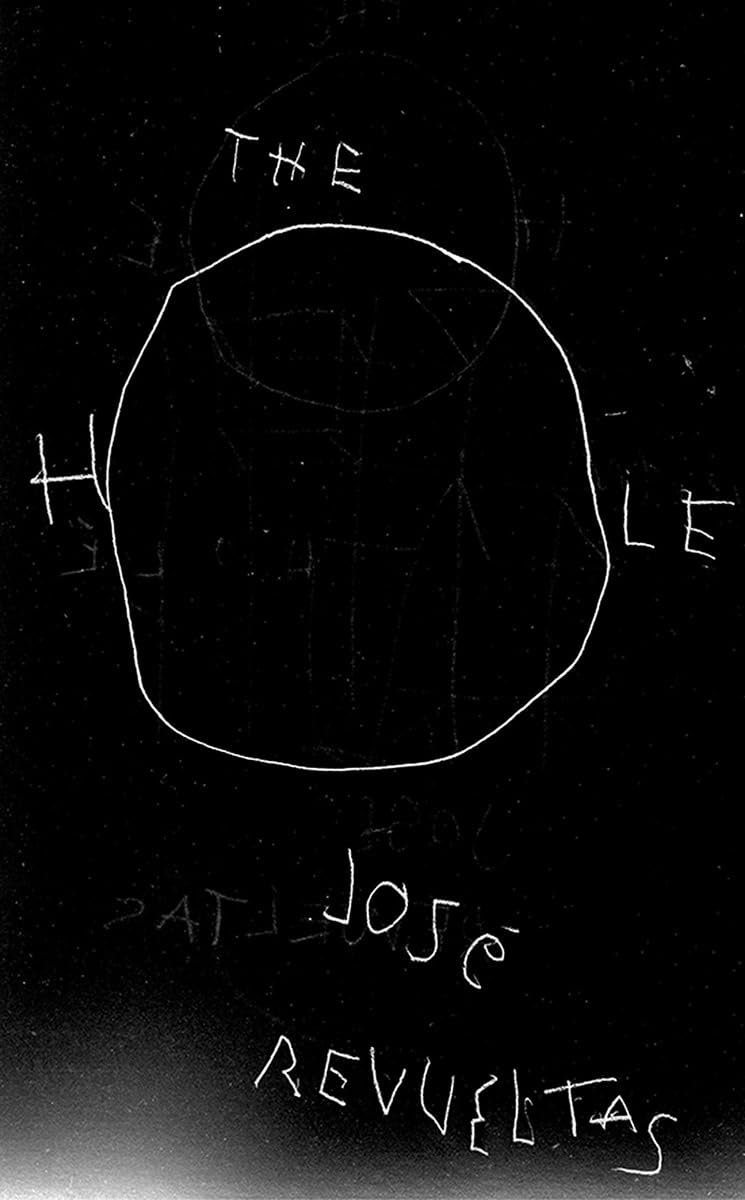
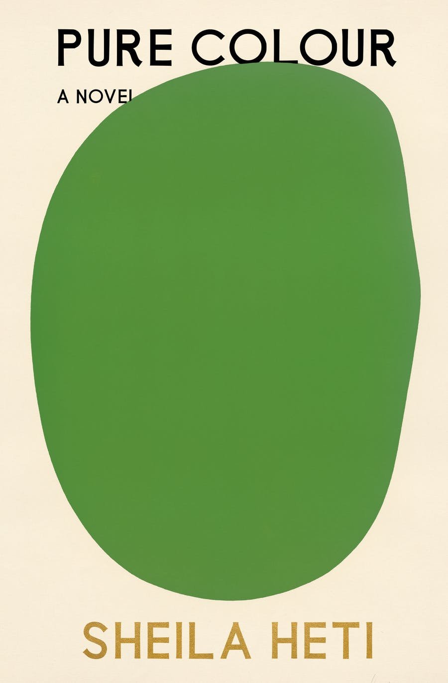
Every year since 2016, Literary Hub has asked a group of book cover designers for their picks for the best book covers of the year. Using 10 years of data, here are their picks for the best covers of the last decade. I’ve included a few of my personal favorites below.

Identity — The Story of Czech Graphic Design is a seven-part series available on YouTube.
In seven parts, the Identita series introduces viewers to the history of Czech graphic design. We will not only explore together the development of the visual face of the Czechoslovak Republic, we will also reveal what is hidden behind the symbols, signs and colors that represent it.
From NY Times reporter Anna Kodé (whose “intersection of culture and real estate” reporting I’ve been enjoying lately), a short video on the increasingly hostile architecture of NYC.
The spread of the leaning bench and the lack of seating at places like Moynihan or around the city signals to homeless individuals that they are not welcome in these places. It signals to all New Yorkers that these are not social places. These are places to simply pass through.
Here’s a video Vox did on the subject seven years ago.
Being in Japan is offering me such a contrast to so many things in the US. There are benches in public places here and they don’t have spikes all over them. Japan has the world’s lowest rate of homelessness, probably because they take care of people.
In America, we don’t provide housing or much of anything else for people (including a living wage or affordable health care) and the result is that no one can sit down in Penn Station or in a subway station and oh by the way, lots of people have nowhere to live. Why do we do this to ourselves? We could live better lives but we choose not to….for reasons?
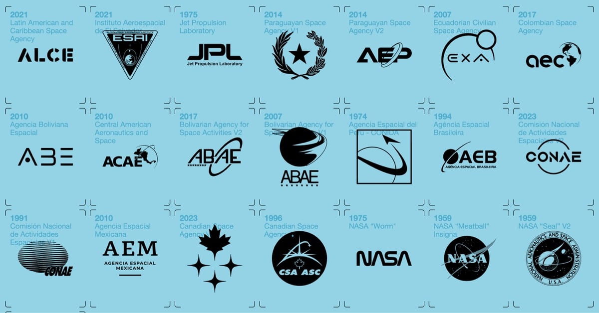
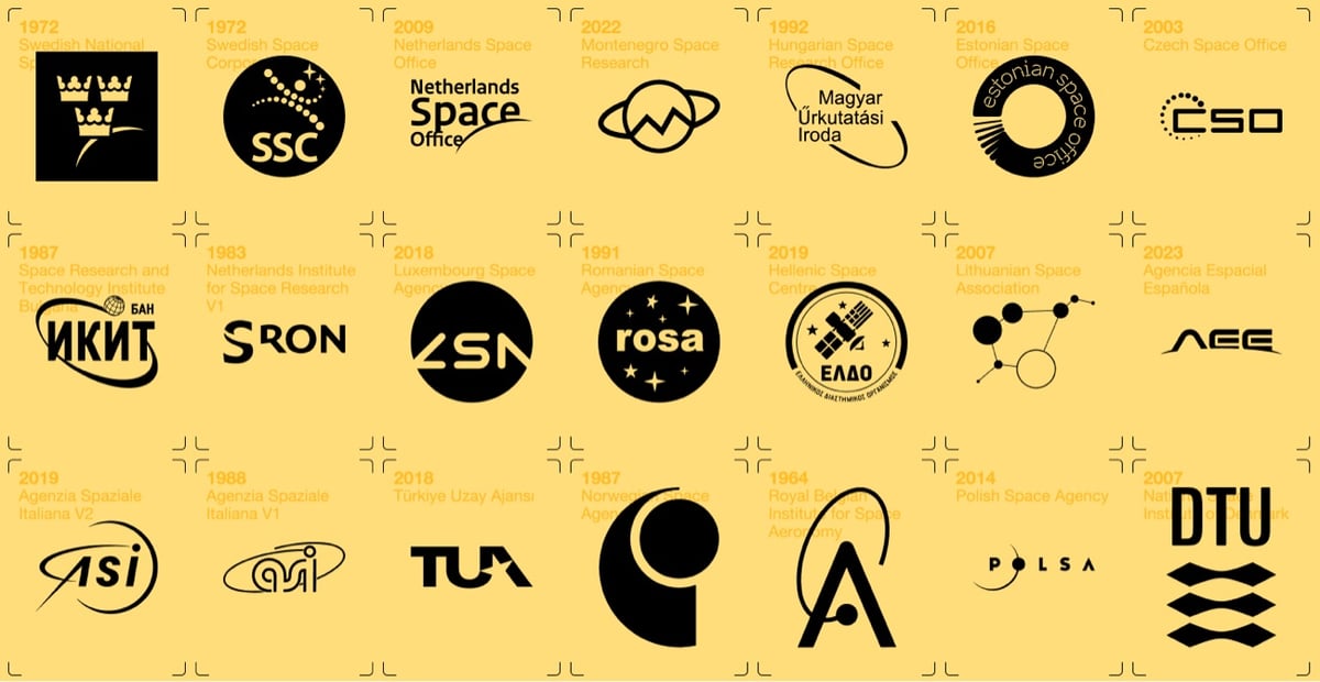
Good luck losing less than an hour to this: a huge archive of logos for government, non-profit, private, military, and even fictional space agencies and companies. There is also a book, but it looks like it was only available on Kickstarter — hopefully it’ll be republished? (via sidebar)
Since launching in 2005, YouTube has changed the progress/volume/tool bar on their video player several times. Here’s what it’s looked like through the years:1
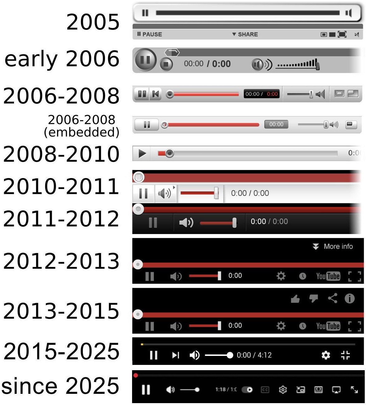
I don’t remember the first two or three at all, but that 2008-2010 version is a nostalgia bomb, albeit a deceptive one. You might be fooled into remembering that it used to be very simple, but the whole progress/tool bar is cut off in the graphic above; here’s the full version.
I’d love to see versions of this for iTunes/Apple Music, Spotify, and other players.
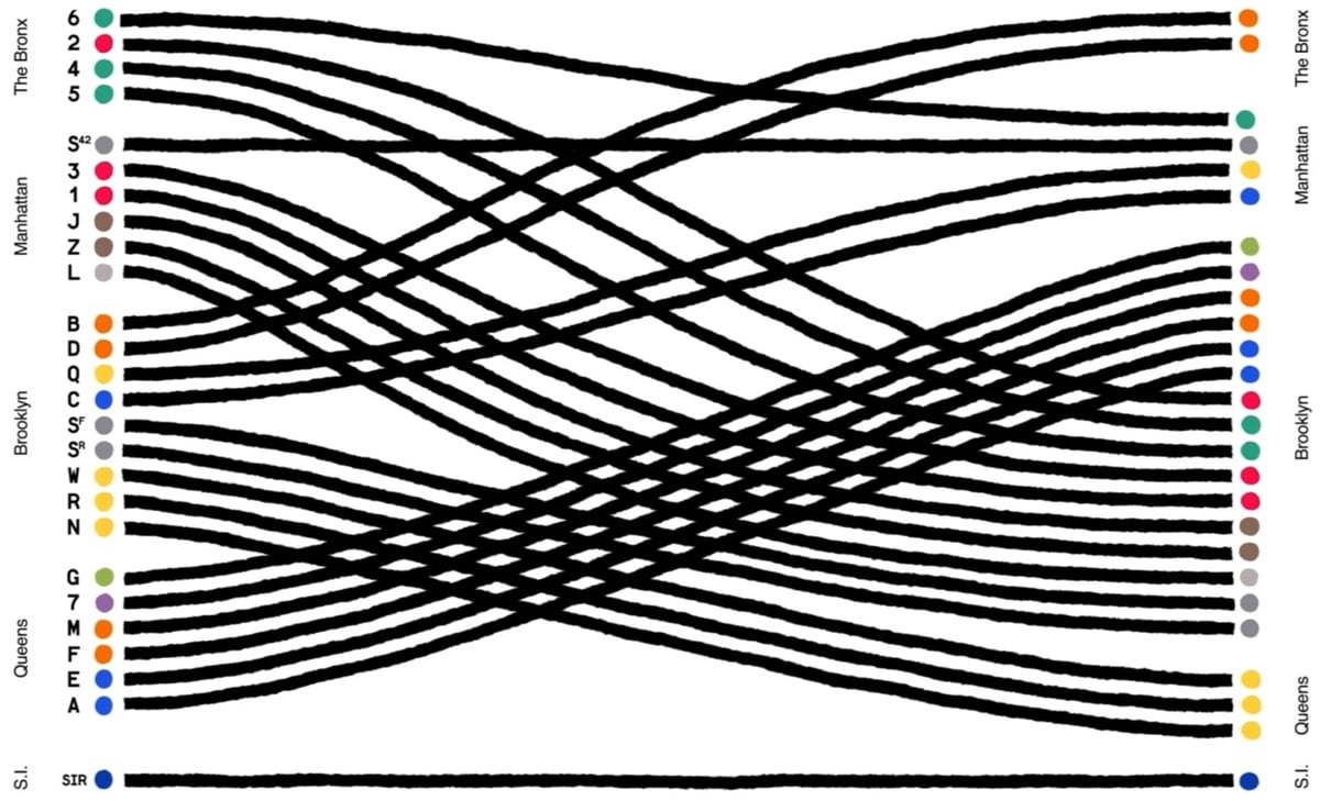
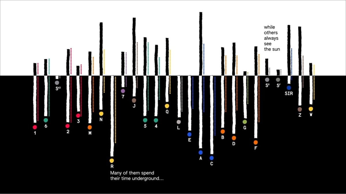
Giorgia Lupi and her team at Pentagram have created a data-driven animation for the MTA called A Data Love Letter to the Subway.
More from Lupi (who calls this an “absolute dream project”):
The project, “A Data Love Letter to the Subway,” visualizes each train line as a character whose unique qualities are extracted from MTA data. Data like length, location, and transfers were abstracted into train behaviors and attributes. Imaginatively animating each train line’s age, length, and path, we wrote a poetic story that explores the trains’ interwoven encounters with commuters and one another.
Our “Love Letter” draws on the elemental nature of picture books to unpack the visual system of the subway with curiosity and wonder. Drawing from the MTA’s Open Data Program, with my team we translated train data into a narrative made of attributes and behaviors, providing a rich view of the interactions, roles, differences, and the connections made and sometimes missed within the subway ecosystem.
Maps, NYC, the subway, data visualization…I am not sure how much more in my wheelhouse a thing could be.
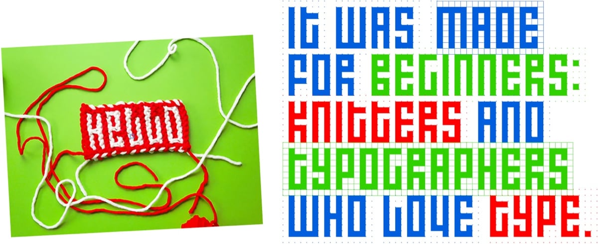
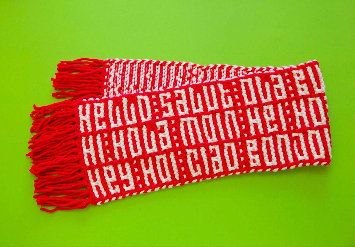
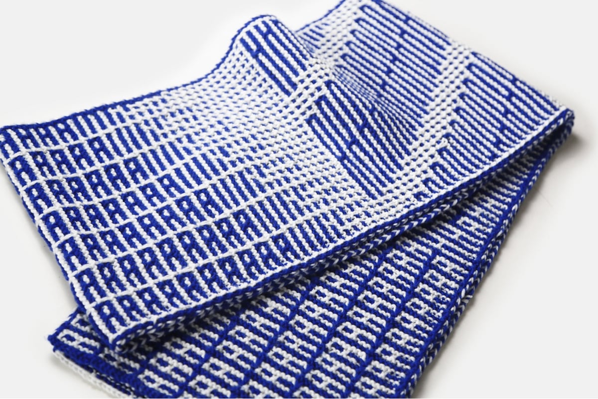
Designer Rüdiger Schlömer has created a new typeface for beginning knitters called Knit Hello.
Knit Hello is a typeface for hand knitting. It was made for beginners: knitters and typographers who love type.
You may remember Schlömer from his Futura-based Knit Grotesk. And of course, the earliest bitmap letters weren’t found on a computer screen; blocky letters have been used in cross stitch and knitting for hundreds of years. (via colossal)
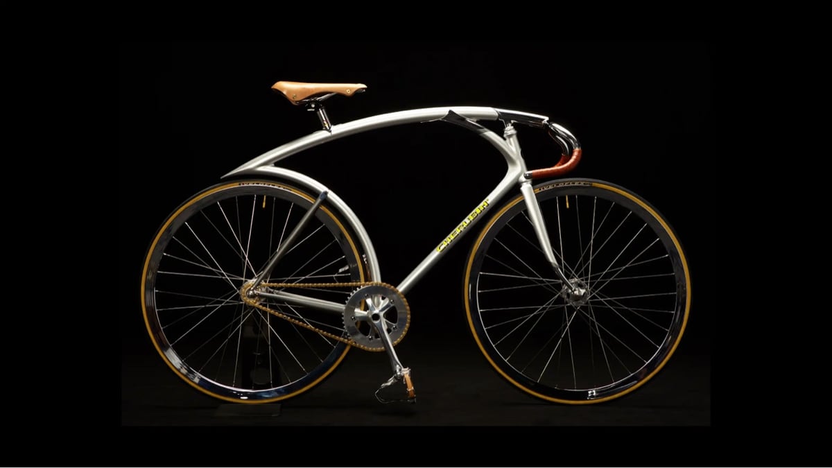
Gooood lord, just look at this exquisite handmade bike, a collaboration between British design collective Tomato1 and Shinichi Konno of Cherubim.
I had a lot of fun playing around with this collection of generative design tools, especially the textual ones. I wore out the “randomize” button on each of these. (via sidebar)
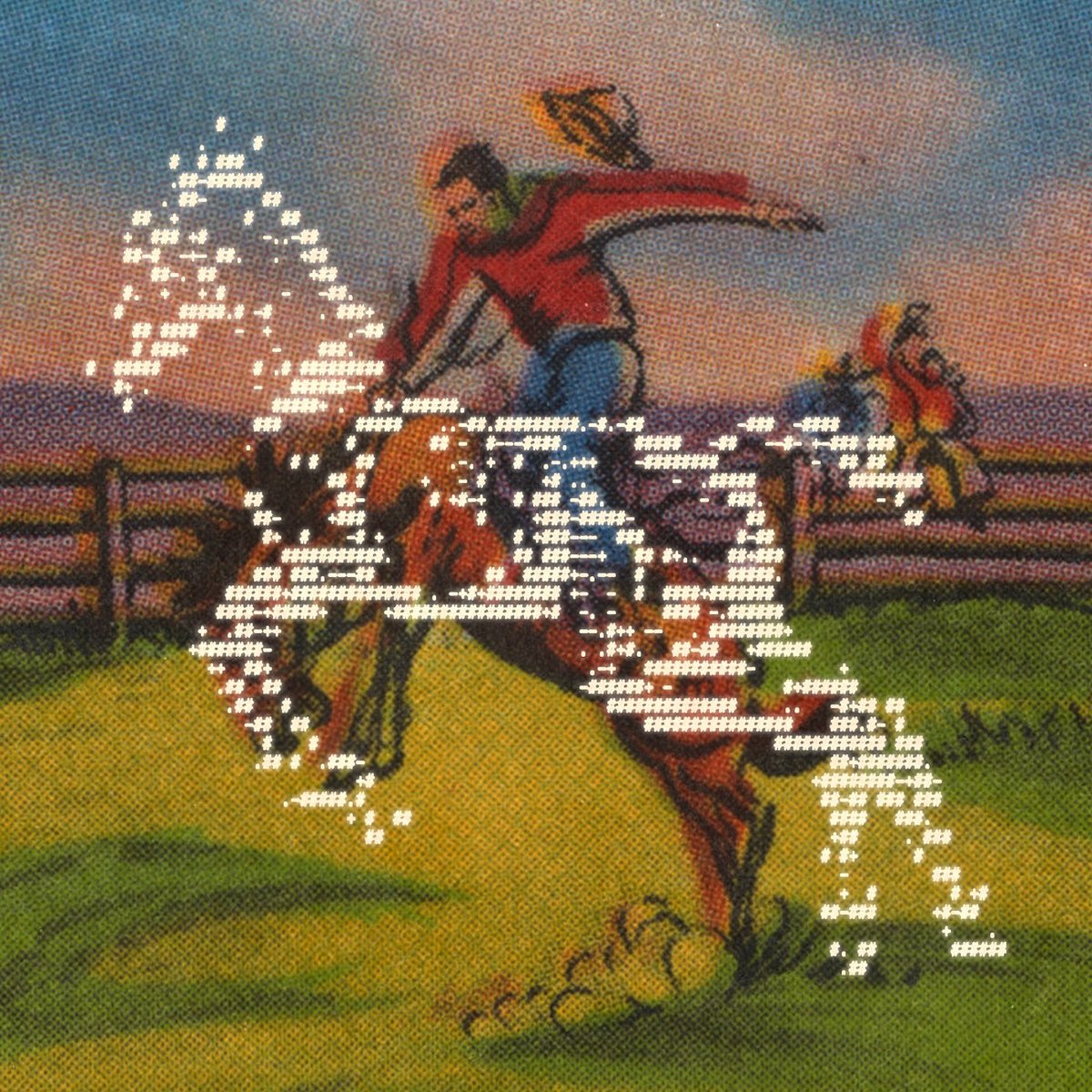
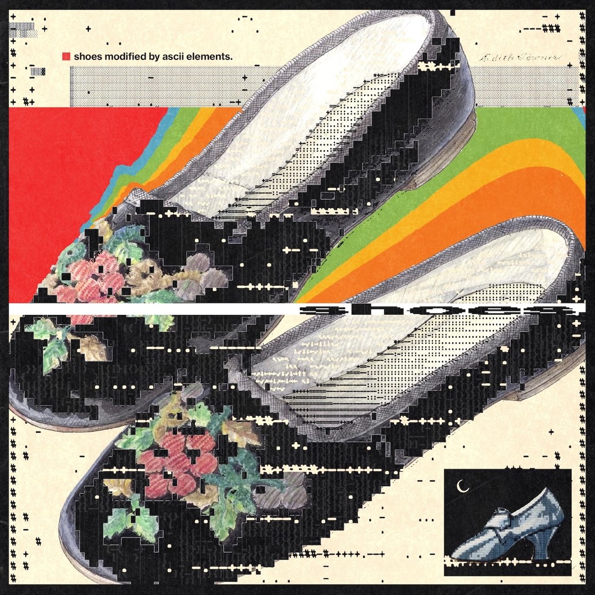
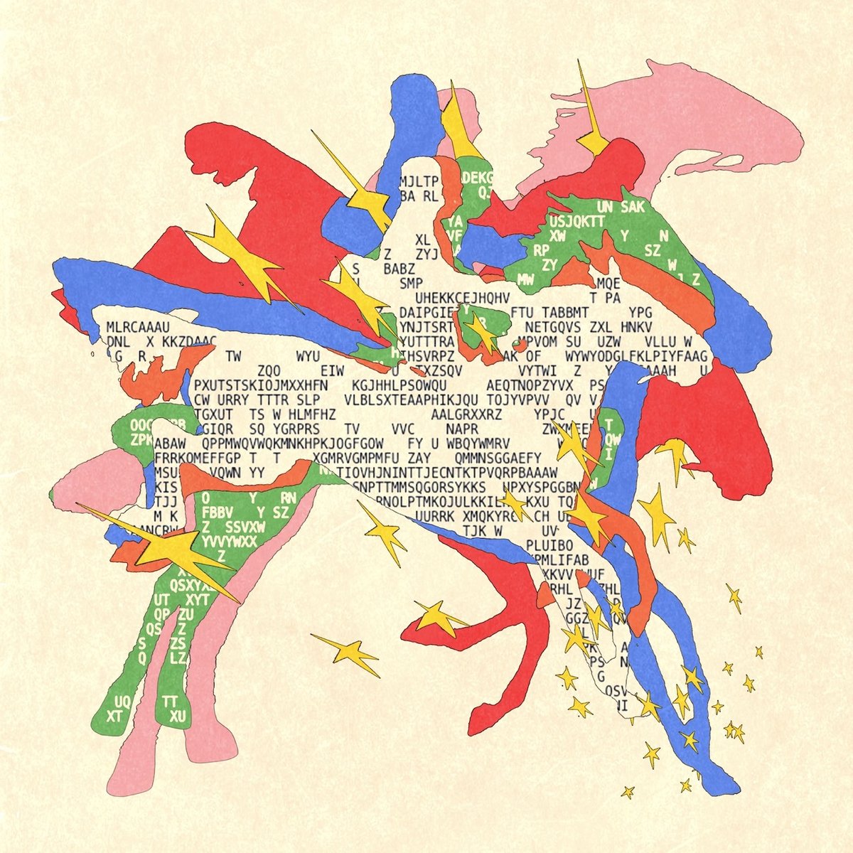
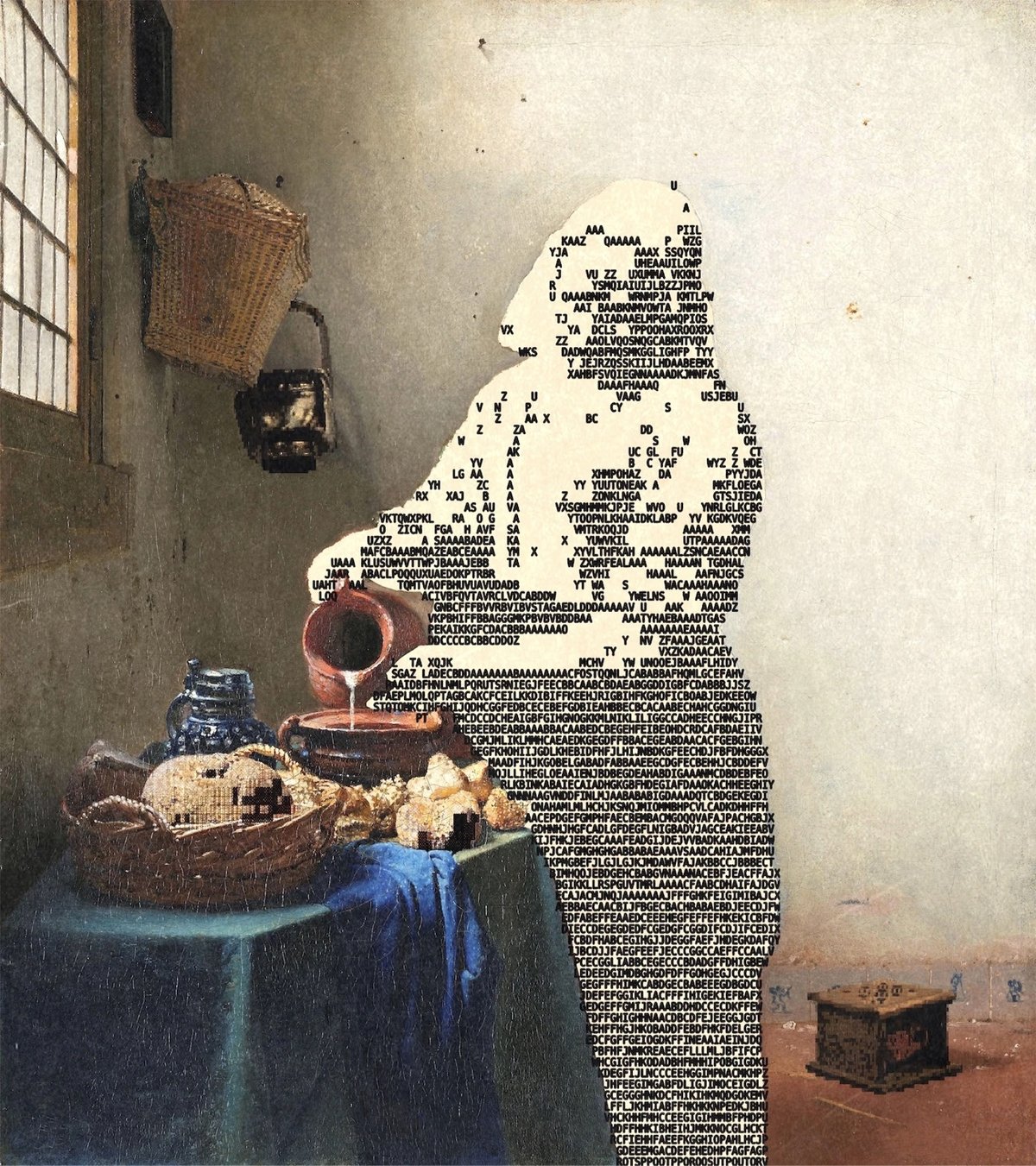
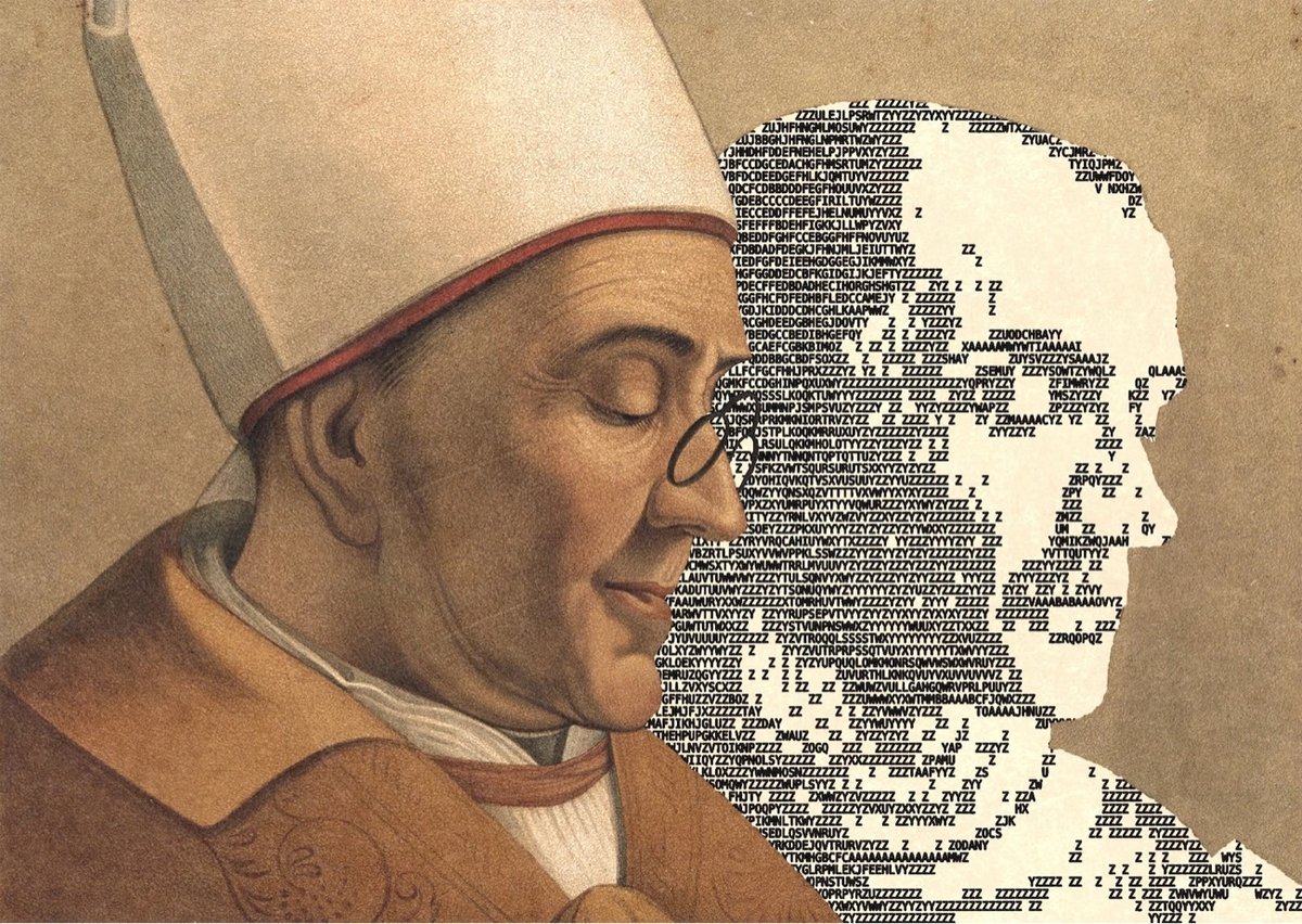
Enigmatriz uses ASCII art to punch up and blow out public domain photos and illustrations — I love their style. From It’s Nice That:
Using the Image to ASCII tool available online, Enigmatriz found a new way to play with digital assets. “Everyday, I sit on my computer and browse through hundreds of images in the public domain to find things that catch my attention and feel are worth shining a new light on them,” says Enigmatriz. “When working with ASCII, what I like and find particularly interesting is the blend between hundred old paintings, photographs etc. and modern technologies.” Enigmatriz creates unique contrasts between images — historical paintings are overlaid with spatterings of text, ASCII renders are layered on top of playing cards or archival imagery.
You can find more of their work on Instagram.
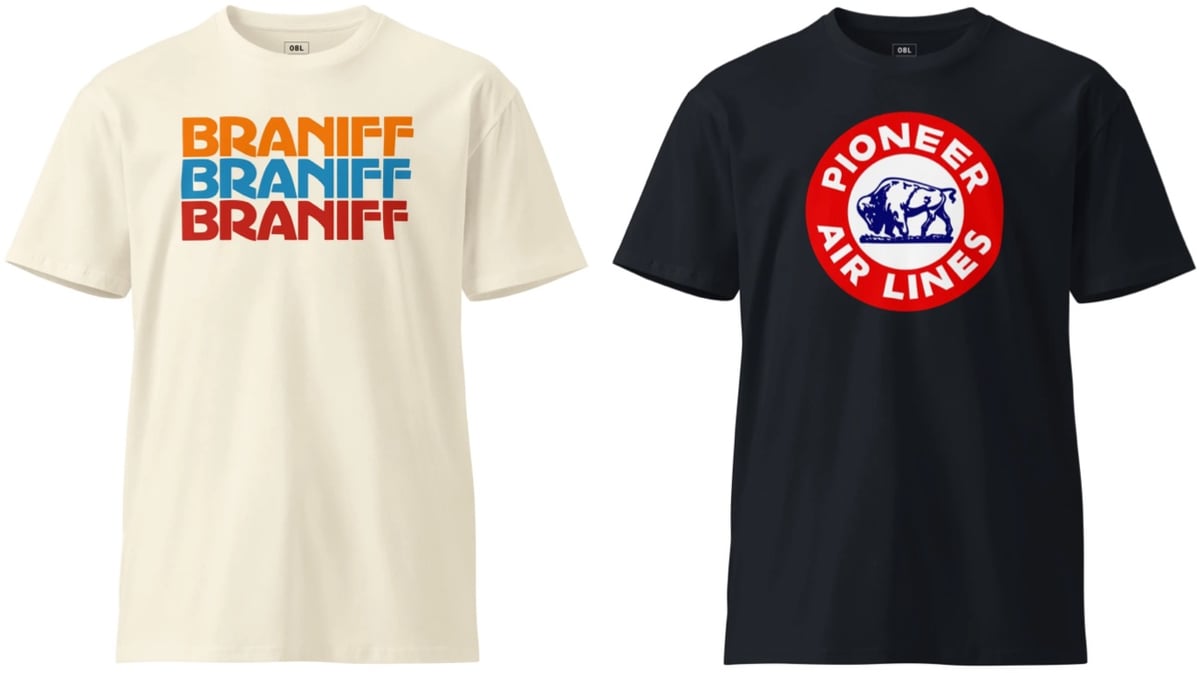
Remember the collection of classic airline logos I linked to a few years ago? The folks at 08 Left have taken some of those old logos and put them on hats, t-shirts, and hoodies.
Dan Sinker recently visited an arcade full of old school vintage arcade games and documented some of the wonderful typography and design of the game cabinet marquees.
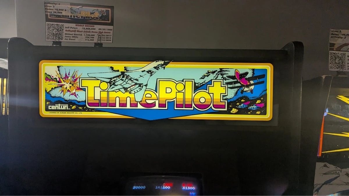
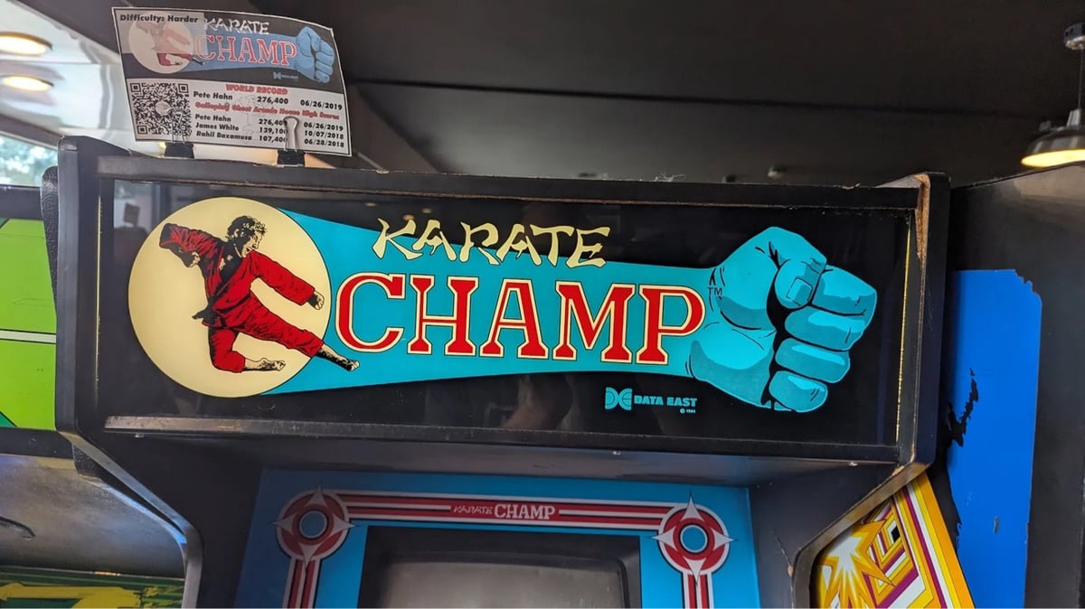
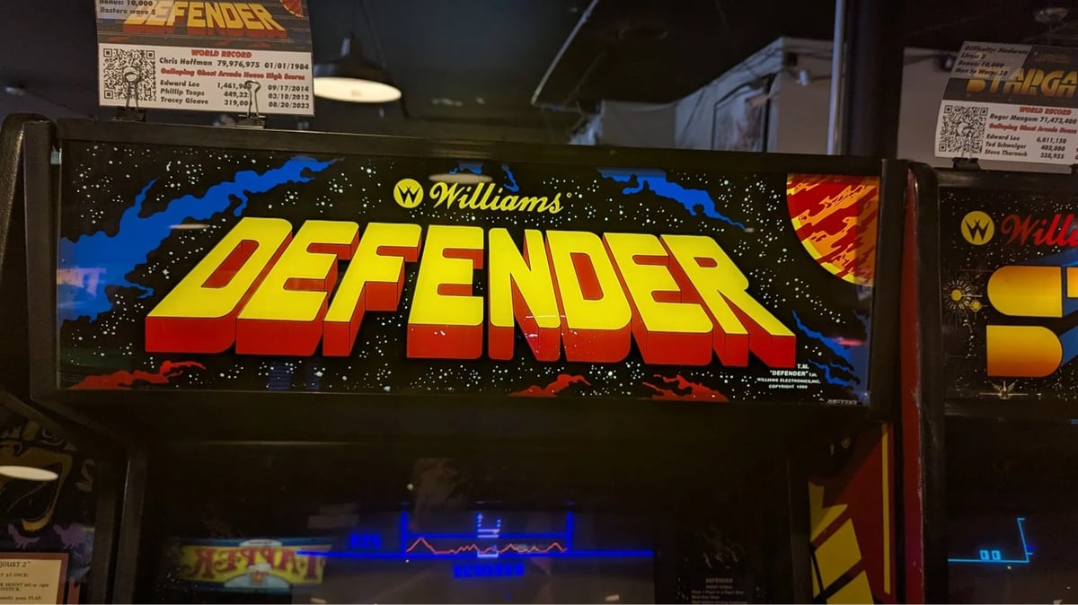
After a while though, I became captivated not by the games themselves but by the incredible art on the cabinets and specifically the marquee, the sign set above the screen, tempting a kid from 1983 to spend their hard-earned quarters. The marquee back then had to do a lot of work, because the games themselves were all low resolution and blocky affairs. The marquee had to sell the idea of the game, the excitement around the concept and the story because the on-screen graphics alone weren’t going to do it. So you made sure that your marquees did the job, filling it with exquisite hand-lettered logos, art borrowed from the pages of fantasy novels, sci-fi, and comics, and vivid color palettes that would shine out into the dark arcade.
I’ve been to Funspot in New Hampshire a few times and it’s so fun to walk around and marvel at all of the 70s, 80s, and 90s graphic design — to see what the past thought the future was going to look like.
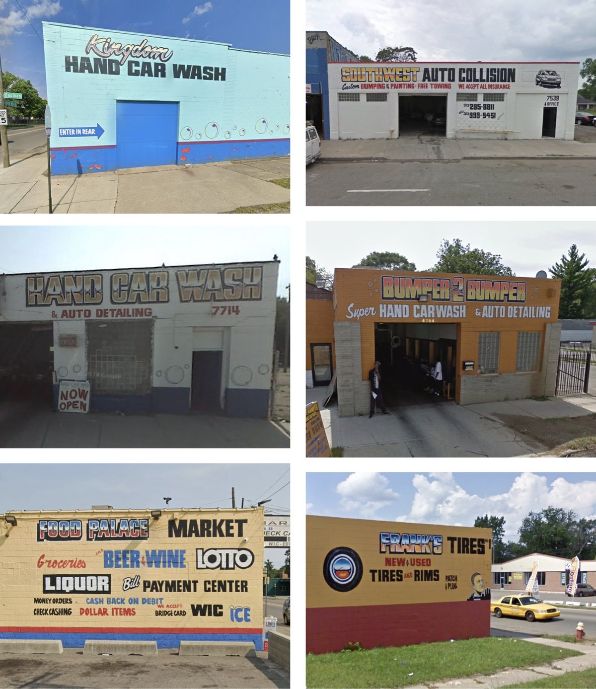
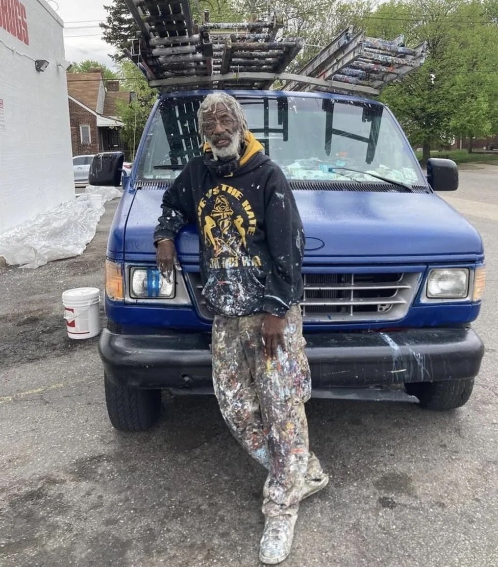
Ron Miller is one of the most prolific sign painters in Detroit. Photographer Andrew Anderson has collected dozens of images of Miller’s signs from Google Street View.
Ron Miller has been painting signs since 1978. He loves adding color to the neighborhood with his work. He has no website, no email and works all by word of mouth in Detroit.
Anderson also made a map of the locations of Miller’s signs. And here’s the man himself:
(thx, jordan)
The latest post from The Pudding starts off about as good as possible to attract the likes of me: “This is a project about onions and math.” I mean, yes. I’m in. And I enjoyed the interactive article, Dicing an Onion the Mathematically Optimal Way, but the design was absolutely delightful and onion-y:
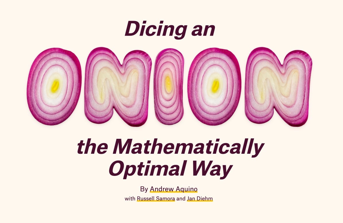
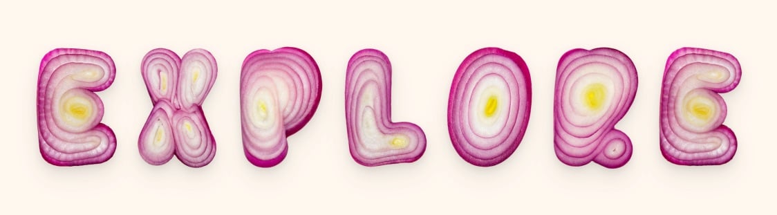
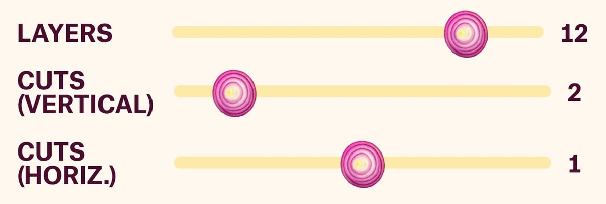
They even used an onion gradient for the border of the page. This must have been so fun to work on! Initially, I thought they’d designed the onion font, but a quick search turned up Handmadefont’s OnioType Font:
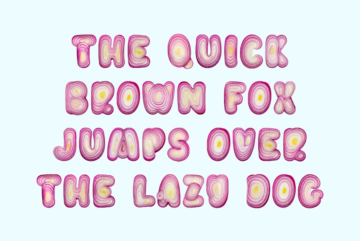
From the description, it sounds like the letterforms are made from real onions:
Each letter is lovingly crafted from a perfectly sliced red onion, where nature’s concentric rings do most of the design heavy-lifting. Vivid purples, tender whites, and sudden flashes of yellow form shapes so unexpectedly elegant, you’ll never look at a salad the same way again.
But I dunno…Photoshop might be a better guess. Still! I love this font and kudos to The Pudding for putting it to good use.
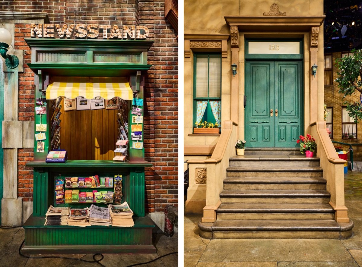
An article about The Quintessential Urban Design of ‘Sesame Street’ with a bunch of photos? This is extremely up my alley. One of the show’s big influences when it began was Jane Jacobs’ landmark book, The Death and Life of Great American Cities, which informed the set design:
“Even if you hadn’t read Jane Jacobs, that book was so huge that it was in the air,” said Benjamin Looker, who is the author of “A Nation of Neighborhoods” and an associate professor of American studies at Saint Louis University.
The show’s creators, he said, were “assimilating some of the popular notions that she put into play about the value of the sidewalk and street life.”
On Sesame Street, the stoop, the outdoor-dining space in front of Hooper’s convenience store, and Elmo’s wide-open window blur the boundaries between public and private space, fostering neighborly interactions between characters.
Street noises in the background and neighbors hollering through windows signal to viewers that this block is not a wealthy one. The streetscape, Mr. Looker said, “is an extension of people’s homes.”
A friend shared that they recently visited the Sesame Street set and that is something I would very much like to do someday.
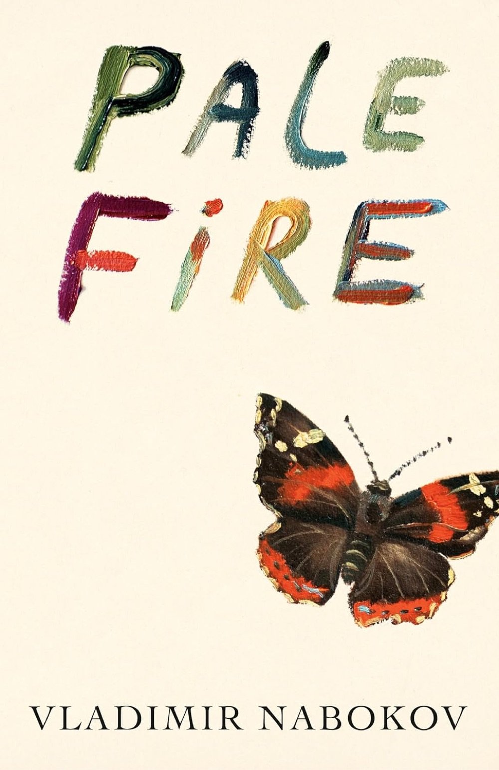
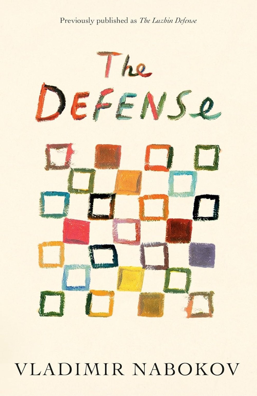
Na Kim is one of the best book cover designers out there, and I love her set of covers for four of Vladimir Nabokov’s books being released in advance of the 70th anniversary of Lolita. Pictured above are her covers for Pale Fire (Bookshop, Amazon) and The Defense (Bookshop, Amazon).
Older posts

Socials & More