kottke.org posts about Edward Tufte
Data visualization pioneer Edward Tufte has published four books on the art and science of displaying information, including the seminal The Visual Display of Quantitative Information in 1983. To that set, he now adds a fifth book: Seeing with Fresh Eyes: Meaning, Space, Data, Truth. I couldn’t find a description of the book, but the website lists the table of contents and shows a few of the page layouts.
His previous four books are some of my favorites about design. You can only order Seeing with Fresh Eyes direct from his site, which says the book is shipping in mid-October. (thx, dewayne)
From designer Karl Sluis, a list of nine great book about information visualization not written by Edward Tufte. Gonna keep my eye out for Stephen Few’s Now You See It and David McCandless’ The Visual Miscellaneum, but Herbert Bayer’s World Geographic Atlas is a little too rich for my blood.
Opening on September 15 at Edward Tufte’s gallery in Chelsea is All Possible Photons, an exhibit of sculptures by Tufte of Richard Feynman’s subatomic particle diagrams.

Made from stainless steel and air, the artworks grow out of Richard Feynman’s famous diagrams describing Nature’s subatomic behavior. Feynman diagrams depict the space-time patterns of particles and waves of quantum electrodynamics. These mathematically derived and empirically verified visualizations represent the space-time paths taken by all subatomic particles in the universe.
The resulting conceptual and cognitive art is both beautiful and true. Along with their art, the stainless steel elements of All Possible Photons actually represent something: the precise activities of Nature at her highest resolution.
Charlie Park takes a look at a type of chart that Edward Tufte developed for his 1983 book, The Visual Display of Quantitative Information. Unlike sparklines, another Tufte invention/coinage, slopegraphs didn’t really take off.
It’s curious that it hasn’t become more popular, as the chart type is quite elegant and aligns with all of Tufte’s best practices for data visualization, and was created by the master of information design. Why haven’t these charts (christened “slopegraphs” by Tufte about a month ago) taken off the way sparklines did? In this post, we’re going to look at slopegraphs — what they are, how they’re made, why they haven’t seen a massive uptake so far, and why I think they’re about to become much more popular in the near future.
Joshua Yaffa profiles Edward Tufte for The Washington Monthly.
After the publication of Envisioning Information, Tufte decided, he told me, “to be indifferent to culture or history or time.” He became increasingly consumed with what he calls “forever knowledge,” or the idea that design is meant to guide fundamental cognitive tasks and therefore is rooted in principles that apply regardless of the material being displayed and the technology used to produce it. As Tufte explains it, basic human cognitive questions are universal, which means that design questions should be universal too. “I purposely don’t write books with names like How to Design a Web Site or How to Make a Presentation,” he told me.
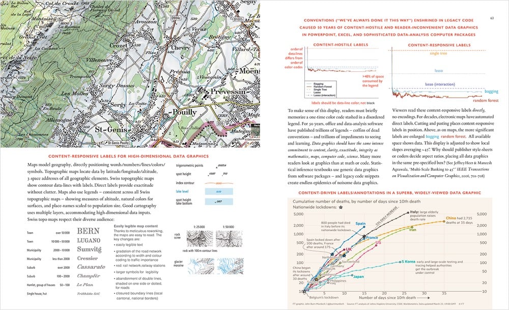
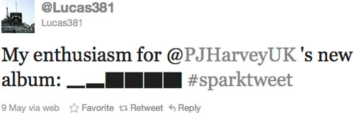
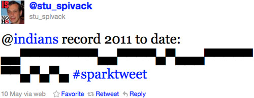
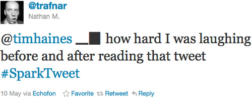
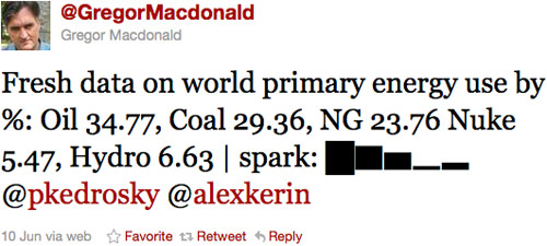
I’ve been seeing a few mini bar charts (aka sparklines) pop up on Twitter in the past few days. Like this one:
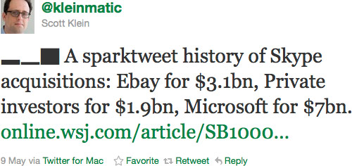
Last year Alex Kerin built an Excel-to-Twitter sparkline generator that uses Unicode block elements for the tiny charts and now media outlets like the WSJ are using it to publish data to Twitter:
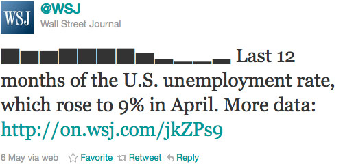
Anil Dash has a nice post on how the WSJ came to use Kerin’s idea. Here are a few more favorites “sparktweets” (1, 2, 3, 4, 5):

Edward Tufte is selling about 200 rare books from his working library, which includes copies of Galileo’s Sidereus Nuncius and Hypnerotomachia Poliphili. Here’s the catalog at Christie’s. Tufte explains why he’s selling:
My library was always working library, with the rare books beside my computer as I was writing. But in the last few years, the books were viewed only when a visitor requested a look at the Galileo, Playfair, or Picasso books, or when I took a nostalgic look in the library. Furthermore, the important books in my library are the unread books. My introduction to the Christie’s catalog explains exactly what I’m thinking about in doing the auction. In particular, note the second to last paragraph. And I am in excellent health, delighted with new adventures in Washington, DC and New York City, and fortunate to be a working and exhibiting artist.
He also dropped the name of his next book: Seeing Around, which will likely be about landscape architecture. (thx, brian)
This is a page from a book called Hypnerotomachia Poliphili.
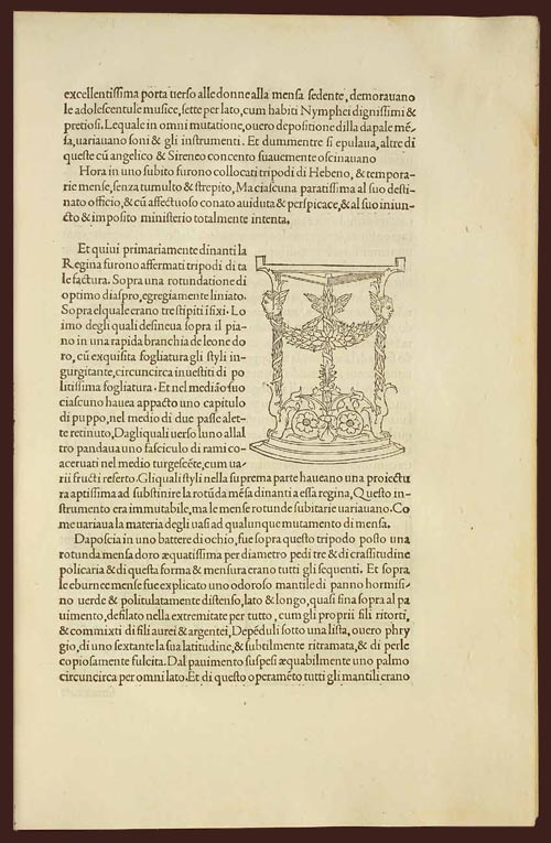
Any guesses as to when it was published? The title, Latin text, yellowed paper, and lack of page numbers might tip you off that it wasn’t exactly released yesterday. Turns out that Hypnerotomachia Poliphili was published in 1499, more than 500 years ago and only 44 years after Gutenberg published his famous Bible. It belongs to a group of books collectively referred to as incunabula, books printed with a printing press using movable type before 1501.
To contemporary eyes, the HP looks almost modern. The text is very readable. The typography, layout, and the way the text flows around the illustration; none of it looks out of the ordinary. When compared to other books of the time (e.g. take a look at a page from the Gutenberg Bible), its modernity is downright eerie. The most obvious difference is the absence of the blackletter typeface. Blackletter was a popular choice because it resembled closely the handwritten script that preceded the printing press, and I imagine its use smoothed the transition to books printed by press. HP dispensed with blackletter and instead used what came to be known as Bembo, a humanist typeface based on the handwriting of Renaissance-era Italian scholars. From a MIT Press e-book on the HP:
One of the features of the Hypnerotomachia that has attracted the attention of scholars has been its use of the famed Aldine “Roman” type font, invented by Nicholas Jenson but distilled into an abstract ideal by Francesco Biffi da Bologna, a jeweler who became Aldus’s celebrated cutter. This font — generally viewed as originating in the efforts of the humanist lovers of belles-lettres and renowned calligraphers such as Petrarch, Poggio Bracciolini, Niccolo Niccoli, Felice Feliciano, Leon Battista Alberti, and Luca Pacioli, to re-create the script of classical antiquity — appeared for the first time in Bembo’s De Aetna. Recut, it appeared in its second and perfected version in the Hypnerotomachia.
In that way, Hypnerotomachia Poliphili is both a throwback to Roman times and an indication of things to come.
The MIT Press site also notes a number of other significant aspects of the book. As seen above, illustrations are integrated into the main text, allowing “the eye to slip back and forth from textual description and corresponding visual representation with the greatest of ease”. In his 2006 book, Beautiful Evidence, Edward Tufte says:
Overall, the design of Hypnerotomachia tightly integrates the relevant text with the relevant image, a cognitive integration along with the celebrated optical integration.
Several pages in the book make use of the text itself to illustrate the shapes of wine goblets. The HP also contained aspects of film, comics, and storyboarding…successive illustrations advanced action begun on previous pages:
All of which makes the following puzzling:
The Hypnerotomachia Poliphili is one of the most unreadable books ever published. The first inkling of difficulty occurs at the moment one picks up the book and tries to utter its tongue-twisting, practically unpronounceable title. The difficulty only heightens as one flips through the pages and tries to decipher the strange, baffling, inscrutable prose, replete with recondite references, teeming with tortuous terminology, choked with pulsating, prolix, plethoric passages. Now in Tuscan, now in Latin, now in Greek — elsewhere in Hebrew, Arabic, Chaldean and hieroglyphs — the author has created a pandemonium of unruly sentences that demand the unrelenting skills of a prodigiously endowed polyglot in order to be understood.
It’s fascinating that a book so readable, so beautifully printed, and so modern would also be so difficult to read. If you’d like to take a crack at it, scans of the entire book are available here and here. The English translation is available on Amazon.
A video and accompanying text from Edward Tufte on Interface Design and the iPhone.
Update: Christopher Fahey posted a thoughtful critique of Tufte’s iPhone thoughts.
Edward Tufte highlights some infographics done by Megan Jaegerman for the NY Times in the 90s. Tufte: “Her work is elegant, smart, finely detailed, inventive, and informative. A fierce researcher and reporter, she writes gracefully and precisely. Her best work is the best work in news graphics.”
Profile of Edward Tufte. “Running his own enterprise, Tufte says, allows him to work ‘elegantly, intensely, gracefully and incredibly efficiently.’”
Last week, Vanity Fair published an article about the U.S. Air Force’s response to 9/11. In writing the article, Michael Bronner makes extensive use of audio tapes from the control room of NORAD’s Northeast headquarters and in the online version, you can listen to audio clips of those tapes. As you can see in the screenshot below, not only are the transcripts of the audio part of the main narrative (and not collected elsewhere or put into a separate footnote or sidebar), but the controls for playing the audio clips (PLAY | STOP) are presented inline as well:
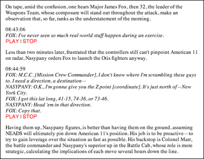
That’s a nice bit of design. No need for a clunky player or to download the clips at the end of the article when two simple text-only inline commands will do. In Beautiful Evidence, Edward Tufte argues for the placement of information in the location where it will do the most good for those attempting to understand the matter at hand, regardless of form:
Evidence is evidence, whether words numbers, images, diagrams, still or moving. It is all information after all. For readers and viewers, the intellectual task remains constant regardless of the particular mode of evidence: to understand and to reason about the materials at hand, and to appraise their quality, relevance, and integrity.
The examples that Tufte cites in the book are all visual and published on paper. This is an instance where web publishing provides for a better way to design for the information at hand than print. (thx to david for kickstarting this post)
Beautiful Evidence is both the title of Edward Tufte’s latest book and an accurate description of the document itself. Like few other mass market publications, BE is lovingly hand-crafted, a physical manifestation of the ideas expressed in its pages; the text and images therein could be about another subject entirely and you might still get the point: “Words, Numbers, Images - Together” (the title of the book’s fourth chapter).
Case in point. Pages 123 and 124 fold out into a spread depicting Charles Joseph Minard’s famous infographic of the disastrous 1812 invasion of Russia by France. But unlike most magazine and book fold-outs, the page that folds out is cut 1/2 inch narrower than the underlying page so that a) a bit of the page underneath peeks out, providing a visual cue for unfoldability, and b) there’s no difficulty when you go to refold the page with getting it caught in the book’s crease or otherwise undesirably bending/creasing it. The fold-out design is a small thing that the casual reader might not even notice, but it demonstrates the care that went into the production of the book (and perhaps the reason why Tufte took so long in writing/designing it).
The gang at 37signals noticed similar craftsmanship in the writing and presentation:
“What struck me is how you almost never have to hold something in your head while turning the page…he usually finishes his thought within the two pages you can see…and when you flip, it’s something new…that’s an excellent self-imposed constraint…’whatever i need to say, i’ll do it here.’” Jason replied, “Yes, I love that. I noticed that more on this book than others. The image and text is in one spread so when you turn you are turning your attention to a new idea. If you have too much to say than the space allowed then you are probably saying too much…it definitely makes it easier to design the book too…you can design each spread as if it was a standalone poster.”
What I’ve also noticed about Beautiful Evidence is the lack of reviews in mainstream publications; I can’t find a single newspaper or magazine that has published a review. Compare that to the releases of Gladwell’s Blink, Remnick’s Reporting, and Anderson’s The Long Tail, for which reviews started appearing almost everywhere before the books were even available. Those books were written for mass audiences and backed by large publishing companies with ample PR resources and plenty of review copies to go around. In contrast, Beautiful Evidence is self-published by Tufte, which means it’s beautiful, personal, and done just right, but also invisible to the mainstream press. Not that Beautiful Evidence is being ignored — the blogosphere is talking about it and the Amazon Sales Rank is currently about 600 (which doesn’t count online sales directly from edwardtufte.com) — but it deserves the consideration of the mainstream press.
Edward Tufte on the user interface of some Sun software: “Dr Spock’s Baby Care is a best-selling owner’s manual for the most complicated ‘product’ imaginable — and it only has two levels of headings. You people have 8 levels of hierarchy and I haven’t even stopped counting yet. No wonder you think it’s complicated.”
I love the little sparkline graphs on information aesthetics (right sidebar). That’s some information richness. Must check out the Sparkline PHP Graphing Library at some point.
Is PowerPoint responsible for the woes of the Space Shuttle? Well, no, but it’s not helping any. “The deeper problem with the PowerPointing of America — the PowerPointing of the planet, actually — is that the program tends to flatten the most complex, subtle, even beautiful, ideas into tedious, bullet-pointed bureaucratese.”
A craigslist missed connection for any of the hot women who were in the audience for Edward Tufte’s lecture. Not too picky, this guy, he’ll take any beautiful woman who was there. Quick, someone snap him up before he makes another sparklines pun.
Sparklines of landscapes of a few American states. The one for Missouri has a little arch while the Iowa sparkline is almost flat.
Edward Tufte and Richard Feynman’s van. “The Feynman-Tufte Principle: a visual display of data should be simple enough to fit on the side of a van.”
Tufte has posted a new chapter from his upcoming book, Beautiful Evidence. Chapter is called “Corrupt Techniques in Evidence Presentations”, some of the ugly evidence in the book.
Older posts
Stay Connected