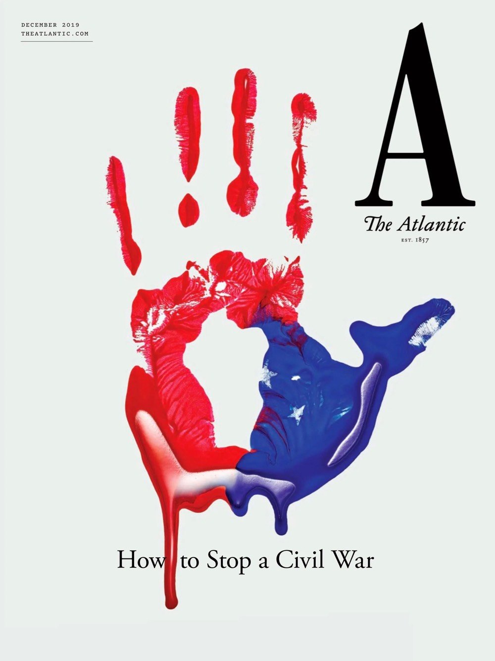
The Atlantic launched a new visual identity the other day, complete with a new logo, custom typeface, updated website, and iOS app. Here’s the first cover carrying the new look:
And more from Mendelsund in this conversation with editor-in-chief Jeffrey Goldberg:
My favorite kind of design is a kind of time-released design, where you look at something and you have an immediate impression of it, and then you, upon further reflection, find something in the design that adds to or subverts that first impression.
Really nice work and methodology behind it. Hearing designers talk about how they approach their work always makes me miss practicing design on a daily basis, a former vocation of mine that seems very very far away these days.
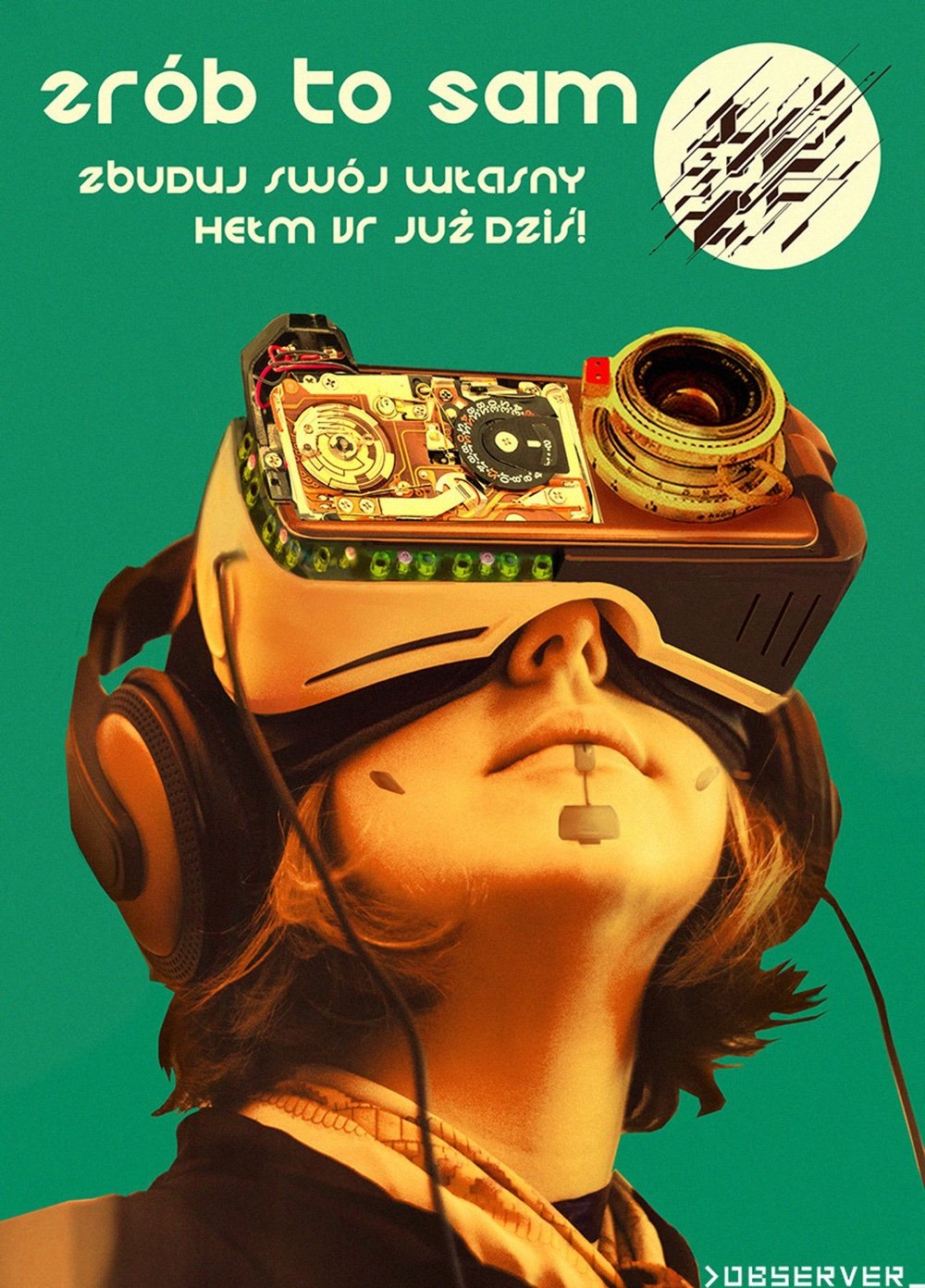
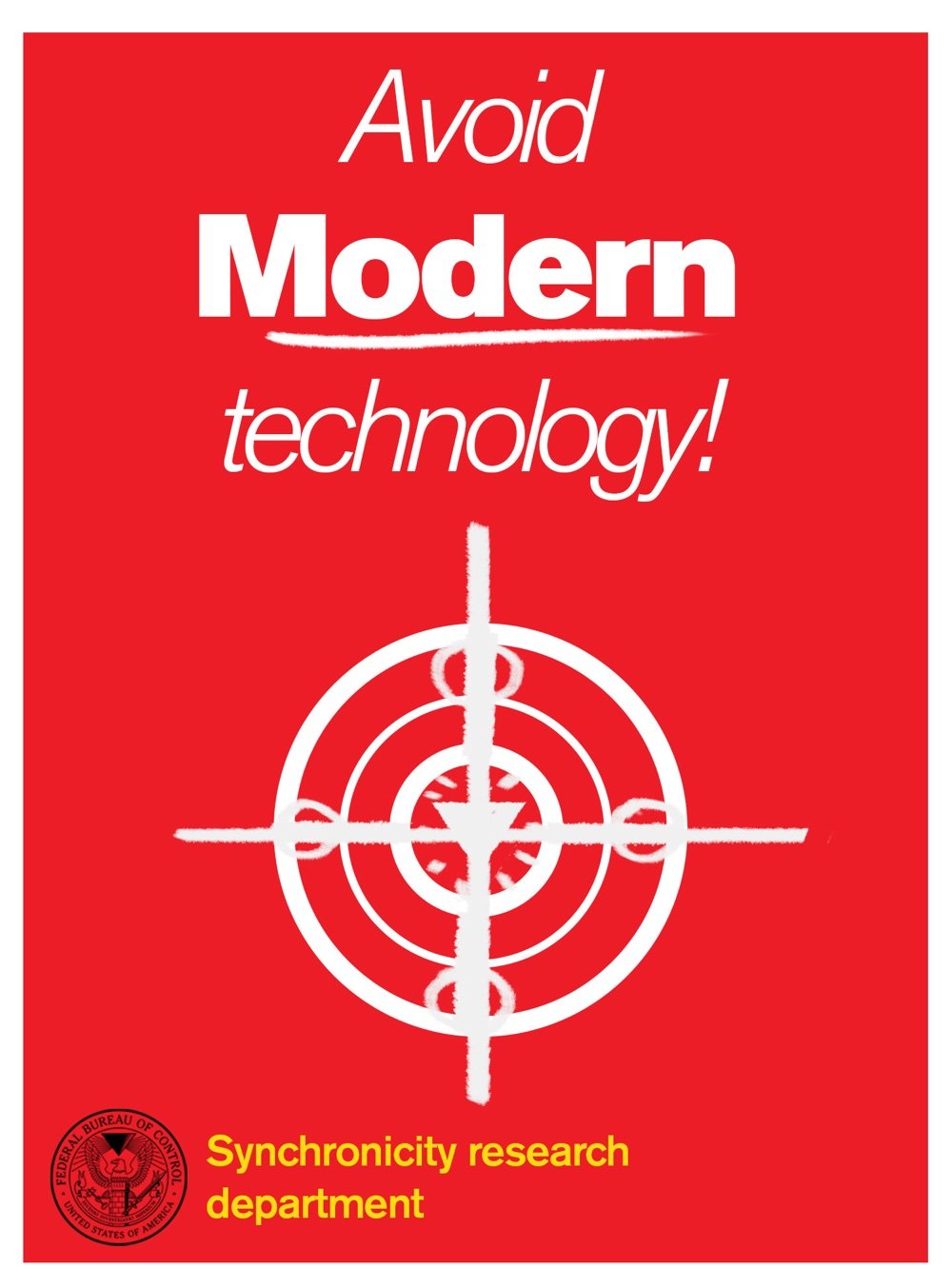
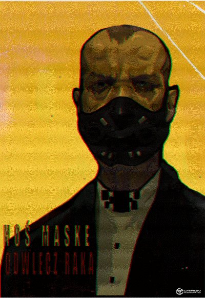
While we’re on the world building topic, here’s another article on design within games, this one about the posters used in the upcomingControl and the Polish cyberpunk-horror game Observer.
Alongside various made up advertisements, brands, book covers and propaganda signs, posters are symbolic of a larger universe, helping to broaden and flesh out any fictional world. An incredible amount of effort is put into creating video game settings, and the poster is but one of many tiny details carefully designed to draw you deeper.
The designers for both games were able to research the vast number of posters of different periods and locations to inform their own creations.
“Posters were a great tool for us to build a story and establish the world design. In one way, they show how this future world is organised, the rules of it etc. but they also represent the protagonist’s various dilemmas,” Lenart explains.
“If done right, [the posters] can help convey everything from small trivial details to the broader story arc. These aspects enrich and deepen the lore and the world.”
Can’t say I’m much of a gamer but I like when things intersect in interesting ways and the launch of Hideo Kojima’s Death Stranding is one of those times. This is a huge launch with lots and lots of coverage, you’ll probably be seeing it everywhere. The GameSport review, which gives a great idea of the look and gameplay, is above and here’s more of what it’s about, from the review at The Verge:
Death Stranding takes place in a distant future, one that has been ravaged by a largely unexplained phenomenon called the death stranding. It wiped out cities and almost all life while opening a gate between the worlds of the living and dead. Those ghostly BTs haunt forests and mountains, and certain humans called repatriates are able to return to life from a strange underwater space known as the Seam. Sam, played by Norman Reedus, is one of these repatriates. He’s also something of a post-apocalyptic delivery man, shuttling supplies from one settlement to the next. Early in the game, he’s given a particularly ambitious task: reunite America (now known as the UCA, or United Cities of America) by traveling across the country, connecting settlements to a sort of internet-like network. At the same time, Sam is trying to reach the west coast of the country to rescue his sister who has been captured by a terrorist organization.
Massive, moody, and — as usual for the video game auteur — weird as hell. The open-world experience has enough contemplative moments to make it feel like a “Grand Theft Auto” sequel directed by Andrei Tarkovsky, and it’s the greatest achievement yet from the most eccentric and forward-thinking designer of a medium in which virtually every large-scale project is created by committee.
Kojima not only intends on reshaping the landscape of conventional open-world gaming (and redefining the meaning of genre itself), but has his eyes set on revolutionizing narrative design and video game cinematography by way of listless immersion.
The motorbike is a collaboration with Norman Reedus’ television show The Ride, glasses are designed by French eyewear brand J.F.Rey, and some of the better looking clothing is designed by Errolson Hugh’s Acronym. While it edges (perhaps goes over for some) into product placement, it goes further, being co-designed for the game and each informing the other. The collaborations span the globe and form a mix to draw in more fans.
As so exemplified by these varied artists, designers, and thinkers, Kojima’s project will boast some of the most interesting forms of immersive insight. Much like how the gameplay itself finds players drawing the world back together in a time of hardship and desolation, the game’s own creation has been a global project that will, in essence, capture the hearts and minds of so many gamers just by the sheer amount of worldwide influence present in its DNA.
For my part, the collaboration with Acronym ( Hypebeast has a few details and pictures about the collaboration ) is especially of interest with Hugh’s design already being so adjacent to near-future fiction and cyberpunk aesthetics. According to GQ, he Sees the Future and he has been having this same kind of bidirectional influence with William Gibson for years.
Please dig through some of the links above if you like this aesthetic and keep an eye on these kinds of collaborations in world building, which are bound to multiply and “attach” more domains of gaming, movies, design, and architecture together.
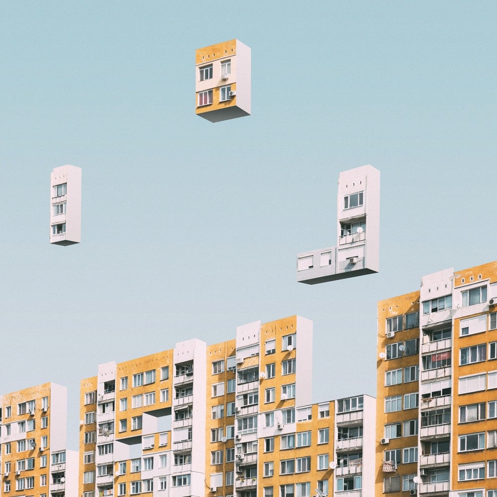
From graphic designer Mariyan Atanasov comes Urban Tetris, in which apartment buildings in Sofia, Bulgaria are turned into a massive game of Tetris. If you’ve played a bunch of Tetris in your life, just looking at these images should trigger the familiar theme song in your head. Next: make this actually playable. (via colossal)
On Oct 21, the emblem for the 2024 Summer Olympics and Paralympics was unveiled in Paris, site of the Games. It features a round symbol that represents a gold medal, the Olympic flame, and Marianne, the “national personification of the French Republic since the French Revolution”.
The French Olympic logo tumbles out of bed on a Parisian morning. She tousles her messy bob, dons breton stripes and ballet flats and whisks down the stairs from her fifth-floor apartment to grab a baguette before enigmatically texting two men who are pursuing her romantically.
The French Olympic logo has an expresso and a cigarette for lunch.
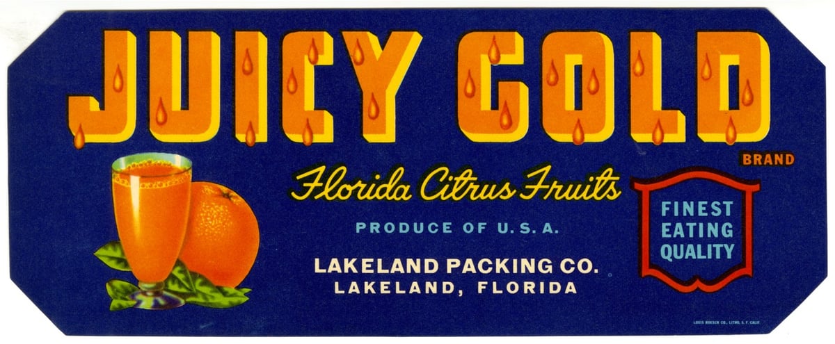
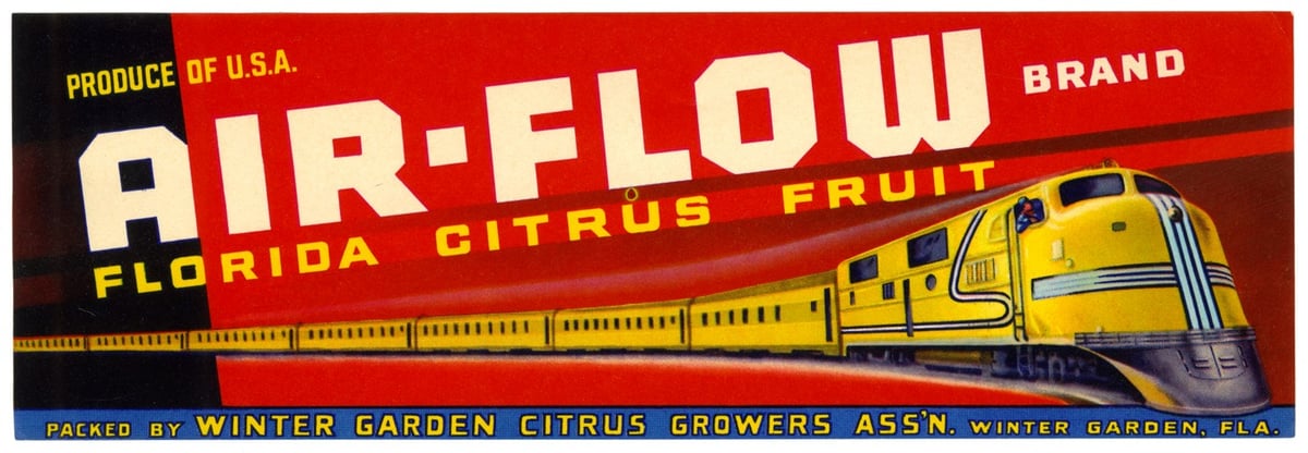
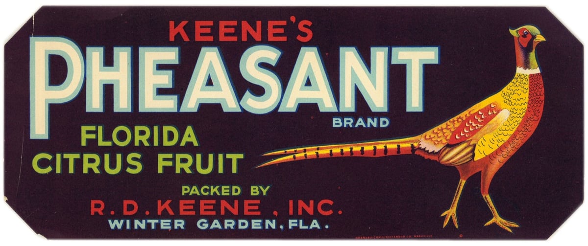
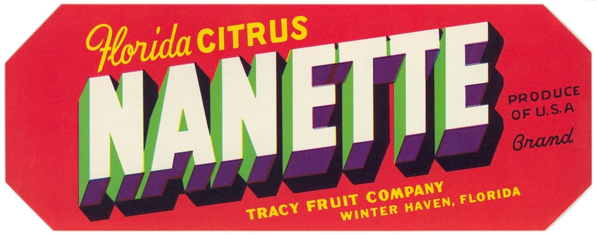
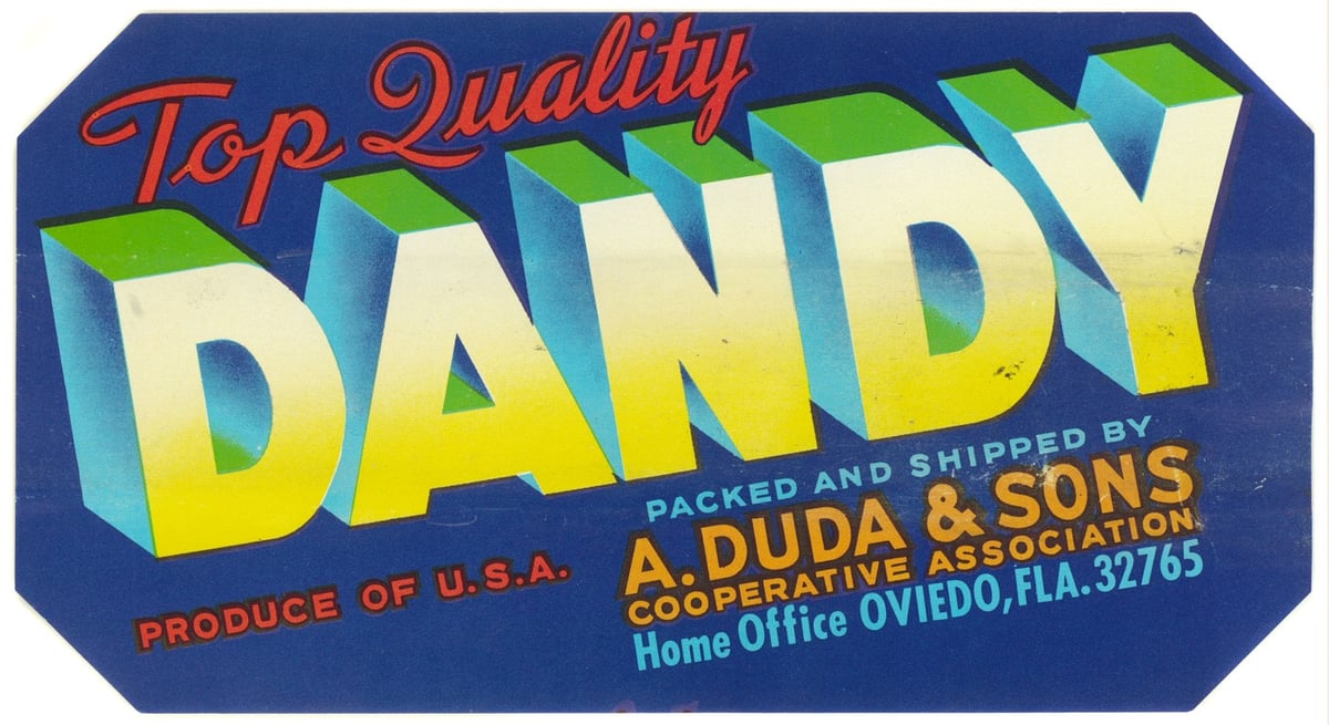
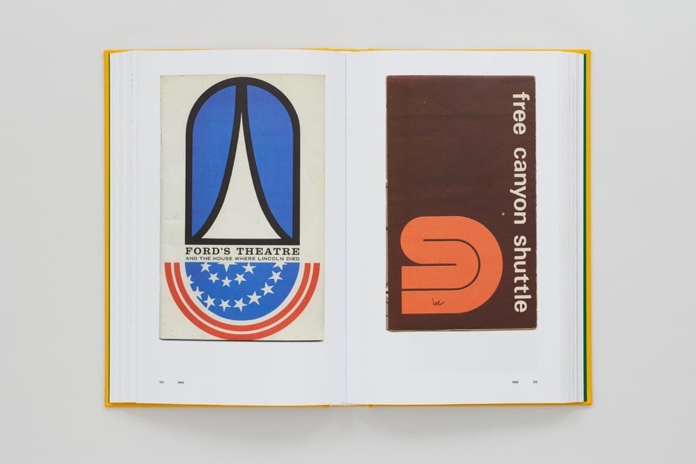
To help give Florida fruits and vegetables an edge, growers looked to the booming produce packing industry in California, where advertisers were already using bold, elaborate labels to catch buyers’ attention. Florida companies began designing their wooden shipping crates and paper labels based on this successful model.
Paper crate labels were used in Florida from the late 1800s until the 1950s. The earliest paper labels were fairly generic and often didn’t include a brand name. Starting in the 1920s, advertisers began developing more complex marketing strategies, aiming to entice buyers with colorful brand names and imagery.
“Red teaming” (creating a group with an explicitly adversarial role, to challenge an organization’s strategy or structures) happens in military and intelligence contexts, and even in tech design, when the underlying issue is security or fending off hackers. Maybe big digital-centric companies, and small ones that aspire to scale, need a variation that’s not about fending off direct adversaries. Imagine instead a sort of Black Mirror Department, devoted to nothing but figuring out how the product can be abused — and thus how to minimize malign misuse.
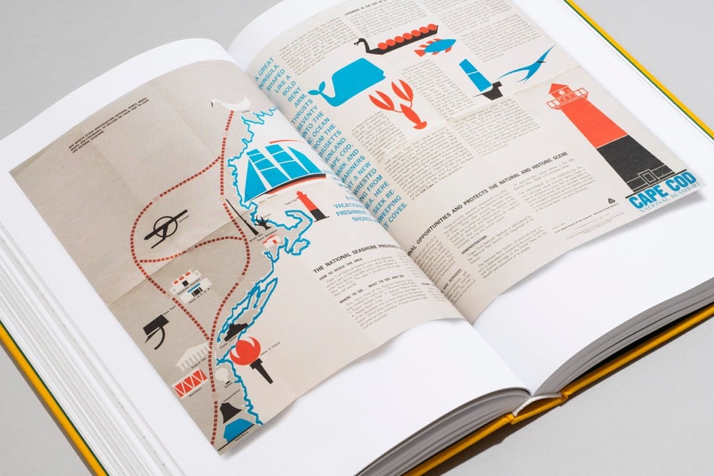
If, as Wallace Stegner famously declared, the national parks are “America’s best idea,” how can we explore this idea? There is the historical aspect: America invented the concept of nationally owned and operated parks in 1872, when Ulysses S. Grant signed Yellowstone National Park into existence. But there is more to Stegner’s sentiment than just the invention of the parks. The rest of the quote goes on to say that the parks are “Absolutely American, absolutely democratic, they reflect us at our best rather than our worst.”
The national parks story isn’t simple or easy. It’s full of splendor and glory, as well as greed and exploitation. For every person who loves one of the parks like it’s their own home, there is another who resents the federal government for owning it. Even before Yellowstone became the first national park, park history was fraught with tension. Tension between preservation and use, between indigenous people and white explorers, between local rights and federal oversight, between wild freedom and human control, between park purists and park recreationists, and between commercial exploitation and historic value.
With this tense backdrop, or maybe because of it, art, imagery, writing, and design have played a vital role in the history of the national parks. Compelling creative materials that celebrated the land — including books, paintings, performances, and advertisements — have marked developments and milestones. These items have brought the rich landscapes and their scientific and historical significance to life.
Perhaps together, the tension and celebration make the National Park System - parks, monuments, natural areas, historic sites, and more - the perfect embodiment of America itself, and what the “best idea” of the parks is really all about.
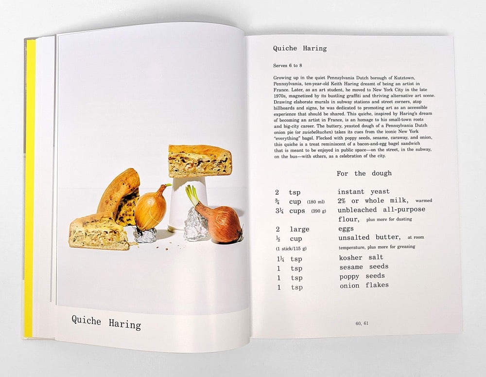
Le Corbuffet was a series of performances by artist Esther Choi that sought to bring together food with notable artists and designers, along with a healthy dose of puns. A cookbook based on the project will be out in October: Le Corbuffet: Edible Art and Design Classics. Here’s the page for Quiche Haring:
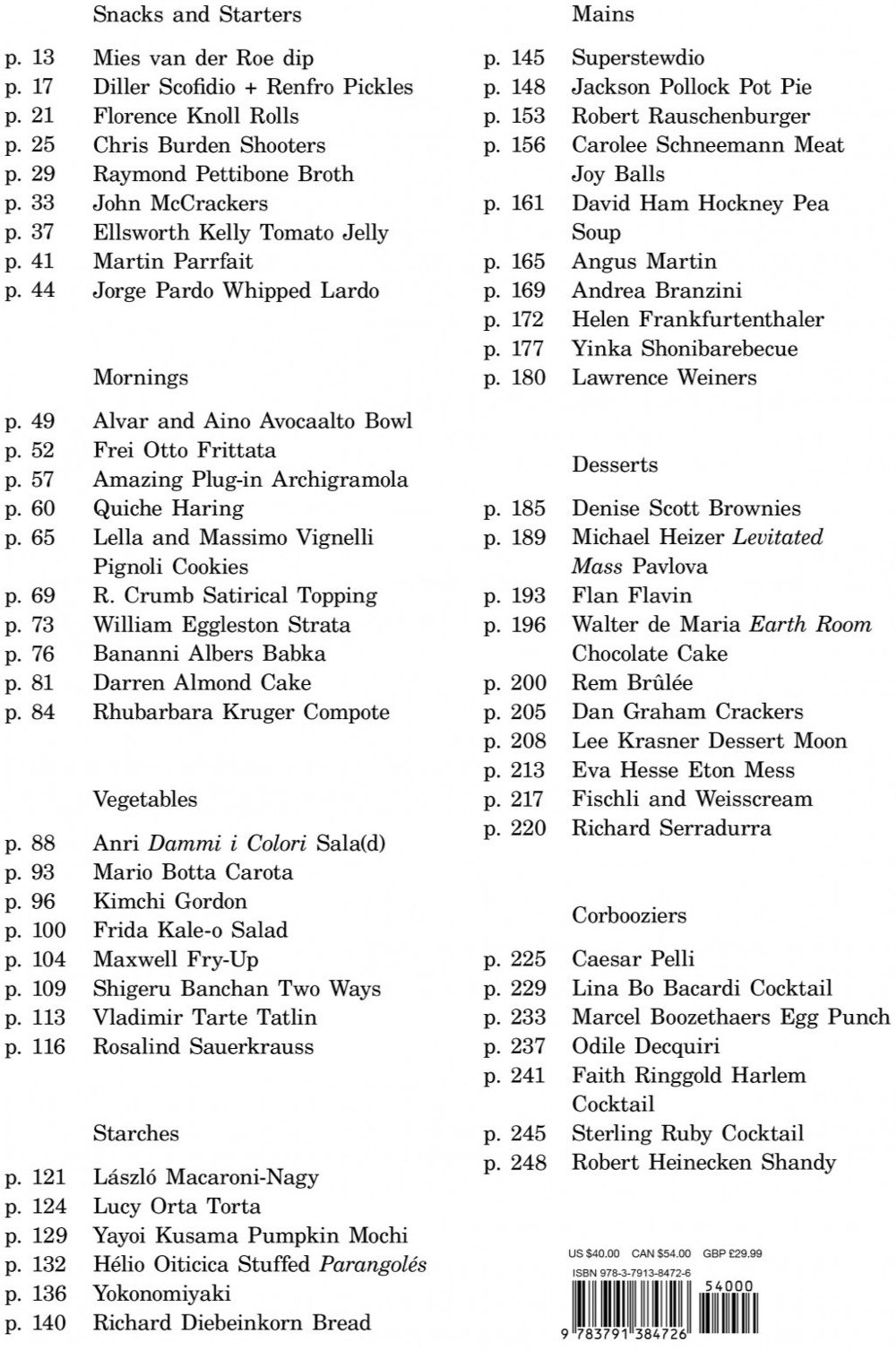
Other dishes include Rhubarbara Kruger Compote, Shigeru Banchan Two Ways, Yokonomiyaki, Rem Brûlée, and the Robert Rauschenburger. Here’s the full menu/table of contents:
Says Choi about where the idea for the project came from:
In 2014, I stumbled across an elaborate menu crafted by László Moholy-Nagy. The multi-panelled bill of fare was for a dinner held in tribute to the Bauhaus founder and architect, Walter Gropius, in 1937. Inspired by the menu for Gropius’s dinner, and the questions that it raised about the elitism of cultural production, I decided to conduct a social experiment a year later.
The mission of Version Museum is to record and present what the interfaces of software and websites looked like, from their earliest versions until now. The site’s tagline is “a visual history of your favorite technology”. Here’s the history of Facebook; an early screenshot:
Internet Explorer (screenshot of the 1.0 version displaying a circa-1995 Yahoo! homepage):
The collection isn’t huge, but the father/son team behind it hits the high points, including Amazon, New York Times, OS X, and iTunes.
Update: One of the Facebook screenshots that the Version Museum is using included Brian Moore’s phone number and other personal information. Per Moore’s general request, I have blurred out that information and I hope the museum does the same. (thx, all)
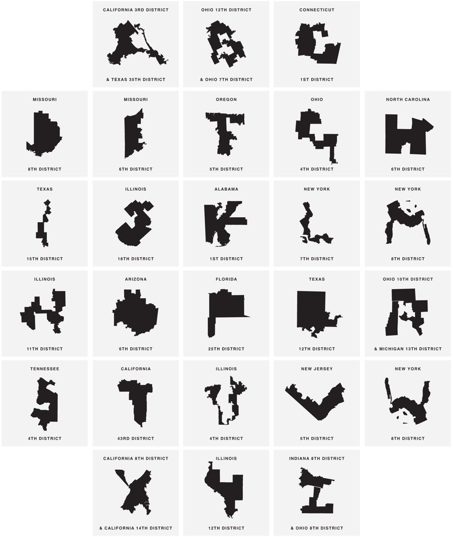
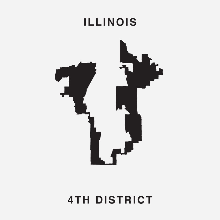
Gerry is a typeface where the letterforms are created from heavily gerrymandered Congressional districts. For example, the letter U is the 4th district in Illinois:
Click through to download the font for free and to tweet at your representative to stop gerrymandering.
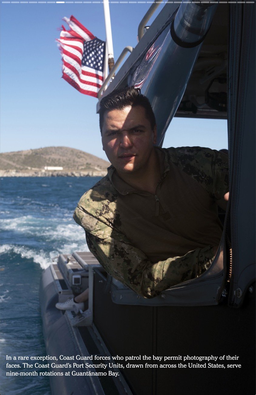
I know this probably isn’t brand new, but in the past couple of weeks I’ve noticed a few articles published by big media companies that are influenced by the design of Snapchat and Instagram Stories. Just to be clear, these aren’t published on Instagram (that’s been going on for years); they are published on media sites but are designed to look and work like Instagram Stories. The first one I noticed was this NY Times piece on Guantanamo Bay.
You can see the Instagram-style progress meter at the top. And then there’s Curbed’s The Ultimate Guide to Googie, where the progress meter is indicated more playfully by the little car at the bottom (it even switches directions based on whether you’re paging forward or back through the story). Curbed EIC Kelsey Keith says it was built using “Vox Media’s new custom storytelling kit tool”.
The third piece I can’t find again — I think it was a WSJ or Washington post article — but it too was influenced by the Stories format.
It’s a good move for these companies. Snap & Instagram have worked hard to pioneer and promote this format, it’s perfectly designed for mobile, and people (especially younger folks) know how to use it. Nominally, these articles are just slideshows, a format that online media companies have been using forever. But I’d argue there are some important differentiators that point to the clear influence of Instagram and to this being a newish trend:
1. The presentation is edge to edge with full-frame photos and auto-playing videos.
2. There’s no “chrome” as there would be around a slideshow and minimal indication of controls.
3. They read best on mobile devices in portrait mode.
4. The display of progress meters.
5. Navigation by swiping or tapping on the far left or right sides of the screen, especially on mobile.
Have you seen any other examples of media companies borrowing the Stories design from Instagram?
Update: Various media outlets are using Google’s AMP Stories to make these. You can see examples on CNN, the Atlantic, and Wired.
This is likely what my mystery third story was built with. (via @adamvanlente)
B-box is a beehive designed for use in close proximity to humans, like near your house or in an urban environment. It does this by separating the honey part of the hive from the area where the bees live and limiting their access to the hive through an entrance more than seven feet above the ground. Check out this video for details:
The makers of the B-box are seeking funding for the project on Indiegogo. Very tempting! (via colossal)
Saul Bass is one of the most celebrated designers of movie posters and title sequences in the short history of cinema. He created iconic poster designs for movies like Vertigo, The Shining, Anatomy of a Murder, and Schindler’s List. In this short film, we learn the strategy behind Bass’ designs: symbolize and summarize.
It’s hard to believe now, but television didn’t used to be a 24/7/365 affair. TV stations stopped broadcasting late at night and when they were off the air, they would commonly display a test pattern until programming resumed in the morning.
Used since the earliest TV broadcasts, test cards were originally physical cards at which a television camera was pointed, and such cards are still often used for calibration, alignment, and matching of cameras and camcorders.
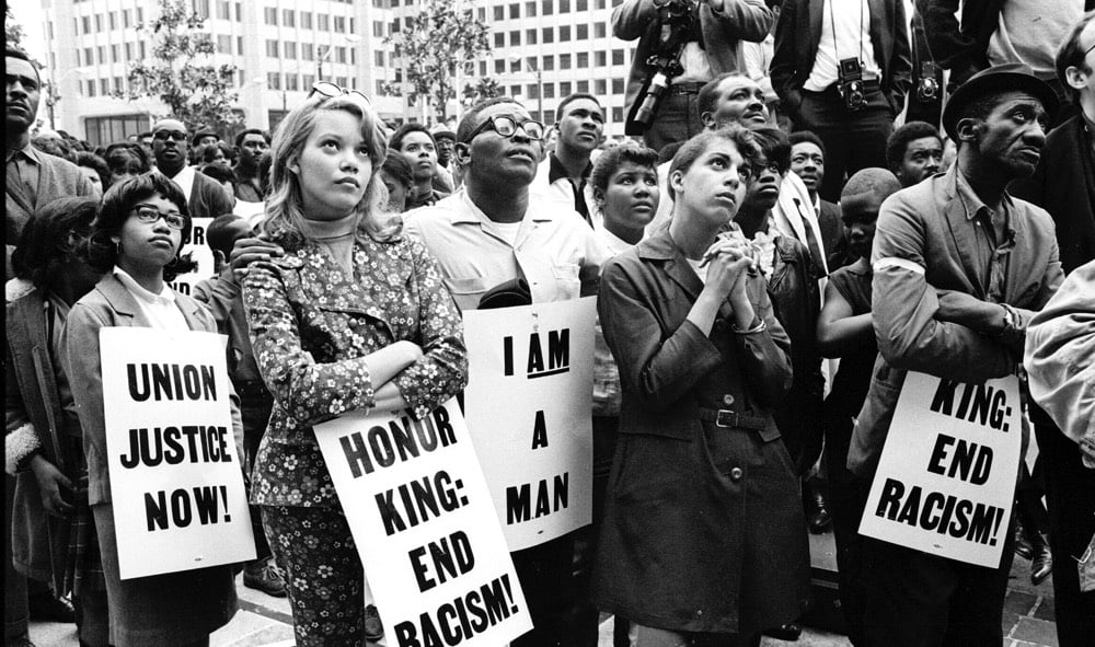
Vocal is a type foundry that makes typefaces that highlight the history of underrepresented people “from the Women’s Suffrage Movement in Argentina to the Civil Rights Movement in America”. For example, the Martin typeface is based on signs carried by marchers in the streets of Memphis after the assassination of Martin Luther King Jr.
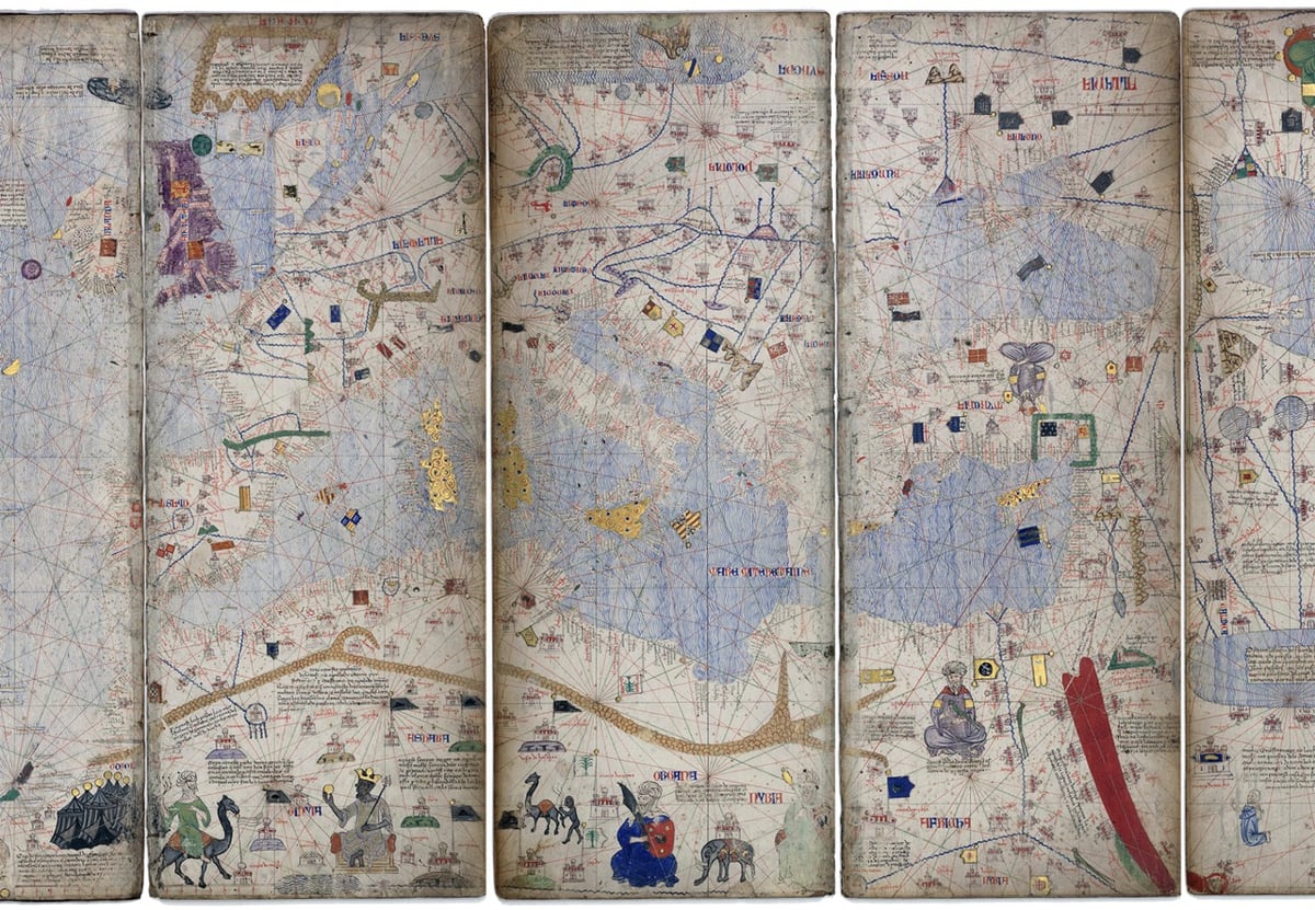
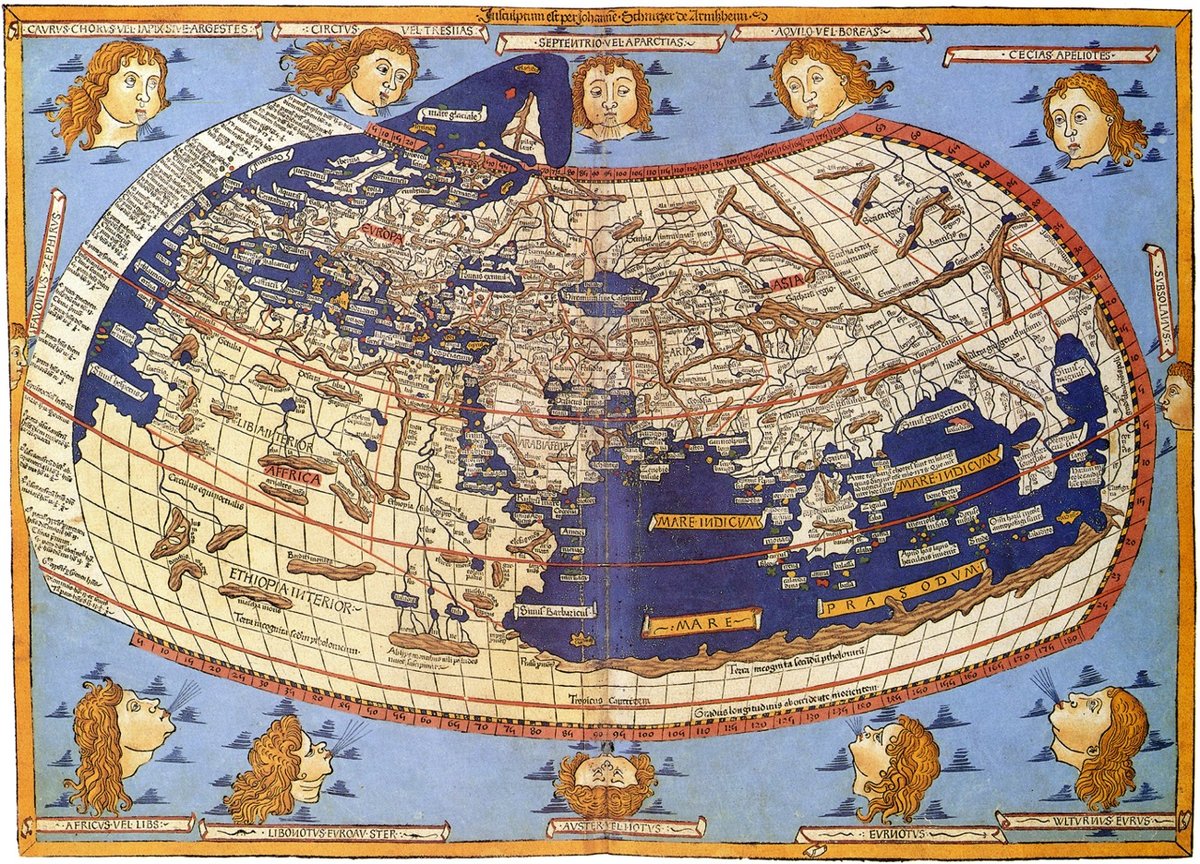
First You Make the Maps is a survey of mapping technology by Elizabeth Della Zazzera showing how, starting at the end of the Middle Ages, better maps facilitated the European discovery of the Americas, the explosion of global trade, the enslavement of Africans, and the colonization by Europeans of much of the world.
While geographically accurate maps had existed before, the Age of Exploration saw the emergence of a sustained tradition of topographic surveying. Maps were being made specifically to guide travelers. Technology progressed quickly through the centuries, helping explorers and traders find their way to new imperial outposts — at least sometimes. On other occasions, hiccups in cartographic reasoning led their users even farther astray.
Design firm Pentagram has brought in a new partner to their New York office, information designer Giorgia Lupi, who joins heavy hitters like Michael Bierut, Paula Scher, and Eddie Opera. I remain fascinated with how Pentagram operates:
Established in 1972, the firm has a collectivist attitude and adheres to a longstanding constitution, which exists in its original form with only small modifications. It spreads profits and decision-making power equally among its self-governed partners — all designers — irrespective of seniority or how much business they brought in during a given year. There’s no CEO. The partners do collaborate with one another, often across disciplines, but essentially operate their own studios, though the local offices meet on a weekly basis and the entire group convenes twice a year. These all-partner meetings, chaired by one of the partners on a rotating basis, are about sharing work with the group and discussing business dynamics, Pentagram’s publishing program, its website, and trends in the industry.
The process for bringing in a new partner can take years from start to finish and requires the unanimous consent of the rest of the partners:
“One vote against and it’s over, truly,” says Miller. “We’ve seen it happen.”
I’ve often thought about if a collective structure could work for independent content sites. I wouldn’t want to sell kottke.org to anyone, but the idea of sharing resources and infrastructure with a couple dozen similar sites is appealing. You could collect the sites into a membership bundle; hire dedicated staff for customer support, ad sales, & devops; do cross-promotion, syndicate the content via a meta-site, and generally help small indie sites punch above their weight. This is what The Deck could have evolved into, I suppose. Aw well.
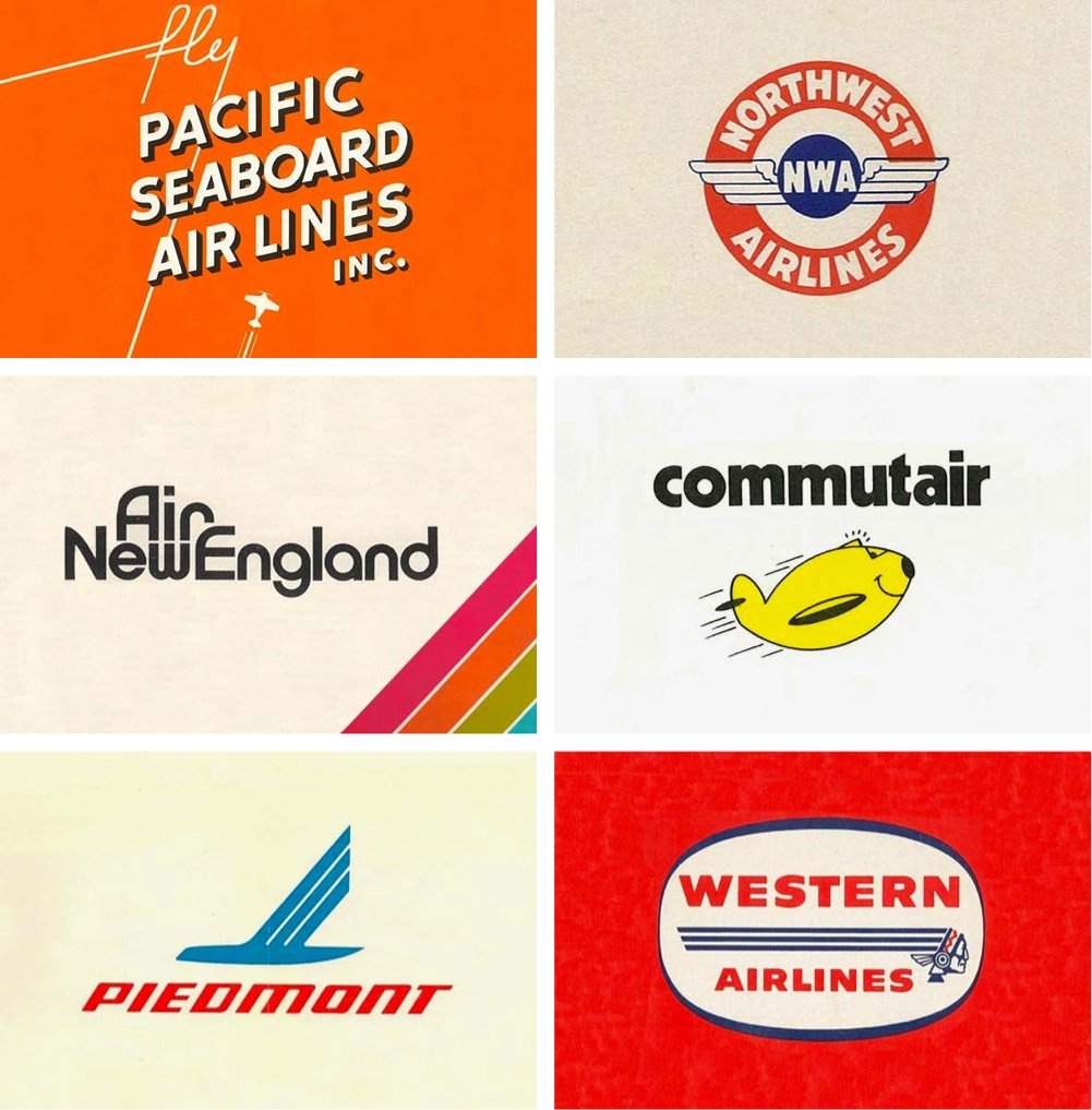
Reagan Ray has collected a bunch of classic logos from American airlines, from the big ones (Delta, United) to small regional airlines (Pennsylvania Central, Cardiff and Peacock) to those no longer with us (Pan Am, TWA, Northwest). I sent him the logo for my dad’s old airline, Blue Line Air Express…I hope it makes it in!
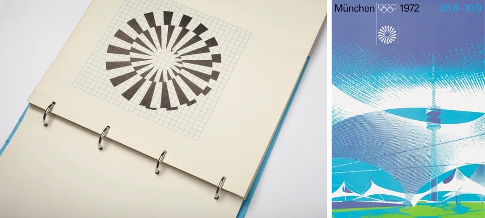
For the 1972 Summer Olympics in Munich, a team led by Otl Aicher designed the iconic identity for the event. The guidelines for the visual design were laid out in a manual produced in 1969, which contained the design systems governing how everything from signage and merchandise to tickets and even landscaping were to be produced.
The visual modules — the typeface, the colors, the grid systems and the application methods — were the basis of all printed matter, merchandising products, signage, wayfinding systems, urban planning and landscaping.
“The freedom of play” was about ensuring “maximum variation” via “strict discipline and adherence to rules”, explained Otl Aicher in 1975.
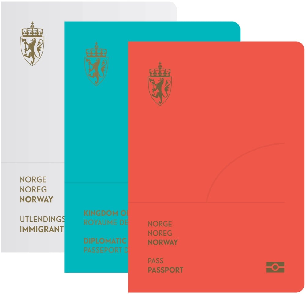
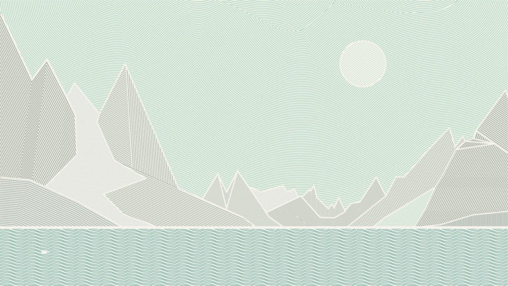
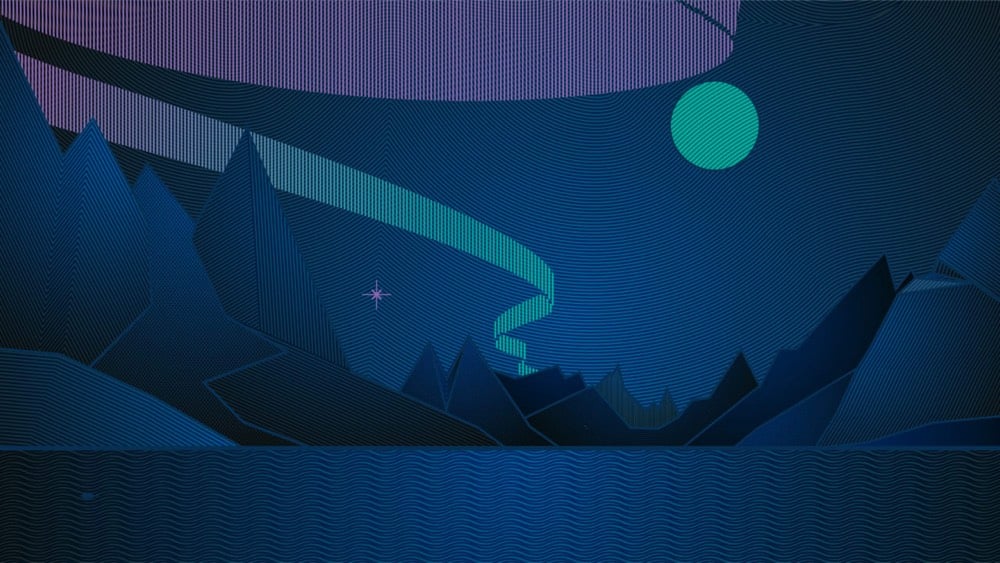
Back in 2014, a design studio called Neue won a national competition to redesign the Norwegian passport. What they came up with is bold and beautiful.
Norwegian landscapes fill the visa pages:
And if you shine a UV light on them, you can see the aurora borealis:
The landscapes surrounding us give a sense of belonging and pride, and fill a symbolic function for the entire nation. Images of scenery and landscape can easily become cliches, but by being widely accepted and deeply rooted in Norwegian culture, they are also very easy to identify with. In addition, to Norwegians, nature is more than beautiful scenery. It supplies us with rich fisheries, clean hydroelectric power, and various other industries.
I don’t think this new design has launched though…beyond a flurry of press about the competition back in 2014, I couldn’t find any evidence of the new design in the wild. (via dense discovery)
It’s worth noting here that this first stage of data-work can be somewhat vexing: computers are great, but they’re also incredibly frustrating when they don’t do what you’d like them to do. That’s why it’s important to remember that you don’t need to worry — learning to program is exactly as infuriating and as dispiriting for you as it is for everyone else. I know this all too well: some people seem to be terrific at it without putting in all that much effort; then there was me, who first began writing code in 2014, and couldn’t understand the difference between a return statement and a print statement. The reason learning to code is so maddening is because it doesn’t merely involve learning a set number of commands, but a way of thinking. Remember that, and know that the little victories you amass when you finally run your loop correctly or manage to solve a particular data problem all combine to form that deeper understanding.
Before you begin visualizing your data, think through the most important points that you’re trying to communicate. Is the key message the growth of a variable over time? A disparity between quantities? The degree to which a particular value varies? A geographic pattern?
Once you have an idea of the essential takeaways you’d like your readers to understand, you can consider which type of visualization would be most effective at expressing it. During this step, I like to think of the pieces of work that I’ve got in my archive and see if any one of those is especially suitable for the task at hand.
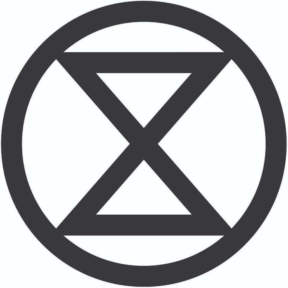
The symbol above represents extinction. The circle signifies the planet, while the hourglass inside serves as a warning that time is rapidly running out for many species. The world is currently undergoing a mass extinction event, and this symbol is intended to help raise awareness of the urgent need for change in order to address this crisis. Estimates are that somewhere between 30,000 and 140,000 species are becoming extinct every year in what scientists have named the Holocene, or Sixth Mass Extinction. This ongoing process of destruction is being caused by the impact of human activity. Within the next few decades approximately 50% of all species that now exist will have become extinct. Such a catastrophic loss of biodiversity is highly likely to cause widespread ecosystem collapse and consequently render the planet uninhabitable for humans.
The symbol and a stencil template are available for download “for non-commercial purposes”.
There’s a disclaimer at the bottom of the page about merchandise, which reads in part:
No extinction symbol merchandise exists, and it never will do. The free use of the extinction symbol by individuals in their personal artwork or other forms of expression is strongly welcomed and encouraged, but any form of commercial use of the symbol is completely against its ethos and should therefore be refrained from. To reiterate, please do not use the symbol on any items that will be sold, or for any other fundraising purposes. There are no exceptions to this policy.
Here’s the thing: I want a t-shirt with the extinction symbol on it so I can signify my support (in a small way) for climate justice. If I’m reading this correctly, I can make a t-shirt for myself but not have one made for me? Or can I have a single print-on-demand shirt made for me at cost? Making my own shirt (I’d need to buy a bunch of single-use supplies) or getting a one-off printed doesn’t seem very climate-friendly at all. How about taking orders from other interested folks (like you all) and selling the shirts at cost? That seems much more climate-friendly but also firmly against the symbol maker’s strict policy.
I think we’re bumping up against an inconvenient truth about capitalism here: it is sometimes (or perhaps even often) the most efficient and least wasteful way to produce something because it’s actually a deeply collectivist endeavor. Let’s say you’re holding a climate protest, 100,000 people are coming, and those people want to bring shirts or signs or other protest equipment to the protest to “advertise” their displeasure to those watching, near and far. Is it more climate friendly for all those people to individually buy supplies and each produce their own things or would it be better to rely on a organization whose sole purpose is to produce protest supplies (using carbon-free energy and materials) and pay them more than the cost of the supplies so they can provide their employees a living wage and even advertise their services a little so they can actually remain in the protest supplies business and take even more advantage of economies of scale to keep prices down? Run it as a non-profit if you’d like. That seems far less wasteful to me than people buying one-off supplies, even on a group basis.
You might interject here that producing anything that uses any natural resources for such a protest is wasteful and unethical. I think that’s a fair point! What’s the ROI for protest materials? Is it wasteful to spend a little CO2 now to possibly save a bunch of CO2 in the future or is it smart? Gah, all I want is a shirt to express myself! Are there any simple and ethical solutions in a world that’s so densely networked and interconnected?
As part of their recent announcement of a new web design system for US government websites, the General Services Administration has also introduced a new typeface called Public Sans.
USWDS 2.0 adds built-in support for custom typefaces, and sometimes you need one that’s simple, neutral, and isn’t Helvetica. Public Sans is an open source, free license typeface (SIL Open Font License 1.1) designed and maintained by USWDS, adapted from Libre Franklin. Just as with our components, we intend Public Sans to be an example of how to design an accessible open source typeface with contributions and feedback from the public — to deliver a useful, neutral, sans serif and continuously improve it.
Always interesting when typefaces are described as “neutral”. I’ve never found that to be the case…
Monotype has introduced a new version of the Helvetica typeface called Helvetica Now.
Helvetica Now is a new chapter in the story of perhaps the best-known typeface of all time. Available in three optical sizes-Micro, Text, and Display-every character in Helvetica Now has been redrawn and refit; with a variety of useful alternates added. It has everything we love about Helvetica and everything we need for typography today. This is not a revival. This is not a restoration.
This is the typeface Max Miedinger and Eduard Hoffmann would have designed back in 1957 if they had known about offset printing, small screens, browsers, digital design tools and UI designers.
Colorado’s exotically-spelled native butterfly lives among snow willow patches high up in the San Juan Mountains. It has an ornate, retro look: rusty or light brown wings neatly segmented with inky black lines. Unfortunately, the Uncompahgre fritillary butterfly’s beauty has played a part in its downfall. Collectors, as well as trampling by people and livestock, have reduced their number to just 11 colonies.


Stay Connected