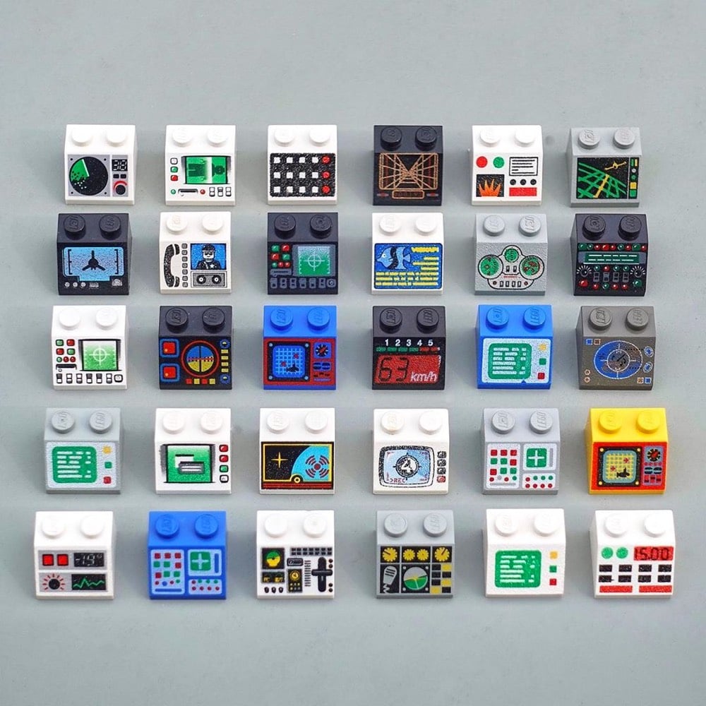
I thought George Cave’s The UX of LEGO Interface Panels was going to be a fun distraction, but it’s actually a great layperson’s explanation, using familiar Lego pieces, of how interfaces work in the real world and the design considerations that go into building them.
Shape coding is one approach to differentiation, but there are many others. Colour coding is perhaps the only one to break into our everyday vocabulary, but we can add four more: size, texture, position and operation coding. Together these six are our allies in the design of error-proof interfaces.
Size, shape and colour-coding are the fundamentals: quick-wins that can fix a lot of interface problems. Texture is also a great differentiator for blind operation, particularly on small dials requiring precise control.
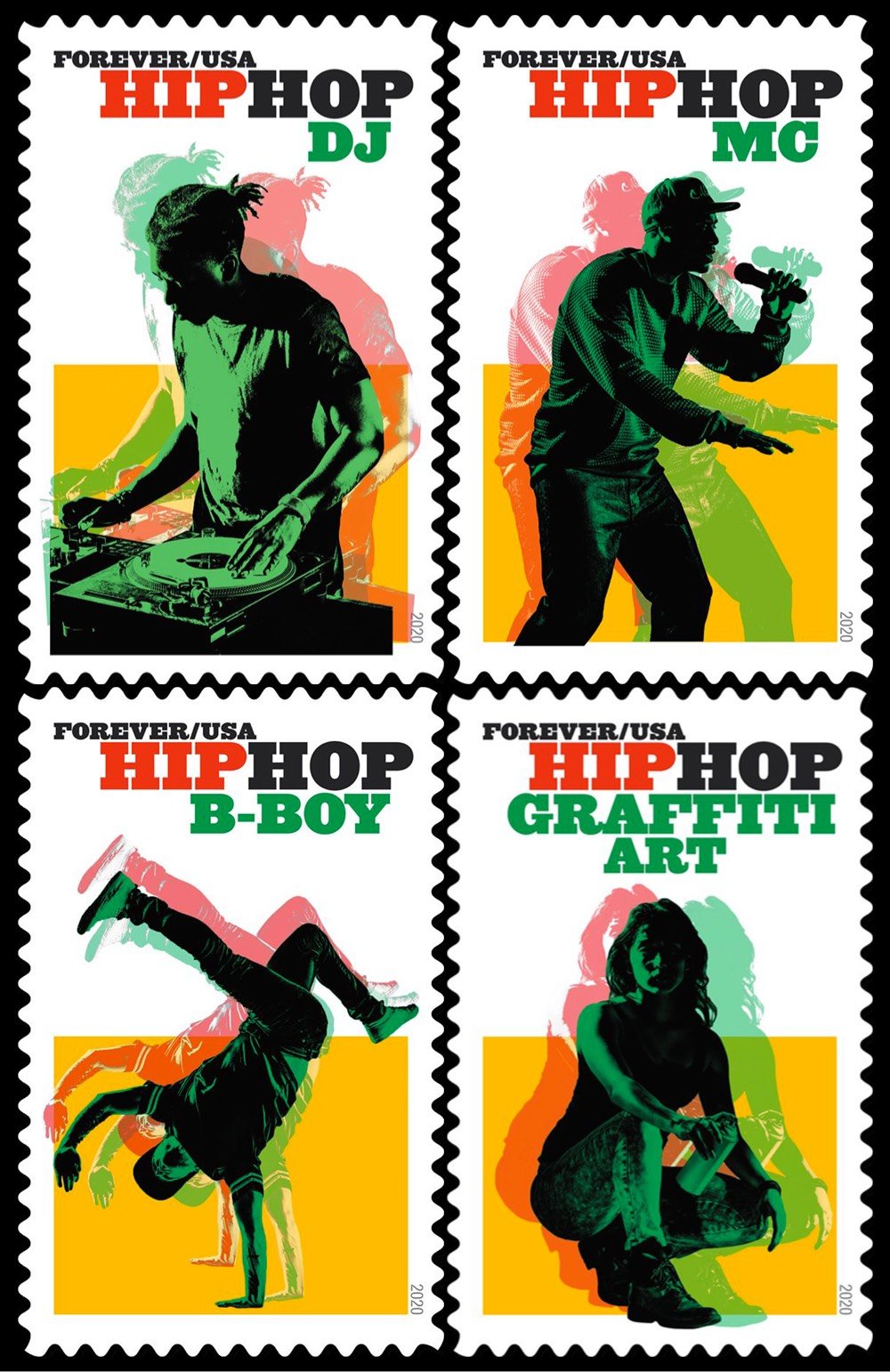
Hip Hop has a long and rich history, and from the start, I knew I wouldn’t be able to represent its totality in one set of stamps. But because it is such an important part of our nation’s art, and one of our most significant cultural contributions to the world, I knew we needed to at least begin representing it somehow. Hip Hop has four widely recognized key elements, or “pillars”: Rap, DJs, Graffiti, and B-boying (known more broadly as break-dancing). Using contemporary images that quickly and accurately depict the genres eased the burden of having to represent the many histories within the subject.
There’s a typeface that has made a resurgence in the last couple of years. It’s appeared on hip hop album covers, food packaging, and advertising. Perhaps you know it from the Garfield comics, Tootsie Roll logo, or the Pet Sounds album cover by the Beach Boys. It’s called Cooper Black, and its popularity and ubiquity has never waned in the hundred years since it was first designed.
Cooper Black tends to get a bad rap from type aficionados (too popular, too cartoony) but this video — and Heck’s comments in particular — have given me a new appreciation for it.
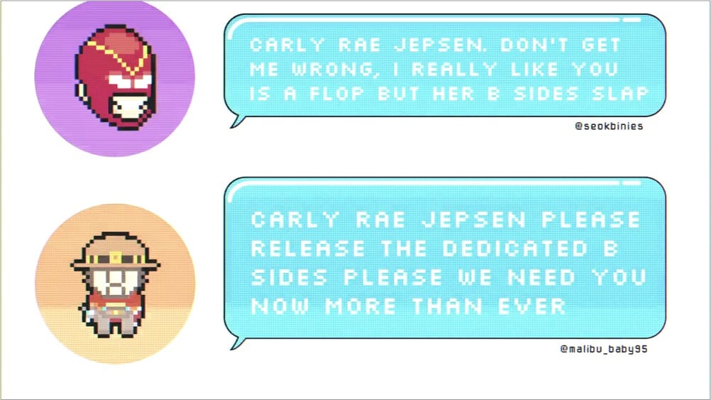
This morning, Carly Rae Jepsen released a new album called Dedicated Side B (stream here). Amidst rumors of fresh music, the pop star had been teasing fans with its release all week, including this video of a simulated chat posted to Twitter and Instagram yesterday.
Long-time readers will recognize that the chat text is displayed with typeface called Silkscreen, which I designed back in 1999, an era of small monitors and even smaller fonts.
Back in the day, Britney Spears used Silkscreen on her website, and now it’s come (sorta) full circle with Jepsen. Silkscreen pops up here and there every few months, and I’m glad to see people are still getting some use out of it. It was retro when I made it and now its retro-ness is retro. Culture is fun! (thx to @desdakon for spotting this)
The AIGA has announced the winners of its annual 50 Books / 50 Covers competition for books published in 2019. The competition recognizes excellence in both book design and book cover design — some of the winners placed in both categories. You’ll notice there are not a lot of books here that you’d find on the front table of the bookstore — the winners tend to be from smaller publishers and/or academic in nature and/or about art or design. For lists containing more mainstream books, check out the lists from the NY Times, Buzzfeed, and Lithub.
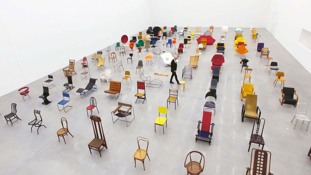
In the focus are 125 objects from the Collection of the Vitra Design Museum. Arranged according to their year of production, they illustrate development from 1807 to the very latest designs straight off the 3D printer, forming a timeline to modern seating design.
Aided by Toshi Omagari, who wrote Arcade Game Typography, Vox’s Estelle Caswell explores the origins and history of 8-bit arcade fonts. From the description of the book:
Video game designers of the ’70s, ’80s, and ’90s faced color and resolution limitations that stimulated incredible creativity. With each letter having to exist in a small pixel grid, artists began to use clever techniques to create elegant character sets within a tiny canvas.
The novel coronavirus, like all viruses, is covered with proteins that give it its character and traits. There are the spike proteins, or S-proteins — the red clusters in the image — which allow the virus to attach to human cells. Envelope or E-proteins, represented by yellow crumbs, help it get into those cells. And membrane proteins, or M-proteins, shown in orange, give the virus its form.
In a video released last February, Eckert explained a little about what she does at CDC.
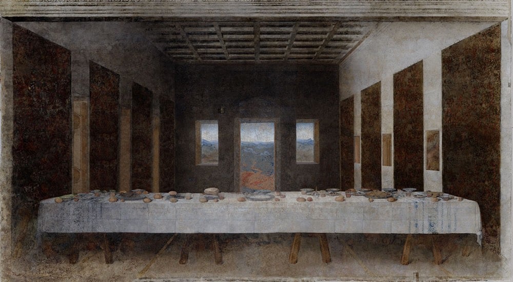
While it predates the COVID-19 pandemic and its accompanying social distancing by several years, José Manuel Ballester’s Concealed Spaces project reimagines iconic works of art without the people in them (like what’s happening to our public spaces right now). No one showed up for Leonardo’s Last Supper:
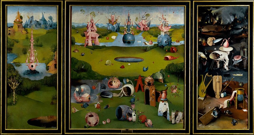
Hieronymus Bosch’s The Garden of Earthly Delights is perhaps just as delightful without people:
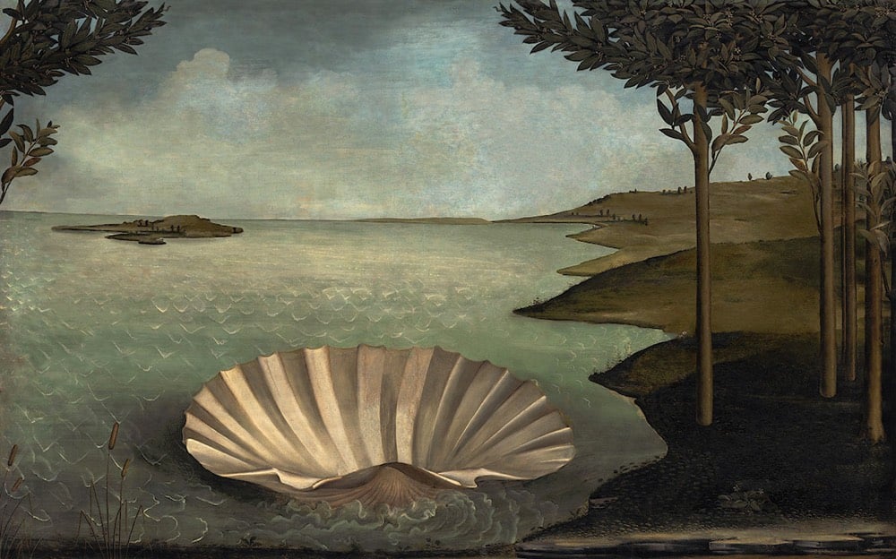
And Botticelli’s The Birth of Venus has been rescheduled:
Thinking that some people might need high quality entertainment while shut inside due to the COVID-19 pandemic, filmmaker Gary Hustwit is streaming his films online for free, one film per week. First up (from Mar 17-24) is Helvetica, his documentary on typography and graphic design. Here’s the trailer:
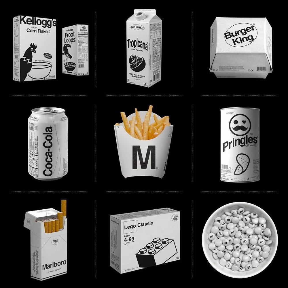
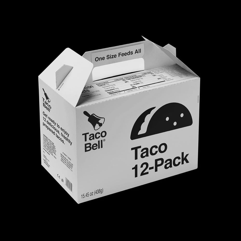
Designer Kunel Gaur, head of a creative agency called Animal, has redesigned the packaging for several familiar brands using minimal black & white graphics and unadorned typography. The designs don’t seem to be collected in one place, so you’ll have to poke around his Instagram to find them.
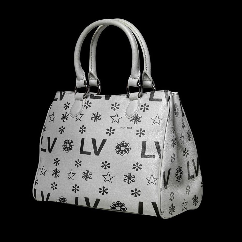
That LV bag actually looks like something Virgil Abloh would design — it would sell like hotcakes. Dye it millennial pink and you’ve got a freaking worldwide sensation. Fashion design is so easy!! (via moss & fog)
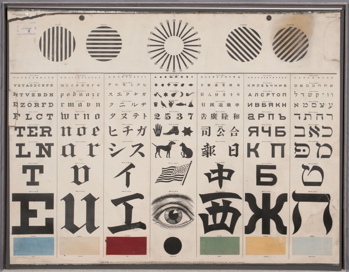
Running through the middle of the chart, the seven vertical panels test for acuity of vision with characters in the Roman alphabet (for English, German, and other European readers) and also in Japanese, Chinese, Russian, and Hebrew. A panel in the center replaces the alphabetic characters with symbols for children and adults who were illiterate or who could not read any of the other writing systems offered. Directly above the center panel is a version of the radiant dial that tests for astigmatism. On either side of that are lines that test the muscular strength of the eyes. Finally, across the bottom, boxes test for color vision, a feature intended especially (according to one advertisement) for those working on railroads and steamboats.
Mayerle was a German optometrist working in San Francisco when he made the chart, designing it for use in a city with a diverse population. My pals at 20x200 are offering limited-edition prints of Mayerle’s chart in a variety of sizes.
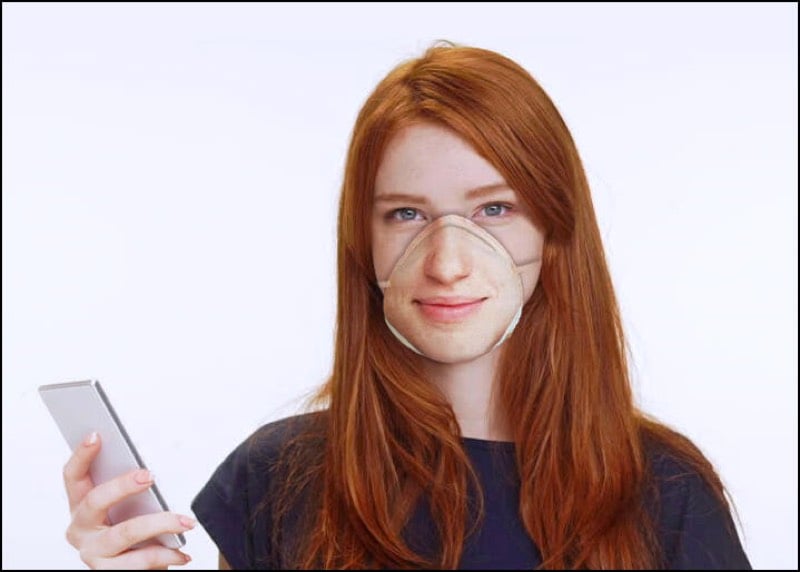
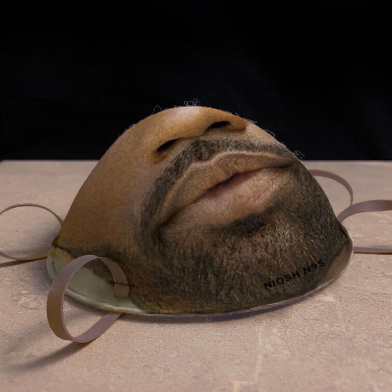
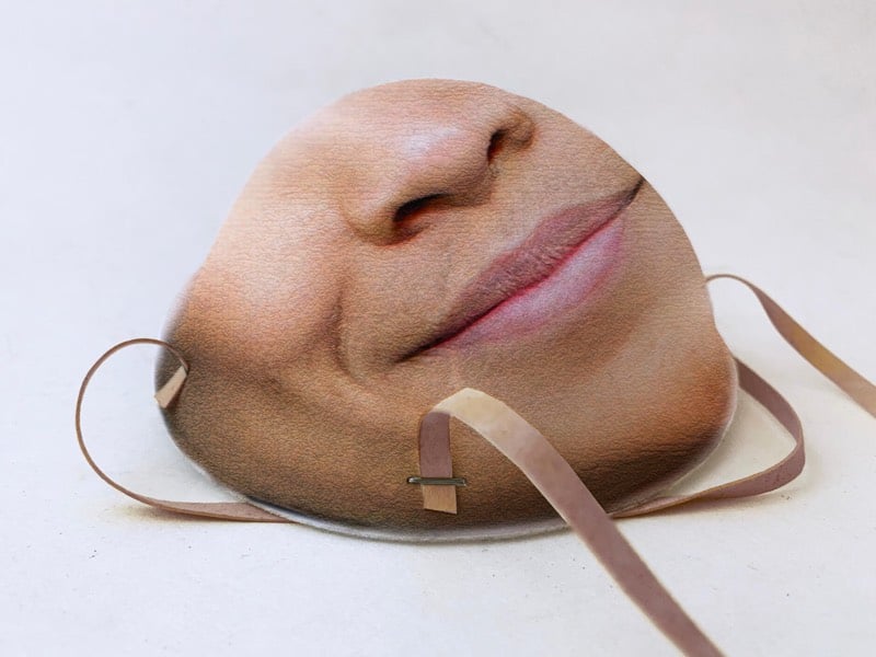
This site is making N95 respirator masks that work with facial recognition software, so that, for example, you can unlock your phone while still wearing a mask.
After uploading your face, we use computational mapping to convert your facial features into an image printed onto the surface of N95 surgical masks without distortion.
Our printer uses inks made of natural dyes. It’s non-toxic and doesn’t affect breathability.
You can use your mask for everyday life as a barrier for airborne particle droplets.
It is unclear whether these will actually ship or not — “Q: Is this a joke? A: Yes. No. We’re not sure.” — but they’re definitely not planning to make them while there are mask shortages related to COVID-19. And it appears the masks will work with iPhones…you just add a new face (while wearing the mask) to your phone’s face database.
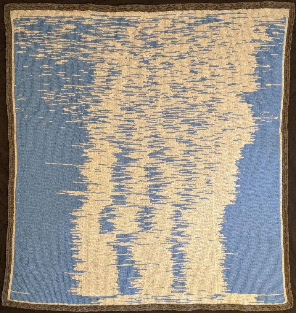
Over a period of three months, Seung Lee knit a blanket showing a visualization of his infant son’s sleep patterns from birth to his first birthday.
The sleep data was collected with the BabyConnect app which lets you export to CSV. The CSVs were filtered and converted into JSON (using Google Apps Script and Python) which could then be used for visualization and tracking.
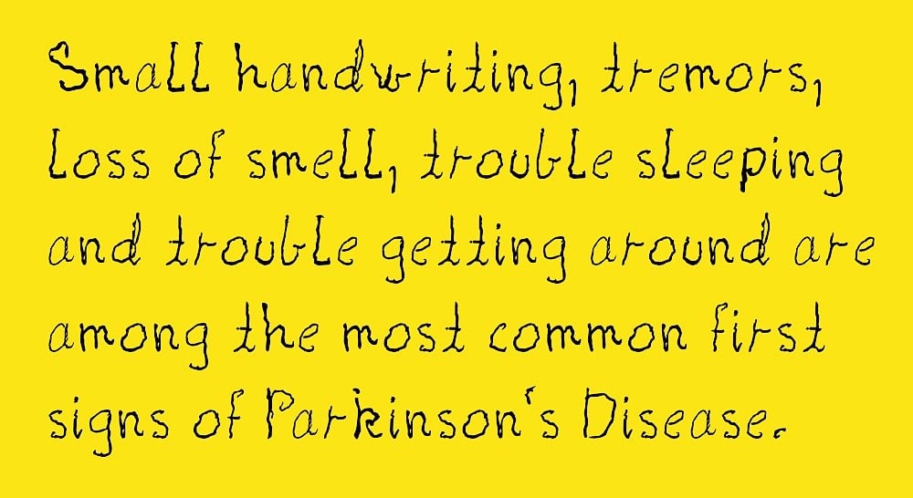
Shake is a typeface made from the real handwriting of a person living with Parkinson’s disease. Creative director Morten Halvorsen:
My mother was diagnosed with Parkinson’s eight years ago. And her handwriting has changed in the years since. I created this font to preserve her handwriting, and enable her to continue to write with her own letters.
A new version of the font will be available each year to capture his mother’s worsening condition. Donate a few dollars (or more!) to download the font — all proceeds go to finding a cure. You can also download a template so that you can document the handwriting of a loved one living with Parkinson’s — for a fee (donated to Parkinson’s research), Halvorsen will turn it into a font for you. (thx, kevin)
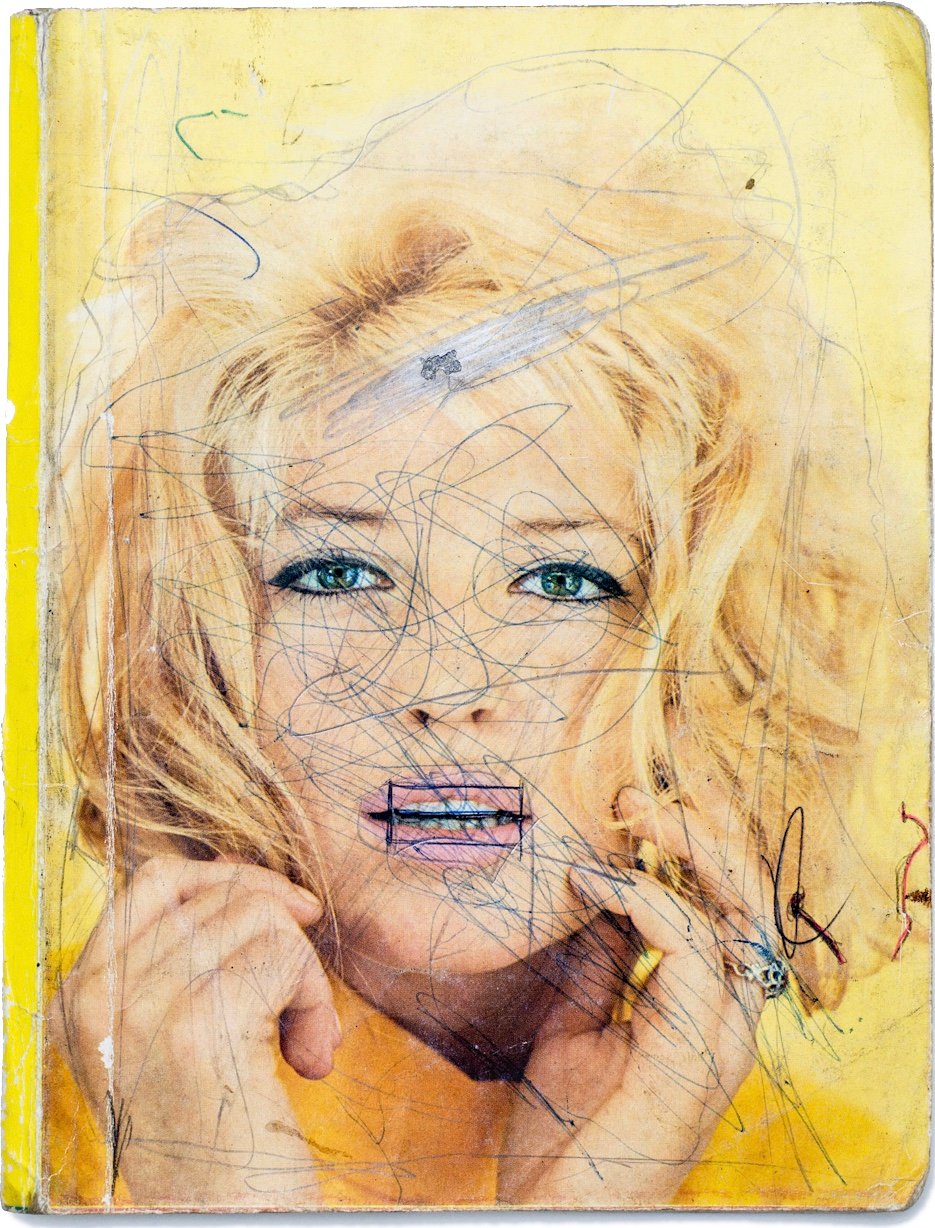
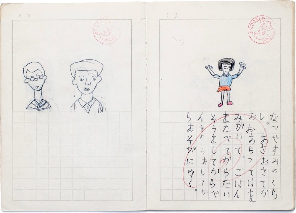
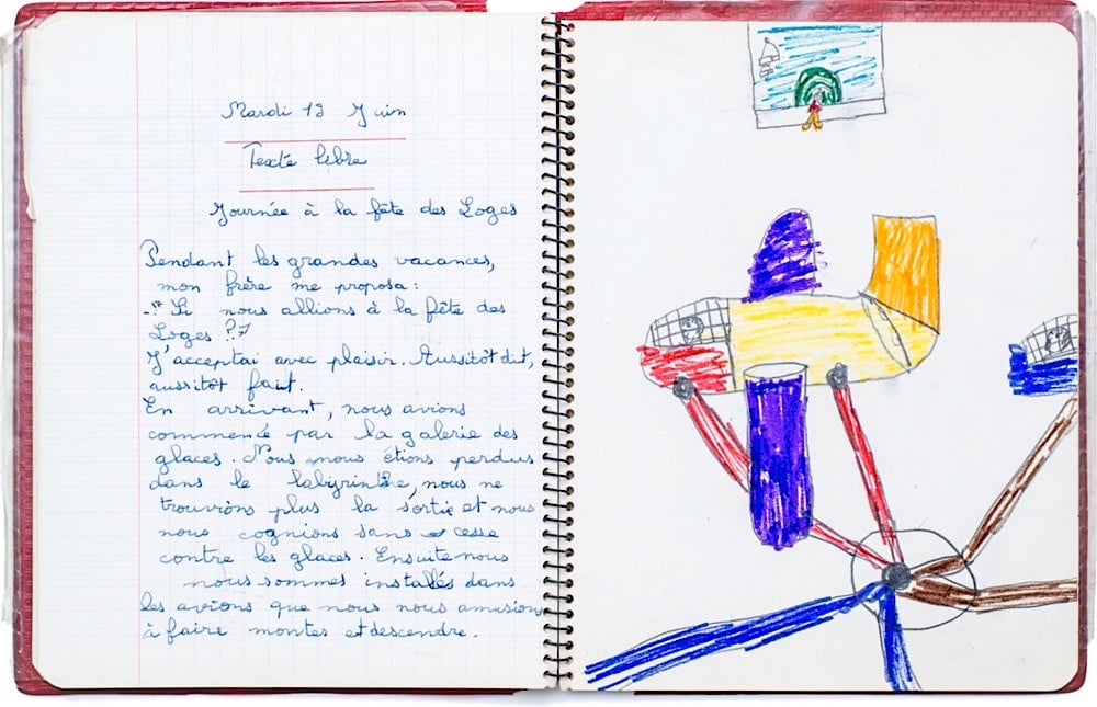
For the past 15 years, the folks at the Exercise Book Archive have been compiling a collection of children’s school notebooks from around the world. In the extensive digital archive, you can find writings, drawings, and aimless doodling in exercise books from as far back as 1773 from countries like the US, Ghana, Latvia, Brazil, and Finland.
The Exercise Book Archive is an ever-growing, participatory archive of old exercise books that allows everyone to discover the history, education, and daily life of children and youth of the past through this unique material. The Archive includes hundreds of exercise books from more than 30 different countries and dated from the late 1700s to the early 2000s. It is preserved and managed by the Milan-based NPO Quaderni Aperti (literally, Open Exercise Books).
If you follow them on Instagram, they are pulling some interesting pieces out of the archive. And if you happen to have any old exercise books from your youth (or your parents’ or grandparents’ youth) lying around, you can donate them to the cause.
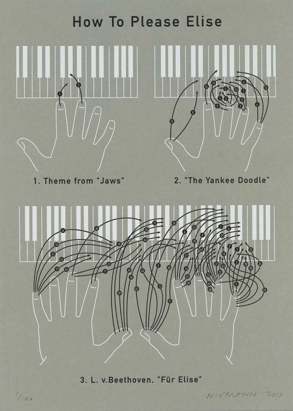
Christoph Niemann with a clever take on the Beethoven composition for piano, Für Elise. He’s offering it as a letterpress print — but supplies are low so order quick if you want one.
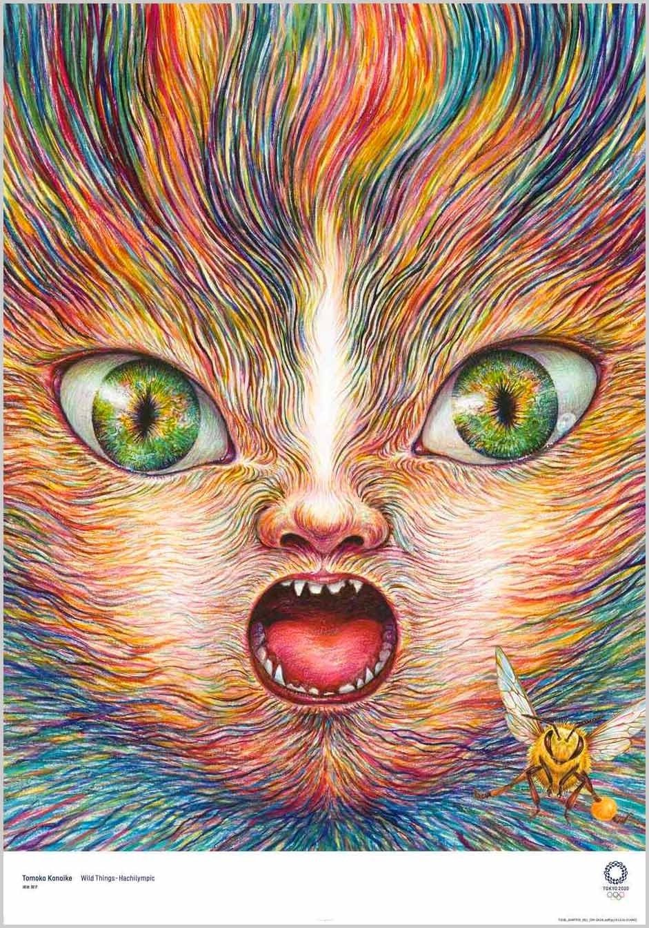
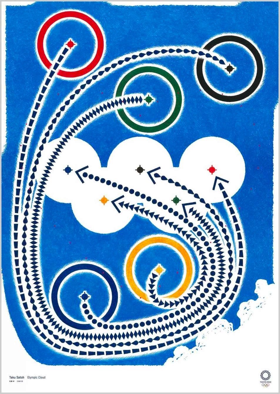
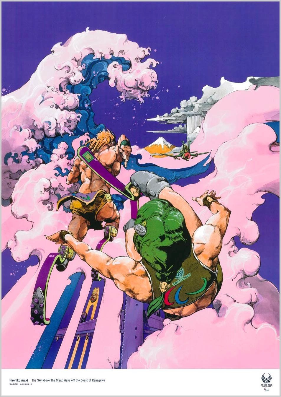
Wow, check out the official posters for the Tokyo 2020 Olympic and Paralympic Games.
What an amazing array of styles and disciplines — there’s manga, shodo (calligraphy), Cubism, photography, surrealism, and ukiyo-e. That stunning poster at the top is from Tomoko Konoike — fantastic. As you can see, posters from past Olympics have tended towards the literal, with more straightforward depictions of sports, the rings, stadiums, etc. Kudos to the organizers of the Tokyo Games for casting their net a little wider. Love it. (via sidebar)
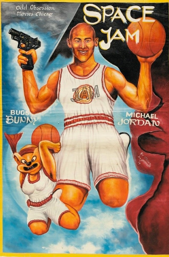
When Frank Armah began painting posters for Ghanaian movie theaters in the mid-1980s, he was given a clear mandate: Sell as many tickets as possible. If the movie was gory, the poster should be gorier (skulls, blood, skulls dripping blood). If it was sexy, make the poster sexier (breasts, lots of them, ideally at least watermelon-sized). And when in doubt, throw in a fish. Or don’t you remember the human-sized red fish lunging for James Bond in The Spy Who Loved Me?
“The goal was to get people excited, curious, to make them want to see more,” he says. And if the movie they saw ended up surprisingly light on man-eating fish and giant breasts? So be it. “Often we hadn’t even seen the movies, so these posters were based on our imaginations,” he says. “Sometimes the poster ended up speaking louder than the movie.”
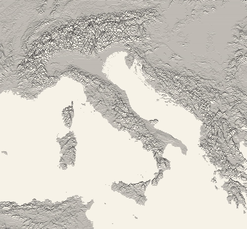
Designer Scott Reinhard takes old geological survey maps and combines them with elevation data to produce these wonderful hybrid topographic maps. From top to bottom, here are Reinhard’s 3D versions of a 1878 USGS Yellowstone map, a 1904 USGS map of Acadia National Park, and a 1899 USGS map of the Grand Tetons.
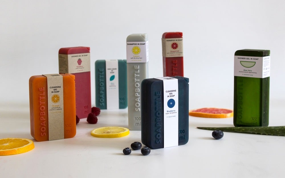
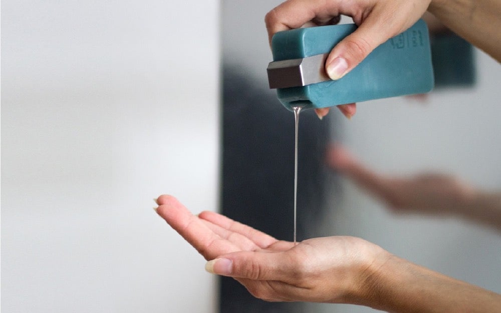
Soapbottle is a packaging made from soap. As the content within is being used, the soap packaging very gradually dissolves. When finished, remnants can be used again, as hand soap or processed into detergents. Soap is made of natural ingredients and is biodegradable: waste can be completely avoided.
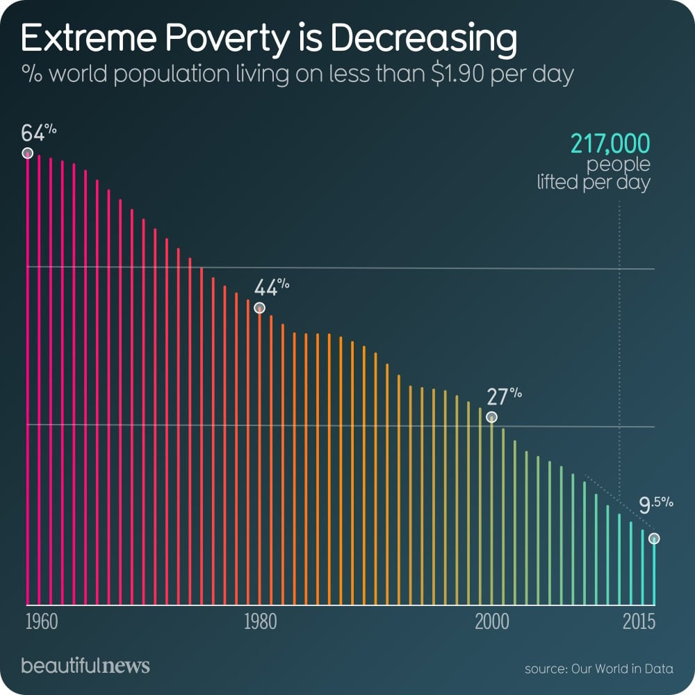
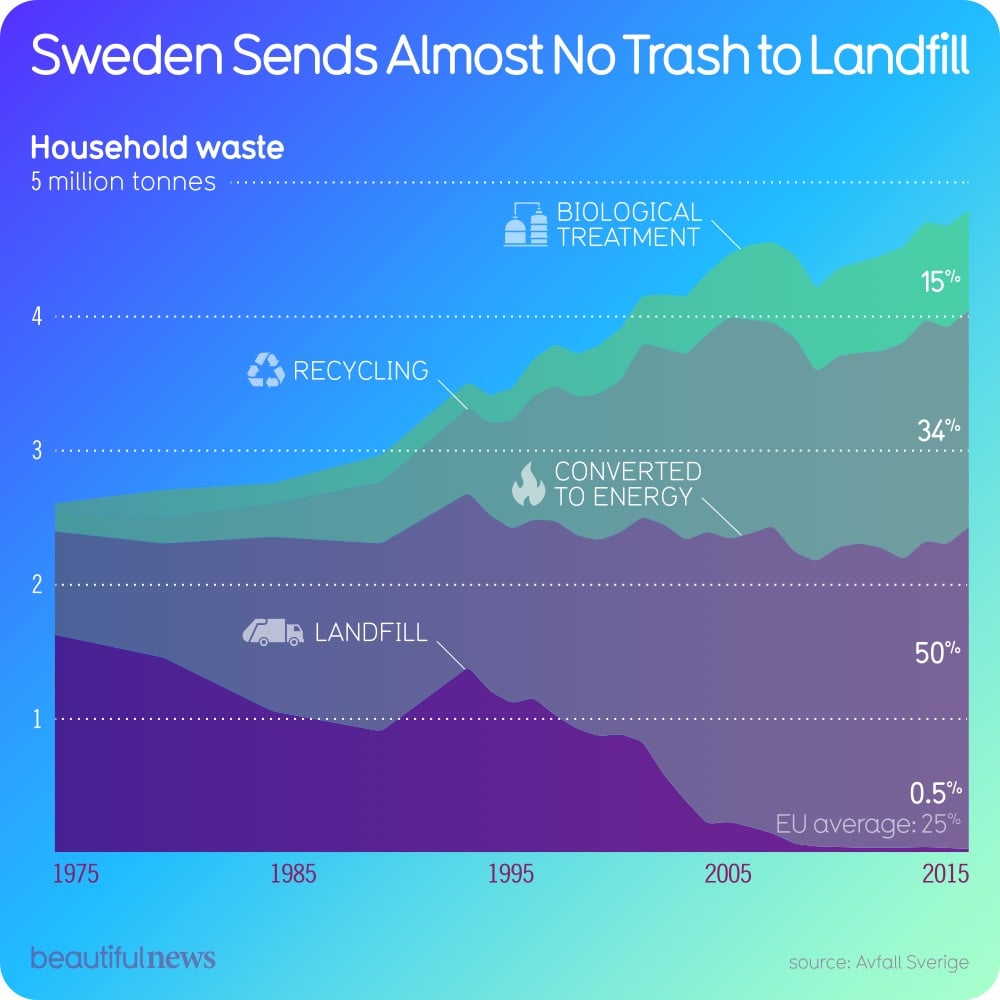
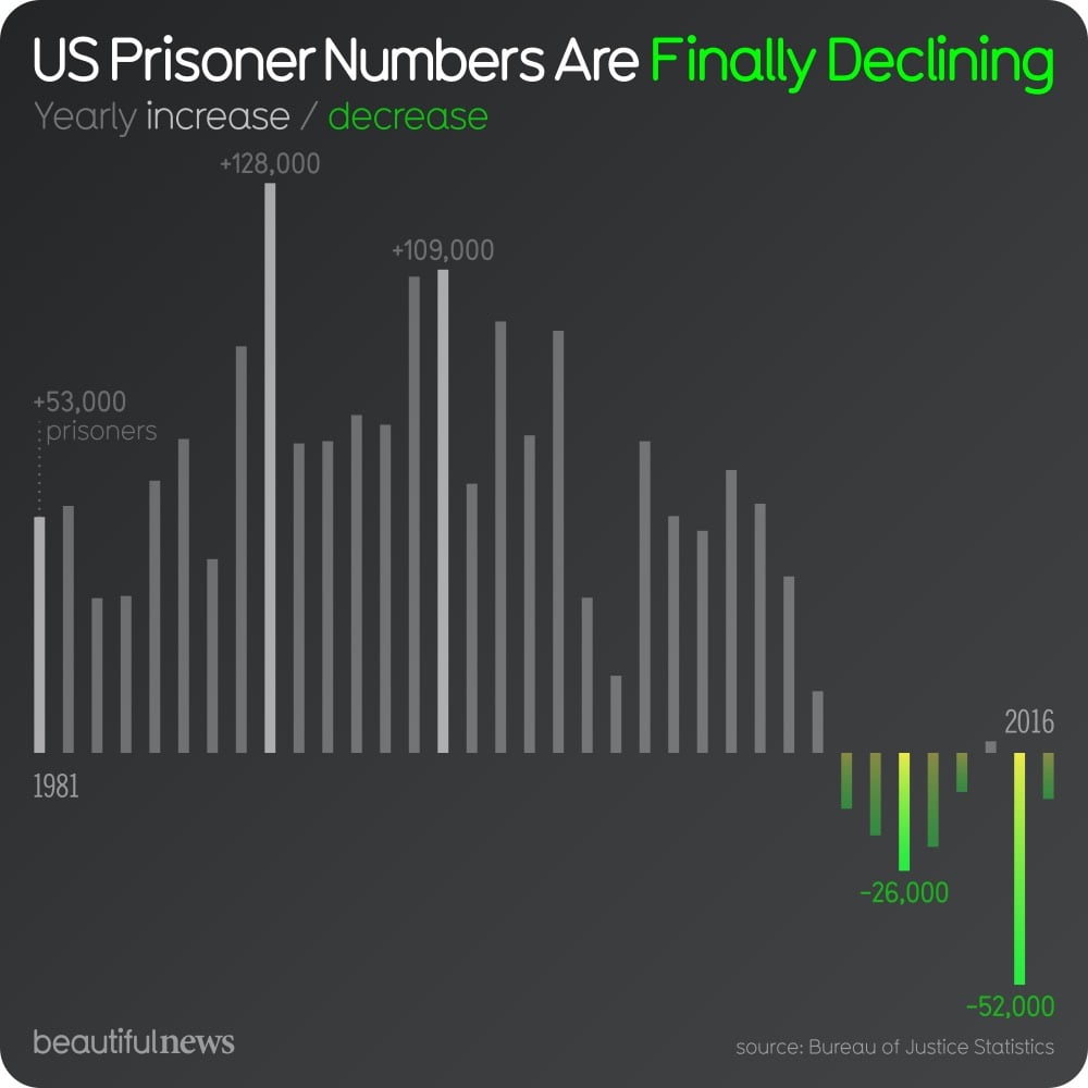
Each day since the beginning of October, the team of designers, technologists, and researchers at Beautiful News Daily (a project by Information Is Beautiful) have been posting infographics and data visualizations that share some good news about the world. The site’s tagline is “unseen trends, uplifting stats, creative solutions”.
The bad news we see everyday on news websites, newspaper front pages, and magazine covers is important (or can be, if it’s not designed to keep people frightened and hooked on the news), but the good news is just as significant (or can be, if it doesn’t cause you to forget the world’s true suffering and turmoil).
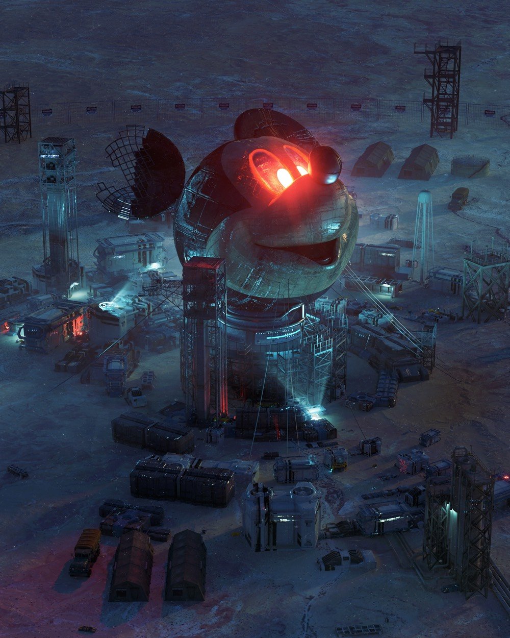
For more than 11 years for a series he calls Everydays, Mike Winkelmann (aka Beeple) has been making a daily picture. As you might expect from the breakneck pace, some of them aren’t that interesting (there’s a lot of juvenile stuff here tbh), but my favorite ones are the Black Mirror-ish with decayed or repurposed pop cultural references.
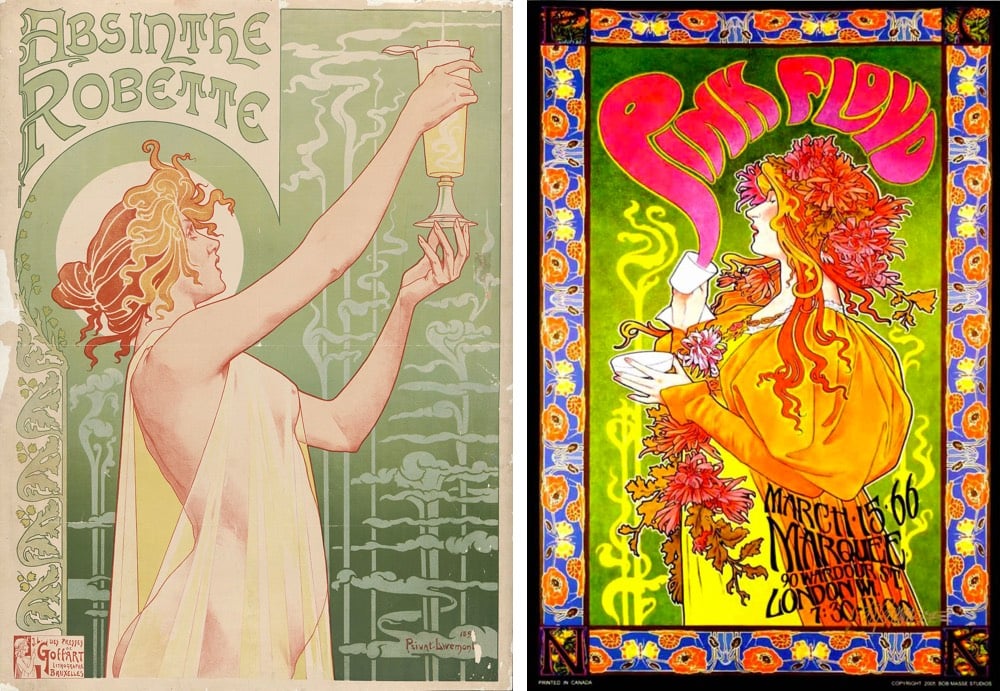
I had somehow never registered this before, but it was (ridiculously) obvious once it was pointed out to me in this video: the psychedelic design of music posters in the 60s were inspired in part by the Art Nouveau movement of the late 1800s. For instance, here’s an absinthe advertisement from the 1890s and a 1966 Pink Floyd poster.
“You can draw a straight line between Art Nouveau and psychedelic rock posters,” Martin Hohn, president of the Rock Poster Society, says. “Mucha, Jules Chéret, Aubrey Beardsley. Borrow from everything. The world is your palette. It was all meant to be populist art. It was always meant to be disposable.” He later adds: “What the artists were saying graphically was the same thing the rock bands were saying musically.”
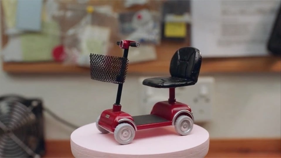
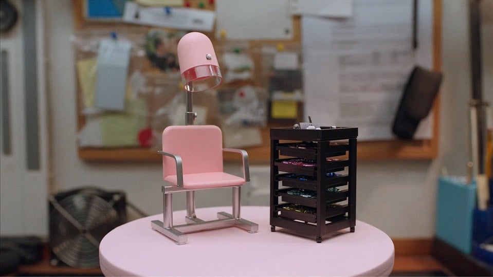
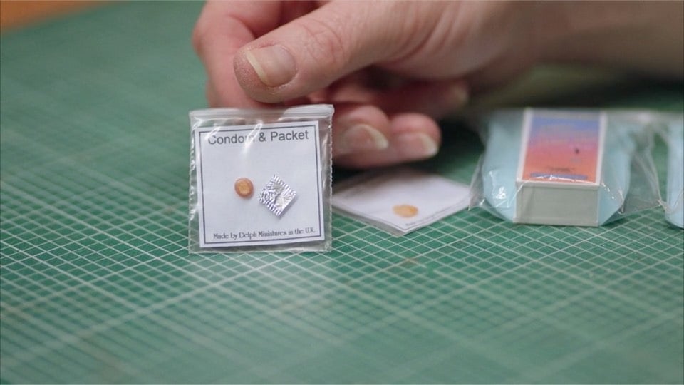
Delph Miniatures is a small company that makes what they call “modern miniatures”, 1/12th scale miniatures of everyday things like washing machines, ironing boards, and mobility scooters. Ellen Evans’ short documentary about the miniatures and the mother/daughter team who make them is completely delightful; I love everything about these women and their work.
They make contemporary miniatures because they want to represent our culture as it is right now and not as it was back in Victorian or Elizabethan times.
Our inspiration is not in resource books or museums, but physically around us, all the time, in our homes, in the shops of our home city, Bradford, and in the lives of our friends and family. We love creating something different and modern that someone wants. In this way our range has expanded as people have asked for more new things. Ideas are all around us. You may be living in a Victorian house but you still have your TV, your microwave, and your computer.
Just look at this meticulous work by Kath Holden and Margaret Shaw — the attention to detail is inspiring:
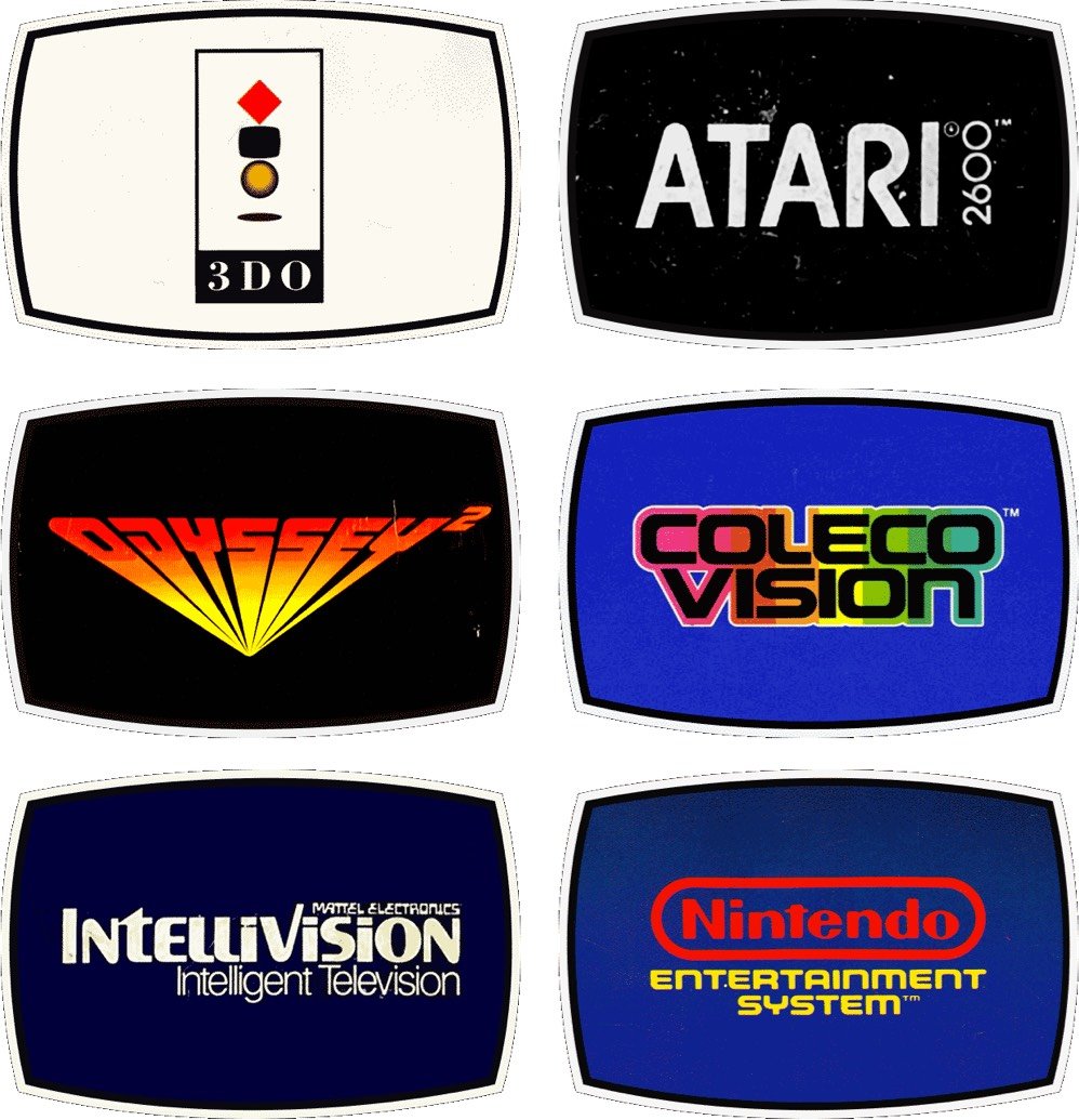
Reagan Ray has collected the logos of video game consoles from 1976 to the present. He ignores the first generation of consoles because there would have been too many to include. (Historical interlude: I didn’t know gaming consoles were broken down into generations. Apparently we’re in the 8th generation now — Wii U, PS4, Xbox One, and Switch.)


Stay Connected