kottke.org posts about WWW
The NY Times has had a difficult time covering the 2024 election in a clear, responsible manner. But I wanted to highlight this short opinion piece from the paper’s editorial board, which I’m reproducing here in its entirety:
You already know Donald Trump. He is unfit to lead. Watch him. Listen to those who know him best. He tried to subvert an election and remains a threat to democracy. He helped overturn Roe, with terrible consequences. Mr. Trump’s corruption and lawlessness go beyond elections: It’s his whole ethos. He lies without limit. If he’s re-elected, the G.O.P. won’t restrain him. Mr. Trump will use the government to go after opponents. He will pursue a cruel policy of mass deportations. He will wreak havoc on the poor, the middle class and employers. Another Trump term will damage the climate, shatter alliances and strengthen autocrats. Americans should demand better. Vote.
What makes this piece so effective is its plain language and its information density. This density is a real strength of hypertext that is often overlooked and taken for granted. Only 110 words in that paragraph but it contains 27 links to other NYT opinion pieces published over the last several months that expand on each linked statement or argument. If you were inclined to follow these links, you could spend hours reading about how unfit Trump is for office.
A simple list of headlines would have done the same basic job, but by presenting it this way, the Times editorial board is simultaneously able to deliver a strong opinion; each of those links is like a fist pounding on the desk for emphasis. Lies, threat, corruption, cruel, autocrats — bam! bam! bam! bam! bam! Here! Are! The! Fucking! Receipts!
How the links are deployed is an integral part of how the piece is read; it’s a style of writing that is native to the web, pioneered by sites like Suck in the mid-90s. It looks so simple, but IMO, this is top-notch, subtle information design.
Ok, look. I know there’s a loooot going on these days, particularly in these United States, but I wanted to take a moment to thank everyone who has supported kottke.org over the years with a paying membership. It’s the 8th anniversary of the membership program, and I’ve written many times about what that support means to me and to the site; here’s a snippet:
Perhaps nearest and dearest to my heart, member support keeps the site free, open, and available to everyone on an internet that is increasingly paywalled. It’s not difficult to imagine an alt-universe kottke.org with ads crammed into every bit of whitespace, email collection forms popping up on every visit, and half the site behind a members-only paywall. No shade to those who have gone that route to keep things running — I’d probably make more money with members-only content on Substack or whatever and that pull is tempting. But seriously, I love you folks so much for collectively keeping all of kottke.org on the open web. Thank you.
One important aspect of the open web I haven’t covered here is linking. The web has always been made up of nodes (web sites/pages) and connections between those nodes (hyperlinks). Over time, the number of nodes has increased (good!) but the nodes have also gotten larger (think Facebook or Google or even Substack) and when they get too massive and too competitive with each other with huge content moats to guard, they turn into hypertext black holes: links go in but they don’t link out.
I love linking out to other sites. The strength of the open web is in its many connections between nodes…the more, the better. Links are the whole goddamned point of the web! I want to send people away from kottke.org to learn something new or have a chuckle and then come back the next day for more. The goal is connection, knowledge, and sharing — I proudly have no competitors in this endeavor, only collaborators. (This is just another sentence so that I can link to more folks who love to link.)
And but so, in the interests of keeping this hyperlink party rolling along here at kottke.org, I wanted to appeal to those who aren’t currently supporting the site to consider doing so. (Or if you’re a past member, to consider rejoining.) As always, if you can’t swing it, no sweat! But if you find value in this site and can manage it, I’d appreciate you supporting the site with a membership.
P.S. I also fixed a couple of nasty bugs with the membership system. Please let me know if you notice anything amiss?
P.P.S. I haven’t raised the prices on memberships in 8 years, but if you are a current member and would like to contribute more, you can go to the subscriptions view and click on “change price”. Thanks!
I attended the XOXO Festival back in August, and video of some of the talks are starting to trickle online. I’m going to highlight a couple of my favorites here on the site; the first one I’d like to share is Erin Kissane’s talk about fixing the social internet.
From her notes:
The talk was about why I left the internet, how the Covid Tracking Project got me back online, and most of all how the work we did at CTP led to me to believe that we — the weirdos of internet-making and online life — have to not merely retreat from the big-world social internet, but fix it.
Kissane talked about the work she’s been doing recently: the COVID Tracking Project, the Fediverse Governance project, and the Meta in Myanmar series. It’s a great talk…I recommend setting aside some time to watch it.
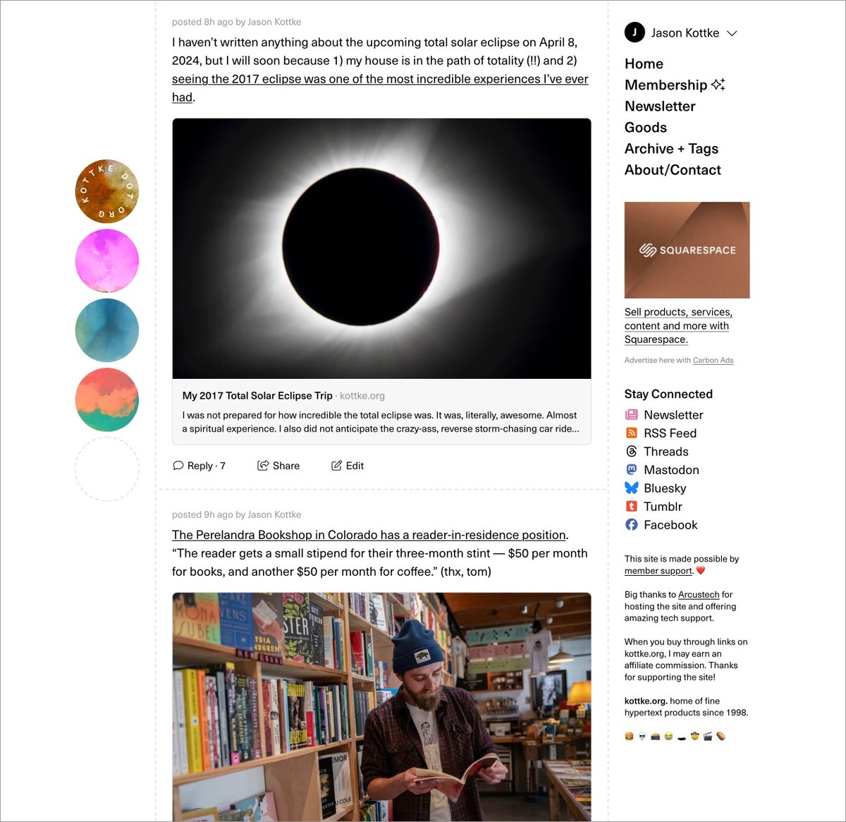
Well. Finally. I’m unbelievably pleased, relieved, and exhausted to launch the long-awaited (by me) redesign of kottke.org today. Let’s dive right into what has changed and why.
{ Important: If the “logo” on the left/top is not circles and is squares/diamonds instead, you can update your browser to the latest version to see it how I intended. (Will be looking for a fix for this…) }
(Justified and) Ancient. The last time I redesigned the site, a guy named Barack Obama was still President. Since then, I’ve launched the membership program, integrated the Quick Links more fully into the mix, (more recently) opened comments for members, and tweaked about a million different things about how the site works and looks. But it was overdue for a full overhaul to better accommodate all of those incremental changes and, more importantly, to provide a solid design platform for where the site is headed. Also, I was just getting tired of the old design.
Back to the Future. In my post introducing the new comments system, I wrote about the potential for smaller sites like mine to connect people and ideas in a different way:
The timing feels right. Twitter has imploded and social sites/services like Threads, Bluesky, and Mastodon are jockeying to replace it (for various definitions of “replace”). People are re-thinking what they want out of social media on the internet and I believe there’s an opportunity for sites like kottke.org to provide a different and perhaps even better experience for sharing and discussing information. Shit, maybe I’m wrong but it’s definitely worth a try.
Before Facebook, Tumblr, Twitter, Instagram, and Snapchat came along and centralized social activity & output on the web, blogs (along with online diaries, message boards, and online forums) were social media. Those sites borrowed heavily from blogging — in the early years, there wasn’t much that those sites added in terms of features that blogs hadn’t done first. With the comments and now this redesign, I’m borrowing some shit back from the behemoths.
A social media design language has evolved, intelligible to anyone who’s used Twitter or Facebook in the past decade. Literally billions of people can draw what a social media post looks like on a napkin, show it to someone else from the other side of the world, and they’d say, “oh, that’s a post”. In thinking about how I wanted kottke.org to look and, more importantly, feel going forward, I wanted more social media energy than blog energy — one could also say “more old school blog energy than contemporary blog energy”. Blogs now either look like Substack/Medium or Snow Fall and I didn’t want to pattern kottke.org after either of those things. I don’t want to write articles — I want to blog.
Practically speaking, “social media energy” means the design is more compact, the type is smaller,1 the addition of preview cards for Quick Links, and the reply/share/???? buttons at the bottom of each post. But, it also still looks like a personal (old school) blog rather than a full-blown Twitter clone (I hope). I think this emphasis will become clearer as time goes on.
So What’s Different? I mean, you can probably tell for yourself what’s changed, but I’ll direct your eye to a few things. 1. Member login + easy account access for members on the top of every page. kottke.org has always been very much my site…but now it’s just a little bit more our site. 2. No more top bar (on desktop), so the content starts much higher on the page. 3. Most Quick Links have a preview card (also called an unfurl) that shows the title, a short description, and often an image from the link in question — the same as you’d get if someone sent you a link via text or on WhatsApp. 4. We’ve bid a fond farewell to the Whitney typeface and welcomed Neue Haas Unica into the fold. 5. IMO, the design is cleaner but also more information dense, reflecting the type of blogging I’d like to do more of. 6. Dark mode! There’s no toggle but it’ll follow your OS settings.
Billions and Billions. kottke.org has (famously?) never had a logo. I’ve never wanted one thing to represent the site — in part because the site itself is all over the place and also because it’s fun to switch things up every once in awhile. Instead, I’ve always gone for a distinctive color or gradient that lets readers know where they are. This time, I’ve opted for a series of circles — a friend calls them “the planets” — but with a twist. There are 32 images, each with 4 different hues and 8 different rotations, that can slot into the 4 available spaces…and no repeats. By my calculations (corrections welcome!), there are over 900 billion different permutations that can be generated, making it extremely unlikely that you’ll ever see the same exact combo twice. Even if, like last time, this design lasts for almost eight years.
Gimme the Goods. The tiny collection of kottke.org t-shirts has its own page on the site now. The Hypertext Tee based on the previous design will be offered only for another few weeks and then probably be retired forever. To be replaced with…TBD. 😉
Winnowing Down. Last time I redesigned, I went back and modified the template of every page on the site, even stuff from the late 90s and early 00s that no one actually remembers. This time around, I’m focusing only on the core site: blog posts from 1998-present, tag pages, membership, and the few pages you can get to from the right sidebar. The rest of the site, mostly pages deep in the archive that see very little (if any) traffic, are going to stick with the old design, effectively archived, frozen in digital amber. We wish those old pages well in their retirement.
So yeah, that’s kind of it for now. There is so much left to do though! The comments need some lovin’, some social media things need tightening up, the about page could use some tuning, the newsletter needs a visual refresh, a few other small things need doing — and then it’s on to the next project (which I haven’t actually decided on, but there are several options).
I’m happy to hear what you think in the comments, on social media, or via email — feedback, critique, and bug reports are welcome. Now, if you’ll excuse me, I have not taken a full day off from the site since late December (including weekends), so I’m going to go collapse into a little puddle and sleep for about a week.
I realize how it sounds, but I’m going to say it anyway because it’s the truth. When I first clapped eyes on the World Wide Web, I fell in love. Here’s how I described the experience in a 2016 post about Halt and Catch Fire:
When I tell people about the first time I saw the Web, I sheepishly describe it as love at first sight. Logging on that first time, using an early version of NCSA Mosaic with a network login borrowed from my physics advisor, was the only time in my life I have ever seen something so clearly, been sure of anything so completely. It was a like a thunderclap — “the amazing possibility to be able to go anywhere within something that is magnificent and never-ending” — and I just knew this was for me and that it was going to be huge and important. I know how ridiculous this sounds, but the Web is the true love of my life and ever since I’ve been trying to live inside the feeling I had when I first saw it.
My love for the web has ebbed and flowed in the years since, but mainly it’s persisted — so much so that as of today, I’ve been writing kottke.org for 25 years. A little context for just how long that is: kottke.org is older than Google. 25 years is more than half of my life, spanning four decades (the 90s, 00s, 10s, and 20s) and around 40,000 posts — almost cartoonishly long for a medium optimized for impermanence. What follows is my (relatively brief) attempt to explain where kottke.org came from and why it’s still going.
It’s an absurd understatement to say that the web has changed a lot in the nearly 30 years since I experienced that “thunderbolt that completely changed my life” — it’s now a massive, overwhelmingly corporate entity that encompasses and organizes an ever-growing share of human information and activity. As a web designer in the 90s and early 00s, I helped companies figure out how to use the web for business, but the core of my own personal experience of the web has always been self-expression and making websites for individual humans to read & experience.
I started making personal websites shortly after discovering the web, first using Notepad and then a program called HTML Assistant. My first site had an audience of exactly one — it lived on a 3.5” floppy disk and was mostly a jazzed-up version of my bookmarks file that I carried back and forth from my dorm room to the physics lab. When I was finally able to finagle public server access, I launched a site called “some web space” (all lowercase, because 90s)1 that included a hand-drawn graphic of swiss cheese and a bunch of links related to Pulp Fiction. This is me right around that time:
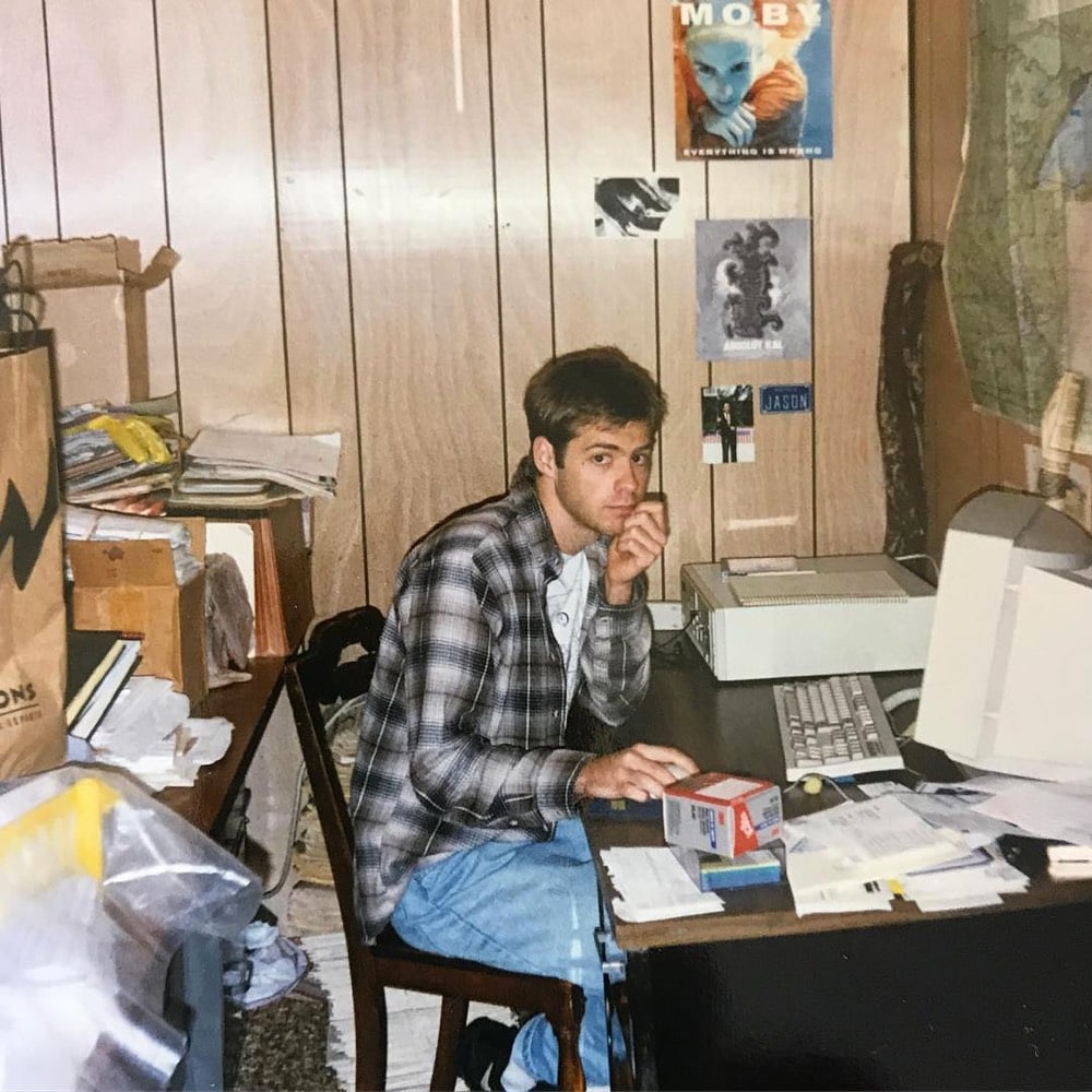
That tiny baby Jason loved cheese, Quentin Tarantino, and the World Wide Web, bless his little heart.
Anyway, the sites I built then were terrible at first, but I was obsessed and slowly they improved. some web space turned into a site called 0sil8, which became a playground of sorts for my experiments in writing and design. Every few weeks/months, I’d create a new “episode” to put up on 0sil8 and gradually I gained an online following and became part of a community of folks who were likewise experimenting with the web.
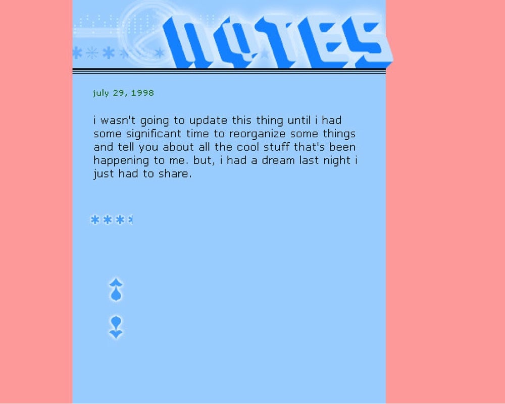
Around this time, more and more of what I was reading online were diaries and these things called weblogs.2 The updates on weblogs & diaries were smaller but more frequent than on other personal sites — their velocity felt different, exhilarating. But by the time I actually got interested enough to start my own weblog, there were so many of them — hundreds! maybe thousands! — that I thought I was too late, that no one would be interested. I forged ahead anyway and on March 14, 1998, I started the weblog that would soon become kottke.org. It was called Notes and here’s what it looked like:
I’m not gonna go through the whole history of the site, but it eventually took off in a way that I didn’t anticipate. Since 2005, kottke.org has been my full-time job and supports my family. I’ve met so many people from all over the world through my work here, including many life-long friends and my (now ex-) wife. I’ve spoken at conferences and travelled the world. I got to be on TV. I launched a membership program (which you should totally join if you haven’t already) that has given the site an incredible boost as it powers through its third decade.
On the occasion of the 20th anniversary of kottke.org, I wrote this:
I’ve been reading back through the early archives (which I wouldn’t recommend), and it feels like excavating down through layers of sediment, tracing the growth & evolution of the web, a media format, and most of all, a person. On March 14, 1998, I was 24 years old and dumb as a brick. Oh sure, I’d had lots of book learning and was quick with ideas, but I knew shockingly little about actual real life. I was a cynical and cocky know-it-all. Some of my older posts are genuinely cringeworthy to read now: poorly written, cluelessly privileged, and even mean spirited. I’m ashamed to have written some of them.
But had I not written all those posts, good and bad, I wouldn’t be who I am today, which, hopefully, is a somewhat wiser person vectoring towards a better version of himself. What the site has become in its best moments — a slightly highfalutin description from the about page: “[kottke.org] covers the essential people, inventions, performances, and ideas that increase the collective adjacent possible of humanity” — has given me a chance to “try on” hundreds of thousands of ideas, put myself into the shoes of all kinds of different thinkers & creators, meet some wonderful people (some of whom I’m lucky enough to call my friends), and engage with some of the best readers on the web (that’s you!), who regularly challenge me on and improve my understanding of countless topics and viewpoints.
I had a personal realization recently: kottke.org isn’t so much a thing I’m making but a process I’m going through. A journey. A journey towards knowledge, discovery, empathy, connection, and a better way of seeing the world. Along the way, I’ve found myself and all of you. I feel so so so lucky to have had this opportunity.
That all still rings incredibly true and I cannot improve upon it as an explanation of why I’m still here doing this moderately anachronistic thing. Thank you all so much for reading. ♥
P.S. You can read my thoughts on past anniversaries and view some previous site designs here: 10 years, 18-ish years, 20 years, and 24 years.
P.P.S. I wrote a separate post about this yesterday, but if you find value in what I do here, I’d appreciate if you’d support the site by purchasing a membership. And to everyone who has supported the site over the years, thank you so much!
P.P.P.S. Last one: I’m gonna write more about this later today, but I’ve turned ordering back on for Kottke Hypertext Tees for the next 24 hours or so. Go get ‘em!
P.P.P.P.S. Ha, I’ve thought of one more thing: I’ve turned comments on for this post! kottke.org used to allow comments on every post, but it’s been almost 8 years since the last time they were on. I figured it would be fun to try them out today. No idea if they’re even going to work or how long they will be available, but let’s try it out. If you’d like to share how long you’ve been reading the site or leave any memories or observations, feel free. My inbox is open as well. Ok, that’s really all for now! Thank you!
Update: A bunch of comments got hung up in a spam filter in my CMS that I didn’t even know was active. They should be all through now…sorry about that!
Ok, if you started using the web 15-25 years ago, prepare yourself for the nostalgic blast of the Web Design Museum.
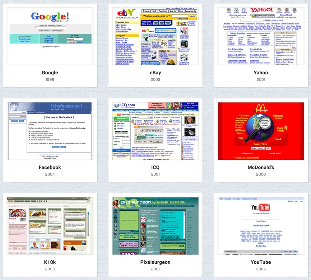
I remember all of these from back in the day — what a trip. Even kottke.org circa 1999 made it in there.
In 1998, author and media critic Neil Postman gave a talk he called Five Things We Need to Know About Technological Change. Here are the five ideas Postman shared that day, which are all still highly relevant today:
1. All technological change is a trade-off. For every advantage a new technology offers, there is always a corresponding disadvantage.
2. The advantages and disadvantages of new technologies are never distributed evenly among the population. This means that every new technology benefits some and harms others.
3. Embedded in every technology there is a powerful idea, sometimes two or three powerful ideas. Every technology has a philosophy which is given expression in how the technology makes people use their minds, in what it makes us do with our bodies, in how it codifies the world, in which of our senses it amplifies, in which of our emotional and intellectual tendencies it disregards.
4. Technological change is not additive; it is ecological. The consequences of technological change are always vast, often unpredictable and largely irreversible.
5. Media tend to become mythic. Cars, planes, TV, movies, newspapers — they have achieved mythic status because they are perceived as gifts of nature, not as artifacts produced in a specific political and historical context.
His first idea about technology is perhaps the most apropos to the current moment:
The first idea is that all technological change is a trade-off. I like to call it a Faustian bargain. Technology giveth and technology taketh away. This means that for every advantage a new technology offers, there is always a corresponding disadvantage. The disadvantage may exceed in importance the advantage, or the advantage may well be worth the cost. Now, this may seem to be a rather obvious idea, but you would be surprised at how many people believe that new technologies are unmixed blessings. You need only think of the enthusiasms with which most people approach their understanding of computers. Ask anyone who knows something about computers to talk about them, and you will find that they will, unabashedly and relentlessly, extol the wonders of computers. You will also find that in most cases they will completely neglect to mention any of the liabilities of computers. This is a dangerous imbalance, since the greater the wonders of a technology, the greater will be its negative consequences.
Think of the automobile, which for all of its obvious advantages, has poisoned our air, choked our cities, and degraded the beauty of our natural landscape. Or you might reflect on the paradox of medical technology which brings wondrous cures but is, at the same time, a demonstrable cause of certain diseases and disabilities, and has played a significant role in reducing the diagnostic skills of physicians. It is also well to recall that for all of the intellectual and social benefits provided by the printing press, its costs were equally monumental. The printing press gave the Western world prose, but it made poetry into an exotic and elitist form of communication. It gave us inductive science, but it reduced religious sensibility to a form of fanciful superstition. Printing gave us the modern conception of nationhood, but in so doing turned patriotism into a sordid if not lethal emotion. We might even say that the printing of the Bible in vernacular languages introduced the impression that God was an Englishman or a German or a Frenchman — that is to say, printing reduced God to the dimensions of a local potentate.
Perhaps the best way I can express this idea is to say that the question, “What will a new technology do?” is no more important than the question, “What will a new technology undo?” Indeed, the latter question is more important, precisely because it is asked so infrequently. One might say, then, that a sophisticated perspective on technological change includes one’s being skeptical of Utopian and Messianic visions drawn by those who have no sense of history or of the precarious balances on which culture depends. In fact, if it were up to me, I would forbid anyone from talking about the new information technologies unless the person can demonstrate that he or she knows something about the social and psychic effects of the alphabet, the mechanical clock, the printing press, and telegraphy. In other words, knows something about the costs of great technologies.
Idea Number One, then, is that culture always pays a price for technology.
It is nearly impossible to read these paragraphs and not think about how social media (and the internet more generally) has shaped our culture in both good and bad ways…and those who still believe that services like Facebook or Twitter are “unmixed blessings”. The rest of the talk is equally thought-provoking and enlightening.
P.S. Postman made these remarks about 2 weeks after I started publishing kottke.org 20 years ago. At that time, very few people I knew or interacted with online saw anything but the positive aspects of the internet and personal publishing online. Should we have seen the weaponization of the internet coming? Perhaps. But then again, not a lot of people who enjoyed the simple pleasures of Howdy Doody, I Love Lucy, and Lassie could have anticipated the government-shaping toxicity of Fox News and cable news in general.
This comparison by designer Alexander Singh of the development of the web from home pages to massive content farms like Facebook with the development of agriculture really got some of the ol’ neurons firing.
Over the past 25 years, the web appears to have transitioned from a primarily nomadic culture to a mostly agrarian one, mirroring the Neolithic Revolution 10,000 years ago.
The simplicity of HTML-only site building, spaces like Geocities & Angelfire, and cultural artifacts such as web rings coupled with poor search engine tech saw us navigate the web like nomads: from point to point, link to link.
The web has developed & so have the skills necessary to build within it. HTML was easy. CSS took a little more time & JS more again, alienating most and establishing a class hierarchy. Discovery was solved, weakening point-to-point navigation.
The literate Priesthood can still build & interface with the web, but the vast majority of people are relegated to the peasantry. “Fortunately” for them, motivated benefactors have offered a Faustian bargain to make their lives “easier”.
Corporate Feudalism has emerged to create centralized, “safe” spaces for the peasantry to work & play. Attention is farmed and sold in exchange for convenience, protection, mediated self-expression & an indifferent audience. You can do anything if it’s within their borders.
Very interesting. What comes next? What does the web’s Renaissance or Enlightenment look like? (via @pieratt)
The original promise of the Web was “small pieces loosely joined” but has over time became “walled gardens fighting each other”, an approach that’s been under increasing scrutiny lately. In The Missing Building Blocks of the Web, Anil Dash argues that some neglected precepts of hypertext and the web could help steer us back towards a place that’s more oriented towards people, to “rebuild the web into something that has the potential, excitement, and openness that got so many of us excited about it in the first place”. One of the concepts he highlights is authoring:
When Tim Berners-Lee invented the world wide web, he assumed that, just like in earlier hypertext systems, every web browser would be able to write web pages just as easily as it read them. In fact, that early belief led many who pioneered the web to assume that the format of HTML itself didn’t matter that much, as many different browsing tools would be able to create it.
In some ways, that’s true — billions of people make things on the web all the time. Only they don’t know they’re making HTML, because Facebook (or Instagram, or whatever other app they’re using) generates it for them.
Interestingly, it’s one of Facebook’s board members that helped cause this schism between reading and writing on the web. Marc Andreessen pioneered the early Mosaic web browser, and then famously went on to spearhead Netscape, the first broadly-available commercial web browser. But Netscape wasn’t made as a publicly-funded research project at a state university — it was a hot startup company backed by a lot of venture capital investment.
It’s no surprise, then, that the ability to create web pages was reserved for Netscape Gold, the paid version of that first broadly consumer-oriented web browser. Reading things on the web would be free, sure. But creating things on the web? We’d pay venture-backed startup tech companies for the ability to do that, and they’d mediate it for us.
Dash also argues for more embedding — not just YouTube videos but “a little functional part of one website embedded in another”. I know this isn’t what he’s referring to, but embedding is anything but neglected: the entire online advertising and tracking industry (Google, Facebook, etc.) is built on embedding little bits of their sites on billions of other web pages. Maybe a little bit less of that sort of embedding?
In “an open memo, to all marginally-smart people/consumers of internet ‘content’”, Foster Kamer has a small suggestion to those who care about the health and diversity of online media: stop reading what Facebook tells you to read and use your browser bar (or bookmarks) instead.
Literally, all you need to do: Type in web addresses. Use autofill! Or even: Google the website you want to go to, and go to it. Then bookmark it. Then go back every now and again.
Instead of reading stories that get to you because they’re popular, or just happen to be in your feed at that moment, you’ll read stories that get to you because you chose to go to them. Sounds simple, and insignificant, and almost too easy, right?
It’s only easy, and simple to do. As for why you should do it: It’s definitely not simple, nor insignificant. By choosing to be a reader of websites whose voices and ideas you’re fundamentally interested in and care about, you’re taking control.
And by doing that, you’ll chip away at the incentive publishers have to create headlines and stories weaponized for the purpose of sharing on social media. You’ll be stripping away at the motivation for websites everywhere (including this one) to make dumb hollow mindgarbage. At the same time, you’ll increase the incentive for these websites to be (if nothing else) more consistent and less desperate for your attention.
*head nodding vigorously* I mean, it’s a complicated situation. Facebook and Twitter are easily the best news/blog reading platforms ever invented, better than any RSS reader for most people. By putting most of the web’s information all in one place, they offer incredible speed and convenience, which is hard for people to ignore. I made this point in a footnote this morning: using Facebook instead of just bookmarks is compelling in the same way that shopping at Walmart instead of small-town shops was in the 80s. We blame Walmart for decimating small businesses, but ultimately, small town shoppers chose convenience and lower prices over the more local and diverse offerings from their neighbors. And for the past several years, readers have been doing the same thing in favoring Facebook. What Kamer is arguing is that readers who value good journalism, good writing, and diverse viewpoints need to push back against the likes of the increasingly powerful and monolithic Facebook…and visiting individual websites is one way to do that.
*record scratch*
*freeze frame*
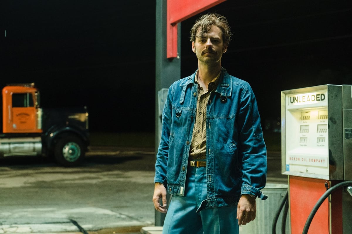
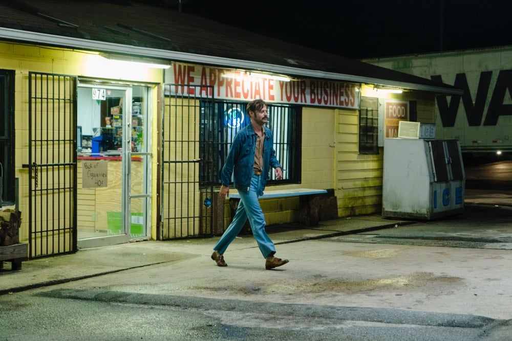
Yep, that’s me. You’re probably wondering how I ended up back in the 1970s with such a sweet jacket and bitchin’ mustac— Ok all jokey tropes aside, I got to appear on AMC’s Halt and Catch Fire last night as a background extra. (Mild spoilers follow.) This season of the show is set in the 90s, but this episode flashes back to the 70s soon after Gordon and Donna get together. My scene takes place during this flashback and is pretty short. Gordon is at a gas station, waiting to use the pay phone. A man (that’s me!) exits the station with a 6-pack of beer, gets into his car, and drives off after Gordon crosses the pavement to the phone. And that was it! But as a big fan of the show — and I refuse to have any chill about this — it was one of the coolest experiences I’ve had in forever.
I’ve been watching the show since the first season, when the action focused on a small company trying to build one of the first IBM-compatible PCs on the market. (You may have read about this show on kottke.org once or twice. Or a dozen times. I have an unauthorized Cardiff Electric t-shirt I bought from some sketchy site online. Did I mention I was a big fan?) At some point during the next two seasons of the show, when the action moved from PCs in Texas to online services & anti-virus software in Silicon Valley, I followed the two creators of the show, Christopher Cantwell and Christopher Rodgers on Twitter. And at some later point, they followed me back and we tweeted at each other a handful of times.
Meanwhile, the show got renewed for a fourth and final season. At the end of season three, the characters started talking about this new thing called the World Wide Web and it was clear that season four was going to focus on early 90s web startups. Now, I don’t know if you know this about me or not, but I love the web. (Oh, you could tell? I let that slip at some point?) And I am so very nostalgic for the early days of the web in the 90s — the Mosaic days, the Altavista days, the Bobaweb days, the Entropy8 days, the Suck days, the CSotD days, the alt.culture.days, the 0sil8 days, the Yahoo on the akebono server at Stanford days. The days when I was young and dumb and decided to quit grad school in a promising field without talking to a single other person about it because I just knew I needed to do whatever I could to get a job working on the web, a job that didn’t even exist at the beginning of my junior year in college. Season four was going to be about those days?! Holy shit.
In June, Chris Cantwell, who was down in Atlanta to direct an episode of the fourth season, tweeted that he was in the hospital, on dilaudid waiting for a kidney stone to pass and was available to answer any questions his followers had about the show. After a crap-can month of May, I’d been focusing on being more direct with what I want, so fuck it, yolo, totally trying to take advantage of this poor guy being hopped up on goofballs, I tweeted back:
Do you need extras for s04? Will do retro web design on screen for zero pay. I still can code circa-1994/5 HTML by hand.
Which was like 30% joking and 70% serious. A few minutes later, he replied:
Dude if you can fly out here I’ll put you in a long wig and put you at a gas station.
I had no idea what the hell he was talking about — remember, he was super fucking high — but we followed up via DM and I bought a plane ticket for Atlanta and booked a hotel the next morning. Sometimes, just sometimes, you get what you want, even if it’s not exactly what you asked for.
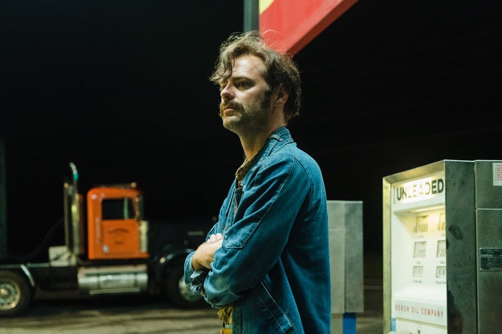
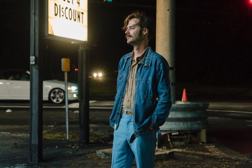
Less than a week later, I’m in Atlanta. They put me through wardrobe, where I tried on two sets of 70s clothes (they ended up using a mix of clothes from the two looks). I got a tour of the storeroom where they keep all of the clothes for the series; it was massive…I kept thinking I was going to uncover the Ark of the Covenant in there. I went from there to hair & makeup, where they fit me with a wig and mustache for Cantwell to approve. My scene wouldn’t shoot until the next evening, so they had to take it off that afternoon and put it all back on the next day:
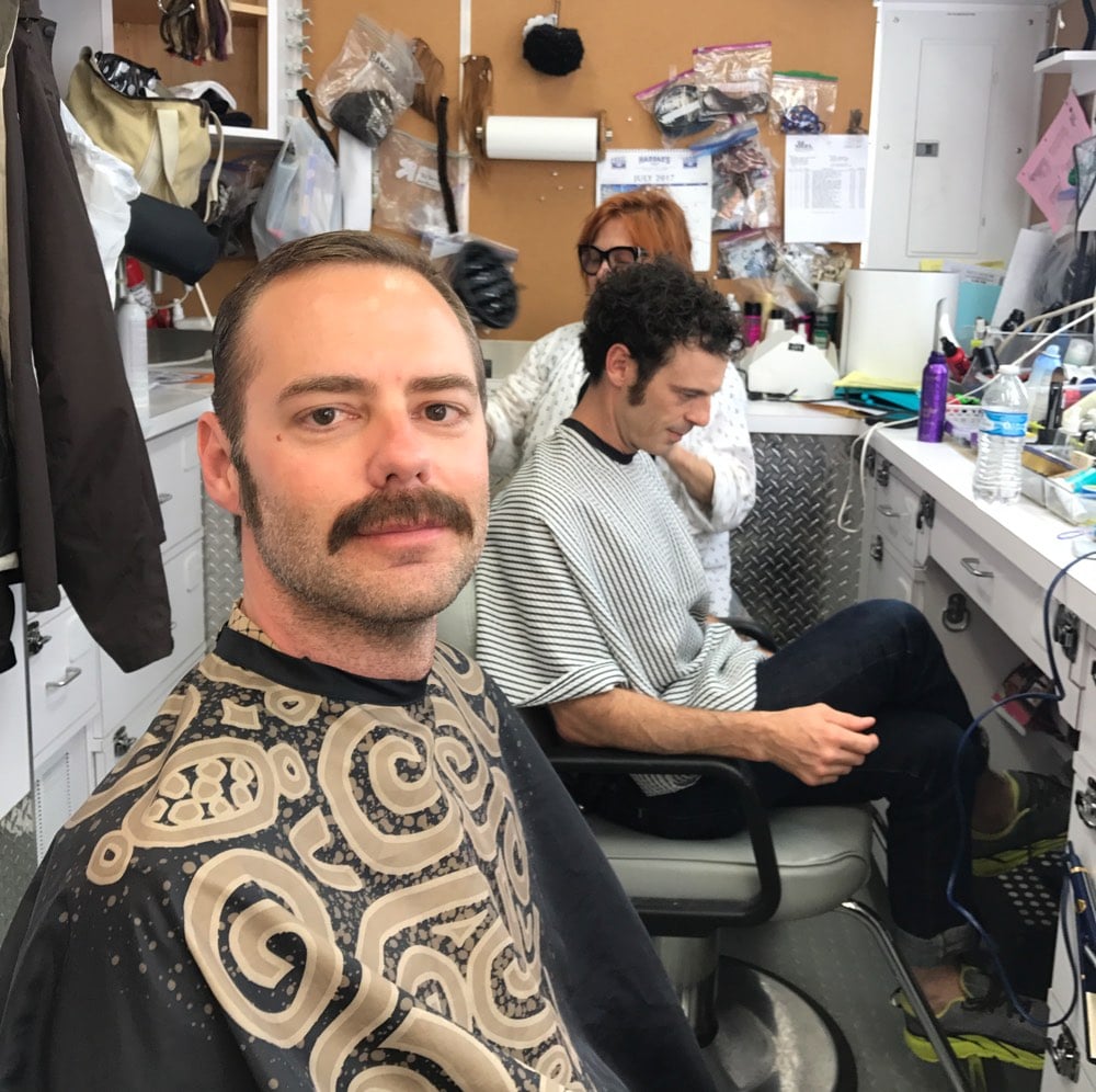
I got to meet the actors that played Gordon, Donna, and Joe…they were super nice. Hell, everyone was super nice and professional and seemed to be having fun…a good crew. I was there to be an extra, but since I knew Cantwell, I was also “a friend of the show”. (Everyone kept saying, “oh, you’re the blogger!”) So they took me out to a couple of the sets, and I got to see Mackenzie Davis do her thing (❤️!). They showed me how everything on-set worked and gave me a headset so I could listen in on what was happening. I met the show’s producers, one of whom told me that with my hair and mustache, I looked just like his friend Bill Paxton from 20 years ago, in Tombstone…to the point where it freaked him out a little to see his recently deceased friend standing before him. I saw a stuntman jump off a cliff into a quarry. They gave me a chair to sit in so I could watch the action on the monitors in real-time. I ate so much food at the end-of-day meal. I got to drive a big-ass Chevy from the 70s. I read a call-sheet for the next day’s shoot that totally spoiled the season’s biggest reveal and I didn’t even care that much.
On the day of the shoot, the scene took place at night, so my call time was 6pm. Did the hair and makeup thing again, ate, sat around, got dressed, and then was shuttled out to the set at around 10pm. I watched them set up and then it was go time. I did my scene probably 8 or 10 times. They shot it with two different camera setups and had me change little things here and there…like the first time I walked out of the store, I didn’t have the beer in my hand:
And then, right around midnight, it was done. I filled out my sheet to get paid ($51.64 after taxes) and somehow stayed awake on the 90 minute drive back to Atlanta.
That last-minute, three-day trip totally blew my travel budget for the summer. Was it worth it? When I was a kid, there was nothing I was more interested in than computers. My dad bought one of the first available IBM PC-compatibles on the market. I’ve read and watched a ton about the PC revolution. I used online services like Prodigy. And the web, well, I’ve gotten to experience that up close and personal. One of the reasons I love Halt and Catch Fire so much is that it so lovingly and accurately depicts this world that I’ve been keenly interested in for the past 35 years of my life. Someone made a TV show about my thing and it was great, a successor to Mad Men great. Getting to be a microscopically tiny part of that? Hell yeah, it was worth it.
Update: Will Fitzgerald pointed out that I now have a Bacon Number of 2.
Six Degrees of Kevin Bacon is a parlour game based on the “six degrees of separation” concept, which posits that any two people on Earth are six or fewer acquaintance links apart. Movie buffs challenge each other to find the shortest path between an arbitrary actor and prolific character actor Kevin Bacon. It rests on the assumption that anyone involved in the Hollywood film industry can be linked through their film roles to Bacon within six steps.
While not strictly within the rules (HaCF is TV, not film), I was in an episode of Halt and Catch Fire with Toby Huss and Huss was in R.I.P.D. Because of a few physics papers I co-authored in college, I also probably have an Erdös Number (I’d estimate 5 or 6?). I’ve got a ways to go on an EGOT, but I’m doing pretty well on the Bacon-Erdös scale!
Update: Here’s a clip of my scene:
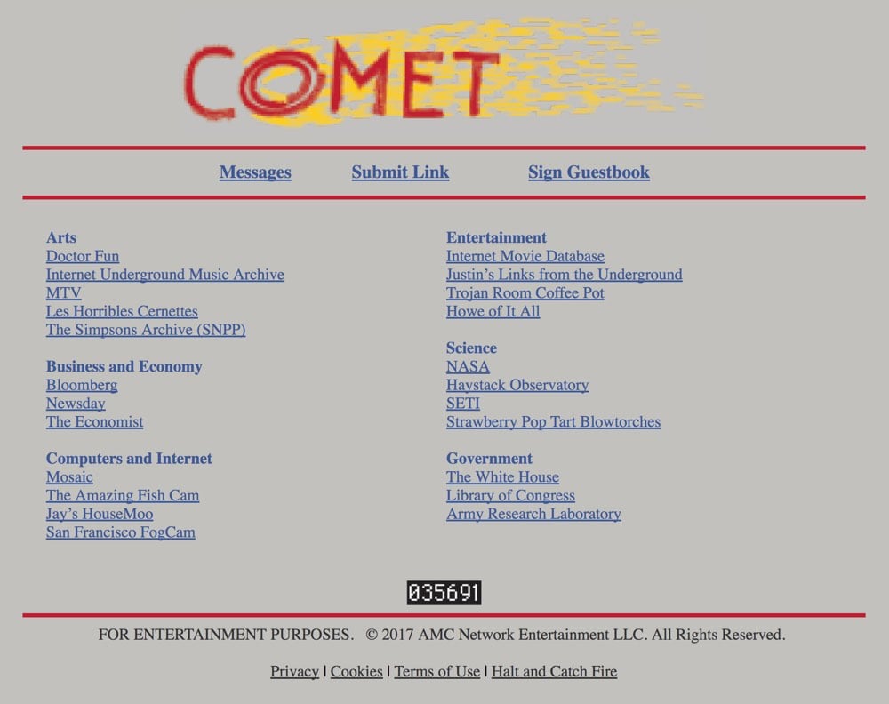
This season on Halt and Catch Fire, competing teams made up of the main characters are building web apps. One team is making a hand-curated directory called Comet and the other is building a search engine with a unique algorithm called Rover. It’s Yahoo vs. Google, more or less. AMC has put up the sites as they appear on the show up on the web: Comet and Rover. They also put up the Cameron Howe fan page seen in the most recent episode, The Howe of It All (that’s a perfectly anachronistic name). See also Yahoo’s website circa 1994 when it was still hosted on a server at Stanford.
A character in the most recent episode also mentioned Justin Hall, creator of the early web’s most well-known personal site, Justin’s Links from the Underground.
Anyone know where I can get a Comet t-shirt? (I already have a Cardiff Electric shirt. (No, really.)) Oh, maybe this?
The fourth (and sadly final) season of Halt and Catch Fire starts this August. The show has followed a core cast through the personal computer revolution, through the rise of online service companies, and into Silicon Valley. As teased last season, the action in this final season focuses on the World Wide Web.
We’re building it together and it’s awesome.
Pretty excited about this for a variety of reasons! You can catch up on Netflix before the new season starts.
Update: New promo trailer is out. Someone’s building a search engine?
Last week (approx. May 7-14), I stopped using social media for an entire week. I logged out of all the sites and deleted the apps from my phone. I didn’t so much as peek at Instagram, which is, with Twitter and old-school Flickr, probably my favorite online service of all time. I used Twitter as minimally as I could, for work only.1 I didn’t check in anywhere on Swarm. No Facebook. As much as I could, I didn’t use my phone. I left it at home when I went to the grocery store. I didn’t play any games on it. I left it across the room when I went to bed and when I worked.
Many people have given up social media and written about it — the digital equivalent of the “Why I’m Leaving New York” essay — but since I didn’t write about leaving New York, I’m going to do this instead.
I used to be very good about using my phone and social media appropriately. More than a decade of working on kottke.org taught me how to not be online when I wasn’t working (for the most part). I tried super hard not to use my phone at all around my kids and if I was out with friends, my phone stayed in my pocket.2
Almost a year ago, after 13+ years in the city, I moved from lower Manhattan3 to rural Vermont. It’s beautiful here. I live in a house in the country surrounded by horse pasture and there’s great skiing in the winter. The nearest town is only five minutes away by car; it has a two-screen movie theater, a handful of restaurants (none of which are typically open after 10pm), two grocery stores, but nowhere to get a proper donut, sushi, or bowl of ramen. (The nearest ramen is an hour’s drive away.) While I was writing this post yesterday afternoon, the power in my house went out and didn’t come back on for three hours, forcing a delay in publication. It’s been difficult to meet people. Folks here are nice, but they mostly remind me of the people in the small town I grew up in (aka why I moved to the city in the first place). I work from home at a desk in my bedroom and some days, the only beings I’ll talk to are Siri, my landlord’s horses, and some days, my kids and their mom.
Social media, mostly through my phone, has been an important way for me to stay connected with friends and goings on in the wider world. But lately I’d noticed an obsessiveness, an addiction really, that I didn’t like once I became fully aware of it. When I wasn’t working, I was on my phone, refreshing Instagram, Twitter, and Facebook repeatedly in an endless series, like a little old lady at Caesar’s Palace working several slot machines at the same time. And I couldn’t stop it — my phone was in my hand even when I was trying to concentrate on my kids, watching a movie, or reading a book. So, I quit for a week to see what would happen. It’s not a super-long time period, but here’s what I noticed:
- Once I’d set my mind to it, it was pretty easy to go cold turkey. Perhaps my Twitter usage and keeping up with the news for kottke.org acted as a nicotine patch, but I don’t think so. Instagram was the toughest to stay away from, but I didn’t crack once.
- As the week went on, it was more and more evident that it wasn’t so much social media as the phone that was the problem. Even now, a few days after the conclusion of my experiment, I’m leaving my phone at home when I go out or across the room when I’m doing something. I’m going to try hard to keep this up.
- Buuuut, when you have kids, there is no such thing as giving up your phone. There’s always the potential call from their school or their mom or their doctor or another parent regarding a playdate or or or. I spend enough time online at my computer for work that I could mostly do without my phone, but with kids, that’s not really an option.
- Not a single person noticed that I had stopped using social media. (Not enough to tell me anyway.) Perhaps if it had been two weeks? For me, this reinforced that social media is actually not a good way to “stay connected with friends”. Social media aggregates interactions between loved ones so that you get industrialized communication rather than personal connection. No one really notices if a particular person goes missing because they’re just one interchangeable node in a network.
- My no-social week, for a variety of reasons, was probably the shittiest week I’d had in more than a year. Total emotional mess. Being off social media didn’t make it any better, but I doubt it made it worse. Overall, it was probably a good thing I wasn’t subjecting my friends and followers to self-subtweets and emo Instagram Stories…I was already scoring enough own goals without social media’s help.
- So, what did I do instead? I wish I could say that I had loads of extra free time that I used to learn Spanish, clean my house, catch up with old friends, cook delicious meals, and finish a couple work projects. Perhaps if shittiest week ever hadn’t been happening, I would have done some of that. Still, I did end up going to bed early every night, read a couple books, and had more time for work and dealing with kid drama.
After the week was up, I greedily checked in on Instagram and Facebook to see what I had missed. Nothing much, of course. Since then, I’ve been checking them a bit less. When I am on, I’ve been faving and commenting more in an attempt to be a little more active in connecting. I unfollowed some accounts I realized I didn’t care that much about and followed others I’ve been curious to check out. Swarm I check a lot less, about once a day — there was a lot of FOMO going on when I saw friends checked in at cool places in NYC or on vacations in Europe. And I’m only checking in when I go someplace novel, just to keep a log of where I’ve been…that’s always fun to look back on.
Mostly, I’ve resolved to use my phone less. Being on my phone was my fidget spinner…this thing that I would do when there was nothing else to do or that I would use to delay going to bed or delay getting out of bed in the morning. Going forward, I’m going to be more mindful about its use. If nothing else, my hands and thumbs might start feeling better.
Alexis Madrigal is back at The Atlantic, where he’ll be writing about technology, science, and business. His first piece is a reflection on how the Internet has changed in the 10 years he’s been writing about it. In 2007, the Web was triumphant. But then came apps and Facebook and other semi-walled gardens:
O’Reilly’s lengthy description of the principles of Web 2.0 has become more fascinating through time. It seems to be describing a slightly parallel universe. “Hyperlinking is the foundation of the web,” O’Reilly wrote. “As users add new content, and new sites, it is bound into the structure of the web by other users discovering the content and linking to it. Much as synapses form in the brain, with associations becoming stronger through repetition or intensity, the web of connections grows organically as an output of the collective activity of all web users.”
Nowadays, (hyper)linking is an afterthought because most of the action occurs within platforms like Facebook, Twitter, Instagram, Snapchat, and messaging apps, which all have carved space out of the open web.
That strategy has made the top tech companies insanely valuable:
In mid-May of 2007, these five companies were worth $577 billion. Now, they represent $2.9 trillion worth of market value! Not so far off from the combined market cap ($2.85T) of the top 10 largest companies in the second quarter of 2007: Exxon Mobil, GE, Microsoft, Royal Dutch Shell, AT&T, Citigroup, Gazprom, BP, Toyota, and Bank of America.
In 2007, I wrote a piece (and a follow-up) about how Facebook was the new AOL and how their walled garden strategy was doomed to fail in the face of the open Web. The final paragraph of that initial post is a good example of the Web triumphalism described by Madrigal but hasn’t aged well:
As it happens, we already have a platform on which anyone can communicate and collaborate with anyone else, individuals and companies can develop applications which can interoperate with one another through open and freely available tools, protocols, and interfaces. It’s called the internet and it’s more compelling than AOL was in 1994 and Facebook in 2007. Eventually, someone will come along and turn Facebook inside-out, so that instead of custom applications running on a platform in a walled garden, applications run on the internet, out in the open, and people can tie their social network into it if they want, with privacy controls, access levels, and alter-egos galore.
The thing is, Facebook did open up…they turned themselves inside-out and crushed the small pieces loosely joined contingent. They let the Web flood in but caught the Web’s users and content creators before they could wash back out again. The final paragraph of the follow-up piece fared much better in hindsight:
At some point in the future, Facebook may well open up, rendering much of this criticism irrelevant. Their privacy controls are legendarily flexible and precise…it should be easy for them to let people expose parts of the information to anyone if they wanted to. And as Matt Webb pointed out to me in an email, there’s the possibility that Facebook turn itself inside out and be the social network bit for everyone else’s web apps. In the meantime, maybe we shouldn’t be so excited about the web’s future moving onto an intranet.
What no one saw back then, about a week after the release of the original iPhone, was how apps on smartphones would change everything. In a non-mobile world, these companies and services would still be formidable but if we were all still using laptops and desktops to access information instead of phones and tablets, I bet the open Web would have stood a better chance.
Someone located a VHS copy of an hour-long program from 1996 called Discovering the Internet and ripped it to YouTube. Total nostalgia bomb for me…even at 28.8K modem speeds, I probably spent 12 hours a day online back then, wrestling with HTML, Photoshop, frames, and JavaScript.
In this tutorial, we’ll take a look at the differences between The Internet and The World Wide Web, the differences between commercial OnLine Services such as the Microsoft Network, Prodigy, or America Online and the Internet, how to get connected to the Web, how to use something called a Web browser to navigate the Web, what a Web Page is, and how to search, locate, and download all types of files, from information files to video and audio files.
It’s worth skipping ahead to 17:30 to hear how the host pronounces “URL”.
See also a brief clip of Blogger/Twitter/Medium co-founder Evan Williams explaining the Internet in the mid-90s.
Look at that kid! He just knew the Internet was going to be a big deal, and boy was he right. (via laughing squid)
If you are a regular reader and appreciate what I do here, please support kottke.org by purchasing an annual membership. It only takes a minute (or about 20 seconds on iOS w/ Apple Pay) and your collective support will mean a lot to the future of kottke.org. This has been in the works for a while now and I have a lot to say about it, but go check it out first, subscribe, and then come back. I’ll wait.
All set? Ok. A couple of recent catalysts have set this into motion, but I’ve been thinking about it for the last few years. So here’s why I feel this is necessary now, in four interconnected main points.
Focus on dedicated readers. Anyone who relies on an audience of some kind — artists, writers, businesses, etc. — has to focus on serving regulars while keeping an eye on attracting new readers/customers/users. As much as I feel that everyone in the world would enjoy reading the world’s best blog — I mean, who wouldn’t? — it’s difficult for me to take time out from writing the site to reach out to potential new readers.1 I love being a regular myself and at this point in the site’s evolution, it makes sense to focus mostly on the people who read and love the site. Part of that focus is building up the financial link between us. In an ideal world: I write for you, you pay me, I write some more. No middlemen. I’m not sure that’s an entirely feasible arrangement at this point, but we can get part of the way there and work on the rest.
Revisiting an old idea. Some of you may remember that I’ve asked for support directly from readers before.2 A few months ago, I went out to lunch with Tim Urban from Wait But Why. We’d hardly said hello when he said something like “my goal for this lunch is by the end of the meal, you’ll agree to ask your readers to financially support kottke.org”. Tim was very clear that asking his readers for support on Patreon had been game-changing for his site. Project creators and potential backers have become comfortable with directly funding creative efforts online, particularly through Kickstarter & Patreon and I’m curious to see how it works for kottke.org in 2016.3
A changed media landscape. It’s been 11+ years since I quit my job to do kottke.org full-time. Online media has changed a lot since then. Hell, it’s changed a lot in the past few years. Blogs are dead — long live blogs! — and the open web is struggling. If you ask around to the creators of other established independent sites on the web (and I have talked to many of them), you’ll hear that traffic and display ad revenue have been falling for the last few years. Many factors have contributed — Facebook, readers switching to mobile, the rise of apps, social overtaking search for discovery, ad blockers, Google Reader’s shutdown, VC money flooding into online media — and smaller sites without dedicated content marketing and mobile/social development teams can’t keep up. Other strategies are necessary.
Diversification. The site currently has two main sources of revenue: advertising via The Deck & the We Work Remotely job board and affiliate income from Amazon & iTunes. In an effort to diversify revenue, I’ve tried several things — RSS sponsorships, sponsored posts for Kickstarter projects, consulting for startups, and speaking — and none of them have stuck. I’ve thought about writing a book, putting on a conference, or doing a podcast. But that all feels like it’s beside the point and not what I really want to do, which is just to write here, for you. A recent (hopefully temporary) hiccup in one of these revenue sources4 has driven home the need for not putting all my eggs in one basket. I would love for reader support to become a healthy third leg on the ol’ revenue stool.
I could go on — and in several previous drafts, boy, did I! — but here’s what it boils down to for me: I’m proud of what I’ve built here at kottke.org over the past 18 years and I’m committed to publishing here regularly and operating independently as long as I am able. Even though the site is primarily a one-person operation, I’ve never done it alone. You have always been an essential part of this site — providing me with feedback, counsel, encouragement, pushback, and many great links and ideas for posts — and I’d love your help in taking this next step. As always, thanks for reading and thanks for the support!
Andy Baio has redesigned his long-running blog Waxy.
After 14 years of blogging, I switched from MovableType to WordPress. The design is finally responsive, though pretty minimalist for now with lots of rough edges. It took some effort, but I preserved the links to everything I’ve ever written — 472 posts and 15,891 links.
In his post about the redesign, he notes why he still continues to publish on his own site:
Ultimately, it comes down to two things: ownership and control.
Last week, Twitter announced they’re shutting down Vine. Twitter, itself, may be acquired and changed in some terrible way. It’s not hard to imagine a post-Verizon Yahoo selling off Tumblr. Medium keeps pivoting, trying to find a successful revenue model. There’s no guarantee any of these platforms will be around in their current state in a year, let alone ten years from now.
Here, I control my words. Nobody can shut this site down, run annoying ads on it, or sell it to a phone company. Nobody can tell me what I can or can’t say, and I have complete control over the way it’s displayed. Nobody except me can change the URL structure, breaking 14 years of links to content on the web.
I might have said “freedom” instead of “control” but there’s some hard nodding from me right here. I’d also add something about the freedom to pursue revenue in whatever way you want. Publishing on YouTube or Facebook or Medium or Instagram or Twitter limits how you can do that.
But given the state of the open web these days, Andy rightly notes that going it alone is much more difficult now than it used to be:
But the ecosystem for independent publications is fundamentally broken. Getting discovered, building a readership, and profiting from your work as an independent writer are all much, much harder than they used to be.
I also have lots of thoughts about this, and I’m glad Andy has decided to join me in sticking it out and remaining independent. Waxy is one of my favorite sites in the world and I’m happy to see it looking so smart this morning.
Note: There are some *major* unavoidable spoilers about the finale of season three of Halt and Catch Fire in this post. If you’ve been watching (and you definitely should be), you might want to catch the finale first and then come back.
The final two episodes of Halt and Catch Fire aired last night. The previous eight episodes of the season took place in the mid-1980s with Joe running something like Norton or McAfee in San Francisco, and Cameron, Donna, and Gordon running a dial-up service like Compuserve for playing online video games, chatting, and selling stuff on a nascent Etsy. In the 8th episode, a lot of that changed and the characters headed their separate ways.
For the final two episodes, the show jumps forward to 1990, and in the last episode, Donna brings the four main characters (plus Cameron’s husband Tom, who works for Sega in Japan) back together to talk about a new and potentially revolutionary idea that’s crossed her desk at the VC firm where she’s now a senior partner: the World Wide Web. The five of them meet over two days, trying to figure out if there’s a business to be built on the Web — Joe argues metaphorically that they should build a stadium while Cameron says that no one’s gonna come to the stadium unless you have a kickass band playing (lack of compelling content) and then Gordon retorts that rock n’ roll hasn’t even been invented yet (aka there’s no network for this to run on). The discussion, some anachronisms and having the benefit of hindsight aside, is remarkably high level for a television audience…I doubt I could explain the Web so well.
At the second meeting, Joe, who is a Steve Jobs / Larry Ellison sort of character, has had some time to think about the appeal of the Web and lays out his vision (italics mine):
Joe: Berners-Lee wrote HTML to view and edit the Web and HTTP so that it could talk to itself. The chatter could be cacophonous, it could be deafeningly silent. Big picture: What will the World Wide Web become? Short answer: Who knows?
Donna: Ok, so what’s your point?
Joe: It’s a waste of time to try to figure out what the Web will become, we just don’t know. Because right now, at the end of the day, it’s just an online research catalog running on NeXT computers on a small network in Europe.
Cam: So, you’re saying everything we’ve talked about since we got here has been a waste of time?
Joe: I’m saying let’s take a step back. Literally step back.
Gordon: What is this on the board?
Joe: It’s the code for the Web browser.
Tom: And you wrote it all on the whiteboard.
Donna: The online catalog of research?
Cameron: Full of Norwegian dudes’ physics papers and particle diagrams and stuff?
Gordon: And we care about this because why?
Joe: How did we all get here today? The choices we made? The sheer force of our wills, something like that? Here’s another answer: the winds of fate, random coincidence, some unseen hand pushing us along. Destiny. How did we all get here today? We walked through this door. We don’t have to build a big white box or stadium or invent rock n’ roll. The moment we decide what the Web is, we’ve lost. The moment we try to tell people what to do with it, we’ve lost. All we have to do is build a door and let them inside.
When I was five, my mother took me to the city. And we went through the Holland Tunnel and it was basic, concrete and steel, but it was also my excitement sitting in the backseat, wondering when it was going to be our turn to emerge, it was the explosion of sunlight. And when we exited the tunnel, all of Manhattan was laid out before us. And that was the best part of the trip: the amazing possibility to be able to go anywhere within something that is magnificent and never-ending.
This is the first Web browser, the one CERN built to view and edit research. I wrote it up here for you to see how simple it is. It takes up one whiteboard — that’s basic concrete and steel — but we can take this and we can build a door and we can be the first ones to do it because right now, everyone else sees this…
Donna: …as an online research catalog…
Gordon: …running on NeXT…
Cameron: …on a network in Europe.
Joe: And with this handful of code, we can build the Holland Tunnel.
It’s Don Draper’s carousel speech from Mad Men…but for the Web. And it hit me right in the feels. Hard. When I tell people about the first time I saw the Web, I sheepishly describe it as love at first sight. Logging on that first time, using an early version of NCSA Mosaic with a network login borrowed from my physics advisor, was the only time in my life I have ever seen something so clearly, been sure of anything so completely. It was a like a thunderclap — “the amazing possibility to be able to go anywhere within something that is magnificent and never-ending” — and I just knew this was for me and that it was going to be huge and important. I know how ridiculous this sounds, but the Web is the true love of my life and ever since I’ve been trying to live inside the feeling I had when I first saw it.
Which is why this scene wrecked me so hard. The Web that they are talking about on the show, the open Web, is ailing, dying. It was like listening to a eulogy at a funeral, this thing that I love, poured the best of my self into, gone forever. Of course that’s not strictly true, the Web is still a fabulous place where anyone can set up a site to do, say, or sell whatever they want, but instead of the promise of small pieces loosely joined, what we mostly got was large pieces tightly coupled. Today’s Web browsers and apps are Holland Tunnels that open up right into shopping malls instead of open city streets. Facebook makes it absurdly easy to start your own blog that all your friends and family can conveniently read, but you give up the freedom to say anything you want, it’s impossible to move those words elsewhere if you’d like (I’m talking with URLs and social graph intact), and they sell advertising against your words & images and you don’t get a cut.
Now, I’m not advocating a Make The Web Great Again policy because the open Web of the 90s had many problems, the greatest of which was a lack of access for anyone without the free time and skills necessary to set up a web server, install software, etc. etc., not to mention the expense involved. Today’s Web is much more accessible to people of all ages, backgrounds, and skill levels and as a result you see much more participation across the socioeconomic spectrum, especially in developing countries.
But the open Web enthusiasts and advocates missed an opportunity to take what the Web was in the 90s and make that available to everyone. Instead of walled gardens like Facebook, Pinterest, and Medium (which echo the closed online services like AOL, Prodigy, and Compuserve that predated the Web), imagine a bunch of smaller services bound together with open protocols where individuals have both freedom and convenience. At this stage, building an open Twitter or open Facebook is nearly impossible, but it wouldn’t have been 10-12 years ago. I hope I’m wrong, but with all of the entrenched incumbents and money pumping into online services, I’m afraid that time has truly passed. And it’s breaking my heart.
For the first time in more than four years, kottke.org is sporting a new design this morning. Since you should never launch anything completely finished,1 there are probably still some things that need to be ironed out, but I hope most of it works. (Drop me a note if you notice something amiss?) Let’s hop right into what’s new and why. (For reference, here’s what the site looked like until late yesterday, here’s what I said about that design, and here’s what some of the previous designs looked like.)
Design. Gone is the now-beloved blue gradient (which ppl didn’t like when I introduced it), replaced with a colorful rainbow banner thingie. The site title and the old school tagline — “home of fine hypertext products” — are both making a comeback. The march toward simplicity continues…every remaining design element serves a purpose. The type is a bit bigger to offset ever increasing display resolutions (which somewhat paradoxically makes everything smaller). Post titles are quite a bit larger. Media embeds and images are much larger, especially if it’s right at the top of the post. Check out this post and this one for examples of what I’m talking about. Tweaked the footnote style.2 More tweaks to come. (Including moving to some even faster new servers at Arcustech, the fantastic hosts of kottke.org for years now. Big thanks to them for all their support!)
The layout of the site is responsive — not fully so, but if you resize your browser window, it’ll change and flow and do all of the neat things that responsive design does. The type is still my favorite Whitney ScreenSmart by Hoefler & Co (designed by Tobias Frere-Jones), but I finally (FINALLY!!!) turned on smart quotes and such — you know, like “opening and closing quotes around this text” and apostrophes’ apostrophes and the proper m-dash right heeeeeere — so now the designers who read the site can finally stop tutting about it. (And Hoefler and Frere-Jones can stop tearing their hair out about seeing text rendered with their point-perfect typeface littered with dumb quotes. Enjoy your tresses, fellows!)
Mobile. This was the main impetus behind the redesign. Over 40% of you read kottke.org on a mobile device of some kind. The old site worked fine on phones and tablets, but not great. Now, the site looks and works great on mobile. (At least I think it does.)
Tags. Some of my favorite things about kottke.org are the tags and tag pages. Looking at the site through the lens of tags, it becomes apparent that kottke.org is actually a collection of hundreds of small blogs about introversion, Stanley Kubrick, time travel, early color photography, economics, crying at work, and all sorts of other things. For the redesign, I made them more visible on the site and I’m hoping to find more ways to improve their involvement in the site soon. You’ll now find tags at the end of posts no matter where you find them on the site; previously they were only on the individual post pages. Tag pages are now paginated so you can go back through hundreds and even thousands of posts on each topic. I’ve also included a list of related tags at the top of each tag page…which is incredibly addictive for surfing around aimlessly.
Biography. With the help of some friends (aka the kottke.org board of advisors), I rewrote the about page. I liked the brevity of the old version, but in the words of one friend, “the previous version undersold the site so much it was almost inaccurate”. This is the first bio I’ve ever written that takes seriously what the site is and what I’ve done in my career…and as such it makes me really uncomfortable. Taking credit, particularly in public, has never been my thing. But I wanted to have a chance at explaining kottke.org to people who might not know the whole story. Everyone here has an opinion about kottke.org, this is mine.
When I started the site in 1998, people expressing their ideas & beliefs through links and attempting to stitch technology & the liberal arts together were not commonplace pursuits. In many ways, media on the web has come to resemble, in form and function, what kottke.org and other early blogs were doing back then. The largest social media companies in the world are now centered around people collecting and showing each other cool/interesting/funny links in order to say something about what they believe. I’m proud that kottke.org and I have played a role in that (r)evolution.
Future. The past 2.5 years have been the most challenging out of the 18+ years I’ve been doing the site. (Translation: they sucked.) I’ve been working, with many loooong periods of inactivity, on this redesign for more than 2 years. It’s not a cure for cancer or the world’s best design work, but to have it finally be out in the world feels amazing. Like a bad chapter in my life is ending. Like I’m still alive. Vital. A start of something. Like I’m finally investing in myself and my future for the first time in a long while. It feels like hope. And I hope you like it. It’s a genuine pleasure being able to share myself with you like this, and I don’t know what I’d do without it.
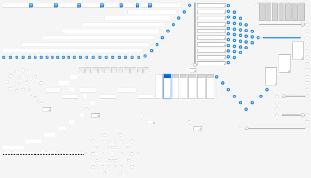
Ahhh, this makes me nostalgic for the 90s World Wide Web. Designer Sebastian Serena has built a Rube Goldberg machine out of HTML form elements. Once you start, you’ll watch the whole thing. (via @Colossal)
From 1996, a Wired article by Josh Quittner about Suck, Carl Steadman and Joey Anuff’s now-legendary website.
Who at HotWired noticed the look of dread and tension on the faces of Carl and Joey when Suck secretly launched like a torpedo on August 28, 1995? Carl tied his desktop machine at HotWired into his server, which was hidden in plain sight among the array of hardware, so he could watch as people logged in to Suck that first day. This is the coldly accurate terror of the new medium: Carl could tell at any second not only how many people were logged in to his server, but in some cases, who they were.
On that first day, a hundred people found Suck — not a bad turnout considering the Boys told only their friends. Naturally, their friends told their friends, and good news travels like a sweet breeze across the Web.
This was critical since Carl had set some ambitious goals: he wanted 1,000 hits by the end of the week, he wanted to be more successful than any HotWired channel by the end of two months, and he wanted to be the Cool Site of the Day within three months.
Suck made each benchmark.
Some notes: 1) Suck was one of the handful of sites that inspired me to start publishing online. Thank you, Carl & Joey. 2) I loved the site so much that I build a parody of it called Sock. They linked to it soon after it went up and I DIED. Can’t link to it because 0sil8, my site from that era, isn’t online right now. 3) I applied for an internship at Hotwired in early 1996. Never heard back. What an alternate timeline that would have been. 4) Reading this made me sad. I love the Web so much, like more than is probably sane and healthy for a non-human entity, but nearly every other good thing in my life has happened because of it. And that Web is going quickly, if not already gone. All good things… and all that, but it still fucking wrecks me.
Justin Hall has been sharing his life online for over 20 years at links.net. Justin’s Links from the Underground was one of the first sites I found and read regularly, back in the mid 90s. Now Hall has made a documentary about his time online, overshare: the links.net story.
Starting in 1994, my personal web site Justin’s Links from the Underground has documented family secrets, romantic relationships, and my experiments with sex and drugs.
overshare: the links.net story is a documentary about fumbling to foster intimacy between strangers online. Through interviews, analysis and graphic animations, I share my motivations, my joys and my sorrows from pioneering personal sharing for the 21st century. In 2004 the New York Times referred to me as “perhaps the founding father of personal weblogging.” I hope this documentary reveals that I was a privileged white male with access to technology who worked to invite as many people as possible to join him in co-creating an internet where we have a chance to honestly share of our humanity.
The movie is available in various formats, including as a digital download with extra footage from VHX for $11.99.
In 2008, Hossein Derakhshan was sentenced to 20 years in jail in Iran for blogging and championing the open web. Released and pardoned late last year, Derakhshan is now wondering why the web he went to jail for is dying and why no one is stopping it. Just as things changed in the real world while he was imprisoned:
Around me, I noticed a very different Tehran from the one I’d been used to. An influx of new, shamelessly luxurious condos had replaced the charming little houses I was familiar with. New roads, new highways, hordes of invasive SUVs. Large billboards with advertisements for Swiss-made watches and Korean flat screen TVs. Women in colorful scarves and manteaus, men with dyed hair and beards, and hundreds of charming cafes with hip western music and female staff. They were the kinds of changes that creep up on people; the kind you only really notice once normal life gets taken away from you.
…so too did the web:
The hyperlink was my currency six years ago. Stemming from the idea of the hypertext, the hyperlink provided a diversity and decentralisation that the real world lacked. The hyperlink represented the open, interconnected spirit of the world wide web — a vision that started with its inventor, Tim Berners-Lee. The hyperlink was a way to abandon centralization — all the links, lines and hierarchies - and replace them with something more distributed, a system of nodes and networks.
Blogs gave form to that spirit of decentralization: They were windows into lives you’d rarely know much about; bridges that connected different lives to each other and thereby changed them. Blogs were cafes where people exchanged diverse ideas on any and every topic you could possibly be interested in. They were Tehran’s taxicabs writ large.
Since I got out of jail, though, I’ve realized how much the hyperlink has been devalued, almost made obsolete.
(via @anildash)
Near the end of a piece by Morgan Housel called Innovation Isn’t Dead, appears “the typical path of how people respond to life-changing inventions”:
1. I’ve never heard of it.
2. I’ve heard of it but don’t understand it.
3. I understand it, but I don’t see how it’s useful.
4. I see how it could be fun for rich people, but not me.
5. I use it, but it’s just a toy.
6. It’s becoming more useful for me.
7. I use it all the time.
8. I could not imagine life without it.
9. Seriously, people lived without it?
That’s about right. I can only recall a couple of instances where I’ve skipped from step 1 to step 8 or 9: when I first used the Web1 and when Jobs introduced the iPhone at MacWorld. Everything else — Google, HD TV, Twitter, personal computers, streaming music services, wifi, laptops, Instagram, mobile phones — went through most of the 9 phases. (via @cdixon)
Kevin Fox recently unearthed a screenshot he took of Apple’s homepage in the early 90s:
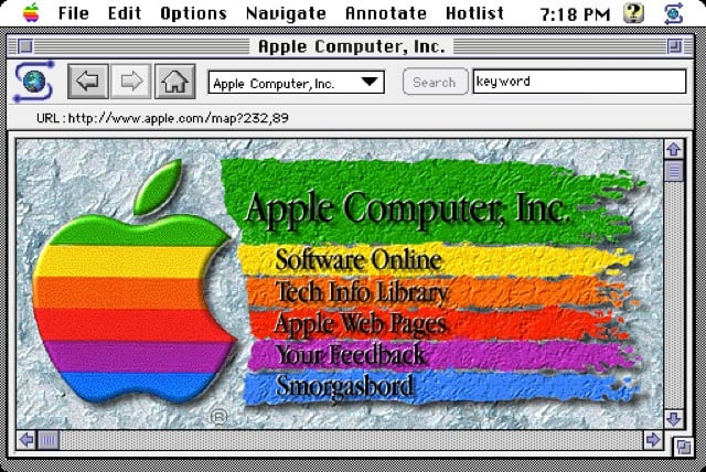
I don’t remember this version, but it looks like it was contemporary with this Microsoft homepage (which I do remember). I bet there’s footage of this page in Triumph of the Nerds or Nerds 2.0.1 or on an episode of Computer Chronicles. Anyone?
Paul Ford writes about how Greg Knauss scaled Paper’s web site after they broke the internet with nude photos of Kim Kardashian.
Via email, Jacobs told Knauss that PAPER believed “they’ve got something that they think will generate at least 100 million page views, and will their current infrastructure support that?”
“This sort of cold thrill goes down my spine,” Knauss said, “and the only thought that makes it out of my brain is, ‘Eep.’”
He continued: “I reflexively begin designing the architecture in my head. It’s a nerd impulse. Dogs chase after thrown balls, system administrators design to arbitrary traffic.”
I love this article for a whole bunch of reasons (including that it’s written by a friend about two other friends, one of whom is responsible for keeping kottke.org’s servers going), but I was just talking about the burstable web scaling issue with a friend the other day. She was trying to make a reservation for a ferry. The reservations open for the entire season on a particular day at a particular hour and in a matter of hours, most (if not all) of the reservations are taken. And of course, their tiny web site and backend systems melts into a huge puddle that day, people can’t get in, and everyone wastes 4 hours of their day trying to make a simple reservation. Basically, the ferry company needs to be Ticketmaster, but only for 3 or 4 hours every year. That’s a weird problem and it’s been an issue on the web since forever, and no one has solved it in an entirely off-the-shelf way. Someone get on this, riches await.
This article attempts to explain, in great detail, what happens when you type ‘google.com’ into your browser and press enter.
To pick a zero point, let’s choose the enter key on the keyboard hitting the bottom of its range. At this point, an electrical circuit specific to the enter key is closed (either directly or capacitively). This allows a small amount of current to flow into the logic circuitry of the keyboard, which scans the state of each key switch, debounces the electrical noise of the rapid intermittent closure of the switch, and converts it to a keycode integer, in this case 13. The keyboard controller then encodes the keycode for transport to the computer. This is now almost universally over a Universal Serial Bus (USB) or Bluetooth connection, but historically has been over PS/2 or ADB connections.
An I, Pencil for the internet age.
To celebrate the 20th anniversary of the first Microsoft home page, the company has recreated that old page here. More here, including screenshots of subsequent designs.
In terms of “Web design,” the notion, much less the phrase, didn’t really exist.
“There wasn’t much for authoring tools,” Ingalls says. “There was this thing called HTML that almost nobody knew.” Information that was submitted for the new Microsoft.com website often came to Ingalls via 3-1/2-inch floppy disks.
“Steve Heaney and I put together PERL scripts that handled a lot of these daily publishing duties for us,” he says. “For a while, we ran the site like a newspaper, where we published content twice a day. And if you missed the cutoff for the publishing deadline, you didn’t get it published until the next running of the presses, or however you want to term it.”
Interestingly, Microsoft doesn’t seem to know exactly when the page first went live:
Based on the findings, it appears the website was launched during the time between HTML/1.0 (June 1993) and HTML/2.0 (Dec 1994).
I made a brief search of the NCSA What’s New Archive, where a web site for Microsoft should have been noted, and found nothing between June 1993 and September 1994. This piece written in 1999 about the beginnings of Microsoft’s site says the page launched in April 1994. I searched some early Usenet groups to no avail. Anyone have a more accurate date? (via waxy)
Older posts
Socials & More